10,000 search results
(0.096 seconds)
- KG What Does The Fox Say by Kimberly Geswein,
$5.00 Kid-friendly left-tilted ball and stick handwriting.
 - BK Bird by Konst.ru,
$10.00 Font for names, logotypes, titles, headers, topics etc.
 - Kermel by La Boîte Graphique,
$25.00 Handwriting font. Usage recommendations: Title, short text, logo.
 - Ninja Hirosi by Yoga Letter,
$16.00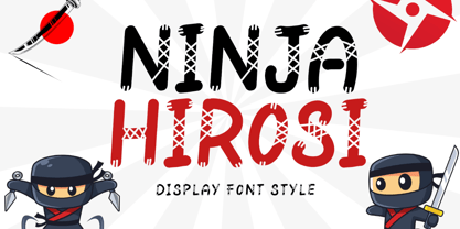 "Ninja Hirosi" is a very unique and cute display font. This font is equipped with uppercase, lowercase, numerals, punctuation, and multilingual support. Very suitable for comics, book titles, promotions, business branding, stickers, banners, branding, logos, film titles, and others.
 - Anabela Christmas by Yoga Letter,
$20.00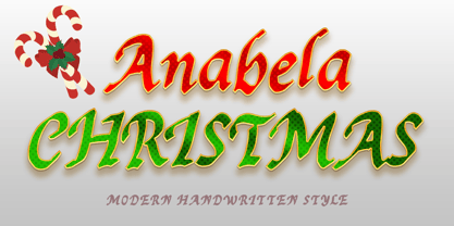 "Anabela Christmas" is an elegant handwritten font. This font is equipped with uppercase, lowercase, numerals, punctuation, and multilingual support. Very suitable for business branding, Christmas, Christmas invitations, weddings, Halloween, logos, film titles, book titles, posters, banners, stickers, and others.
 - Santa Display by Yoga Letter,
$18.00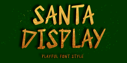 "Santa Display" is a unique and cute display font. This font is equipped with uppercase, lowercase, numerals, punctuation, and multilingual support. Very suitable for Christmas, weddings, birthdays, engagements, posters, branding, stickers, logos, tattoos, book titles, film titles, and others.
 - Sparose by Dhan Studio,
$21.00 Sparose fonts is handwritten specifically designed to get texture, also have ligature and beautiful Swash. Suitable for use in design titles such as invitations, signboards, book titles, stationery designs, quotes, branding, logos, greeting cards, packaging designs, posters, and more.
 - Death Demon by Yoga Letter,
$15.00 "Death Demon" is a horror font that is very scary and full of mystery. This font is perfect for Halloween moments, movie titles, book titles, Halloween party invitations, and more. Equipped with uppercase, lowercase, numerals, punctuation, and multilingual support.
 - Kungfu Brush by Ditatype,
$29.00 Kungfu Brush is a captivating game-themed display font designed in uppercase, infusing the essence of martial arts and the artistry of brush strokes. It features a distinct brush-style accent that brings a sense of handcrafted artistry to each letter. Inspired by the fluid movements of martial arts, the font captures the energy and elegance of brush strokes. This unique feature adds a touch of creativity and authenticity, making this font stand out from conventional display fonts. Designed with fairly low contrast, Kungfu Brush prioritizes a balanced and harmonious visual experience. The subtle differences in stroke width across the letters create a smooth and comfortable reading experience. With its uppercase design, Kungfu Brush exudes power and strength. Each letter commands attention and showcases the boldness of martial arts. The font's uppercase style adds a sense of authority and captures the spirit of determination found in the martial arts realm. You can also enjoy the available features here. Features: Multilingual Supports PUA Encoded Numerals and Punctuations Kungfu Brush fits in headlines, logos, posters, titles, branding materials, print media, editorial layouts, website headers, and any projects that aim to capture the essence of combat, adventure, and discipline. Find out more ways to use this font by taking a look at the font preview. Thanks for purchasing our fonts. Hopefully, you have a great time using our font. Feel free to contact us anytime for further information or when you have trouble with the font. Thanks a lot and happy designing.
 - Ainslie Slab by insigne,
$- Holy Dooley! It’s a new Ainslie! Based on the inspiration from Mt. Ainslie and the Ainslie suburb outside Canberra, the original Ainslie adds geometric simplicity with a hint of aboriginal flair to the project. And now the muses of Ainslie are back at work, lending their structure as the foundation of Ainslie Slab. Like its big brothers, the new Ainslie Slab puts together a great mix of influences from Oz for a great looking typeface with some ace new shoes. Slab’s spiffy new slab serifs complement the classic frame, making the result a ripper Aussie typeface that can be used in a great number of applications. Take a look at the trendy typeface’s alternates in action, too. You can access these in any OpenType-enabled application. Alternates, swashes and alternate titling caps allow you to customize your look and feel. Capital swash alternates, old style figures, and compact caps are included to add a bit more flexibility to your work as well. OpenType enabled applications can take complete benefit of your automatic replacing ligatures and alternates, and this font also presents the glyphs to help a wide array of languages. View all of these in the PDF brochure. And then try them out. Combine it with the original Ainslie and Ainslie Sans for more flexibility. Whether you need a good slab for the copy or you want a clean, upbeat look for your headline, Ainslie Slab offers you a unique touch of the Outback that’s anything but out of touch.
 - Cute Dog by Yoga Letter,
$15.00 "Cute Dog" is a display font with decorative bones, dog heads, and dog paws. This font is equipped with lowercase, uppercase, numerals, punctuation, and multilingual support. Suitable for posters, business branding, logos, banners, stickers, magazine titles, film titles, and more.
 - 21 Emmerson by Deniart Systems,
$20.00 A bit grungy, a bit stern, 21 Emmerson is a tribute to my birthplace and was designed with punky headline posters in mind. The simple lines of this font are angular and sharp - great for party posters, invitations, labels, etc.
 - This Notes by Afkari Studio,
$13.00 Introducing This Notes - Handwritten Marker Note Font is a delightful testament to the artistry of handwriting, meticulously crafted to infuse your designs with an authentic, hand-drawn aesthetic. With a distinctive yet versatile style, This Note is poised to enhance a diverse array of design projects, serving as a conduit for creativity and expression. At its core, This Note embodies the charm of handwritten notes, capturing the nuances and imperfections that make each stroke unique. It's a natural flow and effortless elegance make it an ideal choice for a multitude of graphic endeavors, ensuring its relevance across various platforms and applications. Highlighted Features: - Complete set of uppercase and lowercase letters, numerals, and punctuation marks - Unique alternates and ligatures for added character variation - Compatible with both PC and Mac platforms - Hassle-free installation process - Seamless integration with Adobe Illustrator, Adobe Photoshop, Adobe InDesign, and Microsoft Word - No additional design software is required for full accessibility - Multilingual support encompassing characters such as ä, ö, ü, Ä, Ö, Ü, ß, ¿, and ¡ This Note transcends mere functionality; it becomes a catalyst for innovation and inspiration. Its versatility knows no bounds, seamlessly integrating into digital notes, quote designs, book covers, logos, posters, menu layouts, apparel designs, scrapbooks, comic illustrations, magazine headers, and numerous other creative avenues. The font’s adaptability is matched only by its ability to breathe life into every project it graces. Whether adorning a playful children's illustration or adding a touch of personality to a sophisticated magazine title, This Note lends an air of authenticity that captivates audiences. In conclusion, This Note Handwritten Marker Note Font isn’t merely a font; it's a conduit for creativity, a bridge between imagination and realization, poised to elevate your projects to new heights. Embrace its charm, leverage its versatility, and allow it to become the catalyst for your creative journey. Unlock the boundless potential of This Note, where each stroke tells a story and every design bears the mark of authenticity.
 - P22 Mystic Font by IHOF,
$24.95 The P22 Mystic font knows all. Aside from allowing for type design in a faux eastern script, this font peers into the world of the spirits for guidance and enlightenment. Sure it has small caps and ligatures as OpenType features, but it also has a special “oracle” feature which will answer your most mystifying questions. The design itself was based on an actual Ouija board. Somehow the spirits became embedded into the font itself and now when a question is typed, an answer is revealed—provided the Contextual Alternates feature is enabled. It is not known how the otherworldly harbinger was able to integrate into OpenType scripting, but who are we mere mortals to question this power? Ask and ye shall be amazed! Only the Opentype Pro version will offer the “Magic Eight-Ball” feature. It also contains the small caps and old style figures as found in both TT and PS versions of the fonts.
 - Aerosol - Unknown license

- KG This Is Not Goodbye by Kimberly Geswein,
$5.00 Neat, calligraphy-style handwriting using a chisel-tipped marker.
 - Neuliner by CozyFonts,
$20.00 The Neuliner Family is sleek, condensed, extremely legible & flexible available in 7 styles. The inspiration stems from the classic, slender Art Deco era. Designed with a repeated vertical theme Neuliner is consistent from style to style with variations in weight and character. With over 350 glyphs and applying in over 80 languages with Numerals, Dingbats & Euro accents this family is complete. At the time of its first release Neuliner is available in Medium, Bold, Italic, Outline, Drop, Rough, & Rounded. Other styles are in the works. As displayed in the posters, Neuliner works well, in any style, for headlines, by-lines, logos, titles, posters, signage, billboards, ads, main & end titles, monograms, numbering systems, wedding invites and stationary, etc. The Bold style works congruously with the Outline & Drop styles, for either 'trapped' or 'offset' effects. This family also has its roots and influence in Mid Century influenced architecture and design yet lends its style to contemporary and modern design in the 2020s. The Drop & Rough versions are unique styles that render well in Adobe Illustrator & Adobe Photoshop for use in a myriad of colors and effects. The rough-edged style resembles a stitched and weathered effect, while the drop version plays prominently as headlines in either bright or muted color combinations. The versatile, ever-classic outline style gives any image or photographs an impression of elegance and transparency without sacrificing legibility. Neuliner Rounded embosses and engraves either blindly or foil added with a lasting impression. Neuliner Family from Cozyfonts Foundry.
 - Glogalex by ZultypeFonter,
$21.00 We designed this Glogalex font inspired by today's rapid digital technology, where the art of typography is very much needed to support various digital needs, both for software and for other print media needs. Glogalex is a display font designed with the main focus aimed at the needs of various brands of digital products or other technology products, but not limited to the use of various kinds of printing, both mass media or for the needs of various titles of books, magazines, newspapers, and various other kinds of tabloids, the wealth of Glyph Alternate and Ligature can add to the creation of typography art, you can be creative in using various letters that we have designed by combining ordinary letters with alternative letters and also ligatures, we have combined several ligatures to make it easier for you to use, but if If you have difficulty using Alternate letters and ligatures, we recommend you to manually combine each Alternate and ligature you want to use. We highly recommend the use of this Glogalex font for the needs of displaying company brands, trademarks, logo designs, use in digital media, such as movie titles, online game names, and for various vehicle brands, if you can maximize its use it will be very interesting. for each display that has been designed, pleasing to the eye and easy to read. we are very happy if you are satisfied in using our products, and if there are problems in using our products you can tell us via email zulfikarzul80@yahoo.co.id, we will respond as soon as possible, thank you.
 - Aviano Royale by insigne,
$34.99 Aviano returns to lend its classic line to its newest variation, Aviano Royale--named so because of the rich flow the calligraphic capitals give the established font. The extended lowercase characters give an air of formality to the face as well and bestow on the family a deeper sense of wealth and power. This recent development of a timeless font, part of insigne’s annual tradition of adding to the Aviano family, was elected the clear winner in a poll of insigne design’s social media followers. And is it any wonder why? The long-handed elegance of Royale features graceful script capitals as well as widely tracked and smaller titling capitals, all which make Royale ideal in high-end applications and branding where titling with a taste of gentility is required. Royale’s suite boasts a number of OpenType alternates, most importantly of which are the alternate forms for the capitals. Whereas the default forms of the face are regal, it’s flourishes must be activated through the swash set. For a look more restrained, activate the stylistic alternates. It’s like having three different fonts in one! Additionally, there are baseline lowercase forms. The lowercase forms are 20% smaller in height than Aviano’s lowercase forms, so the families are not interchangeable. However, they can still be used well together. The script capitals could also be used separately as drop capitals and nicely complement any of the other 12 Aviano families. It’s time to look beyond common. For the look of refinement you desire, design with Aviano Royale.
 - Lafemme Vibe by Jolicia Type,
$27.00 LaFemme Vibe is a conceptual serif font that exudes a modern and elegant aesthetic, tailored specifically for women. Featuring uppercase characters with distinctive curly signatures, LaFemme Vibe combines the following elements to create a unique visual experience: Classy Serifs: LaFemme Vibe boasts serif characters with soft, graceful serifs that add an element of sophistication to each letterform. Asymmetrical Charm: This font is intentionally imperfect in its symmetry, as if crafted by a gentle, artistic hand. It radiates an inviting and charming quality. Curly Signature Flourish: The curly, signature-like embellishments that adorn the letterforms in LaFemme Vibe infuse a personal and artistic touch. This imparts the sense that each word written with this font is a unique work of art. Modern Harmony: Despite its classical elements, LaFemme Vibe maintains a modern sense of harmony. The letters appear assertive yet gentle, making it perfectly suited for contemporary women seeking timeless elegance. Elegance and Chic: LaFemme Vibe embraces an elegant and chic aesthetic that is particularly fitting for products or designs targeted towards women who aspire to exude luxury and style. LaFemme Vibe is a typographic masterpiece created to bring a modern and elegant sensibility to women who appreciate beauty in every detail. It’s a font that effortlessly blends classic charm with contemporary allure, making it an ideal choice for a wide range of design projects aimed at celebrating the essence of femininity.
 - Mirey by Nathatype,
$29.00 If you want your designs to be prominent, you will need a unique, prominent, yet professional, legible font. However, it may be hard and take some time to find the right one due to a lot of options available causing difficulty to figure out the suitable one you desire. With Mirey, you can easily create a unique identity for your design. Mirey is a display serif font in thick weights with small lines on the letters’ edges to look formal and classic. In addition, it expresses unique, artistic touches from its combinations with display font characters. This display font has thick lines and strong contrasts, so that it is perfect to attract attention and to show strong impressions. Due to its high legibility level, this font is applicable for a variety of text sizes. In addition, you can enjoy the available features here. Features: Multilingual Supports PUA Encoded Numerals and Punctuations Mirey fits best for various design projects, such as brandings, posters, banners, headings, magazine covers, quotes, invitations, name cards, printed products, merchandise, social media, etc. Find out more ways to use this font by taking a look at the font preview. Thanks for purchasing our fonts. Hopefully, you have a great time using our font. Feel free to contact us anytime for further information or when you have trouble with the font. Thanks a lot and happy designing.
 - Officially Funky by SilverStag,
$14.00 officially funky is a brand new, creative & unique font duo. It is a part of my font duo series and after French Lovers & Silver Garden it was time to create a font that is both modern and nostalgic. It is a 2 in 1 font, where the sans makes it modern and alternate serif letters & cool ligatures will make each of projects projects 100% unique. The font also includes over 45 ligatures and I am sure you will love this funky vibe. It also includes full language support, punctuation, numerals and detailed instructions how to use alternate letters most of the apps on your computer, as well as in Canva. I invite you to check out the preview images, and I hope you will be immersed in my vision for this creative typeface that, I am sure, will work for all kinds of interesting projects you might be working on this year. If you end up publishing your designs on Instagram, tag me - @silverstagco and I will make sure to showcase your design and work to my audience as well! Officially Funky - Modern Font Duo Includes: Over 45 ligatures in sans & serif font Numerals & Punctuation Web Font Kit is included as well Detailed instructions on how to use alternates in most of the apps on your computer and in Canva Happy creating everyone!
 - Deberny by Typorium,
$15.00 The Deberny typeface is an interpretation–carrying a contemporary imprint–of a typographic style which appeared and spread at the end of the 19th century until the begining of the 20th. These typefaces were named Italian, Venetian, Veronese and were classified in the Hellenic category, a spontaneous typographic movement caracterized by triangular and heavy serifs. They found their inspiration among numerous references, from incised to slab serif typefaces and their extreme expressions in wood type letterforms. The Deberny font family is made of 26 styles in 3 complementary sets of style, offering a wide palette of visual resonance: • Deberny Line is ideally suited for editorial, branding, posters and billboards. It has sharp contrast between thick and thin strokes. Heavy horizontal strokes are not frequent in roman letters, but here they fit naturally with the italic letters. • Deberny Open is a stylish outline declination of Deberny Line Medium and Medium Italic. • Deberny Text is an adaptation of Deberny Line made for broader use. Its shapes are less contrasted, which makes it perfectly legible for print or screen reading in small size text. Old style figures and small caps complete Deberny Text in all its 8 styles. The Deberny typeface family supports Latin-based languages and will be available soon in Cyrillic and Greek. Deberny Narrow will be released this year in all its 26 styles.
 - Multiple by Latinotype,
$39.00 As its name suggests, Multiple is a family with multiple font styles. The idea that sums up the concept behind the typeface is “workhorse”. The challenge was to develop a useful font fit for any scenario and suitable for any design needs: editorial design, packaging, branding, screen use, etc. Multiple features soft, rounded shapes and large counterforms which make it well-suited for both text and display usage. The proportions are based on classic typefaces yet its design was specially created to provide a high degree of versatility. Multiple contains different stylistic sets whose variety of glyphs provides a wide range of choices for any design project. Partly humanist and partly grotesque, Multiple comes with a number of font variants that will help you choose the style that will best meet your needs. The font also includes a serif version with the same number of variants as its sans counterpart. The sans version includes 4 stylistic sets while its slab companion comes with 3 sets, both available as separate alt family packages (ideal for those seeking ready-to-use alternate glyph sets). These alternate characters are also available as OpenType features in the regular versions. Multiple comes in 5 weights—ranging from Extra Light to Bold - with matching italics, and contains a 395-character set that supports 207 different languages. Multiple: one font, multiple faces.
 - FS Hackney by Fontsmith,
$80.00 Elliptical The squareness of curves. That was the elliptical – in more than one sense – notion being explored in the making of FS Hackney. The squareness of curves and vertical terminals to create a gentle, soft sans serif, with a little bit of magic. A momentary thought – “It doesn’t have to be like this” – provided the spur to explore the verticals and skeletons of letterforms beyond conventional type design limits. A 12-month gestation period gave rise to a font with a larger-than-usual character set, including non-lining figures, small caps and superior and inferior numbers. It’s a collection that speaks confidently for itself. Assertive It was the Hackney carriage – the black London cab – that gave this font its name, not the north London neighbourhood. Solid, dependable, effective and built to last, FS Hackney was honed to perform in all conditions. Cool, compelling lines and a satisfying overall simplicity lend FS Hackney its assertive air. Assured, versatile and effective; just like a black cab (but without the grumbling). Machined Over a string of meetings, Jason Smith and FS Hackney designer Nick Job worked out how to infuse Nick’s sketched letterforms with Fontsmith’s familiar geniality. “Nick is very meticulous and produces very clean design work,” says Jason. “Hackney is ideal for branding as it’s very clear and its quirks are sensible ones, not odd ones, that don’t distract from the message.”
 - Chucara Next by Letritas,
$25.00 Chucara next is the newest font designed by Juan Pablo De Gregorio, a typeface aimed at high readability when set in paragraphs or large chunks of text. Its predecessor "Chúcara", born in 2003, sought after increasing readability by achieving big and simple counterforms. This time around Juan Pablo went further by increasing the X-height and trimming both ascenders and descenders, thus the font appears to be much larger than it is and can be readable at smaller sizes. The DNA of the whole font is marked by the terminal of the "a" character. Juan Pablo used a specially crafted cut to design this counterform, and this shape together with the graceful and winding forms of the letter resembles the form of a horse, hence the name Chúcara, or untamed. The italic version has a 10-degree angle and a 10% condensation, making it way more streamlined than a regular italic font. The Philosophy of a larger counterform is maintained through and through in the italic variant. This version looks different not only due to its inclination, but the sheer effort put into carefully taking care of the condensation and the gestures allow the italic to enrich the texts gracefully, for the highlighting of the words stands out without affecting the grey of the paragraph. Chucara next is a typeface optimal for being used in books, newspapers, magazines, texts, printing, headlines, editorial, quotes, corporate identity, and lo res printing. The typeface has 8 weights, ranging from “thin” to “black”, and two versions: "regular" and "italic". Its 16 files contain 635 characters with small caps, stylistic sets and different kind of numbers. It supports 219 Latin-based languages, spanning through 212 different countries. Chucara next supports this languages: Abenaki, Afaan Oromo, Afar, Afrikaans, Albanian, Alsatian, Amis, Anuta, Aragonese, Aranese, Aromanian, Arrernte, Arvanitic (Latin), Asturian, Atayal, Aymara, Bashkir (Latin), Basque, Bemba, Bikol, Bislama, Bosnian, Breton, Cape Verdean Creole, Catalan, Cebuano, Chamorro, Chavacano, Chichewa, Chickasaw, Cimbrian, Cofán, Corsican Creek,Crimean Tatar (Latin),Croatian, Czech, Dawan, Delaware, Dholuo, Drehu, Dutch, English, Estonian, Faroese, Fijian Filipino, Finnish, Folkspraak, French, Frisian, Friulian, Gagauz (Latin), Galician, Ganda, Genoese, German, Gikuyu, Gooniyandi, Greenlandic (Kalaallisut)Guadeloupean, Creole, Gwich’in, Haitian, Creole, Hän, Hawaiian, Hiligaynon, Hopi, Hotc?k (Latin), Hungarian, Icelandic, Ido, IgboI, locano, Indonesian, Interglossa, Interlingua, Irish, Istro-Romanian, Italian, Jamaican, Javanese (Latin), Jèrriais, Kala Lagaw Ya, Kapampangan (Latin), Kaqchikel, Karakalpak (Latin), Karelian (Latin), Kashubian, Kikongo, Kinyarwanda, Kiribati, Kirundi, Klingon, Ladin, Latin, Latino sine Flexione, Latvian, Lithuanian, Lojban, Lombard, Low Saxon, Luxembourgish, Maasai, Makhuwa, Malay, Maltese, Manx, M?ori, Marquesan, Megleno-Romanian, Meriam Mir, Mirandese, Mohawk, Moldovan, Montagnais, Montenegrin, Murrinh-Patha, Nagamese Creole, Ndebele, Neapolitan, Ngiyambaa, Niuean, Noongar, Norwegian, Novial, Occidental, Occitan, Old Icelandic, Old Norse, Oshiwambo, Ossetian (Latin), Palauan, Papiamento, Piedmontese, Polish, Portuguese, Potawatomi, Q’eqchi’, Quechua, Rarotongan, Romanian, Romansh, Rotokas, Sami (Inari Sami), Sami (Lule Sami), Sami (Northern Sami), Sami (Southern Sami), Samoan, Sango, Saramaccan, Sardinian, Scottish Gaelic, Serbian (Latin), Seri, Seychellois Creole, Shawnee, Shona, Sicilian, Silesian, Slovak, Slovenian, Slovio (Latin), Somali, Sorbian (Lower Sorbian), Sorbian (Upper Sorbian), Sotho (Northern), Sotho (Southern), Spanish, Sranan, Sundanese (Latin), Swahili, Swazi, Swedish, Tagalog, Tahitian, Tetum, Tok Pisin, Tokelauan, Tongan, Tshiluba, Tsonga, Tswana, Tumbuka, Turkish, Turkmen (Latin), Tuvaluan, Tzotzil, Uzbek (Latin), Venetian, Vepsian, Volapük, Võro, Wallisian, Walloon, Waray-Waray, Warlpiri, Wayuu, Welsh, Wik-Mungkan, Wiradjuri, Wolof, Xavante, Xhosa, Yapese, Yindjibarndi, Zapotec, Zulu, Zuni.
 - Leroy by Andinistas,
$39.95 Leroy is a font family of 5 members designed from geometrizing Roman and Gothic skeletons. Its purpose is to provide optimal reading of titles and paragraphs with strong mechanical flavor. Because of this, its variables are designed to sort information in media such as labels, signs and industrial atmosphere packaging related with the Soviet Union’s fonts in 1920. This idea matured white horizontal lines superimposed on alphabets drawn with an ancient architectural team known as “Leroy K & E Controlled Lettering System”. Then that evolved into a family concept unifying its proportion to the same X height for its members, resulting in a versatile type system. Therefore, Regular and Bold variables have low contrast between thick and thin strokes. Its upstream and downstream are extremely short, generating a suitable interline that clogs the vertical area. Its overall width equal to its X height, supports its tight spacing that compacts the horizontal area. Therefore, the variant with black caliber has plenty of contrast between thick and thin strokes. The light variable has a “blind” effect radiating light halos, ideal to propose hierarchies and combinations with orthogonal projection. In that sense, Leroy’s modular character reminds constructivist ideology merged with typographical variants suitable for graphic design with geometric look. To achieve this, I studied the softening of forms and counter blocks into a typographical system specially designed for composing useful information to attract attention. In that sense, the dingbats were obtained through a careful process of research and testings done with drawings that provided full and empty visual strategies that with the passage of time helped to forge the major decisions of a metamorphosis from industrial tools, birds and humans from pictogram mixing various genres.
 - Antique Tuscan No 9 by HiH,
$8.00 Antique Tuscan No.9 was one of the earlier wood-type designs by William Hamilton Page. It was first shown among the specimens produced in 1859, shortly after Page entered into a new partnership with Samuel Mowry, owner of the Mowry Axle Company. The new company was named Page and Company and was located at the Mowry facility in the Greenville section of Norwich, Connecticut. Antique Tuscan No.9 is an extra-condensed version of the tuscan style that had been released in moveable type by Vincent Figgins of London in 1817 and had become so popular for advertising in the intervening years. Because of the extreme compression in the design, we might be tempted to describe it as "Triple-X," but that might be misleading. The analogy would, of course, be to clothing sizes, not movie ratings. Because of the compression, this typeface reads best when set extra-extra-extra large. For printing, we recommend 36 points or larger. For the screen, we suggest at least 72 points. An unusual and distinctive design, it is best used with discretion. If I were doing a term paper for school or submitting an article to a magazine for publication, I might use it for the title page, to grab someone’s attention. I would certainly not use it for the main body of text - not if I expected anyone to read what I wrote. If you wonder why we make this recommendation, take the Ten-Point challenge. Print this paragraph using Antique Tuscan No.9 and set the font size at 10 points. If you are young and blessed with good eyesight, you will probably be able to read it - with effort. So, here is the challenge: hand it to your Grandmother and ask HER to read it.
 - FF Kaytek Sans by FontFont,
$50.99 Kaytek™ Sans is a fresh take on the correspondence typefaces of the 90s - which were originally designed for the demands of office environments. Just like its predecessors, this text typeface is robust and hard-working - meaning it works well in challenging design or printing environments - but it’s not without personality. Look closer at the lowercase g and a, especially in the italic, and you can see some unexpected elements of subversiveness within the design. This blend of sturdiness and quirkiness means it’s just as relevant for information-heavy projects, such as annual reports, as it is in more expressive environments. Although first and foremost designed for text, Kaytek Sans’ details shine through in its heavier weights and larger sizes, meaning it also has display potential. Every style of the typeface takes up exactly the same amount of space, thanks to the way Radek Łukasiewicz created the design. He based the entire typeface on a single, master set of proportions. This means designers can switch between styles without the text being reflowed, making it particularly useful in magazines, where space might be limited, and also on the internet, where hover links appear in a different style. As well as its roots in the office, Kaytek Sans draws on a little bit more 90s nostalgia. It’s named for the first and only Polish walkman, and embodies the same solid, no-nonsense shapes that made the analogue technology of the era so charming. Just like these early personal music devices, Kaytek Sans is practical, but not clinical, able to work hard while still exuding warmth and personality. It pairs effortlessly with Kaytek Slab, which is a sturdier and more expressive take on the design. Kaytek Sans comes in 12 weights, from Thin to Black Italic, and offers multi-language support. Kaytek Slab, Kaytek Headline and Kaytek Rounded are also available.
 - Bridone by Tipo Pèpel,
$22.00 Introducing the innovative and original Josep Patau’s new recipe, salsa and wild-type master. 1. In a font, combine a bit of slightly outdated British slab types from the late Victorian period. If you find Vincent Figgins’s variety, do not discard. You'll find plenty to choose from in his specimens, some of then with unexpected vitality an enviably condition, despite it’s age. As aging wine, they had improve their quality with time. Cut Didones into thin slices and add. 2. In a blender, whisk the strength of these Slab serif with highly contrasted strokes from Bodoni or Didot’s neoclassical types. Adjust the mix to get a sweeter or spicier taste, but do not forget to emphasize the contrast to avoid the dressing off. 3. On the page, set the wide variety of weights as your menu demands. If you want to feed fill the stomach of the hungriest holders, use Bridone Titling as main course. If you are serving a traditional menu, starter, main and dessert, then simmer a combination of weights and sizes according to your space. It will not disappoint, much less your guests . 4. Spread thoroughly the page, serve and enjoy . If you like natural, switch to Bridona, your pages will thank you.
 - Kastela by Attract Studio,
$12.00 Kastela is a brush script font. It is inspired by brush lettering and has a soft and welcoming look. Kastela can be used for branding, logos, packaging and wherever you need a script font that is easy to read and smooth. Kastela has many ties, strokes, and alternative characters that will make your designs unique and beautiful. All Style Alternatives also have language support.
 - Jubel by Sine,
$15.00 Jubel font is named after the German word for "celebration". Crafted with a natural, blocky style, Jubel is designed for various creative uses, including magazine titles, captivating headlines, book titles, distinctive logos, vibrant shop banners, attention-grabbing flyers, and impactful advertising headlines.
 - Pimpaw Cat by Yoga Letter,
$15.00 "Pimpaw Cat" is a unique and cute display font. This font is decorated with different types of cat shapes. Equipped with uppercase, lowercase, ligatures, punctuations, numerals, and multilingual support Suitable for posters, banners, prints, branding, stickers, magazine titles, film titles, and more.
 - Ink Line by Atom,
$13.00 Ink Line is a modern font script that gives a unique impression. With ligature, titling, swash, and multi language features, Ink Line is very easy to use in the application of posters, flyers, titles, bloggers, Instagram stories, web banners, etc. Happy Design :)
 - Mia Love by Dhan Studio,
$20.00 Mia Love is a special brush font designed to look bold, with a perfect texture, suitable for today's designs. Perfect for use in design titles such as invitations, signboards, book titles, stationery designs, quotes, branding, logos, greeting cards, packaging designs, posters, and more.
 - Haakke by Dawnland,
$13.00 Haakke (or Håkke) - a casual, hand drawn (Stabilo OH pen, Fine) font with 4 alternates to all upper and lower case letters (a-z + å ä ö) as well as numbers for a realistic hand written look and feel! “Ligatures” have been created for double letters (TT, tt, ff, ll & LL (open type version of the font and open type compatible layout application required). Of course it holds all(?) the special characters that you will ever need. 451 glyphs... Haakke also includes symbols. Zodiak signs (letter a-l, upper case A-L write the corresponding name of the sign), planet signs (m-z, upper case M-Z write the corresponding name of the planet) triangles, squares and stars (from pentagrams (5 pointed) to Dodecagrams (12 pointed). (Write a 4, or shift-4 ("euro-sign", european keyboard, or "dollar sign", american keyboard) before your star or triangle and you will get a circle around it).
 - Destra by Isaco Type,
$26.00 Destra is a contemporary, narrow serif family, suitable to save space and legible at small sizes. Its shapes are the result of a mix of styles. "Destra" is the Portuguese word for "right hand". The font has several OT features - fractions, old style-, lining-, tabular numbers, superiors/inferiors, alternative glyphs, dozens of ligatures (standard + discretionary) and an exclusive feature to convert Arabic to Roman numerals up to 1000 (download the “OT Features Guide” pdf). Moreover, Destra has an impeccable technical finish, with a systematic review of nodes, curves, spacing and internal data, eliminating the possibility of errors when using it. The family consists of 8 styles, 4 weights - Regular, Medium, Bold and Black, plus their respective italic versions. The fonts are available in OpenType PS/TT and have extended character set to support CE, Baltic, Turkish as well as Western European languages. You can test Destra downloading the free trial font in Medium version (TT only). This trial file supports only Western languages.
 - FF Kaytek Slab by FontFont,
$50.99 Kaytek™ Slab is a fresh take on the correspondence typefaces of the 90s - which were originally designed for the demands of office environments. Just like its predecessors, this text typeface is robust and hard-working - meaning it works well in challenging design or printing environments - but it’s not without personality. Look closer at the lowercase g and a, especially in the italic, and you can see some unexpected elements of subversiveness within the design. This blend of sturdiness and quirkiness means it’s just as relevant for information-heavy projects, such as annual reports, as it is in more expressive environments. Although first and foremost designed for text, Kaytek Slab’s details shine through in its heavier weights and larger sizes, meaning it also has display potential. Every style of the typeface takes up exactly the same amount of space, thanks to the way Radek Łukasiewicz created the design. He based the entire typeface on a single, master set of proportions. This means designers can switch between styles without the text being reflowed, making it particularly useful in magazines, where space might be limited, and also on the internet, where hover links appear in a different style. As well as its roots in the office, Kaytek Slab draws on a little bit more 90s nostalgia. It’s named for the first and only Polish walkman, and embodies the same solid, no-nonsense shapes that made the analogue technology of the era so charming. Kaytek Slab is robust and solid. Kaytek Slab comes in 12 weights, from Thin to Black Italic, and offers multi-language support. Kaytek Sans, Kaytek Headline and Kaytek Rounded, are also available.
 - Taca by Rúben R Dias,
$42.00 Taca is a typeface built around a shape that Portuguese designer Rúben R Dias calls a “squircle” — neither square nor circle. We usually associate the rounded, convex box with the television screens of the 1960s and Aldo Novarese’s classic typeface, Eurostile. But whereas Eurostile is cold and machined, Taca is warm and rugged, as if it was molded from clay or carved from stone. Taca’s organic nature is also derived from another unique feature: rounded crotches at the right angles where perpendicular strokes meet. This subtle finish, along with blunt stroke endings, softens the otherwise rigid skeleton. With such a strong conceptual vision, Taca could be relegated to the bin of experimental designs, severely limited in their application. But that fate is usually born of a less experienced maker. As a teacher, designer, and letterpress printer, Dias is a type user, keenly aware of the functional requirements of good type. Taca is therefore not a slave to its concept, but a working font family, effective in various sizes and environments. Its lettershapes break away from the base shape whenever it makes sense for legibility, while still maintaining the flavor of the design as a whole. That said, a set of squircle-shaped alternates give the user the flexibility to get more stylized if the situation calls for it. Fitting to its functional aims, Taca has many of the features one expects of a proper text font: upper and lowercase figures, case-sensitive punctuation, and Extended Latin language support. The simplicity, openness, and squareness of Taca’s forms also make it an ideal design for the pixel grid of screen displays.
 - Aero Flux by Ferry Ardana Putra,
$19.00 Introducing "Aero Flux", the cyber mecha font that will take your designs to the next level. This font is designed with a perfect blend of modern and squared feel, giving it a unique and futuristic aesthetic that is perfect for a wide range of applications. The bold and sleek design of Aero Flux makes it an ideal choice for logos, headlines, and branding materials. It's all-caps design with punctuation, numerals, and foreign support allows for flexibility in creating unique and engaging visual designs. Aero Flux's squared feel makes it perfect for projects that require a strong and sturdy look, such as designing video game or movie titles, product packaging, or creating futuristic posters. This font's bold, industrial look is perfect for capturing the essence of the mecha genre, with its sharp angles and futuristic design. The squared feel of Aero Flux adds a sense of strength and solidity to your designs, making it the perfect choice for projects that require a bold, commanding look. Moreover, Aero Flux's industrial, mecha-modern design makes it the perfect font for creating digital interfaces and user interfaces (UIs), especially those that require a futuristic or high-tech feel. In summary, Aero Flux is a highly versatile font that is perfect for a wide range of applications, from logos and branding to digital interfaces and futuristic posters. With its modern, squared feel and unique design, Aero Flux is the perfect font to add a touch of futurism to your projects and captivate your audience. Aero Flux features: A full set of uppercase Numbers and punctuation Multilingual language support PUA Encoded Characters OpenType Features Cyber Mecha Style +246 Total Glyphs
