10,000 search results
(0.034 seconds)
- Black Butter by Ditatype,
$29.00 Arranging fonts is a difficult, time-consuming process, especially the handwriting arrangement which needs careful considerations and precisions for a natural-looking font. Because you deserve a unique, real essence-catching font, let us introduce you to the Black Letter, an attention-catching script font. This capitalized font designs with brush details have curvy, infirm lines to make the designs look more artistic and unique. The letters’ proportions are similar, yet it has high contrast to add some visual attractions to the font. However, a brush font lacks legibility in lengthy texts. As a result, it is more suitable to apply for short texts or titles only. You can also enjoy the available features here. Features: Multilingual Supports PUA Encoded Numerals and Punctuations Black Letter fits best for various design projects, such as brandings, posters, banners, headings, magazine covers, quotes, printed products, merchandise, social media, etc. Find out more ways to use this font by taking a look at the font preview. Thanks for purchasing our fonts. Hopefully, you have a great time using our font. Feel free to contact us anytime for further information or when you have trouble with the font. Thanks a lot and happy designing.
 - Blorp by Missy Meyer,
$12.00 I had a totally different name assigned to this font at first. Then, while drifting off to sleep one night during the creation process, my sleepy brain said, "You know, BLORP would be a great name to go with these letter shapes." Normally when I have those half-asleep ideas and look at them in the morning, they make no sense. But I decided to make a sample image for BLORP, and it turns out I really like it! So ... BLORP it is! This font is extensively edited for super-smooth lines and curves, so it'll cut like butter in your Cricut or Silhouette machine. Though it's also super cute for print projects, logos, branding, or anything else you want to use it for! It has a funky mix of letter sizes and heights, and two sets of uppercase letters, so you can mix everything together JuSt LikE tHIs, and it'll still look great! BLORP includes over 300 extended Latin characters for language support, including, but not limited to: Catalan, Czech, Danish, Esperanto, Estonian, Finnish, French, Gaelic, German, Icelandic, Irish, Italian, Latvian, Lithuanian, Norwegian, Polish, Portuguese, Romanian, Serbian (Latin), Slovak, Slovenian, Spanish, Swedish, Turkish, Welsh, and more!
 - Madelican by Subectype,
$19.00 Madelican is a beautiful combination of modern and classical calligraphy, inspired by the handwriting of Italian women and ancient manuscripts. I think calligraphy has an advantage for the alternate characters, Madelican has tons of possibilities for just one letter. My exploration of this fonts was not as easy as in my imagination, it took several trial and errors for the perfect balance of the style. Madelican is very suitable for weddings, book covers, greeting cards, logos, branding, business cards and certificates, even for any design work that requires a classic, formal or luxurious touch. Almost all letters have more alternate than others, it is fine because the limitations of the shape of the letters. It must be readable and legible. Every letter that I've chose are only the best on it and fit with the character style. Multi-lingual support and up to 16 stylistic alternates. If you do not have programs that support OpenType features like Adobe Illustrator and CorelDraw X Versions, you can access all alternative flying machines using Font Book (Mac) or Character Map (Windows). And feel free contact me if you have a question.
 - Floro by Andinistas,
$29.95 Floro is a typographic family with 3 members designed by Carlos Fabian Camargo. Its idea combines medieval ideas, grotesque, stencil and grunge for T-shirts, stickers, advertising material design. More specifically the concept of Floro join several DNAís coordinating X height, ascendant, descendant and wide, in which proportions and adaptive optics were determined to inject great visual impact when composing titles. Its forms and counter forms have imperfections controlled with vitality and consistency. Floro is useful for ranking words and phrases with corroded edges and creases between the lines of his letters. In that vein, Floro refers to improvised design, deletion and copying. For that reason, its determinants seem stencil patterns that attract the attention of the reader. Its inaccurate decisions were planned that way, in which the type of contrast seems made with a flat tip and the amount of contrast between thick and thin is medium. Its sizes, regular and italic shine by their systematic wear and terminations sometimes in pointed forms resembling medieval darkness. In short, we can say that Floro comes from the miscegenation of Gothic calligraphy texture, foundational calligraphy and some refinements of gothic writings with italic sans-serif ideas of late 19th century. Even with the blur appearance, floro has ideal proportions to pile for horizontal and vertical areas when composing titles with striking looks and robust. And finally, floro dingbats are related shields and stamps, to accompany the written resulting useful at the level of visual support and hierarchical.
 - Marleen Script by Ingo,
$81.00 An authentic style of feminine handwriting with a pencil Who still writes by hand? And who still writes nicely? What constitutes beautiful handwriting anyway? In Marleen Script nearly 100 stylistic alternates for individual letters and more than 400 ligatures are included. With these options it is finally possible to convincingly simulate the effect of true handwriting with a typeface. So, the form of the single character seldom repeats itself since it is mostly replaced with a ligature; and, with each combination of characters the result is a slightly different form of the individual character. Type set in Marleen Script appears remarkably similar to a text actually handwritten with a pencil. The characters of Marleen Script have intentionally been digitalized as a bit loose and irregular. Stylistic alternates are available for many of the letters, some even with various alternates to choose from, in order to produce a font with a very lively appearance. This typeface also fills a completely different kind of gap: finally, a ”typically female“ font. Spirited capital letters, the tendency toward loops and the obvious inclination toward the left are all common characteristics of ”female scripts.“ The original for Marleen Script was created by Marleen Baumann from Augsburg in the spring of 2010 using a sharp pencil on rough handmade paper. In spite of irregularities, this font is aesthetical. Although most people rarely put forward an effort with their handwriting, in Marleen Script one can see the desire for an attractive form.
 - FF Good Headline by FontFont,
$72.99 FF Good is a straight-sided sans serif in the American Gothic tradition, designed by Warsaw-based Łukasz Dziedzic. Despite having something of an “old-fashioned” heritage, FF Good feels new. Many customers agree: the sturdy, legible forms of FF Good have been put to good use in the Polish-language magazine ‘Komputer Swiat,’ the German and Russian edition of the celebrity tabloid OK!, and the new corporate design for the Associated Press. Although initially released as a family of modest size, the typeface was fully overhauled in 2010, increasing it from nine styles to 30 styles, with an additional 30-style sibling for larger sizes, FF Good Headline. In 2014, the type system underwent additional expansion to become FontFont’s largest family ever with an incredible 196 total styles. This includes seven weights ranging from Light to Ultra, and an astonishing seven widths from Compressed to Extended for both FF Good and FF Good Headline, all with companion italics and small caps in both roman and italic. With its subtle weight and width graduation, it is the perfect companion for interface, editorial, and web designers. This allows the typographer to pick the style best suited to their layout. As a contemporary competitor to classic American Gothic style typefaces—like Franklin Gothic, News Gothic, or Trade Gothic—it was necessary that an expanded FF Good also offers customers both Text and Display versions. The base FF Good fonts are mastered for text use, while FF Good Headline aims for maximum compactness. Its low cap height together with trimmed ascenders and descenders give punch to headlines and larger-sized copy in publications such as newspapers, magazines, and blogs.
 - Resting by Nathatype,
$29.00 Font is the most important design element to increase your branding. However, it may be tricky and take quite a while to figure out the perfect font for your design. Resting is a perfect display serif font for any of your design projects. Serif font is a font type with sticky small lines on the letters’ edges expressing formal, classic nuances and more aesthetic, creative touches due to the display font combinations. This display font has thick, high contrast lines perfect for catching attention and creating firm impressions. In addition, use this font for big text sizes for a legibility reason and make use of the other interesting features to beautify your designs. Features: Stylistic Sets Ligatures Multilingual Supports PUA Encoded Numerals and Punctuations Resting fits best for various design projects, such as brandings, posters, banners, logos, magazine covers, quotes, headings, printed products, invitations, name cards, merchandise, social media, etc. Find out more ways to use this font by taking a look at the font preview. Thanks for purchasing our fonts. Hopefully, you have a great time using our font. Feel free to contact us anytime for further information or when you have trouble with the font. Thanks a lot and happy designing.
 - Malik by Zetafonts,
$39.00 Taking its name from the arabic word for "king", Malik is a flared sans serif typeface family designed in 2020 by Andrea Tartarelli. The designer wanted to find a way to bridge the classical letterforms of Roman Old Style typefaces with the readability of contemporary sans typefaces. This was achieved by using the so-called flared serif that emerges gradually from the stem of the letter, ending in a sharp angle. It's something that also reminds of the peculiar shapes of the Simoncini Method, invented by italian type designer Francesco Simoncini to get a sharper definition of letterforms. To this blend of classical elegance and modernist expertise, Malik adds the calligraphic influence of modern masters like Frederic Goudy or Ed Benguiat, visible in signature details like the reverse contrast uppercase B, or the calligraphic lowercase k. Malik also means "owner", and this font surely wants to rule the page. It manages to be extremely readable when used in body text size, but looks surprising and expressive in display use. The inclusion of the Malik Heavy Display weight, with its black texture balanced by deep inktraps, allows for striking logo design. The weight range of the family is extremely wide, including a Book alternative to the Regular weight for fine-tuning readability, a range of light display weights and a solid choice of bold weights for branding, all coming with matching true italics. The 16 cuts of Malik have been equipped with all the features you need to solve your editorial and design challenges, including a wide language coverage (thanks to over one thousand latin and cyrillic characters) and a complete set of open type features (including small capitals, positional numbers, case sensitive forms). Alternate characters and stylistic sets allow you to fine-tune your editorial and branding design by choosing variant letter shapes. Malik is the typeface for everyone who wants to design like a king...or like he doesn't care who the king is!
 - Sofia Pro Condensed by Mostardesign,
$25.00 A geometric sans for space saving typography Sofia Pro Condensed is the condensed version of the popular Sofia Pro font family. This typeface was completely drawn with the look of the original normal-width version. Sofia Pro Condensed contains 16 styles from Ultra Light to Black (Ultra Light, Extra Light, Light, Regular, Medium, Semi Bold, Bold and Black) with an alternative glyph set to improve its use in different graphic contexts. This typeface will be suitable for many projects such as titles, subtitles, long editorials, brand building, mobile applications, ebooks, websites or company signage. Its contemporary aspect and its condensed style will also be suitable for editorial projects who needs to save space. Sofia Pro Condensed also has many powerful OpenType features such as case sensitivite forms, old style and tabular figures, ligatures, capital spacing, fractions and alternative characters to give personality to graphic design projects. Designed also for complex editorial content, this typeface has a powerful home kerning system called “Pro Kerning”. With more than 1500 pairs of glyphs in many languages, Pro Kerning optimizes headlines, subtitles, texts as well as long paragraphs in real time. In addition to all the features of its kind, Sofia Pro Condensed is part of a very complete “type system” with style variants such as the normal-width-version (Sofia Pro), the soft version (Sofia Soft) or the rough version (Sofia Rough). With all these typefaces, you have more than 40 styles to make your own vibrant and professional graphics or web creations while maintaining consistency in your creations. The OpenType features of Sofia Pro Condensed have an extended character set to support Central and Eastern European as well as Western European languages, Cyrillic and Greek. For more info about the powerful opentype features and the complete character map of Sofia Pro Condensed, download the PDF specimen to get a detailed view of all features.
 - Oktah Round by Groteskly Yours,
$25.00 Oktah Round Overview: 1600+ characters per font 16 static fonts 1 variable fonts Extensive OpenType features Support for 220+ Languages (Latin & Cyrillic) Special Symbols, Alternate Sets, and Features Free Trial Fonts Available Oktah Round is a rounded version of Oktah Neue. Oktah Round is soft and friendly, modern and warm. It's a typeface that combines human touch with high functionality. Oktah Round comes equipped with 1600+ characters per font and is available in 16 styles (from Thin to Black), and as a variable font that allows you to change weight and slant angle. Oktah Round supports more than 200 Latin languages and has amazing support for Cyrillic languages like Bulgarian, Serbian, Ukrainian, Macedonian, Russian, and others. Relying heavily on the geometric forms and proportions first introduced in Oktah, this rounded version does more than just smooth out a few corners. To make curves sharper and more uniform, some terminals were modified. Other visual features (like curving tails in 'l' and 't') were dropped to create more clear cut look. Oktah Round is perfectly balanced and finely tuned to be the font you'd want to use again and again. The variety or styles and availability of a variable font give Oktah Round a potential to be used across multiple mediums. Oktah Round supports most Latin based languages, it also has support for Extended Cyrillic. The remainder of the extensive 1600+ glyph character set is reserved for punctuation, numbers, special symbols, and all sorts of additional symbols like squared numbers, geometric shapes, etc. All characters are evenly spaced and carefully kerned, so that there are no overlaps or glaring gaps in any language. OpenType features include Legible Alternates, Case Sensitive Punctuation, Fractions, Sub- and Superscript, Black and White Circled Figures, Ligatures, Oldstyle Figures, Tabular Figures and many others. The variable font incorporates both axes (Weight and Slant) and can be used for web and graphic design alike. 16 static font styles can be purchased separately or as part of Oktah Round family. Two fonts can be downloaded free of charge.
 - Open Book ING by Ingrimayne Type,
$9.00 OpenBookING is a gimmick or novelty font that has letters on pages of a book. It is caps only and monospaced. The letters on the upper-case keys are on the left-handed pages of an open book and the letters on the lower-case keys are the same letters but on the right-handed pages of an open book. One could alternate upper and lower case keys to get letters on complete books, but the Opentype feature of contextual alternatives (calt) does this automatically. Several previous typefaces from IngrimayneType used the calt feature to alternate shapes that fit together in an interlocking pattern, such as alternating concave and convex shapes. OpenBookING uses the calt feature in a different way, to alternate two halves of a symmetrical shape. To provide two copies of numbers and common symbols, some non-alphabetical characters are unavailable because their slots were taken by the second form of the number or common symbol. If stylistic set one (ss01) is turned on, spaces are replaced with empty pages. This may leave you with unwanted spaces at the end of lines, and to eliminate them, turn off the feature (or change the font) for these spaces. The empty pages can be used in a layer to add color to the text. There is also a second set of empty pages with a filled page that can also be used in layers. (See poster for examples.) These pages are on the (logicalnot multiply) and (register divide) characters for the first set and on the (ordmasculine ellipsis) and (macron trademark) keys for the second set. Finally, OpenBookING has a large set of accented characters if anyone should need them. The letters used on the books were derived from the font Myhota-Bold. For a related typeface of letters on book covers, see NewLibrary. OpenBookING has limited uses and is priced accordingly.
 - Breadley Sans by Ardyanatypes,
$14.00 Introducing Breadley Sans, a modern, elegant tagline sans serif type look. This font equipped with 5 levels of thickness, from thin to black suits your needs. Pairs well with modern san serifs and scripts as pictured, or stands strongly on its own as a heading and brand representative for an elegant look. This Breadley Sans overcome with the professional modern characteristic font which could bring elegant and appealing identity to your company for business utilities use like business card, name tag, uniform as brand elevation Advertising usage? sure! This modern Breadley Sans Serif typeface obviously fit to embossed as a letter signboard or even splash it along your office with an elegant look cutting sticker. The type shape of this elegant Breadley Sans, also stunning for books cover or magazine writing You can view all of the available characters in the screenshots above, and you can try out the modern & elegant of Breadley Sans now for any design matter Breadley Sans is also equipped with many languages, so it is easy to use for any country and language usage, and also equipped with Ligatures and alternative stylistic to make your design more attractive. A guide to accessing all alternatives Adobe Photoshop go to Window – glyphs Adobe Illustrator go to Type – glyphs Thank you and have a nice day
 - DBE-Beryllium - Personal use only

- Sprint by Linotype,
$29.99Sprint is a forward-leaning display face that was created by the noted Italian type designer Aldo Novarese. The font is a perfect match for 1970s era racecars, or 21st Century e-commerce start-ups. Get with the speed today, and try out Sprint in a headline or two. - Bombslide by Balpirick,
$15.00 Bombslide is a Modern Handwritten Font. Whether you’re using it for crafts, digital design, presentations, or making greeting cards, this font has the potential to become your favorite go-to font, no matter the occasion! - also multilingual support Enjoy the font! Feel free to comment or feedback! Thank you!
 - Cosima by TypeThis!Studio,
$54.00 Cosima is an effective workhorse with a touch of pointy elegance, designed by Anita Jürgeleit. Launching your new brand or creating a new user interface for your mobile devices – selecting characteristic typefaces is important, whether you're creating app design, magazine or editorial – typography is always the essential part. www.typethis.studio
 - Hungry Dreamy by Balpirick,
$15.00 Hungry Dreamy is a Handwritten Font. Whether you’re using it for crafts, digital design, presentations, or making greeting cards, this font has the potential to become your favorite go-to font, no matter the occasion! - also multilingual support Enjoy the font! Feel free to comment or feedback! Thank you!
 - Creativa by Balpirick,
$15.00 Creativa is a Modern Handwritten Font. Whether you’re using it for crafts, digital design, presentations, or making greeting cards, this font has the potential to become your favorite go-to font, no matter the occasion! - also multilingual support Enjoy the font! Feel free to comment or feedback! Thank you!
 - Barbeque Grill by Mvmet,
$12.00 Barbeque Grill is a whimsical skinny bouncy font. You can use it for anything ranging from t-shirts, book designs, restaurant or cafe menu, greeting cards, stickers, and posters, or anything that needs a casual touch. Try it to create lovely designs and feel the good vibes with it!
 - Sociable by Balpirick,
$15.00 Sociable is a Handwritten Script Font. Whether you’re using it for crafts, digital design, presentations, or making greeting cards, this font has the potential to become your favorite go-to font, no matter the occasion! - also multilingual support Enjoy the font! Feel free to comment or feedback! Thank you!
 - LDJ Billy Bob by Illustration Ink,
$3.00Add character to your paper crafts. Download this cool Billy Bob font to create lettering with a scratched, slightly messy look. Design titles, captions, journaling and more for farm or redneck themes, or simply give your publication an off-beat, handwritten appeal. It's more than just chicken scratch! - Navaja by Andinistas,
$39.95 Very few letter types with the context of grunge style fonts offer hierarchies to differentiate words in sentences or paragraphs. With Navaja I developed a font family that meets this need. This family is useful to organize the information into a hierarchy with an eroded look. Its central idea mixes grotesque, geometric and humanistic letter conventions. This way, Navaja is a grunge-sans with dense proportions to make graphic design with eroded character. Its main purpose appeared when one of my customers asked me for a t-shirt design for a fan club of an important football player. For this reason its starting point were stained and muddy letters characterizing the toughness and coldness of the sport. Over time their glyphs began to imitate the robustness of "wood type & Tuscan Type" widely used in posters in the late nineteenth century. Its purpose was strengthened in a family with 6 members that when mixed they produce mind catching contrast levels ideal for designing T-shirts, stickers, flyers, brochures, posters, billboards, cinema or TV. Therefore its variants are short up and down height X combined with different widths that by working together produce information that radiates outstanding apparently destroyed controlled violence. Navaja Dingbats consists of 52 illustrations useful for frames and textures. In that vein, the origin of each member comes from skeletons of Roman and Italic calligraphy. The low amount of contrast between thick and thin lines matching the contours apparently gnawed but strictly regulated by optical adjustments equating the sum between full and empty areas. Factors such as finishes, shapes and counter internal and external forms are meticulously planned although its scruffy look which strategic arrangements are offset to provide color typographical homogeneous. And in conclusion, I have plans to continue expanding the family with more complete versions in the future.
 - Gator by Canada Type,
$24.95 Cooper Black's second coming to American design in the mid-sixties, after almost four decades of slumber, can arguably be credited with (or, depending on design ideology, blamed for) the domino effect that triggered the whole art nouveau pop poster jam of the 1960s and 1970s. By the early 1970s, though Cooper Black still held its popular status (and, for better or for worse, still does), countless so-called hippie and funk faces were competing for packaging and paper space. The American evolution of the genre would trip deeper into psychedelia, drawing on a rich history of flared, flourished and rounded design until it all dwindled and came to a halt a few years into the 1980s. But the European (particularly German) response to that whole display type trend remained for the most part cool and reserved, drawing more on traditional art nouveau and art deco sources rather than the bottomless jug of new ideas being poured on the other side of the pond. One of the humorous responses to the "hamburgering" of typography was Friedrich Poppl's Poppl Heavy, done in 1972, when Cooper Black was celebrating its 50th anniversary. It is presented here in a fresh digitization under the name Gator (a tongue-in-cheek reference to Ray Kroc, the father of the fast food chain). To borrow the title of a classic rock album, Gator is meaty, beaty, big and bouncy. It is one of the finest examples of how expressively animated a thick brush can be, and one of the better substitutes to the much overused Cooper Black. Gator comes in all popular font formats, and sports an extended character set covering the majority of Latin-based languages. Many alternates and ligatures are included in the font.
 - Cabrito Inverto by insigne,
$- Life’s always more fun when you reverse the stress. The same goes for the new member of the Cabrito family. Cabrito itself is a recently developed slab serif made for the kid’s book The Clothes Letters Wear. Cabrito proved to be more popular than I thought, and I promised I would create an inverted style for this new addition to the font world--a variant that would pair well with the original or even stand well on its own. And so now, here it is. Cabrito Inverto, which features the reversed stress of the strokes from a font’s “normal” traits. Inverted stress fonts are most often associated with cowboys and the Old West. The inverted stress gives it a happy-go-lucky appearance, not to be taken too seriously. It’s a pleasantly rounded, not-so-strictly geometric typeface with handwriting-inspired forms. Whew, that’s a mouthful! Inverto’s bundle of alternates is accessible in any OpenType-enabled program. It contains a workforce of alternates, swashes, and alternate titling caps to embellish the font. Also bundled are swash alternates, aged design and style figures, and compact caps. Peruse the PDF brochure to examine out these solutions in action. OpenType-enabled purposes such as Adobe suite or Quark will allow ligatures and alternates. This font family also includes the glyphs for 72 different languages. Cabrito Inverto does pair well with Cabrito. There is even an extra font weight, Black, for when you want to punch it up a bit. Jeremy Dooley designed Inverto to be a welcoming, day-to-day font family. Use it to express friendliness on just about anything, from candy to food to children’s toys. Cabrito Inverto’s one-of-a-kind visual appearance brings a bundle of fun to the party. Buy Cabrito Inverto to give a boost to your designs every day of the week.
 - Type Master by VP Creative Shop,
$39.00 NOTE : If you want any specific ligature included, just write me a message and I will add it with next update :) Type Master is a sophisticated and delicate serif font that exudes elegance in every aspect. With its extensive collection of over 100 ligatures and alternate glyphs, this font offers endless possibilities for creative expression. Additionally, its support for 87 languages ensures that it is versatile enough to meet the needs of any project. Whether you are designing a logo, creating marketing materials, or crafting an editorial layout, Type Master is the perfect choice for adding a touch of refinement to your work. Language Support : Afrikaans, Albanian, Asu, Basque, Bemba, Bena, Breton, Chiga, Colognian, Cornish, Czech, Danish, Dutch, Embu, English, Estonian, Faroese, Filipino, Finnish, French, Friulian, Galician, Ganda, German, Gusi,i Hungarian, Indonesian, Irish, Italian, Jola-Fonyi, Kabuverdianu, Kalenjin, Kamba, Kikuyu, Kinyarwanda, Latvian, Lithuanian, Lower Sorbian, Luo, Luxembourgish, Luyia, Machame, Makhuwa-Meetto, Makonde, Malagasy, Maltese, Manx, Meru, Morisyen, North Ndebele, Norwegian, Bokmål, Norwegian, Nynorsk, Nyankole, Oromo, Polish, Portuguese, Quechua, Romanian, Romansh, Rombo, Rundi, Rwa, Samburu, Sango, Sangu, Scottish, Gaelic, Sena, Shambala, Shona, Slovak, Soga, Somali, Spanish, Swahili, Swedish, Swiss, German, Taita, Teso, Turkish, Upper, Sorbian, Uzbek (Latin), Volapük, Vunjo, Walser, Welsh, Western Frisian, Zulu Ligatures : IS, FO, OD, FA, TY, EX, NN, PI, EY, AY, SS, LL, FU, US, UT, AS, AN, AM, CI, LO, ES, RO, ET, TE, CK, OH, OO, OE, OC, KO, KE, KC, CH, SE, EA, UR, RS, KS, TH, TU, TT, TK, TL, HE, RG, EP, ER, RE, RC, LE, ND, ED, OF, HA, EN, CT, ST, NT, ON, ME, MO, NG, NC, UG, UC, OU, GH, OR, OP, EE, YO, VE, IT, WE, TI, FAS, FAST, CKS, OOD, FOOD, FOO, THEY, HEY, HYP, TYP, OUT, UST, URS, WAS, THE, WES, EST, WEST, ERS, EAST, EAS, LES, ENT, FOR, OUG, OUGH, ERE, TER, YOU, VER, HER, THER, THA, AND, ITH, THI, MENT, WERE, WER, ROM, THE How to access alternate glyphs? To access alternate glyphs in Adobe InDesign or Illustrator, choose Window Type & Tables Glyphs In Photoshop, choose Window Glyphs. In the panel that opens, click the Show menu and choose Alternates for Selection. Double-click an alternate's thumbnail to swap them out. UPDATES : COMING SOON Mock ups and backgrounds used are not included. Thank you! Enjoy!
 - Prussian Brew - Unknown license

- Kandide Upper Wide - Unknown license

- Kandide Unicase Wide - Unknown license

- Crimson Dream by Seemly Fonts,
$12.00 Crimson Dream is a cute and simple lettered handwritten font that can be used for all chalkboard quotes or teaching material! Its authentic look will add a personal and realistic feel to your designs.
 - AT Move Wyggle by André Toet Design,
$39.95 WYGGLE is a dynamic (capital) font taken from my Alphatool project. It’s an interesting typeface which can be used for interior and/or exterior (3D projects). Concept/Art Direction/Design: André Toet © 2017
 - Almety by Tlatous Type,
$19.00 Introducing Almety by Tlatous Type. Almety is a Modern Handwritten Script Font. This font is perfect for product packaging, branding project, megazine, social media, wedding, or just used to express words above the background.
 - Dans Le Jardin by Latinotype,
$29.00 Dans Le Jardin is a continuation of Dan Le Cuisine dingbat. Their wild and crazy curves give a very special vintage language. Can be used to create patterns or compositions for posters,websites, etc..
 - Weaver Birds by Essentials Studio,
$16.00 introducing by Essentials Studio Weaver Birds Is a A Playfull Handwriting Font Weaver Birds is perfect for product packaging, branding project, megazine, social media, wedding, or just used to express words above the background.
 - Inquisitive by Seemly Fonts,
$12.00 Inquisitive is a thin and dainty handwritten font that can be used for all chalkboard quotes or teaching material! Its authentic look and feel will add a personal and realistic feel to your designs.
 - Impermanence by Essentials Studio,
$16.00 Introducing by Essentials Studio Proudly Present, IMPERMANENCE IMPERMANENCE is a Black Letter Font IMPERMANENCE is perfect for product packaging, branding project, megazine, social media, wedding, or just used to express words above the background.
 - Realite by Roman Melikhov,
$20.00 Realite font is suitable for creating minimalistic logos, wordmarks, titles, taglines. Each letter of the font has two or three alternates. You can mix default characters and alternate characters to get the best combination.
 - Jeztec Empire by Ronin Design,
$15.00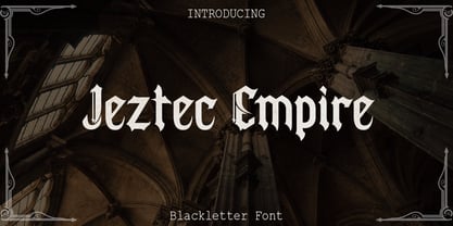 Jeztec Empire is an unique blackletter style, this font will give you stunning design. Jeztec Empire font is ideal for logo design, labels, posters or pretty much anything else that requires a unique touch.
 - Celtiberica by Celtibérica,
$24.00 What was the inspiration for designing the font? Ancient script from Celtiberian culture. What are its main characteristics and features? Very ancient scripts in lead or bronze. Usage recommendations: As you like, Archeological designs.
 - Basketball by Evo Studio,
$10.00 Basketball is a bold and authentic slab serif font. It has a cool style and it will make any of your designs stand out. Use it for sports, racing design, or anything sports-related.
 - Curly Q by Outside the Line,
$19.00 CurlyQ new from Rae Kaiser and Outside the Line. A curly, swirly, girly kind of font. A delightful headline font for your next garden party or note to the kids from the tooth fairy.


