3,315 search results
(0.011 seconds)
- Summer Midnight by Jos Gandos,
$15.00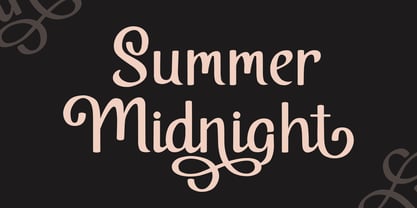 Summer Midnight is beautiful and elegant script font. Each glyph has its own uniqueness and when meeting with others will provide dynamic and pleasing proximity. Summer Midnight also comes with alternate style to make its style more unique and elegant. Summer Midnight will be perfect for your projects such as quotes, poster design, personal branding, promotional materials, logotype, product packaging and more.
 - Mafisha by Letterena Studios,
$17.00 Proudly present Mafisha Typeface , created by Storytype, A serif modern and classic typeface that his own unique style & modern look. This typeface is perfect for an elegant & luxury logo, book or movie title design, fashion brand, magazine, clothes, lettering, quotes, and so much more. This font is PUA encoded which means you can access all of the amazing glyphs and ligatures with ease!
 - Thirsty Spine by PizzaDude.dk,
$17.00 Here's a creative font for your crafts, postcards, posters, book covers or perhaps your next birthday invitation! Thirsty Spine covers a lot of needs, where a crazy handmade look is needed. Each letter has 5 different versions, all with it's own charm. I did very little when digitizing this font, and that in order to keep the genuine pen strokes.
 - Onion Mill by PizzaDude.dk,
$15.00 Onion Mill is based on my own handwriting, when I want to mimic the classic letters from comics. This type of texting can be super useful when you have a massive amount of text that needs to be good looking, as well as legible! You have 4 different versions of each letter to choose from - enough to randomise the appearance of your text!
 - Flatfoot by Brave Lion Fonts,
$9.00 Flatfoot has it's very own style and is surely unique, crafted to shine with individuality. The straight letter endings are giving it a flat look and the tiny serifs are referring to classical types. It has a high contrast and high uppercase letters & many details are waiting for you to be discovered. Take Flatfoots personality and let it influence your designs.
 - Honeybutter by Zansari,
$12.00 Honeybutter is a modern-vintage inspired hand lettered font. This refreshing take on a the vintage sans serif style is perfect just on its own or for pairing with other similar vintage inspired fonts. Highly recommended for digital lettering, logos, marketing material, print, branding material, quotes, overlaying on photography, and much more. This font was carefully designed by hand in Auckland, New Zealand
 - Dempsey by Just My Type,
$25.00 Creative people tend to mix printing and cursive, i.e. some letters connected, some not. Why? Who knows? Handwriting analysts have a field day with this sort of thing. Have a field day of your own with Dempsey, based on the writing of Tucson film teacher, media artist and programmer, Vikki Dempsey. It’s fun, assertive and will make you look even more creative.
 - Verger Sans by David Engelby Foundry,
$25.00 The inspiration behind the design of the Verger typeface family (serif & sans version) comes from the classic Golden Type, which was originally crafted by William Morris. Although Verger is inspired by this classic typeface, it has several modern, expressive and distinctive styles of its own, especially in the design of its italic versions. This is the sans version of Verger .
 - Funky Flamingo by Hanoded,
$15.00 I really can’t tell you why I called this font Funky Flamingo. Normally I name fonts after something I see or do, but I don’t have a special thing for flamingoes, nor do I keep them in my backyard. Funky Flamingo is a happy handmade serif with a retro look. It comes in regular and bold styles, each style with its own Italic.
 - Eckhardt Showcard JNL by Jeff Levine,
$29.00Eckhardt Showcard JNL and Eckhardt Showcard Two JNL are drawn from more lettering found in an old sign painting book. Jeff Levine has continued naming a series of fonts for the late Albert Eckhardt, Jr. (1929-2005) who had owned Allied Signs in Miami, Florida from 1959 until his passing. Al was a talented lettering artist and a good friend to Jeff. - Chevalier by URW Type Foundry,
$35.00 Chevalier is an engraved all-capital typeface with delicate shading. The Chevalier font is suitable for business letterheads and corporate stationery, headlines and packaging, where a clean, safe, established image is desired. Chevalier is a trademark of Heidelberger Druckmaschinen AG, which may be registered in certain jurisdictions, exclusively licensed through Linotype Library GmbH, a wholly owned subsidiary of Heidelberger Druckmaschinen AG.
 - Virago by Khoir,
$15.00 Virago Font consists of two alternative fonts namely Regular Virago which has a modern and contemporary soft impression while Virago Alternate has an old-fashioned vintage impression, both of which have their own distinct impression but have the same advantage of having lots of alternative fonts that make it easier for you to use it, so what are you waiting for?
 - Canto by Lipton Letter Design,
$29.00 Inspired by Edward M. Catich’s seminal thesis on the origins of the Roman inscriptional style, such as that found on Trajan’s column, Richard Lipton’s Canto traces the path from an expressive, preparatory Brush (with Brush Open to preserve gestural details at smaller sizes), through informal Pen, to the formal Roman. Classical capitals are accompanied by Lipton’s own calligraphic lowercase, small caps, and swashes.
 - Risky Biscuit by PizzaDude.dk,
$16.00 Risky Biscuit is wants to go its own ways. It is never too much or too little - just perfect in its awkwardness! You may think surfer, skater, DJ or hand craft - that’s okay, because Risky Biscuit is all that and even more! Comes with contextual alternates - meaning 5 different letters AND small caps for each vowel…and of course multilingual support!
 - Christmas Spirit 2 by Alphabet Zoo,
$14.00 Christmas Spirit was designed to incorporate some of the most familiar icons of the Christmas season into a highly decorative font. Each letter is unique with its own design, and lends itself to a festive environment. From the A as a decorated Christmas tree, to a reindeer that translates into a Z, Christmas Spirit will liven up holiday greetings, invitations, and announcements.
 - Turntable Stencil JNL by Jeff Levine,
$29.00 A disc jockey-only promotional sleeve for a 1964 [45 rpm] release of “Close to Me” and “Let Them Talk” by Dan Penn featured the song titles printed in a stencil typeface on the record sleeve. Closely resembling a stencil version of Franklin Gothic but with its own unique characteristics, this design has been reinterpreted as Turntable Stencil JNL and is available in both regular and oblique versions. For trivia buffs, Dan Penn is a singer-songwriter-record producer, often collaborating with Dewey Lindon “Spooner” Oldham; both closely associated with the late Rick Hall’s Fame recording studios in Muscle Shoals, Alabama. In 1964, Hall started the Fame record label, and for a time it was distributed by Vee-Jay Records of Chicago, the first major Black-owned record label in the United States. Penn’s release was only the second for the new label; Fame 6402.
 - Salty by Fenotype,
$40.00 Salty - not fat just big boned. Salty is a hearty brush family that’s great for any kind of display use from packaging to poster & logos to headlines. Salty has bold and clear basic letterforms and lots of alternates for more customised look. Salty family consists of Script, Caps and Extras and two weights of each. Salty script is equipped with plenty of OpenType features: Keep Automatic Ligatures on to keep the flow and click Swash, Stylistic or Titling Alternates for extra goodies or manually select from even more alternates from Glyph Palette. Salty Caps is a vivid set of casual caps that play well with the script but can also be used on their own. Salty Extras is a set of ornaments and swashes designed to support the script. Some of the Extras are designed so that they can be used to customise the letters - to create your own Alternates.
 - Frasa by Tokotype,
$39.00 Frasa is a contemporary serif family with characteristics that arise from the charms of Caslon and a touch of transitional style; the design offers distinctive proportions to serve long-running small text and the sturdiness of its own form to help as a headline font. Frasa shows that the family is shaped by the traditions of its ancestors through small details that show the personality of the typeface, such as pointed ball terminals and strong shoulders. The italic weights have their own beauty, which is created to humanize the form based on a stylized and natural cursive style with the aim of emphasizing the text's essential elements. The addition of small caps, old-style figures, ligatures, etc. to this type family satisfies conventional typographic requirements. Frasa typefaces can eventually lead to the use of powerful design tools to create editorial and casual design styles.
 - Affair by Sudtipos,
$99.00 Type designers are crazy people. Not crazy in the sense that they think we are Napoleon, but in the sense that the sky can be falling, wars tearing the world apart, disasters splitting the very ground we walk on, plagues circling continents to pick victims randomly, yet we will still perform our ever optimistic task of making some little spot of the world more appealing to the human eye. We ought to be proud of ourselves, I believe. Optimism is hard to come by these days. Regardless of our own personal reasons for doing what we do, the very thing we do is in itself an act of optimism and belief in the inherent beauty that exists within humanity. As recently as ten years ago, I wouldn't have been able to choose the amazing obscure profession I now have, wouldn't have been able to be humbled by the history that falls into my hands and slides in front of my eyes every day, wouldn't have been able to live and work across previously impenetrable cultural lines as I do now, and wouldn't have been able to raise my glass of Malbeck wine to toast every type designer who was before me, is with me, and will be after me. As recently as ten years ago, I wouldn't have been able to mean these words as I wrote them: It’s a small world. Yes, it is a small world, and a wonderfully complex one too. With so much information drowning our senses by the minute, it has become difficult to find clear meaning in almost anything. Something throughout the day is bound to make us feel even smaller in this small world. Most of us find comfort in a routine. Some of us find extended families. But in the end we are all Eleanor Rigbys, lonely on the inside and waiting for a miracle to come. If a miracle can make the world small, another one can perhaps give us meaning. And sometimes a miracle happens for a split second, then gets buried until a crazy type designer finds it. I was on my honeymoon in New York City when I first stumbled upon the letters that eventually started this Affair. A simple, content tourist walking down the streets formerly unknown to me except through pop music and film references. Browsing the shops of the city that made Bob Dylan, Lou Reed, and a thousand other artists. Trying to chase away the tourist mentality, wondering what it would be like to actually live in the city of a billion tiny lights. Tourists don't go to libraries in foreign cities. So I walked into one. Two hours later I wasn't in New York anymore. I wasn't anywhere substantial. I was the crazy type designer at the apex of insanity. La La Land, alphabet heaven, curves and twirls and loops and swashes, ribbons and bows and naked letters. I'm probably not the very first person on this planet to be seduced into starting an Affair while on his honeymoon, but it is something to tease my better half about once in a while. To this day I can't decide if I actually found the worn book, or if the book itself called for me. Its spine was nothing special, sitting on a shelf, tightly flanked by similar spines on either side. Yet it was the only one I picked off that shelf. And I looked at only one page in it before walking to the photocopier and cheating it with an Argentine coin, since I didn't have the American quarter it wanted. That was the beginning. I am now writing this after the Affair is over. And it was an Affair to remember, to pull a phrase. Right now, long after I have drawn and digitized and tested this alphabet, and long after I saw what some of this generation’s type designers saw in it, I have the luxury to speculate on what Affair really is, what made me begin and finish it, what cultural expressions it has, and so on. But in all honesty it wasn't like that. Much like in my Ministry Script experience, I was a driven man, a lover walking the ledge, an infatuated student following the instructions of his teacher while seeing her as a perfect angel. I am not exaggerating when I say that the letters themselves told me how to extend them. I was exploited by an alphabet, and it felt great. Unlike my experience with Ministry Script, where the objective was to push the technology to its limits, this Affair felt like the most natural and casual sequence of processions in the world – my hand following the grid, the grid following what my hand had already done – a circle of creation contained in one square computer cell, then doing it all over again. By contrast, it was the lousiest feeling in the world when I finally reached the conclusion that the Affair was done. What would I do now? Would any commitment I make from now on constitute a betrayal of these past precious months? I'm largely over all that now, of course. I like to think I'm a better man now because of the experience. Affair is an enormous, intricately calligraphic OpenType font based on a 9x9 photocopy of a page from a 1950s lettering book. In any calligraphic font, the global parameters for developing the characters are usually quite volatile and hard to pin down, but in this case it was particularly difficult because the photocopy was too gray and the letters were of different sizes, very intertwined and scan-impossible. So finishing the first few characters in order to establish the global rhythm was quite a long process, after which the work became a unique soothing, numbing routine by which I will always remember this Affair. The result of all the work, at least to the eyes of this crazy designer, is 1950s American lettering with a very Argentine wrapper. My Affair is infused with the spirit of filete, dulce de leche, yerba mate, and Carlos Gardel. Upon finishing the font I was fortunate enough that a few of my colleagues, great type designers and probably much saner than I am, agreed to show me how they envision my Affair in action. The beauty they showed me makes me feel small and yearn for the world to be even smaller now – at least small enough so that my international colleagues and I can meet and exchange stories over a good parrilla. These people, whose kindness is very deserving of my gratitude, and whose beautiful art is very deserving of your appreciation, are in no particular order: Corey Holms, Mariano Lopez Hiriart, Xavier Dupré, Alejandro Ros, Rebecca Alaccari, Laura Meseguer, Neil Summerour, Eduardo Manso, and the Doma group. You can see how they envisioned using Affair in the section of this booklet entitled A Foreign Affair. The rest of this booklet contains all the obligatory technical details that should come with a font this massive. I hope this Affair can bring you as much peace and satisfaction as it brought me, and I hope it can help your imagination soar like mine did when I was doing my duty for beauty.
 - Snare by In-House International,
$5.00 A typeface that celebrates marching to the beat of your own drum. Snare is a jazzy little display type that presents like a stencil but behaves in its own way.Featuring angled section breaks and variable heights, Snare keeps each character’s footprint steady as as its heights change, revealing unique crossbars, periscoping capitals and deep-sinking descenders. Because each character follows its own rules, the more each word grows, the more it shows the beautiful rhythm of variety. Or stretch individual characters to shape the contours of your words. Beyond just being playful, fun to dress in colors, and delightfully useful for tight spaces,Snare’s lanky verticals and nervous energy reflect the time it was created. In this second pandemic spring, Snare brings up the drumroll-expectant heartbeat of our uncertainty, and the wish that when we can all meet again, our newfound weirdnesses will find a home in the world. The Snare font family includes one uppercase alphabet with two lowercase variants and comes in ten standard weights-which-are-just-really-heights (.otf) and as a variable type(.ttf) for designers using compatible platforms. Snare was designed by Alexander Wright and In-House International and developed byRodrigo Fuenzalida at FragType. In-House International’s foundry was launched in the summer of 2020 to offer bold, experimental, display typefaces that tell a story. Our previous releases have been featured on Design Milk, DesignBoom, Slanted and all sorts of exciting places.
 - Cloister Open Face LT by Linotype,
$29.99Cloister Open Face was designed in 1929 by Morris Fuller Benton as one weight of the Cloister Old Style family. Cloister itself appeared from 1897 with American Type Founders, and later for the typesetting machines of the Linotype, Intertype and Monotype companies. At that time, it was the truest modern industrial revival of the Jensonian Roman. Benton stayed close to the style of his model in both design and spacing. Cloister Open Face has an old-world elegance, and it works well for titling in books and magazines. In 1458, Charles VII sent the Frenchman Nicolas Jenson to learn the craft of movable type in Mainz, the city where Gutenberg was working. Jenson was supposed to return to France with his newly learned skills, but instead he traveled to Italy, as did other itinerant printers of the time. From 1468 on, he was in Venice, where he flourished as a punchcutter, printer and publisher. He was probably the first non-German printer of movable type, and he produced about 150 editions. Though his punches have vanished, his books have not, and those produced from about 1470 until his death in 1480 have served as a source of inspiration for type designers over centuries. His Roman type is often called the first true Roman." Notable in almost all Jensonian Romans is the angled crossbar on the lowercase e, which is known as the "Venetian Oldstyle e."" - ITC Chivalry by ITC,
$29.99ITC Chivalry is a calligraphic hybrid that honors the tradition of combining Roman capitals with italic lowercase letters. Drawn by Missouri lettering artist Rob Leuschke, who used a flat-nib pen on textured watercolor stock and then converted the drawings into a digital font, the design combines an old world" feel with "new world" legibility. A companion set of black letter caps completes the suite of characters. "I've loved drawing letters for as long as I can remember," says Leuschke. "Even in kindergarten, I tried to draw letters like my teacher." After graduating from college, Leuschke worked for a short time at a sign company in St. Louis, and in the early 1980s began working at Hallmark Cards in Kansas City. His talent as a calligrapher and lettering artist eventually brought him back to St. Louis to begin a freelance career. Since then Leuschke has created over 250 fonts, primarily for the greeting card industry, that are now being used on work for his clients all over the world. Leuschke first conceived of the face as just the black letter caps; he later added the Roman letters to give the design more versatility. The Roman caps of ITC Chivalry combined with the lowercase are well suited to blocks of copy, while the more decorative black letter caps are ideal for showcasing short text of just a few words. Both sets of capitals also make great initial letters." - Frescito Variable by Mans Greback,
$69.00 Frescito is a modern sans-serif typeface that embodies a fresh, cool, and street-smart aesthetic. Designed to be both balanced and versatile, its clear and legible monoline style is designed for branding and advertising in editorial and digital design. Only one font file, but the file contains multiple styles. Use the sliders in Illustrator, Photoshop or InDesign to manually set any weight and width. This gives you not only the predefined styles, but instead more than a thousand ways to customize the type to the exact look your project requires. More info about Variable Fonts: https://mansgreback.com/variable-fonts Inspired by the energetic spirit of the city and its vibration, Mans Greback set out to create a typeface that would stand out against vivid moment; a type that would work in a traditional café just as well as for contemporary merchandise. The result is a font that combines the best of both worlds: an air of freshness and modernity with an unpretentious, timeless and classy appeal. The font is built with advanced OpenType functionality and has a guaranteed top-notch quality, containing stylistic and contextual alternates, ligatures, and more features; all to give you full control and customizability. It has extensive lingual support, covering all Latin-based languages, from Northern Europe to South Africa, from America to South-East Asia. It contains all characters and symbols you'll ever need, including all punctuation and numbers.
 - Skypilot by Ferry Ardana Putra,
$19.00 Hello there! We are introducing my new font - Skypilot! This font is carefully selected from hundreds of letters. We manually created this font using a flat pen and make it as close as possible to street graffiti style. Not only that, we also make another typeface that is perfectly suited for this theme, Skypilot extruded! With those fonts, you can combine them as a pair to make them a layered style! You will make exquisite real street graffiti art just like on the wall that you saw in the city! Besides all this, the Skypilot Swashes and ornaments are designed to make your designs more fun! You can apply this font to t-shirt designs, posters, covers, video thumbnails, merchandise, wall, and so on to make it look special. ——— Skypilot features: A full set of uppercase and lowercase Numbers and punctuation Multilingual language support PUA Encoded Characters OpenType Features Layered Style +379 Total Glyphs +100 Graffiti Swashes and Ornaments included! ——— ⚠️To enable the OpenType Stylistic alternates, you need a program that supports OpenType features such as Adobe Illustrator CS, Adobe InDesign & CorelDraw X6-X7, Microsoft Word 2010 or later versions. There are additional ways to access alternates/swashes, using Character Map (Windows), Nexus Font (Windows), Font Book (Mac) or a software program such as Pop Char (for Windows and Mac). ⚠️For more information about accessing alternative, you can see this link: http://adobe.ly/1m1fn4Y
 - Retrology by Letterhend,
$15.00 So classic, so retro... it's Retrology! Introducing, Retrology. This monoline typeface will bring you to the good ol' days with its classic touch!
 - LP Cervo by URW Type Foundry,
$35.99 LP Cervo is a typeface designed by German type designer Peter Langpeter. LP has been running his own design studio since 1995, working as a typeface and logo designer, as a calligrapher, cartographer and illustrator. During this time LP created a large number of excellent new typeface designs. With its styles Grotesk, Lapidar, Semiserif and Serif the LP Cervo is well suited for various design possibilities
 - Trocadero Pro by RMU,
$35.00 In 1927 Albert Auspurg cut Trocadero for the Trennert foundry in Hamburg. This new version is not a mere digitalization, but many letterforms were altered and updated, and missing links in the complete alphabet had been drawn afresh. Out came a beautiful cursive font with a certain charm of its own which covers beside the West European languages also those of Central Europe and Turkish.
 - Aglore Story Signature by Letterfreshstudio,
$15.00 Aglore Story Signature Duo This professional resource is also powerful because each font has its own magical design. Comes with four versions Regular, Italic, Signature You can use it for almost anything like blog headers, posters, wedding elements, t-shirts, clothing, book covers, business cards, greeting cards, branding, invitations and quotes and so on. Feature: Uppercase Lowercase Number Accent (multilingual character) Thank you for your purchase!
 - Thursday Afternoon by Bogstav,
$15.00 Nothing is as it really should be with Thursday Afternoon. The x-height is jumpy, letters are not in their right places, lines are crunchy, serifs are uneven...the list goes on...but in the end, Thursday Afternoon turns out as a legible and functional font. It has most of the moves from classic serif fonts, but then again it has a mind of its own!
 - Mentor by Monotype,
$29.99From alphabets created for book illustrations in the 1970s to lettering created for a book jacket in the 1990s, the Mentor family of typefaces has developed along its own slow and circuitous path. Always present in its evolution, though, has been the influence of three 20th century design giants: Eric Gill, Reynolds Stone, and Hermann Zapf, as filtered through the meticulous sensibility of Michael Harvey. - Battle Cry by Comicraft,
$19.00 As Titans Clash in The Final Battle of Good versus Evil, Man versus Machine, God versus Mortal and Coke versus Pepsi, ace lettering artist, Ferran Delgado from Spain teams up with our very own John ‘JG’ Roshell for one last attack on the assembled Cover Lettering Styles of Yore. Fill your lungs and prepare for... BATTTTTTLECRRRRRYYYYYYYYYYY! See the families related to Battle Cry: Battle Scarred & Battle Damaged .
 - Cabarno by Katatrad,
$39.00 Cabarno is a sans-serif organic typeface that can be use in any typographic situation. It has his own unique style in expressed perfect condensed forms with a warm and humane feeling. This font can function as headings, subheadings and body text with a set of alternative characters for your design in any layout. The family has 4 weights ranging from Light to Black and their italic.
 - Angely Blooming by Letterfreshstudio,
$15.00 Angely Blooming Duo This professional resource is also powerful because each font has its own magical design. Comes with four versions Regular, Italic, Script You can use it for almost anything like blog headers, posters, wedding elements, t-shirts, clothing, book covers, business cards, greeting cards, branding, invitations and quotes and so on. Feature: Uppercase Lowercase Number Accent (multilingual character) Thank you for your purchase!
 - Gogles by Aqeela Studio,
$18.00 Inspired by strange classic typography, Gogles has its own unique style. This font is best suited for headlines of all sizes, as well as for blocks of text that have maximum and minimum variations. The Gogles style applies to all types of graphic designs on the web, print, moving images and more, and is perfect for t-shirts and other items such as posters and logos.
 - Glorando by Letterena Studios,
$10.00 Proudly present Glorando Typeface, created by Story type, A serif modern and classic typeface that has its own unique style & modern look. This typeface is perfect for an elegant & luxury logo, book or movie title design, fashion brand, magazine, clothes, lettering, quotes, and so much more. This font is PUA encoded which means you can access all of the glyphs and swashes with ease!
 - Mehriban Outline by Michael Browers,
$25.00Mehriban Outline is a revisit of Mehriban, Michael Browersí most successful text face that was originally released in 2006. Mehriban & Mehriban Outline are deconstructivist revivals inbred from Michael Browers' previous work: Formasi and Disjecta. Formasi characters were morphed with their Disjecta counterparts, and in some cases with previously unpublished letterforms from Disjecta's concept stages, resulting in a grunge font with its own unique swagger. - Simeon's Handwritten Blackletter by Simeon out West,
$20.00 Simeon's Handwritten Blackletter is the result of my desire to have my handwritten old English style writing available for my computer. It is a basic Gothic style font with my own touch to the lettering. Simeon's Handwritten Blackletter comes with full punctuation, a character set for most Western European based Latin alphabet languages. Being a decorative font, it works best at larger point sizes.
 - Milan In Paris by Mevstory Studio,
$25.00 Milan in Paris is a powerful and elegant display typeface, constructed to maximize use of horizontal space. Built from hand sketches drawn over several years, Milan in Paris eight weights span an elegant Thin to a vibrant Heavy, with accompanying obliques.Milan in Paris makes a strong impression in print, headlines, video, and social media – whether paired with a contrasting typeface or on its own.
 - Velvet Hammer by Great Lakes Lettering,
$40.00 The Velvet Hammer is a true hand calligraphy font that offers the viewer a sense of strong elegance. This font can be used for all things such as cards, posters, signage, wedding invitations, catalogs, book covers and so much more! The Velvet Hammer’s simple unique style can stand strong on its own or sit comfortably side by side with any display or text font!
 - Anti Grotesk by 60 KILOS,
$20.00 Anti Grotesk is a personal and internal fight. It tries to build elements capable of building personality, message, and introspection through their own shapes. How to escape from trends being part of them, how to design not establishing commercial and economical interests. Why you started designing and why are you designing today, are some of the concepts that build the universe of Anti Grotesk.