10,000 search results
(0.054 seconds)
- Mah Jongg by Bogusky 2,
$10.00No, it's not the complete set but a great way to send out invitations for Mah Jongg Parties, Notices, Posters, Banners and Flyers. Here's a menu of what's contained and take a look at the Character Chart for some close-ups. It may seem complicated but not really. Shift, Alphabet keys will give you caps Mah Jongg characters, tiles beside a letter of the alphabet. The "lower case" alphabet is the same letter font used in the caps but without a tile. The regular keys "1 through 9" are the actual Crack tiles with the correct oriental glyph. Numerals to match the "lower case" are found using Shift and the Number keys. The $ sign is the Forward Slash and the "¢" sign is the Back Slash Dragons: Left & Right brackets Nice One Bam symbols: Shift, Left & Right brackets Hitting Option & the keys, "A,S,F & C" will reveal attractive flower designs. Punctuation, period, comma, quotes, etc. are in their usual locations. You may want to print this menu as a handy guide. The license agreement stipulates that you may disassemble and use elements from this font to create colorful art as in the illustration shown with the font listing. - Edgar No 9 by Type Innovations,
$39.00 Edgar No. 9 is an original design by Alex Kaczun. Edgar No. 9 is a derivative work based on his Big Boy typeface series. It was designed specifically for display headlines, logotype, branding and similar applications. Primarily a display, this extremely versatile font has generous proportions, large counters and loose fitting which also allow the font to work well across a wide range of text sizes. Edgar No. 9 is a heavy baroque slab serif and although it shares the underling skeleton of 'Big Boy', it is a much more compact in overall proportions and spacing. A handsome bold headline font that works well in text as well as display sizes—ideally suited for publications and advertising. Alex plans to expand the font series to include a large range of weights along with corresponding italics numbering 1 thru 9, as well as, true small capitals and old style figures. Distressed version(s) will also be available in upcoming releases. Stay tuned, more to come soon. The large Pro font character set supports most Central European and many Eastern European languages.variations to expand this 'hip' new font series. Groovin' baby.
 - Katniss by Epiclinez,
$19.00 Katniss is a stylish and modern calligraphy font. It is a nice choice for creating eye-catching logos, branding, and quotes. It has beautiful and well-balanced characters and as a result, it matches a wide pool of designs. Add it to your most creative ideas and notice how it makes them come alive! The font Katniss contains 204 glyphs. Supporting more than 66 languages, from English to Zulu. It is also PUA encoded and has open-type features such as ligatures. So what's included: Basic Latin A-Z, a-z, numbers, symbols, punctuations, and ligatures. Accented Characters : ÀÁÂÃÄÅÆÇÈÉÊËÌÍÎÏÑÒÓÔÕÖØŒŠÙÚÛÜŸÝŽàáâãäåæçèéêëìíîïñòóôõöøœšùúûüýÿžß
 - Azuza by Parkinson,
$20.00 In the 1990s I drew a text face for the San Francisco Chronicle. It was based on W. A. Dwiggins’ Electra and incorporated many features of the Linotype Legibility Series: More compact, with a taller lowercase X-height, etc. That type was called Electric and it was the Chronicle’s text face for nearly a decade, surviving several redesigns. From that, I made Azuza, a more detailed and sensitive style. Azuza was recognized in the TDC2 type competition in 2001. Then it went into hibernation as a Type 1 font family. Today it is back. Six fonts. Open Type.
 - Ballasticus by Shapovalov Fonts,
$15.00 Ballasticus is a controversial bold grotesque for logos, big headlines, posters, signage, gyms, and bodybuilders. The outer contour of the beech is rounded, while the inner space is square. The font contains two barbell icons that can be immediately inserted into your company logo. The character of Ballasticus is honest, stable, open, grounded like a weight. Ballasticus contains extended Latin, Cyrillic, ligatures, barbell and peace sign, as well as alternatives for some letters, the total number of glyphs is more than 700. It contains OpenType functions: liga, numr, dnom, calt, ss01. The font is also case sensitive, has fractions, currency signs, and arrows.
 - La Patio by Nasir Udin,
$16.00 Say hello to La Patio Script, a monoline script font with fun vibes to spread happiness. A perfect choice to give a holiday vibe to any products, merchandise, restaurant or cafe. La Patio comes with several alternates and swashes for you to play with. Also the underline & border features help you to give a special character to your design. It's especially created for restaurant signs with outdoor/open air concept. That's why it's called La Patio. Beside that, it's also perfect for poster, business cards, magazines, blog, book, neon signage, badges, and many more happy things!
 - Sweet Pea by Typadelic,
$19.00Desiring to create a scrapbooking font, I based Sweet Pea loosely on my own handwriting. The characters don't sit on the baseline but tend to rise above or below it, giving a casual, handwritten appearance. - Richfont BT by Bitstream,
$50.99Based on Mr. Hubbard's own hand printing, Richfont Medium is an extremely casual design. Actually light in weight, it renders best at 14 point and above. Richfont Light and Bold are available from the designer. - Mecatoque by ActiveSphere,
$30.00 Mecatoque is a sharp, futuristic display font and works best in text and display applications, such as posters, headline, magazine, logos and titles. Mecatoque font has a full upper and lower-case, accents, punctuation and a selection of monetary symbols. Currently Available for Mac and PC, in Open Type, PostScript or TrueType.
 - Prizma2012 by Stereo Type Haus,
$25.00 A futuristic grid-based interpretation of the classic Prisma by Rudolf Koch (1927-29). Prizma2012 breaks away from typical rounded characteristics of most Multiline designs and embraces 45 degree angles, a rigid grid system and open ended terminals. Intended for use at large sizes, the family comes with four weights for optimal impact.
 - Lidia by ParaType,
$25.00 The decorative title typeface was designed at Polygraphmash type design bureau in 1967 by Iraida Chepil. It is a decorative variant ('open', or 'engraved') of classical serif typefaces. For use in magazine headlines, title and display typography. The revised and completed digital version was designed for ParaType in 2005 by Victor Kharyk.
 - Pyragy by Belli Creative,
$9.00 Pyragy is a display font with a classical vibe. It has beautifully crafted nine swashes. It’s genuine, interesting, and perfectly fits different design works, such as posters, book or album covers, digital spaces, or any other media. It supports various Latin-based languages and comes with powerful open-type and true-type features.
 - Aligarh by NamelaType,
$23.00 Aligarh is a semi-slab serif font formed with a smooth rounded bracket whose edges end with unique shapes, an exploration of combining unique styles in a typefaces. Designed to be used in a variety of media both print and digital media. 18 fonts built from 9 sizes and supported by open types.
 - Hardcore by Garisman Studio,
$20.00 Hardcore is made with a fresh urban edge; delivering a stylish script which is guaranteed to add an eye-catching appeal to your logo designs, brand imagery, quotes, product packaging, merchandise, social media posts, and more. Features: - All Caps letters - Numbers & Punctuation - Simple installation Work for PC and MAC - PUA Encoded Open
 - Balise by NamelaType,
$19.00 Introducing our new product that called �Balise� A retro sans serif influenced from 60s style typeface and coupled with a touch of rounded corners to provide a playful concept with a vintage design style. Balise has 5 weights, and is also equipped with open type features and is supported by various international languages.
 - Mellin by Greater Albion Typefounders,
$7.95 Mellin takes us to the simple designs of the Streamline era. It is based on heavy vertical strokes with a slight taper. Mellin is offered in a solid form as well as an open outline face, and is ideally suited for posters that aim at the elegant functionality of the 40s and 50s.
 - Studio Five by Lafonts,
$29.00 Designed after the sixties neon sign of an arthouse cinema in downtown Zurich, Studio 5 is now a typeface for many applications. The three different styles include old style numbers and alternate characters for titling. All styles have the same metrics. Bold and open styles can be layered for neon sign effects.
 - Amigueta Script by Solidtype,
$14.00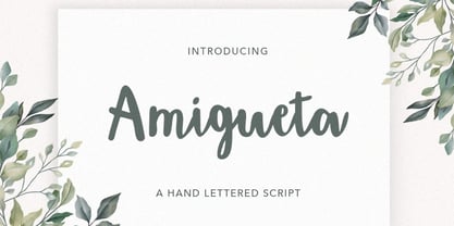 Amigueta Script is a handlettered script font, dynamic and pretty with swashes. Can used for various purposes. such as the title, signature, logo, wedding invitations, letterhead, signage, labels, newsletters, posters, badges, etc. Amigueta Script features Open type feature, including initial and terminal letters,ligatures and International support for most Western Languages is included.
 - Stonekids by Blankids,
$17.00 Introducing a new Layered bold script called Stonekids. Stonekids inspired by handlettering, bold script logotype and kids fonts. Stonekids comes with open type features and multilingual accent good for logotype, poster, badge, book cover, t-shirt design, packaging and any more. Multilingual accents: ŽžŠŒšŸÀÁÂÃÄÅÆÇÈÉÊËÌÍÎÏÐÑÒÓÔÕÖØÙÚÛÜÝßàáâãäåæçèéêëìíîïðñòóôõöøùúûüýÿ Features: - Uppercase - Lowercase - Number - Punctuation - Multilingual - PUA Encode - Opentype
 - Matchmaker by Angie Makes,
$30.00 Matchmaker, a modern calligraphy typeface, was inspired by the various works of modern day calligraphers. Its tall, quirky, and juxtaposed letterforms provide a deviation from traditional calligraphy-inspired typefaces. Matchmaker features smart contextual alternates and swashes that add to the front and beginnings of letters (using lowercase letters, enter === before the word then +++ after the word to see the feature in action). Also watch as letters on the end of words magically receive a shortened tail. This font works best in OpenType aware software so that you can take advantage of its many tricks and features. Comes as an .otf (OpenType font) file. Here is a great article on open type aware software: http://www.myfonts.com/info/opentype-support-in-applications/ Chocked full of swashes, alternates, and ordinals, Matchmaker just might be the perfect match for your next project.
 - Madelyn by Fontfabric,
$27.00 Madelyn is a handwritten script font based on the expression of real handwriting. Amiable and organic, it is perfect if you want to convey individuality and style. It’s written with a calligraphy pen with casual dry strokes and a signature style. This script contains upper and lowercase characters with pleasant low x-height and high ascenders and descenders—and also numerals and a large range of punctuation and symbols. More than 100 ligatures are also available for upper and lowercase characters—double-letters which flow more naturally. Contextual alternates are part of the Open Type feature set. Madelyn Doodles includes a set of handmade ornaments, icons and swashes that can help you for your key visual. Madelyn is perfect for branding projects, logos, product packaging, posters, invitations, greeting cards, titles, blogs, everything that includes personal charm.
 - Dixplay by Emtype Foundry,
$69.00 Dixplay, a typeface based on a pixel grid, is available in two weights: regular and black. Inspired by video game aesthetics of the 80s, was originally intended for display applications, but it works fine on paper as well. The font has been conceived in 20 px size allowing more freedom to manipulate it and making a big difference with other fonts of its kind, this difference it’s more evident in Dixplay Black. As a result, it’s optimized for screen use at 20 px and its multiples. Spacing is one of the most outstanding aspects of Dixplay. While pixel fonts doesn't have kerning pairs, Dixplay offers more than 300 manually done that fit perfectly to the grid. It is available in Open Type format and supports Western European Languages that uses the Latin alphabet. For more details see the PDF.
 - Wishes Script by Typesenses,
$32.00 Plenty of swashes, ligatures, beginning and ending shapes, Wishes is a wit option for invitations, cards, stationery, fashion and apparel, among a wide range of uses. The curves of the cursive style are neither too solemn or pompous, its grace and playfulness are more 1950s than 1750s. This family offers the designer an additional decorative toolkit full of frames, ribbons, hearts, flowers and ornaments, plus a collection of caps and small caps. Wishes Script Pro includes the complete set of Script characters plus Ornaments and Caps. The family offers optically optimized Display and Text styles for each of the weights: Light, Regular and Bold. Use professional software that widely support Open Type features. Otherwise, you may not have access to some glyphs. For further information about features and alternates, see the User Guide Use Wishes to express your greetings!
 - VLNL Vondelpark by VetteLetters,
$35.00 The Vondelpark is the famous Amsterdam city park, 47 hectares stretching out from Leidseplein to the Amstelveenseweg. It was founded in 1864 when a group of well-to-do Amsterdam citizens got together and bought land at the (then) edge of the city centre in order to create a park ‘for riding and strolling’. Designed by architect J.D. Zocher, it opened officially in 1865. The park received its name two years later when a statue of Dutch writer Joost van den Vondel was placed in the park. In the 1960s and 1970s the Vondelpark became a symbol and epicenter of the hippie flower power era. The park was declared a state monument in 1996. Donald DBXL was intrigued by the handmade iron nameplate lettering on the park’s entrance gates, and decided to design VLNL Vondelpark in its glory. The somewhat clumsy iron letters were not revived as is but optimized to turn it into a useful typeface. The all-caps serif with a deliberate constructed feel, contains a Positional Open Type feature that places half circles on the vertical stems, at the beginning and end of a word, to enliven the rhythm.
 - Diaper Bag by Bellafonts,
$25.00 Diaper Bag is a ding bat font providing images related to baby: bottles, pacifiers, rattles, cribs, bassinets, safety pins, and some random things like umbrellas (for a baby shower), expecting moms, storks, baby feet, teddy bear, rubber duckey, booties, teething ring, etc. You can use these to make baby shower invites, baby announcements, and anything you can customize with your own design. Bellafonts' user license allows for commercial use so you can make products for re-sale, including services offering graphic design.
 - Bimbo by Zetafonts,
$39.00 Bimbo is a monoline script font family created in 2018 by Francesco Canovaro for Zetafonts as an extension & redesign of the original Arsenale White typeface created with italian illustrator Jonathan Calugi. Bimbo expands the original design with six new weights and over 300 new characters to cover over 70 languages using the latin, greek and cyrillic alphabets, while keeping the handmade aesthetic that made successful the original font. Bimbo is essentially a display font, born for minimal lettering and logos, with a handwritten sensibility enhanced by the built-in letter swapping open type feature that makes sure double letters are always different one from another. Open counters and a monoline design allow for great readability at small sizes, making Bimbo the ideal font for creating fake handwritten notes and meta-textual jokes.
 - Ciutadella by Emtype Foundry,
$69.00 Ciutadella was originally commissioned by Mario Eskenazi’s studio. It is a versatile geometric sans serif, a simple, clean and direct family. Its power resides in an overhaul simplicity that reflects an “open” personality, easily suitable to be used across a wide range of applications, from identity systems to publications. Although it has been conceived to be used as a display typeface, it performs well in intermediate length texts mostly because of some specific characteristics such as the alternate two-story ‘a’. It is available in Open Type format and includes Alternate Characters, Ligatures, Tabular Figures, Fractions, Numerators, Denominators, Superiors and Inferiors. It supports Central and Eastern European languages. The type family consists of 10 styles, 5 weights (Light, Regular, Medium, SemiBold and Bold) plus italics. See also Ciutadella Rounded and Ciutadella Slab. Ciutadella PDF.
 - Zin Serif by CarnokyType,
$46.00 Zin Serif is a contemporary typeface designed for various situations of typographic usage. Characteristic feature is a large x-height and balance between neutral construction of letters (strictly vertical axis) and dynamic open forms (opened terminals). Another typical feature is a visually narrower connection between stems and strokes. The complete font family consist of three width proportions (Normal, Condensed and Extended). Every sub-family has 5 weights, ranging from Light to Black with matching Italics. Zin Serif can be effectively used for both text and display typesetting. It can be used especialy in magazine layouts and editorial design, as well in advertising typography, orientation systems, corporate identities and many other situations. Zin Serif is a member of the Zin super family, which also includes Zin Sans, Zin Slab and Zin Display fonts.
 - Palatino Sans Arabic by Linotype,
$155.99Palatino Sans Arabic is a collaboration between Lebanese designer Nadine Chahine and Prof. Hermann Zapf. The design is a low-contrast companion to the award winning Palatino Arabic and comes in both regular and bold weights. It is designed for use in print in both large and small sizes, and brings into Arabic the informal and friendly appearance of Palatino Sans. The counters are wide open to allow for better readability in small sizes as well as to maintain an open and friendly appearance. The font has 1091 glyphs and includes a large number of extra ligatures and stylistic alternates as well as the basic Latin part of Palatino Sans and support for Arabic, Persian, and Urdu. It also includes proportional and tabular numerals for the supported languages. - Preto Semi OT Std by DizajnDesign,
$- Preto Semi is an experiment. It is an attempt to create a readable type for text point sizes (other than sans-serif and serif). Preto Semi is not a Sans with added serifs or Serif with serifs removed. The use of the serifs is redefined and used for other purpose(s). The serifs became the extension of the stroke, they help to solve the spacing problem of sans-serif types and they use the primary function of serifs – keeping the eye on the baseline and emphasize the horizontal rhythm of the lines of text. Preto Semi is intended for magazines and editorial design, as other members of Preto family. Preto is an extensive type family, which explores the function of serifs on readability and legibility. Preto consist of three subfamilies: Sans, Semi and Serif. Preto is designed for multilingual typesetting. All of the subfamilies have equal gray value but different texture which can be use to differentiate languages. Preto sub-families have two text weights and two bold styles (Regular -> Bold, Medium -> Black). Every weight has a companion Italic style as well.
 - Preto Semi by DizajnDesign,
$24.00 Preto Semi is an experiment. It is an attempt to create a readable type for text point sizes (other than sans-serif and serif). Preto Semi is not a Sans with added serifs or Serif with serifs removed. The use of the serifs is redefined and used for other purpose(s). The serifs became the extension of the stroke, they help to solve the spacing problem of sans-serif types and they use the primary function of serifs – keeping the eye on the baseline and emphasize the horizontal rhythm of the lines of text. Preto Semi is intended for magazines and editorial design, as other members of Preto family. Preto is an extensive type family, which explores the function of serifs on readability and legibility. Preto consist of three subfamilies: Sans, Semi and Serif. Preto is designed for multilingual typesetting. All of the subfamilies have equal gray value but different texture which can be use to differentiate languages. Preto sub-families have two text weights and two bold styles (Regular -> Bold, Medium -> Black). Every weight has a companion Italic style as well.
 - M Finance PRC by Monotype HK,
$523.99 M Finance is a design inspired by the popular M Elle. M Finance incorporates features of M Yuen or other rounded Gothic-style typefaces. Crossbars (橫) and stems (豎) have squarish entry and finial points with slight round corners, parallel without flare. Thick-thin contrast of strokes is low and the text is visible. Its extra bold stems (豎) make it suitable for eye-catching display. Even distribution of space, careful positioning, size and proportion of radicals create a slightly expanded, opened and balanced construction. Its features and construction create a feel of subtle sharpness and stiffness with wholesome elegance. It is best suited for casual display text, illustrations, set upright (non-slanted), non-condensed.
 - Lagu Serif by Alessio Laiso Type,
$20.00 Lagu Serif blends a geometric inspiration with warm humanist elements, making it the perfect choice for when you need a fresh, contemporary serif typeface. Alessio Laiso has designed Lagu Serif in 18 styles: 9 weights ranging from Thin to Black, with matching, beautiful italics. The companion Lagu Sans makes the Lagu family a real workhorse for any use, including web, digital, print, branding and signage. Lagu Serif has a large x-height and open counterforms, making it easily readable. It comes with powerful OpenType features, including ligatures, alternative glyphs, small caps, fractions, tabular figures, old-style figures, and more. The Lagu family supports 219 languages, covering 100% of the Latin Plus character set.
 - M Finance HK by Monotype HK,
$523.99 M Finance is a design inspired by the popular M Elle. M Finance incorporates features of M Yuen or other rounded Gothic-style typefaces. Crossbars (橫) and stems (豎) have squarish entry and finial points with slight round corners, parallel without flare. Thick-thin contrast of strokes is low and the text is visible. Its extra bold stems (豎) make it suitable for eye-catching display. Even distribution of space, careful positioning, size and proportion of radicals create a slightly expanded, opened and balanced construction. Its features and construction create a feel of subtle sharpness and stiffness with wholesome elegance. It is best suited for casual display text, illustrations, set upright (non-slanted), non-condensed.
 - Silver Archer by SilverStag,
$14.00 In a world of fleeting trends, Silver Archer stands as a testament to enduring elegance and timeless design. Inspired by the classic sans serif typefaces of the mid-20th century, Silver Archer exudes an air of sophistication and refinement, making it an ideal choice for a wide range of typographic applications. With its meticulously crafted proportions and harmonious stroke contrast, Silver Archer strikes a perfect balance between traditional aesthetics and contemporary sensibilities. Its open counters and generous x-height ensure exceptional legibility, both on screen and in print, while its nine weights, ranging from Thin to Black, with each weight complemented by its italic counterpart, provide ample flexibility to suit any design mood or hierarchy.
 - Takox by John Moore Type Foundry,
$7.00 Takox is a display typeface based on a synthesis of righteousness extreme, futuristic spirit leads us to a way of plotting the words in a new way and in line with trends and technology synthesis century. Extreme music. Takox is provided with style forms to small caps, in both Regular and Italic. What was the inspiration for designing the font? Takox is the result of my own research in finding straight shapes of great simplicity. What are its main characteristics and features? Display font witn straight shapes of great simplicity. Usage recommendations: This letter design is ideal for use 3D extrusions, ideal to represent natural forms of cristals, metal or mechanical things. Fits indiustriales representations and aerospace, also for extreme music and avant garde.
 - Cherry by Fenotype,
$19.00 Cherry is a bold and smooth display family with connecting script “Brush” and supporting thin marker caps “Sans”. In addition there is “Extras” which is a set of strokes and ornaments designed to go with the fonts. Cherry Print is the same set with rugged outlines and eroded print texture. Cherry Brush has clear and smooth letter shapes with lot’s of character. It’s great for Logo, Poster, Headlines, Packaging or any Display use. Cherry Brush is equipped with plenty of contextual alternates and ligatures that keep the connections smooth. This feature is set in Standard Ligatures and it’s on by default. Cherry Brush is designed so that you can also use it to writ ALL CAPS. For more flashy initials try Swash feature. Cherry Brush is PUA encoded so you can access extra characters in most graphic design softwares. Cherry Sans is an all caps thin marker font with two size of letters (uppercase & lowercase). Cherry Sans is clean and legible. It’s designed to work with Cherry Brush but works just fine on its own too.
 - VAG Rounded by Linotype,
$34.99 Originally commissioned in 1979 as a new corporate typeface for Volkswagen AG, the VAG Rounded™ family’s geometric sans letterforms feature distinct rounded terminals, imparting the design with a friendly, approachable demeanor. With its design led by Gerry Barney, the VAG Rounded family remained in use for Volkswagen AG’s unified, worldwide automobile marketing for over a decade. The design was released for public use in 1989, and was bundled with many desktop publishing software titles available at the time. This opened the door for millions of computer users to work with the VAG Rounded type family. Available in four weights—from thin to black the VAG Rounded family is an apt choice for logo design, identity systems, or any application where a typographic warmth is desired. For contrast in voice, consider pairing the design with a more reserved serif typeface, or a sans serif with narrow styles, such as those found in the Alternate Gothic, Trade Gothic, or FF DIN type families.
 - Maisharah Script by FadeLine Studio,
$15.00 Maisharah a new Modern Script Calligraphy with its own unique flow and elegant personality :) With a style like this, this font will be suitable in use for logo's, branding projects, homeware designs, product packaging, mugs, quotes, posters, shopping bags, logo's, t-shirts, book covers, name card, invitation cards, greeting cards, and all your other lovely projects. You can use this font for your job very easily. Because there are many features in it. It contains a complete set of lower and uppercase letters, punctuation, numbers, web fonts, and multilingual support. This font also includes several ligatures and alternative style Stylistic Set For those of you who have software that is capable of working OpenType (Corel Draw / Photoshop / Illustrator / InDesign).
 - Sunskin by Teweka,
$15.00 Sunskin is a fresh new font, Made in its own style,Sunskin Has 2 types of fonts namely Regular font and Italic font. Sunskin fonts are suitable for : Branding, Logotype, Posters, Social Media and many more.