10,000 search results
(0.028 seconds)
- Fleurons Four by Wiescher Design,
$39.50 Fleurons are embellishments and here is my fourth round. I found some nice old ones and made some new. These go very well with my scripts Nadine and Ellida!!! Yours once more in a beautiful mood, Gert Wiescher
 - Uncle Hours by Adante Creative,
$23.00 Introducing by Adante.Creative Proudly Present, Uncle Hours Uncle Hours is A Bold Display Typeface Font Uncle Hours is perfect for product packaging, branding project, megazine, social media, wedding, or just used to express words above the background. Enjoy the font, feel free to comment or feedback, send me PM or email.
 - Big Sur by Mysterylab,
$11.00 Big Sur is a six-width slab serif font family with a unique look. At first glance, it is clearly in the tradition of old west style alphabets, with its chunky top and bottom strokes and serifs. But it also features a whimsical vibe in the curvy and pointed flourishes, the wavy baseline, and the swash terminals on many of the glyphs. It's a true standout with unique identifiers, and is bound to grab the eye as something new and different; yet it's traditional enough to establish a solid Western or vintage Americana style. Great for rodeo, county or state fairs, saloons, pubs & taverns, cowboy gear, and even vintage psychedelic posters.
 - Petit Four by Hanoded,
$15.00 A "Petit Four" is a small, bite-sized, French pastry. The font before you is a bite-sized Hanoded original. It is hand made, fun to use and comes with a lot of calories. Like its namesake, use Petit Four sparingly and it will be the cherry on top of your design.
 - Youre Gone by Typodermic,
$11.95 Typography is the art of crafting letters and shaping language, and for designers, selecting the right font is crucial. Every typeface has its unique personality and can evoke different emotions, which is why selecting the right one for your project is essential. With that in mind, we introduce to you the You’re Gone typeface—a true gem in the world of typography. This rounded techno typeface with an industrial vibe from the 1980s is the perfect way to add a unique, technical edge to your message. Its dauntless strokes and mellow, rounded edges create an industrial look with a contemporary twist, making it the ideal choice for designers looking for something fresh and modern. With its distinct, detached letterforms, You’re Gone is perfect for capturing attention and leaving a lasting impression. This typeface is ideal for all kinds of design projects, from branding and packaging to websites and social media graphics. Its bold, techno look is perfect for businesses in the technology, manufacturing, and industrial sectors. You’re Gone is a versatile typeface that can be used in a variety of ways. Its rounded edges and thick strokes create a distinctive and memorable look, while its technical vibe adds a sense of professionalism and expertise to your message. It’s the perfect way to stand out in a crowded marketplace and make a bold statement with your design. Overall, if you’re looking for a typeface that combines industrial vibes with a contemporary twist, then You’re Gone is the perfect choice. With its bold, rounded strokes and detached letterforms, it’s sure to make a lasting impression and give your message the edge it needs to stand out. Most Latin-based European writing systems are supported, including the following languages. Afaan Oromo, Afar, Afrikaans, Albanian, Alsatian, Aromanian, Aymara, Bashkir (Latin), Basque, Belarusian (Latin), Bemba, Bikol, Bosnian, Breton, Cape Verdean, Creole, Catalan, Cebuano, Chamorro, Chavacano, Chichewa, Crimean Tatar (Latin), Croatian, Czech, Danish, Dawan, Dholuo, Dutch, English, Estonian, Faroese, Fijian, Filipino, Finnish, French, Frisian, Friulian, Gagauz (Latin), Galician, Ganda, Genoese, German, Greenlandic, Guadeloupean Creole, Haitian Creole, Hawaiian, Hiligaynon, Hungarian, Icelandic, Ilocano, Indonesian, Irish, Italian, Jamaican, Kaqchikel, Karakalpak (Latin), Kashubian, Kikongo, Kinyarwanda, Kirundi, Kurdish (Latin), Latvian, Lithuanian, Lombard, Low Saxon, Luxembourgish, Maasai, Makhuwa, Malay, Maltese, Māori, Moldovan, Montenegrin, Ndebele, Neapolitan, Norwegian, Novial, Occitan, Ossetian (Latin), Papiamento, Piedmontese, Polish, Portuguese, Quechua, Rarotongan, Romanian, Romansh, Sami, Sango, Saramaccan, Sardinian, Scottish Gaelic, Serbian (Latin), Shona, Sicilian, Silesian, Slovak, Slovenian, Somali, Sorbian, Sotho, Spanish, Swahili, Swazi, Swedish, Tagalog, Tahitian, Tetum, Tongan, Tshiluba, Tsonga, Tswana, Tumbuka, Turkish, Turkmen (Latin), Tuvaluan, Uzbek (Latin), Venetian, Vepsian, Võro, Walloon, Waray-Waray, Wayuu, Welsh, Wolof, Xhosa, Yapese, Zapotec Zulu and Zuni.
 - 112 Hours by Device,
$9.00 Rian Hughes’ 15th collection of fonts, “112 Hours”, is entirely dedicated to numbers. Culled from a myriad of sources – clock faces, tickets, watches house numbers – it is an eclectic and wide-ranging set. Each font contains only numerals and related punctuation – no letters. A new book has been designed by Hughes to show the collection, and includes sample settings, complete character sets, source material and an introduction. This is available print-to-order on Blurb in paperback and hardback: http://www.blurb.com/b/5539073-112-hours-hardback http://www.blurb.com/b/5539045-112-hours-paperback From the introduction: The idea for this, the fifteenth Device Fonts collection, began when I came across an online auction site dedicated to antique clocks. I was mesmerized by the inventive and bizarre numerals on their faces. Shorn of the need to extend the internal logic of a typeface through the entire alphabet, the designers of these treasures were free to explore interesting forms and shapes that would otherwise be denied them. Given this horological starting point, I decided to produce 12 fonts, each featuring just the numbers from 1 to 12 and, where appropriate, a small set of supporting characters — in most cases, the international currency symbols, a colon, full stop, hyphen, slash and the number sign. 10, 11 and 12 I opted to place in the capital A, B and C slots. Each font is shown in its entirety here. I soon passed 12, so the next logical finish line was 24. Like a typographic Jack Bauer, I soon passed that too -— the more I researched, the more I came across interesting and unique examples that insisted on digitization, or that inspired me to explore some new design direction. The sources broadened to include tickets, numbering machines, ecclesiastical brass plates and more. Though not derived from clock faces, I opted to keep the 1-12 conceit for consistency, which allowed me to design what are effectively numerical ligatures. I finally concluded one hundred fonts over my original estimate at 112. Even though it’s not strictly divisible by 12, the number has a certain symmetry, I reasoned, and was as good a place as any to round off the project. An overview reveals a broad range that nonetheless fall into several loose categories. There are fairly faithful revivals, only diverging from their source material to even out inconsistencies and regularize weighting or shape to make them more functional in a modern context; designs taken directly from the source material, preserving all the inky grit and character of the original; designs that are loosely based on a couple of numbers from the source material but diverge dramatically for reasons of improved aesthetics or mere whim; and entirely new designs with no historical precedent. As projects like this evolve (and, to be frank, get out of hand), they can take you in directions and to places you didn’t envisage when you first set out. Along the way, I corresponded with experts in railway livery, and now know about the history of cab side and smokebox plates; I travelled to the Musée de l’imprimerie in Nantes, France, to examine their numbering machines; I photographed house numbers in Paris, Florence, Venice, Amsterdam and here in the UK; I delved into my collection of tickets, passes and printed ephemera; I visited the Science Museum in London, the Royal Signals Museum in Dorset, and the Museum of London to source early adding machines, war-time telegraphs and post-war ration books. I photographed watches at Worthing Museum, weighing scales large enough to stand on in a Brick Lane pub, and digital station clocks at Baker Street tube station. I went to the London Under-ground archive at Acton Depot, where you can see all manner of vintage enamel signs and woodblock type; I photographed grocer’s stalls in East End street markets; I dug out old clocks I recalled from childhood at my parents’ place, examined old manual typewriters and cash tills, and crouched down with a torch to look at my electricity meter. I found out that Jane Fonda kicked a policeman, and unusually for someone with a lifelong aversion to sport, picked up some horse-racing jargon. I share some of that research here. In many cases I have not been slavish about staying close to the source material if I didn’t think it warranted it, so a close comparison will reveal differences. These changes could be made for aesthetic reasons, functional reasons (the originals didn’t need to be set in any combination, for example), or just reasons of personal taste. Where reference for the additional characters were not available — which was always the case with fonts derived from clock faces — I have endeavored to design them in a sympathetic style. I may even extend some of these to the full alphabet in the future. If I do, these number-only fonts could be considered as experimental design exercises: forays into form to probe interesting new graphic possibilities.
 - Aure Zeritha by Aure Font Design,
$23.00 Aure Zeritha emotes the unassuming charm of fairytale romance. The modestly adorned forms of this decorative serif font engage the reader with a subtext of innocence. Zeritha brings an ingenuous romance to text and titles and a guileless promise of adventure to astrological expressions and chartwheels. The breadth of typographic textures revealed in its bold and italic forms is given depth by the charm of its small-caps and the delight of its curly alternates. Zeritha is an original design developed by Aurora Isaac, first released in the LP glyphset in 2011. After more than a decade in development, 2018 marks the release of the CJ and KB glyphsets, available in regular, italic, bold, and bold-italic. The CJ glyphset is a full text font supporting a variety of European languages. A matching set of small-caps complements the extended lowercase and uppercase glyphsets. Supporting glyphs include standard ligatures, four variations of the ampersand, and check-mark and happy-face with their companions x-mark and grumpy-face. Numbers are available in lining, oldstyle, and small versions, with numerators and denominators for forming fractions. Companion glyphs include Roman numerals, specialized glyphs for indicating ordinals, and a variety of mathematical symbols and operators. The CJ glyphset also includes an extended set of glyphs for typesetting Western Astrology. These glyphs are also available separately in the KB glyphset: a symbol font re-coded to allow easy keyboard access for the most commonly used glyphs. Aure Zeritha stands its own as a text font, but for extended text, try pairing Zeritha with its distant cousin, Aure Declare. Use Zeritha where the fairytale romance is needed; use Declare for tight text and practical contrast. Give Aure Zeritha a trial run! You may discover a permanent place for this font family in your typographic palette. AureFontDesign.com
 - Out Back by chicken,
$17.00 A twice-painted sign in Tobago's back country was the seed for this weird grab-bag of chunky, slightly sleazy letterforms.
 - Scary Hours by Seemly Fonts,
$12.00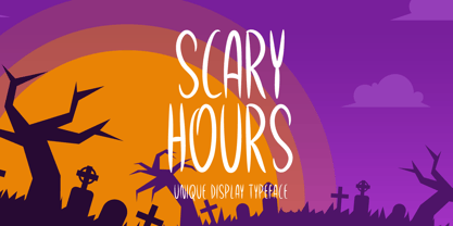 Scary Hours is a unique and spooky display font. It is perfectly suitable for any Halloween-related project or crafty idea! The only limit is your imagination.
 - Aure Westra by Aure Font Design,
$23.00 Aure Westra embodies the liquid look of a broad-nibbed ink pen. These bold forms engage the reader with a subtext of exotic wisdom. Westra’s entrancing flow brings a dramatic intrigue to text and titles and an esoteric savor to astrological expressions and chartwheels. Westra is an original design developed by Aurora Isaac, first released in the LP glyphset in 2011. After more than a decade in development, 2018 marks the release of the CJ and KB glyphsets. The CJ glyphset is a full text font with an extended set of lowercase and uppercase glyphs supporting a variety of European languages. Additional glyphs include standard ligatures, four variations of the ampersand, and check-mark and happy-face with their companions x-mark and grumpy-face. Numbers are available in lining and oldstyle versions, with numerators and denominators for forming fractions. Companion glyphs include Roman numerals, specialized glyphs for indicating ordinals, and a variety of mathematical symbols and operators. The CJ glyphset also includes an extended set of glyphs for typesetting Western Astrology. These glyphs are also available separately in the KB glyphset: a symbol font re-coded to allow easy keyboard access for the most commonly used glyphs. The unique look of Aure Westra stands on its own as a text font. Where needed, use the clean lines of Aure Jane to provide contrasting text that will showcase Westra’s exotic nature. Give Aure Westra a trial run! You may discover a permanent place for this font family in your typographic palette. AureFontDesign.com
 - Look sir, droids! - Unknown license

- KR Ookie Bookie - Unknown license

- Hooked Up 101 - Unknown license

- KR Look Closely - Unknown license

- All Hooked Up - Unknown license

- A Truly Hook by Javanice Studio,
$16.00 Introducing Truly Hook by Javanice Studio a Truly Hook is A Handwritting Font a Truly Hook is perfect for branding project, apparel, labels, magazines, books, greeting / wedding cards, packaging, fashion, make up, stationery, and any type of advertising purpose or just used to express words above the background. This font includes a Truly Hook also multilingual support. Enjoy the font, feel free to comment or feedback, send me PM or email.
 - Boom Pang Pow by TypoGraphicDesign,
$9.00 The typeface Boom Pang Pow is designed from 2020 for the font foundry Typo Graphic Design by Manuel Viergutz. A collection of comic and pop art elements like Speech Bubbles Catch Words, Punctuation Symbols, Boom, Pow, Bang … with various layers for colouring. 1 font-style (Comic) with 248 glyphs (Adobe Latin 1). For use in logos, magazines, posters, advertisement plus as webfont for decorative headlines. The font works best for display size. Have fun with this font & use the DEMO-FONT (with reduced glyph-set) FOR FREE!
 - Boot Hill NF by Nick's Fonts,
$10.00 Here's an unusual take on the classic Tuscan face of the 1880s. The unusual finials lend a slightly spooky feel to the face, hence its current name. Both versions support the Latin 1252, Central European 1250, Turkish 1254 and Baltic 1257 codepages.
 - Boot Camp JNL by Jeff Levine,
$29.00 Boot Camp JNL has the same roots as Jeff Levine's Condensed Stencil JNL, as they were both modeled from a set of vintage brass interlocking stencils made by the Stafford Manufacturing Company. The previous font was drawn from limited examples of the stencils seen in an online photograph, so a number of the basic characters had to be improvised. Since then, a nearly complete set was obtained and the alphabet and numerals are truer to the original design. Additionally, both Regular and Oblique versions of Boot Camp JNL are available.
 - Biff Bam Boom by Comicraft,
$19.00 Thrown from the pages of Spider-Man, Daredevil and Hulk comes BIFF BAM BOOM! Inspired by the Legendary Lettering Legerdemain of comics’ Silver Age, Biff Bam Boom is a font you can’t take a swing at without ending up with a broken nose. If you have any sense, duck and cover!
 - Look Like Coffee by HIRO.std,
$17.00Look Like Coffee is a Display font. This font describes about fun, semi casual, stylish, headline, easy going, dynamic, and easy to use. FEATURES - Support Opentype Features - Support Ligatures - Numbering and Punctuations - PUA Encoded Characters - Multilingual Support - Works on PC or Mac USE Look Like Coffee works great in any product packaging, logotype, magazine, editorial, quotes and any projects that need all about fun and dynamic taste. Enjoy using! Thanks. HIRO.std - Good Looking Karma by Gassstype,
$25.00 Good Looking Karma is a Handwritten Brush font made with Procreate app with Rough style and dramatic movement this font is great for your next creative project such as logos, printed quotes, invitations, cards, product packaging, headers, Logotype, Letterhead, Poster, Label, and etc.
 - Under Boom Graffiti by Sipanji21,
$15.00 "Under Boom" is an urban graffiti font characterized by sharp edges and a bold look. Ideal for music posters, apparel designs, shirts, and streetwear, this font brings a touch of edginess to your projects. The unique style of "Black Squad" makes it the perfect choice for death metal or urban graffiti themes. Whether you want to create a strong and powerful statement or simply add a touch of attitude to your designs, "Under Boom" is the font for you.
 - Ripped Bam Boom by Comicraft,
$19.00 It’s stronger than the Thing AND the Hulk! It can bench press 500 pound gorillas and send them scurrying into the corner. RIPPED BAM BOOM is a font that can tear through the alphabet faster than you can say “A to Z” and will work your chest, shoulders and triceps and help YOUR characters gain upper-body strength and muscle mass! Features alternate uppercase characters, Western & Central Europe, Vietnamese & Cyrillic support, Crossbar I Technology™ and 18 Chinese Sound Effects
 - VTKS FLOWERS IN OUR SOUL - 100% free

- Tickety Boo NF by Nick's Fonts,
$10.00Here's a new take on an old favorite from Frederic Goudy, named Goudy Fancy. Taking its name from a British expression meaning "A-OK," this font is a perfect choice for engaging and enchanting headlines. The font also contains numerous alternate characters to spice up your layouts. Both versions of the font contain characters to support all major European languages. - Boo Meringue NF by Nick's Fonts,
$10.00The inspiration for this font made its first appearance in the 1897 American Type Founders specimen book, under the name "Lithotint". As the name suggests, the original was tinted gray (diagonal lines formed the body); this version is solid and spooky, too. The font contains a few ghostly graphics, including ghosts at the bracket positions, a haunted house at the backslash position, and a scary backdrop at the ASCII tilde and ASCII circumflex positions. Both versions of the font include 1252 Latin, 1250 CE (with localization for Romanian and Moldovan). - Face Your Fears - Personal use only

- Dot Your Eyes - Personal use only

- Magical Mystery Tour - Unknown license

- Blockschrift für Flugzeuge - Unknown license

- Tour de Font - 100% free

- Missed Your Exit - Unknown license

- Crushed Out Girl - Unknown license

- Hold your breath - Unknown license

- Kill your darlings - Unknown license

- KR Yours Truly - Unknown license

- Cacophony Out Loud - Unknown license

- Your Complex BRK - Unknown license

- Know Your Product - Unknown license


