10,000 search results
(0.052 seconds)
- Agedage Simple Versal by Dharma Type,
$14.99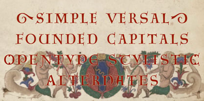 Agedage SimpleVersal is a Opentype font supporting some opentype layout features. To use these functions, you need to use an application which supports OpenType advanced features such as Adobe InDesign CS, Illustrator CS and Photoshop CS. The font includes: Stylistic Alternates Ordinals Numerators, Denominators and Fractions
 - Edgewater Serif by cm5dzyne,
$16.00Edgewater Serif, the companion font for cm5dzyne's Edgewater, is suited for various projects requiring anything from refined titling to a futuristic theme. Its rounded corners reduce the rigid visual impact of normal slab-serif fonts and give it a more casual feel than its sans-serif counterpart. - Paws & Tails by whyteshark,
$15.00 This is a fun animal-based font design. Great for posters for school, pet shops, animal-companies/organizations. Use one letter to start your word or use all of them, you'll have a truly unique logo and company style with this font. Contain only upper case letters.
 - Willow - Unknown license

- Manualito-Flo - Personal use only

- A La Nage - Personal use only

- Z3non by SB type,
$35.00 A bold retro-future font ~ cosmic, weighty & groovy. Each letterform began with a rounded edge box as the base and ovals as a way to create negative space. In instances where the oval was not enough, a series of simple additional arced or straight cuts were made. What resulted is a unique and original font with a lot of personality. Stylistically, the font has a space-age vibe while possessing sleek, futuristic characteristics that ultimately make it feel fresh. It is not meant to be a go-to font for articles with a lot of text, but meant to expand ones library and in the right moment it will bring a lot of energy and major impact. Please note that this family has a limited character set and does not contain €, $, ¢, £, ¥ and other punctuation marks. Please check the glyphs tab to ensure this font will work for you!
 - Ultimatum MFV by Comicraft,
$19.00 ALERT: Comicraft's Mad Font Scientist John Roshell and Lead Lab Assistant Drewes McFarling have applied an Unstoppable Force to our Immovable Font ULTIMATUM, successfully splitting it into a family of three fonts! Here’s the secret formula: ULTIMATUM MASS retains the dynamic details of the original with flat, angled corners; ULTIMATUM FORCE cooperates with your demands for a vertical slice of the action; and ULTIMATUM VELOCITY got tired of waiting for a compromise and cut across its horizontals. The complete family features three styles of eight weights for a total of 24 fonts, each with support for 221 languages including Western & Central Europe, Vietnamese & Cyrillic. Three Variable Fonts provide precise control of Weight & Italic slant. ULTIMATUM MASS FORCE VELOCITY is ideal for high performance car & truck branding, sports uniforms, video game graphics, college & university apparel, and any time you want to convey industrial strength and technological innovation.
 - Vtg Stencil US No. 4 by astype,
$18.00 The Vtg Stencil fonts from astype are based on real world stencils from several countries. The US No. 4 design was derived from a typical antique US-American stencil-plate. This revolving stencil-plate was invented by Eugene L. Tarbox and patented in 1868. It was a mass factored product and a very common tool in the United States until the success of the interlocking stencils. In case of US No. 4 an original early stencil plate from New York Stencil Works was used. The Regular font style is a clean font design featuring an extended Latin glyph set including some typical stencil ornaments and tabular figures. The Paint font style is made from true stenciled letters and features all the letters of the stencil-plate only. If you like the later interlocking design have a look to my Vtg Stencil US No.2 font. More info: pdf specimen
 - Disento by LABFcreations,
$14.00 Disento Sensual Ligature Sans Serif Typeface . Sexy & elegant sans serif font is ideal for creating logon and Brand Identities. With large variations of original ligatures and a lot of sophisticated Alternates It works perfect for creating stylish logos, striking editorials, invitations, graphic quotes, and more. Uppercase Characters Lowercase Characters Discretionary Ligatures Multilingual support for various languages HOW TO GET ACCESS TO ALTERNATE CHARACTERS & LIGATURES Open glyphs panel: In Adobe Photoshop go to Window - glyphs In Adobe Illustrator go to Type – glyphs Microsoft Windows apps -generally propose a Font menu by right-clicking on a selected text. This Font menu lets you setup several font features, in particular ligatures. "In Word 2010 or newer for Windows, press Control-D to open the Font dialog box, and select the Advanced tab. Check the option to “Use Contextual Alternates,” then set Ligatures to “All,” and click OK." Follow me by Instagram: @labfcreations
 - 1462 Bamberg by GLC,
$38.00 Font designed from that used in Bamberg by Albrecht Pfister, in early years of printing, exactly for a book titled "Ackermann Von Böhmen" writen in old German by Johannes Von Tepl, and decorated by a lot of splendid colored carved woods. This font include "long s", naturelly, as typically medieval, but any abbreviated characters, and, curiously no german "ß", no more than "W". (The only one I did found where a hand drawn one.) In addition, the "k" have not a German gothic form. Added, the accented characters, no longer existing on this time, and capitals when was a lack. A render sheet, in the font file, makes all easy to identify on a keyboard. This font is used as variously as web-site titles, posters and fliers design, editing ancient texts... This font supports as easily enlargement as small size, remaining readable, original and beautiful, especially in capitals.
 - Everlasting by Bogstav,
$17.00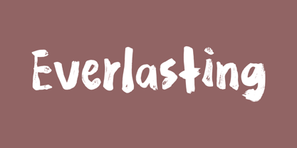 Handmade with an organic feeling.
 - Lemonism by Bogstav,
$17.00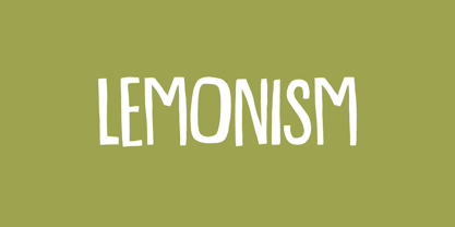 Handmade with an organic feeling.
 - Ahorn by Bogstav,
$17.00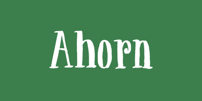 Handmade with an organic feeling.
 - Talkback by Bogstav,
$17.00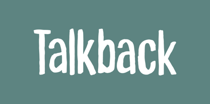 Handmade with an organic feeling.
 - Osculate by Bogstav,
$17.00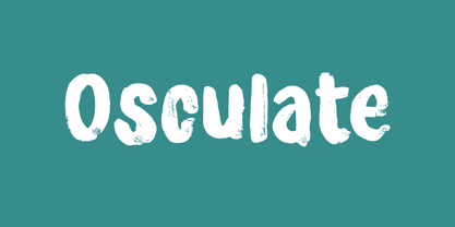 Handmade with an organic feeling.
 - DOORLEY HAND by John Doorley & Associates Pty. Ltd.,
$25.00Doorley Hand is a unique new font based on the handwriting of Australian advertising man and creatist John Doorley. The font's character and personality sits somewhere between charming child-like handwriting and classic contemporary calligraphy. It pays homage to simpler times when more organic and personalised forms of communication reigned. A perfect counterpoint to the fast-forward, hi-tech world today. - Solasta by VP Creative Shop,
$20.00 Introducing Solasta - organic script Solasta is organic and modern script loaded with ligature glyphs and multilingual support. It's a very versatile font that works great in large and small sizes. This font is perfect for branding projects, home-ware designs, product packaging, magazine headers - or simply as a stylish text overlay to any background image. FEATURES Uppercase, lowercase, numeral, punctuation & Symbol ligature glyphs Multilingual support No special software is required to type out the standard characters of the Typeface. Canva friendly Feel free to contact me if you have any questions! Mock ups and backgrounds used are not included. Thank you! Enjoy!
 - Obviate by VP Creative Shop,
$20.00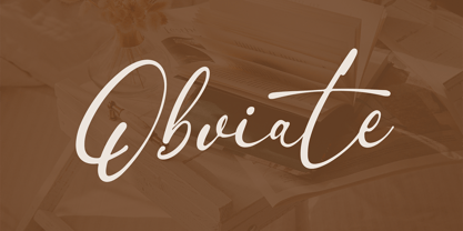 Introducing Obviate - organic script Obviate is organic and modern script loaded with ligature glyphs and multilingual support. It's a very versatile font that works great in large and small sizes. This font is perfect for branding projects, home-ware designs, product packaging, magazine headers - or simply as a stylish text overlay to any background image. FEATURES Uppercase, lowercase, numeral, punctuation & Symbol ligature glyphs Multilingual support No special software is required to type out the standard characters of the Typeface. Canva friendly Feel free to contact me if you have any questions! Mock ups and backgrounds used are not included. Thank you! Enjoy!
 - Polymath by VP Creative Shop,
$20.00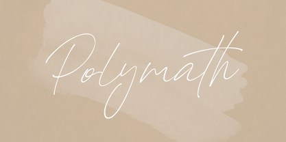 Introducing Polymath - organic script Polymath is organic and modern script loaded with ligature glyphs and multilingual support. It's a very versatile font that works great in large and small sizes. This font is perfect for branding projects, home-ware designs, product packaging, magazine headers - or simply as a stylish text overlay to any background image. FEATURES Uppercase, lowercase, numeral, punctuation & Symbol ligature glyphs Multilingual support No special software is required to type out the standard characters of the Typeface. Canva friendly Feel free to contact me if you have any questions! Mock ups and backgrounds used are not included. Thank you! Enjoy!
 - Machinoir by Invasi Studio,
$19.00 With its organic glyph strokes, Machinoir captures the spirit of the vintage era of motorcycle clubs. The font draws inspiration from this theme to create an all-caps display font reminiscent of the vintage style. Its unique feature set, including alternates and ligatures, adds a touch of uniqueness and organic charm to your designs. A perfect choice for designing eye-catching headings, trendy t-shirts, dynamic flyers, heartfelt greeting cards, captivating product packaging, timeless book covers, inspirational printed quotes, memorable logotypes, and electrifying album covers, Machinoir is your go-to solution. Embrace Machinoir's raw energy and vintage vibes in your designs!
 - Fiest by Panatype Studio,
$9.00 Fiest Font Duo is a handwritten font containing 3 font styles: script and sans serif plus matching slanted. OpenType features make the design more natural and attractive. It's perfect for signature, logotype, wedding invites, posters, brochures or any display use. OpenType Features : Ligatures Stylistic Alternates Ordinals Initial Form Fraction Extended Latin support
 - Emilia Gotisch by RMU,
$25.00 Weiss' gothic-style blackletter font completely redrawn and redesigned for present-day use. This font contains a bunch of useful ligatures, and by typing 'N', 'o' and period plus activating the OT feature Ordinals you get an oldstyle numbersign. As usual in my blackletter fonts, the # key is occupied by the round s.
 - Friendly by Positype,
$29.00 Friendly is an homage to Morris Fuller Benton's adorable Announcement typeface. It is not a strict interpretation, digital revival or reverent reproduction of the original letterforms… but I would be remiss and shady to not acknowledge the letterforms that inspired this typeface. If you are looking for a more accurate 'scanned revival' I would recommend searching "Announcement" on MyFonts. As stated earlier, it is an homage to the original letterforms of the typeface but takes a great bit of freedom tightening the construction up in order to loosen up the movement of the variant letterforms to allow a great deal of usable personality. I enjoy stating this dichotomy… "loosen up to tighten up the forms" and vice versa. It seems counterintuitive or silly but by allowing the letterforms to normalize, I felt more comfortable going back and adding rather indulgent personality. Infused with stylistic alternates, swashes, titling, many many contextual alternates, 9 stylistic sets and 2 stylistic sets with wordmarks, the typeface became far more 'friendly' for me… how could it not? With so many loops, swashes and typographic indulgences, it was bound to be fun. The more elaborate and 'overdone' Friendly got, the more I wanted to slant it. Here's where my thinking differs from MFB's original. I like slanted romans… especially ones with long ascenders, but I do not like much of a slant. It has to be the lettering person in me. It's hard for me to do a completely upright serif and not pair it with an angle, but I did not feel Announcement's 'Italic' offered much and the actual slant needed to be far less. If it's not an italic, I prefer the letters to slant with an angle equivalent to the thickness of the vertical stroke. The Slanted version of Friendly is set at 3.6 degrees, is quite subtle, and very fitting for me. You will find that most characters have a contextual, stylistic, swash and titling alternate assigned to them and some have an echoed alternate to the swash and titling options if the stylistic alt has been selected in tandem. Additionally, all of these are accessible in the glyph palette directly from the base glyph typed or through selecting options through the Stylistic Sets 1–9. Stylistic Sets 10 & 11 are a little different. They are actually configured as complex majuscule ligatures… a result of me getting carried away. Other features like a default old style numeral set and coordinating glyphs have been produced along with case support, ordinals, and more have been added to make it more relevant for contemporary use.
 - Albertina by Monotype,
$29.99Albertina was a typeface ahead of its time. It was in the early 1960s when designer Chris Brand, an accomplished calligrapher, aspired to draw a typeface based on the principles of calligraphy. Unfortunately, typesetting machines of that era put many restrictions on designers. Characters had to be drawn within a very coarse grid, which also defined their spacing. Technological limitations meant that italic designs often had to share the same character widths as the romans. Designers were forced to draw italic faces much wider and with more open spacing than what would be typical in calligraphic lettering or hand-set type. Not surprisingly, production of the first Albertina fonts went very slowly. Brand would submit his character drawings, and the Monotype Drawing Office would modify them to be compatible with the company's typesetting equipment. The new drawings would then be sent back to Brand for approval or rework. Most were reworked. The process took so long, in fact, that by the time the face was completed it was once again out of phase with the times: instead of being released as metal type for the Monotype composing machines it had been tailored for, Albertina debuted as phototype fonts for the Monophoto typesetter. The design's first use was for a catalog of the work of Stanley Morison, exhibited at the Albertina Library in Brussels in 1966. Sales of the design were not remarkable. With the advent of digital type technology, Albertina's story took a far happier turn. Frank E. Blokland, of the Dutch Type Library, used Brand's original, uncompromised drawings as the foundation of a digital revival. The Monophoto version had taken a considerable battering from the limitations of Monotype's unit system," recalls Blokland, "but there was no need for me to incorporate these restrictions in the digital version." With the full backing of Monotype and original designer Brand looking over Blokland's shoulder, a new design for Albertina emerged, displaying all the grace and verve of Brand's original drawings. The basic family drawn by Brand also grew into three weights, each with an italic complement and a suite of small caps and old style figures." - Aure Sable by Aure Font Design,
$23.00 Aure Sable embodies the entrancing mistique of an adventurous spirit. The fluid forms of this brush font engage the reader with a subtext of serendipitious happenstance. Sable Regular brings the soft touch of familiarity to text and titles and imbues astrological expressions and chartwheels with an exotic intrigue. The graceful forms of Sable Italic add the flowing touch of a personal comunique. Sable is an original design developed by Aurora Isaac. After more than a decade in development, 2018 marks the first release of the CJ and KB glyphsets in regular and italic. The CJ glyphset is a full text font with an extended set of lowercase and uppercase glyphs supporting a variety of European languages. Additional glyphs include standard ligatures, four variations of the ampersand, and check-mark and happy-face with their companions x-mark and grumpy-face. Numbers are available in lining and oldstyle versions, with numerators and denominators for forming fractions. Companion glyphs include Roman numerals, specialized glyphs for indicating ordinals, and a variety of mathematical symbols and operators. The CJ glyphset also includes an extended set of glyphs for typesetting Western Astrology. These glyphs are also available separately in the KB glyphset: a symbol font re-coded to allow easy keyboard access for the most commonly used glyphs. Aure Sable is engaging as a text font, but its empathic nature radiates against more traditional fonts that provide the perfect foil to Sable's casual persona. Pair Sable with the formal look of geometric fonts such as Aure Jane and Aure Declare to accentuate Sable's heartfelt nature. Give Aure Sable a trial run! You may discover a permanent place for this font family in your typographic palette. AureFontDesign.com
 - Eyadish by Eyad Al-Samman,
$7.00 Eyadish is an entertaining, comic, and childish font. The name of this font is originally derived from two main syllables. The first one is "Eyad-" which refers to my first name and the second syllables is "-ish" which means characteristics of or relating to. Hence, "Eyadish" refers to the characteristics that "Eyad", the typographer, himself has and had during his childhood. I do like this font for its childish and comic shapes. I have decided to design this font trying to leave a humble and personal imprint regarding the magic and innocent world of all children. Frankly, it is my most favorable designed font. This font comes in two different weights with facilities for writing and publishing in different alphabets included in various Latin and Cyrillic texts and scripts. "Eyadish" is primarily designed to be fit with all prints of kids, children, and juveniles' products. It is major usage is in advertisements and publications. It is suitable for T-shirts, books' covers of children such as fairy tales and comic stories, advertisement light boards in malls, and titles in parental, childish, comic, and other related magazines. "Eyadish" also can be printed in many children's products such as garments, towels, shoes, socks, toys, pacifiers, diapers, exhibitions, festivals, books titles and contents, medicines' packages, kindergartens' signs, buses, comic and TV series, kids and children organizations and charities names, images, software, foods including milk cans, candies, chocolates, and other related products. The font is extremely and distinguishably attractive when it is used with various, and vivid colorful letters and words in posters, cards, and placards. "Eyadish" is specifically designed for commercial, educational, cultural, and social purposes related to infants, babies, kids, and children. The main characteristic of "Eyadish" Typeface is in its childish look that remains when anyone reads or types or even deals visually with its characters.
 - Flamenca by Eurotypo,
$28.00 Flamenco is an Andalusian art. Who think in flamenco, think in Spain. Is the result of a cultural mix: Gypsies, Arabs, Jews and Christians mixed elements of their respective cultures with traditional Andalusian elements. It incorporate dance, song and guitar music. Known for its emotional intensity, flamenco is distinguished by the graceful arm movements, ferocious stomping’s flamenco dancer, deep groans and strumming guitar. Flamenco is an art of passion. Flamenca Regular and Flamenca Luz is a brush script inspired by the flamenco dance. Flamenca is an organic, modern and casual calligraphy family font that has preserved in its glyphs its original textured appearance for a more personalized effect even more authentic. As an exclusively Open Type release, with 747 glyphs, it has several special alternatives for all letters with lots of possibility an infinity of combinations. There are plenty of options to allow you to create something unique and special: standard and discretionary ligatures, several swashes, initial and terminal forms and stylistics alternates for each letter, catchwords, ornaments that can be added to the beginning or end of each letter, and much more. Ornaments has been created inspired in the bars of the Andalusian patios where flamenco is danced. These lovely fonts have already an extended character set to support Central and Eastern as well as Western European languages. As a whole, Flamenca was made to make your project more beautiful and attractive! Have fun with it! Flamenca is fancy, delicious & fresh!
 - Fusaka by Adobe,
$29.00Fusaka was created by graphic designer Michael Want, a highly original and specialized display typeface which bridges Kanji and Roman letterform styles. As in Kanji, each character fits into a square. The shape and the placement of letter and decorative strokes can make Fusaka look like Asian writing at first glance and allow it to be set either horizontally or vertically. Use Fusaka for a unique look on CD covers, magazine headlines, book titles and Web sites. - Mustang by Linotype,
$29.99German Designer Klaus Sutter digitized Mustang, a brush script typeface from the 1950s originally drawn by Imre Reiner (1900-1987) and published in 1956 by D. Stempel AG. Mustang is a right slanted brush type drawn with simple and strong strokes. It has a dynamic character, and could be perfectly applied for emphasis in headlines. Mustang has the character of Imre Reiner's handriting. Imre Reiner was a prominent book illustrator, painter, and typographer during the 1950s. - Fiddle Sticks NF by Nick's Fonts,
$10.00The roly-poly serifs, inspired by West Banjo, designed by Dave West, add such irrepressible charm to this typeface that you just want to pinch its little cheeks, if you are so inclined. Equally at home in the 1960s, when it was originally released, as the 1860s, from which it drew its inspiration. The PC Postscript, Truetype and Opentype versions contain the complete Latin language character set (Unicode 1252) plus support for Central European (Unicode 1250) languages as well. - MFC Arkena Monogram by Monogram Fonts Co.,
$19.95 The source of inspiration for MFC Arkena Monogram is a specimen from the 1917 “Strong’s Book of Designs”. This popular lettering style has been incorporated into numerous film type foundries of the past, but lacked digital permanence. We’ve expanded the original All Capitals glyphset to include smallcaps to make monograms, have added numerals and included unique ornamentation for basic titling typesetting. Download and view the MFC Arkena Monogram Guidebook if you would like to learn a little more.
 - Jolly Roger by Red Rooster Collection,
$45.00 Steve Jackaman has refined and optimized Jolly Roger for digital release. The original design was created in 1970 by the legendary American type designer Phil Martin, founder and creator of the Alphabet Innovations and TypeSpectra type collections. Although quirky, playful and highly unusual, Phil describes Jolly Roger as his personal favorite out of his entire library of over 400 typefaces. We are proud and humbled to reintroduce the design in honor of our good friend and colleague.
 - Elephant by Alias Collection,
$60.00 A contemporary interpretation of grotesque (historic) typestyle, relying on geometric shapes applied to a grid. Idiosyncrasies within the typeface are based on how this grid is constructed and applied rather than those inherent in drawing type with a pen or cutting from a block of wood. Other grot types retain the quirks of original woodcut typefaces. Elephant has a different vocabulary of quirks that remove it from being too reverential or constrained to a historic context.
 - Arbotek by Type-Ø-Tones,
$60.00 Arbotek has the original skeleton that the author used for the development of his typeface Arboria, a real 'architect typography', with a basic and radical approach to pure geometric forms. The three basic styles - Thin, Light and Light Rounded - try to approach the cartographic technique annotations and their output on plotters. The voluptuous style, Ultra, keeps the same structure of the Light versions, but develops as a historic Art Decó variant of this 20s and 30s graphic style.
 - Tangient by Galapagos,
$39.00Designed primarily for display use, Tangient is serviceable down to the larger text sizes. It presents an idiosyncratic profile, with a tight fit, clearly proportionally spaced, yet having the texture of a monospaced design. Its shapes leap out from the page, where well behaved characters would make a more subdued statement. The calligraphy from which Tangient GD was electronically "cut" originally appeared in a series of personal greeting cards prepared by the Zafaranas in celebration of the New Year. - Gothic 13 by Linotype,
$29.99Gothic 13 is a bold condensed sans serif typeface. Originally designed in small sizes, Gothic 13 is very similar to Modern Gothic Condensed, which was a turn-of-the-20th-century modernization of a popular nineteenth century style. Until Linotype integrated it into their technology, it did not exist in sizes larger than 24 point. The design used for digitization was the 18-point. Gothic 13 is ideal for display work, especially where space is at a premium. - Family Time by Alandya TypeFoundry,
$12.00 Family Time is an elegant script. It is slender, feminine and classy, while still maintaining a friendly feel. Family Time is versatile and will work perfectly for fashion, e-commerce brands, trend blogs, wedding boutiques or any business that wants to appear upscale and chic. With its stylistic character Family Time script is perfect for creating original and functional designs. It has extensive language support, ligatures, alternates, stylistic sets that add visual interest to every letter.
 - Horndon by ITC,
$29.99Horndon is a decorative revival of late art nouveau style typefaces. The robust, high waist forms of these letters lend a unique, early 20th Century feeling of optimism to text designed with them. The letterforms themselves have adapted a three dimensional appearance: they each sport an individual drop shadow. Horndon is an all caps typeface, which was originally designed in 1984 by Martin Wait for Letraset. A similar art nouveau typeface, Galadriel, is also available from Linotype." - Goudy National by Matteson Typographics,
$19.95 Frederic Goudy designed National Old Style Roman in 1916. It is loosely based on a logo he lettered for the National Biscuit Company in 1901. Steve Matteson expanded on Goudy’s original by designing a bold, semibold and matching italics. While much of Goudy’s work is strongly influenced by Venetian types of the 15th and 16th centuries - this design has a truly American quality about it. The design is useful for text or headlines that captures a sense of Americana.


