10,000 search results
(0.085 seconds)
- Shattered Dreams JNL by Jeff Levine,
$29.00 Another filter effect version of Adhesive Serif Letters JNL (of which the original design was modeled after some vintage gummed letters used for signage) and is called Shattered Dreams JNL. This variant has jagged edges all around and is kind of reminiscent of shapes you could make with a small magnet and iron filings. Shattered Dreams JNL is available in both regular and oblique versions.
 - Esencia by CastleType,
$59.00 Esencia, a CastleType original, was inspired by a Spanish stock certificate from 1941 with 11 beautiful art deco style letters for the words "PERFUMES y ESENCIAS". Slender, elegant, with a Spanish flare. Uppercase only with numerals and punctuation. Supports all European languages that use the Latin alphabet, as well as modern Greek and most languages that use the Cyrillic alphabet. Includes alternate E, F, and S.
 - Futura Next by Neufville Digital,
$45.25 Our most up-to-date Futura adapted to the new times. Its peculiarity lies in the curved endings of three of its letters (“j”, “l” and “t”), which gives the typeface a more dynamic and modern look, making it easier to visualize on small and low-resolution screens. The original designs of these characters are also included. Futura is a Trademark of BauerTypes SL
 - LTC Ornamental Initials by Lanston Type Co.,
$24.95 Little is known of the origin of these decorative Initial Caps. Series 448 at 24 point were a different design from the 36 point on which this digital version is based. In addition to the basic 26 characters, there is a negative version contained in the lower case position and a fill character (for two color caps) option in the number and punctuation key positions.
 - MFC Arteaga Borders One by Monogram Fonts Co.,
$19.95 The inspiration source for Arteaga Borders One is a collection of the embroidery and beading patterns from a vintage embroidery patterns catalog dating back to 1865. The original collection of patterned sides has been expounded upon to create matching corners that continue the fluidity of the ornate forms. Download and view the “MFC Arteaga Borders One Guidebook” if you would like to learn a little more.
 - MFC Arteaga Borders Two by Monogram Fonts Co.,
$19.95 The inspiration source for Arteaga Borders Two is a collection of the embroidery and beading patterns from a vintage embroidery patterns catalog dating back to 1865. The original collection of patterned sides has been expounded upon to create matching corners that continue the fluidity of the ornate forms. Download and view the “MFC Arteaga Borders Two Guidebook” if you would like to learn a little more.
 - Sole Sans by CAST,
$45.00 Sole Sans, companion to Sole Serif , is a newspaper sanserif available in a wide range of weights and styles. It’s a workhorse, suitable for headlines, diagrams, graphics and tabular work. Contrast at the junctions between arches and stems is a feature of early 19th-century sanserifs which inspired Sole Sans. It was originally designed for the leading Italian financial newspaper Il Sole 24 ore.
 - Anarckhie by Ingrimayne Type,
$12.95 Anarckhie is a decorative slab-serifed typeface with a calligraphic origin. The horizontal elements of the upper-case letters are below their midpoint, and the x-height of the lower-case letters is unusually small. There is some variation in the weights of the horizontal, vertical, and diagonal elements. The small x-height makes this typeface appear smaller than its point size would indicate.
 - Believer by Viaction Type.Co,
$14.00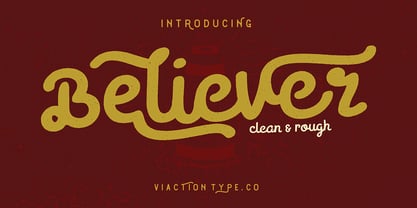 Believer is a letter with original handwriting style, nice applied in various products. Complete with multilingual characters, ligature, alternate and contextual alternate. It is suitable for quote, clothing design, vintage logo, label, poster, packaging design and other designs. File Include : Believer.otf . Believer.ttf . Believer Rough.otf . Believer Rough.ttf . Features (PUA Encoded) UPPERCASE. LOWERCASE. MULTILINGUAL. PUNCTUATION & SYMBOL. STYLISTIC SET. LIGATURE. CONTEXTUAL ALTERNATES. I hope you enjoy and thank you.
 - Blue Jay Way NF by Nick's Fonts,
$10.00Modern Caps—and lowercase, too—was how Ross George described the pattern for this typeface in his Speedball Text Book. Not surprisingly, the design was used on the Beatles' original Magical Mystery Tour album, which suggested the current name. Art Deco meets Psychedelia! Both versions include the complete Unicode Latin 1252, Central European 1250 and Turkish 1254 character sets, with localization for Moldovan and Romanian. - Calps Sans by Typesketchbook,
$55.00 Calps Sans is a variant of the original Calps typeface. Import to be more corporate, Calps Sans family use flat corners instead of rounded corners (Calps). “Calps Sans” is a prominent, eye-catching and unique typeface. It comes with 9 weights and Slim version in order to suit for a multifunctional usage, especially for cooperative work, such as website, magazine, editorial, publishing , as well as packaging.
 - Funny Nature by URW Type Foundry,
$39.99 Funny Nature is not a typeface but a collection of small, comic-like symbols. Lüdicke used to work often for a supplier of gardening equipment etc. He had to come up with new, original and vivid ideas for the design of catalogues and ads. He designed Funny Nature, a wonderful collection of illustrations. Can you hear the humming and buzzuing, can you smell the flowers?
 - Shàngó by CastleType,
$59.00 Shàngó, inspired by the initials from Professor F.H. Ernst Schneidler's classic design released in 1936 as Schneidler-Mediaeval mit Initialen, is an elegant design that looks best when used at large sizes, as the original name suggests. Shàngó is available in two styles: Classic, available in 3 weights, and Gothic, available in 4 weights. Shàngó is a member of the extended Shàngó family (Classic, Chiseled, Sans, Gothic).
 - Amalta by Infonta,
$30.00 Amalta is a Display typeface with calligraphic background. It inherits weight and letter constructions from the original brush lettering. Amalta's Latin and Cyrillic sets were designed simultaneously with an equal attention to details and overall pattern. They both include initial and final swash forms which can be used by a typographer's choice. Amalta is suitable for large sized typesetting: headlines, few-line texts, etc.
 - Gilhaus by Parker Creative,
$18.00 Inspired by the classic German Antiqua style, Gilhaus is a totally original modern serif rooted in iconic history and built for modern projects including branding, web and digital apps, large format printing, and more. While subtle serifs and soft edges bring in an element of warmth and approachability, Gilhaus is balanced out by the bold angular strokes and high contrast letterforms typically found in classic Antiqua typography.
 - Flox Rounded by ParaType,
$30.00 Flex Rounded display typeface was designed in 2000 by Vladimir Pavlikov as alternative 'soft' variant to the original Flox face. In contrast to Flox there are rounded stroke ends and curved shapes in most of Flex characters. The project was aimed to create a decorative vivid alphabet of geometric shapes. Cyrillic was developed in 2005. For use in advertising and display typography. Licensed by ParaType in 2005.
 - Lisboa Hebrew by Vanarchiv,
$52.00 Lisboa Hebrew is humanist sans-serif typeface base on the same design as the original Lisboa (2005). The main structure is more close to the Sephardic proportions, where the letterforms contains reverse contrast and the terminals following the same calligraphic approach (Humanist). There are some characters and figures designed as small caps which have the same proportions from Hebrew. Latin transliteration characters were also included.
 - Lodestone Pro by Red Rooster Collection,
$60.00 Lodestone is a sans serif decorative typeface, and was created by Steve Jackaman (ITF) in 2017. The original design was known as ‘Marvin,’ and was created by Face Photosetting (London) in the early 1970’s. Since the name ‘Marvin’ was in use by another foundry at time of publication, ‘Lodestone’ was born. Lodestone has a clean, retro feel, and is electrifying at display sizes.
 - ASM by Extratype,
$40.00 The initials ASM represent the acronym of the Santa Monica Arts cultural center located in Barcelona, Spain, where this typeface, with the same name, has served as the custom corporate typeface since 2008 till today (2013). ASM is an energetic monospaced with extreme legibility consisting of two original weights, with an underlined version – used on some of corporate applications – all with their corresponding italics.
 - Rassetta NF by Nick's Fonts,
$10.00The pattern for this graceful, subtly modulated Art Deco typeface was designed by Willard T. Sniffin for American Type Founders in the 1930s. True to the original design, the Swash Caps version features Sniffin's twelve decorative variants. The Postscript and Truetype versions contain a complete Latin language character set (Unicode 1252); in addition, the Opentype version supports Unicode 1250 (Central European) languages as well. - Dustown by Letterhend,
$17.00 Dustown is an organic font with natural vibes! Contain two fonts, Sans and Serif with Rough and Stamp Style. You can use this font for every project. Suitable for branding logo, hand lettering, or apparel design. This font duo also support multilingual, number and symbol.
 - Diane Script by GroupType,
$27.00 In 1995, FontHaus came upon a rare opportunity to create a revival of Aries, a little known and previously unavailable typeface by the legendary Eric Gill. Discovering a lost typeface by one of the major designers of the 20th Century, was the discovery of a buried treasure, and being the first type company to release it was an honor. Thirteen years later, FontHaus came across another little known typeface treasure: Diane. Designed by the legendary French designer Roger Excoffon in 1956, this remarkable script has never been faithfully recreated until now. In close collaboration with Mark Simonson, FontHaus and Mr. Simonson painstakingly researched rare type books, publications, European metal type services, and period showings from the United States, England, Germany and from the University of Groningen in the Netherlands. Finding full specimens of the font turned out to be quite a challenge. In most cases, only the caps and lowercase were shown. Furthermore, the more we researched Diane, many curious facts came to light. The caps in earlier specimens of Diane are completely different from specimens published later, suggesting that the face was redesigned at some point, perhaps in the mid-1960s. So we are left with two different sets of caps. The original had very elaborate, swirly strokes, very characteristic of Excoffon¹s gestural designs for posters and logos. Later on, these appear to have been replaced by a set of simpler, more traditional script caps. The original caps are criticized in one source Mark found (Practical Handbook on Display Typefaces, 1959) as being "exquisite" but "not highly legible". Perhaps this is what led to the simpler caps being introduced. Nevertheless, FontHaus's release includes not only both sets of caps, but a range of alternates and a number of new characters not originally available such as the Euro, and a magnificent alternate Ampersand to name a few.
 - Snushane by PizzaDude.dk,
$17.00 Another one of those "perfect for a headline that needs an organic and handdrawn look" fonts. Snushane has a lot of character and likes to play with it's organic typographic muscles. I've added 5 different versions of each letter that automatically cycles as you type - and that goes for the Regular, Outline and Inside versions. All of these versions have multilingual support as well!
 - Moonlight Shadow - Personal use only

- CarlMarx by Adobe,
$29.00This typeface is based on lettering by Carl Marx (1911?1991), designed during his first semester at the Bauhaus in Joost Schmidt?s class, in 1932. Although the letter proportions are based on Schmidt?s teachings, the forms are not constructed from compass and ruler, but drawn with brush and marker, lending the words a warm and lively touch. Hidetaka Yamasaki redrew the letters from scratch and added all missing characters for today?s needs. A set of hanging figures, alternates for some critical letterforms (such as f, r, and t) as well as several ligatures make CarlMarx especially suitable for use in body text. As suggested by Marx, Yamasaki captured two weights from the original drawing and perfectly adjusted light and bold to highlight words and create hierarchy in headlines ? without losing or adding space. True to the original, Yamasaki captured the wobbly contour in CarlMarx, preserving warmth in the condensed geometric style of the early 1930s. - Triplex Italic by Emigre,
$39.00 The drawings, for what is now Triplex Italic, were done in Iowa City in 1985 by John Downer. The italic was originally conceived as a companion for another typeface being drawn at the same time called Arcatext, which (like Triplex) could be described as a "humanist sans-serif" having simplified character shapes constructed mostly of geometric parts. At one stage, a certain customer was interested in Arcatext but wanted a different italic drawn for it, so the plan for the italic took another direction and the idea for this one was dropped. Five years later, Emigre decided to commission the abandoned italic as a digital typeface in three weights as companions to the Triplex Sans and Serif families designed by Zuzana Licko in early 1990. The ascenders and descenders have been shortened to match those of Triplex and the new capitals embody more of the features that distinguish the lower case, but otherwise the digital version closely follows the original drawings. See also Triplex OT.
 - Melina BT by Bitstream,
$50.99Melina Plain and Melina Fancy are characterized by graceful lines, strong contrast and nostalgic overtones. These typefaces are patterned after two members of a type family named Greco, released by Fundición Tipográfica Richard Gans of Madrid, Spain, in the 1920s. Melina Plain is a refined version of Greco Bold, and Melina Fancy is based on Greco Adornado, with the notable addition of a lowercase, which was not a part of the original design. Melina is based on two typefaces (ca. 1920) from the Fundición Tipográfica Richard Gans in Madrid, Spain. Nick Curtis first found Greco Adornado in a type specimen at the Library of Congress. It was a cap only design. He made a cut of the original (Melina Fancy) and created his own lowercase, and many other characters to support contemporary character sets. Later he came across Greco Bold, which had a lowercase, but he chose not to use it and instead, adapted his Melina Fancy to create Melina Plain. - Babetta by Viktor Nübel Type Design,
$- Babetta is a display typeface that comes with some decorative typographical features. Alongside a set of arrows and flower icons, it also includes an alternative ›E‹, some special diacritic marks, a wavy ›S‹ and a series of ligatures. It features 5 weights, a special ›Neon‹ version and supports a wide range of Latin languages. This typographical tool box provides a large and playful variety of options for headlines and logotypes. Babetta supports Latin and Cyrillic languages. The initial inspiration for Babetta was an illuminated vintage shop sign—that of a famous bookstore in Berlin called Karl-Marx-Buchhandlung that dates back to the days of East Germany. During the course of the design process, this slightly shabby historical original was kissed by an Italian Art Deco beauty and has blossomed into a new typeface with its own special charm. The aim was not to preserve the original lettering, but to use it as a starting point for typographical exploration.
 - Lightbox 21 by Protimient,
$21.00 Lightbox 21 is a radical update of my previous version of a geometric sans serif. The design of the original Lightbox was fundamentally based on the idea of incorporating the proportions of the ‘Golden Ratio’ into each letterform; Lightbox 21 greatly improves on this concept by entirely abandoning it. The result is a much more readable, ‘natural’ typeface that retains elements of the original without being bound to it. Overall, Lightbox 21 has been designed to convey that classic feel of a geometric sans that makes the genre so tremendously enduring and versatile, as well as providing an effortless sense of class to whatever they are applied. Primarily intended for editorial work (i.e. short to medium length texts) or display settings, Lightbox 21 has a reasonably extensive character set, including support for Vietnamese, many currency symbols, arrows, and small caps. It also has OpenType support for nut fractions (via a stylistic set) and a barred alternate uppercase i and an alternate curled j.
 - Liminoru by IbraCreative,
$17.00 Liminoru – An Organic Liquid Typface Liminoru is an organic liquid typeface that flows seamlessly between characters, embodying a fluidity reminiscent of cascading water or molten metal. The letters dance with a graceful, serpentine rhythm, each stroke resembling the sinuous movement of organic forms. The typeface’s design evokes a sense of natural beauty and dynamic growth, as if the letters are evolving and adapting to their environment. Liminoru’s unique curves and undulating lines create a harmonious balance between sophistication and an elemental, earthy quality. The liquid nature of the font imparts a tactile, almost sensory experience, making it a visually captivating choice for projects that seek to blend elegance with the organic essence of nature. Liminoru is perfect for branding projects, logo, wedding designs, social media posts, advertisements, product packaging, product designs, label, photography, watermark, invitation, stationery, game, fashion and any projects. Fonts include multilingual support for; Afrikaans, Albanian, Czech, Danish, Dutch, English, Estonian, Finnish, French, German, Hungarian, Italian, Latvian, Lithuanian, Norwegian, Polish, Portuguese, Slovak, Slovenian, Spanish, Swedish.
 - Roosevelt - Unknown license

- Aure Brash by Aure Font Design,
$23.00 Aure Brash speaks with the cheeky inuendo of a sassy parrot. The quirky forms of this unique outline font engage the reader with a subtext of whimsy. Designed for its visual impact, Brash stands out as a title font and offers delightful possibilities for graphic imagery. Brash is an original design developed by Aurora Isaac. After more than a decade in development, 2018 marks the first release of the CJ and KB glyphsets. The CJ glyphset is a full text font with an extended set of lowercase and uppercase glyphs supporting a variety of European languages. Additional glyphs include standard ligatures, four variations of the ampersand, and check-mark and happy-face with their companions x-mark and grumpy-face. Numbers are available in lining and oldstyle versions, with numerators and denominators for forming fractions. Companion glyphs include Roman numerals, specialized glyphs for indicating ordinals, and a variety of mathematical symbols and operators. The CJ glyphset also includes an extended set of glyphs for typesetting Western Astrology. These glyphs are also available separately in the KB glyphset: a symbol font re-coded to allow easy keyboard access for the most commonly used glyphs. Brash is not designed for use in extended text. It shows its strength paired with strong text fonts such as Aure Jane or Aure Teddy. Used sparingly, Brash will add witty highlights to catch the reader's eye. Give Aure Brash a trial run! You may discover a permanent place for this font family in your typographic palette. AureFontDesign.com
 - Hisham by Linotype,
$187.99Hisham is a modern Arabic headline face, designed by the Lebanese calligrapher, Ahmed Maged, originally for Linotype-Hell Ltd. The Hisham design has a distinctive style with a strong baseline, relieved by strategic cut-away effects, which is counterbalanced by the bold vertical strokes and some strong diagonals. This somewhat compact font adds a new style to the range of Linotype’s Arabic headline fonts. This OpenType font includes Latin glyphs from Optima Extra Black, allowing users to set text in both most Western European and Arabic languages without switching between fonts. Hisham incorporates the Basic Latin character set and the Arabic character set, which supports Arabic, Persian, and Urdu. The font also includes tabular and proportional Arabic, Persian, and Urdu numerals, as well as a set of tabular European (Latin) numerals. - Sharpe Variable by Mans Greback,
$19.00 Sharpe Variable is a stylish serif typeface family. The original type was drawn between 2018 and 2019, and the variable font and its updated styles was created in 2020. It is clear, sharp and has brave, lively letter forms but with a conservative backbone. This font is provided as a Variable Font. It is only one font file, but this file contains multiple styles. Use the sliders in Illustrator, Photoshop or InDesign to manually set any weight and width. This gives you not only the 15 predefined styles, but instead more than half a million steps to customize the type to the exact look your project requires. Each style contains ligatures and support for a wide range of languages. More info about Variable Fonts: https://mansgreback.com/s/About_Variable_Fonts.pdf
 - 1484 Bastarde Loudeac by GLC,
$38.00 Font designed after that used in Brehan-Loudeac (Britanny, France) by Robin Fouquet and Jean Crès in years 1480s to print a lot of texts and books. This font include “long s”, naturally, as typically medieval, and a few special characters and abreviations, also some variants, like for “d”, “r” or “v”. The small “y” is accented, just like in British alphabet of the time, though the texts were printed in French. Added, a lot of accented characters no longer existing on this time. A render sheet, in the font file, makes it more easy to identify on a keyboard. This font is used as variously as web-site titles, posters and flier designs, editing ancient texts... all you need. This font supports easily as large than small size, remaining readable, original and pretty.
 - Swingset by Twinletter,
$12.00 This font is created with original hand drawn strokes for a relaxed, beautiful and elegant impression. This font also offers beautiful abstract typographic harmony for a wide variety of design projects, including natural handwriting in digital form for designs, quote designs, for social media business designs, advertisements, trademarks, promotional banners, posts, posters, signatures, and all designs require handwriting or whatever design you want. This font is equipped with uppercase, lowercase, numbers, punctuation marks, swhases and several variations on each character including multi-language. This font is best suited for open type friendly applications. How to get alternative glyphs from open type fonts: http://adobe.ly/1m1fn4Y PUA Character Code - Fully accessible without additional design software. We hope you enjoy this font.Feel free to send whatever message you want to convey.Thank you Regards
 - Molly Lips by Raditya Type,
$15.00 Molly Lips, a monoline handwritten font. Molly Lips can be used for brand identity, wedding invitations and wedding calligraphy, feminine or organic logos, small business branding, packaging, and more!
 - Naturella by Intellecta Design,
$22.90 A collection of natural and organic elements from the garden. A great set of type dingbats in the genre of organic food.
 - Sterling Script by Canada Type,
$54.95 Sterling Script was initially meant to a be digitization/reinterpretation of a copperplate script widely used during what effectively became the last decade of metal type: Stephenson Blake's Youthline, from 1952. The years from 1945 to 1960 saw a heightened demand for copperplate faces, due to post-war market optimism, as well as the banking and insurance industries booming like never before, which triggered the need for design elements that express formal elegance and luxury. The name Sterling Script is a tip of our hat to England, the Stephenson Blake foundry's country of origin. It is also a historical hint about copperplate scripts having been used mainly for banking and bonds in the 19th century. Originally we just wanted to resurrect a gorgeous metal type from the ashes of forgotten history. But after the main font was done we saw that the original s really needed an alternate. We made one. But we felt sorry for the original s and didn't want to see it dropped from use altogether, so we saved it by building a set of ligatures that solve the minor connection problem with the s at large sizes. Before the completion of the ligatures, a few different alternates were also drawn, and we were faced by the fact that the single font we set out to do was now a much larger set than we anticipated. While thinking about how to split up our unexpected bundle of large characters, we drew a few more alternates and some swashes. This abundance "problem" reached a certain point where there was no looking back, so we just decided to go all the way with this font. We added many more alternates, swashes, ligatures, and two full sets of each beginning and ending lowercase letter. The result is over 750 characters of sheer elegance. Sterling Script has many features that set it above and beyond other copperplate scripts: - It has 2 beginning and 2 ending alternates for every single lowercase character. The beginning and ending variants on the vowels are also available in accented form in the appropriate cells of the character map. - Sterling Script is the ultimate elegant font choice for luxury design. Very elegant, but not too soft. Its strong and confident shapes convey a message that is real, comforting and assuring. - One of the eventual purposes of expanding Sterling Script this extensively was to create a script that finds the middle ground between formal and informal without compromising either trait, a script where the degree of formality can be gauged, tweaked, cranked up or toned down depending on the layout's needs. Aside from beginnings and endings, there are multiple variations for the majority of the basic characters. This is a formal script on steroids, where twirls and swashes can be set to come out unexpectedly from any place in the word, which is great for reducing the inherent rigidity of words set in copperplate scripts and "humanizing" them whenever needed. This is especially useful for wedding, postcard and invitation design, where not every viewer of the collateral material has something to do with banking or insurance. - With such an extensive character set, a designer can easily set a word or a sentence in 10 or more different ways, and choose the perfect one for the task at hand. This is particularly useful for work where details are of utmost importance, like logos, slogans, or elegant engravings that consist of one to three words. Let those swashes and twirls intertwine for maximum elegance. The Sterling Script complete package consists of 7 fonts: Sterling Script, Alternates, Beginnings, Endings, Swashes, Swash Alternates, and Ligatures. Sterling Script is available in five different purchase options and price ranges. But with such a massive offering of variation, the Sterling Script complete package is definitely the most value-laden set in its class. Once you use Sterling Script, you will never want to go back to other copperplates.
 - Teen - Unknown license


