10,000 search results
(0.049 seconds)
- Deluxe Ducks - Unknown license

- Birdland Aeroplane - Unknown license

- Stupefaction - Unknown license

- Braeside Outline - Unknown license

- Capacitor - Unknown license

- Lesser Concern - Unknown license

- Arthemis by Hanzel Space,
$25.00 Featuring the latest font "Arthemis Handwriting Font" This font is made with original handwriting, with a quick technique so that the font looks natural and textured. Each letter has a character, so it looks different from a regular font. This font is very suitable for use as movie titles, branding, packaging, quotes, taglines, trademarks, logos, and other promotional media. If you are interested in buying this font for your design needs, then you will get 3 types of files that will be installed on your computer. The attached files are: Artemis OTF Arthemis TTF Artemis WOFF Opentype feature, including 5 Set Alternates, Ligatures, End Swash, and Underlines. PUA Encoded Foreign Languages Support: ÀÁÂÃÄÅÇÈÉÊËÌÍÎÏÐÑÒÓÔÕÖØÙÚÛÜÝßàáâãäåæçèéêëìíîïðñòóôõöøùúûüýÿ Happy Designing!
 - Teen - Unknown license

- Teen Light - Unknown license

- Teen - Unknown license

- LTC Kennerley by Lanston Type Co.,
$24.95 Kennerley Old Style was designed by Goudy for publisher Mitchell Kennerley in 1911. Goudy described it as a "book letter with strong serifs, firm hairlines, and makes a solid, compact page." One of Goudy's best text faces, Kennerley is considered an original American classic as it is not based on historical type designs.
 - Curwen Initials by ARTypes,
$30.00Transcribed from letters designed by Jan van Krimpen for The Curwen Press at Plaistow, London, in 1925; printed on pages 49, 51 & 53 of A Specimen Book of Types and Ornaments in Use at The Curwen Press (1928). A setting at 120 pt is recommended to match the size of the original. - Churchward Lorina by BluHead Studio,
$25.00 Churchward Lorina is a four weight typeface family originally designed in 1996 by New Zealand type designer Joseph Churchward. A personable geometric sans serif, it possesses some of Churchward's trademark quirkiness but reamins highly legible and readable on screen as well as in print. The family includes Light, Regular, Bold and Black.
 - Public Notice JNL by Jeff Levine,
$29.00Public Notice JNL is based on a wood type alphabet originally shown in George Nesbitt’s 1838 catalog as “Gothic.” The image sample used for a model had only the basic A-Z characters, an ampersand and an exclamation point, so numbers and additional characters were designed and added to the digital version. - Futura ND Display by Neufville Digital,
$45.25 Futura Display was designed by Paul Renner in 1932. Its original German name was Futura Schlagzeile, which means “headline”, alluding to its suitability for display use. Its forcefulness and robustness have made it a widely used typeface in film posters, advertising, logos, and music covers. Futura is a Trademark of BauerTypes SL
 - Sablon B by Roman Cernohous Typotime,
$29.00 As a stand-alone version of our original Sablon, Sablon B delivers a bold expression without any distracting moments. The completely redesigned letters and numerals are available in four weights and are complemented by a vintage stylistic set based on lower horizontal lines. Wide language support including a complete set of Cyrillic characters.
 - ITC Resavska by ITC,
$29.99 Olivera Stojadinovic made her first sketches of the ITC Resavska family with the goal of creating a typeface that would be readable at small sizes. Stojadinovic added geometric serifs to the original design to create four weights in serif and sans serif sub-families. Each weight (except the black) has an italic counterpart.
 - Delight Script by Sudtipos,
$59.00 Delight Script is a fresh and original Angel Koziupa design that takes its cue from post-WWII advertising scripts. Casual, bouncy and playful, this upright script is built and engineered by Alejandro Paul with tons of alternates that can make every word look like real hand lettering. It covers all Latin-based languages.
 - Bellucci by Re-Type,
$45.00 Bellucci is the redesign of Ramiro Espinoza's first typeface, Mabella. Being not happy with the original design, he decided to redraw it completely and add 3 new weights. Bellucci is a constructivist, modular, compressed family intended for headlines and posters. The name is an homage to Mabel Bellucci, an Argentinian feminist activist.
 - ITC Resavska Sans by ITC,
$40.99Olivera Stojadinovic made her first sketches of the ITC Resavska family with the goal of creating a typeface that would be readable at small sizes. Stojadinovic added geometric serifs to the original design to create four weights in serif and sans serif sub-families. Each weight (except the black) has an italic counterpart. - Galexica by Ingrimayne Type,
$6.00 Galexica is a geometric, modernistic, sans-serif typeface. The original family had five members, but an upgrade in 2019 expanded that to ten, with five weights and italics for each of those weights. The eccentric letter forms have a techno or futuristic look. There is also a monospaced version of this design,
 - Chennai Slab by insigne,
$29.00 Chennai Slab is an extension of the original Chennai. Chennai Slab is a simplified slab serif with over sixty OpenType alternates for the ball terminals, unique simplified alternates and more traditional capital forms. Use Chennai Slab when you need a fun and versatile slab serif. The sans-serif Chennai makes a great complement.
 - Londrina by Tipos Pereira,
$- Londrina is formerly known as Folk. The Londrina family originally had four typefaces: Solid, Shadow, Outline and Sketches. The idea is to combine the main typeface Solid with the others, experiencing different outlines. Now Londrina has three new weights: Thin, Book and Black, growing the family to work with the Solid version.
 - Think Road by Akrtype Studio,
$19.00 Think Road... This idea originated during the year-end holidays, trying to casually scribble on paper so it becomes handwritten, Think Road includes uppercase and lowercase letters, numerals, and supports multilingual. This smooth handwriting is perfect for creating signature logos and watermarks for photography studio or blogger, best for initial or branding logos
 - 1510 Nancy by GLC,
$20.00 This set of decorated initial letters was inspired by those used in 1510 in Nancy (France, Lorraine) for printing of "Recueil ou croniques des hystoires des royaulmes d'Austrasie ou France orientale[...]" Author Symphorien Champion, unknown printer. There were three sorts of initials family, but only one complete and clear, except a very few characters. The printer used some letters to represent others, as V, turned over to make a A, D to make a Q, M for E, So, the reconstruction was a little less difficult. Thorn, Eth, L slash and O slash were also added. The original font's letters was only drawn in white on a black background only, but it was tempting to propose a negative version in black on white. A few letters have multiple appearance, but only the A was clear enough to be reproduced. It can be used as variously as web-site titles, posters and flyer design, publishing texts looking like ancient ones, or greeting cards, all various sorts of presentations, as a very decorative, elegant and luxurious additional font... This font supports strong enlargements revealing its fine details and remaining very smart. Its original medieval height is about one inch equivalent to about three to four lines of characters. This font may be used with all our blackletter fonts, but as well with "1543 Humane Jenson", "1557 Italic" and "1742 Civilite", without any fear about anachronism.
 - Pre Code Movies JNL by Jeff Levine,
$29.00 The hand lettered credits from the 1931 melodrama “Safe in Hell” inspired the typeface Pre Code Movies JNL, which is available in both regular and oblique versions. The design is strongly influenced by the popular Art Deco style of thick-and-thin characters and also features rounded corners. The font’s name comes from the early era of talking pictures and the short period before the establishment of the Hays Office in 1934 when Hollywood did not self-censor itself. Many then-taboo topics were exploited on film until Will Hays cracked down on such productions. To read more about Pre-Code Hollywood, visit the Wikipedia link: https://en.wikipedia.org/wiki/Pre-Code_Hollywood
 - Ongunkan Khazar Rovas A by Runic World Tamgacı,
$50.00 Khazar, member of a confederation of Turkic-speaking tribes that in the late 6th century CE established a major commercial empire covering the southeastern section of modern European Russia. Although the origin of the term Khazar and the early history of the Khazar people are obscure, it is fairly certain that the Khazars were originally located in the northern Caucasus region and were part of the western Turkic empire (in Turkistan). The Khazars were in contact with the Persians in the mid-6th century CE, and they aided the Byzantine emperor Heraclius (reigned 610–641) in his campaign against the Persians. Although the Khazar Empire had a secular administrative structure, the administrative staff chose the Jewish religion. The Khazars are the only Turkish state that converted to Judaism.
 - Neuer Weltschmerz by Hanoded,
$15.00 About 7 years ago, I released a beautiful (imho) Art Deco inspired font called Weltschmerz. Weltschmerz was an all-caps font and I always wanted to do a lower case version as well. But as things so often go in life, I never found the time and forgot about it. Some time ago, I ‘rediscovered’ my good old Weltschmerz font and remembered that I wanted to create a lower case version. Without further ado: here is Neuer Weltschmerz (‘New Weltschmerz’). I redid the whole font, better kerning, better spacing, better looks… and with a proper lower case! I did keep the original handwritten look intact - because, well, it IS hand made!
 - Hanseat by profonts,
$41.99 Hanseat is a profonts typeface family by Ralph M. Unger, heavily inspired by Germany’s official DIN 1451 Engschrift. Originally, the German DIN (Deutsches Institut für Normung / German Committee for Industrial Standardization) typefaces were taken as the standard traffic fonts for street signs and house numbers. During the 1980s, the DIN fonts became digitally available for sign making systems, initially again primarily for traffic sign purposes. However, later on, the DIN fonts became also popular in the world of designers and art directors. Hanseat is a modern, contemporary interpretation of the DIN fonts, responding to the ever growing demand for such typeface designs reflecting the spirit of the industrial area.
 - Mentha by Resistenza,
$39.00 This new script font was based on our previous font ‘Rachele’. Mentha is a very flexible script with a big set of swashes, condensed, strong and with nice loops at the end of some letter shapes. This font script was designed using small brush pens and playing with pressure and release methods. Mentha Medium has a tiny extra stroke, that helps to make this font a bit stronger and solid, specially if you need to use in a very small scale. Mentha is fresh! If you are looking for a new and original script Mentha suits your needs! We recommend to combine Mentha with Turquoise
 - Aint Nothing Fancy - Personal use only

- ALS Ekibastuz by Art. Lebedev Studio,
$63.00 ALS Ekibastuz is a contemporary urban-style typeface extremely suitable for periodicals and advertising. It has defined, open, clear-cut letterforms and modern proportions. Originally designed to work well for headings, Ekibastuz was developed further to give a distinct energetic feel when used at large sizes and be highly readable and neutral at small sizes. It consists of six font styles and offers a wide choice of weights, which is useful for creating contrast between boxes of text on a page.
 - Fluid by Paulo Goode,
$20.00 This frivolous 6-font typeface was inspired by playing with my food one evening. I began to wonder what it would be like to draw a typeface with a pipette and liquid... the result is Fluid. A key feature are the contextual alternates that substitute an alternate second glyph when typing double letters, this gives a more natural feel to the resulting text. It’s a fun typeface from my back catalogue that was originally released in June 2018. Enjoy playing!
 - ITC Zapf Dingbats by ITC,
$40.99 The Zapf Dingbats originally had been a selection of 360 symbols, ornaments and typographic elements from over 1200 designs. (For the first time a lady's hand is shown for the index symbol, the fist). The exisiting Zapf Dingbats offers a small selection out of this great offer. Therefore Hermann Zapf created new symbols for the set of the Zapf Dingbats, which are available today from Linotype as "Zapf Essentials?" 6 fonts with new and fresh symbols like fax, cell phone and internet symbols.
 - Marvaloha by Fontforecast,
$14.99 Marvaloha is based on the handwriting of an Advertising creative director. The casual but powerful strokes he uses for sketching are also visible in his writing. The Marvaloha font family consists of the original Marvaloha Regular and a Bold version. Both have matching Italics. All four styles have double letter ligatures and a set of symbols and catchwords to give your design some extra power. You will need an Open Type Savvy Application to get the most out of Marvaloha.
 - Gliven by Flawlessandco,
$9.00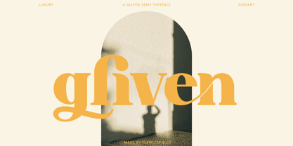 Gliven is a Modern Serif with various alternates and ligatures, an updated blend of bohemian style. An Original typeface that suitable for any graphic designs such as branding materials, t-shirt, print, business cards, logo, poster, t-shirt, photography, quotes .etc This font support for some multilingual. Handcrafted Script that contains uppercase A-Z and lowercase a-z, alternate character, numbers 0-9, and some punctuation. If you need help, just write me! Thanks so much for checking out my shop!
 - Kaapeli by Suomi,
$20.00 I've had mixed feelings about Kabel; It is a brilliant headline font with a lot of character, but it's the characters I have problems with. The versions of all big foundries have the same flaws (in my opinion), especially lowecase a and s. So I finally went ahead and made an all new version. It is not Kabel, but very much like it. It has unique x-height, weight and width, and many individual characters are also different from the original.
 - Broca by Flawlessandco,
$9.00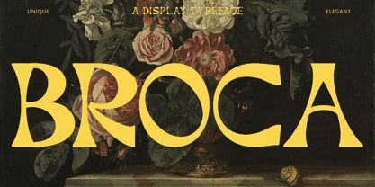 Broca is a Modern Retrotype with various connected letters, an updated blend of bohemian style. An Original typeface that suitable for any graphic designs such as branding materials, t-shirt, print, business cards, logo, poster, t-shirt, photography, quotes .etc This font support for some multilingual. Display Typeface that contains uppercase A-Z and lowercase a-z, alternate character, numbers 0-9, and some punctuation. If you need help, just write me! Thanks so much for checking out my shop!
 - Cutlass by Hackberry Font Foundry,
$24.95 Cutlass was just for fun. A year ago or so [2009, maybe], someone on typophile showed a scan of the word "Ciruelo". I liked it. Those were the only letters I had and no one ever came up with the name of the original font that I saw. It doesn't matter as I went far afield as I designed, as usual. It's just a swashbuckling bit of fun. OpenType 476 Glyphs from my usual set minus the superior and inferior figures. Enjoy!
 - Magea by Flawlessandco,
$9.00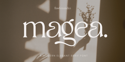 Magea is a Modern Serif Typeface with Elegant vibes in each character with some alternate. An Original typeface that suitable for any graphic designs such as branding materials, t-shirt, print, business cards, logo, poster, t-shirt, photography, quotes .etc This font support for some multilingual. Modern Sweet Retro that contains uppercase A-Z and lowercase a-z, alternate character, numbers 0-9, and some punctuation. If you need help, just write me! Thanks so much for checking out my shop!


