10,000 search results
(0.082 seconds)
- Zentenar Fraktur by RMU,
$25.00 The name of this blackletter font was chosen due to the centennial of the Bauer Foundry, Frankfurt am Mai, in 1937. Ernst Schneidler probably created then the most beautiful of all fraktur fonts. They are the fruit of countless calligraphic drawings and of many years of professional experiences. Zentenar Fraktur became in its time the workhorse among German blackletter fonts. To access all ligatures in both styles, it is recommended to activate Standard and Discretionary Ligatures. The round s can be reached by typing the # key, and the combination N-o-period plus the OT feature Ordinals gives you the Numero sign.
 - Ellograph CF by Connary Fagen,
$35.00 Ellograph® CF is a charming monospaced font family with easy readability and striking cursive italics. A generous x-height and short descenders allow for even, organized lines of text. Beautiful as a coding font and in logos, headlines, and text. With its clean construction and expressive italics, Ellograph® CF stands as a versatile font family on its own. It also pairs well with a wide array of typefaces – contrasting Ellograph with a serif like Artifex CF or Wayfinder CF is effective and beautiful. All typefaces from Connary Fagen include free updates, including new features, and free technical support.
 - Lovely May by VP Creative Shop,
$12.00 Introducing Lovely May - Creative Font duo Lovely May is elegant and organic font duo with multilingual support. It's a very versatile font that works great in large and small sizes. This typeface is perfect for branding projects, home-ware designs, product packaging, magazine headers - or simply as a stylish text overlay to any background image. FEATURES Uppercase, lowercase, numeral, punctuation & Symbol Regular Italic Script Multilingual support No special software is required to type out the standard characters of the Typeface. Canva friendly Feel free to contact me if you have any questions! Mock ups and backgrounds used are not included. Thank you! Enjoy!
 - MN Revolta by Mantra Naga Studio,
$15.00 MN Revolta is an organic hand drawn typeface which has 5 styles, regular, stamp, oblique, oblique stamp and outline. Inspired by the uneven shape of stamp spots, this font is made in a grunge style to make it look more authentic so it looks like it was done manually by hand. There are also extra bonus illustrations to make your design even better. This font is very suitable for people who like vintage aesthetics because it gives a classic, old, vintage feel, and looks like it is handmade. Supporting multilingual as many as 89 languages, this font can be used for all designs.
 - Aronia by Struvictory.art,
$14.00 Aronia is a thin line uppercase font with floral motives. The typeface includes a Decorative and a Symbol version. To get an elegant and unique design, combine letters with elements. The font is easy to use in various design programs or without any program. Aronia is suitable for feminine business branding, eco-friendly and minimalistic art, social media design. The font works great for craft products branding and packaging (organic cosmetics and food, jewelry, handmade soap ect.) Also use individual letters and symbols to create logos and monograms. Aronia combines well with modern graphics: abstract shapes and line art.
 - Unger Fraktur by RMU,
$25.00 In the wake of the Enlightenment and the French Revolution there was a desire for a clear classical blackletter font without frills. That is why in 1793 the famous printer and editor Johann Friedrich Unger and his partner Johann Christian Gubitz accomplished their own fraktur. Now you will be able to use both regular and bold styles of this highly readable blackletter font. It is recommended to activate both OT features Standard and Discretionary Ligatures to access all ligatures in both these fonts. Typing N-o-period and activating the ordinal feature gives you the numero sign.
 - Quirky by Fine Fonts,
$29.00 The origin of Quirky lay in the Duke Ellington number It don't mean a thing if it ain't got that swing. For some time I had wanted to create a font from expanded stroked lines. I wanted to produce a light-hearted font, but with some classic touches. One day, whilst doodling in Adobe Illustrator, Quirky’s letterforms just appeared on screen as if from nowhere. First I drew the test word ‘hamburgefonts’ and then just kept going, unable to stop. Character after character appeared as if by magic. From the start, Quirky had a life of its own. The letterforms are rather more sophisticated than merely outlined stroked lines. Subtle adjustments to compensate for optical effects have been been incorporated. For example, horizontal stems have thicknesses slightly less than vertical stems and where stems join together, the thickening effect has been reduced by cutting into the joint. Being almost monoline, Quirky works well reversed out of a solid background and for TV credits. The Quirky fonts are fun fonts, so set, laugh and enjoy! I hope Quirky will give you as much pleasure in using it as I got in creating it! Shortly after the roman version was born, an italic version and then a thin version were created to form a family of three fonts.
 - Odradeck by Harvester Type,
$20.00 Odradeck is a typeface that originated from the idea of creating a tall, but narrow font, while combining brutalism and technogenic. The difficulty was not to go to extremes and make the font moderately neutral in order to significantly increase the range of font applications. Odradeck came out with a strict, industrial, geometric, but moderately neutral semi-mono font with two axes of variability: height and slant. To all this, + 300 glyphs were added and, as a result, support for +80 languages. The structure of the font allows you to use it in a limited space, and its flexibility will allow you to fill and use this space to the maximum. You can apply it in a very wide range of designs. Whether it's a logo, packaging, banner, title, text, poster, merchandising, identity, branding or product design. Language support: Afrikaans, Albanian, Asu, Basque, Bemba, Bena, Breton, Catalan, Chiga, Colognian, Cornish, Croatian, Danish, Dutch, Embu, English, Esperanto, Estonian, Faroese, Filipino, Finnish, French, Friulian, Galician, Ganda, German, Gusii, Icelandic, Inari Sami, Indonesian, Irish, Italian, Jola-Fonyi, Kabuverdianu, Kalenjin, Kamba, Kikuyu, Kinyarwanda, Lower Sorbian, Luo, Luxembourgish, Luyia, Machame, Makhuwa-Meetto, Makonde, Malagasy, Manx, Meru, Morisyen, North Ndebele, Norwegian Bokmål, Norwegian Nynorsk, Nyankole, Oromo, Portuguese, Quechua, Romansh, Rombo, Rundi, Rwa, Samburu, Sango, Sangu, Scottish Gaelic, Sena, Serbian, Shambala, Shona, Soga, Somali, Spanish, Swahili, Swedish, Swiss German, Taita, Teso, Uzbek (Latin), Volapük, Vunjo, Walser, Zulu.
 - Sgt Peppers by K-Type,
$20.00 SGT PEPPERS LONELY HEARTS CLUB is a typeface inspired by the capital letters on the bass drum in the Beatles' Sgt Pepper album cover. The original lettering was hand painted by fairground artist Joe Ephgrave during March 1967 in an art deco style he called 'futuristic'. The font completes the uppercase, adds a lowercase, and includes a full complement of over 400 characters. SGT PEPPERS OUTLINE and SGT PEPPERS OUTLINE FILL are two fonts with matching spacing and kerning that can be overlapped for creating bicolor/multicolor effects and faux drums. The Outline and Outline Fill fonts do not contain lowercase characters, instead they comprise two weights of outline capitals as painted on the Sgt Pepper drum. The uppercase letters are in the wider style from around the outer edge of the drum, and the lowercase keys deliver the more condensed 'Lonely Hearts' inline style from the middle of the drum. The uppercase Y has been flipped to produce a more conventionally acceptable character with the thicker diagonal arm on the left. However, Joe Ephgrave's reverse Y (with inline) is included in the Outline fonts at the Section keystroke § (Alt-0167 on Windows). A simplified vector image (mono) of the bass drum without lettering is also included within the Outline fonts at the PlusMinus keystroke ± (Alt-0177 on Windows).
 - Directa Serif Variable by Outras Fontes,
$170.00 Directa Serif Variable is a text type family in one single font file. It explores new possibilities for the original type family released by Outras Fontes some years earlier, which is designed to save space with the highest readability. The variable font is composed of two axes of variation: Weight (100–900) and Italic (0–1). It also contains 18 predefined styles between Thin and Heavy and their respective italics. So now you can adjust the weight of the type by interpolating it in real time using any variable font compatible app. There are hundreds of possibilities between the values of 100 (Thin) and 900 (Heavy). And if you're feeling adventurous, you can also use the Italic axis to interpolate instances between Roman (0) and Italic (1) and see what happens in the middle. This new technology can be very useful for web and video animations. Directa Serif Variable is also highly recommended for newspapers, magazines, corporate communication and so on. It has a large set of characters, including Western, Central European, Baltic, Scandinavian, Icelandic, Romanian and Turkish unicode ranges. The variable font also includes several ligatures, a complete set of small caps, sets of lining, old style and tabular figures, as well as fractions, superior and inferior numbers. These features can be easily accessed using any OpenType-compatible software.
 - Frutiger by Linotype,
$42.99 In 1968, Adrian Frutiger was commissioned to develop a sign and directional system for the new Charles de Gaulle Airport in Paris. Though everyone thought he would want to use his successful Univers font family, Frutiger decided instead to make a new sans serif typeface that would be suitable for the specific legibility requirements of airport signage: easy recognition from the distances and angles of driving and walking. The resulting font was in accord with the modern architecture of the airport. In 1976, he expanded and completed the family for D. Stempel AG in conjunction with Linotype, and it was named Frutiger. The Frutiger™ family is neither strictly geometric nor humanistic in construction; its forms are designed so that each individual character is quickly and easily recognized. Such distinctness makes it good for signage and display work. Although it was originally intended for the large scale of an airport, the full family has a warmth and subtlety that have, in recent years, made it popular for the smaller scale of body text in magazines and booklets. The family has 14 weights and 14 companion fonts with Central European characters and accents. Another 14 Cyrillic companion fonts are available as well. See also the new revised version Frutiger Next from the Linotype Platinum Collection. Featured in: Best Fonts for Logos
 - Jackalope LP by LetterPerfect,
$39.00 Jackalope is a new original script font from LetterPerfect Fonts. The design is a hybrid of pressure-pen calligraphy infused with whimsy and curlicue terminals. Letterforms are free-spirited and edges are rough, simulating spontaneous writing on rough paper. In addition to the full ANSI western character set, Jackalope includes a full set of small capitals, both lining and old-style numbers, and swash lowercase alternate characters that can be used as terminal letters at the ends of words for additional flourish. The genesis and realization of Jackalope was also a hybrid process. In 1996, LetterPerfect commissioned type designer Kathy Schinhofen to provide pen-written source material based on her commercial handwriting style and specifically on a logo she had designed for its "Viva la Fonts" line of script fonts. This work was digitized by LetterPerfect’s Garrett Boge and later fonticized by former Hallmark Cards type maven Myron McVay who unified the design and contributed additional characters. The design sat unfinished for over 12 years until Garrett Boge revived the project in 2010 filling out the extended character set. Jackalope is released in two versions: Jackalope LP Regular, which is the base font for continuous text setting; and Jackalope LP Expert, which includes swash variants, small capitals, and old-style numerals which can be swapped into text for extra flourish and effect.
 - Mundo Sans by Monotype,
$50.99 Mundo Sans, by Carl Crossgrove for the Monotype Studio, is distinctive, approachable – and ready to tackle jobs both big and small. Its open counters and large x-height, which give the design a straight-forward no-nonsense mien, are softened by inviting calligraphic undertones. With 10 weights and a complementary suite of cursive italics, there is little outside the range of the Mundo Sans family. The light weights are elegant in packaging and brochure design, the medium are easy readers in digital blogs and print periodicals and the bold command attention in banners and headlines. Mundo Sans is at home in a wide range of sizes, and comfortable in everything from wayfinding to mobile apps. Mundo Sans takes on complicated branding projects with efficient grace. The family enables companies and products to express their brand seamlessly in websites, advertising, corporate messaging, packaging – virtually everywhere visible engagement is possible. A large international character set, that includes support for most Central European and many Eastern European languages, ensures ease of localization. Mundo Sans was originally released with seven weights. The family was updated with three new roman weights and their italics in 2019 that extend and diversify its range of use: a fine hairline weight, a book weight, slightly lighter than regular, and a demi that is subtly lighter than the medium. The design is also is a good mixer. It easily pairs with everything from refined Didones to stalwart slab serif designs. And if you need a more harmonious palette, look no further than Mundo Sans’ relative, Mundo Serif. The two designs harmonize with each other perfectly in weight, typographic color and proportion. Mundo Sans’ italics are true cursive designs, with fluid strokes and obvious calligraphic overtones. The flick of the down-stroke in the ‘a,’ the descending stroke of the ‘f’ and baseline curve of the ‘z’ add grace to the design and distinguish it from more mechanistic styles. Mundo Sans is a design with deep roots. It was originally drawn to pair with classic Renaissance book typefaces like Bembo® and ITC Galliard®. With a hint of diagonal stroke contrast and gentle flaring of strokes, Mundo Sans complements these designs with warmth and grace. Crossgrove says that Mundo isn’t meant to be showy or distinctive. It is intended to follow the tradition of sans serif designs that have a wide range of uses, enabling comfortable reading and clear expression. Crossgrove has designed a variety of typefaces ranging from the futuristic and organic Biome™ to the text designs of Monotype’s elegant Walbaum™ revival. His work for Monotype also often takes Crossgrove into the realm of custom fronts for branding and non-Latin scripts.
 - Myna by Milatype,
$15.00 Myna is a modern geometric sans font family, primarily designed to be a lightweight web font. But is also suitable for any other purpose, such as brand design or editorial design, or any other use case that require clean and elegant geometric sans font. It contains 54 styles, divided into Condensed, Regular and Expanded weight, with 18 styles in each (9 upright, and 9 italic styles), ranging from Thin to Black styles, and are all available in one variable font. All styles are manually TrueType hinted to produce sharp glyph outlines for easier reading at small text sizes. And all contain OpenType features: Fractions, Kerning, Ordinals, Scientific Inferiors, Subscript, Superscript.
 - Milk and Balls by Alit Design,
$12.00 Introducing Milk and Balls Serif font family. This character that seems rigid and decisive is perfect for bold and formal design concepts. The unique shape of the letter makes the design made different from the others. Milk and Balls font is very suitable for header text, body text, and the contents of paragraphs because there are 11 family fonts from Thin to Heavy, in addition there is also an italic version. So Milk and Balls are very complete and suitable to be a collection of fonts that can be used at any time. Don't worry about Multilingual, because Milk and Ball’s are supported by multilingual.
 - Antu by Eurotypo,
$34.00 Antu is a handwriting font, it looks like a real lettering with great visual impact. Take advantage of being able to choose an organic, flexible font with its connection alternatives that makes your text flow natural and better. Antu font includes Open Type features, containing 452 glyphs, a full complement of international characters, standard and contextual alternatives, stylistic sets, and ligatures. All of this makes the text lively and animated, without the monotony of obviously repeating letterforms. Antu font is the perfect choice for titles, logos, posters, packaging, invitations, greeting cards, magazine and book covers, children's items, fashion, and wherever you want! I hope you enjoy it!
 - Zierfraktur by RMU,
$35.00 This highly stylish, engraved blackletter font was cut by Rudolf Koch between 1919 and 1921 for Klingspor in Offenbach on Main. It was then sold under the name Deutsche Zierschrift. I completely redraw and extended this font and called it Zierfraktur. To take full advantage of this fine headline blackletter font, please use it from, at least, 18 points upward. This font contains a bunch of useful ligatures, and it is recommended to activate both Standard and Discretionary Ligatures. The round s can be reached by typing the # key, and you get the numero sign by typing the combination N-o-period and activating the OT feature Ordinals.
 - Guacheva by Ilhamtaro,
$14.00 GUACHEVA is a serif-based font that looks more vintage and slightly feminine, with long hooks and curved elements that make it look a little more flexible and less rigid. It will be very suitable for art and elegant themed designs. This font is an all caps font with a height difference between its Uppercase and Lowercase. So even though it's a little feminine, it still looks sturdy and thick, because this font has bold characteristics too. To enable the OpenType Stylistic alternates, you need a program that supports OpenType features such as Adobe Illustrator CS, Adobe Indesign & CorelDraw X6-X7. Guides to access all alternates glyphs : http://adobe.ly/1m1fn4Y Cheers!
 - Gardena Quanto by UICreative,
$23.00 Introducing our new product the name is Gardena Quanto Serif Display Font Family comes with 9 different weights. Modern Serif font that feels beautiful classy, elegant, and modern. This font is perfectly suited for a wide variety of projects, such as signature, stationery, logo, wedding, typography quotes, magazine or book cover, website header, clothing, branding, packaging design, and more. Also for fashion-related branding or editorial design and displays both masculine and feminine qualities. Gardena Quanto Serif Display Font Family is a general-purpose, utilitarian design incorporating an abundance of OpenType features: small caps, ordinals, numerous figure options plus a few bonus goodies. Supports 66 languages using extended Latin character sets.
 - Walkie Valkyrie by UICreative,
$23.00 Introducing our new product the name is Walkie Valkyrie Serif Font Family comes with 9 different weights. Modern Serif font that feels beautiful classy, elegant, and modern. This font is perfectly suited for a wide variety of projects, such as signature, stationery, logo, wedding, typography quotes, magazine or book cover, website header, clothing, branding, packaging design, and more. Also for fashion-related branding or editorial design and displays both masculine and feminine qualities. Walkie Valkyrie Serif Font Family is a general-purpose, utilitarian design incorporating an abundance of OpenType features: small caps, ordinals, numerous figure options plus a few bonus goodies. Mackinac supports 66 languages using extended Latin character sets.
 - Arbor Brush by GroupType,
$29.00 Arbor Brush is a fresh and lively brush script from the FontHaus design studio. The design is organic, strong, painterly, and anything but tentative. Great for advertising, menus, signage, or display.
 - Goelt by Baqoos,
$18.00 Goelt is a rigidity contrast linear sans apt for headline, editorial, branding, packaging, printed materials and typographic applications. 150+ glyphs with ligatures and fractions provided in opentype .otf and .woff format.
 - Coffee Beans Time by TypoGraphicDesign,
$9.00 The typeface Coffee Beans Time is designed from 2018–2022 for the font foundry Typo Graphic Design by Manuel Viergutz and Annelena Grascht as a graphic design and photography project. The display font based on the original coffee beans and create a dingbat pattern. 3 font-styles (Dingbats, Mix, Coffee Ground) with 304 glyphs (Adobe Latin 2) incl. decorative extras like icons, arrows, dingbats, emojis, symbols, geometric shapes (type the word #LOVE for ♥︎ or #SMILE for ☺ as OpenType-Feature dlig) and stylistic alternates (2 stylistic sets). For use in logos, magazines, posters, advertisement plus as webfont for decorative headlines. The font works best for display size. Have fun with this font & use the DEMO-FONT (with reduced glyph-set) FOR FREE! ■ Font Name: Coffee Beans Time ■ Font Styles: 3 (Dingbats, Mix, Ground) + DEMO (with reduced glyph-set) ■ Font Category: Display for headline size ■ Glyph Set: 304 glyphs (Adobe Latin 2) incl. extras like icons (decorative extras like arrows, dingbats, emojis, symbols) ■ 93 languages: Afrikaans Albanian Asu Basque Bemba Bena Breton Catalan Chiga Cornish Danish Dutch English Estonian Faroese Filipino Finnish French Friulian Galician German Gusii Indonesian Irish Italian Kabuverdianu Kalenjin Kinyarwanda Luo Luxembourgish Luyia Machame Makhuwa-Meetto Makonde Malagasy Manx Morisyen North Ndebele Norwegian Bokmål Norwegian Nynorsk Nyankole Oromo Portuguese Quechua Romansh Rombo Rundi Rwa Samburu Sango Sangu Scottish Gaelic Sena Shambala Shona Soga Somali Spanish Swahili Swedish Swiss German Taita Teso Uzbek (Latin) Volapük Vunjo Welsh Western Frisian Zulu ■ Design Date: 2018–2022 ■ Type Designer: Manuel Viergutz und Annelena Grascht
 - Biblia Serif by Hackberry Font Foundry,
$24.95 This all started with a love for Minister. This is a font designed by Carl Albert Fahrenwaldt in 1929. In the specimen booklet there’s a scan from Linotype’s page many years ago. They no longer carry the font. I’ve gone quite a ways from the original. It was dark and a bit heavy. But I loved the look and the readability. This came to a head when I started my first book on all-digital printing written from 1994-1995, and published early in 1996. I needed fonts to show the typography I was talking about. At that point oldstyle figures, true small caps, and discretionary ligatures were rare. More than that text fonts for book design had lining OR oldstyle figures, lowercase OR small caps—never both. So, I designed the Diaconia family using the Greek word for minister. It was fairly rough. I knew very little. I later redesigned and updated Diaconia into Bergsland Pro—released in 2004. It was still rough (though I impressed myself). Now, with 4-font Biblia Serif family 13 years later, I’ve cleaned up, made the fonts more consistent internally, added more functional OpenType features, and brought the fonts into the 21st century. I used the 2017 set of features: small caps, small cap figures, oldstyle figures, fractions, lining figures, ligatures and discretionary ligatures. These are fonts designed for book production and work well for text or heads. Finally, in 2021, I went over the fonts entirely and remade them in Glyphs.
 - Crispy Magenta by Bogstav,
$17.00 Sweet crispy and crunchy lines, clear and obvious handmade letters! What's not to like?! If you need an organic and dynamic input to your product, Crispy Magenta could be the game changer
 - Bellatrice Natural by IbraCreative,
$17.00 Bellatrice Natural is a captivating natural signature font that effortlessly combines elegance with a touch of organic charm. Its fluid strokes emulate the graceful movements of handwritten script, lending a personalized and authentic feel to any design. The gentle curves and slightly irregular lines of Bellatrice evoke the warmth and individuality of a handcrafted signature, making it an ideal choice for projects that seek a distinctive and human touch. The font’s natural flow and intricate details create a harmonious balance, resulting in a timeless and sophisticated signature style that can elevate a variety of creative endeavors, from invitations and branding to personal correspondence. Bellatrice is a testament to the artistry of a well-crafted signature font, capturing the essence of natural handwriting with grace and finesse.
 - Danielle BF by Bomparte's Fonts,
$40.00 When I first saw the scrapbook pages of Danielle Paradis, I was immediately struck by the funky-cool distinction of her handwriting style. I was inspired and felt moved to ask her for samples, from which to build a complete font. This warm and friendly font is applicable to a wide variety of uses. Use it wherever a casual cool look is desired. It's right at home on trendy restaurant menus, children's publications, organic food labels, correspondence and of course, scrapbooks, to suggest a few. A number of stylistic alternates are included.
 - Hello Kartina by madjack.font,
$14.00 Hello Kartina Script is a beautiful, organic, and fun hand-painted script with different basics and handkerchiefs that can be applied at the beginning and end of all lowercase letters. International support for most Western languages is included. For separate font swash, type lowercase a-z for initial swash and final swash. This font can be used for various purposes. Such as titles, signatures, , wedding invitations, t-shirts, letterhead, signage, labels, news, posters, badges etc. Thank you very much for searching and letting me know if you have questions.
 - Black Wagoon by Letterhend,
$16.00 Black Wagoon is organic display font with unique and fun looks. This font is also suitable to be applied especially in logo, and the other various formal forms such as invitations, labels, logos, magazines, books, greeting / wedding cards, packaging, fashion, make up, stationery, novels, labels or any type of advertising purpose. Features : regular and stamped version numbers and punctuation multilingual & ligatures PUA encoded We highly recommend using a program that supports OpenType features and Glyphs panels like many of Adobe apps and Corel Draw, so you can see and access all Glyph variations.
 - Bonsai Paufo by Intellecta Design,
$18.90 Bonsai Paufo are a collection of dingbats fonts inspired in the ancient art of Bonsai. A beautiful work with organic forms and sensibility with the taste of the vegetal world, by Chyrllene K, who brings you with an amazing extra gift: Buying the family pack (two fonts) you get a special free bonus: the Victorian Advertising EPS PACK 2 with ten beautiful artworks (in eps) inspired in the Victorian ages magazine advertisings (see the banners). See all the glyphs from BonsaiPaufo in the pdf brochures at the gallery section.
 - Linotype BioPlasm by Linotype,
$29.99Linotype BioPlasm is a display face created by Italian design Mauro Carichini in 2002. It distorts and deletes parts of letters, creating the appearance of a living, typographic organism in pages of text. Lines set in Linotype BioPlasm seems bubble to the surface, and always hints at some sort of unrevealed secret. Although only parts of most letterforms are visible, the high x-heights of Linotype BioPlasm's letters make its text surprisingly legible for such a concept-font. For usage in products ranging from Sonic to Science, Linotype BioPlasm may be the font for you! - Hand It by PintassilgoPrints,
$24.00 Carefully messy, sweetly odd, this friendly family conveys a cool - but warm - organic feel. With mixed letterforms and somewhat unexpected choices here and there, each font brings a handful of alternates for a nice natural look: there are five alternates for letters, three for numbers plus alternates for punctuation marks. All cleverly programmed into Contextual Alternates feature to instantly cycle at your command. This is not an usual font. Is that one just strange enough to nicely fit a wide range of designs, carrying your idea with plenty of personality. Quite cool. Hand it!
 - PGF Strange by PeGGO Fonts,
$36.00 Multilayer Roman font with 8 levels, inspired on ’70-80s, it wears sharp edges and compact proportions, with a way fresh contemporary retro volumetric style, ideal for branding & packaging, logotype, headlines, covers, sign letters, label, ticket design, and even 3D lettering. It contains a variety of design resources like stylistic alternates, sensitive case adaptations, old-style numbers, fractions, ordinals, ligatures, localized forms, all of them are accessible via character set panel. Design period: 2019 & 2021. Release: 2021 Graphic interpretation: Pedro González Concept: Bruno Jara Development: Peggo Fonts Foundry.
 - Verlyana by Gatype,
$12.00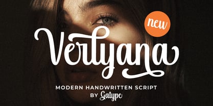 Verlyana is an organic, handwritten font suitable for branding, signatures, wedding invitations, promotions, product packaging, and other needs. This font is modern, simple, but still authentic. You'll get a full set of lowercase and uppercase letters, numbers and punctuation, multilingual symbols, initial and final lowercase swashes, binders, and extra swashes. Verlyana features OpenType style alternatives, International binders and support for most Western Languages included. To enable the OpenType Stylistic alternative, you need a program that supports OpenType features such as Adobe Illustrator CS, Adobe Indesign & CorelDraw X6-X7, Microsoft Word 2010 or a later version.
 - Getlost by Alcode,
$18.00 Getlost is an organic signature font inspired by natural brush typography. Written in rapid motion using a slightly dry brush pen. This will give you a fresh and elegant design. Getlost comes with uppercase and lowercase letters, large sets and small sets, numbers, alternative styles for several lowercase characters are also available that make your text and design more attractive. Try Getlost, enjoy the richness of OpenType features and let her fun and elegant excitement make you happy and enhance your creativity! You can use this font very easily. Included multilingual support and special ligatures
 - Decart by Par Défaut,
$9.00 Decart is retro display font inspired by "Art Deco" style with more than 1100 characters, covering many languages using latin and cyrillic alphabet. The font also has 15 OpenType features : (All access Alternative (aalt) - Contextual Alternates (calt) - Fraction (frac) - Numerator (numr) - Denominator (dnom) - Superior (sups) - Inferior (sinf) - Tabular Figure (tnum) - Old Style (onum) - Ordinals (ordn) - Small Capital (smcp) - Small Capital From Capital (c2sc) - Case Sensitive Forms (case) - Stylistic Set (ss01 - ss02 - ss03) and Kerning (kern). Decart has, in addition, circled letters (basic latin & cyrillic), figures, fraction and arrows.
 - Kimberlie Display by Attract Studio,
$23.00 Kimberlie is a luxurious display serif font with unique character by combining geometric shapes with organic curvy details. It is a unique typeface for your individual personality. Inspired by old-style serif and contemporary serif fonts. The extreme contrast between thick and thin strokes gives a harmonic and stylish look. Elegant and sensuality didone serif enhanced by ligatures, alternates and swashes. Kimberlie features OpenType with 1025+ glyphs, 210 Stylistic Alternates, 486 Ligatures. Perfect for a wide range of uses. From greeting cards to magazines, wedding invitations, logos to website etc.
 - Riverside Forest by Letterhend,
$14.00 Introducing, Riverside Forest is a hand drawn display font with organic looks. This font perfectly made to be applied especially in logo, and the other various formal forms such as invitations, labels, logos, magazines, books, greeting / wedding cards, packaging, fashion, make up, stationery, novels, labels or any type of advertising purpose. Features : Uppercase & lowercase Numbers and punctuation Alternates & Ligatures Multilingual PUA encoded We highly recommend using a program that supports OpenType features and Glyphs panels like many of Adobe apps and Corel Draw, so you can see and access all Glyph variations.
 - Dusk Till Dawn by Comicraft,
$19.00 The Vampires have risen from their graves! Innocent young virgins (also goats, sheep, sheep dogs, cows and other sundry farmyard animals) may not see out the night. DUSK TILL DAWN has been exhumed, lightly dusted in dry earth and exsanguinated for your convenience. Bury your tombstones in Gothic Chic with a font that may very well be worth dying for. We cannot guarantee you will come back to life however. We waited to unleash this font until the midnight hour, so grab your wooden stakes, silver bullets, crossbows, slingshots and any supernatural weaponry you may have at hand. Garlic capsules and Holy Bibles are also recommended!
 - Custer by Font Bureau,
$40.00 In 2009, a book from 1897 in the library of the University of Wisconsin caught David Berlow’s attention. It was set in a clear text face—a predecessor of Bookman—cast by the Western Type Foundry who called it Custer. Upon noting how well the typeface worked in sizes of 6 and 7 points, Berlow developed it into a member of the Reading Edge series specifically designed for small text on screen. Custer RE was a broad and approachable typeface drawn large on the body with a tall x-height to maximize its apparent size when set very small. This was the beginning of the newly expanded series; in 2020, Berlow added new optical sizes and weights, growing the original design’s versatility up to headline sizes.