10,000 search results
(0.055 seconds)
- Chorneil Script by Letterhend,
$17.00 Chorneil Script is a casual script with organic style. This type of font perfectly made to be applied especially in logo, and the other various formal forms such as invitations, labels, logos, magazines, books, greeting / wedding cards, packaging, fashion, make up, stationery, novels, labels or any type of advertising purpose. Features : Uppercase & lowercase Numbers and punctuation Alternates & Ligatures Multilingual PUA encoded
 - Samuel by Gian Studio,
$12.00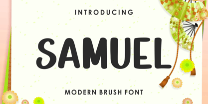 INTRODUCING Samuel is modern brush font, stylish and organic. can be used for stationery, fashion, logo, merchandise, books, clothing, magazines, cover artwork etc. Syaquita includes several ligatures, alternates and international support for most western languages. Thanks so much for looking, I really hope you enjoy it and please don't hesitate to drop me a message if you have any issues or queries :)
 - Zenaida by Hanken Design Co.,
$30.00 Zenaida is a distinctive display serif font adorned with stylized serifs, evoking a floral essence. Its graceful, flowing ligatures and stylistic alternates add an organic touch to text. Featuring a range of styles including Regular, Medium, Bold, ExtraBold, and an additional semibold weight, Zenaida offers versatility across various design applications, providing a diverse set of options to infuse character and distinction into projects.
 - II Balfron by Increments,
$19.00 Inspired by Ernö Goldfinger's east London tower block of the same name, II Balfron is an imposing, all caps, one-weight typeface. Brutalist in form, the characters embody the principles of the distinctive 27-storey concrete profile with unexpected angles set within a rigid, structural grid. Much like Goldfinger's humanist, utopian housing ideals, the font is best viewed at large scale.
 - Breathney by MJB Letters,
$19.00 Breathney a beautiful, natural handwritten font that exudes charm. With its soft, curved lines, it captures the uniqueness of human handwriting, adding a personal touch to graphic designs. Ideal for feminine, friendly projects like wedding invites, logos, and posters, Breathney brings warmth and authenticity. Enhance your designs with its gentle, organic aesthetic, conveying a heartfelt message. File Included : Ligature PUA Encoded Multilanguage Support
 - Koara by Rosario Nocera,
$14.99 Koara is a handmade font family inspired by nature. It's composed of two versions, (rough and wild) and available in the weights, light, regular and bold, with an alternative capital K, linear lowercase and capital numbers. It's recommended for large titrations, small paragraphs, typographic compositions and logotype, Koara shines on several backgrounds like leafs, jungle, nature images and even organic food.
 - Versina by Latinotype,
$39.00 Versina is a display typeface with a unique and expressive yet moderate personality resulted from its organic elegant shapes which are inspired by Spanish transitional typefaces from the 18th century. This font is perfectly suitable for both titles and short text. Versina features a flowing organic stroke and asymmetric bracketed serifs, and its shapes convey rhythm and dynamism. The font has a large x-height and its ascenders are shorter than the cap height, making it look more slender and modern. Calligraphic and crescent-like terminals give the design great formal richness. Versina comes in 5 weights with matching italics plus a set of ornaments, in Regular and Black styles, and also includes old style/lining/tabular figures, fractions, superscripts and subscripts as well as a set of small caps, standard ligatures, historical ligatures, symbols and frames. Versina contains a set of 694 characters that support over 200 Latin-based languages.
 - Verao by insigne,
$24.99 Remember clear summer days as a kid? Remember open fields that you explored? Sun shining? Simple breezes sweeping past your face as you ran far and free? The feeling was uncomplicated and enjoyable. It was natural. That’s Verao, the simple spirit of summer. Alive and vibrant, Verao takes a turn away from the cold structure of today’s rigid creations and embraces the movement back to the value of things handmade. This artisan creation represents the rare, soul-invested fusion of the craftsman’s tools, materials, and hand movements, which shapes the solid--but beautifully defined--parts, pieces that, when put together, breathe a measure of life into everyday paragraphs and other bodies of text. Verao’s hand-written brush script, with its characters’ imperfect elegance and handmade quality, keeps your work looking organic. Write a word in more than a hundred different ways thanks to the large number of extra letters it offers. Two sets of lowercase alternative letters without connectors are included as is a set of swashed endings. Verao contains stylistic substitutions and ligatures, too, that you can combine however you like. Whichever way you design, the elements continue to appear balanced and separate and will undoubtedly add more personality to your design. So stop switching out cogs in your rigid set of fonts. Take time again to play with a natural face that’s both easy and energetic. Verao’s great temperament makes it a joy to design with. Let this spirit of summer take you away from the mundane. There’s a good chance Verao will lead you where you need to go. Production assistance from Lucas Azevedo.
 - Faktum by René Bieder,
$39.00 Faktum is an exploration into the geometric sans genre, inspired by Mid-century modern architecture and interior design. Especially the combination of clear lines, organic curves and geometric shapes, highly popular among designers and architects of the second third of the 20th century, gave the impetus for a design with clear modernist roots and a strong contemporary finish. The family comes in 8 weights plus matching italics, featuring a wide range of alternate characters and opentype features like discretionary ligatures, case sensitive shapes, different number sets and many more. Due to its clean lines and slightly organic structure, Faktum functions great in many sizes and surroundings, working either as a restrained supporting font in long paragraphs, or as a main actor in powerful headlines.
 - Daisy Perfume by Balpirick,
$15.00 Introducing by Balpirick Studio. Daisy Perfume is a Modern Calligraphy Font that's perfect for adding a personal touch to your design projects! With its natural, organic feel and unique character. Crafted with care and attention to detail, this font is incredibly versatile and can be used for a range of design projects, including logos, branding, invitations, and more. Its modern, handwritten style gives it a unique character that's sure to make an impact. - also multilingual support Enjoy the font! Feel free to comment or feedback! Thank you!
 - Let's Go Green by Atom,
$15.00 Let's Go Green is a natural, organic, casual, uneven touch font! Made naturally using brush strokes with ink on paper, giving a very unique and distinctive impression. It is ideal for logos, quotes, print media, product packaging, merchandise, advertising, social media and your design projects. Let's Go Green comes as a single font that is packed with OpenType Features. It contains the complete set of lowercase & uppercase letters, various punctuation marks, numbers, and multilingual and ligature support. Thanks for using this font! Happy Design :)
 - Kolega by Just My Type,
$25.00 Maybe I should have named this font “Communist Block”. But it also works well for Colonial-style tavern signs. It’s square, geometric and rigid, and is the perfect thing for totalitarian themes. The family consists of three fonts: Kolega (“Comrade” in Polish), Kolega Tall, and Kolega Podrobska (Fake Comrade). Kolega and Kolega Tall are fully charactered with U.S., European, Greek and Cyrillic glyphs. The latter font is meant to use in English only; although it contains many accents and character variations, they mean nothing. It’s a joke.
 - Option by Vladimir Likh,
$10.00 Option is a modern condensed sans serif. Inspired by geometric architectural fonts. But despite the geometric construction every single letter was build based on optical evaluation. This approach makes Option more organic and lively in a text line. Option was created for wide spaces. Condensed and thin, but extremely sweeping vertically font makes your massage elegance and strong. The font functions great in many sizes and surroundings. The family comes in one weights plus italics. Creating of bold weight is underway. Options supports Cyrillic as well.
 - Signature Creek by Balpirick,
$14.00 Signature Creek is a Modern Handbrushed Script Font that's perfect for adding a personal touch to your design projects! With its natural, organic feel and unique character. Crafted with care and attention to detail, this font is incredibly versatile and can be used for a range of design projects, including logos, branding, invitations, and more. Its modern, handwritten style gives it a unique character that's sure to make an impact. - also multilingual support Enjoy the font! Feel free to comment or feedback! Thank you!
 - Hillary Kimber by Balpirick,
$15.00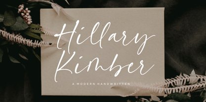 Introducing by Balpirick Studio. Hillary Kimber is a Modern Handwritten Font that's perfect for adding a personal touch to your design projects! With its natural, organic feel and unique character. Crafted with care and attention to detail, this font is incredibly versatile and can be used for a range of design projects, including logos, branding, invitations, and more. Its modern, handwritten style gives it a unique character that's sure to make an impact. - also multilingual support Enjoy the font! Feel free to comment or feedback! Thank you!
 - Whitestar by Balpirick,
$15.00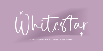 Whitastar is a Modern handwritten typeface that's perfect for adding a touch to your design projects! With its natural, organic feel and unique character. Crafted with care and attention to detail, this font is incredibly versatile and can be used for a range of design projects, including logos, branding, invitations, and more. Its modern, handwritten style gives it a unique character that's sure to make an impact. This font includes - also multilingual support - Ligatures Enjoy the font! Feel free to comment or feedback! Thank you!
 - Children Friends by Nirmana Visual,
$19.00 Introducing our playful and whimsical handwritten children font, perfect for bringing joy and imagination to any design project. Our font is the perfect choice for creating fun and engaging designs for children's books, educational materials, and playful branding projects. With its charming and quirky handwritten style, our font captures the innocence and creativity of childhood, inspiring imagination and wonder. The organic curves and playful details create a sense of spontaneity and fun, making it perfect for designs that need to capture a child's attention.
 - Hillary Austine by Balpirick,
$15.00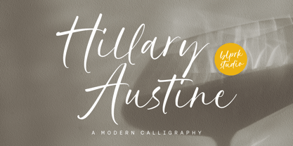 Introducing by Balpirick Studio. Hillary Austine is a Modern Calligraphy Font that's perfect for adding a personal touch to your design projects! With its natural, organic feel and unique character. Crafted with care and attention to detail, this font is incredibly versatile and can be used for a range of design projects, including logos, branding, invitations, and more. Its modern, handwritten style gives it a unique character that's sure to make an impact. - also multilingual support Enjoy the font! Feel free to comment or feedback! Thank you!
 - Honey Secrets by Balpirick,
$15.00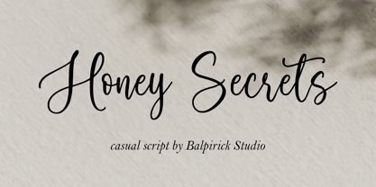 Introducing by Balpirick Studio. Honey Secrets is a Casual Script Font that's perfect for adding a personal touch to your design projects! With its natural, organic feel and unique character. Crafted with care and attention to detail, this font is incredibly versatile and can be used for a range of design projects, including logos, branding, invitations, and more. Its modern, handwritten style gives it a unique character that's sure to make an impact. - also multilingual support Enjoy the font! Feel free to comment or feedback! Thank you!
 - Vintage Paradise by Balpirick,
$15.00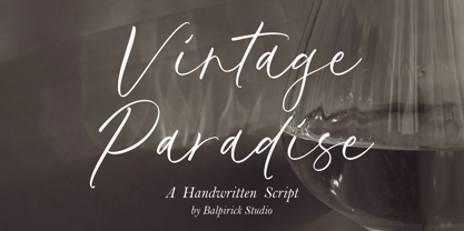 Introducing by Balpirick Studio. Vintage Paradise is a Handwritten Script Font that's perfect for adding a personal touch to your design projects! With its natural, organic feel and unique character. Crafted with care and attention to detail, this font is incredibly versatile and can be used for a range of design projects, including logos, branding, invitations, and more. Its modern, handwritten style gives it a unique character that's sure to make an impact. - also multilingual support Enjoy the font! Feel free to comment or feedback! Thank you!
 - Royale Kingdom by Balpirick,
$15.00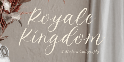 Introducing by Balpirick Studio. Royale Kingdom is a Modern Calligraphy Font that's perfect for adding a touch to your design projects! With its natural, organic feel and unique character. Crafted with care and attention to detail, this font is incredibly versatile and can be used for a range of design projects, including logos, branding, invitations, and more. Its modern, handwritten style gives it a unique character that's sure to make an impact. - also multilingual support Enjoy the font! Feel free to comment or feedback! Thank you!
 - Salvador History by Balpirick,
$15.00 Introducing by Balpirick Studio. Salvador History is a Handbrushed Script Font that's perfect for adding touch to your design projects! With its natural, organic feel and unique character. Crafted with care and attention to detail, this font is incredibly versatile and can be used for a range of design projects, including logos, branding, invitations, and more. Its modern, handwritten style gives it a unique character that's sure to make an impact. - also multilingual support Enjoy the font! Feel free to comment or feedback! Thank you!
 - Arinar by Hackberry Font Foundry,
$24.95 Arinar is a well modulated, rounded, humanist sans serif font family based on Brinar. A distant ancestor the basic letterforms is Minister (a Dutch bible font of the 19th century) through my first font, Diaconia. There are many OpenType features with over 600 characters: Caps, lower case, small caps, ligatures, discretionary ligatures, swashes, small cap figures, old style figures, numerators, denominators, accent characters (including CE), ordinal numbers (1st-infinity: lining and oldstyle), and so on. It is designed for text use in body copy.
 - Easy Does It by Bogstav,
$15.00 I started making this font with a few days left at work before my 4 weeks vacation. I managed to finish the font on the day my vacation started - but with no stress. Now I can look forward to 4 good weeks at the summerhouse, and look back at the release of this laid back, handmade and somewhat quirky font. Personally I’d use it for anything that needs an organic handmade look - perhaps packaging, posters, flyers or maybe even clothes or toys for kids!
 - P22 Morris by P22 Type Foundry,
$24.95 William Morris (1834-1896) was probably the most influential figure in the decorative arts and private press movements of the late 19th and early 20th century. In reaction to the increasing lack of quality that the industrial revolution brought on, Morris sought a return to the ideals of the medieval craftsman. Dissatisfied with the commercially available typefaces of the day, he undertook the design of the fonts for his books himself. The P22 Morris font set features new versions of Morris's famous type designs for his Kelmscott Press. The two main fonts include full international character sets for Western European languages. P22 created MORRIS GOLDEN with a rough edge to simulate the look of printing on handmade paper. There is a more "refined" recent version of Golden, but its sterile digitization does not approach the effect that Morris achieved in his Kelmscott books. You'll notice the handmade effect less in the smaller sizes but will find it quite decorative in the larger sizes. (Morris cut his Golden type in only one size for the Kelmscott Press, approximately equal to 14 points.) P22's version of MORRIS TROY is more smooth than Morris Golden and is true to the original Morris design. It is based on the Kelmscott Troy type (an 18 point font) and its smaller counterpart, the Chaucer type (a 12 point font). American Type Founders made an unauthorized version of Troy, "Satanick," 189?, contrary to Morris's wish that it not be made available commercially.(Legend has it that the naming of Satanick comes from William Morris telling the agent inquiring about making copies of his fonts available to go to hell) Several digital versions of Troy (and Satanick) have appeared over the years. The P22 version offers a much more accurate rendering than any previous version. Morris designed the original Troy font to be spaced very tightly; our version reflects and honors his intention. The MORRIS ORNAMENTS are based on those Morris designed and used in his Kelmscott Press books. Characters in the positions of the letters A to Z are decorative drop cap initials. Characters in the number key positions reproduce other Morris embellishments. (See the accompanying key chart.) As with all headline fonts and complex dingbats characters, this font is best used at larger point sizes (e.g., 48, 72, 120). Use in body text or at small point sizes on-screen may not achieve desired results. P22 is grateful to William S. Peterson, Steven O. Saxe and the Lightsey-Offutt Library who gave invaluable research assistance to this project.
 - Commando, a font by defaulterror, bursts onto the scene like a hero in a 1980s action film—muscles bulging, ready to take on any design challenge with boldness and a touch of bravado. Imagine each le...
- Rustic TC by Tom Chalky,
$19.00 Proudly introducing Volume Rustic, where hand-craftsmanship meets professional design. Each of these meticulously handcrafted fonts were thoughtfully designed to harmoniously complement one another, oozing the essence of authenticity, warmth, and the human touch. These fonts are tailor-made for projects that celebrate the organic, the handmade, the local, and everything that puts people at the center. Compatible & Multilingual The fonts are in the OpenType font format. OpenType fonts are accepted within the vast majority of design software (including mobile and tablet design apps). Multilingual support is also included for Basic Latin, Western European, Euro & Pan African Latin.
 - ITC Bolthole by ITC,
$29.99I fell in love at the age of twelve in Wales, recalls Bernard Philpot. "My father brought me to a small graveyard in the Welsh hills to show me two headstones carved by the great Eric Gill. I instantly fell in love with the beauty of the carving and the perfection of the letterforms. I still go back to marvel at these works of art." However, the ITC Bolthole™ design, Philpot's first commercial typographic endeavor, is quite unlike the works of Eric Gill that first captured his heart. Bolthole is a craggy sans serif with a definite grumpy attitude. It's not terribly legible, and, if more than a few words are set in the design, it's not very readable. To round out its cranky personality, Bolthole does not like to be set in small sizes. Like Cheez Whiz® and bullfights, you either love or hate this typeface. But whichever emotion dominates, there is no denying that Bolthole has a personality to be reckoned with - one with ample magnetism to ensure reader attraction. If used to set brief blocks of display copy, the typeface makes a powerful statement. Bolthole was originally designed to complement a whimsical ad for the Royal Society for the Prevention of Cruelty to Animals. As Philpot recalls, "although the ad didn't win any awards, the type attracted some very positive comments for its original look and feel." Philpot studied graphic design and typography at the London School of Printing, and soon after graduation found himself working in a large advertising agency in London. According to Philpot, "After designing type for everything from packaging to ads, I thought it time to convert one of my designs into a complete font - and Bolthole was born." ITC Bolthole could very well be the Shrek™ of typeface design - which might not be such a bad thing." - Diesel Rudolf by Ingo,
$82.00 Write like the inventor of the diesel engine — it’s possible with the Diesel Rudolf Script (patterned after the original handwriting of Rudolf Diesel)... In 2008 the city of Augsburg and the MAN Group celebrated the 150th birthday of Rudolf Diesel, inventor of the diesel engine which was named after him. With the help of a few preserved original letters, it was possible to create a convincing digital version of Rudolf Diesel’s personal handwriting. The engineer and inventor Rudolf Diesel was born in Paris in 1858 and also went to school there. In1870 his family moved to England and Rudolf was sent to relatives in Augsburg where he continued going to school. Later, after completing his studies in Munich, he began working as an engineer in the machine factory Linde. Alone this part of his life makes clear why Rudolf Diesel’s handwriting was so ”jerky,“ hesitant and inconsistent. He learned to write according to the French style, that is, Latin cursive — completely different from the very correct and neat German handwriting taught at that time which he had to learn at 13 years of age. These circumstances explain why his handwriting is ”messy“ (especially for those days) with its mixtures of letter forms within a text, even within individual words. Plus, he obviously did not attach much importance to ”pretty writing.“ Sometimes the characters are wide, then narrow, sometimes large and clear and then again crammed and primitive. The individuality is emphasized with characteristics derived from quill and ink. The diversified images of the font Diesel Rudolf Script make more than 80 ligatures and stylistic alternates possible which can be selected with help from the OpenType functions Ligatures and Discretional Ligatures.
 - DT Skiart Serif Mini by Dragon Tongue Foundry,
$9.00 ‘Skiart Serif Mini’ is now available online. Originally inspired by the san serif font ‘Skia’ by Mathew Carter for Apple. ‘Skiart’ was designed to feel more like a serifed font, but without any serifs. It took a step between sans serif and serif fonts. Next on the path towards a serif font comes Skiart Serif Mini, with tiny serifs added. This is a true serif font, all be it on the small side. It remains fully readable and feels as clean and normal as any of the best body copy serifs, and yet still has the strong solid bones of all the other Skiart font familys. If compared to one of the more commonly used serifs like ‘Times New Roman’, the ‘Skiart Serif Mini’ lowercase is more open with a taller x-height, increasing its readability and friendliness. The serifs are smaller and less distracting. They are not pretending to be ligatures. Where ‘Times’ makes its p q b d forms out of a barely touching oval and stem, the ‘Serif Mini’ forms are much more firmly attached, appearing clearly as single letters. The standard setting for the g’s are round single storied, (the italic a’s are also), feeling warmer and more inviting in the ‘Serif Mini’ font. Much more friendly than the stuffy double storied versions in fonts such as ‘Times’ etc.
 - SlabFace 2010 - 100% free

- MGN Debris by Morgana Studio,
$17.50 This design is characterized by its futuristic and modern aesthetic. The clean lines and minimalist approach create a sleek and sophisticated look, while the unique touches and use of the MGN Debris font give it a bold and edgy vibe. It is a perfect example of how a modern design can also be unique and innovative, with elements that set it apart from traditional designs. This style is perfect for businesses and organizations that want to convey a sense of innovation and cutting-edge technology. The MGN Debris font used in this design adds to its modern and futuristic feel. The font is bold and sharp, with a unique style that makes it stand out. It complements the overall design perfectly and adds to the edgy and unique vibe. This font is perfect for businesses and organizations that want to convey a sense of innovation and forward-thinking, and it pairs well with modern designs. Overall, this design is a great example of how a modern and futuristic style can be unique and captivating, with the use of the MGN Debris font adding an extra element of boldness and edge.
 - Larisch by HiH,
$8.00 Larisch is a hand-lettered design by the Austrian calligrapher and teacher, Rudolf von Larisch. The original was used for the title page of the 1903 edition of Beispiele Kunstlerischer Schrift (Examples of Artistic Writing). Larisch is an attractive, casual set of caps of even strokes with rounded terminals. Except for the terminals, it is similar in style to Kunstler Grotesk. The numerals are lining or ranging figures, meaning they line up with the baseline, unlike old-style text figures. All are of equal width for setting up columns of numbers. The letters are well formed and easy to read, as you would expect from a writing master. Ligatures includes CH (123), CK (125), FT (135), LA (137), LO (167), OO (172), CO (177) and TT (181. An alternative O with underscore is provided at position 111. Friendly, but not fancy -- a very useful all-cap font.
 - Hargloves Sans by Heypentype,
$20.00 Hargloves sans remixes between grotesque proportions and 80’ industrial inspired-typefaces. Yes, it is a major improvement from original Hargloves fonts with completely different projections. Hargloves Sans intended primarily for text, editorial or long-form text. This new design emphasized on reader joy experience when reading text without losing typeface characters. Hargloves Sans support almost all Latin script language, roughly around 356 latin language according to hyperglot analytics. This language coverage is heypentype priority to serve all possible Latin script language all over the world. The premise is simple, because it is text typeface it should cover all Latin script languages whether its popular language or not. Hargloves Sans have a higher x-height compared to Hargloves. Higher x-height will give a seamless, undistracted reading. The open counter on nearly squared proportions is Hargloves Sans main character. There’s a lot of feature coming for this typeface in the future.
 - Museum Ornaments by T4 Foundry,
$7.00Museum Borders and Ornaments is part of a typographical treasure, the Norstedts type collection in Sweden. Type designer Torbjörn Olsson has painstakingly translated the original 34 Ornament matrices in the collection to Open Type. Among them are several of Granjon's arabesques, as well as symbols from both Swedish and Danish typefoundries. The signs were cut in the 16th, 17th and 18th centuries. The old Swedish name for these "type trademarks" were "rössjor". Museum Borders and Ornaments is an OpenType creation, for both PC and Mac. Swedish type foundry T4 premiere new fonts every month. Museum Borders and Ornaments is our tenth introduction. Museum Borders and Ornaments is part of the growing Museum type family. Museum also includes Museum Tertia Cursive, an exquisite 1700's typeface with modern additions, and Museum Fournier, a set of Rococo capitals designed by Pierre Simon Fournier le Jeune circa 1760. - Blooming Meadow by ParaType,
$25.00A set of original ornamental symbols was designed by Viktor Kharyk and licensed to ParaType in 2007. The name was inspired by the famous book “Champ Fleury” by Geoffroy Tory (1529) but the theme of blooming meadow was embodied much more literally. Each ornamental motive has a real prototype in flora. Mainly there are plants raising on Ukrainian wooded steppe. Plants were chosen for their Ukrainian and Latin names begin of proper letters from Ukrainian and Latin alphabets. The font is consisted of two styles: Day for normal and Night for reversed that reminds night lighting by its unexpected distribution of black and white areas. Fleurons may be used for creation of ornamental surfaces, composed borders and corners, decoration of any materials, and even as botanical illustrations. Blooming Meadow Day have been adjudged Award of Excellence in Type Design at TypeArt’05 international type design contest - Snuggels by Ingrimayne Type,
$9.95 Snuggles began as a set of hexagons and hour-glass shapes that fit together. Letters were formed from these shapes with effort made to preserve as much as possible the original outlines. The result is two sets of letters that by themselves are awkward and misshapen and that only look good when mixed together. The OpenType contextual alternatives (calt) feature automatically alternates the sets in computer programs that support this feature. Snuggles-Lower replaces the letters of Snuggles-Regular with lower-case shapes, but without ascenders or descenders, and the results are jarring. Several of these lower-case shapes (D, N, T, W, and Y) are available as OpenType stylistic-set alternatives in the Snuggels-Regular font. Both Snuggels-Regular and Snuggels-Lower have light versions. Snuggels loves to be noticed so it likes to be large and it considers foolish anyone who would use it as body text.
 - New Kakuji by Edomoji Type,
$15.00 New Kakuji is designed from the Kakuji style of characters originating during the Edo period of Japan. New Kakuji has expanded the historical character set to include the surnames from the ancient Chinese text: Hundred Family Surnames, as well as the most common surnames in Japan, in addition to many other historically and culturally significant words, going well beyond the scope of characters that were used in the Edo period. No other font has expanded the character set of the Kakuji Style to the same extent as New Kakuji. A Latin alphabet expansion inspired by the old Kakuji style has also been included for western audiences and designers. New Kakuji contains over 500 Chinese/Japanese characters along with over 200 additional Latin characters or symbols. The solid and blocky style of New Kakuji is ideal for seal designs or other branding designs and should be used at larger point sizes.
 - Toisy by Letrizmo,
$21.00When the right late seventies / early eighties message is needed, Toisy comes to the rescue. Founded on a mix of references from letterforms of the time, this new original nods to a style that defined an era. A sexy theme font that conveys a clear image of what was truly chic thirty years ago, this alphabet is deeply rooted in sultry memories of soft, endless nights. Exaggerate contrast between strokes and angular lines combine with rounded corners to provide a unique character and a look that sharply differs when set in all caps or lower case, thanks to an uncommon treatment of density and proportions. Set it real tight, as was typographically in fashion circa 1981. Toisy and Toisy Greek include a set of 13 matching images inspired in leisure stuff and the clothing of the last days of disco. They are different from the set included with Toisy Alt. - Wintanceastre by Hanoded,
$25.00 I am a HUGE fan of Bernard Cornwell’s ‘The Saxon Stories’. Ever since a television series has been made, the series of books is also know as ‘The Last Kingdom’. I have read them all, at break-neck speed and I can’t wait for the next book!! Wintanceastre (Winchester) is based on a 10th century Latin manuscript. I have tried to stay close to the original letters, but since Latin does not have all modern glyphs, I found myself designing the missing ones. So, before you scold me for having made a font that is historically inaccurate: it was never meant to be an exact replica, nor would anyone want an exact replica, as it would be useless for modern texts and designs. Wintanceastre comes with a whole bunch of ligatures and alternate glyphs. Use it for any design that needs a little ‘Dark Ages’ look!
