4,342 search results
(0.017 seconds)
- Drawlers by Letterhend,
$14.00 Drawlers is a organic sans with stencil versionthat effortlessly infuses your designs with a touch casual and a dash of classic. Its unique type- maekt it perfect choice for any projects especially in logo, and the other various formal forms such as invitations, labels, logos, magazines, books, greeting / wedding cards, packaging, fashion, make up, stationery, novels, labels or any type of advertising purpose. Features : Regular & Stencil Version Uppercase & lowercase Numbers and punctuation Alternates & Ligatures Multilingual PUA encoded
 - Catalina by Kimmy Design,
$10.00 Earlier this year I visited a bakery in Newport Beach, CA and fell in love with the organic design and typography of the place. Hand-drawn menus, table cards, chalkboards, and wall quotes surrounded the charming spot. It inspired me to create a new font family based on the combination of hand drawn fonts. Included in this package are 5 font families, with 2 graphic ornament fonts. Each font family contains at least a light, medium and bold. Here is a breakdown of what's cookin' at Catalina's Bakery: Catalina Anacapa: Tall and skinny, this font comes in 3 weights for both sans and slab serif styles. It includes contextual alternatives (giving 3 versions of each letter), stylistic alternatives for select letters (A, K, P, Q, R, Y) and also includes Small Caps. Catalina Avalon: Based off Anacapa, this sub family has a high contrasting line weight. It comes in light, regular and bold as well as an inline alternative for both sans and slab serif styles. Avalon also includes opentype features such as contextual alternatives (giving 3 versions of each letter), stylistic alternatives for select letters (A, K, P, Q, R, Y) and small caps for each letter. Catalina Clemente: In a more standard width, Clemente is one of the two sub families that can be used for paragraph text as well as headlines. It's organically geometric in style and comes in ALL CAPS and lowercase, includes upright and custom italics, and has the opentype feature giving 3 versions of each letter. Catalina Script: A great compliment with the display sub-families, Catalina Script rounds out the package with a hand-drawn cursive flair. It includes contextual alternatives (giving 2 variations to each letter) as well as stylistic alternatives for many of the capital and lowercase letters. It has special ligatures for some letter combinations, and titling alternatives for all the capital letters. Catalina Typewriter: The second of the paragraph text sub-families, this typewriter inspired hand-drawn font family works great as either a display or paragraph text. It has contextual alternatives with 3 versions of each letter, and comes in both upright and custom italics versions. Catalina Extras! These two fonts go perfectly with the Catalina Family. They includes borders, frames, arrows, banners, flourishes and more. Catalina Flourish has all of it's options in a light and bold style, to use the light version type all lowercase letters, then to make something bold, used it's uppercase (or shift+) characters. For a breakdown of graphic/letter correlation, see the breakdown PDF. All of Catalina was drawn by the same hand, using the same ink and technique. While they contrast in their type styles, they work together perfectly to create one cohesive font family.
 - FS Dillon by Fontsmith,
$80.00 Bauhaus Geometric, economical, functional... The good, wholesome, modernist values that once fired up the tutors and students of the Bauhaus became the inspiration for FS Dillon after an exploration of the work of the pre-war art and design powerhouse in the Fontsmith studio. The font combines simplicity and directness with a characteristic Fontsmith warmth. Letterforms are compact, with a generous x-height, and built for maximum clarity and impact. The Bauhaus sought beauty through function. FS Dillon achieves it. Made for TV The weights of fonts for TV sometimes have to be adjusted so as not to “blow” on-screen. FS Dillon was originally drawn for the on-screen presentation branding of Film Four, whose primary colour was red. Black type on a red background looks heavier than white, so Dillon needed two weights that would allow white and black type to be used together, looking balanced and equal. Type design is an organic process. Years after developing FS Dillon, we revisited it, redrawing elements and adding italics to maintain consistency. Olympic You don’t get a much higher confirmation of the functional fitness of a typeface than to have it selected to guide visitors around an Olympic complex. FS Dillon was selected as the font for signage at some of the key venues at the London 2012 Olympic Park, helping to get spectators, athletes and officials from all over the world to their seats and starting blocks on time.
 - Garrigue by Nootype,
$45.00 Garrigue is a sans-serif typeface, it's inspired by the typography of German rationalism of mid XXth century, the base version is combining this rationalism with more organic elements, while Garrigue Sharp is simpler, ideal for technical applications. The OpenType functions allows near 700 different combinations of ligatures in Capital letters, which gives to text interesting patterns and a lot of dynamism in 100 different languages, including cyrillic. The family contains different stylistic alternates which gives more flexibility to the typeface. The Garrigue family includes 14 weights, seven styles from Thin to Black in Normal and “Sharp” version. Each font includes OpenType Features such as Discretional Ligatures, Proportional Figures, Tabular Figures, Numerators, Superscripts, Denominators, Scientific Inferiors, Subscript, Ordinals, Standard Ligatures, Stylistic Alternates and Fractions. Larsseit family supports Latin and Cyrillic, all these languages are covered: Latin language support: Afrikaans, Albanian, Asturian, Azeri, Basque, Bosnian, Breton, Bulgarian, Catalan, Cornish, Corsican, Croatian, Czech, Danish, Dutch, English, Esperanto, Estonian, Faroese, Filipino, Finnish, Flemish, French, Frisian, Friulian, Gaelic, Galician, German, Greenlandic, Hungarian, Icelandic, Indonesian, Irish, Italian, Kurdish, Latin, Latvian, Lithuanian, Luxembourgish, Malagasy, Malay, Maltese, Maori, Moldavian, Norwegian, Occitan, Polish, Portuguese, Provençal, Romanian, Romansch, Saami, Samoan, Scots, Scottish, Serbian, Slovak, Slovenian, Spanish, Swahili, Swedish, Tagalog, Turkish, Walloon, Welsh, Wolof Cyrillic language support: Adyghe, Avar, Belarusian, Bulgarian, Buryat, Chechen, Erzya, Ingush, Kabardian, Kalmyk, Karachay-Balkar, Karakalpak, Kazakh, Komi, Kyrgyz, Lak, Macedonian, Moldovan, Mongol, Permyak, Russian, Rusyn, Serbian, Tatar, Tofa, Tuvan, Ukrainian, Uzbek
 - Secret Ring by Ditatype,
$29.00 Secret Ring is a captivating display font that will unravel the mysteries of the unknown in your designs. Designed in uppercase and bold, this typeface commands attention and exudes an aura of secrecy and horror. Each letter is meticulously crafted with details resembling plant roots with sharp edges, adding an eerie and enigmatic touch to the font. With its bold weight and uppercase design, Secret Ring creates a powerful and impactful presence. The root-like details in each letter of this font bring an organic and otherworldly appearance, as if the font draws its power from ancient and malevolent roots. These haunting details add an element of supernatural energy and create an atmosphere of foreboding and suspense. The combination of bold weight and sharp-edged root details gives this font a sinister and enigmatic look, evoking images of hidden rituals and occult symbols. For the best legibility you can use this font in the bigger text sizes. Enjoy the available features here. Features: Alternates Multilingual Supports PUA Encoded Numerals and Punctuations Secret Ring fits in headlines, logos, movie posters, flyers, invitations, branding materials, print media, editorial layouts, headers, and any horror-themed project. Find out more ways to use this font by taking a look at the font preview. Thanks for purchasing our fonts. Hopefully, you have a great time using our font. Feel free to contact us anytime for further information or when you have trouble with the font. Thanks a lot and happy designing.
 - Mobalys by Alit Design,
$19.00 Introducing Mobalys - Where Elegance Meets Nature Embrace the beauty of nature with Mobalys, a captivating font that seamlessly blends the grace of elegant script with the modern simplicity of sans serif. Immerse your designs in the lush greenery of a go-green theme, accompanied by stunning leaf illustrations that breathe life into your creations. Elegance in Every Curve: Mobalys boasts an exquisite script style that adds a touch of sophistication to your projects. Each curve and swirl is carefully crafted to exude elegance. Modern Simplicity: The sans serif elements bring a contemporary flair, ensuring versatility in usage. Whether it's a sleek logo or a clean headline, Mobalys adapts effortlessly. Nature's Embrace: Dive into a world of greenery with Mobalys. The font is adorned with enchanting leaf illustrations, adding a touch of organic charm to your designs. Let the beauty of nature seamlessly integrate into your projects. Extensive Character Set: With 730 characters at your fingertips, Mobalys provides a diverse range of options to express your creativity. Explore a plethora of possibilities with ligatures, alternates, swashes, and more. PUA Unicode: Unleash your design freedom with Mobalys' Private Use Area (PUA) Unicode support. Access additional characters and symbols for a truly customized touch to your work. Elevate your designs with Mobalys, where the synergy of elegance and nature creates a visual masterpiece. Immerse your audience in the refreshing green world and let your creativity flourish. Mobalys is not just a font; it's an experience.
 - Emploi by ParaType,
$30.00 The type family includes two decorative designs that combine features of an italic typefaces and calligraphy. The elegant swashes and curls in upper case letters make the fonts rich and showy. Emploi Ingenue has rather developed decorative elements, and Emploi Travesti is more modest. Both fonts are intended for titles, display typography, especially advertising and for initials.
 - Fine And Dandy JNL by Jeff Levine,
$29.00 Fine and Dandy JNL comes from the hand lettered title of the 1929 movie "Isle of Escape"; found on the sheet music for its theme song "My Kalua Rose". An engraved and fancy Roman, the style combines elements of Western, Art Nouveau and Art Deco into one attractive type design; available in both regular and oblique versions.
 - Paragon by Greater Albion Typefounders,
$12.50 Paragon is a display Roman family of nine faces, combining elements of formality and fun. It embodies a high degree of contrast between near hairline horizontal strokes and bold vertical strokes. The family is offered in three widths and in regular, small capitals and title faces. Use Paragon to lend impact to your next design project.
 - Forwardback LL by Leftover Lasagne,
$25.00 Forwardback is a clean and friendly typeface with a large compliment of European characters. Its round & bouncing letters impart a smooth handwritten feel. The font features auto-ligatures for duplicate letters, plus a hefty set of graphical elements & shapes which can be accessed by convenient keyboard shortcuts (a lowercase letter directly followed by a number from 0-9).
 - Bandiera Del Legno NF by Nick's Fonts,
$10.00 This typeface appeared in the William H. Page Woodtype specimen book as Gothic Tuscan Condensed Reversed—quite a mouthful. Banner elements appear in the brace and bracket positions, and reversed spaces can be found in the underscore and bar positions. Both versions of this font support the Latin 1252, Central European 1250, Turkish 1254 and Baltic 1257 codepages.
 - Dietal Sans by Tour De Force,
$25.00 Dietal Sans is a companion to the Dietal slab serif family. It is a condensed sans serif family that comes in 5 weights. Dietal Sans coquettes with different type categories from sans and slab to calligraphy, western, pixel and display elements. Contains Stylistic Alternates, Ordinals and Tabular Figures as Open Type Features in Extended Latin and Cyrillic character set.
 - Ambriel by Type Innovations,
$39.00 Ambriel is a fancy neoclassic delight—typographic "eye candy" for the senses. Alex Kaczun embelished one of his earlier typefaces, Kaczun Oldstyle Italic, and infused it with many decorative elements including extravagant ball terminals along with many additional whimsical touches throughout. And, what he created is a truly unique display font reminiscent of the ornately decorated Victorian era.
 - MGN Burro by Morgana Studio,
$17.50 MGN Burro by Morgana Studio is a slab serif font offering 7 styles: Thin, Light, Regular, Medium, Semibold, Bold, and Extra Bold. Combining classic and modern elements, it caters to diverse designs, ensuring readability and impact. From delicate Thin to bold Extra Bold, each weight caters to various preferences, making MGN Burro a versatile toolkit for designers.
 - Mimogie by Youngtype,
$14.00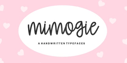 Mimogie - Handwritten Typefaces Contains a complete set of lowercase, uppercase, alternative, ligatures, punctuation marks, numbers and multilingual support. This font is ideal for use in watercolor designs or hand bold styles, such as blog headers, posters, wedding elements, t-shirts, clothing, book covers, business cards, greeting cards, branding, merchandise, invitations and handmade quotes and more. again. again. Thank you :)
 - Mercurius Script by Monotype,
$29.99 Mercurius Script font was designed by the Hungarian wood engraver and type designer Imre Reiner in 1957 for the Monotype Corporation. The expressiveness of this bold script typeface is the result of Reiner's use of a bamboo pen for Mercurius Script's elemental shapes. Used sparingly, Mercurius Script font gives even the dullest headlines genuine spirit and excitement.
 - Urbanhive by Jaetwo Type,
$45.00 Urban Hive : reinterpreting three-dimension to the typeface A blueprint consists of two-dimensional elements changes into a three-dimensional structure. What works would be created by reversing the process? The building components were divided into three parts : Facade, Inside space and Construction materials to apply all the features to the typeface. This is Facade version.
 - Art Magazine JNL by Jeff Levine,
$29.00 A 1920 art magazine from Great Britain entitled “Pan” had its three letter name hand lettered on the cover in a style that had elements of Art Nouveau, Art Deco and what would eventually be called Techno in the 1980s. This inspired the typeface Art Magazine JNL, which is available in both regular and oblique versions.
 - Joyful Magnolia by Youngtype,
$18.00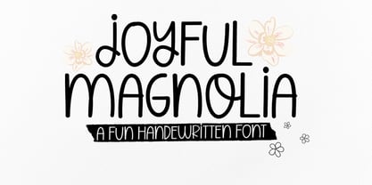 Joyful Magnolia handwritten. Contains a complete set of lowercase, uppercase, alternative, ligatures, punctuation marks, numbers and multilingual support. This font is ideal for use in watercolor designs or monoline styles, such as blog headers, posters, wedding elements, t-shirts, apparel, book covers, business cards, greeting cards, branding, merchandise, invitations and handmade quotes and more. again. Thank You :)
 - Maison by Milieu Grotesque,
$99.00 Maison is a mono-lined grotesque constructed using rigid elements to achieve a minimalist industrial feel in homage to the early twentieth century modernist design concepts.Originally created as a mono-spaced typeface family—with less optical corrections than its successor Maison Neue—Maison has been further developed to work equally in both mono-spaced and proportional alignments.
 - Broken Vows by The Type Fetish,
$10.00Broken Vows was one of two typefaces I created to go along with some fragmented poetry written as I went through a divorce, the second being WHORE. The letterforms contain fragments of familiar script faces that are attempting to hold themselves together. Some of the connecting elements of the letterforms remain and hold the face together. - Gulfs Display by Studio Sun,
$10.00 Gulfs Display Inspired by the 90's playful cartoon & comic books. This playful font comes in six widths; condensed, semi condensed, normal, semi expanded, expanded and extra expanded. This font can be used for modern and vintage designs, also can be easily paired with some graphic elements (Illustration, Photography) this font perfect for, Logotype, Branding, Title, and Packaging.
 - Quincey by AdultHumanMale,
$20.00 Quincey is a display font with the feel of old style signpainter’s works with a hint of hand drawn elements too. It has over 350 glyphs and several variations on the standard alphabet with all those €xtra pesk¥ foreign characters too. Some extra Glyphs in there too. It is available in 2 weights regular and medium.
 - Messy Linocut 2D by 2D Typo,
$24.00 Don't try to find logic in this font, nor the harmony of the forms. It is meant to be crank. All the letters were first cut in linoleum and then digitized. Hence, everything is alive. You will find no uniform elements. We think this font will find its use in the hands of a brave designer.
 - Chocolate Peaches by PeachCreme,
$12.00 Hey guys! So happy to introduce you our new font “Chocolate Peaches”! It is great for projects that have a playful or cute theme, whether for labels, signage, packages, stickers, etc. Along with being legible due to its bold letters, this typeface can make a lovely addition to boho designs that incorporate natural elements, patterns, texture and many colors.
 - Teletex by The Northern Block,
$16.70 A typewriter style slab serif typeface. The design is influenced by the font Rockwell and uses a combination of precise geometry with subtle elliptical curves. The harmony of these elements creates a distinctive and functional typeface suitable for a variety of graphic design applications. Details include 4 weights, a complete character set, manually edited kerning and Euro symbol.
 - Dietal by Tour De Force,
$25.00 Dietal is condensed slab serif family that comes in 5 weights. Dietal coquettes with different type categories from sans and slab to calligraphy, western and display elements. It is available in two versions: with curved and sharp joining. Contains Stylistic Alternates, Ordinals and Tabular Figures as Open Type Features in Extended Latin and Cyrillic character set.
 - Linotype Reducta by Linotype,
$29.99Linotype Reducta is a part of the Take Type Library, selected from contestants of Linotype’s International Digital Type Design Contests of 1994 and 1997. It was designed by Austrian artist Herbert O. Modelhart with only a small number of constant form elements. The cool and technical Linotype Reducta is intended exclusively for headlines in large point sizes. - Heraut by astype,
$35.00The Heraut is a typical art nouveau advertising display typeface. The design is based on the work of Hermann Hoffmann from 1901. OpenType features: over 580 Glyphs Central European Glyphs Small Capitals Contextual Alternates The ornaments typeface uses several common OpenType features to switch easily between the elements. Have a look into the Heraut specimen PDF. - Baloon Everyday by Arterfak Project,
$16.00 Baloon every day is a layered font. Consists of 4 elements that you can combine to get a cute & stylish word. There is Regular, Shadow, Emboss, and Glossy. This font set is bold, fatty, rounded and funny and suitable for kids' themes or entertaining design. Equipped with stylistic alternates and multilingual support. Thank you for watching!
 - Semiramis by Scriptorium,
$18.00Semiramis is based on lettering from the Roycroft movement, but has a Science Fiction/Fantasy feel to it, drawing on elements from antique scripts and the Art Nouveau period to produce a result which is modern and ancient at the same time. There are two different shapes for each character, accessed with the upper and lower case keys. - Aragon Condensed by Canada Type,
$24.95The condensed version of Hans van Maanen's Aragon is a headline star. The elements that made Aragon a popular "Dutch Garamond" text repeat here, with the slight stress shifts and tapering stems optimized for headline use. Aragon Condensed also comes in bold and italic variations. All three fonts contain extended language support, superiors and inferiors, and class-based kerning. - Madsen by Monotype,
$15.99 With chunky, confident letters, Madsen is rough and ready, but with an element of pizzazz. This script was drawn with a wet brush pen and rough paper to create coarse edges and an uneven baseline that showcase its handwritten, charismatic aesthetic. Madsen is a bold script, that has some contrast and a lot of natural charm.
 - Just Boys by j.dsky,
$19.00 Silhouette font designed to be used as a decorative element within layouts and illustrations. Featuring boys and toys in everyday life situations. Inspired by my kids and their friends playing, running, fighting and expressing different emotions. To create this set of 81 glyphs I used photographs that I hand-traced. Picture font recommended for a variety of illustrative purposes.
 - Bromley Hatch by Attract Studio,
$12.00 Bromley Hatch & Extras is a modern scripts with handwriting, decorative characters, and basic dance lines! designed to perfectly combine informal, sassy, romantic, sweet scripts, and hand-drawn design elements allow you to create many beautiful typographic designs in an instant, just in time for branding, logos, web design and editorial, branding, prints , invitations, crafts, quotes, and more.
 - Spectacular Americanos by Youngtype,
$17.00 Spectacular Americanos & Spectacular Americanos Outline is a hand brush font made with brushes and ink. This typeface is ideal for use in thick watercolor designs or handwriting styles, such as blog titles, posters, wedding elements, t-shirts, clothing, book covers, business cards, greeting cards, branding, merchandise etc. Contains full set : Uppercase Lowercase Ligatures Punctuation number multilingual support. Thank you!
 - Rorschach by Kenn Munk,
$15.00How to use The Rorschach dingbat: q,w,e,r,t,y,u,i,o,p create the start of an inkblot a,s,d,f,g,h,j,k,l create a middle, you can use any number of middle-elements z,x,c,v,b,n,m create the ending. Your Rorschach is now finished, get analysing! - Divenire by CAST,
$45.00 Divenire is derived from a custom typeface designed for the Partito Democratico (Italian Democratic Party), it is used in their political communication. It has variation of tension in its design, alternating curved and almost straight elements. The glyphlist includes many alternatives like a set of odd punctuation marks: the famous "interrobang" and others, starting from Hervé Bazin's work.
 - Haenel Antiqua by RMU,
$30.00 This narrow neoclassical revival is based upon a font released by the Haenel Foundry, Berlin, in the 19th century. By typing [alt] + p respectively [alt] + b you have access to a framing element as it can be seen on the posters. By using the OT feature stylistic alternative you can change the normal numbersign into an oldstyle numero sign.
 - Xpress by Wiescher Design,
$12.00 »XPress« is a very distinct, expressive, typical new Sans. »XPress« is my new Sans-Serif that impresses – especially in small sizes – with its outstanding readability. Seven precisely calibrated weights from »Thin« to »Heavy« and its corresponding italics make this font-family universally usable. »XPress« got its bearings from the fabulous American »Gothic« fonts of the twenties of last century. Modern, present day elements, high lowercase letters and infinitesimal elegant slight curves in start- and end strokes make the font family not only great for body copy, but also very useful in advertising. »XPress« ist eine individuelle, expressive, typische neue Sans. »XPress« ist meine neue Serifenlose die – speziell in kleinen Schriftgraden – durch aussergewöhnliche Lesbarkeit auffällt. Sieben präzise aufeinander abgestimmte Schnitte von »Thin« bis »Heavy« und dazu passende Kursive machen die Schriftfamilie vielseitig einsatzfähig. »XPress« orientiert sich bewusst an den grossen amerikanischen Groteskschriften der zwanziger Jahre des letzten Jahrhunderts. Durch moderne Formelemente, große Mittellängen und unendlich leichte, elegante An- und Abstriche ist die Schrift jedoch nicht nur als Textschrift, sondern auch im gesamten Bereich der Werbung vielseitig einsetzbar.