10,000 search results
(0.015 seconds)
- S Water Jump by Supfonts,
$10.00 Water Jump will be perfect for wedding lettering, beautiful frame for your home, book covers, greeting cards, logos, marketing, magazines or anything that requires cute handwritten lettering :) What's inside: Multilingual support Cricut support If you have any questions, please contact me directly or in instagram @superdizigner
 - Wallflowers II by Laura Worthington,
$19.00 Create borders, wallpaper, or repeating patterns using Wallflower II’s unique hand drawn wallpaper tiles and accompanying icons. Wallflowers II are easy to use for borders or wallpaper: simply type the same letter consecutively (i.e., aaa) and the pattern will emerge. See what’s included! http://bit.ly/2bGXbnC
 - Ricardo Montero by Supfonts,
$12.00 Ricardo Montero will be perfect for wedding lettering, beautiful frame for your home, book covers, greeting cards, logos, marketing, magazines or anything that requires cute handwritten lettering :) What's inside: Multilingual support Cricut support If you have any questions, please contact me directly or in instagram @superdizigner
 - Opera by Stereo Type Haus,
$10.00 Characterized by its quirky counter spaces, Opera is named after the font’s letter “O”, resembling the open mouth of an opera singer. The 3 weights plus italics can be used individually or together for a variety of applications including magazine body texts or a striking headline.
 - M Kai 2 HK by Monotype HK,
$523.99 M Kai 2 HK is a handwritten style Traditional Chinese typeface. Handwritten font designs are derived directly from hand-drawn lettering or handwriting using analogue tools. Handwritten style Traditional Chinese fonts can include typefaces that reference or reinterpret traditional calligraphy, using classical exemplars by calligraphic masters.
 - HippityDippity by Ingrimayne Type,
$9.00 HippityDippity is a whimsical typeface with big, sloppy serifs and no straight lines or smooth circles. It comes in two weights and an inline variation. HippityDippity Inline Middle and HippityDippity Inline Inside are designed to be layered with HippityDippity Inline to produce bicolored or tricolored letters.
 - Fontazia Mazzo by Deniart Systems,
$15.00 Fontazia Mazzo features a unique assortment of floral bouquets in abstract vases. A modern addition to any interior design layout or for any project where flowers say just the right thing! Like other type, these dingbats can easily be integrated into any text document or graphic program.
 - Tomoli by PizzaDude.dk,
$20.00Tomoli is short for "things of more or less importance". In this dingbat font you'll find 52 stylized drawings of animals, food and lots of different stuff - that is of more or less importance! :) Furthermore, the drawings are made of remarkbly steady lines! - Go have a look! - Winter Wallflowers by Laura Worthington,
$19.00 Create borders, wallpaper, or repeating patterns using 25 unique hand drawn wallpaper tiles and accompanying icons. Winter Wallflowers are very easy to use for borders or wallpaper: simply type the same letter consecutively (i.e., aaa) and the pattern will emerge. See what’s included! http://bit.ly/2bO1mIE
 - M Kai 2 PRC by Monotype HK,
$523.99 M Kai 2 PRC is a handwritten style Simplified Chinese typeface. Handwritten font designs are derived directly from hand-drawn lettering or handwriting using analogue tools. Handwritten style Simplified Chinese fonts can include typefaces that reference or reinterpret traditional calligraphy, using classical exemplars by calligraphic masters.
 - Magic Clause by Balpirick,
$15.00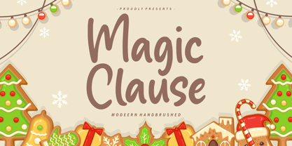 Magic Clause is a Modern Handbrushed Font. Magic Clause is a cute and friendly handwritten font. Get creative with its childlike playfulness, and use it to Magic Clause also multilingual support. Enjoy the font, feel free to comment or feedback, send me PM or email. Thank you!
 - Brotusse by Forberas Club,
$16.00 Hi this is Brotusse our new handwritten font, maybe this playful font theme can suits your upcoming event, party, or your personal project. This font is free for personal use, If you need an extended license or corporate license you can contact me at gasforberas@gmail.com.
 - Shaker Script by Fenotype,
$19.00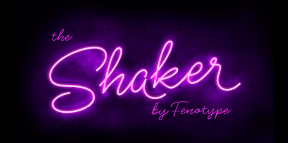 Shaker is a neon style monoline Script. Shaker has Swash Alternates for every uppercarse and lowercase standard character and it’s equipped with Contextual Alternates that keep the flow and connections smooth. Shaker is great for headlines, packaging, neon sign or as a logotype or any display use.
 - MHeiSung HKS by Monotype HK,
$523.99 M Hei Sung PRC is a monolinear style Simplified Chinese typeface. Monolinear font designs have little or no thick-thin contrast in the strokes, and modest design characteristics at entry, finial and transitional points of the strokes. The Monolinear category includes Hei (or Gothic) and Yuen typefaces.
 - Pretty Letters by Supfonts,
$14.00 Pretty Letters will be perfect for wedding lettering, beautiful frame for your home, book covers, greeting cards, logos, marketing, magazines or anything that requires cute handwritten lettering :) What's inside: Multilingual support Cricut support If you have any questions, please contact me directly or in instagram @superdizigner
 - Vallecito by Matteson Typographics,
$19.99 Vallecito or “Little Valley” is an Aldine woodtype design popular in the 19th century for posters and headlines. Vallecito’s multitude of weights and widths allows for impactful typography in signage, posters, menus and logos. Vallecito’s exaggerated, reversed stress shapes may be used in traditional or impressionistic typography.
 - Panoramic by Supfonts,
$9.00 Panoramic will be perfect for wedding lettering, beautiful frame for your home, book covers, greeting cards, logos, marketing, magazines or anything that requires cute handwritten lettering :) What's inside: Panoramic Script Multilingual support Cricut support If you have any questions, please contact me directly or in instagram @superdizigner
 - PR Scrolls 05 by PR Fonts,
$10.05 Inspired by food labels, signs and coats of arms, PR Scrolls is a collection of images which can be used for framing text in contexts where antiquity, craftsmanship, or traditional quality are conveyed. Most of the glyphs are presented in a range of four or more widths.
 - Halloween Day by Goodigital13,
$20.00 These font can be used in web design and apps as well as in booklet, posters, or any other printed matter. Halloween, is a display spooky feel font. It’s suitable for dark and Halloween theme. Such as a Poster, Logotype, Social Media Promotion, Merchandise or Crafter.
 - Calligramy by IbeyDesign,
$16.00 Calligramy Calligraphy Script Font is a unique stylish calligraphy font. It’s perfect for adding a personal charm to your photography, watermarks, social media posts, advertisements, logos & branding, invitations, product designs, labels, stationery, wedding designs, product packaging, special events, or anything that need calligraphy or handwriting taste.
 - Paula Fluiton by Raditya Type,
$12.00 Paula Fluiton is a font in an elegant signature style. This typeface is suitable when used for writing a brand name, as a logo or naming a product. When used for an invitation or greeting card, it will make the greeting you write more beautiful and luxurious.
 - Peach Comix_PersonalUseOnly - Personal use only

- Shelter_PersonalUseOnly - Personal use only

- Stright Brush by MJB Letters,
$17.00 The Introducing ‘Stright Brush‘ is a thick brush font with a natural texture, this font is suitable to use as a logotype, product designs, label, watermark, social media posts, apparel, invitation, signboard, sports club, special events, or anything that need handwriting taste. I highly recommend using a program that supports OpenType features and Glyphs panels such as Adobe Illustrator, Adobe Photoshop CC, Adobe InDesign, or CorelDraw, so you can see and access all Glyph variations. This font is encoded with Unicode PUA, which allows full access to all additional characters without having special design software. Mac users can use Font Book, and Windows users can use Character Map to view and copy one of the extra characters to paste into your favorite text editor/application. We hope you enjoy the font, please feel free to comment if you have any thoughts or feedback. Or simply send me a PM or email me. Thanks for purchasing and have fun!
 - Brexit by Cafe.no,
$48.00 Brexit now has its own typeface. Brexit the type family is made for being slanted one way or another, to offer stylistic choices and expressions, like for or against, or remain or leave. Because Brexit is international, the letters are made to support many languages. The name is given to mark the British withdrawal from the European union. Brexit is an elongated display typeface in three styles. It is a sans serif with contrasts in stroke and shape. Brexit supports languages with latin characters and ligatures as well as Greek and Cyrillic. The italic and contra italic are extremes that can be used to contrast each other or versus a standing regular. Sometimes complex concepts are best communicated in single words, and the typeface Brexit is made for that and more. The typeface works well for clear messages, shop displays, poster work, menus, signage and other purposes where you want to have impact.
 - Enjoy by Andinistas,
$26.00 Enjoy is a font family designed by CFCG. Its 5 fonts work in groups or independently. When used to complement illustrations or spontaneous projects requiring organic fonts, in Enjoy you will find expressive attributes reflected in uppercase, lowercase and numbers written with brush and fluid ink. Its strategies were carefully written providing greater handcrafted realism in its bonds and alternatives to create with eloquent letters at the beginning, middle or end of the word without losing order and readability. Enjoy contains many special textures to maximize its typographical benefits activating opentype buttons. Enjoy contains an authentic worn texture reflected in a variety of alternate characters and ligatures. Due to its maximum and coordinated cursive logic, captivates the interest in graphic design or advertising for cafeterias, sales of plants, bakeries, etc. When complement illustrations or spontaneous projects requiring organic fonts, with Enjoy you will find expressive attributes reflected in uppercase, lowercase and numbers written with brush and fluid ink.
 - Rough Sketch by Java Pep,
$13.00 Introducing Rough Sketch fonts duo. This font has character like the name "rough" but yet elegant. Rough Sketch is suitable use for stand out and contradiction themes. This font also elegant for logo, web titles, poster, quote, book or magazine cover, poster and more. Benefit of Rough Sketch Packages Perfect collaboration of Rough Sketch and Roug Duo. You can get two fonts that always well-suited to collaborate in your design or project so this font complete each other. Multilingual Support and ligature set. This font is already for multilingual support for Italian, French, Spain, Danish, Czech, Portuguese, Hungarian, Irish, English, Finnish, Norwegian, Polish etc or contact me if you need to add your language. Ligatures is two or more of letters are joined as a single font like or, sr, pr, and etc. I hope you enjoy using Rough Sketch - fonts duo, if you have anything question about this font please let me know with your comments. Thanks for reading and have a nice day:)
 - Hello Monday by Fenotype,
$25.00 Hello Monday is a bold and wide vintage style serif font with a friendly charm and a reminiscence of a warm nostalgic feeling. Hello Monday is a great typeface for contemporary graphic design with that certain feeling of familiarity. It works well on logos, packaging, restaurant graphics, or any display use, as well as in headlines or shorter texts. Try Hello Monday with reduced tracking for tighter word images, or if you want to use it in really small sizes add some tracking. Hello Monday is equipped with Contextual, Swash, Stylistic and Titling alternates as well as Discretionary Ligatures and even more extra alternates. All these features can be accessed by OpenType controls or straight from Character or Glyphs window. Swash Alternates are the most exaggerating ones while Stylistic Alternates do smaller changes. In addition Hello Monday has 15 ornaments that can be accessed from 0-9 and punctuation by clicking on Titling Alternates.
 - Oratoria MF by Masterfont,
$59.00 Great family for all uses, text for advertising or packaging - you choose.
 - Balora MF by Masterfont,
$59.00 Nostalgic and elegant solution for any outstanding poster or banner. You choose..
 - Fligerish by PizzaDude.dk,
$20.00Fligerish is a true romantic font, without being too fancy or swirly. - Jane Playful by Forberas Club,
$16.00 Jane Playful is special handwritten type for playful moment or cute moment.
 - 112 Hours by Device,
$9.00 Rian Hughes’ 15th collection of fonts, “112 Hours”, is entirely dedicated to numbers. Culled from a myriad of sources – clock faces, tickets, watches house numbers – it is an eclectic and wide-ranging set. Each font contains only numerals and related punctuation – no letters. A new book has been designed by Hughes to show the collection, and includes sample settings, complete character sets, source material and an introduction. This is available print-to-order on Blurb in paperback and hardback: http://www.blurb.com/b/5539073-112-hours-hardback http://www.blurb.com/b/5539045-112-hours-paperback From the introduction: The idea for this, the fifteenth Device Fonts collection, began when I came across an online auction site dedicated to antique clocks. I was mesmerized by the inventive and bizarre numerals on their faces. Shorn of the need to extend the internal logic of a typeface through the entire alphabet, the designers of these treasures were free to explore interesting forms and shapes that would otherwise be denied them. Given this horological starting point, I decided to produce 12 fonts, each featuring just the numbers from 1 to 12 and, where appropriate, a small set of supporting characters — in most cases, the international currency symbols, a colon, full stop, hyphen, slash and the number sign. 10, 11 and 12 I opted to place in the capital A, B and C slots. Each font is shown in its entirety here. I soon passed 12, so the next logical finish line was 24. Like a typographic Jack Bauer, I soon passed that too -— the more I researched, the more I came across interesting and unique examples that insisted on digitization, or that inspired me to explore some new design direction. The sources broadened to include tickets, numbering machines, ecclesiastical brass plates and more. Though not derived from clock faces, I opted to keep the 1-12 conceit for consistency, which allowed me to design what are effectively numerical ligatures. I finally concluded one hundred fonts over my original estimate at 112. Even though it’s not strictly divisible by 12, the number has a certain symmetry, I reasoned, and was as good a place as any to round off the project. An overview reveals a broad range that nonetheless fall into several loose categories. There are fairly faithful revivals, only diverging from their source material to even out inconsistencies and regularize weighting or shape to make them more functional in a modern context; designs taken directly from the source material, preserving all the inky grit and character of the original; designs that are loosely based on a couple of numbers from the source material but diverge dramatically for reasons of improved aesthetics or mere whim; and entirely new designs with no historical precedent. As projects like this evolve (and, to be frank, get out of hand), they can take you in directions and to places you didn’t envisage when you first set out. Along the way, I corresponded with experts in railway livery, and now know about the history of cab side and smokebox plates; I travelled to the Musée de l’imprimerie in Nantes, France, to examine their numbering machines; I photographed house numbers in Paris, Florence, Venice, Amsterdam and here in the UK; I delved into my collection of tickets, passes and printed ephemera; I visited the Science Museum in London, the Royal Signals Museum in Dorset, and the Museum of London to source early adding machines, war-time telegraphs and post-war ration books. I photographed watches at Worthing Museum, weighing scales large enough to stand on in a Brick Lane pub, and digital station clocks at Baker Street tube station. I went to the London Under-ground archive at Acton Depot, where you can see all manner of vintage enamel signs and woodblock type; I photographed grocer’s stalls in East End street markets; I dug out old clocks I recalled from childhood at my parents’ place, examined old manual typewriters and cash tills, and crouched down with a torch to look at my electricity meter. I found out that Jane Fonda kicked a policeman, and unusually for someone with a lifelong aversion to sport, picked up some horse-racing jargon. I share some of that research here. In many cases I have not been slavish about staying close to the source material if I didn’t think it warranted it, so a close comparison will reveal differences. These changes could be made for aesthetic reasons, functional reasons (the originals didn’t need to be set in any combination, for example), or just reasons of personal taste. Where reference for the additional characters were not available — which was always the case with fonts derived from clock faces — I have endeavored to design them in a sympathetic style. I may even extend some of these to the full alphabet in the future. If I do, these number-only fonts could be considered as experimental design exercises: forays into form to probe interesting new graphic possibilities.
 - Aramis - Unknown license

- EG Dragon Caps - 100% free

- Storyville by Canada Type,
$29.95 This is the redrawn and expanded version of an alphabet Rebecca Alaccari made back in 2009 as a bespoke font for a tourism agency looking to recapture the appeal of New Orleans after the hurricane Katrina disaster robbed it of its core industries. The brief back then was to "revive the unique spirit of what always made Nola great for new adults, which is the excellent combination of history, romance, food and music." No word of a lie, the brief actually contained "new adults." Storyville contains two interchangeable sets of forms drawn in the doodly, loose and organic way now conspicuously popular with today's young designers, almost every one of whom thinks they will get to design something for a boutique coffee bar somewhere. Well, this whole thing perhaps means freedom, youth, fun, happiness, good stuff like that. But just in case, a little caution doesn't hurt: Use this font only if you know what you're doing. We don't want to go back to the 1990s. Please. We were nearly done for by that exposure the first time around. The ligatures feature in this font does some pseudo-randomization, so the forms in doubled letters don't repeat. Serious fun can be had by also applying the stylistic alternates feature, or picking a letter in the middle of a setting and disabling the ligatures feature. Or various sequences of all that. If you don't like any of that stuff, just forget about it. Uh, wutever.
 - Gilgongo Kaps - Unknown license

- Gilgongo Tiki - Unknown license

- Gilgongo Ombre - Unknown license

- Gilgongo Mutombo - Unknown license


