10,000 search results
(0.099 seconds)
- Chesna Grotesk by Horizon Type,
$- Chesna grotesk is a geometric form-based sans serif typeface. It has 20 weights 10 uprights and 10 italics. Bringing a new approach to the classic grotesque design, Chesna was inspired by typefaces such as Avenir, Futura and Circular. Each weight includes extended language support, fractions, tabular numbers, arrows, alternative characters and ligatures. (Please see the pdf specimen for more information.) PDF Specimen, Horizontype.com
 - Arethia by Solidtype,
$21.00 A new modern calligraphy font that features a varying baseline, smooth line, classic and elegant touch. It comes with a handy set of opentype stylistic, use the beautiful ligatures, alternates and swashes. It is perfect for logo, greetings, branding, quotes, prints, invitations and crafting. All lowercase letters include alternates, beginning & end swashes, that makes the font look fabulous! Thanks and have a wonderful day :)
 - Carrosserie by Letterwerk,
$27.00 Carrosserie is made for display use, inspired by the shapes of the ’30s. It is a capital letter font with alternate characters and special domain symbols (check the PDF in the gallery for details). The font is now available in thin, extra light, light, regular, medium, bold & fat. Enjoy!
 - Anulika by Bosstypestudio,
$12.00 Anulika is a new calligraphy font which is fresh, funny, interesting and with a cute heart that can be connected. It is suitable for greeting cards, branding materials, business cards, quotes, posters, and more!
 - Glaudusa by Bosstypestudio,
$12.00 Glaudusa is a new calligraphy font which is fresh, funny, interesting and with a cute heart that can be connected. It is suitable for greeting cards, branding materials, business cards, quotes, posters, and more!
 - Keyden Drop Caps JNL by Jeff Levine,
$29.00 A set of slab serif framed capitals is displayed in the 1906 edition of the Keystone Type Foundry specimen book as “John Alden Initials”. Digitally redrawn as Keyden Drop Caps JNL, regular and reverse versions are available in one font file. Upper case keys contain the regular version, lower case keys have the reverse version. Blanks frames for each are on the parenthesis keys. The font’s name is a hybrid of both ‘Keystone’ and ‘Alden’. These vintage letters can easily be used as drop caps, monogram initials or for short novelty titles or headlines. Choose from either regular or oblique for your next print project.
 - Patrick Oklahoma by Grezline Studio,
$18.00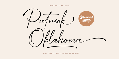 Patrick Oklahoma is a handwritten signature script font. This font has a luxurious and stylish feels that is perfect for fashion-related design. Patrick Oklahoma font is also usable in a wide range of works such as logos, covers, posters, quotes, product packaging, merchandise, social media and much more! Feature : - Alternate Glyphs - Multilingual Language - Works on PC & Mac - Simple installations - Accessible in the Adobe Illustrator, Adobe Photoshop, Adobe InDesign, even works on Microsoft Word. Thank you! Grezline Studio - Akhmad Reza Fauzi
 - Hellschreiber by Jörg Schmitt,
$35.00 The birth of the monospaced types dates back to the past. There was a need for the creation of typesets for typewriters. The difficulty was to align the different glyphs in the same width. This led to particular problems with letters like “M” and “l”; the former seemed to be squeezed into the same width of all letters and the second one appeared way too streched. Despite – or perhaps because of – the impression of the typewriter is still popular with Graphic Designers. Nowadays there are even monospaced versions of primarily proportional types; for example the the Sans Mono designed by Lucas de Groot or the DIN Mono. Then again, why not the other way round?! In the first half of the Nineties, Erik Spiekermann developed a proportional type named ITC Officina based on the Letter Gothic. According to a survey on the 100 best fonts of all time conducted by FontShop, ITC Officina is in an eighth place, far ahead of its forerunner. This was the reason for me to create a wider design with a Serif and a Sans Serif based on the queen of all monospaced types – the Courier.
 - ITC Goudy Sans by ITC,
$29.99 Frederic W. Goudy designed three weights of this friendly-looking sans serif font from 1922-1929 for Lanston Monotype in the United States. Goudy was attempting to impart freedom and personality to the sans serif form at a time when geometric sans serifs, such as Futura, were gaining rapid world-wide popularity. To achieve this challenging goal, he looked to lapidary inscriptions and manuscript writing for inspiration. He included elements such as slight swellings of terminal strokes, slab serifs on a few of the caps, alternate uncial forms, and a few swash strokes. The result is uniquely Goudy: charming, instinctive, and just right for adding warmth to magazine or advertising layouts. The design staff at ITC updated and filled out the family for a total of eight styles in ITC Goudy Sans. ITC Goudy Sans® font field guide including best practices, font pairings and alternatives.
 - Facility Signage JNL by Jeff Levine,
$29.00 A famous 1971 photo shows boxing champ Muhammad Ali making faces through a window at Joe Frazier at the challenger’s training facility. A small sign sits in the window that says “Joe Frazier Training Headquarters” and is lettered in a simple sans serif condensed typeface. This is now available as Facility Signage JNL in both regular and oblique versions.
 - Blackstone by Chris Costello,
$28.75 Dragons, pirates, magic, and all that is gothic was the inspiration for this design. Blackstone was one of ten winners in The 1988 Chartpak Typeface Design Competition and is now available in two styles with additional characters, alternates and dingbats. Several alternate caps can be found using alt keystrokes, so try using different combinations of all caps.
 - Counter Courage by Viaction Type.Co,
$15.00 Counter Courage is a vintage-style sans serif font with an ink effect that’s perfect for industrial and vintage-themed designs. This font is equipped with the opentype feature and supports multilingual. Included in the fonts: Uppercase Lowercase Symbols & Pointing Alternate Characters Multilingual Support Get it now at an affordable price and high value for your needs. Thank You.
 - Squared Off JNL by Jeff Levine,
$29.00 In an 1896 specimen catalog for American Type Founders there is a design called Geometric Gothic. The lettering style looks as if it’s ahead of its time; foreseeing the 1980s. With its squared characters, some pointed overhangs and modified character shapes, this type design is now available as Squared Off JNL, in both regular and oblique versions.
 - Geometry Circle by Vjeko Sumic,
$39.00 Geometry circle is a heading/display type, built with the intent to illustrate and attract the viewer, not to be used for long text. The inspiration comes from the Futurist movement typefaces, especially from Marinetti’s own workshop on new age typography of that time (Italy 1920). The typeface is composed of only capital letters. The letters are of an unique geometric design taking the basic 64 grid system and subtracting the shape of a circle form each glyph in a unique way to form a letter. There is a full complement of typography symbols as well as a support for Central and Eastern European symbols and characters.
 - Biome by Monotype,
$29.99 In the sketches that formed the basis for his typeface Biome, Crossgrove experimented with inner and outer shapes in different styles, adapted letters to the form of the super-ellipse, and added curves only to remove these again. His challenge was to find a harmonious and coherent approach that provided sufficient contrast with existing fonts. Biome is essentially in the sans serif tradition and the letters exhibit only minor variations in terms of line thickness. There is still a suggestion of the super-ellipse at many points, but this never becomes the predominant design factor. While most of the terminals of the vertical strokes are only slightly rounded, the horizontals and diagonals have pronounced arches and it is these that basically determine the round and soft character of the typeface. The more unconventionally shaped letters, such as the lowercase 'g' with its two semi-open counters and the 'k' and 'x' with their crossbars, provide Biome with an individual personality. And this effect is emphasized by the generously rounded links in the 'v' and 'w' and the uppercase 'M' and 'N'. Biome has been designed as a typeface super-family. From the near hairline Extra Light to the amply proportioned Ultra, there are seven clearly differentiated weights and three tracking widths. There are oblique italic versions of all variants. The range includes small caps and numeral sets containing lowercase and uppercase digits. With its available range of characters, Biome can be used to set texts in all Eastern European languages. Although the remarkable individuality of Biome is most clearly apparent in the larger point sizes, this typeface is not just suitable for producing headlines and logos. Biome's elegant visual effects mean that it is equally comfortable in short texts while its large x-height and generous counters make it readily legible even in the small font sizes. Biome is a contemporary typeface that employs mid-20th century futurist elements which ironically give it a retro feel.
 - Tarotee One by Monotype,
$29.99Traditional as Gutenberg, fresh as a sealed deck of playing cards - Tarotee One Arabesques is a remarkable set of ornaments that combine and recombine in endlessly beautiful combinations. Created by Tony Lansbury (and if you're still wondering what "tarotee" means, here's a hint - tear open that deck of cards mentioned above and look at the backs). - Xpress by Wiescher Design,
$12.00 »XPress« is a very distinct, expressive, typical new Sans. »XPress« is my new Sans-Serif that impresses – especially in small sizes – with its outstanding readability. Seven precisely calibrated weights from »Thin« to »Heavy« and its corresponding italics make this font-family universally usable. »XPress« got its bearings from the fabulous American »Gothic« fonts of the twenties of last century. Modern, present day elements, high lowercase letters and infinitesimal elegant slight curves in start- and end strokes make the font family not only great for body copy, but also very useful in advertising. »XPress« ist eine individuelle, expressive, typische neue Sans. »XPress« ist meine neue Serifenlose die – speziell in kleinen Schriftgraden – durch aussergewöhnliche Lesbarkeit auffällt. Sieben präzise aufeinander abgestimmte Schnitte von »Thin« bis »Heavy« und dazu passende Kursive machen die Schriftfamilie vielseitig einsatzfähig. »XPress« orientiert sich bewusst an den grossen amerikanischen Groteskschriften der zwanziger Jahre des letzten Jahrhunderts. Durch moderne Formelemente, große Mittellängen und unendlich leichte, elegante An- und Abstriche ist die Schrift jedoch nicht nur als Textschrift, sondern auch im gesamten Bereich der Werbung vielseitig einsetzbar.
 - SK Ilke Mono by Salih Kizilkaya,
$9.99 SK Ilke Mono is a "mono geometric sans" font family. Designed by Salih Kızılkaya in 2021, this font is designed for the needs of designers and software developers. Character ranges and proportions of characters have been specially designed so that you can use it comfortably in any area you want to use mono font. SK Ilke offers full support for the Latin alphabet and includes many typographic elements that you will need in your designs. It contains 22 different fonts and 12,760 glyphs in total. Each font of this font family contains 580 glyphs. In this way, it offers you all the typographic elements you will need in your designs and aims to meet all your design needs.
 - Revolution Gothic P by Dharma Type,
$19.99 Revolution Gothic P font family is designed based on Revolution Gothic and a distressed offshoot from the original. Revolution Gothic is an arranged and extended version of PAG Revolucion released from Prop-A-Ganda type foundry in 2008. The original font is inspired by retro propaganda posters and wallpainting in Cuba from the 60s to 80s. And the original PAG Revolucion is the most popular font from Prop-A-Ganda. The glyphs that damaged by printing the original had been tweaked by hand work with great care to be looked like natural damaged effect. This Revolution Gothic P family contains basic Roman, Italic, Bold and it’s Italic to suit a wide range of your creative works and it will be one of the most powerful solutions for printing and web.
 - Gill Sans MT by Monotype,
$45.99 Gill Sans is a humanistic sans serif family that, while is considered by many to be quintessentially British in tone and concept, has been used in virtually every country and in nearly every application imaginable. Gill Sans has reached this level of near-ubiquity for one simple—and very good—reason: it is an exceptionally distinctive design with a potential range of use that is almost limitless. This toolkit family includes a wide range of styles including the standards such as Light—which is open and elegant—and a Regular that, with its flat-bottomed d, flat-topped p and q and triangular-topped t, has a more compact and muscular appearance. Its Bold styles tend to echo the softer, more open style of the light while the extra bold and ultra bold have their own vivid personalities, but each of them would make for an eye-catching headline. Take into account the family’s many weights, including condensed and extra condensed designs, and extended language support and you have yourself a tool you’ll be thrilled to return to, time and again. Gill Sans was designed by Eric Gill: a versatile, brilliant, and prolifically successful designer of the early part of the last century. One of the main reasons for the enduring success of his namesake design is that it is based on Roman character shapes and proportions, making it unlike virtually any other sans serif out there. Gill also worked his own warmth and humanity into his design, resulting in a typeface in which each weight retains a distinct personality of its own. Pair with serif fonts like Gill's own Joanna; or more modern offerings like Frutiger® Serif, Malabar™, Syntax® Serif, FF Scala®, or DIN Next™ Slab.
 - Inertia by VP Creative Shop,
$20.00 Introducing Inertia - Logo Typeface - 5 weights Inertia is futuristic, logo typeface loaded with alternate glyphs, ligatures, 5 weights and multilingual support. It's a very versatile font that works great in large and small sizes. Inertia is perfect for branding projects, home-ware designs, product packaging, magazine headers - or simply as a stylish text overlay to any background image. Uppercase, numeral, punctuation & Symbol Hairline Light Regular Bold Black Alternate glyphs Ligatures Multilingual support How to access alternate glyphs? To access alternate glyphs in Adobe InDesign or Illustrator, choose Window Type & Tables Glyphs In Photoshop, choose Window Glyphs. In the panel that opens, click the Show menu and choose Alternates for Selection. Double-click an alternate's thumbnail to swap them out. Feel free to contact me if you have any questions! Mock ups and backgrounds used are not included. Thank you! Enjoy!
 - Decennie JY Pro by JY&A,
$45.00 JY Décennie has been designed for both the web and print. Essentially applying the principles of newspaper typefaces, attention has been paid to the Windows versions of the family to ensure clarity when used in web browsers. It was originally conceived with an Australian broadsheet newspaper in mind, and ultimately launched to commemorate JY&A’s 10th anniversary. The design itself is based on Australian and New Zealand wood type, which was used widely by European settlers during the nineteenth century.
 - Sungar by Twinletter,
$12.00 Introducing Sungar sans serif font. Your customers will be captivated by the unique combination of inspiration, craftsmanship, and style that comes with this new typeface. You’ll get the full power of professional design without the hard work or hefty price tag. Of course, your various design projects will be perfect and extraordinary if you use this font because this font comes with a font family, both for titles and subtitles and sentence text, start using our fonts for your extraordinary projects.
 - CTM Sans by Gspr one,
$- CTM Sans is a typeface of the grotesk category, it is designed based on a previous Herokid typeface, but with greater freedom to creative tastes and at the same time with more rebellion and errors (quite a few, but well-intentioned) than its predecessor. This makes Bellavista a somewhat messy clone, for the grotesk style. This font does not seek to be a correct typography, but rather fun and useful for the designer. I hope you like it
 - George Town by FoxType,
$12.00 Introducing George Town new generation Typeface with 6 Weights. George Town Typeface created with the vision of to attract the audience to your brand . The finest details of this typeface are methodically and mathematically created. George Town is created with all the tasks of a corporate font and also for the usage in a variety of projects, including branding, logos, titles, headlines, servers, screens, display, digital ads, and everything else. We are putting a lot of effort on this font as a long-term project. The Typeface includes Six Weights. Thin, ExtraLight, Light, Regular, Medium, and SemiBold Features: Numerals, extended punctuation & Basic Symbols(200+ Glyphs). Expert kerning and quality crafting. Uppercase Letters & Lowercase Letters 24x7 Support Thank you for taking the time to look into the font.
 - North Bay Grotesk by FoxType,
$16.00 Introducing NorthBay Grotesk new generation Typeface with 5 Weights. NorthBay Typeface created with the vision of to attract the audience to your brand . The finest details of this typeface are methodically and mathematically created. NorthBay is created with all the tasks of a corporate font and also for the usage in a variety of projects, including branding, logos, titles, headlines, servers, posters, screens, display, digital ads, and everything else. We are putting a lot of effort on this font as a long-term project. The Typeface includes Five Weights. Light, Regular, Medium, SemiBold and Bold Features: Numerals, extended punctuation & Basic Symbols(200+ Glyphs). Uppercase Letters & Lowercase Letters 24x7 Support Thank you for taking the time to look into the font.
 - Brant Ford by FoxType,
$16.00 Introducing BrantFord new generation Typeface with 5 Weights. BrantFord Typeface created with the vision of to attract the audience to your brand . The finest details of this typeface are methodically and mathematically created. BrantFord is created with all the tasks of a corporate font and also for the usage in a variety of projects, including branding, logos, titles, headlines, servers, screens, display, digital ads, and everything else. We are putting a lot of effort on this font as a long-term project. The Typeface includes Five Weights. Light, Regular, Medium, SemiBold and Bold Features: Numerals, extended punctuation & Basic Symbols(200+ Glyphs). Expert kerning and quality crafting. Uppercase Letters & Lowercase Letters 24x7 Support Thank you for taking the time to look into the font.
 - Ever West by Andrew Tomson,
$10.00 Meet the new font family! This font came to my mind while I was sitting in line at the dentist. There are often different magazines at the front desk to read and pass the time while waiting. One of those magazines turned out to be about fashion. When I opened it on a random page, I saw beautiful pictures. But you know what the first thing that catches my eye? The font! The font in which the headline or quote is written. After you read it, you look at everything else. And I wondered what my font would be in this case. I present to you my version of a font for fashion lettering. Good luck and love to you, friends!
 - Dorris by Creativemedialab,
$20.00 Dorris - Swirly font family Unique, cute and versatile serif family with alternates and ornaments to create a more stunning display. Try capital letters for groovy vintage style look or Capitalize for a happy, cute and beauty. This Family has 9 weights from thin to black with a soft and curly tail that makes this font look funky and fresh. Suitable for use in many design forms, for example, magazines, DIY projects, quotes, ice cream, postcards, logos, vintage look badges, old classic music, the 60s, 70s, 80s era, stickers, label, kids, baby, wedding projects and many more. We recommend using Adobe Programs.
 - Ps Willy by Fontopia,
$13.99 Willy is a typeface with a wink. This display font is based on existing piquant form from the immediate vicinity. It is sexy, if you have an eye for. But it also should not be taken too seriously, especially because it has a humorous slant. The font has its origins in an art project. It is now made available for design around festifals, parties, invitations, etc.
 - Apex Brush by Hanoded,
$15.00 I like playing around with brushes and Chinese ink. I always have some kind of idea of what the final design should look like, but once it’s done, it never ever looks like what I had in mind. Apex Brush is one of those designs: it started off as a few brush strokes, but before I knew it, I had a really nice set of matching brush fonts! Use it for any design that needs a bit of rough, a splash of ink and a pinch of rebel.
 - FF Meta Correspondence by FontFont,
$97.99 German type designer Erik Spiekermann created this sans FontFont between 1997 and 2002. The family contains 4 weights: Regular, Italic, Bold, and Bold Italic and is ideally suited for logo, branding and creative industries. FF Meta Correspondence provides advanced typographical support with features such as ligatures, alternate characters, case-sensitive forms, fractions, super- and subscript characters, and stylistic alternates. It comes with a complete range of figure set options – oldstyle and lining figures, each in tabular and proportional widths. As well as Latin-based languages, the typeface family also supports the Cyrillic and Greek writing systems. This FontFont is a member of the FF Meta super family, which also includes FF Meta, FF Meta Headline, and FF Meta Serif.
 - Analogue Pro by Ingo,
$42.00 very traditional forms strongly slanted italic consistant proportions extraordinary ligatures swashes alternate letters alternate figures lower case l with a hooked “foot” Believe it or not, there are hardly any sans serif fonts in which the lower case letter l also has the hooked form of an l. Instead, we readers have to constantly distinguish whether we are seeing an uppercase I or a lower case l — just take a look at the word “Illinois”... The ingoFont Analogue was developed for exactly this reason. The intent: To create a pretty much »ordinary«, even classical font with its most striking characteristic being the inclusion of the “crooked l.” As a model, I used the »mother of all sans serifs«, Akzidenz Grotesk from Berthold, with its beginnings going back to the 19th century. Analogue is so to say a new interpretation of Akzidenz Grotesk from ingoFonts. All characters — following the model — have been newly designed. And if you want to emphasize the shape of the hooked foot even more, you can also activate the alternate styles for d, h, m, n (Style Set 1). Conversely, the alternate a somewhat softens the “hooked” impression (Style Set 2). The slanted versions — it isn’t truly a real cursive font — are noticeably stronger with 13° than the italics in comparable fonts, and were given a round e with a mind of its own which distinguishes itself considerably compared to the upright characters in the overall appearance of the font. More modern and formal solutions in detail were chosen for some of the characters, for example the M was given lightly slanted sides; the a reflects the curves of the s; the “feet” of a, l and t match; the flared legs of K and R became a “foot”, too. General proportions were carried over almost completely with no changes from Akzidenz Grotesk as well as the slanted trimming on the open forms of a, c, e, s; in comparison, C, G and S were given straight endings. Analogue contains many ligatures, even discretional ligatures, plus proportional, old style as well as tabular figures. All in all, at first sight Analogue brings back memories of the charm of its well-known predecessor; and yet, many small differences give Analogue an unmistakable certain something...
 - Elvira Serif by Sudtipos,
$39.00 Elvira Serif is a typeface family that proposes to make the use of display serifs a little more fun, including in its anatomy some sharp points, ink traps implanted in some glyphs, and the formality of a traditional serif. All of these elements make Elvira Serif a great option that balances the contemporary with traditional touches. Elvira Serif has 9 weights, as well as true italics, which gives it dimension and versatility in its use. It can be used for a wide variety of purposes: it works well on the web, headlines and especially designed for book publishing at small sizes. Elvira Serif has the ability to look robust and imposing in its black weight, and subtle and elegant in its light weight. Enjoy it, it is made with a lot of passion and fun by Sudtipos and Vástago.
 - BOnuts by BOtype,
$29.00 BOnuts is a modern rounded sans built in 8 styles and crafted for you by BOtype. It's clean and minimal and modern rounded design gives you a wide array of uses such as branding, editorial & print, and also makes it perfect for UI & digital applications. We designed Bonuts to have the most legibility to give you a very versatile font family you use for any use you want. It includes Alternate Characters, Ligatures, Tabular Figures, Fractions, Numerators, Denominators, Superiors and Inferiors. It supports Central and Eastern European languages, basic Cyrillic and Greek. The type family consists of 8 weights (Thin, Light, Normal, Regular, Medium, Bold, Black and Heavy).
 - Nena Serif by DuoType,
$39.00 Nena Serif is a transitional readable typeface, with a contemporary style, designed for extensive reading in books, newspapers and magazines. The font is very legible when used in small body text, with medium x-height and moderate contrast it creates an elegant look on the page and is well suited for stylish headers and various on-screen uses. The Nena Serif family is available in 6 weights, ranging from light to heavy, with matching italics and alternate glyphs. The font contains a character set of 411 characters supporting 206 different languages.
 - Dungeon by Red Rooster Collection,
$45.00 Dungeon is a glyphic font family that combines elements of both sans serif and spur serif typefaces. It was designed exclusively for the Red Rooster Collection in 1998 by Steve Jackaman (ITF). The family is loosely based on Dick Jensen’s famous design “Serpentine,” which was created for the Visual Graphics Corporation (VGC) in 1972. Dungeon is available in four weights, each of which is optimized for legibility at any size. The family’s masculine feel has helped it to turn up in a variety of projects, ranging from brand identity to advertising.
 - Broadsheet by Three Islands Press,
$29.00 A full-featured typeface that simulates old newspaper text from the 1700s, Broadsheet gives you all the “long s” ligatures you could ever dream of. Wonderfully authentic in either display type or long blocks of body copy. Includes a couple of printer’s flourishes. (Based on antique publications from 1728 and 1776.)
 - La Moda NF by Nick's Fonts,
$10.00An unusual blend of block and script letterforms, based on poster lettering for an Italian fashion house of the same name, designed by Wilman Schiroli in 1935, and notable for its very jolly lowercase c. Both versions of the font include 1252 Latin, 1250 CE (with localization for Romanian and Moldovan). - SK Goldilocks by Salih Kizilkaya,
$12.99 SK Goldilocks is a grotesque font family. It is designed to meet all your typographic needs in your daily and professional life. You can use it in many areas from the title to the body texts, as well as in media such as logos, posters and packaging. SK Goldilocks takes its name from the "Goldilocks Zone" given to the habitable zone of the solar system and aims to open a new field in design for you. Thanks to the 14 different fonts and 6720 glyphs it contains, it contains many typographic materials that you will need. In this way, you can easily use it in your designs or in your daily life. You can visit my Behance account to examine the project images in more detail.