10,000 search results
(0.05 seconds)
- Devina Rodent by UICreative,
$23.00 Introducing of our new product the name is Devina Rodent Sans Serif Font Family comes with 9 different weights. Modern Sans Serif font that feels beautiful classy, elegant, and modern .This font is perfect suited for a wide variety of projects, as to signature, stationery, logo, wedding, typography quotes, magazine or book cover, website header, clothing, branding, packaging design and more. Also for fashion related branding or editorial design and displays both masculine and feminine qualities.
 - Youngsters by UICreative,
$23.00 Introducing our new product the name is Youngsters Classy Display Sans Serif Font Family comes with 9 different weights. Modern Sans Serif font that feels beautiful classy, elegant, and modern. This font is perfectly suited for a wide variety of projects, such as signature, stationery, logo, wedding, typography quotes, magazine or book covers, website headers, clothing, branding, packaging design, and more. Also for fashion-related branding or editorial design and displays both masculine and feminine qualities.
 - Crowd Funded by Hanoded,
$15.00 Crowd Funded fonts wasn’t really crowd funded… In fact, all of the funding came from me, as I had to buy paper and a new pen to get this font going! Crowd Funded is an all caps display font, which I based on a recent font of mine called Longreach. Crowd Funded is narrower and rounder than Longreach and, in a way, more delicate. It comes with a generous amount of diacritics and basic Cyrillic as well!
 - Darleyna by Jamalodin,
$19.00 Darleyna Script is a new classic legendary calligraphy font that is suitable for branding, wedding invitations, greeting cards, posters, name card, quotes, blog header, logo, fashion, apparel, letter, stationery and other projects. Come with 600+ glyphs. Uppercase (Two style) & Lowercase, International Language, Symbols Support Punctuation & Numeral, Alternates Stylistic Set 1-17 Character Variant Contextual. And this Font has given PUA Unicode. so that all the alternate characters can easily be accessed in full by a craftsman or designer.
 - Mauritz by Mans Greback,
$59.00 Mauritz is a brush script typeface. A speedy handwriting, Mauritz was drawn and created by Mans Greback in 2021 to be the ultimate set of wild-style scripts for logotypes and branding. This calligraphy family consists of 10 high-quality fonts in a great variety of weights and styles: Mauritz Thin, Light, Regular, Bold and Black, and each one as Italic. The font is built with advanced OpenType functionality and has a guaranteed top-notch quality, containing stylistic and contextual alternates, ligatures and more features; all to give you full control and customizability. It has extensive lingual support, covering all Latin-based languages, from North Europe to South Africa, from America to South-East Asia. It contains all characters and symbols you'll ever need, including all punctuation and numbers.
 - Proda Sans by Nasir Udin,
$24.00 Meet Proda Sans, a humanist typeface with geometric construction inspired by the humanist-style sans serif faces that were popular in the mid 20th-century. Its calligraphic influenced letterforms have been adjusted to have geometric’s low-stroke-contrast for better legibility. The medium x-height give it a warm and delicate appearance, and keep your page bright. It's a family of nine weights plus matching italics. The thin and the black weights are great for display purposes. The light, book and regular weights are well suited for longer paragraphs and smaller texts. Proda Sans is developed for advanced typography needs. The OpenType fonts have an extended character set to support 200+ latin-based languages. For full presentation please visit my Behance post.
 - TT Squares Condensed by TypeType,
$29.00 You are on the page of the old display version of the TT Squares Condensed typeface. In 2020, we released an entirely new, completely redesigned, and significantly expanded version of the typeface called TT Octosquares. In addition to 73 styles, TT Octosquares has 3-axis variable version, stylistic alternates, ligatures, old-style figures and many other useful OpenType features. Before you buy the old display version of the font, we suggest that you pay attention to the new superfamily TT Octosquares and study it in more detail. - We've expanded the TT Squares font family and created a narrow version of the typeface. Just as its older brother, TT Squares Condensed fits perfectly for any engineering, military, and technological theme. The family is ideal for implementation in interior design, packaging design, creation of uniforms with inscriptions, and for logos and headlines. Fonts belonging to the TT Squares font family look manly and have a strong character that instantly tunes in the spectators and makes them perceive the information seriously. If we were to compare fonts to people’s professions, TT Squares Condensed would most definitely be a first-class technical engineer whose talented hands are adorned with calluses and machinery oil spots. TT Squares Condensed is optimized or web and mobile applications.
 - ITC Christoph's Quill by ITC,
$29.99ITC Christoph's Quill is just about everything you could want in a typeface: it's distinctive, beautiful, and exceptionally versatile. According to designer Russell Bean, ITC Christoph's Quill is the culmination of experimentation with a graphics tablet that spanned several years. Then one day, as if by magic, it all just fell into place. The design seemed to flow from my pen." Bean was born in Australia and, except for a brief stint with a photo-lettering firm in Southern California, has spent most of his career working down under. "I can recall a deep fascination for the written word," he says. "Even before learning to spell, read or write, I think I recognized that this was a means of visual communication." Bean's first job was in a small ad agency as a trainee in the production department, where he learned art techniques and how to handle print, as well as "the value of visual impressions," he says. His career path meandered from one design job to another, but always in the general direction of fonts and typefaces. Today, his workload consists of logo design commissions, font editing, typography and print production consultation to a select group of loyal clients - still leaving time, notes Bean, "to pursue my type design ambitions." ITC Christoph's Quill began life as a simple, visually striking font of caps, lowercase, punctuation and numerals. To this Bean added a bold weight, for when a little more strength is desirable. Next came a flock of alternate characters. Finally, Bean drew a set of decorative caps, a suite of logos, and a sprinkling of beginning and ending swashes. The net result is a type family that can add a signature flourish to a vast range of projects: from invitations and menus to logos, signage, packaging and more." - Grand Cru by Fenotype,
$25.00 Meet Grand Cru – a new approach to serif type. The type family is divided to three groups – Small, Medium and Large – according to the amount of contrast in letterforms. Forget about those old Text/Display categories – it’s up to you how to use your typeface. While the Grand Cru Large fonts are highly decorative, the Small versions function as reliable workhorses. All Grand Cru fonts come with thoughtful Open Type features – built-in small capitals are found in all of them, while the italics come with handsome Swash capitals. The romans are equipped with intelligent numeral styles including subscript and superscript and fractions.
 - Bryson by Valentino Vergan,
$16.00 Introducing Bryson, A bold sans serif ligature typeface. The Bryson typeface is characterized by simple but distinctive shapes. The typeface is very eye catching, its tight kerning and bold shapes makes it great for retro designs. You can use it for a wide range of projects, including print and web. If you are looking for something bold and retro for you next project, Bryson is the typeface for you. I hope you enjoy using the Bryson typeface.
 - Personnel JNL by Jeff Levine,
$29.00 The hand lettered title found on the 1938 sheet music for "I Haven't Changed a Thing" is a condensed Art Deco thick-and-thin sans serif with rounded corners. Reminiscent of office door and similar signage, this classic bit of lettering from the past is now available as Personnel JNL in both regular and oblique versions.
 - Mercato VF by Borutta Group,
$79.00 MERCATO is a headline family of typefaces inspired by hand-painted price tags. The idea for this family was born a few years ago in South America. I wanted to create a typeface that is written, expressive and organic on the one hand, and thrown into a geometric frame on the other. Co-designers: Karol Mularczyk & Małgorzata Bartosik.
 - Jealous Radio by Bogstav,
$14.00 Each letter is handmade and drawn with a “blobbly” pen, leaving a wobbly and grungyline. The corners are rounded which adds a blurry look to the rough lines. All in all, Jealous Radio is kind-looking,soft, yet rough and really organic looking! Useful for a wide range of things: from kids products, comics, posters, invitations or even protest banners!
 - Giette by AEN Creative Studio,
$10.00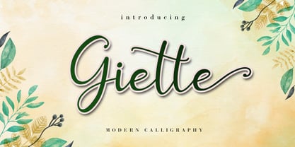 Giette is a delicate and timeless handwritten font that brings its own unique style to any design project. It will elevate a wide range of design projects to the highest level, be it branding, headings, wedding designs, invitations, signatures, logos, labels, and much more! It is PUA encoded which means you can access all of the glyphs and swashes with ease!
 - Literal by Kosinsky,
$25.00 Literal is a classic sans serif typeface with closed shapes. Simple and elegant at the same time, it is perfect for a wide range of uses, where you need both large and small text, be it a print product, website design, logo design and much more. The font supports Extended Latin and Extended Cyrillic. Created in 2019. Type designer Igor Kosinsky.
 - Mary Read by Melli Diete,
$50.00 Mary Read is a modern handwritten Display Font, showing its fancy curves best in headlines as well as short texts. For typographic variety the typeface offers a range of features and extras. Give your texts a quite playful and handwritten note. Being chi chi is not a crime, don’t hesitate to pepper some sweetness in the midst of people’s attention.
 - Summer Love by Komet & Flicker,
$15.00 Good Vibes Only! This hand drawn brush font gives a loose and laid-back feeling to any project. Included with are 10 common connector words like "the" "and" and "with" which can easily be accessed through Illustrator's glyphs panel. Also included are 24 hand drawn sun & surf themed icons.
 - Chalk Street Tag by Mvmet,
$10.00 Chalk Street Tag is a quick skinny handwritten font, inspired by graffiti-style tags made with chalk. It will elevate a wide range of design projects to the highest level. You can use this font for many design ideas such as stickers, t-shirt designs, amazing logo designs, magazine or book covers, comics, cartoon drawings, and many more. This font will add a super cool touch to your designs!
 - Impulsive Marker by Mvmet,
$12.00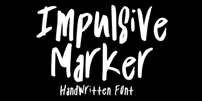 Impulsive Marker is a spontaneous and quick handwritten marker font, inspired by fun and fluid expressive energy of mankind. It will elevate a wide range of design projects to the highest level. You can use this font for many design ideas such as stickers, t-shirt designs, amazing logo designs, magazine or book covers, comics, cartoon drawings, and many more. This font will add a super cool touch to your designs!
 - Geryline by Slex Studio,
$11.00 Geryline simplifies elegance into one truly outstanding handwritten font. It maintains its classy calligraphic influences while feeling contemporary and fresh. This versatility will appeal to a wide range of crafty ideas, from letterheads and titles, to stationery. This font is PUA encoded which means you can access all of the cute glyphs and swashes with ease! It also features a wealth of special features including alternate glyphs and ligatures.
 - Genotype BRK Pro by CheapProFonts,
$10.00 A stylistic and square outline font suitable for headlines and logos. The original font contained no diacritics at all, so I have designed these to match. I also made the descenders on "g/j/p/q/y" a bit longer - so they would balance better with the letters with diacritics below the letter... I redesigned the "t", but have included the original "t" as an alternate, available via your programs' glyph palette or using the OpenType functions "Stylistic Alternates"/"ss01". Genotype S BRK Pro is the perfect companion for Genotype H BRK Pro (The H stands for Hollow and the S stands for Solid). Can be used as a fill for its companion (using layers), but is also quite a usable font on its own. ALL fonts from CheapProFonts have very extensive language support: They contain some unusual diacritic letters (some of which are contained in the Latin Extended-B Unicode block) supporting: Cornish, Filipino (Tagalog), Guarani, Luxembourgian, Malagasy, Romanian, Ulithian and Welsh. They also contain all glyphs in the Latin Extended-A Unicode block (which among others cover the Central European and Baltic areas) supporting: Afrikaans, Belarusian (Lacinka), Bosnian, Catalan, Chichewa, Croatian, Czech, Dutch, Esperanto, Greenlandic, Hungarian, Kashubian, Kurdish (Kurmanji), Latvian, Lithuanian, Maltese, Maori, Polish, Saami (Inari), Saami (North), Serbian (latin), Slovak(ian), Slovene, Sorbian (Lower), Sorbian (Upper), Turkish and Turkmen. And they of course contain all the usual "western" glyphs supporting: Albanian, Basque, Breton, Chamorro, Danish, Estonian, Faroese, Finnish, French, Frisian, Galican, German, Icelandic, Indonesian, Irish (Gaelic), Italian, Northern Sotho, Norwegian, Occitan, Portuguese, Rhaeto-Romance, Sami (Lule), Sami (South), Scots (Gaelic), Spanish, Swedish, Tswana, Walloon and Yapese.
 - Bosento by Gatype,
$12.00 Hi everyone, come back from us The Bosento font is perfect for Your projects today are branding, poster design, t-shirts, invitations, designs for children, and editorial design. You will find a lot of glyphs, including ligatures, to look elegant in this bold serif. OpenType features include style sets, character variants, starting and ending forms, and multilingual support. Important information: To access the alternatives, you must have access to an older version of Photoshop to copy/paste the glyphs from the included PSD, OR the Glyphs Panel, which can be found in Photoshop CC or any Version of Adobe Illustrator. Cheer!
 - Azuza by Parkinson,
$20.00 In the 1990s I drew a text face for the San Francisco Chronicle. It was based on W. A. Dwiggins’ Electra and incorporated many features of the Linotype Legibility Series: More compact, with a taller lowercase X-height, etc. That type was called Electric and it was the Chronicle’s text face for nearly a decade, surviving several redesigns. From that, I made Azuza, a more detailed and sensitive style. Azuza was recognized in the TDC2 type competition in 2001. Then it went into hibernation as a Type 1 font family. Today it is back. Six fonts. Open Type.
 - Freitag Display by Zetafonts,
$39.00 Probably as a reaction to the pragmatism of modernist design, the seventies saw an explosion of buoyant, vivacious typography. Psychedelia fueled a return to the melting, lush shapes of Art Nouveau while Pop culture embraced the usage of funky, joyful lettering for advertising, product design and tv titling. New low-cost technologies like photo-lettering and rub-on transfer required new fonts to be expressive rather than legible, pushing designers to produce, bubbly, high-spirited masterpieces, where geometric excess and calligraphic inventions melted joyfully. Freitag is Cosimo Lorenzo Pancini's homage to this era and its typography. His starting point was the design of a heavy sans serif with humanist condensed proportions, flared stems and reverse contrast, that generated both the main family, and a variant display subfamily. The main typeface family slowly builds the tension and design exuberance along the weight axis - a bit like our desire for the weekend increases during the week. In Light and Medium weights the font shows a more controlled, medium-contrast design, tightly spaced for maximum display effect. The Book weight follows the same design but uses a more relaxed letter spacing to allow usage in smaller sizes and short body copy. As weight increases in the Bold weight the style becomes more expressive, with a visible reverse contrast building up and culminating in the Heavy weight with his clearly visible "bell bottoms" feel. In the display sub-family the design is pushed further by introducing variant letterforms that have a stronger connection to calligraphy and lettering. Also, the weight range becomes a optical one, with weights marked as Medium, Large, XLarge, as bringing the contrast and the boldness to the extreme creates smaller counterspaces that require bigger usage sizes. Another important addition of the display sub-family is the connected italics that sport swash capitals and cursive letterforms, developed with logo design and ultra-expressive editorial design in mind. To balance the extreme contrast in the XL weight, contrast of punctuation is reduced, creating a rich, highly-dynamic texture wherever diacritics and marks are used in the text. The full family includes 16 styles + 4 variable fonts, allowing full control of the design over its tree-hugging design space. All 20 fonts share an extended latin charset with open type features including case sensitive forms, single and double story variants and alternate glyphs. According to its creator, "Freitag is the typeface that sounds like an imaginary Woodstock where on the stage with Jimi Hendrix with Novarese, Motter, Excoffon and Benguiat playing onstage with Jimi Hendrix". Jeepers creepers!
 - Coma by Volcano Type,
$19.00 Originally designed by Alois Ganslmeier as a Billboard-Font, the Coma Font was later developed into a complete typeset with capitals and small letters, Cyrillic letters, Greek letters and Hebrew letters by Andy Jörder and Jörg Herz. The Coma Font is a massive constructed font which can be used for headlines. When only typed in capitals it gives the impression of blocks for there are no ascenders or descenders. The font comes alive because of its massive appearance, its edgy form and the opulence impression when used line-by-line. Not without reason, the font is named “dick und eckig”.
 - Recoleta by Latinotype,
$29.00 Just like Grandma’s recipe, Recoleta combines a variety of ingredients—from various popular 1970s typefaces—such as the soft and gentle shapes found in Cooper or the fluid, angled strokes in Windsor— mixed into one single design that features familiar, yet fresh, modern flavors. Its variety of weights provide a range of choices that will help you find the best typographic color for your project. Lighter weights are well-suited for body text while heavier ones are ideal for high impact headlines. The available stylistic alternates offer a number of different characters that give your logo or business card a unique look. Recoleta, our best selling typeface; now support russian cyrillic. Made by Jorge Cisterna, the Latinotype Team with the consulting of Vika Usmanova.
 - Anything Skribble by Crumphand,
$15.00 Hello, Introducing the new font "Anything Skribble" the font was very cute. Match for your doodling, Scribble motion and Etc. Good readability, good contour. What's Included ? Uppercase Lowercase Numerals Symbols Multilingual Supports. Thank you, Regards!
 - Art Nouveco by Ilhamtaro,
$23.00 ART NOUVECO is a cross between art nouveau and art deco fonts, this font will become a new and interesting trend to explore in a design, elegant art nouveau is made a little more masculine due to the influence of art deco, resulting in a slightly elegant but elegant font. Fonts that still match the art deco style but have a slight touch of grace, will be suitable for classic but elegant designs. To enable the OpenType Stylistic alternates, you need a program that supports OpenType features such as Adobe Illustrator CS, Adobe Indesign & CorelDraw X6-X7. Cheers!
 - Toisy by Letrizmo,
$21.00When the right late seventies / early eighties message is needed, Toisy comes to the rescue. Founded on a mix of references from letterforms of the time, this new original nods to a style that defined an era. A sexy theme font that conveys a clear image of what was truly chic thirty years ago, this alphabet is deeply rooted in sultry memories of soft, endless nights. Exaggerate contrast between strokes and angular lines combine with rounded corners to provide a unique character and a look that sharply differs when set in all caps or lower case, thanks to an uncommon treatment of density and proportions. Set it real tight, as was typographically in fashion circa 1981. Toisy and Toisy Greek include a set of 13 matching images inspired in leisure stuff and the clothing of the last days of disco. They are different from the set included with Toisy Alt. - Chleona by Handpik,
$13.00 Hello, on this occasion, we would like to introduce a new font. which we named him "CHLEONA", a font that we design with an elegant, stylish and simple shape at a relatively affordable price but has good quality. This font has the following advantages. Featured Uppercase Lowercase Numeral Functional Stylistic Ligature Multilingual
 - Adrim by Kaer,
$18.00 Hi there! I'm happy to present you my new font! Adrim is a modern symbols and lines display font. Each uppercase character have a unique pattern with moon, stars and leaves. Here are also clear font option. It is perfect to use in any vintage logos, branding, flyers, product packaging, romantic stationery, ecology posters, astrology blog design, holiday invitations. What you will get: * Pattern and Clean styles * Uppercase and lowercase * Numbers * Symbols * Ligatures * Punctuation * Multilingual support If Adrim font family is not ok, please check out Avery https://www.myfonts.com/fonts/kaer/avery/ I hope you enjoy this font. Follow my shop to receive updates of products and the very hottest news! If you have any question or issue, please contact me: kaer.pro@gmail.com Please request to add additional characters and glyphs if you need! Thank you!
 - Easton by Typemotion,
$15.00 I wanted to combine a classical antiqua with corners and edges. I was convinced this combination would create a new, a fresh design of types. At the beginning I used the forms from "Goudy Old Style", later I modified the sizes, the widths of the letters, the x-height and their forms in general. At the moment the Easton Family consists of 3 styles called Easton Serif, Easton Semiserif and Easton Sans.
 - Maritote by I Can Be Your Type,
$20.00While designing a logotype for a client, she described herself as "loud and colorful." Thinking about some eras in typefaces that portrayed this idea, I instantly thought of the "Roaring 20s" and the Prohibition era where the cinema is starting to take off and the Italian mafia are running the bars. (Which is coincidental because my client has family connections to Al Capone.) One of the most iconic typefaces designed for these times was Broadway by Morris Fuller Benton in 1925. This typeface was the zeitgeist of Broadway, the big city, theater, and cinema, which can now be seen in use almost everywhere an old family run cinema is located. Using the heavy influences of the thick and thin contrast of this typeface, Maritote brings the charm of Broadway into the 21st century. - Kokoschka by PintassilgoPrints,
$25.00 Dense and strong, this family is inspired by the lettering on the poster of a short expressionist play by the astonishing and highly skilled Austrian painter, printmaker and writer Oskar Kokoschka in 1909. If the typeface itself is already deeply vigorous, the font programming makes it shine, making great use of OpenType features. Contextual Alternates will cycle alternate glyphs, providing a more realistic handlettered feel. Ligatures will not only trigger special glyphs, but also build new combinations through a smart kerning adjustment. And yet there are also some stylistic alternates to add that extra-twist. The family counts with a nice textured version, also an oblique and a very handy assortment of extras, making this family an impressive toolbox for expressive designs.
 - Tall Skinny Condensed by Outside the Line,
$19.00 This is the tallest, skinniest, most condensed, non serif font I know of. I designed this because I felt a serious need for that one big, thin word to fit in a narrow space. It is great for ‘SALE!’ in a one column ad. Also is a life saver for several long words in a narrow space like Merry Christmas... If you need a full character set take a look at the new Ultra Condensed 3 font family. Ultra Condensed was based on Tall Skinny Condensed with some changes and a full character set. Ultra Condensed Lettered is a hand lettered version and Ultra Condensed Line is a lighter hand drawn version
 - Dyna Pro by Anatoletype,
$33.00 Elena Albertoni on Dyna: “While studying in Paris, I worked for a design studio specialized in packaging. French supermarkets are full of lettering with a handwriting flavor, which seems to go very well with a wide range of very different products. With the aim to analyze and summarize the qualities of these letterings in one typeface, I faced choices and limits similar to the ones encountered with handwriting. The letters are sloped at different angles, which gives them rhythm; their open shapes suggest movement and gesture. Letters want to dance!” Dyna Pro’s extended character set provides support for a wide range of European languages that share the Latin and Cyrillic scripts. Cyrillic characters designed by Elena Novoselova
 - ArchiLogo by Archiness,
$- ArchiLogo is not a regular outline-font. It has a stencil element to it and it’s a kind of indirect, because the font is basically the space between the lines. You have to read between the lines, so to speak. It’s like one of the key elements in architecture: the space between the walls. Here’s where type design meets architecture! The new version, ArchiLogo 3.0, has been improved slightly and 13 glyphs have been added to a total of 85 characters. It is still a free font. Because of the popularity of this font I decided to introduce ArchiLogo Pro. Indeed, the pro version of ArchiLogo. Besides the basic Macintosh Character Set the supported languages are Latin 1, Latin 2: Eastern Europe, Turkish, Windows Baltic. It grew to over 300 glyphs.
 - Frankie by Type-Ø-Tones,
$60.00 Frankie remains a classic among classics. A pioneer of the Type-Ø-Tones catalog, this is their personal eroded Franklin Gothic. Avoid imitations. Try Frankie, today still their best-seller. Now, in this updated version with a complete CE Character Set.
 - Steagal by insigne,
$24.75 I love geometric sans serifs, their crispness and rationality. Le Havre taps into this style, but for a while, I've wanted to create a font recalling the printed Futura of the 1940s, which seems to have an elusive quality all its own. After seeing an old manual on a World War II ship, I developed a plan for "Le Havre Metal" but chose to shelve the project due to Le Havre's small x-height. That's where Steagal comes in. When Robbie de Villiers and I began the Chatype project in early 2012 (a project which led one publication to label me the Edward Johnston of Chattanooga!), we started closely studying the vernacular lettering of Chattanooga. During that time, I also visited Switzerland, where I saw how designers were using a new, handmade aesthetic with a geometric base. I was motivated to make a new face combining some of these same influences. The primary inspiration for the new design came from the hand-lettering of sign painters in the United States, circa 1930s through 1950s. My Chatype research turned up a poster from the Tennessee Valley Authority in Chattanooga, Tennessee, which exhibited a number of quirks from the unique hand and style of one of these sign artists. Completing the first draft of Steagal, however, I found that the face appeared somewhat European in character. I turned then to the work of Morris Fuller Benton for a distinctly American take and discovered a number of features that would help define Steagal as a "1930s American" vernacular typeface--features I later learned also inspired Morris Fuller Benton's Eagle. The overall development of Steagal was surprisingly difficult, knowing when to deliberately distort optical artifacts and when to keep them in place. Part of type design is correcting optical illusions, and I found myself absentmindedly adjusting the optical effects. In the end, though, I was able to draw inspiration from period signs, inscriptions, period posters, and architecture while retaining just enough of the naive sensibility. Steagal has softened edges, which simulate brush strokes and retain the feeling of the human hand. The standard version has unique quirks that are not too intrusive. Overshoots have almost been eliminated, and joins have minimal corrections. The rounded forms are mathematically perfect, geometric figures without optical corrections. As a variation to the standard, the “Rough” version stands as the "bad signpainter" version with plenty of character. Steagal Regular comes in five weights and is packed with OpenType features. Steagal includes three Art Deco Alternate sets, optically compensated rounded forms, a monospaced variant, and numerous other features. In all, there are over 200 alternate characters. To see these features in action, please see the informative .pdf brochure. OpenType capable applications such as Quark or the Adobe Creative suite can take full advantage of the automatically replacing ligatures and alternates. Steagal also includes support for all Western European languages. Steagal is a great way to subtly draw attention to your work. Its unique quirks grab the eye with a authority that few typefaces possess. Embrace its vernacular, hand-brushed look, and see what this geometric sans serif can do for you.
 - Tuscarora - Unknown license

