10,000 search results
(0.047 seconds)
- Cochin by URW Type Foundry,
$35.99 The Cochin font is based on the work of eighteenth-century punchcutter, Cochin. Charles Peignot commissioned the revival of this strong typeface in 1912. The capitals are squarish. The lowercase has long ascenders and sharp serifs, giving Cochin an unusual elegance. The curved ascender in the italic lowercase d is a major characteristic and the p and q lack foot serifs. Cochins overall vivacity derives from the engravings on copper, produced in France in the eighteenth century. Cochin is a trademark of Linotype Corp. registered in the U.S. Patent and Trademark Office and may be registered in certain other jurisdictions in the name of Linotype Corp. or its licensee Linotype GmbH.
 - Poligon by Halbfett,
$30.00 Poligon is a large family of geometric sans serif fonts. It is inspired by classic typefaces from the geometric-sans genre, like Futura and Avant Garde Gothic, whose shapes were constructed from circles and straight lines. Every character has been crafted to give it a distinct and individual feel. The family is an excellent choice for both corporate design and editorial design projects because of its range of weights, as well as its legibility in text. The typeface family ships in two different formats. Depending on your preference, you can install the typeface as two Variable Fonts or use the family’s eight static OpenType font files instead. Those weights run from Thin to Black. While the static-format fonts offer a good intermediary-step selection, users who install the Variable Fonts have vastly greater control over the stroke width in their upright and italic texts. The weight axes in Poligon’s Variable Fonts allow users to differentiate between almost 1,000 possible font weights. That enables you to fine-tune your text’s exact appearance on-screen or in print. But even the static fonts satisfy the need for flexibility, creating harmonious variations of texture and emphasis. Despite their rigid geometry, the fonts have a playful air to them. That playfulness and uniqueness can be dialed up by applying stylistic alternates via the fonts’ four Stylistic Sets. The first of these replaces “G”, “M”, and “&” with alternate, more outgoing shapes. Stylistic Set 2 has an alternate “ß”; Stylistic Set 3 has a “Q” with a longer tail and another “G”. Stylistic Set 3 has alternates for “A”, “K“, “Q”, “R”, “S”, “Y”, and “Z”.
 - Claudia Alves by DYSA Studio,
$19.00 Claudia Alves is a New Modern Serif Typeface. This another collection of Serif is perfect for your next branding project, excellent for your business. Claudia Alves have a smooth edges, so this font gives an authentic handcrafted feel style.
 - Pianka Brush by DYSA Studio,
$19.00 Pianka Brush is a new Handwritten Script Font. This another collection of handwritten is perfect for your next branding project, excellent for your business. Pianka Brush have a natural edges, so this font gives an authentic handcrafted feel style.
 - Dekalb by Design is Culture,
$35.00 The idea for the typeface Dekalb was born in 2013 after a day of photographing signage, murals and graffiti around Dekalb and Wyckoff avenues in Bushwick, Brooklyn. The initial drafts of the letterforms were first made into a single ultra-weight font that I used while working as the Creative Director for Sneaker News Magazine. After having made its first appearance in Sneaker News, I decided to expanded Dekalb to an eight style family.
 - Eskorte Latin by Rosetta,
$60.00 Eskorte is a diligently designed Latin type family with an uncomplicated, engaging poise that conveys a crisp, businesslike tone. Its precise range of styles looks to no-nonsense efficiency and ease of use by non-designers in the office and text-intensive professional environments. Eskorte supports over ninety languages in a full range of weights, with both upright and matching italics. The italics are lively, fluid forms that infuse their charms into text settings or take on their own personality in large, dominant headlines. In concert with the hardworking upright styles, the two fit smartly into a range of publications, from corporate to casual. All of the weights and styles offer an adept set of features like small caps, case-sensitive punctuation, and both tabular and proportional figures to make short work of any typographic task. Whether employed in enterprise reports, lifestyle publications, or identity work, Eskorte is ready for business.
 - Kaboom by Picador,
$20.00Kaboom family contains 80 handmade glyphs depicting animals. It consists of two varieties: black as an outline and regular - with details. Inside you'll find monkeys, fish, birds, deer, pandas and other animals from the real world and fairy-tale. Illustrations can decorate invitations, t-shirts, children's texts, books, and posters. - Pace by Ratzlaff Type,
$9.00 Pace is a geometric minimalist typeface with a large range of weight options to suit multiple scenarios, from videogames to sports magazines. To inspire movement and speed, try the Slanted styles.
 - Grosin by Linecreative,
$16.00 Introducing "Grosin," a captivating typeface that seamlessly merges the timeless elegance of Art Deco with a modern, condensed form. This font embodies the essence of sophistication, offering a perfect blend of retro aesthetics and contemporary appeal. Grosin's condensed design is a nod to efficiency, allowing it to make a bold statement even in limited space. Its sleek lines and geometric precision capture the essence of Art Deco, evoking the glamour and elegance of a bygone era while maintaining a distinctly modern feel. With Grosin, each character exudes a sense of refined simplicity, making it an ideal choice for conveying a sleek and stylish impression. The font's condensed nature ensures versatility, making it well-suited for a range of applications, from titles and headlines to posters and modern art projects. The beauty of Grosin lies in its ability to transport your designs into a harmonious blend of past and present. Whether you're aiming for a retro-inspired aesthetic or a modern twist on classic design, Grosin stands as a testament to the enduring allure of Art Deco, breathing new life into your creative endeavors. Choose Grosin for a typeface that effortlessly bridges the gap between nostalgia and contemporary chic.
 - Lazy Kids by Gassstype,
$22.00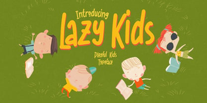 Hello Everyone, introduce our new product Lazy Kids is a Playful Kids Typeface with a natural feel. This handmade font will make your design has a beautiful natural touch for each details. It is perfect for any design project as Invitation,logo, book cover, craft or any design purposes. This font is PUA encoded which means you can access all of the magical glyphs. It also features a wealth of special features including ligatures glyphs.
 - Cool Beans by Comicraft,
$19.00 Can you dig it, man? Comicraft's Jazzy "JG" Roshell, just swung by after playing bongos down at the coffee bar in his black turtleneck sweater, stove-pipe trousers, dark glasses and beret. Check out the rad Tiki corners on our freshest font, COOL BEANS and you'll want to snap your fingers, put on some Miles Davis and take the next train out of Squaresville, um, Daddio.
 - Emfatick NF by Nick's Fonts,
$10.00 Here’s a fresh take on a classic, Caslon Black Swash by Ed Benguiat. Big, bold and beautiful, it’s a natural choice for distinctive and attractive headlines. Several alternate lowercase characters are included in the font, in place of some math operators. The PC Postscript, Truetype and Opentype versions contain the complete Latin language character set (Unicode 1252) plus support for Central European (Unicode 1250) languages as well.
 - Bodoni by Linotype,
$29.99 Giambattista Bodoni (1740–1813) was called the King of Printers and the Bodoni font owes its creation in 1767 to his masterful cutting techniques. Predecessors in a similar style were the typefaces of Pierre Simon Fournier (1712–1768) and the Didot family (1689-1836). The Bodoni font distinguishes itself through the strength of its characters and embodies the rational thinking of the Enlightenment. The new typefaces displaced the Old Face and Transitional styles and was the most popular typeface until the mid-19th century. Bodoni’s influence on typography was dominant until the end of the 19th century and, even today, inspires new creations. Working with this font requires care, as the strong emphasis of the vertical strokes and the marked contrast between the fine and thick lines lessens Bodoni’s legibility, and the font is therefore better in larger print with generous spacing. The Bodoni of Morris F. Benton appeared in 1911 with American Type Founders.
 - Yaty by Mans Greback,
$59.00 Yaty is a relaxed and spontaneous script font. With its long descenders, bold capital letters and genuine style, this typeface fits perfectly for a down-to-earth logo or headline, emitting familiarity and friendliness. The font contains ligatures and support for an extensive range of world-wide languages.
 - Ambule BT by Bitstream,
$50.99Huxley Vertical meets Peignot in this stylized cap/lowercase hybrid design called Ambule. French designer Julien Janiszewski has created a clean, straightforward design that is strikingly effective in both text and display settings. Ambule Oblique and Ambule Outline complete the typeface family, extending its range of possible uses. - Clockwork by Maulana Creative,
$22.00 Introducing Clockwork Blackletter Vintage Clockwork Blackletter Vintage is a handmade Modern Victorian handlettering, which is combining modern and classic typography with some awesome alternates. Yes we back to early 1800s, bring classic touch on this decade.
 - Benguiat Caslon by House Industries,
$33.00 Designed to be set in big, large and huge sizes in classic TNT (tight-not-touching) style, Benguiat Caslon is dynamite for a wide range of display demands. We also included outline and drop-shadow versions as well as numerous swash caps, ligatures, contextual alternates and automatically-shifting punctuation. Ed Benguiat originally designed this alphabet for the Photo-Lettering library during his tenure as the legendary type house’s art director. When we purchased Photo-Lettering in 2003, one of the first things we did was start picking some of our favorite films to digitize as fonts. Photo-Lettering partner Christian Schwartz chose this expressive serif specimen for its high contrast strokes that stand up to the most vigorous display typography demands without withering against pesky design limitations like screen resolution, ink spread and dot gain. FEATURES: Alternate characters, ligatures and contextual substitutions add an unexpected flair to words and phrases. We also provided a drop shadow to add depth and dimension. Shifting punctuation marks take care of those optical tricks so you don't have to. A delicately expressive outline version adds color even in black and white. BENGUIAT CASLON CREDITS: Typeface Design: Ed Benguiat Typeface Digitization: Christian Schwartz, Bas Smidt Typeface Production: Ben Kiel, Jason Campbell Like all good subversives, House Industries hides in plain sight while amplifying the look, feel and style of the world’s most interesting brands, products and people. Based in Delaware, visually influencing the world.
 - Rubba by MADType,
$19.00 Rubba was created using rub-on type to create completely new letterforms from the bits of others.
 - Raleigh Gothic by Red Rooster Collection,
$45.00Based on the ATF typeface by Morris F. Benton, circa 1934. Steve created two additional new weights. - Cannot Write by Forberas Club,
$16.00 Introducing Can't Write. This new Handwritten font is written by our team, and ready to pop up your project by using this font for your party, event, invitation or at your wedding decor.
 - Kette Pro by Tilde,
$39.75 The design of Kette evolved from searching new ways to make cool and semi-formal type. Study of aspects of legibility was part of the process when designing Kette. It suits posters, slogans. Condensed, Regular and Extended styles of Kette allow fitting variable long text in headlines retaining the style and feel of the original design. This Pro font is packed with all European and Cyrillic alphabets, small caps, variable figure sets and features.
 - Materhorn NF by Nick's Fonts,
$10.00This is a new and improved version of an old freeware font named Materhorn, hased on a design originally called Fanfare, designed by Louis Oppenheim in 1927 for H Berthold AG. The outlines have been completely redrawn, the entire font has been thoughtfully hand-kerned, and OpenType features have been added. Additionally, the font contains not only the complete Latin language character set (Unicode 1252) plus also support for Central European (Unicode 1250) languages - Gang by Ani Dimitrova,
$39.00 Gang is a 2 - style display font family designed by Ani Dimitrova. Both weights contain a set of extended Latin and Cyrillic, as well as all sorts of open type features: standard ligatures, proportional figures, numerals, arrows, matching currency symbols, and fractions. In both styles, the font is well-suited for large headlines, word emphasis, and different types of advertising. The fonts' wide proportions make them a perfect choice for screen usage. This style palette offers a flexible range for display typography. The Gang type family is ideally suited for magazines, branding, posters, as well as web and screen design, and more.
 - Stone by Tipos do aCASO,
$14.95Let your mind wander, think about new cultures, missing links. After discovering a bamboo pen, the founder of the first digital type foundry in the northeast of Brazil proposed a set of graphic signs for a fictional civilization. Stone, established in 1999, is the only record of a mystical culture from the age of rocks. - Umba Soft by TypeThis!Studio,
$54.00 The best thing about Umba is its surprise! UMBA Soft is a mellow sans serif typeface designed by Anita Jürgeleit. Your creation should be soft and gentle and you need a suitable font? Something that should be cuddly, sweet and soft but a serious type family that covers all your concerns? Umba Soft is your match! Your typographic composition will improve with your new favourite font. Thirty styles from thin to bold and matching italics helps you to create a highly appealing design product. Alternates and small caps are accessible in separate styles. There is no need for any special software to use them. The styles will appear in your font menu to make sure you stay aware of the many possibilities that your new font offers. 30 styles Italics Alternates Small Capitals Predefined Fractions Sub-/Superscript Numerator/Denominator Old style figures Tabular figures Ligatures Let’s get in touch! www.typethis.studio
 - Basilio by Canada Type,
$29.95 In the late 1930s, old Egyptiennes (or Italiennes) returned to the collective consciousness of European printers and type houses — perhaps because political news were front a centre, especially in France where Le Figaro newspaper was seeing record circulation numbers. In 1939 both Monotype and Lettergieterij Amsterdam thought of the same idea: Make a new typeface similar to the reverse stress slab shapes that make up the titles of newspapers like Le Figaro and Le Frondeur. Both foundries intended to call their new type Figaro. Monotype finished theirs first, so they ended up with the name, and their type was already published when Stefan Schlesinger finished his take for the Amsterdam foundry. Schlesinger’s type was renamed Hidalgo (Spanish for a lower nobleman, ‘son of something’) and published in 1940 as ‘a very happy variation on an old motif’. Although it wasn’t a commercial success at the time, it was well received and considered subtler and more refined than the similar types available, Figaro and Playbill. In the Second World War, the Germans banned the use of the type, and Hidalgo never really recovered. Upon closer inspection, Schlesinger’s work on Hidalgo was much more Euro-sophisticated and ahead of its time than the too-wooden cut of Figaro and the thick tightness of Playbill. It has a modern high contrast, a squarer skeleton, contour cuts that work similarly outside and inside, and airy and minimal solutions to the more complicated shapes like G, K, M, N, Q and W. It is also much more aware of, and more accommodating to, the picket-fence effect the thick top slabs create in setting. Basilio (named after the signing teacher in Mozart’s Figaro) is the digital revival and major expansion of Hidalgo. With nearly 600 glyphs, it boasts Pan-European language support (most Latin languages, as well as Cyrillic and Greek), and a few OpenType tricks that gel it all together to make a very useful design tool. Stefan Schlesigner was born in Vienna in 1896. He moved to the Netherlands in 1925, where he worked for Van Houten’s chocolate, Metz department store, printing firm Trio and many other clients. He died in the gas chambers of Auschwitz in 1944. Digital revivals and expansions of two of his other designs, Minuet and Serena, have also been published by Canada Type.
 - Malikasthi by Yoga Letter,
$16.00 "Malikasthi" is an elegant and beautiful brushed handwriting font. This font is equipped with uppercase, lowercase, numerals, punctuation, and multilingual support. It is suitable for weddings, engagements, business branding, stickers, banners, branding, posters, valentines, back to school, and others.
 - Butter Christmas by Yoga Letter,
$15.00 "Butter Christmas" is a very pretty handwritten font. This font is equipped with uppercase, lowercase, numerals, punctuation, ligatures, and multilingual support. It is very suitable for Christmas, Valentine, back to school, winter, autumn, birthday, wedding, engagement, and so on.
 - Favela by Borutta Group,
$29.00 Favela is an experimental, geometric and sans serif type family. It is characterised by scalable construction of glyphs – hairline version is at the same time condensed, regular is normal, and black is super extended, with short ascenders. Favela was made mainly for branding and display purposes but middle weights are prefect for short texts. Thanks to characteristic features compilation of extreme styles will work on layouts, websites and prints. Favela type Family consist 18 styles with scalable x-height and width.. All styles include over 500 glyphs with set of small caps.
 - Bejo by Twinletter,
$15.00 BEJO is a display font in the Japanese style, with each letter having its own individual personality. This font is appropriate for a wide range of project demands, particularly those involving Asian features. By utilizing this typeface, you will create a project with a gorgeous, original, and elegant appearance that will be remembered by many people. Logotypes, food banners, branding, brochure, posters, movie titles, book titles, quotes, and more may all benefit from this font. Of course, using this font in your various design projects will make them excellent and outstanding; many viewers are drawn to the striking and unusual graphic display. Start utilizing this typeface in your projects to make them stand out.
 - Square Spray by Blankids,
$22.00 Introducing of our new product the name is Square Spray Graffiti Font, Square Spray inspired by graffiti style with a fun theme very good for graffity poster, Hip Hop music, kids poster, flyer, childrenbook, cartoon, comic etc
 - Bomber Throw by Blankids,
$21.00 Introducing of our new product the name is Bomber Throw Graffiti Font, Bomber Throw inspired by graffiti style with a fun theme very good for graffity poster, Hip Hop music, kids poster, flyer, childrenbook, cartoon, comic etc
 - Street Lord by Blankids,
$23.00 Introducing of our new product the name is Street Lord Graffiti Font, Street Lord inspired by graffiti style with a fun theme very good for graffity poster, Hip Hop music, kids poster, flyer, childrenbook, cartoon, comic etc
 - Stepra Murtinella by Wontenart,
$20.00 is a sans serif font with a wide range of uses, This san serif output can cover any product from fashion products, such as beauty equipment, clothes, shoes, magazines, women's knick-knacks to anything related to today's women. I made this font more subtle than the typical san serif family. because it is intended for more detailed beauty. You can see a preview of it in the image I made. Thank you
 - Castle by Linotype,
$29.99This family, which includes faces in light, book, bold, and ultra weights, more stroke contrast than is typical of sans serifs, making it very legible in text. Because of its large x-height, it is recommended for used in point sizes ranging from 12 point upward. Of course, it functions well in display sizes, too. The contrast between the four weights makes this family optimal for use in hierarchical advertising systems, and corporate identity uses. - CUKIER by Borutta Group,
$29.00 After my previous typefaces inspired by the flavour of local typography (Massimo, Picadilly & Zigfrid), I'd like to present new one, called CUKIER. This family was designed mainly for branding purposes - visual identity of CUKIER.WORKS Agency. Cukier is a sans serif, geometric typeface, inspired by the vernacular typography from Zanzibar (Tanzania). A lot of letters have intentionally made mistakes in a drawing, and this it what makes the whole font unusual. Family consist 10 styles – 5 weights with italics.
 - Atocha by Sudtipos,
$49.00 It was expected that Joluvian’s third type font would be inspired by the city where he currently resides: Madrid, Spain. His previous creations had originated in Venezuela (Zulia) and The Philippines (Salamat), both, places where he had once lived. Joluvian believes “now is the time to pay tribute and show gratitude towards a city that has bestowed me with so many fortunes.” He considers that Madrid’s people, streets, scents, flavor and sounds are gift enough to awaken the creative urgency in any artist. This time around, it is being expressed through the crafts of the Typographic industry. Since his arrival in Spain, Joluvian has been attached to the city’s central area, specifically to the renowned Atocha Street and its railroad station. It was precisely on that street that Joluvian and Mauco Sosa, his friend and partner, decided to establish the Patera Studio: a charming creative space that birthed the concept for this new font which they proudly named Atocha Script. The artists where still in the final phases of their previous script, Salamat, when the idea for Atocha came about. This dynamic is actually very typical of the artistic process, in which every finished product spawns the need to create its next level offspring. “Working on Atocha and Atocha Caps has been a very pleasant journey. We have given our best efforts, for we wanted to offer a typeface that was both versatile and user-friendly on a number of applications, showing a wide scope of alternatives in our glyphs,” says the artist. The illustrations were created by Mauco, to ensure visual integration that would showcase the work of both members of the Patera Studio and their complementing aesthetic voices. Atocha, as Salamat and Zulia before, was digitized by Alejandro Paul.
 - Jams And Jellies JNL by Jeff Levine,
$29.00 Based on a vintage set of kitchen labels, Jams and Jellies JNL is a font containing 52 of the most common names for jams, jellies and preserves as well as a blank label for creating your own flavor choices. Note: While this font may be used in many commercial advertising applications, any manufacture for retail sale of a complete set (or portion thereof) of these labels requires a special license from the font's author.
 - Wanderlust Collection by Cultivated Mind,
$32.00 Wanderlust Letters has returned, but now offered in a beautiful collection of hand painted scripts. New versions include Wanderlust Letters Pro, Decorative, Boho, Chic, Shine, Gold, Caps, and Ornaments. Wanderlust Letters Pro is an extended version of the immensely popular Wanderlust Letters. This latest version includes three sets of basic alternates, one set of decorative alternates, and one set of ligatures. Wanderlust Decorative Pro offers a magnificent updated flow from the initial Wanderlust Letters release. Decorative Pro includes two sets of decorative alternates, two sets of basic alternates, and one set of ligatures. Decorative Regular comes with one set of decorative alternates. Boho, Chic, Shine and Gold are an updated spin off of Wanderlust Letters. These fonts offer new letter styles that blend seamlessly with all Wanderlust fonts. Pro versions of Chic, Shine and Gold comes with three sets of basic alternates and one set of decorative alternates. Boho Pro comes with with two sets of basic alternates and two sets of decorative alternates. Caps is a perfect choice for headline use since it’s an all uppercase font. But don't be afraid to mix it up with all the other Wanderlust fonts. The entire Wanderlust Collection works impeccably to enhance your magazine, packaging, advertising, branding, posters, websites, and films. Combine all Wanderlust fonts with Ornaments to create unique hand painted typography art.
 - Blushing by Crumphand,
$16.00 Hello, introducing new font, its called Blushing. Blushing is natural beauty handtype. im making this font for specific product. this font very match for your beauty product : Cosmetic, Cream product, Nail art, Spa & Beauty, Lipstick, Shampoo and etc. You can mix and match with regular font. what's included inside the font ? Uppercase Lowercase Numeral & Punctuation Multilinguals Standart Ligatures Thank You!