10,000 search results
(0.248 seconds)
- Valentine by profonts,
$51.99 Valentine is another brand-new profonts script typeface family with versions in light, light italic, medium and medium italic, supplied in the new OpenType Pro font format. Valentine contains about 1.100 glyphs for every weight, covering the complete Latin character set (West, East, Baltic, Turkish, Romanian), and a huge number of handmade ligatures, character combinations and alternates to make it a perfect OpenType Pro connecting script. Valentine is a very distinguished, elegant and versatile script font.
 - Vintage Painting by Aestherica Studio,
$12.00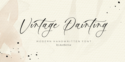 Introducing the new Handwritten Script Font by Aestherica Studio. Proudly Present, Vintage Painting Vintage Painting is perfect for product packaging, branding project, megazine, social media, wedding, or just used to express words above the background. This font includes multilingual support. Enjoy the font, feel free to comment or feedback, send me PM or email.
 - Maus by Sentinel Type,
$10.00A heavy duty block-shadow font derived from Sentinel Sten Type, Maus' inflexible, near-featureless block-like shapes give the impression of great mass and solidity. Maus is an example of minimalism in type design, using a minimum of sculpting to elicit the essence of familiar Latin forms. Two sets of complimentary letters allow designers to pick and choose combinations for letter fit, for their symmetric values, or to create a particular look or feel to suit the subject. Obviously Maus has great potential for signage, posters and billboards, and screen-printed garments. - Tribal Spiral BA by Bannigan Artworks,
$14.95This font was inspired by the swirling and spiraling art from various cultures such as the ancient Celtic and Pictish tribes of Ireland and Scotland, and the Maori moko tattoos of New Zealand. - Orotund by Canada Type,
$24.95 This is the digitization and considerable expansion of the cheeky and enormously popular film type Eightball, one of the most widely used faces of the 1970s and 1980s. Round and happy like a bouncy ball, these are letters after a sign maker’s own heart. Seen everywhere in its film version, from bingo and pool hall parlor signs to comic books, now this computer version opens the door for the happy roundness to be used on a much larger scale by anyone who designs layouts on a computer. The original film type included a few alternates. We included them, but we added many more as well. So make sure to check out the various OpenType features in your program while using this font. Eightball is great for a variety of applications, including signage, rubber stamps, poster design, titling, cartoons, comics, and pretty much anything where happy and round fit in.
 - Rainier by Kimmy Design,
$10.00 I was inspired to create the Rainier type family during my summer back home in the Pacific Northwest. The concept behind it may be simple - a hand crafted font family - but what it delivers is quite complex! Here is a breakdown of everything you get: FONT FAMILIES: Two sub-families with unique styles - Rainier North and Rainier West WEIGHTS: 4 weights per family, broken down numerically - 100 (light), 300 (regular), 500 (bold), 700 (black) OPENTYPE: In each family, there are tons of OpenType options, offering lots of customizable opportunities (in order to access all these goodies, you must be using Illustrator, Photoshop, Indesign or Publisher). Because Rainier is 100% handmade, contextual alternatives allow each letter has three subtle variations, this way it keeps that authentic hand-drawn look. Additionally, a full alphabet with special descending swashes, as well as start and end swashes for capitals and small caps. Titling alternatives offer a full character set just to help with readability! Meant for captions or smaller text, these letterforms are easy on the eye and a great complement to the regular alphabet. Stylistic Alternatives add a little fun, providing a unified cap height, no matter what case you are using (all caps, small caps or lowercase.) Discretionary Ligatures are created only for capitals, and takes specific letter pairs and creates a unique ligature between them To get a better understanding of everything, please check out the quicker user guide (http://bit.ly/1W0Bfma) and print if you so desire (http://bit.ly/23W9ZV6) that helps you navigate your way around and get the most out of Rainier! Unfortunately those links aren't working right now and soon I will have them fixed. So sorry! ORNAMENTS: In addition to the font, you get a set of awesomely rustic ornaments designed and drawn to go specifically with Rainier! - Rustic Northwest Illustrations - Banners & Flags - Frames - Flourishes - Lines & Line Breaks - Arrows There are a lot of extras packed in this set, so make sure you check out the Ornaments User Guide to get the most out of it! Check it out here: http://bit.ly/1rRVJRx And that’s all folks! Hope you enjoy Rainier!
 - Sinkwitz Gotisch by preussTYPE,
$29.00 Sinkwitz Gotisch is a new release of the font of the same name originally designed by Paul Sinkwitz in 1942. The Sinkwitz Gotisch was 1942 by Schriftguss AG Dresden font cast first cast and later supplied by the East German firm VEB Typoart. Paul Sinkwitz (1899-1981) has created them. This font displays not the characteristics of a chunky Gothic, which have influenced the image of national socialism. Paul Sinkwitz was a painter, graphic artist, wood engraver, was interested in religious topics, which he had presented in numerous graphics. But also his interpretation of his Gothic font is modern, without having the font this is ugly. In addition to the GOTISCH he created Roman Uppercase letters, which perfectly harmonize with the lowercase letters. This extra font is called BASTARD. The digital version of Sinkwitz is a beneficial addition to a Gothic with calligraphic character and should be in any historically interested graphic design.
 - Celebrity by Canada Type,
$24.95 Celebrity is a new execution of a film type concept put forth by Willy Wirtz in 1971. The original idea, called Latus, had many irregularities and unfit characters that are now fixed and expanded in this digital version. Celebrity's construct combines extreme thicks with hairline thins to build forms that contribute to a type totality that is at once modern and techno, as well as retro-deco. Eye catching and memorable, Celebrity is ideal for use on posters, book covers, media sleeves and packaging. It also has enough geometric appeal to inspire unique logos and set attractive titling. Celebrity comes in all popular font formats, and includes a very expanded Latin character set.
 - KG Build A Game by Kimberly Geswein,
$5.00 Build your own board game! This unique font contains lots of bits and pieces to put together your very own custom board game. Print the backgrounds large on cardstock and use the blank die outline to createa custom die! This is a great creativity builder for kids – let them create their own game with their own rules! Alisha Peare of The Bubbly Blonde has come up with a great free synonym/antonym game to showcase some of the ways you can use this font. Download her excellent game for free here: http://www.teacherspayteachers.com/Product/Lost-Leprechaun-AntonymSynonym-Game-Board-FREEBIE
 - Algerian Rnd by FontMesa,
$29.00 It's finally here, Algerian Rnd is an all new version of our Algerian Mesa font with rounded soft corners and serifs. Imagine the impact Algerian Rnd will have on your product label and packaging. Algerian Rnd is a new timeless beauty that you'll find many uses for in your logos and advertising. Algerian Rnd is for every generation, put it to work in your next project, you're going to love this font. Algerian Rnd does include some alternate glyphs which you'll need an Opentype aware application to access the alternates in Algerian Rnd. Algerian Rnd is ideal for product logos, labels, packaging, t-shirt designs and other merch. Algerian Rnd is a trademark of FontMesa LLC
 - Makeba Retro Funky Groovy by Beast Designer,
$15.99 Makeba Retro Funky Groovy Font is a fun and funky display font that brings back the spirit of the 70s. Its bold, rounded letters feature groovy curves and playful embellishments that exude a retro vibe. This font is perfect for creating eye-catching titles and headlines for posters, album covers, and other retro-inspired designs. The font’s energetic and upbeat personality is sure to make any project stand out.
 - VT Showcard by VarsityType,
$15.00 This condensed block is a true knockout. VT Showcard is a heavy-hitting headliner with presence. Inspired by the boxing showcards of the 60’s and 70’s, VT Showcard towers over body copy and demands attention. This tall and mighty athletic display typeface features chiseled corners and subtle embellishments that reinforce a steady rhythm across its dramatic letterforms. With 7 weights, VT Showcard provides a versatility for sports headlines and similar projects.
 - Enza by Neo Type Foundry,
$25.00 Enza is a display font designed by José José Villamizar. Its design stems from the typographic exploration for the realization of the identity of a company aimed at entrepreneurs in the millennium generation. It’s a family of five weights composed of 455 glyphs. includes Thin, Light, Medium, Bold and Black styles. It also includes stylistic alternates, fractions, and ligatures. Its use is recommended for titles, semicondensed texts or short, and elements of visual communication large phrases. It is also ideal for creating logos, in packaging, signboards and poster design.
 - Nimble by Twinletter,
$14.00 Nimble carries a strong, unique, cute, elegant, and formal character theme with a different touch, giving a new impression. beautiful, harmonious, relaxed but still formal. This font is rich in uniqueness in various characters in each letter, especially uppercase letters. you can alternate calls in each uppercase letter to create a new and captivating look in writing a name or trademark or something else. This font is perfect for strong text with displays for a wide variety of branding, advertising, posters, banners, packaging, news headlines, magazines, websites, logo design, and more.
 - Basalt by Volcano Type,
$19.00 Basalt is a hard, black volcanic rock with less than about 52 weight percent silica. Because of basalt's low silica content, it has a low viscosity (resistance to flow). Basalt is erupted at temperatures between 1100 to 1250° C.
 - Alfarn by Adobe,
$29.00Alfarn is based on capital letters that Bauhaus student Alfred Arndt (1898?1976) drew for a poster in 1923, designed to advertise a bakery in Jena, Thuringia. The poster is an example for what we call today ?Bauhaus features?: yellow circle, red square, black bars and an indication of geometric lettering that became so popular in the following years. C�line Hurka carefully analysed Arndt?s lettering and derived two weights in different widths: wide and condensed. She took on the characteristic bars and transformed them into an underlined weight of its own. Hurka also drew perfectly balanced small caps, which make up for a missing lower case. Alfarn captures the spirit of 1920s Bauhaus-influenced posters ? a timeless style quite suitable for contemporary designs. - Utopian by Sudtipos,
$39.00 UTOPIAN is a color font family based on primary colors and pure geometric shapes, influenced by Bauhaus, DeStijl and Art Deco. Its pure shapes and basic colors are inspired by the beauty of simplicity of modular order and grid, creating a perfect environment where all these elements live in a perfect color harmony. In the other hand, DYSTOPIAN, the black and white family, represents a close sibling in appearance and structure, that carries an opposite meaning, with a darker look and feel. Both typefaces are, somehow, a reflection of the divided views and posible outcomes that the future times ahead yield before us. Package: Utopian/Dystopian comes in file with a pre-defined color palette. You can always change the colors converting the text to outlines. Technical info to use: The package contains a normal TTF/OTF set of fonts in Black and White and a colorfont in SVG-TTF format. To be able to use the color file you need to have installed Adobe Photoshop CC2017 or Adobe Illustrator CC2018. Not all the browsers support color fonts so please be sure to use them as graphics.
 - Battista by preussTYPE,
$29.00 The BATTISTA typeface stands in the long tradition of the designs developed by Giambattista Bodoni, who made his famous typefaces in the end of the eighteenth century. Similar designs can be found on various specimen books e.g. Alexander Wilson, John Bell, Edmund Fry and Alexander Thibaudeau. One of the best italics was available by Stephenson Blake & Co. foundry form Sheffield, England. In the end of the nineteenth century an unknown punch cutter at the German type foundry Schelter & Giesecke made an very bold cut of this Bodoni design. He brought both designs, the regular and the italic to an new level of harmony. Compared to the original Bodoni designs the new typeface was a lot bolder, which was well taken by the audience in this time. The BATTISTA typeface is an remarkable design, assembled of ultra bold and very fine shapes, but in all, the spirit of Bodonis design was well preserved. BATTISTA is a classic display design. The fine details are best shown on larger text sizes.
 - Times Eighteen by Linotype,
$29.00In 1931, The Times of London commissioned a new text type design from Stanley Morison and the Monotype Corporation, after Morison had written an article criticizing The Times for being badly printed and typographically behind the times. The new design was supervised by Stanley Morison and drawn by Victor Lardent, an artist from the advertising department of The Times. Morison used an older typeface, Plantin, as the basis for his design, but made revisions for legibility and economy of space (always important concerns for newspapers). As the old type used by the newspaper had been called Times Old Roman," Morison's revision became "Times New Roman." The Times of London debuted the new typeface in October 1932, and after one year the design was released for commercial sale. The Linotype version, called simply "Times," was optimized for line-casting technology, though the differences in the basic design are subtle. The typeface was very successful for the Times of London, which used a higher grade of newsprint than most newspapers. The better, whiter paper enhanced the new typeface's high degree of contrast and sharp serifs, and created a sparkling, modern look. In 1972, Walter Tracy designed Times Europa for The Times of London. This was a sturdier version, and it was needed to hold up to the newest demands of newspaper printing: faster presses and cheaper paper. In the United States, the Times font family has enjoyed popularity as a magazine and book type since the 1940s. Times continues to be very popular around the world because of its versatility and readability. And because it is a standard font on most computers and digital printers, it has become universally familiar as the office workhorse. Times™, Times™ Europa, and Times New Roman™ are sure bets for proposals, annual reports, office correspondence, magazines, and newspapers. Linotype offers many versions of this font: Times™ is the universal version of Times, used formerly as the matrices for the Linotype hot metal line-casting machines. The basic four weights of roman, italic, bold and bold italic are standard fonts on most printers. There are also small caps, Old style Figures, phonetic characters, and Central European characters. Times™ Ten is the version specially designed for smaller text (12 point and below); its characters are wider and the hairlines are a little stronger. Times Ten has many weights for Latin typography, as well as several weights for Central European, Cyrillic, and Greek typesetting. Times™ Eighteen is the headline version, ideal for point sizes of 18 and larger. The characters are subtly condensed and the hairlines are finer. Times™ Europa is the Walter Tracy re-design of 1972, its sturdier characters and open counterspaces maintain readability in rougher printing conditions. Times New Roman™ is the historic font version first drawn by Victor Lardent and Stanley Morison for the Monotype hot metal caster." - Times Europa LT by Linotype,
$29.99In 1931, The Times of London commissioned a new text type design from Stanley Morison and the Monotype Corporation, after Morison had written an article criticizing The Times for being badly printed and typographically behind the times. The new design was supervised by Stanley Morison and drawn by Victor Lardent, an artist from the advertising department of The Times. Morison used an older typeface, Plantin, as the basis for his design, but made revisions for legibility and economy of space (always important concerns for newspapers). As the old type used by the newspaper had been called Times Old Roman," Morison's revision became "Times New Roman." The Times of London debuted the new typeface in October 1932, and after one year the design was released for commercial sale. The Linotype version, called simply "Times," was optimized for line-casting technology, though the differences in the basic design are subtle. The typeface was very successful for the Times of London, which used a higher grade of newsprint than most newspapers. The better, whiter paper enhanced the new typeface's high degree of contrast and sharp serifs, and created a sparkling, modern look. In 1972, Walter Tracy designed Times Europa for The Times of London. This was a sturdier version, and it was needed to hold up to the newest demands of newspaper printing: faster presses and cheaper paper. In the United States, the Times font family has enjoyed popularity as a magazine and book type since the 1940s. Times continues to be very popular around the world because of its versatility and readability. And because it is a standard font on most computers and digital printers, it has become universally familiar as the office workhorse. Times™, Times™ Europa, and Times New Roman™ are sure bets for proposals, annual reports, office correspondence, magazines, and newspapers. Linotype offers many versions of this font: Times™ is the universal version of Times, used formerly as the matrices for the Linotype hot metal line-casting machines. The basic four weights of roman, italic, bold and bold italic are standard fonts on most printers. There are also small caps, Old style Figures, phonetic characters, and Central European characters. Times™ Ten is the version specially designed for smaller text (12 point and below); its characters are wider and the hairlines are a little stronger. Times Ten has many weights for Latin typography, as well as several weights for Central European, Cyrillic, and Greek typesetting. Times™ Eighteen is the headline version, ideal for point sizes of 18 and larger. The characters are subtly condensed and the hairlines are finer. Times™ Europa is the Walter Tracy re-design of 1972, its sturdier characters and open counterspaces maintain readability in rougher printing conditions. Times New Roman™ is the historic font version first drawn by Victor Lardent and Stanley Morison for the Monotype hot metal caster." - Times Ten by Linotype,
$40.99In 1931, The Times of London commissioned a new text type design from Stanley Morison and the Monotype Corporation, after Morison had written an article criticizing The Times for being badly printed and typographically behind the times. The new design was supervised by Stanley Morison and drawn by Victor Lardent, an artist from the advertising department of The Times. Morison used an older typeface, Plantin, as the basis for his design, but made revisions for legibility and economy of space (always important concerns for newspapers). As the old type used by the newspaper had been called Times Old Roman," Morison's revision became "Times New Roman." The Times of London debuted the new typeface in October 1932, and after one year the design was released for commercial sale. The Linotype version, called simply "Times," was optimized for line-casting technology, though the differences in the basic design are subtle. The typeface was very successful for the Times of London, which used a higher grade of newsprint than most newspapers. The better, whiter paper enhanced the new typeface's high degree of contrast and sharp serifs, and created a sparkling, modern look. In 1972, Walter Tracy designed Times Europa for The Times of London. This was a sturdier version, and it was needed to hold up to the newest demands of newspaper printing: faster presses and cheaper paper. In the United States, the Times font family has enjoyed popularity as a magazine and book type since the 1940s. Times continues to be very popular around the world because of its versatility and readability. And because it is a standard font on most computers and digital printers, it has become universally familiar as the office workhorse. Times™, Times™ Europa, and Times New Roman™ are sure bets for proposals, annual reports, office correspondence, magazines, and newspapers. Linotype offers many versions of this font: Times™ is the universal version of Times, used formerly as the matrices for the Linotype hot metal line-casting machines. The basic four weights of roman, italic, bold and bold italic are standard fonts on most printers. There are also small caps, Old style Figures, phonetic characters, and Central European characters. Times™ Ten is the version specially designed for smaller text (12 point and below); its characters are wider and the hairlines are a little stronger. Times Ten has many weights for Latin typography, as well as several weights for Central European, Cyrillic, and Greek typesetting. Times™ Eighteen is the headline version, ideal for point sizes of 18 and larger. The characters are subtly condensed and the hairlines are finer. Times™ Europa is the Walter Tracy re-design of 1972, its sturdier characters and open counterspaces maintain readability in rougher printing conditions. Times New Roman™ is the historic font version first drawn by Victor Lardent and Stanley Morison for the Monotype hot metal caster." - Times Ten Paneuropean by Linotype,
$92.99In 1931, The Times of London commissioned a new text type design from Stanley Morison and the Monotype Corporation, after Morison had written an article criticizing The Times for being badly printed and typographically behind the times. The new design was supervised by Stanley Morison and drawn by Victor Lardent, an artist from the advertising department of The Times. Morison used an older typeface, Plantin, as the basis for his design, but made revisions for legibility and economy of space (always important concerns for newspapers). As the old type used by the newspaper had been called Times Old Roman," Morison's revision became "Times New Roman." The Times of London debuted the new typeface in October 1932, and after one year the design was released for commercial sale. The Linotype version, called simply "Times," was optimized for line-casting technology, though the differences in the basic design are subtle. The typeface was very successful for the Times of London, which used a higher grade of newsprint than most newspapers. The better, whiter paper enhanced the new typeface's high degree of contrast and sharp serifs, and created a sparkling, modern look. In 1972, Walter Tracy designed Times Europa for The Times of London. This was a sturdier version, and it was needed to hold up to the newest demands of newspaper printing: faster presses and cheaper paper. In the United States, the Times font family has enjoyed popularity as a magazine and book type since the 1940s. Times continues to be very popular around the world because of its versatility and readability. And because it is a standard font on most computers and digital printers, it has become universally familiar as the office workhorse. Times™, Times™ Europa, and Times New Roman™ are sure bets for proposals, annual reports, office correspondence, magazines, and newspapers. Linotype offers many versions of this font: Times™ is the universal version of Times, used formerly as the matrices for the Linotype hot metal line-casting machines. The basic four weights of roman, italic, bold and bold italic are standard fonts on most printers. There are also small caps, Old style Figures, phonetic characters, and Central European characters. Times™ Ten is the version specially designed for smaller text (12 point and below); its characters are wider and the hairlines are a little stronger. Times Ten has many weights for Latin typography, as well as several weights for Central European, Cyrillic, and Greek typesetting. Times™ Eighteen is the headline version, ideal for point sizes of 18 and larger. The characters are subtly condensed and the hairlines are finer. Times™ Europa is the Walter Tracy re-design of 1972, its sturdier characters and open counterspaces maintain readability in rougher printing conditions. Times New Roman™ is the historic font version first drawn by Victor Lardent and Stanley Morison for the Monotype hot metal caster." - Times by Linotype,
$40.99In 1931, The Times of London commissioned a new text type design from Stanley Morison and the Monotype Corporation, after Morison had written an article criticizing The Times for being badly printed and typographically behind the times. The new design was supervised by Stanley Morison and drawn by Victor Lardent, an artist from the advertising department of The Times. Morison used an older typeface, Plantin, as the basis for his design, but made revisions for legibility and economy of space (always important concerns for newspapers). As the old type used by the newspaper had been called Times Old Roman," Morison's revision became "Times New Roman." The Times of London debuted the new typeface in October 1932, and after one year the design was released for commercial sale. The Linotype version, called simply "Times," was optimized for line-casting technology, though the differences in the basic design are subtle. The typeface was very successful for the Times of London, which used a higher grade of newsprint than most newspapers. The better, whiter paper enhanced the new typeface's high degree of contrast and sharp serifs, and created a sparkling, modern look. In 1972, Walter Tracy designed Times Europa for The Times of London. This was a sturdier version, and it was needed to hold up to the newest demands of newspaper printing: faster presses and cheaper paper. In the United States, the Times font family has enjoyed popularity as a magazine and book type since the 1940s. Times continues to be very popular around the world because of its versatility and readability. And because it is a standard font on most computers and digital printers, it has become universally familiar as the office workhorse. Times™, Times™ Europa, and Times New Roman™ are sure bets for proposals, annual reports, office correspondence, magazines, and newspapers. Linotype offers many versions of this font: Times™ is the universal version of Times, used formerly as the matrices for the Linotype hot metal line-casting machines. The basic four weights of roman, italic, bold and bold italic are standard fonts on most printers. There are also small caps, Old style Figures, phonetic characters, and Central European characters. Times™ Ten is the version specially designed for smaller text (12 point and below); its characters are wider and the hairlines are a little stronger. Times Ten has many weights for Latin typography, as well as several weights for Central European, Cyrillic, and Greek typesetting. Times™ Eighteen is the headline version, ideal for point sizes of 18 and larger. The characters are subtly condensed and the hairlines are finer. Times™ Europa is the Walter Tracy re-design of 1972, its sturdier characters and open counterspaces maintain readability in rougher printing conditions. Times New Roman™ is the historic font version first drawn by Victor Lardent and Stanley Morison for the Monotype hot metal caster." - Tooth & Nail by Set Sail Studios,
$12.00 Introducing Tooth & Nail; a rustic & hearty hand-painted dry brush font, designed to work in both all-caps as well as lowercase. It also includes a bonus vector pack, featuring 24 elements designed to boost your text and reaffirm it's hand-made style. With rough bold strokes and high quality textures throughout, Tooth & Nail is the perfect workhorse font for product packaging, promotional messages, handwritten quotes, home decor and branding projects. Tooth & Nail is reliable and familiar, like meeting someone for the first time and feeling like you've been reunited with an old friend. Tooth & Nail consists of 2 styles: 1. Tooth & Nail • A handwritten brush font containing upper & lowercase characters, numerals and a large range of punctuation. 2. Tooth & Nail Alt • This is a second version of Tooth & Nail, with a completely new set of lowercase characters. If you wanted to avoid letters looking the same each time to recreate a custom-made style, or try a different word shape, simply switch to this font for an additional layout option.
 - Phervasans by Emboss,
$12.95 If you build a block, they will come.
 - Compressed Wood JNL by Jeff Levine,
$29.00 Two word examples (“nice” and “bud”) from the J.G. Cooley & Co.’s Specimens of Wood Type catalog for the typeface ‘Roman Triple Extra Condensed Fifty Line’ offered only seven letters to work with. Despite this lack of characters, it inspired Compressed Wood JNL, which is available in both regular and oblique versions.
 - Awwam by Eyad Al-Samman,
$20.00 Awwam refers to the region of Awwam which is now thought by most scholars to be Ma'rib or the famous temple of Awwam otherwise known as Mahram Bilqis. The Awwam temple—Arabic Haram Bilqis or Mahram Bilqis—is a Sabaean temple near Ma'rib in today's Yemen. It was built by Mukarrib ‘Yada'il Dharih I’ between the 7th and 5th century B.C. Also, one of the most frequent titles of the God ‘Almaqah’ was the Lord of Awwam. Almaqah was the main God of the ancient Yemeni kingdom of Saba' and also the kingdoms of D’mt and Aksum in Eritrea and Northern Ethiopia. Different members of the ruling dynasties of Saba' regarded themselves as Almaqah’s children. Awwam is a wide and headline Arabic display typeface. The main trait of this typeface is the wide, curved, and streamlined design of its wide kashida, letters, and ligatures. This feature renders it as one of the modern stylish typefaces used for headlines, titles, headers, banners, and captions. Among the distinguished letters of Awwam typeface are the “Alef”, “Qaaf”, “Waaw”, “Yaa”, “Gheen”, and others. Moreover, Awwam typeface has a character set which supports Arabic, Persian, Urdu, and simple Latin letters/numerals with a limited range of specific Arabic and Latin ligatures. This typefac comes in two styles (i.e., Awwam, and Awwam-Pro) with a single weight (i.e., regular) and nearly 650 distinctive glyphs for each style. Due to its ultra-wide design, Awwam typeface is mostly appropriate for headings and titles in Arabic, Persian, and Urdu. It can be graphically and visually exploited in books, novels, magazines, newsletters, pamphlets, posters, and interfaces of other objects such as clothes and equipment. Moreover, it can be pleasingly used for signs, books’ covers, advertisement light boards, and titles of flyers, and books of children and adults. In brief, Awwam typeface is one of the new wide Arabic typefaces which can be utilized efficiently in diverse graphic, typographic, and artistic works for different languages and cultures.
 - Bellowers by Aestherica Studio,
$12.00 Introducing a new handwritten script font by Aestherica Studio. Bellowers is perfect for product packaging, branding projects, magazines, social media, wedding, or just used to express words above the background. Enjoy the font.
 - Schwager Sans by Latinotype,
$25.00 Schwager sans is the new version of Schwager. This time with a fresher taste, retaining the same principles of structure, geometry and modernist aesthetics in a contemporary reinterpretation. Designed especially for use in titles, reveals concepts associated with masculinity, technology or sports, perfect for application in cover design, logos, web.
 - Garota Serif - Personal use only

- Realtime Text Rounded by Juri Zaech,
$30.00 Realtime Text Rounded is the proportional alternative to the monospaced Realtime type family. Nevertheless Realtime Text Rounded includes a monospaced design already built into the font. It is employable through OpenType by activating alternate characters. Realtime Text Rounded is a technical yet friendly design with details that serve function and visual impact alike and lends itself to tabular designs, sturdy columns and tidy layouts. It comes in five weights, from light to black, and with a character set that covers over 200 latin languages.
 - Gosent by NamelaType,
$19.00 Gosent is a Modern Sans serif typeface that has larger x-height size, it will give great performance in small text sizes. Features moderate contrast and lots of special details like the unusual ink trap, giving a modern feel. Gosent is great your various design, both serious and fun projects. Consists of 9 Weight variants from Thin to Black and comes with Oblique version
 - Carnival by House Industries,
$33.00 Unlike the modest fonts in your menu content with discreetly imparting information, Carnival is conspicuous by design. Deliberately engineered to attract eyeballs, the typeface’s unmistakable silhouette produces a dramatic visual texture that stands out in print, on screen, or in any environment where your message demands to be noticed. The steady yet vibrant rhythm created by its letterforms also makes Carnival ideal for fashioning alphabet patterns and graphic devices. Flaunting a lean slender body anchored by stout stroke endings, Carnival turns conventional typographic thinking on its head by inverting the relative thickness of its stems and serifs. This reverse-contrast approach stretches all the way back to the roots of modern advertising, when similar types became the favorite for posters, packaging, and loads of consumer products during the 1800s. The striking style prevailed well into the next century, as Harold Horman, co-founder of New York City-based Photo-Lettering. Inc., modernized a version for the company’s popular film-typesetting service in the early 1940s. Digitized and expanded by Dan Reynolds in 2013, Carnival had previously been used exclusively for House Industries projects. Now you can get in on the action, and use this stunning slice of type history anytime you want your work to turn heads. SUGGESTED USES Carnival’s unique character commands attention, making it the perfect voice for promotional pieces, editorial design, labels, packaging, posters, and any other application that needs to strike the right tone. Like all good subversives, House Industries hides in plain sight while amplifying the look, feel and style of the world’s most interesting brands, products and people. Based in Delaware, visually influencing the world.
 - Ciutadella Display by Emtype Foundry,
$69.00 Ciutadella Display is the extreme partner of the popular Ciutadella family for use in large sizes. The weight has been taken to the limit in both directions. It is available in Open Type format and includes Alternate Characters, Ligatures, Tabular Figures, Fractions, Numerators, Denominators, Superiors and Inferiors. It supports Central and Eastern European languages. The type family consists of 12 styles, 6 weights (Thin, UltraLight, ExtraLight, ExtraBold, Black and UltraBlack) plus italics, creating an expanded and really flexible system. See also the original Ciutadella, Ciutadella Rounded and Ciutadella Slab.
 - Straight Angles by Celebrity Fontz,
$24.99Straight Angles is a precisely designed three-dimensional font with a clean and futuristic look. The predominant angles are 90 degrees and 180 degrees with parallel and perpendicular lines. Each character is surrounded by a crisp black border of even thickness throughout the font. Upper- and lower-case letters are the same, providing a constant maximum top height while the stems extending below are allowed to show off their distinct personalities in order to spice things up. The 3D extrusion effect makes text appear to stand out from the page. - FS Hackney by Fontsmith,
$80.00 Elliptical The squareness of curves. That was the elliptical – in more than one sense – notion being explored in the making of FS Hackney. The squareness of curves and vertical terminals to create a gentle, soft sans serif, with a little bit of magic. A momentary thought – “It doesn’t have to be like this” – provided the spur to explore the verticals and skeletons of letterforms beyond conventional type design limits. A 12-month gestation period gave rise to a font with a larger-than-usual character set, including non-lining figures, small caps and superior and inferior numbers. It’s a collection that speaks confidently for itself. Assertive It was the Hackney carriage – the black London cab – that gave this font its name, not the north London neighbourhood. Solid, dependable, effective and built to last, FS Hackney was honed to perform in all conditions. Cool, compelling lines and a satisfying overall simplicity lend FS Hackney its assertive air. Assured, versatile and effective; just like a black cab (but without the grumbling). Machined Over a string of meetings, Jason Smith and FS Hackney designer Nick Job worked out how to infuse Nick’s sketched letterforms with Fontsmith’s familiar geniality. “Nick is very meticulous and produces very clean design work,” says Jason. “Hackney is ideal for branding as it’s very clear and its quirks are sensible ones, not odd ones, that don’t distract from the message.”
 - Adieu Two Pro by Hackberry Font Foundry,
$24.95 AdieuTwo is a radical revision of Adieu which was a revision of my original font, Chivalry, that was traced from Chevalier back in the mid-1990s. Its roots are obvious, but this one has small caps, small cap figures, oldstyle figures, ligatures, and more. This is a thoroughly up-to-date font ready to be used for stylish heads.
 - Austin Antique by HiH,
$10.00 “More is better” may have been the motto of Richard Austin of Austin and Son’s Imperial Letter-Foundry on Worship Street at Finsbury Square in London when he designed and cut his Antique typeface. The year it was created is uncertain, but it is known to have appeared in a specimen book produced in 1827. At first glance, the upper case letters of Austin Antique look very much like Figgins Antique. But, upon examination, one will note that the Austin face is much darker. In general, the letters designed and cut by Richard Austin have fatter strokes, larger serifs and smaller counters -- more metal and less daylight. The premise was that the darker the letter, the more attention an ad using the typeface would receive. In old pictures of London and Paris one may see walls crowded with posters and “bills” -- competing for the attention of the passerby. Morris and Updike aside, the early nineteenth century marked the beginning of a commercial as well as industrial revolution. Patterns of commerce were changing. With new methods of marketing came the need for new typefaces to support the new methods. Foundries found the display types were very profitable and competed most energetically and creatively for the trade. There was a lot of trial-and-error. Some ideas faded away. Others, like the Antiques or Egyptians, were refined and developed. From them came the Clarendons that were to prove both popular and long lasting -- because they worked. Their job was to sell goods, not please the aesthetic sensibilities of the critics. They did their job well. Austin Antique has a full Western European character set, plus the following ligatures: ct, st, fi, fl, ff, ffi and ffl. Tabular numbers. Surprisingly readable.
 - Linotype Scrap by Linotype,
$29.00Linotype Scrap is part of the Take Type Library, chosen from the entries of the Linotype-sponsored International Digital Type Design Contests of 1994 and 1997. The font is available in two weights and was designed by German artist Ingo Preuss. It is as though the forms of the basic weight were cut with scissors out of pieces of paper. There are no inner contours, only the outer silhouettes. The capital letters which make up Scrap Bonus are set on black rectangular backgrounds and are white and framed with a white contour. This weight includes a number of different pictograms which were also not spared the scissors. The decorative Linotype Scrap embodies the comic style of the 1990s and is meant exclusively for headlines of points sizes 18 and larger. - Bleqcki by Twinletter,
$17.00 Welcome to the nostalgic world of typography! Bleqcki is a retro serif display font that brings the strength and beauty of a classic look to your projects. If you are looking for the perfect solution to bring a classic and vintage look to various visual branding design projects, then Bleqcki is an unmatched choice. What makes Bleqcki so interesting? This font not only brings a strong classic feel but also comes with several features that allow you to express your creativity. With families that include regular, shadow, outline, and slant, as well as alternate ligatures and characters. You have various options to create a look that suits your brand identity. We understand that branding and design projects can be very diverse and reach different audiences worldwide. That's why Bleqcki supports multiple languages, allowing you to communicate with your audience without restrictions. So, make each branding project an enchanting trip back in time. Get Bleqcki now and enjoy the nostalgic feel it brings to your projects.
