4,550 search results
(0.019 seconds)
- Hannah Style by Sensatype Studio,
$15.00 A new Serif font that we created special for logo and branding needs, with extra unique shape that will add your brand value. I. And specially for Hannah font, We prepared any alternate characters to help you create unlimited variations for your creative needs specially for logotype or wordmark. Hannah Cute Serif font ready with: Any options to get creative variations Preview as a inspirations that you can do with Hannah font Ready with Lowercase and Uppercase characters Wish you enjoy our font. :)
 - Abi by Bohloul Arabic Type Design,
$30.00 For everyone wishing for a modern serif that’s as clear and readable as a sans in restrictive digital environments, meet ABI by Reza Bohloul. Sans serifs are commonly used on small screens to save space and carry a modern tone and Abi is the best one. Abi now provides a serif option for these restrictive digital environments. The screen has met its serif match. Abi was created from and for the digital world. Abi supports Arabic, Persian, Urdu and Kurdish languages.
 - Signature Collection by Nicky Laatz,
$20.00 Get ultra chic with the new ‘Signature Collection’ handwritten font - A stylish and super-casual font created to look as close to natural handwriting as possible by including over 100 carefully designed, natural looking opentype ligatures, and a full set of lowercase alternates. Loaded with built in Opentype features, it’s recommended that you use it with your opentype ligatures option turned on in your character settings, then watch as, like magic, this script comes to life as if you are writing it yourself.
 - Al Salks Bold by Aluyeah Studio,
$149.00 Hello Aluyeaholics! Introducing Salks, the Typeface That Brings Joy to Your Designs! Salks is a playful and joyful display typeface that will add a touch of happiness to your creative projects. With Salks' 140+ playful ligatures, four weight options, quick access features, and careful attention to detail, you'll have the perfect tool to instantly uplift any project and unlock unlimited creative possibilities. Experience the happiness that Salks brings to your creative world with this delightful display typeface that guarantees smiles all around.
 - Tactic Sans by Miller Type Foundry,
$35.00 Tactic Sans was created to be as versatile as a special forces operator. Seven weights times three widths, all with italics, means that Tactic Sans has forty-two options to make every design accomplish its mission. From military to sports, posters to email blasts, Tactic Sans works for almost any project. Tactic Sans supports extended Latin alphabets as well as Cyrillic alphabets. Opentype accessories include: Alternate Characters, Tabular Lining Figures, Ligatures (including symbol ligatures), Numerators (including $¢£€¥ƒ#%) Denominators Superscript & Subscript, Fractions and more!
 - Jimmslofs by Maulana Creative,
$12.00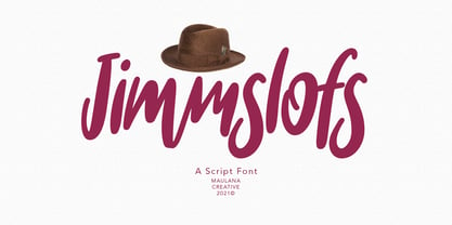 Jimmslofs is a casual script display font, with a clean bold stroke, slanted and fun character. It has Opentype features ligatures of character and alternate lowercase option, To give you an extra creative work. Jimmslofs font support multilingual more than 100+ language. This font is good for logo design, Social media, Movie Titles, Books Titles, a short text even a long text letter and good for your secondary text font with sans or serif. Make a stunning work with Jimmslofs font. Cheers, MaulanaCreative
 - FF Tibere by FontFont,
$41.99 French type designer Albert Boton created this serif FontFont in 2003. The family has 7 weights, ranging from Light to Bold (including italics) and is ideally suited for book text, film and tv, editorial and publishing as well as small text. FF Tibere provides advanced typographical support with features such as swashes, ligatures, small capitals, petite capitals, alternate characters, and case-sensitive forms. It comes with a complete range of figure set options – oldstyle and lining figures, each in tabular and proportional widths.
 - Config Rounded by Adam Ladd,
$25.00 Config Rounded is a condensed geometric sans with rounded corners. Config’s sibling, this typeface was influenced by geometric sans with circular forms on the tops and bottoms of characters, but the proportions have been condensed by incorporating straight sides for a design that is efficient yet friendly. Use it for a subtle softness that still looks modern and strong. With 10 weights, there are options to fit the need—black and thin for extreme uses and intermediates for more common needs.
 - NTF Fragma by Noble Type Foundry,
$20.00 A futurist headline typeface exploring the concept of sub-baseline interconnectivity and flow. Boasting over 450 glyphs, this typeface comes with an enormous amount of ligatures to achieve optimum flow between letterforms. Its sources of inspiration are endless (old science fiction, Arabic letterforms and 90s UK garage/rap album artwork featuring futurist custom type.) The typeface is best suited to headlines and larger type. Currently available in Bold with an Italic version coming in the not too distant future. Enjoy!
 - Adriane Swash by Typefolio,
$59.00 The Swash version of Adriane Text features the best characteristics of this lineage, without losing the strong personality and elegant design featuring in your text styles, Adriane Swash brings a fancy look to this classic style. The family comes with a complete character set in Uppercase, Lowercase and Small Caps, and the Swash option can be activated through the OpenType features panel, including glyphs initial, intermediate and final, plus a wide range of stylistic ligatures, alternate glyphs, ornaments and languages.
 - Platinor by Larin Type Co,
$16.00 Platinor this is a beautiful and elegant Display Serif font. You can use this font in the classical style, with it you can highlight exactly what you need. But Platinor can also be more expressive, playful and looking vintage due to the many alternatives and ligatures that are harmoniously combined in this font. Try changing alternatives, ligatures and you will get many options for your project, which will make it unique. This font is easy to use as it has OpenType features.
 - Montheim by Arterfak Project,
$24.00 Introducing Montheim, a vintage script font with medium weight. Inspired by modern retro movement and brush calligraphy, Montheim has many variations of alternates characters that you can mix and match, also with custom swashes (ligature) in the middle text and end swashes. Montheim complete with stylistic set gives more options to the layout. Montheim looks good in layout, vertical or horizontal and is the perfect choice for posters, logos, logotypes, insignia, storefronts, t-shirt designs, labels, flags, magazines, and other vintage design needs.
 - WBP Cor by Studio Jasper Nijssen,
$25.00 Introducing the WBP Cor. A retro font based on the old drugstore signage (DROGISTERIJ). Many happy customers have observed it and is now made available for all. Accents have been added, and there quite are a few alternative glyphs. The A has two options for example: there's a sharp version consistent with the original signage, but also a rounded version consistent with the rest of de design. The font can be used to recreate retro signage or other niche designs.
 - Antagonist by Haksen,
$20.00 Antagonist is a Bold elegant modern vintage serif style with upper and lowercase feel nice balanced. Its wide range of uppercase and lowercase alternates allow versatile design options and works perfectly for headlines, logos, posters, packaging, T-shirts, postcards and much more. Recommended to use in Adobe Illustrator or Adobe Photoshop with opentype feature. How to access Alternate Characters? Open glyphs panel : In Adobe Photoshop choose tool Window glyphs In Adobe Illustrator choose tool Type glyphs Have a great day, Haksen
 - FF Turmino by FontFont,
$41.99 German type designer Ole Schäfer created this sans FontFont in 2002. The family has 6 weights, ranging from Light to Black and is ideally suited for advertising and packaging, editorial and publishing as well as sports. FF Turmino provides advanced typographical support with features such as ligatures, alternate characters, case-sensitive forms, fractions, super- and subscript characters, and stylistic alternates. It comes with a complete range of figure set options – oldstyle and lining figures, each in tabular and proportional widths.
 - The Notice2Std font, designed by the talented Denis A. Serikov, is a typeface that manages to capture attention through its unique blend of classical charm and contemporary flair. At first glance, No...
- Enchante Script by Designova,
$20.00 Enchante is the handwritten masterpiece typeface for luxury / branding / logotype / wedding invites / greeting cards / promotional graphics. Enchante typeface is completely handmade with more than 300 hours of artistic craftsmanship bringing perfection and aesthetics at its level best. The typeface comes with the following features: OpenType Features & Stylistic Sets The typeface contains 400 glyphs beautifully handcrafted with perfection. 122 stylistic alternatives with 70 lowercase and 52 uppercase letters. 61 unique Swashes & Lines arranged in separate font file to enhance ease of use and efficiency. Powerful OpenType features including multi-set stylistic alternatives and ornaments. Includes extended language support including Western European & Central European sets. What You Get The typeface comes with 2 fonts (Normal, Swashes) so you can easily add decorative elements by simply choosing the Swashes version of the font. The stylistic alternatives and ornaments can be selected via character options within any editing software such as Illustrator, Photoshop, Inkscape etc. The pack contains Desktop fonts (OTF, TTF) and Web Fonts (all EOT, SVG, WOFF, WOFF2) as licensing options. Advanced Kerning & Essential Ligatures: We have performed advanced, in-depth kerning to make sure the font looks amazing on all possible letter combinations.
 - Bestorika by Mokatype Studio,
$19.00 Introducing Bestorika Beautiful Modern serif with contrast lines and balanced curves. This font may be conservative and classic, and also may be more playful and modern. A lot of stylish alternates will give you many useful variations for use. Try to play with compositions of curves / alternates letters basic. Like all of my fonts it is inspired by lettering from the good old past, but it still has a strong modern appearance. Its wide range of stylistic alternates allows versatile design options and works perfectly for headlines, logos, posters, packaging, coffee shops, restaurants, magazine's headers, signs or gift/post cards,cafe's and weddings. Try to use it in your beauty or travel blogs, you will see how many options you will have with stylish Bestorika. What's Included : Standard glyphs Ligatures Alternates Web Font International Accent Works on PC & Mac Simple installations Accessible in the Adobe Illustrator, Adobe Photoshop, Adobe InDesign, even work on Microsoft Word. PUA Encoded Characters - Fully accessible without additional design software. Fonts include multilingual support Image used : All photographs/pictures/vector used in the preview are not included, they are intended for illustration purpose only. Thank You
 - Etnier by Ahmad Jamaludin,
$17.00 Introducing Etnier – A brand-new modern family with a unique! Etnier is a modern variable font. Essentially, it's a sans-serif font with a sturdy and squared appearance, ensuring excellent legibility. It offers various widths and italics that provide versatility for your designs. The bolder, the stronger – this defines Etnier. Its bold and robust qualities, especially in the italic version, make it ideal for UI/UX-related designs. In total, there are 14 font styles available, or even more if you use the single files variable. You have the flexibility to slide through the weight and width options to find the sweet spot for Etnier. shape! What's Included? Etnier Main File 14 fonts family with Weight and Oblique options Instructions (Access special characters in all apps, even in Cricut Design) Accessible in Adobe Illustrator, Adobe Photoshop, Microsoft Word even Canva! PUA Encoded Characters. Fully accessible without additional design software Language Support: Danish, English, Estonian, Filipino, Finnish, French, Friulian, Galician, German, Gusii, Indonesian, Irish, Italian, Luxembourgish, Norwegian Bokmål, Norwegian Nynorsk, Nyankole, Oromo, Portuguese, Romansh, Rombo, Spanish, Swedish, Swiss-German, Uzbek (Latin) Come and say hello over on Instagram! https://www.instagram.com/dharmas.studio/ Have a great day! Dharmas Studio
 - Presley Slab by Sudtipos,
$49.00 The lightest weight of Presley Slab takes inspiration from a late nineteenth-century type specimen, but what began as a decorative and delicate contrasted serif stirred Alejandro Paul’s imagination to conjure voluptuous reverse contrasted letterforms. These became the heaviest weight of Presley Slab, which nods to the lacquered hairstyles from the birth of rock ’n roll with its idiosyncratic ball terminals. Its playful allure and swagger remains visible in the weights that stand between these two extremes but as the curls loosened, many things happened in the design process including the appearance of swashes and alternates. Presley Slab’s personality has breadth; it is a fun, confident and contemporary palette of letters that will perfectly perform for any job, from editorial design to branding. The Extra Bold and Black weights are a powerful option at large sizes for use on posters and billboards; the graceful Thin and Extra Light weights are delicate options for packaging design or fashion branding. Despite it conjuring images of mid-century music halls, Presley Slab is also staunchly European in it’s aesthetic, offering everything from good-humour to elegance with its unique touches.
 - LunchBox by Kimmy Design,
$25.00 LunchBox is a uniquely hand-drawn typeface that gives infinite customizable options and a fully authentic look. Using Lunchbox’s OpenType features gives access to over 1,500 different characters. Contextual alternatives give each letter 4 different character styles, all cycling through each other to ensure that no two letters ever show up together. There is also a custom set of small caps, each with 4 style variations as well. Stylistic alternatives give an extra hand-drawn flourish, loop and slight variation, also with 4 different styles per letter. Discretionary ligatures pertain to both regular all caps Lunchbox as well as stylistic alternatives. It takes special letters and gives a unique interaction with the characters around them, giving your design a unique and personalized look. Swashes also have four style variations to both the regular and stylistic alternatives, as well as lowercase letters with ascenders and descenders. All of these options are available in Light, Regular and Bold and can be purchased with Lunchbox Ornaments for an extra element. If you do not use Opentype but are using a program that includes a full glyph panel, you will be able to access each of the style variations you want. Enjoy!
 - Chalk Hand Lettering by Fontscafe,
$39.00 If you are into the vintage feel, you will love this one. This is as vintage as it probably gets. There are probably only a handful of places in the world where schools still use blackboards and chalk – they’ve given way to their white board and marker counterparts for decades now. White boards are definitely more practical and less messy when compared to chalk, but then if you are creatively inclined you will agree that a little bit of mess is worth it if you are going to get the effects that you desired! Well, we can give you the effects minus the mess with our chalk hand lettering fonts! As the name suggests, this font gives you that distinctly unique chalk on slate feel, and if you are wondering what’s distinct about it; writing on slate or blackboard was a slow process which required deliberated and concentrated efforts resulting in a handwriting which was usually quite different to a person’s handwriting on paper. Typography of chalk on slate was an everyday event in the classrooms of yesterday, and today we hardly ever get to see one of these if it all. Writing on a black board with chalk was quite an interesting achievement in its own right, if you ended up with anything legible and if your writing remained focused and ‘in-line’! But of course like everything else, his took time to master and when you did get it right, chalk hand lettering was quite an enjoyable experience! For semi-permanent designs, say for example an eventful day at school; students of the day would create beautiful typography on the boards, and add a solidarity to it sometimes by shading one side of the lettering – usual y the right side towards which the lettering leaned. This is the effect our chalk hands lettering shaded variation gives you. You could get this font individually, but we strongly advise you check out the “chalk hand lettering pack” font. It includes the simple “chalk hand lettering” (minus the shading effect) and also a “chalk hand elements” bag of tricks. The elements is a collection of graphic art which resemble shapes and designs that used to be added to chalk art, to beautify the typography. If you enjoyed seeing the effects of our Chalk Hands font, and the shaded variant – you are simply going to go gaga over Chalk Hand Elements! The chalk hand font of course enables you to make typographic art similar to the effect of chalks on slates and black boards. This was quite the art form in the days gone by! The shaded variation added a bit of solidarity and the technique was commonly used to make semi-permanent designs say for example a welcome note when somebody important was to visit. Classic chalk hand designs, especially the semi permanent ones often had little pieces of art to help beautify the creation as a whole. It could simply be symmetrical graphics appearing before and after the title and headings, maybe just an interesting shape to fill in an empty area on the board, and such…our Chalk Hand Elements offers you a ton of such graphics. The two chalk hand variations and the elements are all included in the Chalk Hand Family, and this is strongly recommended if you want to make designs that are truly reminiscent of the days of chalk on slate.
 - Generis Slab by Linotype,
$29.00The idea for the Generis type system came to Erik Faulhaber while he was traveling in the USA. Seeing typefaces mixed together in a business district motivated him to create a new type system with interrelated forms. The first design scheme came about in 1997, following the space saving model of these American Gothics. Faulhaber then examined the demands of legibility and various communications media before finally developing the plan behind this type system. Generis’s design includes two individually designed styles; each of with is available with and without serifs, giving the type system four separate families. Each includes at least four basic weights: Light, Regular, Medium, and Bold. Further weights, small caps, old style figures, and true italics were added to each family where needed. The Generis type system is designed to meet both optical criteria and the highest possible measure of technical precision. Harmony, rhythm, legibility, and formal restraint make up the foreground. Generis combines aesthetic, technical, and economic advantages, which purposefully and efficiently cover the whole range of corporate communication needs. The unified basic form and the individual peculiarity of the styles lead to Generis’ systematic, total-package concept. The clear formal language of the Generis type system resides beneath the information, bringing appropriate typographic expression to high-level corporate identity systems, both in print and on screen. The condensed and aspiring nature of the letterforms allows for the efficient setting of body copy, and the economic use of the page. A range of accented characters allows text to be set in 48 Latin-based languages, offering maximal typographic free range. This previously unknown level of technical and design execution helps create higher quality typography in all areas of corporate communication. Optimal combinations within the type system: Generis Serif or Generis Slab with Generis Sans or Generis Simple. - Generis Serif by Linotype,
$29.00The idea for the Generis type system came to Erik Faulhaber while he was traveling in the USA. Seeing typefaces mixed together in a business district motivated him to create a new type system with interrelated forms. The first design scheme came about in 1997, following the space saving model of these American Gothics. Faulhaber then examined the demands of legibility and various communications media before finally developing the plan behind this type system. Generis’s design includes two individually designed styles; each of with is available with and without serifs, giving the type system four separate families. Each includes at least four basic weights: Light, Regular, Medium, and Bold. Further weights, small caps, old style figures, and true italics were added to each family where needed. The Generis type system is designed to meet both optical criteria and the highest possible measure of technical precision. Harmony, rhythm, legibility, and formal restraint make up the foreground. Generis combines aesthetic, technical, and economic advantages, which purposefully and efficiently cover the whole range of corporate communication needs. The unified basic form and the individual peculiarity of the styles lead to Generis’ systematic, total-package concept. The clear formal language of the Generis type system resides beneath the information, bringing appropriate typographic expression to high-level corporate identity systems, both in print and on screen. The condensed and aspiring nature of the letterforms allows for the efficient setting of body copy, and the economic use of the page. A range of accented characters allows text to be set in 48 Latin-based languages, offering maximal typographic free range. This previously unknown level of technical and design execution helps create higher quality typography in all areas of corporate communication. Optimal combinations within the type system: Generis Serif or Generis Slab with Generis Sans or Generis Simple. - Generis Simple by Linotype,
$39.00The idea for the Generis type system came to Erik Faulhaber while he was traveling in the USA. Seeing typefaces mixed together in a business district motivated him to create a new type system with interrelated forms. The first design scheme came about in 1997, following the space saving model of these American Gothics. Faulhaber then examined the demands of legibility and various communications media before finally developing the plan behind this type system. Generis’s design includes two individually designed styles; each of with is available with and without serifs, giving the type system four separate families. Each includes at least four basic weights: Light, Regular, Medium, and Bold. Further weights, small caps, old style figures, and true italics were added to each family where needed. The Generis type system is designed to meet both optical criteria and the highest possible measure of technical precision. Harmony, rhythm, legibility, and formal restraint make up the foreground. Generis combines aesthetic, technical, and economic advantages, which purposefully and efficiently cover the whole range of corporate communication needs. The unified basic form and the individual peculiarity of the styles lead to Generis’ systematic, total-package concept. The clear formal language of the Generis type system resides beneath the information, bringing appropriate typographic expression to high-level corporate identity systems, both in print and on screen. The condensed and aspiring nature of the letterforms allows for the efficient setting of body copy, and the economic use of the page. A range of accented characters allows text to be set in 48 Latin-based languages, offering maximal typographic free range. This previously unknown level of technical and design execution helps create higher quality typography in all areas of corporate communication. Optimal combinations within the type system: Generis Serif or Generis Slab with Generis Sans or Generis Simple. - Generis Sans by Linotype,
$29.00The idea for the Generis type system came to Erik Faulhaber while he was traveling in the USA. Seeing typefaces mixed together in a business district motivated him to create a new type system with interrelated forms. The first design scheme came about in 1997, following the space saving model of these American Gothics. Faulhaber then examined the demands of legibility and various communications media before finally developing the plan behind this type system. Generis’s design includes two individually designed styles; each of with is available with and without serifs, giving the type system four separate families. Each includes at least four basic weights: Light, Regular, Medium, and Bold. Further weights, small caps, old style figures, and true italics were added to each family where needed. The Generis type system is designed to meet both optical criteria and the highest possible measure of technical precision. Harmony, rhythm, legibility, and formal restraint make up the foreground. Generis combines aesthetic, technical, and economic advantages, which purposefully and efficiently cover the whole range of corporate communication needs. The unified basic form and the individual peculiarity of the styles lead to Generis’ systematic, total-package concept. The clear formal language of the Generis type system resides beneath the information, bringing appropriate typographic expression to high-level corporate identity systems, both in print and on screen. The condensed and aspiring nature of the letterforms allows for the efficient setting of body copy, and the economic use of the page. A range of accented characters allows text to be set in 48 Latin-based languages, offering maximal typographic free range. This previously unknown level of technical and design execution helps create higher quality typography in all areas of corporate communication. Optimal combinations within the type system: Generis Serif or Generis Slab with Generis Sans or Generis Simple. - Magnies by Arterfak Project,
$22.00 Feel the sweetness with Magnies, a minimalist serif font with clean stencil looks. The feminine letterforms which are perfect for logotype, fashion, and display. Magnies was designed with a high contrast of the strokes and cut the thinner line to get the optical effect but still keep the legibility. Great choice with over 100+ alternates characters, that you can create many variations for your design.
 - Fairfield by Linotype,
$41.99 Rudolph Ruzicka designed his font Fairfield as a legible text font. His philosophy: The reader expects optical assistance with reading. He does not want to be distracted while interpreting and understanding the ideas of a text." Fairfield font is based on the forms of Venecian Old Face fonts as well as on the designs and details of Art Deco, giving the font a distinctive appearance"
 - Virtual by John Moore Type Foundry,
$25.00 Virtual is an experimental fantasy font based on a pseudo optical enclosure where a linear system that is not connected there. Virtual comes in three weights: regular. light, and thin also an virtual mix by mixing different thicknesses in a single font, with alternative variations through features of open type. Virtual is an experience based on play with the laws of the Gestalt of closing.
 - Iyannu by Thirdin,
$20.00 Iyannu has no meaning in its self. This font is made to be very quiet and simple yet to be unique. Iyannu is created by Japanese designer and it is designed so called "Retro Future" like cyberpunk in Tokyo. When font is made strictly with mathematic sometimes it looks unbalanced. So this font is mixing mathematics method and optical illusion of view to maintain the clear balance.
 - Gopher by Adam Ladd,
$25.00 Gopher is a reverse contrast, geometric sans serif typeface in 3 optical sizes ranging — Text, Normal, and Display. With the most subtle contrast,Text works best in smaller type settings while Display is the most dramatic as the contrast has been pushed more to the extreme for an immediate visual impact. Gopher works great in a variety of settings for branding, advertising, posters, magazines, packaging, and more.
 - Occulista by VersusTwin,
$39.00 Occulista began as a modern take on a vintage tri-line style of typeface, but quickly evolved into something quite different. This heavyweight optically-stimulating family features nine weights, with alternate uppercase letters in place of lowercase. This typeface works best in eye-catching headlines or short bursts of text, and the variant styles can applied to accent key wordings in many interesting combinations.
 - Selene by Flanker,
$17.99 Selene is a sans-serif font family designed by Leonardo Di Lena. The font is based on geometric forms with as few improving legibility optical corrections as possible. If you need a minimalist font, technical but friendly and elegant, this is your choice. There are glyphs for all languages with Latin, Greek and Cyrillic alphabets, all the basic ligatures, old style numerals and alternates.
 - Yukas by Alex Camacho Studio,
$25.00 Yukas is a funky and sexy typeface where the proportions are based on the optical balance between black strokes and white shapes. Ideal to enjoy on a large scale. It takes its references from the psychedelic movement, old-school western movie posters, and mid-19th century American wood type with those big, heavy capital letters. Includes several Open Type alternatives to customize your design however you want.
 - IL Palamede by Notope,
$25.00 IL Palamede is a typeface with just one style, referring by its name to the French chess magazine Le Palamède. Connects with chess here not only the name. Each symbol is built on a 5x5 grid with 3x3 priority. At the same time, the logic here is higher than optical compensation, so you can observe here quite dense, for example "b". Thanks to this solution, the typed text is balanced in width, and it also creates the feeling of a chess cell, where black and white cells alternate. Connects with chess here not only the name. Each symbol is built on a 5x5 grid with 3x3 priority. At the same time, the logic here is higher than optical compensation, so you can observe here quite dense, for example, "s". Thanks to this solution, the typed text is balanced in width, and it also creates the feeling of a chess cell, where black and white cells alternate. Use this font for any purpose that includes winning or enjoying.
 - Sequel Sans by OGJ Type Design,
$35.00 Sequel Sans is a new chapter in the book of neogrotesque typefaces. Its core idea and its name were conceived in collaboration with the max bill georges vantongerloo foundation. The main inspiration for its design were the sans-serif typefaces used by Max Bill, the larger-than-life Swiss architect, artist, and designer. Honoring these roots, I designed Sequel Sans to be a clean and adaptable font family that is built upon a comprehensive system of styles. 8 weights, each with a corresponding italic, and a matching set of Variable Fonts are available in 4 optical sizes. These range from standard (for text sizes) to Subhead to Headline to Display—larger optical sizes come with tighter spacing and a number of gently adjusted glyph shapes. Like the great neogrotesques found in mid-century Swiss Style designs, Sequel Sans is a vessel that you can fill with any kind of content. It will amplify your message while retaining its own modernist character.
 - Fino by TypeTogether,
$35.00 Tall, stately, and refined, with a showy contrast between thick and thin, a certain kind of titling Didone has become synonymous with fashion. Ermin Međedović’s latest type system amplifies the most theatrical aspects of this genre while bringing an uncommon flexibility of style and variation to any type palette — particularly those required for editorial design. Fino is a Rational (or Modern) display serif with sharp details. Its fairly Title proportions produce a regular beat of bold stems at frequent intervals. One can add an unexpected twist to this plot line by introducing the alternate ‘C, D, G, O, and Q’ (found in the uppercase); these replace the standard, Title oval shapes with big, full, show-stopping round ones. Other alternate forms, along with a grand ensemble cast of ligatures, lets the director continually flip the script. This stage is set in three acts: Fino, Fino, and Fino Stencil. Each of these offer six weights and italics, and each actor is comfortable speaking any Latin-based language, from standard Hollywood English to the many accents of Eastern Europe. Finally, every style comes in two optical sizes, with Title having the finest hairlines for the biggest parts. This lets you put Fino to work in a variety of productions, from short texts (24pt–48pt settings) to epic titles. The complete Fino family, along with our entire catalogue, has been optimised for today’s varied screen uses. All these talents let Fino perform a range of roles far broader than your typical Bodoni or Didot.
 - Fino Sans by TypeTogether,
$35.00 Tall, stately, and refined, with a showy contrast between thick and thin, a certain kind of titling Didone has become synonymous with fashion. Ermin Međedović’s latest type system amplifies the most theatrical aspects of this genre while bringing an uncommon flexibility of style and variation to any type palette — particularly those required for editorial design. Fino Sans is a Rational (or Modern) display serif with sharp details. Its fairly Title proportions produce a regular beat of bold stems at frequent intervals. One can add an unexpected twist to this plot line by introducing the alternate ‘C, D, G, O, and Q’ (found in the uppercase); these replace the standard, Title oval shapes with big, full, show-stopping round ones. Other alternate forms, along with a grand ensemble cast of ligatures, lets the director continually flip the script. This stage is set in three acts: Fino Sans, Fino Sans, and Fino Sans Stencil. Each of these offer six weights and italics, and each actor is comfortable speaking any Latin-based language, from standard Hollywood English to the many accents of Eastern Europe. Finally, every style comes in two optical sizes, with Title having the finest hairlines for the biggest parts. This lets you put Fino Sans to work in a variety of productions, from short texts (24pt–48pt settings) to epic titles. The complete Fino Sans family, along with our entire catalogue, has been optimised for today’s varied screen uses. All these talents let Fino Sans perform a range of roles far broader than your typical Bodoni or Didot.
 - Beebzz Rounded by Popskraft,
$19.00 Everybody loves black colour, strict stylish and elegant shapes. We strive to be perfect. Right? But... Do not you think that we have lost something? Maybe child's spontaneity? The Beebzz Rounded font brings you back to those perfect times, when there was no need to be serious, when the whole world was not so serious. Beebzz Rounded is an original font family designed for headlines, titles and subtitles. It has his own unique style in expressive, perfectly condensed forms, inspired by child calligraphy and strong geometric typefaces. Beebzz Rounded is a font family that is ideal for display, text, print, branding, signage, and also for user interfaces, mobile devices, especially web design creation, with a set of optimal characters for your design in any layout.
 - Antry Sans by Mans Greback,
$59.00 Antry Sans is a cool uppercase typeface. With heavy letterforms in a sturdy appearance, this poster font gets attention while keeping clean. It is legible and clean, optimized for a non-complex design or headline. The Antry Sans font family consists of Thin, Regular and Bold, and each weight as Italic, totalling in six styles. The font is built with advanced OpenType functionality and has a guaranteed top-notch quality, containing stylistic and contextual alternates, ligatures and more features; all to give you full control and customizability. It has extensive lingual support, covering all Latin-based languages, from Northern Europe to South Africa, from America to South-East Asia. It contains all characters and symbols you'll ever need, including all punctuation and numbers.