10,000 search results
(0.3 seconds)
- Optima by Linotype,
$45.99 Many typefaces are distinctive or attractive at the expense of legibility and versatility. Not so the Optima® family. Simultaneously standing out and fitting in, there are few projects or imaging environments outside of its range. Although Optima is almost always grouped with sans serif typefaces, it should be considered a serifless roman. True to its Roman heritage, Optima has wide, full-bodied characters – especially in the capitals. Only the E, F and L deviate with narrow forms. Consistent with other Zapf designs, the cap S in Optima appears slightly top-heavy with a slight tilt to the right. The M is splayed, and the N, like a serif design, has light vertical strokes. The lowercase a and g in Optima are high-legibility two-storied designs. Optima can be set within a wide choice of line spacing values – from very tight to very open. In fact, there are few limits to the amount of white space that can be added between lines of text. Optima also benefits from a wide range of letter spacing capability. It can be set quite tight, or even slightly open – especially the capitals. If there are any guidelines, Optima should be set more open than tight. It’s not that readability is affected that much when Optima is set on the snug side; it’s just that the unhurried elegance and light gray typographic color created by the face are disrupted when letters are set too tight. Optima is also about as gregarious as a typeface can be. It mixes well with virtually any serif design and a surprisingly large number of sans serif faces. The Optima family is available in six weights, from roman to extra black, each with an italic counterpart. In addition, the family is available as a suite of OpenType® Pro fonts, providing for the automatic insertion of small caps, ligatures and alternate characters, in addition to offering an extended character set supporting most Central European and many Eastern European languages. When you’re ready to find its perfect pairing, browse these fantastic matches: Monotype Century Old Style™, Dante®, Frutiger® Serif, Joanna® Nova, Malabar™ and Soho®.
 - Optika by Designova,
$15.00 The design concept of OPTIKA is inspired by our all-time best-selling typeface NORD Optika is a minimal and modern Sans-Serif typeface that makes your designs stand out from the crowd. Optika is an all-purpose typeface, a perfect choice for creating logotypes, branding, headlines, corporate identities, and marketing materials for web, digital & print alike. The typeface will be a great option for branding, logo/logotype design projects, marketing graphics, banners, posters, signage, corporate identities and editorial design. Adding extra letter spacing will make this font the perfect choice for minimal headlines and logotypes, as shown in the promo designs attached. Handcrafted and designed with powerful OpenType features in mind, each weight includes extended language support with Western European, Central European and South Eastern European sets. A total of 394 glyphs are available. Optika typeface includes 14 fonts in total, with seven upright weights (Thin / Light / Regular / Medium / Bold / Heavy) and Italic equivalents of all seven weights.
 - Optimus by Letterafandi Studio,
$12.00 Optimus is a cool and modern display font. This font is ideal for writing web designs, business cards, or pretty much anything else that requires a unique touch.
 - Rowling Stone Semi Bold - Unknown license

- Optimal - Unknown license

- Optimism by T-26,
$29.00 - Optima Nova by Linotype,
$57.99 With the clear, simple elegance of its sans serif forms and the warmly human touches of its tapering stems, the Optima family has proved popular around the world. In 2002, when it was finally possible to produce digital alphabets without technical limitations and compromises, and more than fifty years after the first sketches, an expansion and redesign of the Optima family was completed and released as Optima nova. Hermann Zapf and Japanese type designer, Akira Kobayashi, collaborated on the project, which included re-working of the existing weights and the addition of several new weights: small caps, old style figures, light, heavy, and condensed. The original Optima was never manufactured with a real italic, only an oblique version of the roman. Optima nova has a complete range of beautifully designed real italics; the new italic forms, of the e, f and g are especially notable. The titling face includes capital letters with special and unusual letter combinations and ligatures, making it an excellent choice for headlines, logos and advertising purposes. Optima continues to be an all-purpose typeface; and Optima nova works for just about anything from book text to signage. Optima Nova® font field guide including best practices, font pairings and alternatives.
 - Optima Cyrillic by Linotype,
$65.00Many typefaces are distinctive or attractive at the expense of legibility and versatility. Not so the Optima® family. Simultaneously standing out and fitting in, there are few projects or imaging environments outside of its range. Although Optima is almost always grouped with sans serif typefaces, it should be considered a serifless roman. True to its Roman heritage, Optima has wide, full-bodied characters – especially in the capitals. Only the E, F and L deviate with narrow forms. Consistent with other Zapf designs, the cap S in Optima appears slightly top-heavy with a slight tilt to the right. The M is splayed, and the N, like a serif design, has light vertical strokes. The lowercase a and g in Optima are high-legibility two-storied designs. Optima can be set within a wide choice of line spacing values – from very tight to very open. In fact, there are few limits to the amount of white space that can be added between lines of text. Optima also benefits from a wide range of letter spacing capability. It can be set quite tight, or even slightly open – especially the capitals. If there are any guidelines, Optima should be set more open than tight. It’s not that readability is affected that much when Optima is set on the snug side; it’s just that the unhurried elegance and light gray typographic color created by the face are disrupted when letters are set too tight. Optima is also about as gregarious as a typeface can be. It mixes well with virtually any serif design and a surprisingly large number of sans serif faces. The Optima family is available in six weights, from roman to extra black, each with an italic counterpart. In addition, the family is available as a suite of OpenType® Pro fonts, providing for the automatic insertion of small caps, ligatures and alternate characters, in addition to offering an extended character set supporting most Central European and many Eastern European languages. When you’re ready to find its perfect pairing, browse these fantastic matches: Monotype Century Old Style™, Dante®, Frutiger® Serif, Joanna® Nova, Malabar™, and Soho®. - Cabrito Semi by insigne,
$24.00 Relax. Deep breath. And step away to font nirvana with Cabrito Semi. Like its Cabrito relatives, Semi’s handwriting-inspired feel is mellow and care-free. But don’t misunderstand us. Even with its fun-loving peculiarities, this free spirit will command whatever party you invite it to. It’s a perfect blend of unique and functional. So what’s the secret of this little one’s strength? It’s pure balance. Cabrito Semi’s energy surges from deep within the relaxed, balanced tones of its humanist structure and calligraphic crafting. The 36 fonts of this well-crafted semi serif originate from the popular Cabrito, an insigne design slab serif developed for the kid’s book, The Clothes Letters Wear. Along with its other amigos, Inverto and Sans, Cabrito Semi rounds out this easy-going household of fonts. The four fonts play well together on anything from meals and candy to toys and cars. With the support of the other three, Semi makes a great choice for titles and moderately long text like you would use for websites, flyers, and packaging. Semi’s complete pack of alternates is accessible in any OpenType-enabled system. This kiddo has loads of alternates, swashes, and alternate titling caps to add a bit of sweetener to the balance. Also bundled are swash alternates, old style figures, and compact caps. Preview any and all of these features in the interactive PDF brochure. This font members of the family also consists of your glyphs for 72 languages. So who says you can’t love quirky? Take a look at Cabrito Semi--and any of the other members of the Cabrito family. You’re bound to find yourself loving fun all over again.
 - Sintesi Semi by FSdesign-Salmina,
$39.00 Are you looking for a robust, contemporary font with strong personality? Sintesi Semi might be exactly what you are looking for. Sintesi Semi is a hybrid font which manages the “synthesis” between Sans and Serif in its own way. Due to its constant stroke the favorite font of the author is closer to a sans serif and scores with its robustness and contemporary style. Its strong serifs though evoke rather a slab serif font. Sintesi Semi builds together with Sintesi (Serif) and Sintesi Sans an extended family. Prove character too, with Sintesi Semi. Download a free trial version of Sintesi Semi with a reduced character set. Check it out!
 - French Semi by Wooden Type Fonts,
$20.00A revival of one of the popular wooden type fonts of the 19th century, condensed, bold, flat thick serifs, a very useful design for display. - Xenois Semi by Linotype,
$29.99“Drawing letters is my passion,” says Erik Faulhaber, the designer of the Xenois typeface family. Pronounced “zeeno-is,” the design distills character shapes into what Faulhaber believes are their purest forms. “I studied many typefaces, carefully examining their structure, before I began drawing Xenois. Then I actually wrote out a detailed design brief establishing the goals for my design.” - Ipsum Semi by Rawblind Basetype,
$19.99 Fresh new type from the Netherlands. An original, lively, eclectic semi-slab serif intended for general use. Quirky yet seriously usable, the family features enough weights to fit any design situation and all fonts are suitable for screen and print. Full Latin-script language support, including Maltese, Turkish, Vietnamese, Greenlandic, Azerbaijani, Afrikaans and localized Polish and Romanian. Download the Quick Start Cheat Sheet here to help you get the most out of Ipsum Semi. For requests or remarks, feel free to get in touch.
 - Clarendon Semi by Wooden Type Fonts,
$15.00 One of the classic display types of the 19th century, an Egyptian with bracketed serifs. There are many variants of this face and its uses are many, this a modified version lacking the teardrop or ball terminals on a, c, f, g, j, r, f, y.
 - Preto Semi by DizajnDesign,
$24.00 Preto Semi is an experiment. It is an attempt to create a readable type for text point sizes (other than sans-serif and serif). Preto Semi is not a Sans with added serifs or Serif with serifs removed. The use of the serifs is redefined and used for other purpose(s). The serifs became the extension of the stroke, they help to solve the spacing problem of sans-serif types and they use the primary function of serifs – keeping the eye on the baseline and emphasize the horizontal rhythm of the lines of text. Preto Semi is intended for magazines and editorial design, as other members of Preto family. Preto is an extensive type family, which explores the function of serifs on readability and legibility. Preto consist of three subfamilies: Sans, Semi and Serif. Preto is designed for multilingual typesetting. All of the subfamilies have equal gray value but different texture which can be use to differentiate languages. Preto sub-families have two text weights and two bold styles (Regular -> Bold, Medium -> Black). Every weight has a companion Italic style as well.
 - Sumi by Okaycat,
$29.50 Sumi is an inked Asian brush font. Nice Japanese calligraphy with a consistent yet distressed look in ink! Sumi is extended, containing West European diacritics & ligatures, making it suitable for multilingual environments & publications.
 - Samy by Soda,
$20.00 Samy is pure warm in a rational world. Yet its features cover uses of any kind. From very thin to chubby weights, this typeface offers a wide range of styles. This work is composed of two subfamilies: Samy, which gives a more conventional font looking, and the Alt version, conveying more fun and joy.
 - Bemis by Leksen Design,
$29.00 I accidentally fell in love with type design, and more specifically, the inscription on the historic Bemis building in Seattle. A high waist and great contrast are characteristics of this classic caps lettering that inspired my debut typeface, with additions of 3/4 caps and ornaments to boot. Read and hear more about the creation of this digital revival.
 - Demis by Tour De Force,
$25.00 Supreme decorative typeface, with wedged display serifs.
 - Optien - Personal use only

- Artimas by Hackberry Font Foundry,
$24.95 The Artimas family is the new book design font family developed out of Aramus. These new serif typefaces are readable and graceful — part of my development of a series of book families. Aramus was very popular for a single font release of a text font. This new book font family retains the looseness of the original with radically different font metrics and many shape “corrections”. In fact, Artimas continues a genuine new path for this foundry This new font family for book design continues a turn toward more “traditional” x-heights of around a third of the point size.The Artimas print production font family is six new OpenType Pro fonts with Caps, lowercase, small caps, & figures to go with each of those character sets. There are many ligatures, a few swashes, fractions, numerators, denominators, and ordinals to infinity. This family of fonts is a joy to read and easy to use for text or display.
 - Fortima by Meat Studio,
$30.50 Fortima is a 12 style angular sans serif that utilises subtle modular shapes, designed by Stew Deane. The result is a font with character that adapts to a variety of sectors and brands, and is suitable for anything from advertising and branding to web and screen. The angular shapes help create a unique aesthetic that are instantly recognisable and have impact and character in large or small sizes.
 - Option by Vladimir Likh,
$10.00 Option is a modern condensed sans serif. Inspired by geometric architectural fonts. But despite the geometric construction every single letter was build based on optical evaluation. This approach makes Option more organic and lively in a text line. Option was created for wide spaces. Condensed and thin, but extremely sweeping vertically font makes your massage elegance and strong. The font functions great in many sizes and surroundings. The family comes in one weights plus italics. Creating of bold weight is underway. Options supports Cyrillic as well.
 - Sophima by insigne,
$10.00 What's Included : • Ligatures • Works for PC and Mac • Simple installation • 7 styles: 1 undistressed, 6 distressed • 500+ glyphs in each type • More than 75 languages are supported, including extended Latin. • Each style includes 12 OpenType features, including stylistic alternatives, ligatures, old-fashioned figures, and other helpful elements. • Two different swash ending varieties. • Non connected forms • All connected forms, including caps • Randomly selected character forms for organic looking textures. Sophima exudes languorous luxury. The writing glides around, changing elevation above and below the standard x-height, giving it a lively and raucous vibe. Sophima is designed for 3D printing. I required a contemporary script with technical elements that could be printed using a 3D printer. This necessitates the use of quite thick linking characters. Another result of this technology was the need that all letters, including caps, be linked. Such letters are included in optional Opentype style sets. The unusual technological limitation gave the design a new and distinct vibe. Sophima may be used for a variety of purposes, including headlines, weddings, social media, logos, posters, packaging, T-shirts, coffee shops, restaurants, magazine headers, signage, gift/post cards, cafés, and weddings. Designers have a plethora of alternatives from which to pick, giving them greater variety, power, and creative flexibility. Automatic ligatures for best character connections are supplied, as are alternate ending characters that appear at the end of words that lack connectors or have lengthy swash endings. Sophima is made up of five fonts: one standard and five texture variants that change the tone of the typeface. Each design has 500 characters and is available in more than 75 languages. The typeface has 15 OpenType features, such as stylistic alternates that change the look of characters, ligatures, and more. Constraints and a desire to solve challenges breed the finest creativity. And there's no question that Sophima came up with a solution to the situation. Now use Sophima to create your own designs.
 - Optien by Mans Greback,
$59.00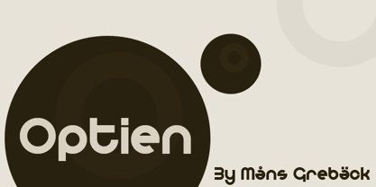
- Ultima by TipografiaRamis,
$29.00 Ultima is a rounded geometric monoline typeface family, built in ten styles. The typeface is ideal for use in display sizes, though is quite legible in text. Ultima is released as OpenType single master with a Western CP1252 character set.
 - VTC Optika - Unknown license

- VTC Optika - Unknown license

- VTC Optika - Unknown license

- VTC Optika - Unknown license

- Black Optimus by Letterafandi Studio,
$16.00 Black Optimus is a natural handwritten font. It is a tough-looking font with a strong brush touch, ready to rock every design you want to create. It is perfect for logos, quotes, posters, clothing, and so much more! Add it to any of your creative projects, and be amazed by the generated outcome!
 - Optimus Seasonal by Allouse Studio,
$16.00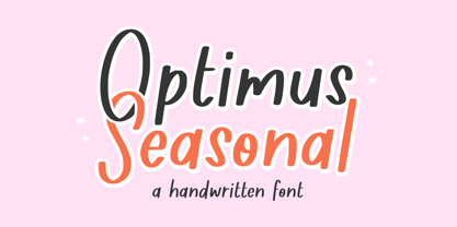 Proudly Presenting, Optimus Seasonal A Handwritten Font. Optimus Seasonal is perfect for any titles, logo, product packaging, branding project, megazine, social media, wedding, or just used to express words above the background. Optimus Seasonal also come with Multi-Lingual Support. Enjoy the font, feel free to comment or feedback, send me PM or email. Thank You!
 - Bolded by We Make Font,
$16.00 Bolded is a new complete type family, designed and developed by creative professionals. Contains geometric and rounded features, optimized for both long texts and small screens and texts. The complete family offers seven weights divided between the basic, italic, condensed and condensed italic family. Created in 2022, Bolded has a modern and functional look, designed for the most diverse uses and projects. Bolded is a geometric rounded family that can meet the needs of the most varied professionals looking for a clean and elegant font family with a wide set of Latin characters.
 - Bolde by Figuree Studio,
$18.00 Bolde is a powerful sans serif font family with modern touches. A balance of hard lines and smooth curves makes them able to stand on their own dynamically Features: five all caps font, Numbers & Punctuation / Extensive Language Support Bolde works great in any branding, logos, magazines, film. The different styles give you the full range to explore a whole host of applications. Thanks for having a peek at Bolde. As always, if you have any questions just send me a message!
 - Prima - Unknown license

- Oxima by Graviton,
$24.00 Oxima font family has been designed for Graviton Font Foundry by Pablo Balcells in 2021. It is a technical sans serif typeface with rounded endings that provide a mixture between strong general aesthetics and soft elaborated details. Its strong and industrial, yet legible shapes make it perfect for contemporary and futuristic oriented projects and suitable to be used in any sizes, from headlines to body text and everything in between. Oxima consists of 8 styles, each containing small caps and glyph coverage for several languages.
 - Ontime by Fontysia,
$15.00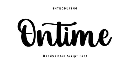 Ontime is a modern handwritten script font! This font is perfect for shirt designs, websites, branding, quotes, children's designs, blogs, logos, invitations and more!
 - Otama by Tim Donaldson,
$49.00 From the dainty light weight through to the striking UltraBold, Otama raises the bar to a new level of dangerous sophistication. Although easily classified alongside Modern typefaces such as Didot and Bodoni, Otama was purposely developed with minimum reference to these two visual heavy weights. In search of something more than a mere historical revival, Otama instead draws proportional reference from popular 20th century Transitional and Garalde typefaces with visual inspiration coming from calligraphic studies. Many characteristics from Tim Donaldson’s 2010 display face Pyes Pa were directly passed on in execution of Otama — The shoelaced k, e and a being the most obvious examples of this family relation. Refined over 2 years with well over 8,000 characters over 28 styles, Otama certainly deserves its place as a comprehensive and versatile typeface in any designer’s font library.
 - Zado Semi-Condensed - Unknown license

- Walkway UltraCondensed Semi - Unknown license


Page 1 of 250Next page