10,000 search results
(0.19 seconds)
- Overnight Oats by Hanoded,
$11.00 I recently walked part of the South West Coast Path in the UK. A couple of days in the hike, I came across a small cafe and I decided to have an oat latte (I am lactose intolerant). Since it was early in the morning, the breakfast menu was out and one of the items I noticed was ‘Overnight Oats’. I normally cook my oats with some lactose free milk and water, but apparently you can soak them overnight, add fruit and nuts and eat it like that. I tried it, it’s ok, but I think I prefer the cooked version. Overnight Oats is a bit of an odd font: it is very higgledy piggledy, yet legible and unique. If you want something out of the ordinary, then this may be your font!
 - Schools Out by Comicraft,
$39.00 Originally created for Sound Effects in Marvel's GHOST RIDER 2099, our spraycan stylish HOOKY font has just the right Scrawl of the Wild for graph-iti enthusiasts everywhere -- and they wash right off with just a little splash of 'delete'. Spray it, don't Say it!
 - Scratch Out by Pixesia Studio,
$23.00 Introducing Scratch Out - Urban Brush Font Scratch Out is an edgy and modern brush font that is perfect for adding a rough, urban look to your designs. The brush strokes give it a handmade, authentic feel that is perfect for streetwear brands, music album covers, posters, and more. With its bold and rough style, Scratch Out is sure to make a statement and catch the eye of your audience. This font is versatile and can be used for a wide range of projects where you want to create a raw and energetic look. FEATURES - Stylistic Alternates - Ligatures - PUA Encoded - Uppercase and Lowercase letters - Numbering and Punctuations - Multilingual Support - Works on PC or Mac - Simple Installation - Support Adobe Illustrator, Adobe Photoshop, Adobe InDesign, also works on Microsoft Word Hope you Like it. Thanks.
 - Steppin Out by Bitstream,
$50.99Nick Curtis has created this stylish, Deco inspired design, packed full of quirky features and characters. Some of the letterforms, like the uppercase K, appear to be walking. And dig that lowercase ‘g’! There is a lot of lively design happening here, so much so that its a battle not to be stylish when you are Steppin Out. - Shout Out by Comicraft,
$19.00 Here's a big shout out to all our Loud and Proud font homies -- If you've got a good set of lungs on you -- fill 'em up and get ready to Shout, SHOUT! Yes, let it all out because this is a font you can't do without -- It will make you wanna SHOUT! Throw your hands up, SHOUT! Kick your heels back, SHOUT! Throw your head back, SHOUT! Come on now, SHOUT! And don't forget to say you will... Don't forget to SHOUT! Yeah yeah yeah yeah, SHOUT! A little bit softer now, (Shout) A little bit softer now, (Shout) A little bit softer now, (Shout) A little bit louder now, SHOUT! A little bit louder now, SHOUT! A LITTLE BIT LOUDER NOW! SHOUT! SHOUT! SHOUT! SHOUT! PHEW -- Who says Comicraft doesn't know how to Pump it Up AND Get Down?!
 - Spaced Out by TypeArt Foundry,
$45.00
- Black-Out by Wordshape,
$25.00 Bohemian Modern slab stencil display font Black–Out is a result of three things: the need for a distinctive ultra-black display typeface, an admiration for slab-serifs and Clarendons, and the love of systematic stencil type. Fusing all the desires together resulted in Black–Out. What was the inspiration for designing the font? Slab serifs + Clarendons + systematic stencil type = Black-Out! What are its main characteristics and features? It is a massive chunk of type, contemporary in nature while also harking back to the sun-drenched Modernism of California of the 1970s. Usage recommendations: Display type for use in materials that are meant to evoke a range of emotions.
 - Out Back by chicken,
$17.00 A twice-painted sign in Tobago's back country was the seed for this weird grab-bag of chunky, slightly sleazy letterforms.
 - Loud noise Black Skew - Unknown license

- Holiday And Party Words by Outside the Line,
$19.00 Handwritten or printed holiday and party words for all your flyers and party invitations. Font includes Happy Birthday, Merry Christmas, Happy Holiday, New Year, Holidaze, Joy, Greetings, Ho, Ho, Ho, Fa, La, La, Glad Tidings, Jingle, Yule tide, Happy Kwanzaa, Happy Hanukkah, Easter, Valentine’s Day, 4th of July, Labor Day, Engagement, Wedding, Baby, Open House, Party, Shower and Event. Just add an icon from Party Doodles or Holiday Doodles or Holiday Doodles Too and you have a years worth of flyers!
 - Words And Music JNL by Jeff Levine,
$29.00 The 1934 sheet music for "I'll String Along with You" from the Dick Powell-Ginger Rogers musical "20 Million Sweethearts" yielded the charming Deco monoline design for Words and Music JNL.
 - SF Eccentric Opus - Unknown license

- SF Eccentric Opus - Unknown license

- Crushed Out Girl - Unknown license

- SF Eccentric Opus - Unknown license

- SF Eccentric Opus - Unknown license

- A Little Pot - Personal use only

- Boldly Go Out - Unknown license

- Out of sight - Unknown license

- Supervixen Honeyed Out - Personal use only

- Decked Out NF by Nick's Fonts,
$10.00Inlines that go over, under sideways, down! Deck out your headlines in grand style with this unusual inline face, based on Dektiv, a seventies-style classic from "Homage to the Alphabet." Both versions include the complete Latin 1252, Central European 1250 and Turkish 1254 character sets, as well as localization for Moldovan and Romanian. - Evening Out JNL by Jeff Levine,
$29.00 Based on an example of [circa] 1950 Finnish embroidery lettering, Evening Out JNL is a classic Art Deco design with contrasting thick and thin lines. This elegant and stylish typeface is available in both regular and oblique versions.
 - Spread Out NF by Nick's Fonts,
$10.00Here's another gem from perennial Speedball penmaster Ross F. George, originally called Split Caps. George's original design has been enhanced with the addition of lowercase characters, borrowed from another of his alphabets, and adapted to the style of the caps. This font derives its name from one of the catchphrases of the estimable Stooge-in-Chief, whose signature hairdo can be found in place of the Section mark. Both versions of the font include complete Latin 1252, Central European 1250 and Turkish 1524 character sets, with localization for Moldovan, Romanian and Turkish. - Just Flower Pots by Outside the Line,
$19.00 Pots of flowers, pots of leaves. 30 topiaries, daffodils, hearts, daisies, lily, a snail, a butterfly, a ladybug, a shovel, a bell jar and watering can too. Just in time for Spring.
 - Dining Out JNL by Jeff Levine,
$29.00 A 1940s ad flier for the Los Angeles restaurant “Lucca Paris Inn” had its name hand lettered at the top of the page in a condensed Art Deco slab serif with some stylized characters. Given a more uniform look, the end result became Dining Out JNL and is available in both regular and oblique versions.
 - Opa-locka JNL by Jeff Levine,
$29.00 Opa-locka JNL is named for a city in Miami-Dade County, Florida and is based on an Art Nouveau-era bit of hand lettering found on vintage sheet music. Legendary aviation pioneer Glenn Curtiss (who successfully developed the city of Miami Springs and the city of Hialeah with James Bright) began the development of Opa-locka around 1925 as a planned community with a "1001 Arabian Nights" theme. Plans for this exclusive community included a country club and a small private airfield, but the hurricane of 1926 derailed Curtiss' original vision of the city. Opa-locka gradually took shape as a residential area for middle-class families, but the closing of a long-established Marine base, changing demographics and a reputation for being a hot-spot for crime, drug abuse and corruption tarnished this once-grand community (which boasts the largest collection of Moorish Revival architecture in the Western hemisphere). Old-time Miamians bristle when the city's name (an abbreviation of a Seminole place name, spelled Opa-tisha-wocka-locka) is mis-spelled as "Opa-Locka", "Opa Locka" or "Opalocka". The correct name is hyphenated, and the second part is in lower case.
 - Maxed Out NF by Nick's Fonts,
$10.00 This family of faces is based on the series Riverside Drive, designed by Peter Max for Photo-Lettering Inc. in the early 1970s. However, several letters have been altered to maintain design consistency and to improve legibility. Both versions of this font support the Latin 1252, Central European 1250, Turkish 1254 and Baltic 1257 codepages.
 - Opz Popz JNL by Jeff Levine,
$29.00 Opz Popz JNL is a collection of fifty-two designs based on geometric designs and pop art (reminiscent of the 1960s). These images are perfect embellishments for retro-themed work projects.
 - FE Blacking Out by Egor Stremousov,
$50.00 A bunch of OpenType features to blacking out of texts. The font does not contain glyphs. Only black blocks that replace your text with OpenType features. Watch demo: https://youtu.be/qUQgUV0PIT0
 - Tooned Out JNL by Jeff Levine,
$29.00Tooned Out JNL gives a serif treatment to the cartoon-inspired lettering of Toon-In JNL. Both fonts are great for any casual or fun messages or themes. - Farm Days Out by Epiclinez,
$18.00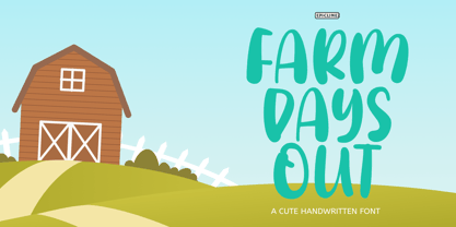 Farm Days Out is a cute and playful font. Suitable for your crafting projects.
 - DB 'Tis The Season Words by Illustration Ink,
$3.00DoodleBat 'Tis the Season Words is a collection of Holiday themed words and phrases. - Synthetique OT - Unknown license

- Oxida OT by Sudtipos,
$79.00 The unmistakable hand of Angel Koziupa and the technical expertise of Alejandro Paul brings us once more the kind of calligraphy that reads softly yet commands attention. This time around, Angel's statement adds a slightly coarse and rusty aura to the usual elegance, which makes Oxida an indispensable typeface for use at large sizes, particularly in poster design, book covers and culinary packaging.
 - PT Medievil by Paupe Type,
$10.00 PT MEDIEVIL is a new display font inspired by artefacts of the dark middle-ages with a contemporary twist. It contains 195+ meticulously crafted glyphs characterized by: -Upper part indented inward to be true to imperfect handwritten medieval typography -Smooth curve shapes -Rounded intersections between shape sections -Rounded serif Easily create headlines, display titles, subheadings, body copy.
 - Cynapse OT by Positype,
$29.00 Several years ago I was faced with a project that required very small type to be used in a directory. In general, there was a need for a lot of 'fine print'. Faced with this, all of the tests I was making with existing faces were producing too much bleed of the individual glyphs...Cynapse was born. It evolved into this pseduo-techy looking type that standardized and glorified the ink trap (the small, tiny allowances of white space that reduces the amount of ink hitting the page, and in effect, reducing the appearance of bleed). The results was promising. The new OT version contains additional OpenType features that include expanded ligature sets, fractions, 5 sets of numerals as well as small caps and Central European diacritics.
 - Amorinda OT by Sudtipos,
$59.00 Amorinda is a connected script that manages to be wild and disciplined at the same time. It can scream wildly within a design or smoothly blend in to make it more human. With its versatile character and a complete set of alternates, Amorinda is the perfect display face for everything from product branding to signage. This 2007 version of Amorinda is now available in OpenType format to expand possibilities of use with lots of alternates when used with OpenType-aware applications such as Adobe Creative Suite.
 - Satellite PT by Puckertype,
$19.00Satellite PT started out as an experiment. Wanting to explore the geometry of using angles instead of curves, I started sketching out the face using grid paper. I had seen similar fonts that tended to be completely symmetrical. My exploration tended to include what I humorously call 'faux humanist' elements, such as asymmetrical bowls, tapers and 'flare-serifs' (for lack of a better word) for select terminals. The result was a quirky and interesting face at display sizes. However, at small sizes, as ink bleed starts to take over, the angles disappear in favor of the overall forms (rounded bowls, etc.) and the 'faux-humanist' effects start to mimic modulation found in more traditional, modulated text faces. While it is hardly a true text face, the result is surprising legibility at text sizes. - PT Spaghetti by Paupe Type,
$10.00 PT Spaghetti is a display font inspired by Spaghetti Western films but with a playful twist given by big serif and high contrast.
 - Emporia OT by Bean & Morris,
$42.00 Emporia OT Roman and Italic, a classic, elegant font with upper and lower case, swash alternatives lining and old style figures, ligatures and small caps. Includes more than 500 glyphs supporting more than 80 latin-based languages. Suitable for both display and text settings it will enhance and preserve Roman history with sheer elegance, grace and style.


