10,000 search results
(0.063 seconds)
- Victorian Alphabets by Intellecta Design,
$24.00 Victorian Alphabets is a incoming family of complete victorian style alphabets, researched and developed upon a comprehensive number of vintage books, magazines and catalogues from XIX century. The "Victorian Alphabets A" font has just A' designs, performing 52 differnt A's to your use. And the Victorian Alphabets B and C has, too 52 B and C letters, only, each. You also can take a look in our massive collection of monograms, here : https://www.myfonts.com/fonts/intellecta/intellecta-monograms/
 - P22 Araminta by IHOF,
$29.95 P22 Araminta is a new font family from the prolific hand of Ted Staunton. Araminta Regular is a Tuscan style decorative font in the Victorian tradition. The Araminta Caps features a multi-font chromatic type system which allows for layering in colors using optional floral embellishments or simple colorful splashes in drop cap settings. Araminta Regular includes over 390 glyphs for multiple language options, while the multi-layer caps fonts contain only the capital letters A–Z.
 - MC Kartoz by Maulana Creative,
$16.00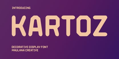 Kartoz is a modern Tech Decorative Display font. Medium stroke, fun character with a bit of ligatures and alternates. To give you an extra creative work. Kartoz font support multilingual more than 100+ language. This font is good for logo design, Social media, Movie Titles, Books Titles, a short text even a long text letter and good for your secondary text font with script or serif. Make a stunning work with Kartoz font. Caps only Fonts. Cheers, Maulana Creative
 - Daleant by Maculinc,
$15.00 The new beautiful and attractive Serif Font comes with a unique alternative in each Uppercase, This Font is available in Uppercase and Lowercase Complete with Numbers, Punctuation, Alternate and Ligatures. Daleant Serif Font is available in the family of Light, Light-Italic, Regular, Italic, Medium, Medium-Italic, Semi Bold, Semi Bold-Italic, Bold, Bold-Italic. Alternatives and Ligatures in this font are only available in uppercase letters, Add alternatives to make sentences more unique and interesting.
 - The Story So by Comicraft,
$19.00 Trapped in a world they never made, the characters in our Story So Far have been engaged in final battle with their Arch Enemies... the characters known only as ToBeContinued. One of our characters will win, one will die, at least two of them will be engaged in a Clash of Titans. Face Front, True Believer, This One's Got it All! The Story So Far & Near complete family includes eight weights with support for Western & Central Europe.
 - PTT by TYDTYP,
$20.00 PTT typeface has very rounded outlines. They are extremely overlapping each other like packed potatoes. The face will be very strong and give your design extraordinary spice! Basically, main characters are consist of two different shapes, one is initial form which is only used at the beginning of a word, the other is medial form which is used for the rest. To use this function, I highly recommend to use appropriate layout application (e.g. Adobe illustrator, InDesign, QuarkXpress).
 - Badehaus by Hanoded,
$15.00 In the German city of Bad Neuenahr you can visit a spa called Thermal Badehaus. This beautiful art deco building has an even more beautiful art deco lettering covering its facade. I had to work with only a couple of glyphs ('Thermal Badehaus' to be exact) and tried to capture their beauty in the remaining glyphs. The result is a font called Badehaus (Bath House in German). It is a bold, all caps typeface, with some unique glyphs.
 - Satampra by Scriptorium,
$24.00Satampra evokes the spirit of Arabic calligraphy with a hint of something strange and magical. It is an unusual calligraphic font based on an obscure hand lettered style with unique overlapping character strokes. It fits the theme of oriental fantasy and would work well with the fonts in our Arabian Nights Fonts and Art package. Satampra is an upper-case only font, but the lower case positions have alternative versions of the upper case character set. - Myoungwon by Designsuh,
$12.00 Font 'myoungwon' is a 'colorfont' that contains a color(Gradient) other than the existing one of a single color font. You can use it on Photoshop(since CC 2017), illustrator(since CC 2018), InDesign(since cc 2019), QuarkXpress(since 2018), Pixelmator(since macOS 10.14 Mojave), Sketch(since macOS 10.14 Mojave), Affinity Designer(since macOS 10.14 Mojave), Paint.NET(windows only), Microsoft edge(since 38 on windows 10), Safari(since 12, macOS 10.14 & iOS 12), Firefox(since 26), and so on.
 - Blackminster by Hanoded,
$10.00 Blackminster is a Gothic font, inspired by a handwritten set of letters (designed by Harry Lawrence Gage) I found in a 1916 book about lettering. I only had the ABC/abc to work with, so I designed the remaining glyphs myself. Use Blackminster for your Metal album covers, skateboards and downhill mountain bikes, or just anything that requires a bit of a Gothic look! Comes with a serious amount of diacritics and an alternate, swashy, g and y.
 - Feeltrips by Maulana Creative,
$15.00 Feeltrips is an all caps handwritten display font. With bold stroke, italic and fun character with a bit of ligatures. To give you an extra creative work. Feeltrips font support multilingual more than 100+ language. This font is good for logo design, Social media, Movie Titles, Books Titles, a short text even a long text letter and good for your secondary text font with sans or serif. Make a stunning work with Feeltrips font. Caps only fonts. Cheers, MaulanaCreative
 - Carbines by Gatype,
$14.00 Carbines Serif is Retro with extreme cuts, sharp angles and interactive straps. Affected characters are spread across three capital-only subfamilies, with distinct styles, and distinct personalities. The bold separation of characters and the considered standard of ligature create a type that is solid, modern and attractive. Carbines is a modern fashion serif font, each letter has been carefully crafted to make your text look unique. Don't hesitate to send me a message if you have any questions!
 - Mr Cyrk by Hipopotam Studio,
$18.00 Hand drawn typeface designed for one of our books. You can layer different styles over the background style to achieve lots of colorful effects. Use just one style to get a single color letter or set the fillOne and fillTwo over the background style to get a full, tree color mode. Mr Cyrk has only uppercase characters with alternate glyphs in place of lowercase letters. You can have one style for $18 or all of them for $30.
 - All Smiles by Ingrimayne Type,
$14.95 AllSmiles is a sunny little face in which all the letters smile at you. It can be used in notes and cards of congratulation or in celebrating good-news announcements. In the update of 2011, emoticons were added in the appropriate unicode slots (unicode 1F601 to 1F640 slots). For the sad version, see BringInTheFrowns, and if you only want to proclaim a little joyfulness, you can temper the feelings with a plain version of the typeface, FebDrei.
 - Timesky by Nathatype,
$29.00 Experience the timeless allure of Timesky, a serif font that effortlessly blends classic elegance with a modern sensibility. The generous spacing between characters ensures that your text breathes, This ample spacing not only enhances legibility but also lends a feeling of modernity to your design. On the other hand, the inline style brings a sense of depth and dimension to the font, creating a captivating visual. Timesky fits in headlines, branding materials, print media, and many more.
 - MuskitosCaps by Ingrimayne Type,
$8.95 MuskitoCaps is a Tuscan (split-serif) font that is rather narrow and a bit awkward. It is caps only, though the lower case differs from the upper case(the lower case lacks the mid-stem spike). The family has three styles, plain, shadowed, and shadowinside. The last has the same shapes as the plain style but has the spacing of the shadowed style so it can be layered with the shadowed style to easily produce bi-colored lettering.
 - Magallanes Essential by Los Andes,
$18.00 Magallanes Essential a contemporary neo-humanist sans serif font designed by Daniel Hernández. Its strokes and terminals are related to the calligraphic strokes from humanist typefaces. Every weight comes with alternative glyphs for a more dynamic use. Magallanes is the perfect titling font to complement text faces in magazines, logotypes, etc. It is a essential family of 8 fonts, 4 weights and italics. This typeface no contains alternate glyphs and add only Windows 1252 Character set (219 Glyphs).
 - Hammered by Ingrimayne Type,
$14.95 In Hammered all the letters are made up of hammers and an occasional nail. It is caps only, but the characters on the lower-case keys differ from those on the upper-case keys. It has a large set of accented characters. It is not often that one needs a typeface made of hammers and nails, but if one does, there is a font for that. For related, tool-based typefaces, see Screwged, NailsNStaples, and WrenchedLetters.
 - Flagstaff JNL by Jeff Levine,
$29.00Flagstaff JNL takes the lettering from Roma Initial Caps JNL and gives them the movement of an unfurled banner. For added effect, there are flagpoles facing in either direction on the lesser and greater keys. Left and right flag ends are placed on the parenthesis keys; a wide blank flag panel is on the left brace key and a narrow blank flag panel is on the right brace key. Letters only; no punctuation or extended characters. - Worker by Ndiscover,
$29.00 Worker is a versatile family of geometric fonts with a sturdy industrial feel. It has a vintage flavor and conveys a professional and technical look. It has 5 styles with matching slants and a generous language support. Worker works very well in branding and headlines, but also renders peculiarly well in short strings of text. This design has great personality having the power to create a whole universe of meaning resorting only to a few letters.
 - Forever Loved by Joanne Marie,
$19.99 Forever Loved is a delightful new handwriting font which is full of character and suitable for every occasion. It has OpenType features such as alternates (two sets of uppercase alternates), swashes, ligatures, terminal forms in lowercase, and a European language support. This wonderful script font is perfect for wedding stationery, engagements, and baby, family and friends orientated themes. Not only that - it can be used for logos, tattoos, delicious food and drink, mugs, clothing, the list is endless!
 - Katuku by Twinletter,
$15.00 Katuku is an Arabic Style Font based on the exquisite Arabic calligraphy style, which means that the writing style is highly decorative and highly variable. Arabic style fonts will give your designs a genuine Middle Eastern feel. Use this font in your super projects to grab everyone’s attention. Not only is it perfect for logos and headlines, but it adds an elegant Arabic touch to the design and will give you a real edge over your competitors’ designs.
 - Mano by Linotype,
$29.99Linotype Mano is a fresh new font from the Swiss designer Marco Ganz. Urgent and vital, the typeface suggests swift communication or the latest trends: spontaneous and informal, personal and individual. Ganz deliberately gave the characters a marked lean to the right, similar to that of quick handwriting. But Linotype Mano is not only nimble and quick, it also retains its legibility as a text font. Linotype Mano is as dynamic, brisk and casual as modern pop music. - Trumania EEN - 100% free

- Ambiguity by Monotype,
$50.99 Ambiguity is a type family with five distinct personalities or ‘states’, created as a tool for coaxing designers and brands out of their comfort zone. It embraces both tradition and radicality, as well as generosity and thrift, encouraging us to question our beliefs about the intersection of style and meaning. The family is designed by Charles Nix, who describes Ambiguity as “as much thought experiment as typeface.” Its five states—Tradition, Radical, Thrift, Generous and Normate—each express or subvert different aspects of typographic tradition. Tradition is conservative, relying on historical letter shapes. Radical rejects inherited ideas of proportion, making typically slender letterforms wide, and wide letterforms slender. “It’s contrarian,” says Nix. Thrift cherry picks the condensed shapes from Tradition and Radical, while Generous does the same for wide forms. Normate sits at the center, a synthetic blend of all of the others. “Tradition is very comforting,” says Nix. “It’s the mask of conservatism. It’s calming because it delivers the proportions we expect. With Thrift more fits into a smaller space, so it’s great where words want to get large, like gigantic headlines, or text needs to cram in, like small screen type. You get a sense of carefree and luxury from the Generous cut. One would expect the Radical to be used in a sort of Dadaist way, but in a classic context it provides an enjoyable jolt.” Ambiguity is a litmus test. Designers could spend hours trying on typefaces that offer just one of these voices. Ambiguity provides five different personalities—ideas—beliefs—each of which also work seamlessly together. “It’s a palettea, like idea cards,” he says. “It’s a way of making yourself see differently. My hope is that traditionalists will try on radical clothes and vice versa. It’s a way of exploring outside your comfort zone, breaking out of the doldrums, by stepping through a variety of voices.”
 - Squeam by PizzaDude.dk,
$17.00 Here's a fun font that is quirky, jumpy and uneven. It's also unpredictable, but not more than your text will be clear and legible...but in a fun way! :) I've added several lowercase versions that automatically cycles as you type. A great way to make your text random and lively
 - Rieven by Delve Fonts,
$29.00 Designer Steven Skaggs wanted a versatile uncial typeface that was not simply decorative. Traditionally, a true uncial is a majuscule form, entirely lacking in ascenders and descenders. However, by designing Rieven Uncial, Skaggs found a way to use the true uncial as inspiration but retained a lowercase look and feel. Typically, uncials do not have italic forms but in order for Rieven to be a truly versatile face, it was imperative that it should be accompanied by an italic. The italic form owes much to the historical roots in the letra antigua cursiva of the 15th century humanist masters. Rieven Uncial was awarded a Certificate of Excellence in Type Design in the 2010 TDC2.
 - Reina Neue by Lián Types,
$29.00 Hey! See Reina Neue in action here! INTRODUCTION When I designed the first Reina¹ circa 2010, I was at the dawn of my career as a type designer. The S{o}TA, short for the Society of Typographic Aficionados, described it as complex display typeface incorporating hairline flourishes to a nicely heavy romantic letterform². And it was like that; that’s what I was pursuing at that time since I was very passionate about ornaments and accolades of Calligraphy. Why? I felt that Typography, in general, needed more of them. These subtle flourishes could breathe life into letters. Maybe, I thought it was the only way I could propose something new into the field of type. However, after some years, I came across a very interesting quote: –Beautiful things don’t ask for attention– Wow! What did this mean? How could something be attractive if it’s not actually showing it. Could this be applied to my work? Sure. I think every type-designer goes through this process (aka crisis) regarding his or her career. At the beginning we love everything. We are kind of blind, we only see the big picture of a project. And that’s not because we are lazy. We actually can’t see the small mistakes nor the subtleties that make something simpler beautiful. We are not able. But, the small subtleties… They are actually everything: With experience, one puts more attention into the details and learns that every single decision in type has to be first meticulously planned. Here I am now, introducing a new Reina, because I felt there was a lot of it that could be improved, also the novelty of Variable Fonts caught my attention and I had to take that to my type library. THE FONT A thing of beauty is a joy forever Now, a decade later, I’m presenting Reina Neue. This font is not just an update of its predecessor: –A thing of beauty is a joy forever– is the first line of the poem ‘Endymion’ by John Keats, and despite the meaning of “beauty” may vary from person to person, and even from time to time (as read in the last paragraph), with Reina I always wanted to bring joy to the eye. In 2010, and now, in 2020. I believe the font is today much better in every aspect. It was entirely re-designed: Its shapes and morphology in general are much more clean and pure. The range of uses for it is now wider: While the old Reina consisted in just one weight, Reina Neue was converted into a big family of many weights, even with italics, smallcaps and layered styles. The idea behind the font, this kind of enveloping atmosphere made out of flourishes, is still here in the new Reina. This time easier to get amazing results due to the big amount of available alternates per glyph and also more loyal from a systemic point of view. However, and as read in the introduction -Beautiful things don’t ask for attention-, if none of the flourishes are activated the font will look very attractive anyway. Reina Neue is ready to be used in book covers, magazines, wedding cards, dazzling posters, storefronts, clothing, perfumes, wine labels and logos of all kind. Like it happened with the previous Reina, I hope this new font satisfies every design project around the world if used, and can be a joy forever. SOME INSTRUCTIONS Before choosing the right style for your project, hear my advice: -Reina Neue Display was meant to be used at big sizes. If you plan to print the font smaller than 72pt, I suggest using Reina Neue, not Display. Otherwise, if the font will be BIG or used on a digital platform, Reina Neue Display should be your choice. For even smaller sizes, use Reina Neue Small. This style was tested and printed in 12pt with nice results. (Note for variable fonts: Print them in outlines) -Reina Italic is not a slanted version of the roman, and this means some flourishes are different between each other. The Italic version has other kind of swirls. More conservative, in general. -All the styles of Reina Capitals have Small Capitals inside. -Reina Capitals Shine should be used/paired ONLY with Reina Capitals Black. The engraved feeling can be achieved if Reina Capitals Black and Reina Capitals Shine are used as layers, with the same word. Variable fonts instructions: -For more playful versions, choose Reina Neue VF, Reina Neue Italic VF or Reina Neue Capitals VF: With them you can adjust between 3 axes: Weight (will change the weight of the font) – Optic Size (will thicken/lighten the thin strokes and open/close the tracking) – Accolades (will modify the weight of the active flourishes). SOME VIDEOS OF REINA NEUE VF https://youtu.be/8cImmT5bpQM https://youtu.be/1icWfPmKAkg https://youtu.be/YC9GkJDL1a8 NOTES 1. The original Reina, from a decade ago: https://www.myfonts.com/fonts/argentina-lian-types/reina/ 2. In 2011, Reina received an honourable mention by S{o}TA. “Great skill is shown in the detailing, and an excellent feel for the correct flow of curves and displacement of stroke weight.” https://www.typesociety.org/catalyst/2011/ Reina was featured in the “Most Popular Fonts of the year” in MyFonts in 2011 https://www.myfonts.com/newsletters/sp/201201.html In 2012, the font was also selected in Tipos Latinos, the most prestigious competition of type in Latinoamerica. https://www.tiposlatinos.com/bienales/quinta-bienal-tl2012/resultados Also, chose as a “Favorite font of the year” in Typographica. https://typographica.org/typeface-reviews/reina/
 - Mandira by Arterfak Project,
$24.00 Introducing Mandira, the ultimate serif font for those seeking a unique and sophisticated touch to their design projects. With its rounded curves shaped. Inspired by the modern retro, Mandira is the perfect choice for those seeking a minimalist yet stylish look. The font boasts a wide range of special characters, giving you the freedom to mix and match to create a truly personalized touch. Whether you’re a designer, blogger, or creative, this font is perfect for logos, headings, and branding, and its bold and fancy appearance to ease you make a masterpiece. With over 400+ glyphs to choose from, you can be sure that your work will stand out. Mandira is not only fashionable and casual, but it’s also versatile enough to be used in a wide range of design projects. So why wait? Try Mandira today and elevate your designs to the next level! What you’ll get : Uppercase Lowercase Numbers & punctuation Stylistic alternates Stylistic set 01-05 Ligatures Multilingual support Hope you enjoy the font!
 - Stile by FSdesign-Salmina,
$39.00 Are you looking for a true cursive sans serif? Stile is a true cursive with moderate inclination. Its cursive character has mainly to do with writing-speed. Therefore it may serve also as copy font and not only for emphasizing purposes. Stile has a good readability and is really flexible and universally applicable. Stile is a sans serif and renounces to an excessive use of ligatures and other explicit calligraphic shapes in order to ensure a contemporary style and a homogenous text color. The whole font family consists of 8 weights (from ultrathin to black) and offers a wide range of Western and Eastern European special characters, typographical ligatures, uppercase, oldstyle and fraction figures. In addition Stile features a very complete and specifically tailored range of numberings and arrows. Bring a personal style into the artwork, with Stile. Download a free trial version of Stile with a reduced character set. Check it out!
 - OKASA by Twinletter,
$15.00 Okasa, our newest typeface, is now available. We present to you a quirky and contemporary typeface, which you can use to produce an optimal visual display in each of your projects and to impress all of your audience with the unique look of your project. Because everyone does not necessarily understand Japanese letters, we supply fonts with letters that can be utilized for your project. We produced this display font with a Japanese theme or an Asian font, which we designed to fulfill the needs of your Japanese-themed project. Of sure, your initiative will be understood by people all around the world. Logotypes, food banners, branding, brochure, posters, movie titles, book titles, quotes, and more may all benefit from this font. Of course, using this font in your various design projects will make them excellent and outstanding; many viewers are drawn to the striking and unusual graphic display. Start utilizing this typeface in your projects to make them stand out. Caps only fonts
 - Chilead by Groteskly Yours,
$12.00 Chilead is reminiscent of the early days of magazine publishing. Its elegant curves, high contrast and all-round heartwarming feel are perfect for art projects and typography across all mediums. Chilead is a sans serif font that looks great in titles, when used in larger sizes – but is not out of the place in a text either, which makes it a perfect choice for artists and designers who pursue not only the aesthetic qualities of the font, but also its functionality. Originally designed in 2019 and fully updated and expanded in 2022, Chilead offers users a large set of ligatures (both standard and discretionary) and a number of alternative forms for letters (such as a, v, w, y, etc). Chilead comes equipped with 600+ glyphs, which covers most of Latin-based scripts. Carefully kerned, Chilead is ready to be used in any project that requires a typeface that combines unique and stylish letterforms with a modern feel.
 - ITC Johann Sparkling by ITC,
$29.99ITC Johann Sparkling is the work of Austrian designer Viktor Solt, a perfect imitation of the handwriting of an educated person of the 18th century. ITC Johann Sparkling is intended to close the gap between highly formal copperplate scripts and the scribbled look of 'true' handwriting," says Solt. "I am not very interested in highly formal and perfect calligraphy, but rather in quick, personal-looking scripts. Usually I start with some historical samples in mind, but I do not try to copy these sources. Instead, I incorporate them into my own handwriting. It takes up to two weeks, and many sheet of paper, before the respective script becomes my own. Of course, this would not be an economic approach for individual lettering jobs, but I can conserve the custom script for future use by digitizing it." ITC Johann Sparkling should be used in fairly large point sizes and its capitals only as initials. - ITC Abaton by ITC,
$29.00 ITC Abaton, by Argentinian designer Luis Siquot, is an exercise in geometry and simplification. “It is done,” says Siquot, “with few elements, with modules of only straight lines (horizontals, verticals and diagonals of almost 45 degrees). Drawing the I and the O, I got the basic elements, and so started the fight between strict geometry and optical impression, until I obtained the rest of the characters.” The basic rectangular form is characterized by wedge-shaped serifs, almost like caps on the heads and feet of the letters. “Abaton has the 'spirit' of 19th-century faces used on money bills or postage stamps, but the realization is totally different,” Siquot explains. Abaton is a “shaded” typeface of caps and slightly smaller caps, upright and slightly condensed in form. Although the letterforms are legible at small sizes, the shading tends to clog up if it gets too small, so Abaton is happiest as a distinctive display face.
 - Redbird by Eurotypo,
$34.00 Redbird is a modern hand-painted script with an irregular baseline. Rough edges and imperfect lines give to this brush font a unique and trendy look. All glyphs have been carefully painted giving your words a wonderful flow. Fat and thin stroke in this font impresses the harmony. Want to give your projects an organic, hand-painted look? Redbird font contains 584 glyphs, with inky lines, and "perfect or imperfect" painted edges, including a few extra character alternates, swashes and ligatures for a genuine hand-lettered effect. This font includes OpenType features that may only be accessible via OpenType-aware applications, a Central European language support. Bonus: 60 useful ornaments and a lot of catchwords that you use for the most demanding design project! Redbird looks lovely on wedding invitations, greeting cards, logos, business cards and is perfect for using in ink or watercolour based designs, fashion, magazines, food packaging and menus, book covers and more!
 - FingerSpeller BF by Bomparte's Fonts,
$40.00 Many years ago I studied American Sign Language in an effort to better communicate with some friends of mine within the deaf community. I found ASL to be a beautifully expressive language from a vibrant and active culture. Out of that attempt came this stylized depiction of the manual alphabet used in finger-spelling. Until recently it had only existed in analog form, born of pen and ink on paper. So now I'm glad to say it’s turned digital. Typing a period (.) will reveal the sign for “I Love You” (a combination of the letters I, L and Y), which fits nicely within the shape of a heart. Holding down the shift key while again typing period (greater symbol) will reveal the heart in its filled-in form, which can serve as an underlay. Use these in an application that supports layering in order to create different color combinations. There’s a stylistic alternate letter “S” and an “OO” ligature which can be accessed in OpenType-savvy apps.
 - Trained Monkey by Hanoded,
$15.00 Trained Monkey is a happy serif cartoon font. Use it for your book cover designs, posters, product packaging (may I suggest peanut butter?) and whatever else you may fancy. This monkey was made by hand, so the glyph edges are a bit rough and uneven - giving it ‘ye olde handmade look’. The name? Well, I was watching a movie (can’t remember which one) in which two guys were having a discussion. One of them said to the other: ‘a trained monkey could have done this job!’ That’s all folks.
 - Love Wins by Resistenza,
$19.00 In 2007 we shared our first pride together. More than 1 million people took the streets of Madrid for this huge celebration … seeing the diversity of people supporting love was incredibly touching. Gay Pride is a celebration of freedom, human rights and the right to love whoever we want. It’s a memorial for the battles, the lives lost and the pain suffered while fighting for a growing list of equal rights. But let’s not forget there are still places where LGTBQ community is repressed and persecuted. As Letter crafters we love seeing the signs people design for their different pride parades, and we wondered… Why don’t we create a collection of handcrafted lettering to share some love and to add a typographic realness to the party? Love Wins Font is a series of 60 phrases handwritten with expertise and love specially designed to celebrate diversity. The lettering was crafted with different calligraphic tools creating diverse aesthetics. You can use them to create your signs, t-shirts, stickers, poster, banners.. all you need is to spread love during your Pride Celebrations (or day-to-day life!).
 - 99 Names of ALLAH Linear by Islamic Calligraphy75,
$12.00 We have transformed the “99 names of ALLAH” into a font. That means each key on your keyboard represents 1 of the 99 names of ALLAH Aaza Wajal. The fonts work with both the English and Arabic Keyboards. We call this Calligraphy "Linear" for obvious reasons. The first "Alef" has a "fatha", this indicates that the name can be pronounced only one way, "AR-RAHMAAN". (in the zip file you will find a pdf file explaining the differences in the "harakat", pronunciation and spelling according to the Holy Quran). This calligraphy is very clear and no letters overlap. Decorative letters used in this calligraphy: "Mim, Aain, Sin, HHe, He, Kaf, Ta & Saad". Purpose & use: - Writers: Highlight the names in your texts in beautiful Islamic calligraphy. - Editors: Use with kinetic typography templates (AE) & editing software. - Designers: The very small details in the names does not affect the quality. Rest assured it is flawless. The MOST IMPORTANT THING about this list is that all the names are 100% ERROR FREE, and you can USE THEM WITH YOUR EYES CLOSED. All the “Tachkilat” are 100% ERROR FREE, all the "Spelling" is 100% ERROR FREE, and they all have been written in accordance with the Holy Quran. No names are missing and no names are duplicated. The list is complete "99 names +1". The +1 is the name “ALLAH” 'Aza wajal. Another important thing is how we use the decorative letters. In every font you will see small decorative letters, these letters are used only in accordance with their respective letters to indicate pronunciation & we don't include them randomly. That means "mim" on top or below the letter "mim", "sin" on top or below the letter "sin", and so on and so forth. Included: Pdf file telling you which key is associated with which name. In that same file we have included the transliteration and explication of all 99 names. Pdf file explaining the differences in the harakat and pronunciation according to the Holy Quran.
 - Jellyka BeesAntique Handwriting - Personal use only


