10,000 search results
(0.02 seconds)
- Blood Scratch by Creaditive Design,
$12.00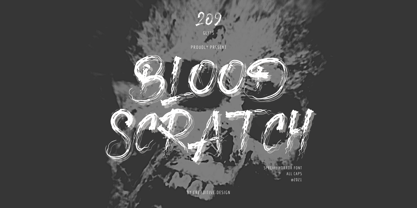 Blood Scratch is a creepy and brushed display font. It is perfectly suitable for any Halloween-related project or crafty idea, creepy film project and horror themes will be nice! The only limit is your imagination.
 - Forum Titling by Red Rooster Collection,
$45.00An original design based on the Frederick Goudy design first shown in 1912. Originally a caps only design in one weight. Produced as a foundry face by Lanston Monotype 1924. Featured in: Best Fonts for Tattoos - Sveva by astype,
$58.00 Sveva Versal is a light swinging art nouveau caps only headliner, with swash like alternates and lots of special combinations. It's well suited to set a short and fancy block or line of text. PDF Specimen
 - Handy Cut by Los Andes,
$34.00 Handy Cut is an experimental project inspired by paper cutting only using fingers, designed by Paty Bean from south Chilean farm. It includes dingbats and alternate characters to play with in expressive and irregular short texts.
 - Wardrum Pro by Letterhend,
$14.00 Wardrum is an expanded sans with two styles. Use this font for your new project. Suitable for branding, poster, or your headline! This font contain uppercase only with numbers, symbols, punctuation and also multi-lingual support.
 - Sumantry by Artisan Studio,
$20.00 Sumantry is the only feminine font script, with a pure handwriting style, and very perfect for invitations, signatures, logo designs, brands, and resources from this font can also be in the title of books and magazines.
 - Pixettish by Aah Yes,
$4.95Pixettish is a fun-font, a slightly ornamental sans serif typeface with curls to the upper and lower case characters. The zip files contain both OTF and TTF versions of the font - install one version only. - Back Lot Stencil JNL by Jeff Levine,
$29.00 Back Lot Stencil JNL is a hand lettered slab serif stencil design based on the titles and credits from the 1954 film “Human Desire” and is available in both regular and oblique versions. Caps only Font.
 - 161 Vergilius by GLC,
$38.00 This font was inspired by the rare manuscript Roman Quadrata used by an unknown scribe to inscribe a copy of the Roman poet Virgil’s GEORGICS, somehwere around 161 to 180 AD. Only a few sheets have survived, now preserved by different libraries around the world. In creating this font, we have adapted it for contemporary users, making differences between U and V; I and J (which made no difference at all to ancient Latin scribes) and naturally adding the glyphs for Thorn, Oslash, Lslash, W, Y, as well as the usual accented characters and punctuation, none of which existed at the time. Only capitals are present in the original; but we have provided alternates: so alternating each character A-Z/a-z will give a pleasant appearance of manual script. We have added the Roman numerals “I V X L C D M” in the OTF/TTF versions usable as “Old Style Numerals” alternates.
 - MFC Monarchy Initials by Monogram Fonts Co.,
$19.95 The inspiration source for Monarchy Initials is the 1934 Book of American Types by American Type Founders. In that specimen book, they had created a sophisticated two color initial design they called "Stationers Initials" which was only available in metal type at 24, 36, and 48 points. This wonderfully detailed initial style is now digitally recreated and revived for modern use. Monarchy Initials is only capable of initial or single letter monograms due to its unique design. The two color aspect of the original design has been preserved and made accessible within all programs. The Capital character slots contain the background color glyphs, and the lowercase slots hold the outline art for the letters. You can choose a color, type a capital letter, then switch to black and type a lowercase letter for the two color effect, or just tpe a lowercase letter on its own. It's that easy! Download and view the Monarchy Initials Guidebook if you would like to learn a little more.
 - MFC Memoriam Initials by Monogram Fonts Co.,
$19.95 The inspiration source for Memoriam Initials is the 1934 Book of American Types by American Type Founders. In that specimen book, they had created a sophisticated two color initial design they called “University Initials” which was only available in metal type at 24, 36, and 48 points. This wonderfully detailed initial style is now digitally recreated and revived for modern use. Memoriam Initials is only capable of initial or single letter monograms due to its unique design. The two color aspect of the original design has been preserved and made accessible within all programs. The Capital character slots contain the background color glyphs, and the lowercase slots hold the outline art for the letters. You can choose a color, type a capital letter, then switch to black and type a lowercase letter for the two color effect, or just type a lowercase letter on its own. It’s that easy! Download and view the Memoriam Initials Guidebook if you would like to learn a little more.
 - Rhythmic Revue JNL by Jeff Levine,
$29.00 The vintage sheet music for "Between the Devil and the Deep Blue Sea" yielded another bit of Art Deco-era lettering perfect for developing into a digital font. This time it wasn't the song title, but rather the name of the show it was from serving as the type inspiration - the Cotton Club's 1931 revue "Rhythm-Mania". Harlem's Cotton Club was an "exclusive, whites only" club; both famous for its talent and shows, yet infamous for hiring black acts but not allowing black patronage. On the sheet music, the show title was hand lettered in a bold, slightly stylized fashion which became the basis for Rhythmic Revue JNL; available in both regular and oblique versions.
 - CA Postal by Cape Arcona Type Foundry,
$39.00 CA Postal is a cute and clever little stamp-font. It was originally intended for a record-cover only, but when the artist wanted all lyrics printed in the booklet, it was time for a font. The initial inspiration was a moveable-stamp printing-set, which had a nice Futura-like style, being very pleasant to read, especially in small sizes. But of course it’s the loose and irregular outlines that give the font its special charms. CA Postal features two sets of characters and the "Contextual Alternates" feature will make sure that never two identical characters will stand next to each other, so that the stamp-look becomes even more authentic.
 - Birly by Orenari,
$18.00 A few nights ago, I was dreaming about making a cute font that the children in the city would love. I only remember some characters of the font but I thought that it was a sign to make a new font. So, here it is, Birly. A new font and I think its cute yet playful for your fun projects. Birly was made with all my heart, I love it, and I hope you like it too. Birly has 2 styles, the regular and solid. You can choose, these all in the package! Please take a look and enjoy the preview pictures of Birly. I made it seriously, so you can see how is Birly looks on some projects.
 - Horatio by ITC,
$29.00British designer Bob Newman's Horatio family is a delightful look back into the modernists experiments of the 1920s. This geometric sans serif design was created in 1971, and was originally released by Letraset. We are please to offer the family in digital form, in light, medium, and bold weights. Many designers during the 1920s were interested in reforming the alphabet, and wanted to reconcile letterforms with the machine and manufacturing technology of the age. Herbert Bayer at the Bauhaus was one of many designers who developed a universal alphabet," creating letters using only the simplest of geometric forms. Similar experiments in 1920s-style revivals were also created during the 1970s, most notably Herb Lubalin's ITC Avant Garde Gothic." - Uptown Review JNL by Jeff Levine,
$29.00 Cover art for the 1933 sheet music of Harold Arlen and Ted Koehler's "Stormy Weather" (from the musical production "Cotton Club Parade") listed the cast of the show in a condensed hand lettered sans that typified the 1930s and the Art Deco era. This served as the inspiration for Uptown Review JNL; available in both regular and oblique versions. The Cotton Club was a whites-only night club which showcased black acts, and was originally located on 145th Street in Harlem from 1923 to 1935, then existed for a short time in the New York theater district from 1936 to 1940. After the Broadway incarnation of the club closed, its space was taken over by the Latin Quarter.
 - Vocaloid - Personal use only

- French Serif Moderne JNL by Jeff Levine,
$29.00French Serif Moderne JNL gives a slab serif treatment to the lettering comprising Jeff Levine's French Art Initials JNL. The font - containing a full character set - was inspired by a page from an early 20th Century French alphabet book posted online at an image sharing site. - Spoon by Dharma Type,
$19.99 Spoon is a fresh and contemporary sans-serif that can be used in wide range of project. Its skeleton of letterform is geometrically-based and minimal but the body was designed with a touch of humanistic outlines as though they were handwritten. This not only make the font clean, legible and functional, but also make it possible to give natural, friendly and soft impressions. Spoon comes in seven weights with matching italics and includes diacritics for most European in each weight.
 - Visoko by Mostardesign,
$19.00 Visoko is a playful, geometric typeface inspired by post-modern fonts designed by Mecanorma from the 80s. This typeface has been designed on a grid of 7×6 squares but the goal was to create variations from the grid to give the character a destructured aspect. VISOKO is available in two styles : regular and italic and only in uppercase. It has aspects of Laser shapes and proportions but has modern additions that make it ideal for industrial brands and modern titles.
 - Cutlass by Hackberry Font Foundry,
$24.95 Cutlass was just for fun. A year ago or so [2009, maybe], someone on typophile showed a scan of the word "Ciruelo". I liked it. Those were the only letters I had and no one ever came up with the name of the original font that I saw. It doesn't matter as I went far afield as I designed, as usual. It's just a swashbuckling bit of fun. OpenType 476 Glyphs from my usual set minus the superior and inferior figures. Enjoy!
 - G&G by Woodside Graphics,
$19.95G&G is the only authorized digitized version of the original handlettering of early 20th Century architects Charles and Henry Greene. This font is both accurate and authentic -- it was adapted directly from the Greenes' original plans for The Gamble House in Pasadena, California, and others. G&G contains both Upper and Lower-case characters, consistent with the Greenes' use of lower-case to explain fine construction details on their plans. G&G is very successful in creating the illusion of hand lettering. - Flight by ITC,
$29.99Flight is the work of British calligraphic artist Timothy Donaldson, whose specialty is the experimentation with different design tools. Flight is named for the free-flowing lines of its forms which bring to mind a freedom of movement. It was first rendered in pencil using a quick sketching technique. The stem junctions were then carefully thickened to produce a futuristic style without losing its calligraphic origins. The capitals are intended for initialling purposes only. Flight is a lighthearted font with elegant letterforms. - Jazzy Croquette by Art Grootfontein,
$19.00 Jazzy Croquette is a friendly handwritten all-caps family made for jazzing up your designs! It was initially designed by illustrator Art Grootfontein for lettering his speech bubbles. Some cool Opentype ligatures give its distinctive organic jazzy feel. Jazzy Croquette is a professional tool designed to support Central and Eastern European as well as Western European languages. This font would be honored to be used on comic book, games, press, food products, advertising and all kind of stationery! Caps only Fonts.
 - Catsme by Peliken,
$7.00 Cats OTF color font. Creative set of characters, kittens pictured in a variety of poses. You can use this font for design logos, quotes prints on t-shirts and other. OpenType-SVG Font was designed with Fontself Maker in Illustrator CC. Contains only uppercase letters and digits. WARNING Color fonts are pretty new technology - they currently show up in Photoshop CC 2017+, Illustrator CC 2018 and some Mac apps. Learn more about color font support on third-party apps here: https://www.colorfonts.wtf/
 - Elegant Script Pro by SoftMaker,
$7.99 This typeface was created in 1972 and reworked by SoftMaker in 2010. Elegant Script Pro is perfect for invitations to weddings, celebrations, and dinner parties. Elegant Script Pro comes with a huge character set that covers not only Western European languages, but also includes Central European, Baltic, Croatian, Slovene, Romanian, and Turkish characters. Case-sensitive punctuation signs for all-caps titles are included as well as many fractions, an extensive set of ligatures, and separate sets of tabular and proportional digits.
 - Dotage by ParaType,
$30.00 This decorative caps-only type family was designed in 2004 by Vladimir Pavlikov and licensed by ParaType. Its letterforms are imitating low resolution display letters used at railway stations, airports, and other public places. Regular, Inline, Shadow Left, and Shadow Right styles are available. An additional set of symbols and pictograms is included in each style to increase its decorative abilities. The face is good in magazine advertising, posters, and industrial graphic design in the fields of science and technology.
 - AT Move Strano by André Toet Design,
$39.95 STRANO Like the name indicates it’s a strange typeface. Just capitals (including punctuation marks and numbers), composed from early sketches for a corporate identity in 2005 by André Toet. The complete font was restyled and translated to a Monospaced version. It’s a quite versatile font: it can be used in a lot of different cases, not only in print but also in architecture and street furniture. Think about lettering on benches, bridges, buildings. Concept/Art Direction/Design: André Toet © 2017
 - Estimo by Karandash,
$28.00 Estimo is an unusual, yet elegant type family of three styles in five weights. Originally developed as upper-case-only family, Estimo was inspired by the works of Bulgarian type and graphic designers in 1980’s. It is characterized by its lack of diagonal strokes (wherever possible), thus experimenting with letterforms without losing legibility. This unique typeface is suitable for all kinds of creative and editorial works, creating impact for headlines of all sizes, as well as readability for text blocks.
 - fancyPens by JOEBOB graphics,
$9.00 In case you find yourself looking for an erratic, inconsequent and loose free-style calligraphy font, I guess you need to look no further and try fancyPens. I used several pens in several ways on several days to create it and it shows. Hope you like it.
 - Rothe by Konstantine Studio,
$10.00 ROTHE, A luxury vintage lettering style fonts. Inspired by the branding from the vintage classic era with the full decorative feels and complex design but still get the luxury feels right away. Armed with some swash letters to expand the style like the old lettering way.
 - Zagora by CastleType,
$19.00 Based on an art deco design, with alternate characters and numerals. Named for a little town in Morocco on the border of the Sahara desert, with a billboard at the edge of a great expanse of sand that points the way to Timbuktu (several days by camel).
 - Imperial Tea by Hanoded,
$15.00 I am a coffee person, but two years ago, just before the whole Covid-thing happened, I came down with what I assumed to be the flu. It was a really nasty flu as well: I was down for 10 days or so and when I sort of recovered, nothing tasted the same. Coffee tasted like cardboard and I couldn't stand the taste of it, so I decided to drink tea instead. The 'supermarket tea' we have in Holland is quite bad and tasteless, so I ordered some proper strong English tea online and I have been drinking it ever since. Of course I was thinking of this when I created Imperial Tea font. Imperial Tea font was made with... yes, you've guessed it: Chinese ink and a brush. Imperial Tea is a nice, 'oriental-ish' looking font that comes with a set of alternate glyphs and an impressive language support, including Vietnamese and Greek.
 - Pronave by Almarkha Type,
$23.00 Introducing Pronave – Display with strong and challenging nuances. very suitable for the title, logo, typography, clothes, magazines, brochures, packaging and much more for your design needs, making your designs more modern and professional. Caps Only Fonts. What’s Included : Standard glyphs Web Font Works on PC & Mac Simple installations Accessible in the Adobe Illustrator, Adobe Photoshop, Adobe InDesign, even work on Microsoft Word. PUA Encoded Characters – Fully accessible without additional design software. Fonts include multilingual support Image used : All photographs/pictures/vector used in the preview are not included, they are intended for illustration purpose only. Cheers! Thank You
 - Pumpkin Boy by PizzaDude.dk,
$14.00 October is the season for pumpkins - some of them are meant for soups, salad or other kinds of food. Others are cut into creepy looking pumpkinheads...and then there are the ones that are used for fun and games only! And that is exactly what this font is about! Pumpkin Boy is my laid back comic font with a jumpy x-height and crunchy lines. If you choose to write in uppercase only, the letters are a bit less funky, but still crunchy and great for headlines. I've added ligatures for double letters substitution for the most common letter combinations.
 - Kaipara by Gleb Guralnyk,
$14.00 Presenting originally designed decorative font named Kaipara. The main goal of this font is a pattern that flows between the characters. Each letter has six variations that switches automatically to create a solid pattern feeling. Check out that "context alternates" OpenType feature is activated to achieve neccessery result. Also a simple supporting font is available here. Note: Please note that full pattern effect is working only with english alphabet and numbers. All other characters has only one variation. Note: Check out that all of your letters has the same case (lowercase or uppercase) to make the effect work properly.
 - Sadio by Abo Daniel,
$21.00 introducing SADIO - the extended signature - This font is created specifically for logotypes. Yes, this font is only suitable for making logos or headline text. This font is not suitable for use in subtitles or main content. It is great for branding, business card, signature, and more. I also created the lowercase swash to completed this product. You can combine the standard character and the swash. It is perfect. Very easy to access the lowercase swash, you only need to add underscore twice after the lowercase characters. For example a_ _ it will be a with swash. Features: Uppercase Lowercase Number & Punctuations Swash PUA encoded
 - No Rules by Gleb Guralnyk,
$13.00 Introducing a creative font named No rules. It's a very unique typeface with modern experimental shapes. It includes five different styles for letters and numbers. No rules font can help you to create an unexpected texture and graphical rythm. Each next letter will be automatically switched to another variation using OpenType contextual alternates feature. Using capital or lower first letters will make a different looking words. Also letters set can be changed using stylistic alternates feature. Please note: Only english alphabet and numbers have five glyphs variations. Multilingual characters have only two of them for capital and lower case letters.
 - Mr Tiger by Hipopotam Studio,
$30.00 After the success of our best-selling Mr Black, we decided to once more use my grandfather’s dry transfer lettering sheets. My grandfather was a Polish military cartographer and he left us some used-up sheets. The letters didn't transfer so well but we liked the way they were damaged. Mr Tiger has upper- and lowercase characters with up to four alternate glyphs. First three variations are only slightly damaged but the fourth one is usually more distorted. All of the glyphs have a very high resolution so they can be used in a large scale and they will still look great. One of the best things in Mr Tiger is the OpenType Contextual Alternates feature. It will automatically set alternate glyphs depending on frequency of appearance of the same character. The script doesn’t throw random glyphs. For example in the word “HIPPOPOTAMUS” you will automatically get three different “P” glyphs and two “O” glyphs. It really works great but of course you can always fine tune it by hand.
 - Mangerica by Ndiscover,
$25.00This design incorporates different styles into a consistent look. A pinch of script, a little of geometric and some humanistic shapes as well create a very distinguishable sans-serif. It has an overall good feeling specially on the heavier weights that have intended contrast irregularities to create a 'cartoonish' look. On the intermediate weights the design will preform well on small font sizes because of its large counters, low contrast and large x-height, but as you go to the extremes you will see shapes full of personality that will pop out in large font sizes. The font is loaded with opentype features such as small caps, ligatures, alternates, old style figures, and much more. The italic version is deeply rooted in the calligraphic heritage of the Italics. This way the brush inspired strokes are emphasized as well as an overall calligraphic look. Far from being a mere slant, Mangerica Italic had every lowercase glyph redesigned as well as some uppercase, besides that, every glyph was optically adjusted to ensure not only aesthetics but functionality too.
