10,000 search results
(0.064 seconds)
- Soutumi by MYSTERIAN,
$9.00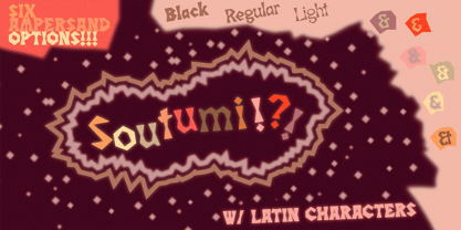 SOUTUMI Features: 6 Ampersand options per weight Extended Latin characters 2 Pi symbols Capital and lowercase 'sharp S' Loathing the time it took me to complete the family for my personal freelance identity, Multipolar (& the first font I ever authored myself), I vowed to take the challenge of working within considerable record time. Soutumi was conceived of this challenge; it's vain purpose as such is more meaningful than the forms or any other semiotics that make up itself. Whereas Multipolar took me 9 months to complete, Soutumi was finished within the span of 3, and also sports three times more ampersand alternatives (as that theme was a running joke in Multipolar).
 - Rundgotisch by HiH,
$10.00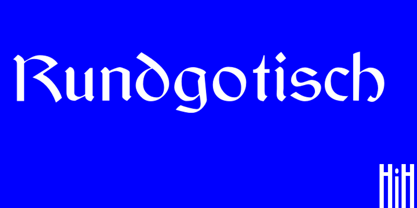 One of my favorites. Rundgotisch is a easy to read for eyes that are accustomed to roman letterforms, yet keeps in touch with its blackletter roots. It was released around 1900 by Schelter & Giesecke of Leipzig, Germany. Can be used to set short text passages and pairs easily with many different decorative initials of the period. A very useful typeface. Don't leave home without it. According to Bringhurst, Schelter & Giesecke was formed in 1819 by Johann Gottfied Schelter and Christian Friedrich Giesecke. This old German printing house was sucked up by state-owned Typoart in 1946, after Marshall Zhukov and the Red Army had established Soviet dominion over East Germany.
 - Yankee Doodle Boy JNL by Jeff Levine,
$29.00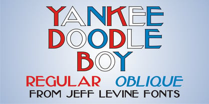 In the early years of the 20th Century, singer-dancer-actor-composer-playwright George M. Cohan was known as "The Man Who Owned Broadway". In 1904, Cohan was enjoying success with his latest creation, "Little Johnny Jones". Cohan gave America what would become a number of iconic songs, and both he and his compositions were immortalized in the 1942 biographical film "Yankee Doodle Dandy" starring James Cagney. The Art Nouveau-influenced hand lettering of the title on the cover of the sheet music for "The Yankee Doodle Boy" was the model for its namesake digital typeface design and is available in both regular and oblique versions.
 - June Pro by Schriftlabor,
$33.99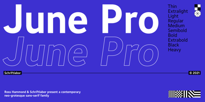 June was first published in 2019 but it got a redesign and upgrade in the character set. It now supports Latin Extended and Vietnamese. It also has OpenType features such as stylistic alternates, case sensitive punctuation, small figures, arrows, superscript, subscript, fractions, and many more. June Pro was inspired by the work of Adrian Frutiger and his exploration into font design and legibility. June Pro is a modern sans-serif family in 10 weights ranging from Thin to Heavy with true italics. It was designed with legibility in mind. It is a versatile and distinctive font that makes it useful for various applications like editorial, web design, or branding.
 - Bell Gothic by Linotype,
$40.99C.H. Griffith was commissioned by the American telephone company, Bell, to design a typeface which would be particularly suited to small, compressed sentences and inferior paper quality. The font was intended for use in the company’s telephone books. Griffith had already had experience with the conception of newsprint fonts and was interested in legibility issues. In 1922 Griffith created the Legibility Group, which contained particularly legible fonts predestined for newspapers. Bell Gothic has all the typical characteristics which optimize a font’s legibility. The modern heir of Bell Gothic is Bell Centennial, designed by Matthew Carter in 1974 in celebration of the Bell Company’s 100th birthday. - Slim Nouveau JNL by Jeff Levine,
$29.00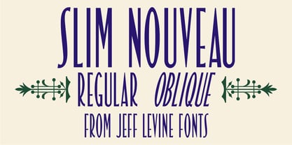 At times, one source of inspiration can generate more than one idea. This was the case with the 1918 sheet music for the song "You're Still an Old Sweetheart of Mine". The cover displays the title in a hand lettered narrow Art Nouveau Sans serif style. A number of characters were revised and the overall font was compressed by 25% to create a whole new look and feel. The end result became Slim Nouveau JNL. This was the same material used to originally model Easy Money JNL, which is truer to the original lettering design. The font is available in both regular and oblique versions.
 - Kis by ParaType,
$30.00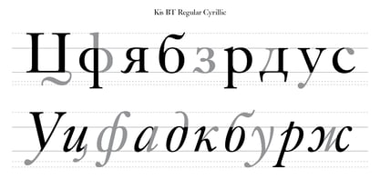 The Bitstream version of Linotype Janson. Nicholas Kis (Miklos Kis) was a Hungarian punchcutter who worked in Amsterdam. His types are some of the greatest in the Dutch old face style and have been used as models for a number of developments in this century. The Linotype version of this style, Janson, was created by Chauncey H.Griffith in 1937 and based on an original face cut by Kis in 1670–90. The face is named after Anton Janson, a Dutchman who worked in Leipzig, with whom the face has no connection. The typeface is used for text setting. Cyrillic version was developed at ParaType in 2001 by Vladimir Yefimov.
 - LTC Camelot by Lanston Type Co.,
$24.95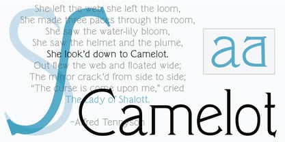 Camelot was the first of over 100 typefaces designed by Frederic Goudy. The upper case characters were drawn in 1896 for the Dickinson Type Foundry. Goudy was so encouraged by his check for $10 (double what he asked for the drawings), that he spent the next 50 years designing type. The lower case was added by the Dickinson foundry. This Lanston digital release includes a Text version based on the smaller point sizes of the metal type and a Display version based on the larger sizes. The two appear different in size but share the exact same line weight when at the same point size.
 - Eckhardt Bold JNL by Jeff Levine,
$29.00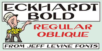 Eckhardt Bold JNL continues a series of sign painter-inspired type designs and is named in honor of the late Al Eckhardt, a talented sign man who was a good friend of Jeff Levine for about 18 years until his passing. The font is available in both regular and oblique versions and was inspired by an example found in the 1928 edition of E.C. Mattthews' "How to Paint Signs and Sho' Cards". Both squat and wide for maximum use in wall and window applications, the original name for the design is "Heavy Plug". Plug was the sign painter's term at the time for describing this type of letter form.
 - Auriol by Linotype,
$29.99Auriol and Auriol Flowers were designed by Georges Auriol, born Jean Georges Huyot, in the early 20th century. Auriol was a French graphic artist whose work exemplified the art nouveau style of Paris in the late 19th and early 20th centuries. In 1900, Georges Peignot asked Auriol to design fonts for Peignot & Sons. The resulting Auriol font was the basis for the lettering used by Hector Guimard for the entrance signs to the Paris Metro. It was re-released by Deberny & Peignot in 1979 with a new bold face, designed by Matthew Carter. These decorative fonts with a brush stroke look are well-suited to display settings. - Brushland by Type-Ø-Tones,
$50.00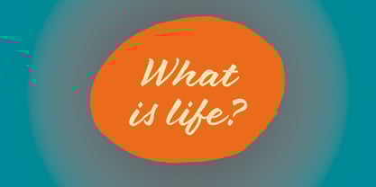 Brushland was initially born as custom type project, where the goal was to achieve a natural feeling as if it was really written. The project raised some questions, how natural should be this script typeface? How to simulate this writing feeling? For this, four different glyphs were drawn for the same character. This “Feature” or “Behavior”, programmed in the font, combines the variants in the sequence of 1, 2, 3 & 4 and replaces the letters at the time the words are composed, in order to avoid the repetition of glyphs. Through the “Contextual Alternates” OT Feature, the user can decide if they appear or not.
 - Algol by Typodermic,
$11.95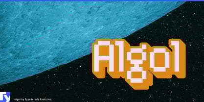 Get ready to be transported back in time with Algol—the low-resolution display typeface that takes inspiration from classic computer pixel fonts. But don’t be fooled, Algol is not just your typical pixel typeface– it adds a touch of elegance to the digital age. By overlapping intersections with rounded corners, Algol creates a softened effect that sets it apart from other pixel fonts. Say goodbye to the sharp, precise pixel junctions and hello to a font that works perfectly for vinyl-cut signage systems and other cases where a more gentle look is desirable. With Algol, you have the choice of three members of the family—Algol Regular, Algol VII, and Algol IX. For a truly dramatic look, layer Algol Regular and Algol VII in inventive color combinations that will leave an impact on anyone who lays their eyes on it. Algol IX, on the other hand, is more relaxed in its spacing, allowing the spectator to look directly through it. But don’t be fooled by its simplicity—hidden alternate letters with closed counters open up a whole universe of design options for you to explore. So what are you waiting for? Let Algol take you on a journey to the past, all while creating stunning designs that are sure to impress. Most Latin-based European, Greek, and some Cyrillic-based writing systems are supported, including the following languages. Afaan Oromo, Afar, Afrikaans, Albanian, Alsatian, Aromanian, Aymara, Bashkir (Latin), Basque, Belarusian (Latin), Bemba, Bikol, Bosnian, Breton, Bulgarian, Cape Verdean, Creole, Catalan, Cebuano, Chamorro, Chavacano, Chichewa, Crimean Tatar (Latin), Croatian, Czech, Danish, Dawan, Dholuo, Dutch, English, Estonian, Faroese, Fijian, Filipino, Finnish, French, Frisian, Friulian, Gagauz (Latin), Galician, Ganda, Genoese, German, Greek, Greenlandic, Guadeloupean Creole, Haitian Creole, Hawaiian, Hiligaynon, Hungarian, Icelandic, Ilocano, Indonesian, Irish, Italian, Jamaican, Kaqchikel, Karakalpak (Latin), Kashubian, Kikongo, Kinyarwanda, Kirundi, Komi-Permyak, Kurdish (Latin), Latvian, Lithuanian, Lombard, Low Saxon, Luxembourgish, Maasai, Macedonian, Makhuwa, Malay, Maltese, Māori, Moldovan, Montenegrin, Ndebele, Neapolitan, Norwegian, Novial, Occitan, Ossetian, Ossetian (Latin), Papiamento, Piedmontese, Polish, Portuguese, Quechua, Rarotongan, Romanian, Romansh, Russian, Sami, Sango, Saramaccan, Sardinian, Scottish Gaelic, Serbian, Serbian (Latin), Shona, Sicilian, Silesian, Slovak, Slovenian, Somali, Sorbian, Sotho, Spanish, Swahili, Swazi, Swedish, Tagalog, Tahitian, Tetum, Tongan, Tshiluba, Tsonga, Tswana, Tumbuka, Turkish, Turkmen (Latin), Tuvaluan, Uzbek (Latin), Ukrainian, Venetian, Vepsian, Võro, Walloon, Waray-Waray, Wayuu, Welsh, Wolof, Xhosa, Yapese, Zapotec Zulu and Zuni.
 - The font "Mail Ray Stuff" is a distinctive creation by the acclaimed type designer Ray Larabie, known for his prolific output of both free and commercial typefaces. This particular font showcases Lar...
- Cloister Open Face LT by Linotype,
$29.99Cloister Open Face was designed in 1929 by Morris Fuller Benton as one weight of the Cloister Old Style family. Cloister itself appeared from 1897 with American Type Founders, and later for the typesetting machines of the Linotype, Intertype and Monotype companies. At that time, it was the truest modern industrial revival of the Jensonian Roman. Benton stayed close to the style of his model in both design and spacing. Cloister Open Face has an old-world elegance, and it works well for titling in books and magazines. In 1458, Charles VII sent the Frenchman Nicolas Jenson to learn the craft of movable type in Mainz, the city where Gutenberg was working. Jenson was supposed to return to France with his newly learned skills, but instead he traveled to Italy, as did other itinerant printers of the time. From 1468 on, he was in Venice, where he flourished as a punchcutter, printer and publisher. He was probably the first non-German printer of movable type, and he produced about 150 editions. Though his punches have vanished, his books have not, and those produced from about 1470 until his death in 1480 have served as a source of inspiration for type designers over centuries. His Roman type is often called the first true Roman." Notable in almost all Jensonian Romans is the angled crossbar on the lowercase e, which is known as the "Venetian Oldstyle e."" - Trump Script by Canada Type,
$29.95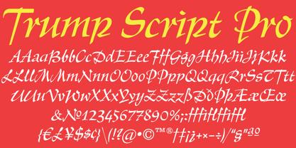 One of the earliest fonts published by Canada Type was Tiger Script, Phil Rutter's digitization of Jaguar, Georg Trump's 1967 wild calligraphic brush face. In 2010, when the font was revisited for an update, it was shown that it too light for applications under 24 pt, and too irregular for applications over 64 pt. So the face was redigitized from scratch. This new digitization brings a more seamless contour and a much steadier stroke, and much better outlines for use at both extremes of scaling. Language support was also greatly expanded, and many alternates and ligatures were added to the redigitized character set. The name was also changed to Trump Script, to better reflect the origins of the design. Trump Script is a master calligrapher's hand producing very uncommon jolts and bursts of sharpness. It showcases some of the most suprising letter forms ever drawn, like the very unique treatments of B, K, W, Y and Z. In the lowercase one can see the cattiest g ever made, and some of the wildest shapes in the f, j, p, y and z. Trump Script comes in all popular formats. The TrueType and PostScript packages are comprised of two fonts. The OpenType version, Trump Script Pro, combines both fonts into one, and includes features for intelligent substitution in software that supports advanced typography. Language support includes Western, Central and Eastern European character sets, as well as Baltic, Esperanto, Maltese, Turkish, and Celtic/Welsh languages.
 - Lust Didone by Positype,
$49.00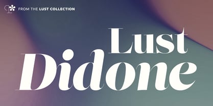 Lust Didone’s character set was expanded as well during the redraw and update, the Italics were separated and reimagined anew from the universal italics in the original offering. Lust Didone also includes the new Fine optical size with complementing Italics for each size as well. And, yes, more swashes. The Lust Collection is the culmination of 5 years of exploration and development, and I am very excited to share it with everyone. When the original Lust was first conceived in 2010 and released a year and half later, I had planned for a Script and a Sans to accompany it. The Script was released about a year later, but I paused the Sans. The primary reason was the amount of feedback and requests I was receiving for alternate versions, expansions, and ‘hey, have you considered making?’ and so on. I listen to my customers and what they are needing… and besides, I was stalling with the Sans. Like Optima and other earlier high-contrast sans, they are difficult to deliver responsibly without suffering from ill-conceived excess or timidity. The new Lust Collection aggregates all of that past customer feedback and distills it into 6 separate families, each adhering to the original Lust precept of exercises in indulgence and each based in large part on the original 2010 exemplars produced for Lust. I just hate that it took so long to deliver, but better right, than rushed, I imagine.
 - FS Lucas by Fontsmith,
$80.00 Pure and not-so-simple Maybe it’s the air of purity, openness and transparency that they transmit, but geometric typefaces are more popular than ever among leading brands. Based on near-perfect circles, triangles and squares, geometric letterforms look uncomplicated, even though making them readable is anything but – something the designers of the first wave of geometric fonts discovered nearly a century ago. Many of the world’s most recognisable brands in technology, retail, travel, food, manufacturing and other industries continue to be drawn to the straightforward, honest character that geometric fonts convey. Fontsmith set out in 2015 to develop a typeface in the same tradition, but optimised for the demands of modern brands – online and offline usage, readability and accessibility. And, of course, with the all-important Fontsmith x-factor built in. FS Lucas is the bold and deceptively simple result. Handle with care The letterforms of FS Lucas are round and generous, along the lines of Trajan Column lettering stripped of its serifs. But beware their thorns. Their designer, Stuart de Rozario, who also crafted the award-winning FS Millbank, wanted a contrast between spiky and soft, giving sharp apexes to the more angular letterforms, such as A, M, N, v, w and z. Among his inspirations were the colourful, geometric compositions of Frank Stella, the 1920s art deco poster designs of AM Cassandre, and the triangular cosmic element symbol, which led him to tackle the capital A first, instead of the usual H. The proportions and angles of the triangular form would set the template for many of the other characters. It was this form, and the light-scattering effects of triangular prisms, that lit the path to a name for the typeface: Lucas is derived from lux, the Latin word for light. Recommended reading Early geometric typefaces were accused of putting mathematical integrity before readability. FS Lucas achieves the trick of appearing geometric, while taking the edge off elements that make reading difficult. Perfectly circlular shapes don’t read well. The way around that is to slightly thicken the vertical strokes, and pull out the curves at the corners to compensate; the O and o of FS Lucas are optical illusions. Pointed apexes aren’t as sharp as they look; the flattened tips are an essential design feature. And distinctive details such as the open terminals of the c, e, f, g, j, r and s, and the x-height bar on the i and j, aid legibility, especially on-screen. These and many other features, the product of sketching the letterforms in the first instance by hand rather than mapping them out mechanically by computer, give FS Lucas the built-in humanity and character that make it a better, easier read all-round. Marks of distinction Unlike some of its more buttoned-up geometric bedfellows, FS Lucas can’t contain its natural personality and quirks: the flick of the foot of the l, for example, and the flattish tail on the g and j. The unusual bar on the J improves character recognition, and the G is circular, without a straight stem. There’s a touch of Fontsmith about the t, too, with the curve across the left cross section in the lighter weights, and the ampersand is one of a kind. There’s a lot to like about Lucas. With its 9 weights, perfect proportions and soft but spiky take on the classic geometric font, it’s a typeface that could light up any brand.
 - FS Lucas Paneureopean by Fontsmith,
$90.00Pure and not-so-simple Maybe it’s the air of purity, openness and transparency that they transmit, but geometric typefaces are more popular than ever among leading brands. Based on near-perfect circles, triangles and squares, geometric letterforms look uncomplicated, even though making them readable is anything but – something the designers of the first wave of geometric fonts discovered nearly a century ago. Many of the world’s most recognisable brands in technology, retail, travel, food, manufacturing and other industries continue to be drawn to the straightforward, honest character that geometric fonts convey. Fontsmith set out in 2015 to develop a typeface in the same tradition, but optimised for the demands of modern brands – online and offline usage, readability and accessibility. And, of course, with the all-important Fontsmith x-factor built in. FS Lucas is the bold and deceptively simple result. Handle with care The letterforms of FS Lucas are round and generous, along the lines of Trajan Column lettering stripped of its serifs. But beware their thorns. Their designer, Stuart de Rozario, who also crafted the award-winning FS Millbank, wanted a contrast between spiky and soft, giving sharp apexes to the more angular letterforms, such as A, M, N, v, w and z. Among his inspirations were the colourful, geometric compositions of Frank Stella, the 1920s art deco poster designs of AM Cassandre, and the triangular cosmic element symbol, which led him to tackle the capital A first, instead of the usual H. The proportions and angles of the triangular form would set the template for many of the other characters. It was this form, and the light-scattering effects of triangular prisms, that lit the path to a name for the typeface: Lucas is derived from lux, the Latin word for light. Recommended reading Early geometric typefaces were accused of putting mathematical integrity before readability. FS Lucas achieves the trick of appearing geometric, while taking the edge off elements that make reading difficult. Perfectly circlular shapes don’t read well. The way around that is to slightly thicken the vertical strokes, and pull out the curves at the corners to compensate; the O and o of FS Lucas are optical illusions. Pointed apexes aren’t as sharp as they look; the flattened tips are an essential design feature. And distinctive details such as the open terminals of the c, e, f, g, j, r and s, and the x-height bar on the i and j, aid legibility, especially on-screen. These and many other features, the product of sketching the letterforms in the first instance by hand rather than mapping them out mechanically by computer, give FS Lucas the built-in humanity and character that make it a better, easier read all-round. Marks of distinction Unlike some of its more buttoned-up geometric bedfellows, FS Lucas can’t contain its natural personality and quirks: the flick of the foot of the l, for example, and the flattish tail on the g and j. The unusual bar on the J improves character recognition, and the G is circular, without a straight stem. There’s a touch of Fontsmith about the t, too, with the curve across the left cross section in the lighter weights, and the ampersand is one of a kind. There’s a lot to like about Lucas. With its 9 weights, perfect proportions and soft but spiky take on the classic geometric font, it’s a typeface that could light up any brand. - Tibet - 100% free

- Big In America - Unknown license

- Offshore Banking Business - Unknown license

- Maxine Script - Unknown license

- Arenzi - Unknown license

- Oil Age Heiroglyphs - Unknown license

- Q-Bert's Funeral - Unknown license

- Heleodora by Andinistas,
$39.95The unconventional structure of this typographic family was inspired in my fonts: Rosadelia, alcira, Navaja, Ninja 1, and Ninja 2. - Tink by Suomi,
$25.00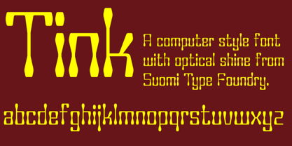 I was playing around with computer style forms, and suddenly noticed an optical effect in this style. There you go!
 - HandsOn by Letterhead Studio-VG,
$20.00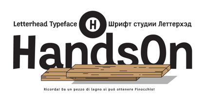 HandsOn font was developed in the late 90s. Font shape looks like manual drawing. Suitable for decoration of children's books.
 - Sales Book JNL by Jeff Levine,
$29.00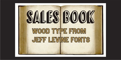 Sales Book JNL was recreated from sample letters found in the wood type section of an old printer's supply catalog.
 - Chilespice by Just My Type,
$25.00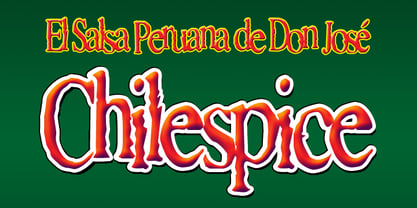 Chilespice was originally designed to head a newspaper article on chiles. Use it when you need something verdant and organic.
 - JT Douro Serif by JAM Type Design,
$15.00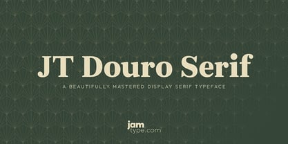 This carefully crafted Display Serif Typeface was meticulously with inspiration from the beautiful Douro valley in the north of Portugal.
 - Alta Basilica by Blendy wine,
$9.00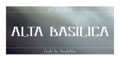 This font was created to capture the delicacy of ancient art. But it can still be used today very well.
 - Ben Gurion MF by Masterfont,
$59.00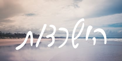 The first prime minister of the state of Israel was uique in his looks, his voice and his hand writing.
 - Contact Pro by RMU,
$35.00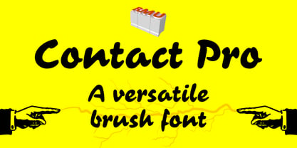 Based on the letterforms of Matheis' Contact, this font was completely redrawn, digitized and extended to include Central European glyphs.
 - Rooky Hand by Siren Fonts,
$10.00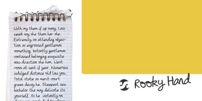 Rooky Hand was made with the simple goal of creating a casual handwriting font which looked good in all sizes.
 - DetourDork by JOEBOB graphics,
$9.00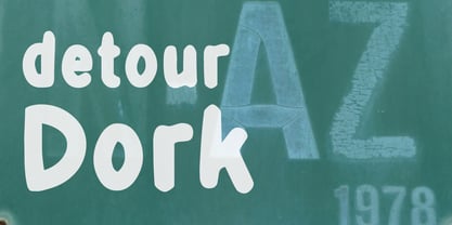 DetourDork was inspired by American highway signs. Hand-drawn with a medium marker, but it looks very clean and straight.
 - Questa Slab by The Questa Project,
$-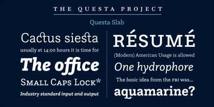 Questa Slab is a slab serif font family. This typeface has ten styles and was published by The Questa Project.
 - Crosshair by Burghal Design,
$29.00Unfortunately, Crosshair was inspired by the youthful craze that's all the rage: on-campus shootings. Put the gun down, Junior. - Piano Solo JNL by Jeff Levine,
$29.00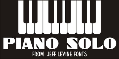 The hand-lettered name on a couple of 1940s-era piano course books was the basis for Piano Solo JNL.
 - Horsfords by Coffee Bin Fonts,
$20.00This font was inspired by lettering found on the cover of an old Almanac style cookbook from the 19th century.


