10,000 search results
(0.037 seconds)
- Framistat by Comicraft,
$39.00Face Front, True Believers, here comes another Spectacular Smash Hit from the Comicraft House of Ideas! A worthy companion to our Monster Mash and Doohickey Masterworks, Framistat is an All-New, Truly Titanic Typeface designed to dutifully display cover copy as demanded by Collector's Item Classic comic book tradition! - Airwave by A New Machine,
$19.00 Airwave is suitable for display and logo work. It comes in three faces and would work well for technical designs or for giving a fresh, modern look. It is an all cap font with a few (A, E, N, R) lower cap alternates and contains West European diacritics.
 - Bombslide by Balpirick,
$15.00 Bombslide is a Modern Handwritten Font. Whether you’re using it for crafts, digital design, presentations, or making greeting cards, this font has the potential to become your favorite go-to font, no matter the occasion! - also multilingual support Enjoy the font! Feel free to comment or feedback! Thank you!
 - Goldstick by Balpirick,
$15.00 GOLDSTICK is a Fun Monoline Handdrawn Font. GOLDSTICK is perfect for product packaging, branding project, megazine, social media, wedding, or just used to express words above the background. This font includes multilingual support. Enjoy the font, feel free to comment or feedback, send me PM or email. Thank you!
 - Silvertone by Balpirick,
$15.00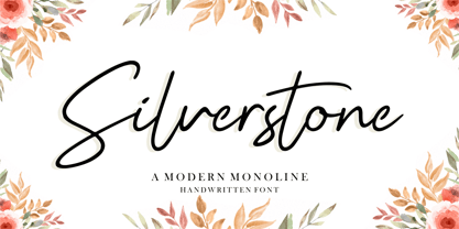 Silvertone is a Modern Monoline Handwritten Font. Silvertone is perfect for product packaging, branding project, magazine, social media, wedding, or just used to express words above the background. Silvertone also support multilingual. Enjoy the font, feel free to comment or feedback, send me PM or email. Thank you!
 - Mordie by Gian Studio,
$18.00 Mordie vintage display font is suitable for logos, branding, greetings, themes, screen printing, social media and wedding invitation designs. It is also a great typeface for titles because of its unique design and attractive appearance. If you have any questions please feel free to contact me! Thank You,
 - Novelo by AcidType,
$60.00 Novelo is a 9 weight neo-grotesk typeface family. Featuring; over 800 characters and symbols, including over 100 ligatures, with extended language support, and true italics. The wide selection of alternate characters allows for deep customisation, making the Novelo family a powerful and flexible toolkit for the modern designer.
 - Icebold by Balpirick,
$15.00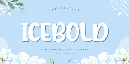 ICEBOLD is a Fun and Bold Hand brushed Font. ICEBOLD is perfect for product packaging, branding project, magazine, social media, wedding, or just used to express words above the background. It support multilingual. Enjoy the font, feel free to comment or feedback, send me PM or email. Thank you!
 - Exotic Necklace by Balpirick,
$15.00 Exotic Necklace is a Beautiful Handdrawn Font. Exotic Necklace is a thin and elegant handwritten font. Use it to make your ideas even more realistic and create spectacular designs! Exotic Necklace also multilingual support. Enjoy the font, feel free to comment or feedback, send me PM or email.
 - Gendis by Surotype,
$20.00 Gendis is a complete fonts pack for build brands, comes in three different styles and extras. This complete package is perfectly for all your creative work such as branding projects, packaging design, ads and more. To enable the opentype stylistic alternates, you need a program that supports opentype features.
 - Marsha by Trim Studio,
$12.00 Marsha is a cheerful font that gives your design happiness and love. This font is perfect for showing your affection. If you have any questions or problems, feel free to send us a private message, and please rate us if you like :) Hope you enjoy the font! Thank you
 - Brushed by d[esign],
$4.62 Let this free-flowing brush script add a little hand painted goodness to your works. Cheaper than a bucket of paint, use Brushed to add brush painted letters to your works or manipulate the many glyphs in this font using image editing software to create art as shown above.
 - Hungry Dreamy by Balpirick,
$15.00 Hungry Dreamy is a Handwritten Font. Whether you’re using it for crafts, digital design, presentations, or making greeting cards, this font has the potential to become your favorite go-to font, no matter the occasion! - also multilingual support Enjoy the font! Feel free to comment or feedback! Thank you!
 - Hellophiy by Qwrtype Foundry,
$14.00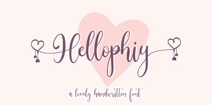 Hellophiy is a Lovely Handwritten Font Hellophiy perfect for product packaging, branding project, magazine, social media, wedding, or just used to express words above the background. Hellophiy also come with Multi-Lingual Support. Enjoy the font, feel free to comment or feedback, send me PM or email. Thank you!
 - Zombie Starfish by Hanoded,
$15.00 Ever seen a zombie starfish? No? Well, neither have I. But this font actually comes close! Zombie Starfish, despite its name, is quite a happy cartoon font. It comes in three styles (regular, eroded and dots), plus accompanying italics. Use it for book covers, seafood restaurants or packaging.
 - HGWelles by Just My Type,
$20.00 Designed for a privately-published luxury edition of The Time Machine, HGWelles Ultralight, Regular and Bold are now being made available to the public. This is the Welles of the early 20th century, seeing many of his predictions coming true and anticipating the shape of things yet to come.
 - AndrewAndyCollege by Ingrimayne Type,
$13.95 AndrewAndyCollege is an outlined font derived from the Ingrimayne font AndrewAndreas, a san-serif face. In 2018 the inside and the middle ring were separated out and made independent fonts. They can be used alone, or layered with the original to produce letters with two or three colors.
 - Creativa by Balpirick,
$15.00 Creativa is a Modern Handwritten Font. Whether you’re using it for crafts, digital design, presentations, or making greeting cards, this font has the potential to become your favorite go-to font, no matter the occasion! - also multilingual support Enjoy the font! Feel free to comment or feedback! Thank you!
 - Leony by Gholib Tammami,
$14.00 Leony - Elegant Serif Fashion font by golibtamami introducing our new "Leony" Modern with Elegant Style this is perfect for branding, logos, invitation, master-heads and more. Leony Features : Multi language If you have any questions, before or after purchase, please feel free to get in touch. Thank you
 - Filmgraph by Essentials Studio,
$16.00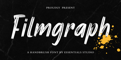 Introducing by Essentials Studio Proudly Present, Filmgraph Filmgraph Is a Modern Handbrush Fonts Filmgraph is perfect for product packaging, branding project, megazine, social media, wedding, or just used to express words above the background. Enjoy the font, feel free to comment or feedback, send me PM or email
 - Patagon by Latinotype,
$19.00 Patagon is a contemporary Woodtype Sans typeface especially designed for fresh, high impact sentences with a mix of flavoured features. Its upper-case Opentype ornamental alternate glyphs provide great elegant textures adding versatility to the three weight family: condensed, regular & extended. Mix them up for a really cool design!
 - Groovy Happy by Haksen,
$18.00 GROOVY HAPPY FONT A hand-drawn, bubbly font with a groovy look! There are three fonts included : Regular Outline Extrude. GROOVY HAPPY is perfect for: shirts, retro designs, procreate, stickers, logos, branding, greeting cards, Cricut projects, posters, magazines, social media, prints and more! Have a great day, Haksen
 - Sociable by Balpirick,
$15.00 Sociable is a Handwritten Script Font. Whether you’re using it for crafts, digital design, presentations, or making greeting cards, this font has the potential to become your favorite go-to font, no matter the occasion! - also multilingual support Enjoy the font! Feel free to comment or feedback! Thank you!
 - Grealish by Essentials Studio,
$16.00 Introducing by Essentials Studio Proudly Present, Filmgraph Grealis Is a Modern Handbrush Fonts Grealis is perfect for product packaging, branding project, megazine, social media, wedding, or just used to express words above the background. Enjoy the font, feel free to comment or feedback, send me PM or email
 - Cristalake by Essentials Studio,
$16.00 Introducing by Essentials Studio Proudly Present, Mysthiqa cristalake Is a Modern Script Font cristalake is perfect for product packaging, branding project, megazine, social media, wedding, or just used to express words above the background. Enjoy the font, feel free to comment or feedback, send me PM or email
 - Landepz by Zamjump,
$9.00 Landepz Typefamily includes three normal styles, grunge texture and glitch, Landepz is a family of bold hand-printed types, celebrating the style of the original printing press and all its beautiful imperfections. Its solid, robust shape lends itself to a robust design, while its texture provides an authentic sound.
 - Stickywild by Essentials Studio,
$16.00 Introducing by Essentials Studio Proudly Present, Filmgraph Stickywild Is a Modern Handbrush Fonts Stickywild is perfect for product packaging, branding project, megazine, social media, wedding, or just used to express words above the background. Enjoy the font, feel free to comment or feedback, send me PM or email
 - Wendy LP by LetterPerfect,
$39.00 The Wendy family is a cursive script provided in three weights -- Light, Medium and Bold. The design is an upright, casual handwriting style, with natural joins and connecting strokes. Wendy, in her various modes, projects a friendly persona, adding an approachable quality to headlines and short runs of text.
 - Frosty Xmas by SilverStag,
$19.00 Get ready to unwrap a typographic delight with Frosty Xmas, the holiday-themed serif font designed to infuse your projects with festive charm and timeless elegance. With its soft round corners, delicate serifs, and all-uppercase characters, Frosty Xmas exudes a timeless charm that complements a wide range of holiday designs. Its classic serif letters, adorned with swirls, swashes, and star elements, add a touch of whimsy and magic to your creations. Whether you're crafting holiday cards, designing festive branding, or creating typographic posters that echo the joy of the season, Frosty Xmas is your go-to companion. Its versatility knows no bounds, making it equally suited for standard branding, logo design, and a wide array of creative ventures. But that's not all – Frosty Xmas comes bundled with 40 hand-drawn holiday doodles, adding an extra layer of whimsy to your projects. From snowflakes to stockings, candy canes to Christmas trees, these doodles are the perfect embellishments for all your holiday-themed endeavors. Crafted with over 450 carefully designed glyphs, Frosty Xmas supports over 90 languages, making it a versatile tool for designers and crafters worldwide. Whether you're creating holiday greeting cards, packaging labels, or typography posters, Frosty Xmas will infuse your designs with festive cheer. Elevate your designs, captivate your audience, and make this holiday season truly memorable with Frosty Xmas. The magic begins with each letter – are you ready to unwrap the joy? Happy designing and Merry Frosty Xmas! 🎄✨
 - Mainsail by Melvastype,
$29.00 Mainsail is a handwritten brush script font. It is casually written with dry brush pen, so it has this nice texture and flow. Mainsail has lots of alternates to make it look more like real handwriting; four sets of lower cases and two sets of upper cases. Mainsail is great option for logos, headlines and packaging. You can also use it in longer texts where you need this casual handwritten look. It will also combine well with sans and serif fonts. Mainsail has OpenType features that automatically makes text look more authentic. Discretionary Ligatures replaces other of two identical letters following each other. Contextual Alternates will unleash the full cycle of the alternates. It will cycle all four lower case sets to make the text look as natural as possible. Mainsail has also underline strokes in separate font called Mainsail Swash. It includes combined 52 different underlines, strokes and circles. With these you can add the final punch to your design.
 - Gravitica Mono by Ckhans Fonts,
$34.00 Features: • Support for 28 languages: Afrikaans Albanian Catalan Croatian Czech Danish Dutch English Estonian Finnish French German Hungarian Icelandic Italian Latvian Lithuanian Maltese Norwegian Polish Portugese Romanian SlovakSlovenian Spanisch Swedish Turkish Zulu Swedish Turkish Zulu • Contains OpenType features with alternates or substitutes • Tabular Figures • Ordinal numbers • 74 icons (It will keep updating.) • 72 graphic patterns for designer (It will keep updating.) • 28 brand symbols (It will keep updating.) • 27 arrows glyphs • 0-99 line circled glyphs • 0-99 solid circled glyphs • A-Z line circled glyphs • A-Z solid circled glyphs Gravitica Mono family consists of 18 styles (6 weights, 6 Italics, 6 Icons), in each of which there are more than 508+ glyphs. In the typeface, each weight includes extended language support, fractions, tabular figures, arrows, ligatures and more. Perfectly suited for graphic design and any display use. Useful links: Gravitica PDF Type Guide and Specimen (You can know how to use icons and arrows, other glyphs.)
 - Frambuesa by Sudtipos,
$39.00 Organic versus geometric are two different universes that converges on nature systems and has its reflection on this new sans serif typeface. Frambuesa is a half humanist-half geometric sans that merges decorative curves with straight lines looking for a balance. The result: a solid but somewhat romantic, nostalgic type program that go ahead harmoniously, dancing to the rhythm of a naturally imperfect melody. Frambuesa can’t hide its family genetics. Structure and proportions come from Elisetta, her older sister they so both have a really good text performance. Regular variables and italics feel comfortable in a lot of contexts and are useful for little words or big title compositions. All seven weights are carefully adjusted to achieve soft transitions between one and the other resulting in high readability levels on program combinations and complex uses. This new font family name is a tribute to Lucia’s childhood, a very happy one. Frambuesa honors this sweet intense red fruit that her grandpa’s Coco gave to his grandchildren every Sunday in the summer.
 - PF Libera Pro by Parachute,
$79.00 PF Libera was designed at a time of leisure with no particular intention for commercial use. In fact it was offered in the beginning as a freeware. In 2001, designer Charis Tsevis was convinced that it may have some commercial value, so Parachute obtained the rights to sell this typeface. At that time, we did not even imagine what would follow. Since then, PF Libera is one of our most successful typefaces. We have seen it being used in very diverse applications. From publishing to advertising to banking, to transportation, to retail applications. Food, beverages, fashion, automobiles, tourism, the list goes on and on. In any way, this typeface is very personal, modern and provocative. It stays with you and definitely it brings along the message. PF Libera comes in 3 styles. One of them, 'Liberissima', was added later and is more loose than the other two. The new 'Pro' version is powered with 7 OpenType features and is carefully designed to include all languages that are based on Latin, Greek and Cyrillic.
 - Lido STF by Storm Type Foundry,
$39.00Times with a Human Face: In my article of the same name which appeared in the magazine Font, volume 2000 I described the long and trying story of an order for a typeface for the Czech periodical Lidové noviny (People’s Newspaper). My task was to design a modification of the existing Times. The work, however, finally resulted in the complete re-drawing of the typeface. The assignment, which was on the whole wisely formulated, was to design a typeface which would enable “a smooth flow of information in the reader’s eye”, therefore a typeface without any artistic ambitions, from which everything which obstructs legibility would be eliminated. A year later Lidové noviny had a different manager who in the spring of 2001 decided to resume the cooperation. The typeface itself definitely profited from this; I simplified everything which could be simplified, but it still was not “it”, because the other, and obviously more important, requirement of the investor held: “the typeface must look like Times”. And that is why the above-mentioned daily will continue to be printed by a system version of Times, negligently adjusted to local conditions, which is unfortunately a far cry from the original Times New Roman of Stanley Morison. When I was designing Lido, the cooperation with the head of production of Lidové noviny was of great use to me. Many tests were carried out directly on the newspaper rotary press during which numerous weak points of the earliest versions were revealed. The printing tests have proved that the basic design of this typeface is even more legible and economical than that of Times. The final appearance of Lido STF was, however, tuned up without regard to the original assignment – the merrier-looking italics and the more daring modelling of bold lower case letters have been retained. The typeface is suitable for all periodicals wishing to abandon inconspicuously the hideous system typefaces with their even more hideous accents and to change over to the contemporary level of graphic design. It is also most convenient for everyday work in text editors and office applications. It has a fairly large x-height of lower case letters, shortened serifs and simplified endings of rounded strokes. This is typical of the typefaces designed for use in small sizes. Our typeface, however, can sustain enlargement even to the size appropriate for a poster, an information table or a billboard, as it is not trite and at the same time is moderate in expression. Its three supplementary condensed designs correspond to approximately 80% compression and have been, of course, drawn quite separately. The intention to create condensed italics was abandoned; in the case of serif typefaces they always seem to be slightly strained. I named the typeface dutifully "Lido" (after the name of the newspaper) and included it in the retail catalog of my type foundry. In order to prevent being suspected of additionally turning a rejected work into cash, Lido STF in six designs is available free of charge. I should not like it if the issuing of this typeface were understood as an “act out of spite” aimed against the venerable Times. It is rather meant as a reminder that there really are now alternatives to all fonts in all price categories. - Stoutface is a fantastic free font that adds a bold and modern touch to any design! Its unique style can really elevate projects, making it perfect for eye-catching headlines or creative branding. I ...
- AZ Rough Fart by Artist of Design,
$20.00 AZ Rough Fart font was created out of a need for a typeface that would compliment a rough outlined Tee-Shirt design. For use as a headline or subhead in your design.
 - Vacaciones - Personal use only

- La Pejina ffp - Personal use only

- Sabandija ffp - Personal use only

- Artifex CF by Connary Fagen,
$35.00 Designed for easy reading of long passages, Artifex CF's smoothed-off serifs help the flow of text without unnecessary visual noise. Artifex's even rhythm and mellow tone make it an excellent option for books, magazines, articles, blogs, captions, and longform texts. A near-upright italic adds emphasis and urgency with elegance. Artifex also doubles as a handsome display typeface, scaling gracefully with charming details revealing themselves at large sizes. Artifex CF pairs nicely with bold, clean sans-serifs, such as Greycliff CF and Visby CF. Artifex also has a sibling typeface, Artifex Hand CF, cut from the same cloth, but with subtle flares in place of the serifs. All typefaces from Connary Fagen include free updates, including new features, and free technical support.


