10,000 search results
(0.028 seconds)
- Classica Pro by URW Type Foundry,
$35.99 Classica Pro by Bernd Möllenstädt A real alternative for letterpress printing A masterpiece It was only after many years, shortly before the end of his life, Bernd Möllenstädt brought out these early drafts of his Classica Light and Light Italic from his drawer, and asked me to produce for him on the computer a Bold and Bold Italic, from which we later wanted to interpolate further cuts like Regular and so on. The boldening of letters with an oblique axis and with hairlines which should not grow to the same extent as the general line widths, is hard to cope with perfectly, even for the smartest computer program, and even more so, when it concerns an as complicated set of data as those conceived by Bernd. The automatically generated result could therefore only be a first step that had to be improved manually later. This was about the stage that we had reached when Bernd died in March 2013, leaving me behind with comprehensive corrections on proofs of this automatically generated Bold. Although I was aware that it would mean a lot of work to complete the project, I did not want to leave it unfinished and decided to finalize and publish the Classica, also in Bernd‘s honor. In the course of the two years that I worked on this font family it somewhat naturally became also my own. New details were added and some of the existing changed. A book typeface requires the supreme and forgives rarely, it represents a true masterpiece. My intention and my ambition were to create a real alternative for letterpress printing, with a font family that contains all the typographic options for an excellent typesetting, and is better readable and has a better appearance than other existing typefaces. Whether this was achieved, the reader may decide. Volker Schnebel, Hamburg, december 2014
 - Gambler by Fenotype,
$25.00 Gambler is a characteristic display type collection of 7 font styles with both clean and textured -making it total 14 fonts designed to play together. Gambler strikes with witty and elegant appeal combining vintage and modern elements. Gambler is an effective set for creating identities for branding, posters, book covers, headlines, logotypes, prints on garments, restaurant menus, beer labels and so on, both offline and online. Gambler Script is a smooth contrasted script that comes in two weights and it is packed with plenty of OpenType features: Standard Ligatures and Contextual Alternates are automatically on and they help to keep the flow and connections smooth. From Stylistic Alternates you’ll find characters with pointed endings and some other small variations. For extra flair try Swash or Titling Alternates. Gambler Script is PUA encoded so you can access the extra characters in most graphic design softwares. Gambler Brush is a soft brush script with low contrast and large x-height. Gambler Brush comes with following OpenType features: Standard Ligatures and Contextual Alternates that are automatically on and that keep the connections smooth. For less uneven word picture try Stylistic or Swash Alternates. Gambler Brush is PUA encoded so you can access the extra characters in most graphic design softwares. Gambler Flare is a flared serif with sharp edges and wide characters Gambler Flare comes in two weights. Gambler Gothic is a rigid condensed sans serif that comes in two styles: Regular and Shadow. Gambler Gothic Shadow has a narrow lining giving a three dimensional expression to the font. Gambler fonts are designed to play together, in pairs, or all together but they also work great as themselves or combined with other Fenotype Fonts.
 - Ginbe by Twinletter,
$15.00 Ginbe, our newest display font, has lovely curves that give your designs a handcrafted, contemporary feel that’s cute and lovely. This design is perfect for any project that requires a simple and clean appearance. It will help you with all of your visual projects. of course, your various design projects will be perfect and extraordinary. Start using our fonts for your extraordinary projects.
 - Bogota by Din Studio,
$22.00 Bogota is a modern and clean display (Serif) font create from our talented font designer. The design of Bogota will make your design more beautiful and inspiring. This font will suitable for any project, like branding, print template, logo and etc. The font also available in a thin version. Features: Accents (Multilingual characters) Alternates PUA encoded Numerals and Punctuation (OpenType Standard)
 - Marcelo by Din Studio,
$29.00 Introducing the Marcelo engraved font. Marcelo font is designed to be used in display settings. Created by our talented font designer Donis Miftahudin. The design of typeface will make your design more beautiful and inspiring. This font will suitable for any project, like branding, print template, logo and etc. Features: Accents (Multilingual characters) 27 Alternates PUA encoded Numerals and Punctuation (OpenType Standard)
 - Maxhild by ahweproject,
$9.00 Maxhild is a cool, graffiti-style display font. Add this font to your urban and casual creations, and you will love the outcome. Whatever the topic, this font will be a wonderful asset to your font library, as it has the potential to enhance any creation. This font is suitable for designs such as t-shirts, sportswear, logos, advertisements, clothing, and more.
 - DuPlay by Dutype Foundry,
$39.00 Duplay is a sans-serif designed and developed by darman kadir in this late 2023, influenced by famous Swiss-style typefaces like Helvetica and others. This sans-serif typeface will become an alternative solution to enhance your sports and apparel presence. It has a solid and fast appearance, harder in certain font families, and stronger characteristics that will make your image more prominent.
 - Coachella by Sarid Ezra,
$15.00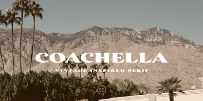 Introducing Coachella, a serif typeface with vintage vibes! Coachella is a vintage inspired serif that will make your project more vintage and modern. You can use this font for any project, such as poster, music concert announcement, or for your logo. This font have a rough detail that will make your design more handmade. This font also support multi language.
 - Nickvic by Niamullah aqil,
$20.00 Nickvic is a font that you can instantly download. You can use this font in Photoshop, Illustrator, or any other program that will allow you to import fonts. This font is for personal and commercial use. Please note that this is a digital download, you will not be sent anything physical. All sales are final. Refunds or exchanges are not accepted.
 - Forestine by Sarid Ezra,
$15.00 Introducing, Forestine, a stylish blackletter font! Forestine is a modern and stylish blackletter typeface that will make your project more stunning and unique. It comes with handwritten and rough feel, will make your design more humanist. You can use the uppercase and lowercase together for more unique touch! Also comes with multilingual support and PUA encoded! This font also including customized star!
 - Wicked Awesome by Nicky Laatz,
$22.00 Say hello to Wicked Awesome! A playful all caps cutout-style font. Lowercase letters have filled letters (A,O,B etc) and the Uppercase keys have the regular unfilled letters. Pick and choose which letters you want filled to get the look you are after :) Great for greeting cards, quotes, social media posts, posters, playful branding, and so much more!
 - Anori by Océane Moutot,
$29.90 Anori is a playful sans serif. Inspired by handwriting and the playfulness of the italic sharp, Anori is a dynamic, high contrast and smooth typeface. It will bring originality to your designs and the large variety of glyphs will give you freedom for all of your projects. Anori is available in 10 styles, from light to black, in roman and italic.
 - Rigney by Solotype,
$19.95Bill Rigney, an old job printer in my home town, established his shop in 1896, closed it in 1900 to take a steady job, stored the equipment in a large shed, and reopened for business upon his retirement in 1950. What a find! A bonanza of old type! We became good friends and upon his death I bought the type. Bless you Bill. - Logica Sans by Alexander Sharkov,
$3.00 Let me introduce our cool new sans serif font Logica Sans! It is a versatile font. Great for logo design, mobile apps, online and print use, and a wide variety of projects. We will be constantly updating our font. Add new languages, glyphs, font styles. Follow the updates! We will be glad if our font helps in the development of your project!
 - Death Party by Yoga Letter,
$15.00 "Death Party" is a special halloween font that will make your halloween party even more scary and will make you more total in welcoming the halloween party. This font is very easy to use because it has been specially designed. "Death Party" is also suitable for making Halloween greeting cards, horror movie titles, comic titles, magazines, posters, book titles and more.
 - Sponge Bear by Attractype,
$12.00 Sponge Bear is a playful heavy display font, this unique font is suitable for various designs that require thick text and designs with funny, cheerful, happy, spirit, adventure themes. The stylistics of the Sponge Bear font will change the vertical position of the letters randomly, this will make the series of words more unique and interesting. Have fun creating with Sponge Bear.
 - Claytonia by Letterhend,
$16.00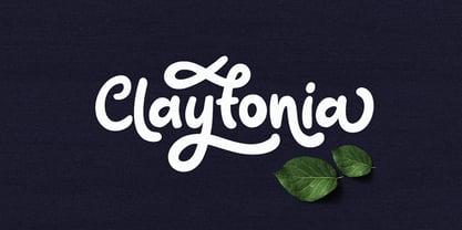 Claytonia is a bold script typeface which is simple yet casual. Made by hand written with many opentype features that you will like. This font is perfect as a logo, quotes, apparel design, wedding invitation, and many more. You can play with the ligatures, stylistic alternate, swash, etc to create your own customized lettering. This font will also support multi languages.
 - Rembullan by SSI.Scraps,
$18.00 The Rembullan family font is a beautiful script calligraphy. It has so many alternative characters in every style. It will change your design to be prominent and attractive. In Holiday style you will find a unique glyph that matches with cheer and joyful design. Happiness is Rembullan. There is also a beautiful torn paper template as a bonus. Download the paper template here .
 - Summer Midnight by Jos Gandos,
$15.00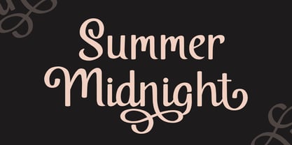 Summer Midnight is beautiful and elegant script font. Each glyph has its own uniqueness and when meeting with others will provide dynamic and pleasing proximity. Summer Midnight also comes with alternate style to make its style more unique and elegant. Summer Midnight will be perfect for your projects such as quotes, poster design, personal branding, promotional materials, logotype, product packaging and more.
 - La Brilliante by Lucky Type,
$20.00 La Brilliante is the newest signature font perfect for wedding invitations, website headers, logos and more. La Brilliante is designed with natural handwriting which will make your design look unique and very beautiful. La Brilliante has front and back swashes in lowercase letters and has more than 50 ligatures that will beautify your writing. Thank you very much for viewing.
 - La Dolce Vita by Angele Kamp,
$26.00 La Dolce Vita is an elegant serif font family with a feminine style. This beautiful collection will instantly add class to all of your design projects. This stylish font family is timeless and can not be missed in your font collection. It is the perfect branding font and will help you to easily create logos, wedding designs, and all other commercial projects.
 - Lineart by Atom,
$22.00 With the concept of a slightly bold monoline and a touch of fast strokes to produce a very unique modern typography. Lineart , a modern font that really stands out, will add dynamism to your design needs. It will be very dynamic when combined with serif and sans serif fonts. With Lineart, make your design look different than others! Many thanks Eko Kurniawan | Letteratom
 - Letter Sketch by Motokiwo,
$15.00 This fun typeface is great for quote, tagline, or headline. Letter Sketch is all caps hand drawn font with two style, rough sketch and filled version. It's have natural drawing feels in each characters and give personal touch to your projects. Letter Sketch Regular : a funky rough pencil sketch font Letter Sketch Bold : the filled version of Letter Sketch Regular
 - Remind by Din Studio,
$29.00 Introducing Remind Font. Remind is a modern serif font. Create from our talented font designer. The design of typeface will make your design more beautiful and inspiring. This font will suitable for any project, like branding, print template, logo and etc. Includes : Remind (OTF) Features : PUA encoded Stylistics Set Numerals and Punctuation (OpenType Standard) Full Support Thanks for visiting and purchasing my font!
 - Murisa Alexenia by Murisa Studio,
$10.00 Have you ever wanted a pattern in your font?, so it will look unique and attractive?. We present to you the Alexenia font. Murisa Alexenia is a font inspired by fallen leaves in winter. A font full of aesthetics in it. A font that will take you into a calming atmosphere. Use this font in your best design, and feel the sensation..
 - Chaser by Larin Type Co,
$12.00 Chaser is stencil font inspired by aviation and military style includes 3 sections ( clean, rough, printed). this font is a narrow specialization, it will be an excellent option for projects in the military style in both modern and vintage versions. This font also includes several illustrations that may be useful for creating your project and will be a useful addition.
 - Rameyon by ahweproject,
$9.00 Rameyon is a cool, graffiti-style display font. Add this font to your urban and casual creations, and you will love the outcome. Whatever the topic, this font will be a wonderful asset to your font library, as it has the potential to enhance any creation. This font is suitable for designs such as t-shirts, sportswear, logos, advertisements, clothing, and more.
 - Kisba Nova by Identity Letters,
$29.00 Kisba Nova – A character actor that turns heads. Spiky serifs, soft ball terminals. All eyes on Kisba Nova: enter a typeface designed to arouse attention. Kisba Nova is that one guest who joins a party, and a murmur goes through the crowd. Kisba Nova is pure charisma. Opposites attract: Kisba Nova combines sharp wedge serifs and spiky spurs with round and soft ball terminals. Infuse this with a neoclassical stroke contrast and you get a thrilling typeface driven by visual extremes. Sure: Kisba Nova is a diva. But it’s a pro, after all. That’s why it comes in two optical sizes: Headline and Text. This makes sure it looks gorgeous in any situation. The Kisba Nova Headline subfamily is flaunts the trademark flamboyant looks and extravagant letters like f and k. They bring you all of the excitement of the showbiz in large applications—use it for sizes of 24 Pt. and more. The extraordinarily designed, thin and monolinear diacritics, punctuation marks, and symbols of Kisba Nova Headline add to this modern and elegant character. Kisba Nova Headline consists of seven weights from Thin to Black, offering plenty of possibilities to set headlines and titles. With about 600 characters per weight, it contains enough functionality for the demands of a skilled typographer. OpenType features, such as a large set of ligatures, extended language support, case-sensitive forms, different sets of figures, and arrows, enable sensational designs both in web & print layouts. The Kisba Nova Text subfamily comes with decreased contrast, more generous letter proportions, and wider spacing. Instead of employing flashy thin and monolinear diacritics, punctuation marks, and symbols, Kisba Nova Text aims for a more even texture on the page. It retains the true, elegant Kisba DNA while allowing you to set legible copy in sizes between 9 and 18 Pt. Nothing will distract your reader–Kisba Nova Text aims to please. Kisba Nova Text consists of seven weights from Thin to Black, offering plenty of possibilities to set body copy and subheadlines. With about 600 characters per weight, it contains enough functionality for the demands of a skilled typographer. OpenType features, such as a large set of ligatures, extended language support, case-sensitive forms, different sets of figures, and arrows, enable sensational designs both in web & print layouts. Kisba Nova celebrates the dual nature of softness and sharpness in a single typeface. It’s a character actor that turns heads.
 - Actium by Type Mafia,
$45.00 Actium is a contemporary multilingual sans serif typeface developed to help perfect typography automatically. Type Mafia has focussed on words with odd combinations of capital letters and numbers, such as product names and postal codes such as WD40 and H1N5, jump out of the text. They sit awkwardly together as the numerals have been designed to work with the lowercase, not the uppercase letters – affecting readability.To fix this Type Mafia invented Smart Capo™. Smart Capo™ Smart Capo is a feature that automatically activates once you type an uppercase letter together with a number. When a capital letter is sat next to a numeral, Smart Capo converts the letter to a mid-cap — a contemporary alternative to small caps — and the default old-style numeral to a lining numeral. Actium’s mid-caps and lining numerals have been designed with the same height (between cap and x-height) so they sit comfortably next to each other and fit more harmoniously into text. Smart Capo applies equal attention to capitalised words without any numbers, such as NAVO and USA, and are also automatically set into mid-capitals. Working on its own, Smart Capo saves time and money for the typographer — taking the pain out of text formatting — and makes it a more pleasurable experience for the reader. This feature is made possible by the use of ‘contextual alternates’, an OpenType feature used in modern font software, working with a set of characters specially designed at mid-cap height. By default these changes automatically take place so it doesn't need to be switched on, it will just work. Actium Actium’s design has an unusual diagonal contrast — much more common in a serifed face than in a sans serif — giving it more bite. The typeface looks elegant when set in large sizes and remains very legible when shown in small sizes. The family consists of six weights in two styles, making a dozen fonts. Weights range from light to black in roman and true italic. All fonts are fully loaded with functional elements. Actium boasts an extended Latin character set and with Greek. This means a wide range of Western languages are supported: perfect for use in bilingual publications and packaging. For numerals, each font includes old-style and lining figures in both proportional and tabular widths, with superiors and inferiors. These allow you to select the right set of numbers for the right task.
 - PS Fournier Std by Typofonderie,
$59.00 Style and elegance in 14 styles PS Fournier, created by Stéphane Elbaz, is designed in tribute to Pierre Simon Fournier. Fournier was the prolific Parisian type designer whose work is best known for its iconic representation of French transitional style. PS Fournier elegantly represents the transition to the modern era of typography. Featuring three optical sizes, PS Fournier is designed to perform in any context. The Pierre Simon Fournier heritage Pierre Simon Fournier (1712—1768) was a leading innovative type designer of the mid-18th century. Early in his career, the young Pierre Simon developed a strong aesthetic that he cultivated throughout his life. His art is representative of the pre-revolutionary “Age of Enlightenment” (Siècle des Lumières). Precursor of the Modern style, Fournier’s body of work deeply influenced his times, and created the fertile ground from which the Didot family and Giambattista Bodoni developed their own styles. During the historical period of the 18th century, Fournier exemplified the intellectual pursuits of the times with his own research on type, documenting in detail the typefounding process. He also offered a unique vision: he is the first to clearly comprehend the concept of “type family,” sorting a set of similarly styled alphabets by sizes, width, and by x-heights. In addition, Fournier is one of the earliest advocates of the point system to organize the practice of typography, the point system that contemporary typographers continue to use to this day. The refined and discreet elegance of PS Fournier With a close look at the family, one finds you’ll find that the difference between the optical sizes (Petit, standard and Grand) is more than a contrast variation between the thin and the thick; the eye can also denote a palette of distinct tones: More streamlined and robust in the smaller sizes (Petit), more refined and detailed in the larger sizes (Grand). The PS Fournier standard family is designed to adapt to any situation with its intermediate optical size, from body copy to headlines. With a bit of tracking, PS Fournier Petit will make the smallest captions perfectly readable. However, Petit family is not limited to body and captions — its “slabby robustness” will make a relevant headline choice as well. PS Fournier Grand presents a higher contrast adapted to large text sizes, displays or banners. Its refined elegance makes it a perfect choice for Design, Fashion or Luxury publications. As a “modern” type PS Fournier Grand features a larger x-height than the preexistent old style typefaces such as Garamond or Jenson. These proportions provide any basic text set in PS Fournier Grand a strong typographic texture. As a result, the PS Fournier global family is a versatile alternative to the Modern typefaces commonly used in the publishing industry. The optical sizes, the large range of weights, and the design variations make this family adaptable to captions, paragraphs, and pages, as well as to large texts and displays. A leading-edge typography in the 18th century In the spirit of modernity, Pierre Simon Fournier did not find any use for the conventional swashes still produced by peers such as Caslon or Baskerville. Nevertheless the French designer created many inventive elements to decorate the page and set delightful variations in the text itself. To this regard PS Fournier includes a large set of glyphs variations, ligatures and more than one hundred glyphs for borders, rules and ornaments or — as called in French — “vignettes.” PS Fournier: A tribute to the French modern typography era by Stéphane Elbaz
 - Poster Inline JNL by Jeff Levine,
$29.00 The word "Signs" hand-lettered on the cover of a 1930s instructional book on sign and poster lettering was the basis for Poster Inline JNL.
 - SubwayTicker by K-Type,
$20.00Subway Ticker is based on a 5x7 grid, electronic display observed on a New York subway train in February 2005 en route to Coney Island. - Five Minutes - Unknown license

- FLOWER GARDEN - Unknown license

- Cilogie - Personal use only

- War Letters - Personal use only

- abc - Unknown license

- MoneyGoRound - Personal use only

- GlOrY - Unknown license

- Sanity - Unknown license


