10,000 search results
(0.031 seconds)
- Bonsai by Three Islands Press,
$29.00 Years ago, I developed an interest in the Japanese art of dwarfed potted trees, bonsai. I bought some books on the subject from Brooklyn Botanic Garden. In one -- Handbook on Bonsai: Special Techniques (seventh printing, February 1976) -- the type was bad. Old worn lead type, I suspect, spread wide in the tops of characters and disappearing on the bottoms. Two decades later, I came across my Brooklyn Botanic Garden collection and was struck again by this interesting type. Inspired, I made a typeface. Didn't take me long to decide on a name for it, either: a name with a double-meaning, based both on its look and its inspiration. Bonsai, the typeface, has two styles, a roman and a true italic.
 - CemeteryWalk by Ingrimayne Type,
$5.00 I created CemeteryWalk in 2018 to illustrate a program for a local cemetery walk. CemeteryWalk places letters on pictures of gravestones. In 2022 I expanded the family by placing three different sets of letters on the gravestones. Each of the four different sets of letters on gravestones has two styles, one with black letters on white gravestones and the other with white letters on black markers (the bold style). The bold style can be placed beneath the plain style to add color or texture. All eight styles are caps only, with the lower-case letters having different shapes for the tombstones but the same letters as in the upper case. There is only one set of accented characters and it is where the upper-case letters are found. Each also has an alternate set of characters that are somewhat similar in appearance and it can be accessed using the OpenType feature of stylistic sets. A final typeface in the family is a picture font of items that may be found on old tombstones.
 - Asper Crown by Letterhend,
$17.00 Asper Crown a strong and bold sans serif with a touch of vintage look and feel. Comes with 38 bonus hand drawn illustration in vector and free 12 premade logo. This type of font perfectly made to be applied especially in logo, headline, signage and the other various formal forms such as invitations, labels, logos, magazines, books, greeting / wedding cards, packaging, fashion, make up, stationery, novels, labels or any type of advertising purpose. Features : Regular & Stamp version 38 hand drawn illustration 12 premade logo uppercase & lowercase numbers and punctuation multilingual alternates / swashes and ligatures PUA encoded We highly recommend using a program that supports OpenType features and Glyphs panels like many of Adobe apps and Corel Draw, so you can see and access all Glyph variations. How to access opentype feature : letterhend.com/tutorials/using-opentype-feature-in-any-software/ Email us to letterhend@gmail.com if you need something! Happy Designing!
 - Retiro Std by Typofonderie,
$59.00 Full of life Hispanic Didot in 2 optical sizes Retiro is a daring interpretation of Spanish typography. Severe, austere and yet, full of life, Retiro is a vernacular version of Castilian and Andalusian in a typical Didot. Named after a lovely park in Madrid, Retiro started life as a a bespoke typeface designed to give a unique voice to the magazine Madriz. In 2006, the founder of Madriz was looking for a Didot for his new magazine. The Didot is the archetypal typeface used in high-end magazines. Retiro is a synthesis of these high contrast styles mixed with an Hispanic mind. Result is then, after 2-3 years of work, a typeface with countless variations to establish typographic shades adapted to different sections and pages of the Madriz. In 2014, it was necessary to further revise the typeface before its launch at Typofonderie. In order to keep its originality, the unique weight was retained, but complemented with optical size variants to set highly contrasted headlines into various sizes, visually balanced. How to use Retiro optical sizes? Each font provided in Retiro family is named according to the scale of body size: 24 pt and 64 pt. Of course, these names are referring to the body sizes used in typographic design. In the “glorious old days,” the letterpress period, it was customary to cut punches directly to the size at which typefaces would be used. The punchcutter had to visually adapt his design to the engraving size. The aim was to optimize the best contrast and general weight, but also to respect both design’s and reader’s needs. In Retiro’s case, intended for large titling sizes, it’s an adaptation of this ancient practice for our contemporary uses. Although each font is named by a typographic point size, do not feel obliged to use this font at this precise size, but why not, in larger or smaller. It’s rather the concept of gradients that must be preserved in layouts, rather than strictly size numbers. It’s up to the designer to select the right font size for his own designs. Granshan Awards 2012 Creative Review Type Annual 2011 Designpreis 2011 Club des directeurs artistiques, 41e palmarès Type Directors Club 2010 Certificate of Type design Excellence
 - Poster Inline JNL by Jeff Levine,
$29.00 The word "Signs" hand-lettered on the cover of a 1930s instructional book on sign and poster lettering was the basis for Poster Inline JNL.
 - SubwayTicker by K-Type,
$20.00Subway Ticker is based on a 5x7 grid, electronic display observed on a New York subway train in February 2005 en route to Coney Island. - Krul by Re-Type,
$99.00 ‘Krul’ is a typographic interpretation of the lettering style created by Dutch letter painter Jan Willem Joseph Visser at the end of the 1940s, which decorated the traditional brown bars of Amsterdam. In the beginning, these letters were strongly associated with the pubs connected to the Amstel brewery, given that Visser was the company’s official painter. As the years passed, the style became increasingly popular, and various business owners in Amsterdam and other Dutch and Belgian cities also commissioned its use. In the 1970s and 1980s, Leo Beukeboom, another talented letter painter, continued and expanded this lettering tradition while employed under the Heineken brand. Much of his work can still be found in the Jordaan and De Pijp neighborhoods in Amsterdam. The Amsterdamse Krulletter, or Amsterdam’s curly letter, is strongly inspired by the calligraphic works of the 17th century Dutch writing masters, of which Jan van den Velde was a central figure. However, distinct characteristics of this style, for example, its unusual and beautiful ‘g’, originate from a model that was published by Johannes Heuvelman in 1659, which J. W. J. Visser referenced. Typographic circles have somehow overlooked the Amsterdamse Krulletter and its heritage. The Dutch calligraphic hands preceded and influenced the formal English penmanship which has inspired numerous typefaces in the Copperplate style. In contrast, the models from van den Velde, Heuvelman, and Jean de la Chambre, among others, are a missing chapter in Dutch typographic history, and had never been turned into typefaces until now. Conscious of the cultural and identity issues that arise in reviving a unique style, and concerned about the speed with which the lettering style was disappearing, Ramiro Espinoza focused the project of designing ‘Krul’ on digitally recreating the calligraphic complexity of these beautiful letters. Created through several years of research, ‘Krul’ is not a direct digitization of the Amsterdamse Krulletter, but instead, an interpretation that incorporates numerous alternative characters absent in the original model, and improves upon details where necessary, resulting in an optimal performance on the printed page. The typeface is presented in Open Type format, with an abundance of intricate ligatures, fleurons, and swashes, which permit the creation of numerous calligraphic effects. The very high contrast and rhythm of the strokes in this typeface make it especially suited for media applications conveying a sense of elegance and sophistication. Designers of feminine magazines, advertisements, and corporate identities within the fragrance and fashion industries will find in this typeface to be an extremely useful and appropriate resource.The great Amsterdamse Krulletter is finally back, and we are proud to make it available to you.
 - Noam Text by TypeTogether,
$69.00 Adi Stern’s Noam Text shows that typographic progress is often in the small things — in the perfecting of familiar traditions and in staying loyal to the spirit of what came before. It can’t really be called progress unless it honours its history. In this way, TypeTogether is happy to introduce Noam Text: A Hebrew and Latin serif font that builds on its heritage with the twin tools of honour and progress. Since 1908, the Frank-Rühl fonts have dominated the Hebrew book and newspaper market. Noam Text’s design goal was to create a coherent family with both Latin and Hebrew serif text typefaces, each authentic to its own script, and which would serve as an alternative to last century’s predecessor. In short order, users will recognise Noam Text as a source of progress in its bilingual abilities. Hebrew and Latin have opposite reading directions, creating many issues: opposing directionality of the open counters; vertical stress in Latin, but horizontal in Hebrew; fewer extenders in Hebrew; and no Hebrew capital letters. All these have been taken into account in Noam Text’s modern design. Of unique importance — all punctuation marks have a Hebrew version, which makes each script complete and uncompromising. Among other technologically advanced details, Noam Text was programmed for all expected scenarios of mixing Hebrew, Latin, figures, and punctuation. Noam Text is intended mostly for setting long texts, so it strives to achieve maximum legibility in minimum space with its large x-height, short and fairly condensed Latin capitals, large and open counters, and low contrast. Originally derived from the Hebrew, the shallow horizontal curves and strong baseline serifs provide dynamism and enhance the reading flow. Noam Text Latin’s italic is rounded and reading friendly, is condensed to generate a lighter texture than the roman, and has a flowing stance. These virtues help it endure harsh printing conditions and subpar inks and paper. Noam Text’s three total weights provide a proper solution for integrating texts in both scripts, as well as a contemporary alternative for use in books, newspapers, and magazine design. Aligned with TypeTogether’s commitment to produce high-quality type for the global market, the complete Noam Text family displays an impressive amount of discretion, applying to wide use-cases by not edging too close to religious motifs or imbibing in secular indulgence. This means Noam Text can be the go-to family across the board and capitalise on the desire for clear typographic progress in this modern age.
 - Boldini by Luxfont,
$18.00 Introducing the unique family of COLORED fonts "Boldini" with minimalistic clean letters of a harmonious form in the style of modern POP culture. You no longer need to adjust the gradient for each letter, letters are immediately printed in gradient! Gradient fonts is perfect for headlines for fashion websites, magazines, and print design, and the basic solid font is suitable for branding boutique signs as well as for large amounts of text, because the font is very readable in a small size. Font family has two thicknesses - bold & regular, 6 gradient directions, gradient fonts also 2 type - with transparency and without transparency, as well as 2 basic monochrome fonts. Font consists of letters of the same height without division into uppercase and lowercase glyphs. *See also these fonts, which based on this family: Culoare & Anaglyph. Which means that if necessary you can combine these families and they will be absolutely stylistically identical and complement each other. Check the quality before purchasing and try the FREE DEMO version of the font to make sure your software supports color fonts. Features: Such color combinations in gradients are universal and very convenient for repainting. IMPORTANT: - OTF SVG fonts contain vector letters with gradients and transparency. - Multicolor OTF version of this font will show up only in apps that are compatible with color fonts, like Adobe Photoshop CC 2017.0.1 and above, Illustrator CC 2018. Learn more about color fonts & their support in third-party apps on www.colorfonts.wtf - Don't worry about what you see all fonts in black and not in multicolor in the tab “Individual Styles” - all fonts are working and have passed technical inspection, but not displayed in multicolor they, just because the website MyFonts is not yet able to show a preview of colored fonts. Then if you have software with support colored fonts - you can be sure that after installing fonts into the system you will be able to use them like every other classic font. Question/answer: How to install a font? The procedure for installing the font in the system has not changed. Install the font as you would install the classic OTF | TTF fonts. How can I change the font color to my color? · Adobe Illustrator: Convert text to outline and easily change color to your taste as if you were repainting a simple vector shape. · Adobe Photoshop: You can easily repaint text layer with Layer effects and color overlay. Try to experiment, it is so interesting and very easy! ld.luxfont@gmail.com
 - Sagittarius by Hoefler & Co.,
$51.99 A typeface with lightly-worn futurism, Sagittarius is equally at home among the beauty and wellness aisles, or the coils of the warp core. The Sagittarius typeface was designed by Jonathan Hoefler in 2021. A decorative adaptation of Hoefler’s Peristyle typeface (2017), Sagittarius’s rounded corners and streamlined shapes recall the digital aesthetic of the first alphabets designed for machine reading, a style that survives as a cheeky Space Age invocation of futurism. Sagittarius was created for The Historical Dictionary of Science Fiction, where it first appeared in 2021. From the desk of the designer: Typeface designers spend a lot of time chasing down strange valences. We try to figure out what’s producing that whiff of Art Deco, or that vaguely militaristic air, or what’s making a once solemn typeface suddenly feel tongue-in-cheek. If we can identify the source of these qualities, we can cultivate them, and change the direction of the design; more often, we just extinguish them without mercy. Sometimes, we get the chance to follow a third path, which is how we arrived at Sagittarius. During the development of Peristyle, our family of compact, high-contrast sans serifs, I often found myself unwittingly humming space-age pop songs. Nothing about Peristyle’s chic and elegant letterforms suggested the deadpan romp of “The Planet Plan” by United Future Organization, let alone “Music To Watch Space Girls By” from the ill-advised (but delicious) Leonard Nimoy Presents Mr. Spock’s Music from Outer Space, but there they were. Something in the fonts was provoking an afterimage of the otherworldly, as if the typeface was sliding in and out of a parallel universe of high-tech spycraft and low-tech brawls with rubber-masked aliens. It might have had something to do with a new eyeglass prescription. But I liked the effect, and started thinking about creating an alternate, space-age version of the typeface, one with a little more funk, and a lot more fun. I wondered if softer edges, a measured dose of seventies retrofuturism, and some proper draftsmanship might produce a typeface not only suitable for sci-fi potboilers, but for more serious projects, too: why not a line of skin care products, a fitness system, a high-end digital camera, or a music festival? I put a pin in the idea, wondering if there’d ever be a project that called for equal parts sobriety and fantasy. And almost immediately, exactly such a project appeared. The Historical Dictionary of Science Fiction Jesse Sheidlower is a lexicographer, a former Editor at Large for the Oxford English Dictionary, and a longtime friend. He’s someone who takes equal pleasure in the words ‘usufructuary’ and ‘megaboss,’ and therefore a welcome collaborator for the typeface designer whose love of the Flemish baroque is matched by a fondness for alphabets made of logs. Jesse was preparing to launch The Historical Dictionary of Science Fiction, a comprehensive online resource dedicated to the terminology of the genre, whose combination of scholarship and joy was a perfect fit for the typeface I imagined. For linguists, there’d be well-researched citations to explain how the hitherto uninvented ‘force field’ and ‘warp speed’ came to enter the lexicon. For science fiction fans, there’d be definitive (and sometimes surprising) histories of the argot of Stars both Trek and Wars. And for everyone, there’d be the pleasure of discovering science fiction’s less enduring contributions, from ‘saucerman’ to ‘braintape,’ each ripe for a comeback. A moderated, crowdsourced project, the dictionary is now online and growing every day. You’ll find it dressed in three font families from H&Co: Whitney ScreenSmart for its text, Decimal for its navigational icons, and Sagittarius for its headlines — with some of the font’s more fantastical alternate characters turned on. The New Typeface Sagittarius is a typeface whose rounded corners and streamlined forms give it a romantically scientific voice. In the interest of versatility, its letterforms make only oblique references to specific technologies, helping the typeface remain open to interpretation. But for projects that need the full-throated voice of science fiction, a few sets of digital accessories are included, which designers can introduce at their own discretion. There are alternate letters with futuristic pedigrees, from the barless A popularized by Danne & Blackburn’s 1975 ‘worm’ logo for NASA, to a disconnected K recalling the 1968 RCA logo by Lippincott & Margulies. A collection of digitally-inspired symbols are included for decorative use, from the evocative MICR symbols of electronic banking, to the obligatory barcodes that forever haunt human–machine interactions. More widely applicable are the font’s arrows and manicules, and the automatic substitutions that resolve thirty-four awkward combinations of letters with streamlined ligatures. About the Name Sagittarius is one of thirteen constellations of the zodiac, and home to some of astronomy’s most inspiring discoveries. In 1977, a powerful radio signal originating in the Sagittarius constellation was considered by many to be the most compelling recorded evidence of extraterrestrial life. Thanks to an astronomer’s enthusiastically penned comment, the 72-second transmission became known as the Wow! signal, and it galvanized support for one of science’s most affecting projects, the Search for Extraterrestrial Intelligence (SETI). More recently, Sagittarius has been identified as the location of a staggering celestial discovery: a supermassive black hole, some 44 million kilometers in diameter, in the Galactic Center of the Milky Way. <
 - Zamyatin - Unknown license

- Hard Shadow by Kate Brankin,
$27.00 Hard Shadow, the perfect typeface for headlines, logos, posters, and anything else that needs to call attention to itself.
 - Dunley by Eko Bimantara,
$18.00 Dunley is soft script that fit for various design purposes. Good for display sizes, branding, titles, logo and more.
 - Venfro by ffeeaarr,
$11.00 venfro is dynamic including tech display fonts, is a bold with futuristic character. it's work for games, logo & more
 - Lugatype by Tkachev,
$- This font family will be the best solution for posters, signage, magazine, product branding, corporate branding, logos and titles.
 - Chiland by Hitype,
$15.00 Chiland is a bold fun display typeface with unique style. Excellent for branding, packaging, advertising, logo, poster, print, etc.
 - Bolchray by Nilson Art Design,
$30.00 Bolchray is a script font useful for flashy headlines, ads, logos, printed quotes, invitations, cards, product packaging and headers.
 - Stereoflows by Maulana Creative,
$16.00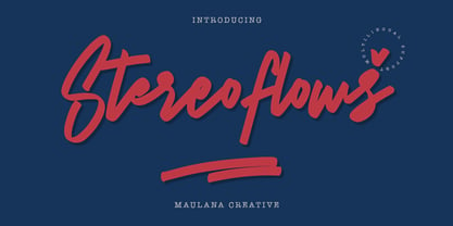 Give your designs an authentic handcrafted feel. � Stereoflows� is perfectly suited to stationery, logos and much more. Many Thanks!
 - Gilbert Qualifi by EmbunStudio2018,
$20.00 Hello Everyone have a nice day, let me introduce our new Classy Serif Font called "Gilbert Qualifi" !! Are you ready to make the project more elegant and classy? makes every eye that sees it stunned and silent for a moment This font is part of our dedication to the world of fonts, the work that takes a long time, makes us make this font as our mainstay font Whether you have a client that needs a new chic logo, or you're designing your social media posts. Maybe you're preparing your wedding mood board, stationery, invitations, Gilbert Qualifi font is just perfect for all of that and more. you can check it all on preview !! Enjoy !! and start Creating !! Include Multilingual : ÀÁÂÃÅÄĄĀĂÆÇĆČĎÈÉÊËĘĒĖĚĞÌÍÎÏĪİÐÑŃŇÒÓÔÕÖŌŐOEŔŘØÙÚÛÜŪŮŰŲŚŠŞŁÝŸŻŹÞ àáâãąåäāăæçćčďđèéêëęěēėğıìíîïīðñńňòóôõöoőoeøùúûüūůűŭųþýÿŕřśšşłżźž
 - Postulat Pro by ParaType,
$40.00 Postulat Pro is a contemporary slab serif typeface. The family contains 16 fonts: 8 romans with matching italics, from Hairline to Bold. The character set include contains more than 2100 glyphs which support most Latin and Cyrillic languages including Vietnamese, Greek, as well as small caps, stylistic and local alternates, and many other useful characters. The font uses a combination of smooth and extremely simple straight shapes. The author abandoned the use of teardrop-shaped classical elements, replacing them with straight ones, which makes Postulat Pro more dynamic and modern. These unique features give the font a unique personality. Postulat Pro is the perfect choice for headlines, logos, branding, packaging, publications and websites. The typeface was designed 2021 by Alexey Chekulaev.
 - Auristela Script by Shape Studio,
$12.00 Auristela is a new modern script calligraphy font with an irregular baseline. Auristela Script looks lovely on wedding invitations, thank you cards, quotes, greeting cards, logos, business cards and more. Perfect for using in ink or watercolour. Including initial and terminal letters, alternates, ligatures and multiple language support. To enable the OpenType Stylistic alternates, you need a program that supports OpenType features such as Adobe Illustrator CS, Adobe Indesign & CorelDraw X6-X7, Microsoft Word 2010 or later versions. There are additional ways to access alternates/swashes, using Character Map (Windows), Nexus Font (Windows), Font Book (Mac) or a software program such as PopChar (for Windows and Mac).Thanks so much for looking and please let me know if you have any questions
 - Trauville by Eurotypo,
$22.00 Inspired by Beauville Script, Trauville is a handmade, modern, joyful and elegant pen font with a vintage touch. Its informal appearance, the bouncy baseline, the round forms and bumpy stems, the good connection between the letters and the large number of ligatures that create more authentic and varied connections between the letters, refer to the fluent handwriting. With its 830 glyphs, the Trauville font is equipped with contextual and stylistic alternatives, many stylistic alternatives, swashes, initial forms and ligatures. This font contain a Central European language support to adapt to your design. Trauville works perfectly on greeting cards, invitations, weddings, posters, magazines, fashion world, brands and logos, packaging, etc. He is friendly and kind, fresh and fun to work with.
 - Caitlin Script by Shape Studio,
$12.00 Caitlin is a new modern script font with an irregular baseline. Caitlin Script looks lovely on wedding invitations, thank you cards, quotes, greeting cards, logos, business cards and more. Perfect for using in ink or watercolour. It includes initial and terminal letters, alternates, ligatures and multiple language support. To enable the OpenType Stylistic alternates, you need a program that supports OpenType features such as Adobe Illustrator CS, Adobe Indesign & CorelDraw X6-X7, Microsoft Word 2010 or later versions. There are additional ways to access alternates/swashes, using Character Map (Windows), Nexus Font (Windows), Font Book (Mac) or a software program such as PopChar (for Windows and Mac).Thanks so much for looking and please let me know if you have any questions.
 - Judicious by Create Big Supply,
$15.00 Judicious is perfect for making a bold statement and grabbing attention with its strong and commanding style. With its uppercase and lowercase letterforms, Judicious offers versatility and creativity for your design projects. Whether you're creating impactful headlines, striking logos, or eye-catching posters, this font will ensure your message is delivered with confidence. Featuring a comprehensive character set, Judicious includes numbers, punctuation marks, and supports multiple languages, making it suitable for various design applications. Additionally, the font is PUA encoded, allowing easy access to all glyphs and swashes, expanding your design possibilities. Let Judicious be the foundation of your next design project. Whether you're working on branding, advertising, packaging, or any other creative endeavor, this bold display font will command attention and leave a lasting impression.
 - Maylafaisha Script by Shape Studio,
$12.00 Maylafaisha is a new modern script calligraphy font with an irregular baseline. Maylafaisha looks lovely on wedding invitations, thank you cards, quotes, greeting cards, logos, business cards and more. Perfect for using in ink or watercolour. Including initial and terminal letters, alternates, ligatures and multiple language support. To enable the OpenType Stylistic alternates, you need a program that supports OpenType features such as Adobe Illustrator CS, Adobe Indesign & CorelDraw X6-X7, Microsoft Word 2010 or later versions. There are additional ways to access alternates/swashes, using Character Map (Windows), Nexus Font (Windows), Font Book (Mac) or a software program such as PopChar (for Windows and Mac).Thanks so much for looking and please let me know if you have any questions
 - The Malgena by Gold Type,
$15.00 The Malgena is a modern script font featuring a classic and elegant touch. Malgena is attractive because it is sleek, clean, feminine, sensual, glamorous, simple and very easy to read, thanks to its many beautiful letter joints. I also offer a number of decent stylistic alternatives for some of the letters. Classic style is very suitable to be applied in various formal forms such as invitations, labels, restaurant menus, logos, fashion, make up, stationery, novels, magazines, books, greeting cards / weddings, packaging, labels or all kinds of advertising needs. . . . . . Files included: -The Malgena Contains full set: -Uppercase -Lowercase -Alternative -Ligature -Punctuation -Number -Multilingual support. Need help or have questions let me know. I'm happy to help. Thank you & Congratulations on the Design!
 - George Town by FoxType,
$12.00 Introducing George Town new generation Typeface with 6 Weights. George Town Typeface created with the vision of to attract the audience to your brand . The finest details of this typeface are methodically and mathematically created. George Town is created with all the tasks of a corporate font and also for the usage in a variety of projects, including branding, logos, titles, headlines, servers, screens, display, digital ads, and everything else. We are putting a lot of effort on this font as a long-term project. The Typeface includes Six Weights. Thin, ExtraLight, Light, Regular, Medium, and SemiBold Features: Numerals, extended punctuation & Basic Symbols(200+ Glyphs). Expert kerning and quality crafting. Uppercase Letters & Lowercase Letters 24x7 Support Thank you for taking the time to look into the font.
 - Xyngia by ROHH,
$40.00 Xyngia is a professional modern sans serif typeface. Thanks to its excellent legibility it is a great choice both for on-screen use as well as print purposes. Xyngia is designed for use in long and short paragraphs of text, headlines and user interfaces. Its design nuances gives it distinctive character making it an interesting option for brand identification and logo design. Xyngia consists of 22 fonts - 11 weights and their corresponding italics. It has extended language support (over 1000 glyphs) and true italics, as well as broad number of OpenType features, such as small caps, case sensitive forms, standard and discretionary ligatures, stylistic sets, contextual alternates, lining, oldstyle, tabular and small cap figures, slashed zero, fractions, superscript and subscript, ordinals, currencies and symbols.
 - Welland by Factory738,
$15.00 Welland is a modern and elegant serif font family. The combination of modern and vintage elements renders an elegant design. The variety of weights provide a range of choices that will help you find the best typographic colour for your project. Lighter weights are well-suited for body text while heavier ones are ideal for high impact headlines. The available stylistic Ligature and Alternate offer a number of different characters that give your project design or logo a unique look. 5 Weights (Light, Regular, Semibold, Bold, Black) Basic Latin A-Z and a-z Numerals & Punctuation Stylistic Alternates & Ligatures Multilingual Support for ä ö ü Ä Ö Ü ... OTF file format Free updates and feature additions Thanks for looking, and I hope you enjoy it.
 - Cherly Hills Typeface by Krismagraph,
$19.00 Cherly Hills typeface is a beautiful and inspiring mix of classic calligraphy and modern serif with 56 unique ligatures. come in 2 versions regular & italic. Beverly Hills is made mainly for headlines, titles, and other short texts and is well-suited for advertising, vintage mood board, branding, logotypes, packaging, titles, editorial design, modern logos, websites, social media quotes, wedding branding, and modern and vintage design. Accessible in Adobe Illustrator, Adobe Photoshop, Coreldraw, and even work on Microsoft Word. PUA Encoded Characters – Fully accessible without additional design software. Fonts include multilingual support. Image used: All photographs/pictures/vectors used in the preview are not included, they are intended for illustration purposes only. Feel free to follow, like, and share. Thanks so much for checking out my shop!
 - Kristalena Script by Shape Studio,
$12.00 Kristalena Script is a new modern calligraphy font with an irregular baseline. Being trendy and feminine, Kristalena Script will look lovely on wedding invitations, thank you cards, quotes, greeting cards, logos, business cards and more. Perfect for using in ink or watercolor. Including initial and terminal letters, alternates, ligatures and multiple language support. To enable the OpenType Stylistic alternates, you need a program that supports OpenType features such as Adobe Illustrator CS, Adobe Indesign & CorelDraw X6-X7, Microsoft Word 2010 or later versions. There are additional ways to access alternates/swashes, using Character Map (Windows), Nexus Font (Windows), Font Book (Mac) or a software program such as PopChar (for Windows and Mac). Thanks so much for looking and please let me know if you have any questions.
 - Glenthya Habithan by Bungletter,
$10.00 Glenthya Habithan is a modern script font that features a classic and elegant touch. Glenthya Habithan is attractive because it is sleek, clean, feminine, sensual, glamorous, simple and very easy to read, thanks to its many beautiful letter connections. I also offer a number of decent stylistic alternatives for some of the letters. Classic style is very suitable to be applied in various formal forms such as invitations, labels, restaurant menus, logos, fashion, make up, stationery, novels, magazines, books, greeting/wedding cards, packaging, labels or all kinds of advertising purposes. . . . . . . . . Files include: Contains full set: -Uppercase -Lowercase -Alternative -Style -Ligatures -Punctuation -Number -Multilingual support. need help or have questions let me know. I'm happy to help. Thanks & Congratulations on the Design!
 - Paper Tiger by Fenotype,
$35.00 Paper Tiger is a splendid display font package by Fenotype. It’s a Victorian Script accompanied by a condensed flared serif in two weights and a chunky sans serif. Together they make a powerful set for creating logotypes, posters, packaging design, headlines or any display use online or offline. Paper Tiger fonts are available as normal clean versions, as well as “Print” versions that have rugged outlines and eroded texture inside. Paper Tiger suits great for book covers, restaurant menus, food products, craft ale labels, organic teas, sport teams logos and any such. Paper Tiger Script is equipped with Contextual Alternates and Standard Ligatures that keep the connections smooth. Both features are automatically on. In addition it has Swash, Stylistic and Titling Alternates for some extra flair.
 - Boldoy by Ardyanatypes,
$15.00 Boldoy is here everyone~ an attractive Typeface with agile and energic character See the beefy trunk? it will attract more attention like telling "hug me" ;) Boldoy come up with many decoration in multilanguage When you put it on the boom cover, it will stopping eye from others. The joyful shape impress a cheerful, clingy, gentle, cute, elephant, which super fit for your summer season Big Boy Boldoy also including alternates and ligatures that will make your idea never run out. It was so playful font but also easy to read and applied in various design styles such as traveling snacks, packaging, logos, event poster, animal lovers, cool T-shirts, and many more design projects. So, ready for play? Enjoy your design playground with BOLDOY
 - Banafsha Script by Shape Studio,
$12.00 Banafsha is a new modern script calligraphy font with an irregular baseline. Banafsha looks lovely on wedding invitations, thank you cards, quotes, greeting cards, logos, business cards and more. Perfect for using in ink or watercolour. Including initial and terminal letters, alternates, ligatures and multiple language support. To enable the OpenType Stylistic alternates, you need a program that supports OpenType features such as Adobe Illustrator CS, Adobe Indesign & CorelDraw X6-X7, Microsoft Word 2010 or later versions. There are additional ways to access alternates/swashes, using Character Map (Windows), Nexus Font (Windows), Font Book (Mac) or a software program such as PopChar (for Windows and Mac).Thanks so much for looking and please let me know if you have any questions.
 - Roman Pride by Letterhend,
$15.00 Introducing Roman Pride, a fresh and stylish font duo that features an elegant serif font and a charming script font. The combination of the two fonts creates a perfect harmony that is both classic and modern. Whether you're working on a wedding invitation and the other various formal forms such as labels, logos, magazines, books, packaging, fashion, make up, stationery, novels, labels or any type of branding project purpose, Roman Pride is a versatile font that will elevate your designs to the next level. Features : Uppercase & lowercase Numbers and punctuation Alternates & Ligatures Multilingual PUA encoded We highly recommend using a program that supports OpenType features and Glyphs panels like many of Adobe apps and Corel Draw, so you can see and access all Glyph variations.
 - Standly by Groen Studio,
$15.00 Standly is a bold brush script that is beautiful and unique, it is a model of a calligraphy writing style. Font features included: - Contextual Alternates - Standard ligatures - Discretionary ligatures - Stylistic Alternates - Stylistic sets Font files included: - Standly OTF Languages supported: Breton, Catalan, Czech, Danish, Estonian,French, German, Hungarian, Icelandic, Italian, Romanian, Scottish Gaelic, Slovak, Latvian, Lithuanian, Norwegian, English, Finnish, Polish, Portuguese, Slovenian, Spanish, Swedish, Turkish, Welsh. Basically, all european languages that are based on latin alphabet Can be used for various purposes.such as headings, logos, wedding invitation, t-shirt, letterhead, signage, lable, news, posters, badges etc. To enable the OpenType Stylistic alternates, you need a program that supports OpenType features such as Adobe Illustrator CS, Adobe Indesign & CorelDraw X6-X7.
 - Gernsheim by Brenners Template,
$19.00 Gernsheim is a semi condensed display sans serif font family. This font family has been created for use in headlines and logo display fitted on showcase screen. 9 weights and 18 font styles make up the initial release. To increase the adoption of a wide range of display fonts, the individual glyphs' handle fluctuations were subtly applied. The compromise of disproportion between straight lines and curves improves glyphs autonomy and relieves tension. And by applying rounded corner effects to each style, it presents the reader with softness and comfort. It is designed so that the rebellious disproportion created by heavy styles transition to flat and classy tenderness as the thin style approaches. Try the uniqueness and excitement of individual styles for yourself
 - Hustony Extrude by MJB Letters,
$16.00 Hustony is a layered retro bold script that comes with a regular and extrudes version which will make it easier for you to make a retro effect on a design, this font is designed carefully to be used for many purposes such as logo design, poster design, branding, labels, covers, magazine, wedding design, fashion design and more. You will get : Hustony Regular Hustony Extrude In order to use the beautiful swashes, you need a program that supports OpenType features such as Adobe Illustrator CS, Adobe Photoshop CC, Adobe Indesign, and Corel Draw. but if your software doesn’t have a Glyphs panel, you can install additional swash font files: if you have questions about the latest fonts, please provide a short message to us Thank You! MJB Letters
 - Comicblast by Kustomtype,
$25.00 Comicblast is a comic and hand-drawn font family with a universal and timeless design. The font is inspired by the work of acclaimed Belgian comic artists. The font is unique and helps you to complete your designs with a custom and handmade look. This typeface has six styles, available in regular, medium and bold weights, with italic counterparts, all-in-one style-linked. In short: a complete and affordable package for each designer. Comicblast has smooth and round shapes. It looks friendly and casual, is completely handmade and suitable for comics, logos, titles, package design or wherever you need a fun and warmhearted comic font, for all your fantastic designs! Comicblast is designed by Coert De Decker in 2018 and published by Kustomtype Font Foundry.
