10,000 search results
(0.045 seconds)
- Fearlessly Authentic by Ahmad Jamaludin,
$19.00 Say hello to the new classic nineties retro font, Fearlessly Authentic! The trend is to make thin serif fonts that made the 80s and 90s style, so we wanted to make them too but with a different touch. Make it slightly rounded for a retro look and make your design look great! Fearlessly Authentic - A classic nineties retro with a complementary italic version. In the italic family, we make it different from the regular and make a shape with a unique uppercase so it looks more classic, retro but a little modern We've also been loving combining the regular and italic, especially for logos (see the "Symphatize logo, image #3) Included : Regular and Italic Letters, numbers, symbols, and punctuation Use in many programs even in Canva Multilingual Support Language Support: Danish, English, Estonian, Filipino, Finnish, French, Friulian, Galician, German, Gusii, Indonesian, Irish, Italian, Luxembourgish, Norwegian Bokmål, Norwegian Nynorsk, Nyankole, Oromo, Portuguese, Romansh, Rombo, Spanish, Swedish, Swiss-German, Uzbek (Latin) Come and say hello over on Instagram! https://www.instagram.com/dharmas.studio/ Dharmas Studio
 - Hafidzah by Redy Studio,
$19.00 Hafidzah – Modern Calligraphy Script Meet Hafidzah. Hafidzah is a modern calligraphy font that combines traditional calligraphy style with modern type-design techniques. It comes in dashing rounded terminals and structured letters. You’ll especially love working with the decorative and elegant swashes that are included in Hafidzah, which you can use to add a fancy touch to your designs and expand the font’s versatility. Hafidzah is great for a wide range of projects, including logos, wedding invitations, greeting cards, product packaging, and signage. The combination of traditional calligraphy style, modern type design techniques, and unique letterforms will give your logo or project a stylish approach. Hafidzah will add individuality and originality to your designs, making them more fun and modern. Hafidzah features: A full set of upper & lowercase characters Numbers & punctuation 19 Special ligatures Lowercase beginning swashes Lowercase ending swashes Lowercase alternates characters Multilingual symbols PUA Encoded Characters – Fully accessible without additional design software. Feel free to give me a message if you have a problem or question. Thank you so much for taking the time to look at one of our products.
 - Darling Suttine by Aldedesign,
$18.00 Darling Suttine is a font is both awesome and classy. It comes with a natural feeling and so many ligatures. We kept this font looks classy, readable, elegant, stylish, catchy and absolutely easy to use. Darling Suttine is the great choice for watermark on branding, design, wedding, photography, signature, logo design, album cover, business card, quotes, and many other design project. This font is for those who want to show something smooth and modern. Use this font if you want to attract modern buyers. The font design seems to show that you have a passion in the business and give your love to the products and services you are offered to customers. Because it is an eye-catching signature font, you can use it for a variety of purposes including wedding invitation, signature, logo, branding, poster, and more. Each font has: - Stylish handwritten style - Many special ligatures - Multilingual support - PUA Encoded Characters - Fully accessible without additional design software. - How to access alternate glyphs? you can see it here: http://goo.gl/1vy2fv
 - Goodrich by Hendra Pratama,
$15.00 WARNING! Roughed version is quite heavy to open. Highly recommended to install the font without previewing it first. GOODRICH come in 2 different styles, with same character; Bold & Strong, and can evoke a different emotions. It comes in both clean and rough styles in only Uppercase Latin characters. When choosing a font, it’s important to consider the visual theme of your design. A clean bold fonts can lend a more stronger tone to your design, making it a great choice for Logo or Title. On the other hand, a textured fonts can lend a more natural printed-looks, making them perfect for designing 70s-80s themed parties. It can be used for various design purposes ; Posters, Logos, Packaging, Books or Movie Titles. In summary, these fonts are versatile and can add a unique look to any design project. If you want to add a touch of nostalgia and elegance to your designs, these fonts were timeless asset. With plenty of vintage and retro design resources available, it’s easy to find the perfect ideas for your next project.
 - Chunky Beard by IKIIKOWRK,
$17.00 Proudly present Chunky Beard - Retro Type, created by ikiiko. Chunky Beard is a vintage font with bold, rounded letterforms with vintage vibes from the 60's era. These fonts often have heavy, wide strokes and lack clear borders, giving them a warm and inviting appeal. Rounded edges, exaggerated curves, and exaggerated serifs are some of the characteristics of 60s vintage-type typography. Additionally, they often have very constant stroke weight across letters, further accentuating their distinctive appearance. From posters and flyers to logos and branding materials, bold typography with a vintage '60s feel is a great way to add a dash of retro charm to any design project. The font it self is grab people's attention with their vibrant, fun, vintage appeal and undeniable aesthetic. This kind is ideal for projects that seek to convey a sense of nostalgia and the retro vibes as well as retro-themed designs. As a movie title, corporate logo, quote, poster design, magazine layout, or just as a chic text overlay to any background image. What's Included? Uppercase & Lowercase Numbers & Punctuation Multilingual Support Works on PC & Mac
 - Kiddy by Gaslight,
$20.00 Kiddy is simple and slightly rough on one side and light and funny on other side. Kiddy have two set initials (realised as Contextual and Titling Alternates) and numerous decorative elements.
 - Peach Crush by Fenotype,
$25.00 Peach Crush is a bold vintage style serif font with a soft charm and smooth features. Peach Crush delivers a reminiscence of a familiar and warm nostalgic feeling. Peach Crush is equipped with Contextual, Swash, Stylistic and Titling alternates as well as Discretionary Ligatures and even more extra alternates. All these features can be accessed by OpenType controls or straight from Character or Glyphs window. Contextual Alternates and Standard Ligatures are automatically on and they simply do small changes to prevent certain character collisions. Other features are optional and can be used for bolder design solutions. Peach Crush has a total number of 115 alternate characters, even Swash Alternates for certain Standard and Discretionary Ligatures such as ch, ck, sh, sk, ff, fl and fi. Peach Crush is a great typeface for contemporary graphic design with that certain feeling of familiarity. It works well on logos, packaging, restaurant graphics, or any display use, as well as in headlines or shorter texts. Try Peach Crush with reduced tracking for tighter word images, or if you want to use it in really small sizes add some tracking. Peach Crush is based on another Fenotype font, Tomato Ketchup but has more contrast and sharper serifs.
 - Sister Pamella Font Cyrillic Duo by Ira Dvilyuk,
$18.00 Sister Pamella font duo Cyrillic is a pair of script and sans serif fonts, which perfectly complement one another. With a handwritten script font and a modern sans serif Sister Pamella font duo Cyrillic will be perfect for use in all your design projects be it logos, signatures, labels, packaging design, blog headlines. Also, it will look great on mugs, cards, gorgeous typographic designs, wedding stationery and much more. The Cyrillic part of the font contains the uppercase letters and lowercase letters and 17 ligatures, giving a realistic hand-lettered style. Sister Pamella script Cyrillic includes a full set of uppercase 2 sets of lowercase letters, numerals, a large range of punctuation and 38 ligatures, giving a realistic hand-lettered style. Sister Pamella sans serif containing uppercase only characters, numerals and a large range of punctuation. Creates a perfect contrast with the Sister Pamella script font. Multilingual Support for 32 languages: Afrikaans, Albanian, Basque, Bosnian, Catalan, Danish, Dutch, English, Estonian, Faroese, Filipino, Finnish, French, Galician, Indonesian, Irish, Italian, Malay, Norwegian Bokmål, Portuguese, Slovenian, Spanish, Swahili, Swedish, Turkish, Welsh, Zulu. And Cyrillic glyphs support for Russian, Belorussian, Bulgarian, Ukrainian and Kazakh languages. Works perfectly on the Canva platform. For Cricut & Silhouette recommended.
 - Bordonaro Spur by Estudio Calderon,
$35.00 Bordonaro Spur - Bordonaro Script’s partner - is a typography strongly influenced by old beer labels and includes some serifs based on Frederic W. Goudy’s Copperplate, but with some softened spurs adding an elegant and soft texture to the text. It is ideal to be used on large bodies and has a set of special ligatures ideal to be used in branding. Psss...Check out the NEW Bordonaro Spur with Rounded corners , same version but soft! FEATURES Co = company1 Co = company2 Estd = established Inc = incorporated Ltd = limited Mc = mac Rd = Road St = street And also from Adobe CC you can activate Style Sets (SS) and get ideal ligatures for ordinal numbers: 1st = st 2nd = nd 3rd = rd 4th = th Bordonaro Script and Bordonaro Spur are two typographic styles that were designed under the same characteristic features with the idea of combining them to obtain better results, for that reason, we recommend merging them in a creative way and you will realize everything you can design with them. The banners designs are based on old brands of beer labels, coffee packaging, sports logos and in some cases we use Copperplate Gothic but only as a complementary font in order to harmonize the layout of the elements in each banner.
 - Chipen by 38-lineart,
$14.00 I am pleased to present you an excellent futuristic font "Chipen" in unique graphic style! This font consists of regular, expanded, regular italic and expanded italic, these 4 fonts are encapsulated in one variable. With one font variable, this will cover 4 styles and cover all the weights between regular and expanded. If you are used to working with variable fonts it will give you more weight options, if you have never tried this variable font it will be an amazing new experience for you, take a look at this video snippet: https://youtu.be/jgqNPGeoVjc Chipen comes in bold and with a “RoundCube” cut, this is perfect for modern, Sci-Fi, and technology themes. Coupled with the stripe in the middle of the makes it appear more sporty. Not only that, this stripe can also display "Eighties" if you package it in a retro concept. Another strength of this font is the lowercase ligature, we present a lot of ligatures and one of them might be suitable for your logo brand. Finally, this font is a dynamic font with a variable concept capable of covering more 'weight', unique to appearing in various eras, exploring the world of retro and even science and fiction.
 - Walonka by TripleHely,
$18.00 Hello! Let me introduce Walonka – a modern calligraphy font. With its natural, elegant shapes Walonka is the perfect choice for logos, branding, web, blog headlines, invitations, magazine and book design, product packaging – or for any text on postcards and on your favorite photos. Walonka includes: a standard set of characters with wide multilingual support: Western-, Central- and Eastern-European, Baltic, Turkish, Latin-type Africans, and Asian (94 languages in total) two additional character sets: lowercase letters with alternates shapes and lowercase letters without a connection stroke - for the position at the end of a word another two additional lowercase character sets – initial and final swashed forms 75 ligatures for double letters and frequent combinations Walonka has a large number of embedded context-dependent auto-replacement features that give the text a natural, handwritten look and correct inharmonious combinations of letters. These features work well in many apps (even simple ones like Notepad/TextEdit), and if you need to customize their application – you could use programs that support OpenType features (for example, Adobe apps or CorelDraw). All these additional glyphs are PUA-encoded, so if your software does not support OpenType — you could access them through Character Map (Windows) or Font Book (Mac). I hope you will like Walonka and create great designs with it!
 - Gareh Note by Afkari Studio,
$19.00 Introducing Gareh Handwritten Marker Note Font, a font that merges the liveliness of handwritten script with a unique, natural touch. Crafted to captivate attention and infuse a fresh vibe into your designs, Gareh strikes the perfect balance between the elegance of handwriting and a casual feel. With expressive characters and authentic marker accents, each letter exudes warmth and originality. Gareh is the ideal solution for design projects seeking a personal and creative touch. Whether you're creating posters, greeting cards, logos, or working on branding projects, this font will leave an unforgettable impression. Every stroke brings inviting warmth and inspirational vibes. With Gareh, you can add a new dimension to your messages. Easy to use, this font grants the freedom to express limitless creativity. Get Gareh now and discover how each letter can lend that special handmade touch to every design of yours." Highlighted Features: – Uppercase, Lowercase, Number, and Punctuation – Special alternates and ligatures – Works on PC & Mac – Simple installations – Accessible in Adobe Illustrator, Adobe Photoshop, Adobe InDesign, and even work on Microsoft Word – Fully accessible without additional design software. – Mültîlíñgúãl Sùppört for; ä ö ü Ä Ö Ü ß ¿ ¡ Hope you enjoy our font and this font is a useful font for your projects!
 - Deco Of Tomorrow JNL by Jeff Levine,
$29.00 On occasion, when seeking retro source material for font designs, one can unearth interesting examples of typography that bridges decades with its ahead-of-its-time style. The songwriter credits on one particular piece of vintage sheet music had both the Art Deco influence but took on more of a techno look that was popularized in the 1980s. This hybrid of generations is the basis for Deco of Tomorrow JNL.
 - Seasons Greetings by Ingrimayne Type,
$14.95 Seasons Greetings is intended to bring Christmas cheer. It has a very limited character set, with all the letters being lower-case. One set of letters is white on black Christmas balls, while the other is black on white Christmas balls. The lower-case letters can be layered on top of the upper-case letters to give bi-colored lettering. The letters on the Christmas ornaments are from the typeface Cuthbert.
 - KG I Need A Font by Kimberly Geswein,
$5.00 A neat handwritten font in 2 styles- one with hearts and one without hearts.
 - Bright Ideas by Ingrimayne Type,
$9.00 The BrightIdeas family contains two novelty fonts that have letters on light bulbs. The fonts have some characters on standing bulbs and some on hanging bulbs and these two sets are made to alternate with the OpenType contextual alternatives (calt) feature. To use only one set of bulbs, this feature must be turned off and character spacing adjusted. The family contains a style with clear bulbs and one with filled bulbs. They can be used in layers to add color. Both are monospaced. The characters on the bulbs are derived from the font Myhota-Bold.
 - Celestial by My Creative Land,
$18.00 Have you ever struggled while creating a quote with all ascenders/descenders getting on the way? When you can't find a perfect placement for a word because the letters on the upper line crossing the ones on the lower one? Well, I have :) If you want to reduce this struggle to a minimum, the Celestial brush font is for you. Full of open type features and alternates it won't stand on your way to get the job done ;) Most of the font's letters have "longer" or "shorter" alternates. Celestial brush font is fully unicode mapped.
 - Unfortunately, I can't give a detailed, current description of the "Motorcade" font by Ray Larabie, as my latest update was in April 2023 and I might not have the latest details on this specific font...
- As of my last update in April 2023, the specific font named 914-SOLID by E. V. Norat II doesn't have a widely recognized description or set of characteristics that are commonly known in the type desi...
- Tecna Dark Up Triangle BNF by Descarflex,
$30.00 The Tecn@ Dark&Light Triangle Background Nomenclature Font family is differentiated by the direction of the triangle tip in the 4 cardinal points. The family were designed to head, enumerate, indicate or highlight writings or design plans, for this reason, the characters are available only in capital letters and some signs or symbols that can serve such purposes. A triangle or empty character is included so that the user can use it overlaying any character of his choice or to be used alone. What is Lorem Ipsum? Lorem Ipsum is simply dummy text of the printing and typesetting industry. Lorem Ipsum has been the industry's standard dummy text ever since the 1500s, when an unknown printer took a galley of type and scrambled it to make a type specimen book. It has survived not only five centuries, but also the leap into electronic typesetting, remaining essentially unchanged. It was popularised in the 1960s with the release of Letraset sheets containing Lorem Ipsum passages, and more recently with desktop publishing software like Aldus PageMaker including versions of Lorem Ipsum. Why do we use it? It is a long established fact that a reader will be distracted by the readable content of a page when looking at its layout. The point of using Lorem Ipsum is that it has a more-or-less normal distribution of letters, as opposed to using 'Content here, content here', making it look like readable English. Many desktop publishing packages and web page editors now use Lorem Ipsum as their default model text, and a search for 'lorem ipsum' will uncover many web sites still in their infancy. Various versions have evolved over the years, sometimes by accident, sometimes on purpose (injected humour and the like). Where does it come from? Contrary to popular belief, Lorem Ipsum is not simply random text. It has roots in a piece of classical Latin literature from 45 BC, making it over 2000 years old. Richard McClintock, a Latin professor at Hampden-Sydney College in Virginia, looked up one of the more obscure Latin words, consectetur, from a Lorem Ipsum passage, and going through the cites of the word in classical literature, discovered the undoubtable source. Lorem Ipsum comes from sections 1.10.32 and 1.10.33 of "de Finibus Bonorum et Malorum" (The Extremes of Good and Evil) by Cicero, written in 45 BC. This book is a treatise on the theory of ethics, very popular during the Renaissance. The first line of Lorem Ipsum, "Lorem ipsum dolor sit amet..", comes from a line in section 1.10.32. The standard chunk of Lorem Ipsum used since the 1500s is reproduced below for those interested. Sections 1.10.32 and 1.10.33 from "de Finibus Bonorum et Malorum" by Cicero are also reproduced in their exact original form, accompanied by English versions from the 1914 translation by H. Rackham. Where can I get some? There are many variations of passages of Lorem Ipsum available, but the majority have suffered alteration in some form, by injected humour, or randomised words which don't look even slightly believable. If you are going to use a passage of Lorem Ipsum, you need to be sure there isn't anything embarrassing hidden in the middle of text. All the Lorem Ipsum generators on the Internet tend to repeat predefined chunks as necessary, making this the first true generator on the Internet. It uses a dictionary of over 200 Latin words, combined with a handful of model sentence structures, to generate Lorem Ipsum which looks reasonable. The generated Lorem Ipsum is therefore always free from repetition, injected humour, or non-characteristic words etc.
 - Brodia by Rillatype,
$17.00 Introducing, Brodia. Brodia is a modern logo font with different uppercase and lowercase that will make your design futuristic and modern. This font is perfect for your logo, branding, movie poster, or logotype. If you have any question please feel free to reach me at Rillatype@gmail.com Thank You!
 - Seanor by Typebae,
$15.00 Seanor is a modern and versatile logo font that features 26 elegant ligatures. It offers a modern aesthetic, making it suitable for various branding and design projects. The font's ligatures provide unique and stylish combinations of letterforms, enhancing the overall visual appeal of any logo or typographic design.
 - Rachmanty by Goodigital13,
$20.00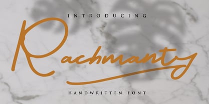 minimal fashion fonts designs. projects to the highest level, be it branding, headings, wedding, digital, movie, invitations, signatures, logos, labels, and much more! This font is readable, catchy, and easy to use. This font is suitable for quotes, logo designs, magazines, business cards, and many other design projects.
 - Quick Baseball by Nirmana Visual,
$22.00 Quick Baseball, contemporary of Serif font, Insipired by Baseball Club Logo, Quick Baseball it's retro, bold, and playful. Perfect if you need a dose of fun in your project. offers beautiful typographic harmony for a diversity of design projects, including logos & branding, social media posts, advertisements & product designs.
 - Rouge by Dharma Type,
$14.99 This unique font has been designed and is based on lip rouge on windscreen. But it inspires a different feeling for different people; e.g. Organic, mathematical or ancient. Rising Star on April 2008.
 - Alexandria Signature by Ergibi Studio,
$20.00 Alexandria Signature is a modern Signature font crafted in an elegant and professional style with alternative characters. perfect font for creating signature logos and watermarks for photography studios or personal photography logos, best for initial logo or brand signatures.Alexandria Signature includes a full set of beautiful handwritten upper and lower case letters, numbers, assorted punctuation marks. All lowercase letters include start and end strokes, providing a realistic handwriting style. If you have any questions about our fonts, please feel free to contact us Thank You Ergibi Studio
 - Taurunum by Kostic,
$40.00 The initial idea for this font came when a friend of mine asked me to create a logo for a sports team that he was forming. Since it was a martial arts competitive sport, bold and striking lettering was needed to reflect that. When the logo was finished, I was really pleased whith the letters so I decided to create the entire font. Taurunum is made with intention to be used for display design (logos, posters, etc.), and combining the weights should give best results.
 - Subroyal by Subtitude,
$15.00 Subroyal was inspired by the official logo of the City of Montreal. The idea came to us while reading an article about a revised version of this logo that didn't have any original typography. We realized it was our civic duty to bring the City logo to life, and the result is a fairly romantic font that reminds us of the many parks around the island, its fragile snowflakes, and its electronic music scene. Voilà! Montreal has its first custom-made (non-official) font package.
 - NailsNStaples by Ingrimayne Type,
$14.95 In NailsNStaples the letters are made up of nails and staples. (The staples are not the staples one uses to join paper, but the kind one hammers into wood.) It is not often that one needs a typeface made of nails and staples, but if one does, there is a font for that.
 - Ongunkan Phoenician by Runic World Tamgacı,
$50.00 Phoenician/Canaanite The Phoenician alphabet developed from the Proto-Canaanite alphabet, during the 15th century BC. Before then the Phoenicians wrote with a cuneiform script. The earliest known inscriptions in the Phoenician alphabet come from Byblos and date back to 1000 BC. The Phoenician alphabet was perhaps the first alphabetic script to be widely-used - the Phoenicians traded around the Mediterraean and beyond, and set up cities and colonies in parts of southern Europe and North Africa - and the origins of most alphabetic writing systems can be traced back to the Phoenician alphabet, including Greek, Etruscan, Latin, Arabic and Hebrew, as well as the scripts of India and East Asia. Notable features Type of writing system: abjad / consonant alphabet with no vowel indication Writing direction: right to left in hortizontal lines. Sometimes boustrophedon. Script family: Proto-Sinaitic, Phoenician Number of letters: 22 - there was considerable variation in their forms in different regions and at different times. The names of the letters are acrophonic, and their names and shapes can be ultimately traced back to Egyptian Hieroglyphs. For example, the name of the first letter, 'aleph, means ox and developed from a picture of an ox's head. Some of the letter names were changed by the Phoenicians, including gimel, which meant camel in Phoenician, but was originally a picture of a throwing stick (giml).
 - Shocka Family by Skinny Type,
$23.00 Shocka Family is a confident serif. Designed to reflect nature, it creates a sense of softness and natural expression. We pushed the concept in a usability-focused direction, to work as a bold tool and a beautiful communicator. Variable Shocka enables fluid design in 9 weights, italics and 2 styles with major latin based languages. The right slant advances aesthetics, brings energy and makes it suitable for modern designs. The type family blends organic curves and soft repetition into strong and harmonious types. At large dot sizes you can appreciate the shape of the letters, while the same control and focus creates an even texture for small dot sizes and long reads. Fonts extend their use by giving weights ranging from light to black. The natural curve, a swollen and sloping stem, grows in character as the font gains weight. While the thinner weight has lowered contrast and optical correction to create a warm and soft look. The Shocka Family character set combines additional symbols, style alternatives, unique binding, and case sensitive punctuation - resulting in a stable, hard-working family ready to tackle projects of any size. I can't wait to see what you do with Shocka Family! Feel free to use the #Skinny_Type and #Shocka Family font tags to show what you've done visit my Instagram : https://www.instagram.com/skinny.type/ Thank you!
 - Wingdings by Microsoft Corporation,
$29.00The Wingdings™ 1 font was designed by Kris Holmes and Charles Bigelow in 1990 and 1991. Wingdings 1 originally named Lucida Icons, Arrows, and Stars to complement the Lucida text font family by the same designers. Renamed, reorganized, and released in 1992 as Microsoft Wingdings(TM), the three fonts provide a harmoniously designed set of icons representing the common components of personal computer systems and the elements of graphical user interfaces. There are icons for PC, monitor, keyboard, mouse, trackball, hard drive, diskette, tape cassette, printer, fax, etc., as well as icons for file folders, documents, mail, mailboxes, windows, clipboard, and wastebasket. In addition, Wingdings includes icons with both traditional and computer significance, such as writing tools and hands, reading glasses, clipping scissors, bell, bomb, check boxes, as well as more traditional images such as weather signs, religious symbols, astrological signs, encircled numerals, a selection of ampersands and interrobangs, plus elegant flowers and flourishes. Pointing and indicating are frequent functions in graphical interfaces, so in addition to a wide selection of pointing hands, the Wingdings fonts also offer arrows in careful gradations of weight and different directions and styles. For variety and impact as bullets, asterisks, and ornaments, Windings 1 also offers a varied set of geometric circles, squares, polygons, targets, and stars. Character Set: Picture/Symbol - Progeny by Type Associates,
$35.00 Progeny is a single-stroke freehand informal script that began life as a logo for a fast food company. That logo was rejected but when I added a suite of swash caps and a few extra ligatures and my trademark underlines it all started to come together as a font. Then I used it successfully for another logo and I proceeded to complete the weight variations that emerged during the first logo design, rounding the lighter weights to give a more friendly, softer look. That treatment didn't suit the bold weight but sharp corners did not detract from the robust, legible headliner that emerged. All weights work in all-lowercase, all-capitals, lowers with swash or regular initial caps and surprisingly – in all-caps with swash initials.
 - Dark Angel by Alphabet Soup,
$60.00 Selected as one of “Our Favorite Typefaces of 2013” by Typographica.org, Dark Angel is the first completely new take in decades on the traditional “blackletter” font style. It began its journey towards the light years ago when this style was born as a sketch for a new logo for the California Angels baseball team (renamed shortly thereafter the Anaheim Angels). The Angels logo never happened, but that sketch has risen from the dead and become the basis for this brand new font design—and was also the source for the name. It’s kind of blackletter in feel, but as a display font it’s so much more. It is far more legible than most “Old English” or “Gothic Script” styles, and incorporates many features never before seen in them, such as swashes, tails and a plethora of ligatures. Dark Angel can be purchased in its regular solid form, or as Dark Angel Underlight—a handtooled font. If these two fonts are purchased together, the Family package will contain a third font—Dark Angel Highlight. With this font layered over the basic font, you can achieve two–color typesetting when the highlight and the base font are assigned two different colors. Dark Angel has enough language support to make the builders of Babel envious—its 1,163 glyphs can be used to set copy in 59 different languages. From A to Z: Afrikaans, Albanian, Basque, Bemba, Bosnian, Catalan, Cornish, Croatian, Czech, Danish, Dutch, English, Esperanto, Estonian, Faroese, Filipino, Finnish, French, Galician, Ganda, German, Hungarian, Icelandic, Indonesian, Irish, Italian, Kalaallisut, Kamba, Kikuyu, Kinyarwanda, Lithuanian, Luo, Malagasy, Malay, Maltese, Manx, Morisyen, North Ndebele, Norwegian Bokmål, Norwegian Nynorsk, Nyankole, Oromo, Polish, Portuguese, Romansh, Sango, Shona, Slovak, Slovenian, Somali, Spanish, Swahili, Swedish, Swiss German, Turkish, Welsh, and last (but not least) Zulu. PLEASE NOTE: Dark Angel is a cross-platform font which depends to some extent on certain advanced OpenType features, therefore it can be used to its full potential only with programs that support those features. ADDITIONALLY: When setting Dark Angel one should ALWAYS select the “Standard Ligatures" and “Contextual Alternates” buttons in your OpenType palette. Please see the “Read–Me–First!” file in the Gallery section.
 - Etrusco Now by Italiantype,
$39.00 Etrusco Now is the revival of a lead typeface originally cast in lead by Italian foundry Nebiolo in the early 1920s. Heavily inspired by the design of the Medium weight of Schelter & Giesecke's Grotesk, Etrusco was, like Cairoli, an early precursor of the modernist grotesque superfamilies: a solid, multi-purpose "work-horse" typeface family that could solve a wide range of design problems with its range of widths and weights. When designing the new incarnation of Nebiolo's Etrusco, the Italiantype team directed by Cosimo Lorenzo Pancini and Mario de Libero decided to extend the original weight and width range to keep this "superfamily" approach. Etrusco Now has twenty-one styles widths in three widths of seven weights each, with matching italics; the original weights for the typeface have been collected in the Etrusco Classic subfamily. Etrusco Now new widths allowed the team to include in the design many nods and homages to other vintage classics of Nebiolo. The lighter weights of the normal width have been heavily influenced by the modernist look of Recta, while the heavy condensed and compressed widths refer to the black vertical texture of Aldo Novarese's Metropol. This infuses the typeface with a slightly vintage mood, making Etrusco at the same time warmly familiar and unexpected to eyes accustomed to the formal and cold look of late modernist grotesques like Helvetica. Contemporary but rich in slight historical quirks, Etrusco Now is perfect for any editorial and branding project that aims to be different in a subtle way. Etrusco Now's deviations from the norm are small enough to give it personality without affecting readability, while its wide range of open type features (alternates, stylistic sets, positional numbers) and language coverage make it a problem solver for any situation. Like its cousin Cairoli, Etrusco is born out of love for lost letterforms and stands like its lead ancestor from a century ago, at the crossroads between artsy craftsmanship and industrial needs.
 - Frutiger Symbols by Linotype,
$29.00In Adrian Frutiger, the discipline of a mathematically exact mind is joined with an unmistakable artistic sense. His independent work possesses the controllable language of letterforms. Personal and intensive, this work is the manifestation of his expressive will. Frutiger's precise sense of outline reveals itself two- or three-dimensionally in wood, stone, or bronze, on printing plates and in the form of reliefs. However, even his independent work can be understood as objectivized signs; in their symbolism, they are embedded in the fundamental questions of human existance. They might have developed in the spirit of playfulness, but their nature is always conceptual, directed towards a complex, yet harmonic, whole. Following function, form also necessarily follows the content of the language. The entire spiritual world becomes readable through letters. Essentially, Adrian Frutiger attempts to fathom the basic, central truth which defines our lives: change, growth, division - beginning and end. In a virtual synthesis, he seems to close the circle in which the world reflects itself in symbolic forms. Frutiger Stones is for Adrian Frutiger the example of his formal artistic sensibility par excellence. Searching for the fundamental elements in nature, he has discovered the pebble, rounded and polished over innumerable years by gently flowing water. And out of this, he has created his complete system, a ruralistic typeface of letters and symbols. It depicts animals and plants, as well as astrological and mythical signs. Because of its unique aura, Frutiger Stones is particularly well-suited to different purposes - in headlines and prominent pictograms, as symbol faces, illustrations, and more. Frutiger Symbols is a symbol font of plants, animals and stars as well as religious and mythological symbols. Together with Frutiger Stones this typeface builds a complete design system, which offers endless possibilities. It can be used for illustrations or a symbol type with its distinctive pictograms. Frutiger Symbols is available in the weights regular, positive and negative. - Ambassador Script by Canada Type,
$69.95 When Aldo Novarese designed his “tipo inglese” Juliet typeface, he had a simple objective in mind: Reduce the inclination angle of the traditional 18th and 19th centuries English script in order to make the punchcutter’s job easier and the resulting metal type more durable. But when Juliet was released by Nebiolo in 1955, it was a big surprise to both typesetters and calligraphers all over Europe. Novarese’s idea of working the standard copperplate script within the limited technology of the time proved to be a marvel in optical metal sizing (Juliet was available in sizes ranging from 12 to 60 pt), but also opened the door to new calligraphic possibilities. Easier readability and a very friendly color were obvious side effects of the reduced angle. So soon after its release, calligraphers worldwide began emulating the angle reduction and experimenting with the application of the same concept to other calligraphic genres. Today, more than 50 years later, many professional calligraphers point to Novarese’s Juliet as an opening to fresh ideas and new directions in 20th century elegant calligraphy. Ambassador Script, this digital version of Aldo Novarese’s surprising masterpiece, is the result of more than a thousand hours of work. Going above and beyond its duty as a revival, it was expanded by a great number of alternates, swashes, beginning and ending forms, as well as accompanying flourishes and snap-on strokes for even more ending forms. Ambassador Script also supports almost every known Latin-based language, which makes its name all the more fitting. Ambassador Script is available in all popular font formats. The True Type and Postscript Type 1 versions come in 12 fonts, available in different piecemeal configurations or a full volume. The OpenType version collects more than 2300 characters in a single feature-rich font that can sing mightily in OpenType-supporting applications. Ambassador Script is ideal for weddings, invitations, greeting cards, book and magazine covers, or anywhere a touch of calligraphic elegance is desired.
 - Magneta by Volcano Type,
$19.00One of our first fonts ever. Simply made from some magnets hanging on a refrigerator. - FishyPrint AOE - Unknown license

- Disco by Solotype,
$19.95Each letter or character comes in two forms on this font: One as a complete disc, the other as a disc with a segment removed so the succeeding character can overlap the preceding one.
