10,000 search results
(0.053 seconds)
- Hendrix Bubble by Letterena Studios,
$17.00 Hendrix bubble is a modern and classic display font with its own unique style and modern looks. This typeface is perfect for an elegant & bold logo, book or movie title design, fashion brand, magazine, clothes, lettering, quotes, and so much more.
 - Quihk by Letterena Studios,
$9.00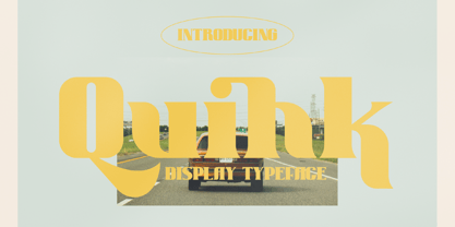 Quihk is a modern and classy serif font with its own unique style and modern look. This typeface is perfect for an elegant & luxury logo, book or movie title design, fashion brand, magazine, clothes, lettering, quotes, and so much more.
 - Dishta Bikailen by Letterena Studios,
$17.00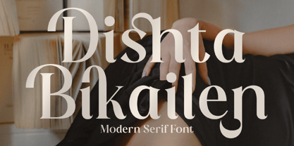 Dishta Bikailen is a serif modern and classic typeface that has its own unique style & modern look. This typeface is perfect for an elegant & luxury logo, book or movie title design, fashion brand, magazine, clothes, lettering, quotes, and so much more.
 - Decafe by Arendxstudio,
$14.00 Introducing Decafe: wrapped with texture ruling pen so that this font has its own characteristics compared to other fonts that carry a distinctly distinct style. Decafe is equipped with full simple Latin characters that meet the International character glyphs standard
 - Grunge Decay by Okaycat,
$29.50 Grunge Decay is an urban font with a unique look. It creates a rugged and unusual feel to with its own character & stylization. Grunge Decay is extended, containing West European diacritics and ligatures, making it suitable for multilingual environments & publications.
 - Romalika by Letterena Studios,
$17.00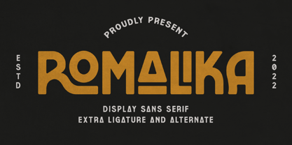 ROMALIKA is a serif modern and classic typeface that has its own unique style & modern look. This typeface is perfect for an elegant & luxury logo, book or movie title design, fashion brand, magazine, clothes, lettering, quotes, and so much more. **Uppercase
 - Kaldera by Letterena Studios,
$17.00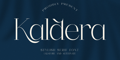 Kaldera is a modern and classic serif typeface that has its own unique style and exquisite look. This font is perfect for elegant and luxurious logos, book or movie title designs, fashion brands, magazines, clothes, lettering, quotes, and so much more.
 - Abstract by Los Andes,
$29.00 Abstract is a contemporary and eclectic serif typeface inspired by today's life and created in times of pandemic. This family includes a true italic variant —that has its own personality— alternates, lining and old style figures, numerators and denominators & Cyrillic support.
 - Tattooflash Marie by Otto Maurer,
$14.00 Tattooflash Marie is made for Tattoofans, Tattoostudios and Tattoo artists. Make your own tattoo flash with your Name or the Names of your children. The Font is made for your skin but you can also make Tattooposter, Tattooequipment and more.
 - Best Signature by Nirmalagraphics,
$14.00 Best Signature is a font in modelled after my own signature style. This font also works well when used for magazines, brochures, flyers, Instagram posts, as well as themes for women. Best Signature includes ligatures and expanded multi-lingual support.
 - Heiders by Seventh Imperium,
$20.00 Heiders is a font family including 71 fonts with 4 sub families - Heiders Script, Heiders Sans, Heiders Handmade and Heiders Extras. Heiders contains texture options and lots of extras to make it easier for you to create your own way!
 - Uplift by Fontop,
$11.00Uplift is a modern serif typeface with its own character and charisma. Works cool both when used in headlines, magazines, pull quotes and also in branding, unique logos, etc. Uplift comes with multilingual support also and also feature stylistic alternates. - Blue Ocean by Letterena Studios,
$9.00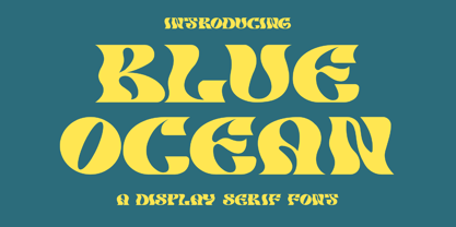 Blue Ocean is a creative slab serif font that has its own unique style and modern look. This typeface is perfect for an elegant & luxury logo, book or movie title design, fashion brand, magazine, clothes, lettering, quotes, and so much more.
 - Spring LP by LetterPerfect,
$39.00 Spring is a lively contemporary script that designer Garrett Boge modeled after his own brush lettering. It was released in 1988 at the launch of LetterPerfect's font collection, and has seen increasing use in advertising, packaging, and point-of-display promotions.
 - BLT Portage by Black Lab Type,
$12.00 PORTAGE is a slab serif that carries its own weight. Adventurous and rugged, this typeface that evokes the wild country and makes headlines stand out. The typeface was built from a land and forest journal from the mid-50's.
 - Garges by Letterena Studios,
$9.00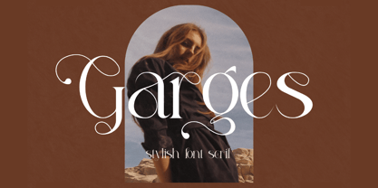 Garges is a modern and classy serif font with its own unique style and modern look. This typeface is perfect for an elegant & luxury logo, book or movie title design, fashion brand, magazine, clothes, lettering, quotes, and so much more.
 - Stencil Modernistic JNL by Jeff Levine,
$29.00Stencil Modernistic JNL was modeled directly from an early 1960s lettering stencil that favored the Art Deco style. There is minimum kerning due to the nature of this typeface, so designers should use their own judgment when working with it. - Bindweed by Solotype,
$19.95From an old wood type owned by a San Francisco printer. Wood types were customarily given somewhat generic names (Antique Tuscan) or, more frequently, numbers to identify them. Our clients liked colorful, easily-remembered names better, and so did we. - Magisho by Letterena Studios,
$17.00 Magisho is a distinct and classic serif font that has its own unique style & modern look. This typeface is perfect for an elegant & luxury logo, book or movie title design, fashion brand, magazine, clothes, lettering, quotes, and so much more.
 - Bellissima Script Pro by Sudtipos,
$79.00 While in the same vein and spirit as Burgues and Compendium, Bellissima began from an entirely different thread from those fonts. It started with Alex Trochut generously showing me a gorgeous lettering book from his grandfather’s library: Bellezas de la Caligrafía, by Ramón Stirling, 1844. Stirling was one of the Latin calligraphy pioneers who introduced a refined version of English calligraphy in Spain and made it popular in the nineteenth century. Some scans from that book served as initial basis for the caps in my Poem Script. But it was always in the back of my mind that I should do a copperplate, and the Stirling model was the perfect source. My intention was to veer away from Stirling’s exuberant ornamentation, and work within simplified forms of his ideas. As it usually is with most of my projects, Bellissima became its own bird and shaped its own flying patterns. Suddenly there were many ligatures, multiple endings and swashed connections, hundreds of alternates for both uppercase and lowercase. Bellissima has an effusive energy that appeals much beyond its sourcing. It’s intended for these modern times of appreciation for old crafty things like stationery and letterpress, where its origins help it shine brightly. Bellissima Script Pro is a complete font with almost 2000 characters full of alternates, swashes, ligatures & ornaments covering a wide palette of latin languages and Bellissima Script Redux is a random sample of glyphs totally usable with a reduced price.
 - Homogenic by HIRO.std,
$16.00 Homogenic is a new casual modern script font. This font describes about girly, feminist, elegant, dynamic, humanist, easy to use and will bring a good harmony when the letters are connected and paired each other. FEATURES - Support Opentype Features - Support Ligatures - Automatic stylistic alternates bb dd ee ff gg hh ii kk ll mm nn oo pp rr ss tt zz ah ak al am an ar ba bh bl br bt cl ch eh ek el em en gh ght gl gn gr gt ie ih ik il im in ir jt lt nt oh ok ol om on or or ov ow se sh sk sl sn sp sr st ue uh uk ul um un ur ve we wi wo yl yn yt Sl Sh Sk - Uppercase - Lowercase - Numbering and Punctuations - Multilingual Support - Works on PC or Mac USE Homogenic works great in any branding, logos, magazines, apparel, wedding designs, social media posts, advertisements, product packaging, product designs, label, photography, watermark, invitation, stationery and any projects that need handwriting taste.
 - Sign Helpers JNL by Jeff Levine,
$29.00Sign Helpers JNL is a collection of silhouette images carefully redrawn from two distinct sources. Prior to their bankruptcy in 1984, the Holes-Webway Company of St. Cloud, MN produced thousands of their "Webway" sign kits that were utilized by merchants, libraries and schools throughout the country. At one point they included in their sales catalog a selection of die-cut images for embellishing sign work. In the late 50s and throughout the 60s, the Joseph Struhl Company (now known as Magic Master Industries) produced cling vinyl sign kits for business, and a home movie titling set for do-it-yourself film makers. This set also featured die-cut embellishments. A generous selection of designs from both kits have been faithfully re-drawn in digital form to pay tribute to two innovative companies. Other fonts based on products from these companies are Sign Kit JNL (Webway® Sign Kit), Cling Vinyl JNL, and Sign Maker JNL (Magic Master® Sign Kits). Trademarked names are used purely for reference purposes. - Hand Stamp Play Rough Serif by TypoGraphicDesign,
$25.00 “Hand Stamp Play Rough Serif” is a rough and dirty serif Font with authentic & real stamp look. Original Hand Stamped. A–Z, a–z, and 0–9 are each 3× different forms (every letter/glyph has two additional alternate characters) and is intended to show the hand-made nature and the vibrancy of the display font. The different pressure (velocity) of the stamp on paper creates a liveliness in the typeface. Ligatures like ae, oe, AE, OE, ff, fl, fi, fj, ffl, ffj, ffi, and additional logotypes like and, the, by, tel fax, web, www … and a Versal Eszett (Capital Letter Double S) give the Font more life and shows that despite their retro-looks works with modern OpenType technology (from ❤ love is, from luck will ✤ … ). Replacing the glyphs “E” instead of “3” to convey that typeface invites you to play. It is the desire to experiment and promote uninhibited experimentation. A variety of alternative letters and a few glyphs follow her own head @, &, ₤, £, “,”, * … The typeface has its quirks and downright human characteristics to “just love.” Have fun with this font – Just Stamp It. Application Area The serif font works best for headline size. Logo, Poster, Editorial Design (Magazine or Fanzine) or Webdesign (Headline Webfont for your website), Webbanner, party flyer, movie poster, music poster, music covers … How To Use – awesome magic OpenType-Features in your layout application ■ In Adobe Photoshop and Adobe InDesign, font feature controls are within the Character panel sub-menu → OpenType → Discretionary Ligatures … Checked features are applied/on. Unchecked features are off. ■ In Adobe Illustrator, font feature controls are within the OpenType panel. Icons at the bottom of the panel are button controls. Darker ‘pressed’ buttons are applied/on. ■ Additionally in Adobe InDesign and Adobe Illustrator, alternate glyphs can manually be inserted into a text frame by using the glyphs panel. The panel can be opened by selecting Window from the menu bar → Type → Glyphs. Or use sign-overview of your operating system. ■ For a overview of OpenType-Feature compatibility for common applications, follow the myfonts-help http://www.myfonts.com/help/#looks-different ■ It may process a little bit slowly in some applications, because the font has a lot of lovely rough details (anchor points). Technical Specifications ■ Font Name: Hand Stamp Play Rough Serif ■ Font Weights: Regular, Bold ■ Fonts Category: Display for Headline Size ■ Desktop-Font: OTF (OpenType Font for Mac + Win) + TTF (TrueType Font) ■ Web-Font: SVG + EOT + TTF + WOF ■ Font License: Desktop license, Web license, App license, eBook license, Server license ■ Glyph coverage: 617 ■ Language Support: Albanian, Alsatian, Aragonese, Arapaho, Aromanian, Arrernte, Asturian, Aymara, Basque, Bislama, Bosnian, Breton, Cebuano, Chamorro, Cheyenne, Chichewa (Nyanja), Cimbrian, Corsican, Croatian, Czech, Danish, Dutch, English, Estonian, Faroese, Fijian, Finnish, French, French Creole (Saint Lucia), Frisian, Friulian, Galician, Genoese, German, Gilbertese (Kiribati), Greenlandic, Guarani, Haitian Creole, Hawaiian, Hiligaynon, Hmong, Hopi, Hungarian, Ibanag, Iloko (Ilokano), Indonesian, Interglossa (Glosa), Interlingua, Irish (Gaelic), Islandic, Istro-Romanian, Italian, Jèrriais, Kashubian, Kurdish (Kurmanji), Ladin, Latvian, Lithuanian, Lojban, Lombard, Low Saxon, Luxembourgian, Malagasy, Maltese, Manx, Maori, Megleno-Romanian, Mohawk, Nahuatl, Norfolk/Pitcairnese, Northern Sotho (Pedi), Norwegian, Occitan, Oromo, Pangasinan, Papiamento, Piedmontese, Polish, Portuguese, Potawatomi, Rhaeto-Romance, Romanian, Romansh (Rumantsch), Rotokas, Sami (Inari), Sami (Lule), Samoan, Sardinian (Sardu), Scots (Gaelic), Seychellois Creole (Seselwa), Shona, Sicilian, Slovak, Slovenian (Slovene), Somali, Southern Ndebele, Southern Sotho (Sesotho), Spanish, Swahili, Swati/Swazi, Swedish, Tagalog (Filipino/Pilipino), Tahitian, Tausug, Tetum (Tetun), Tok Pisin, Tongan (Faka-Tonga), Tswana, Turkish, Turkmen, Turkmen (Latinized), Tuvaluan, Uyghur (Latinized), Veps, Volapük, Votic (Latinized), Walloon, Warlpiri, Welsh, Xhosa, Yapese, Zulu ■ Specials: Alternative letters, Versal Eszett (German Capital Sharp S), symbols, dingbats, digits, accents & €, incl. OpenType-Features like Access All Alternates (aalt), Contextual Alternates (calt), Glyph Composition/Decomposition (ccmp), Discretionary Ligatures (dlig) Denominators (dnom), Fractions (frac), Kerning (kern), Standard Ligatures (liga), Numerators (numr), Ordinals (ordn), Stylistic Alternates (salt), Stylistic Set 01 (ss01), Stylistic Set 02 (ss02), Stylistic Set 03 (ss03), Superscript (sups), Slashed Zero (zero) ■ Design Date: 2014 ■ Type Designer: Manuel Viergutz
 - Vianova Serif Pro by Elsner+Flake,
$59.00 The font superfamily Vianova contains each 12 weights of Sans and Slab and 8 weights of the Serif style. The design from Jürgen Adolph dates back into the 1990s, when he studied Communication Design with Werner Schneider as a professor at the Fachhochschule Stuttgart. Adolph started his carrier 1995 at Michael Conrad & Leo Burnett. He was responsible for trade marks as Adidas, BMW, Germanwings and Merz. He has been honored as a member of the Art Directors Club (ADC) with more than 100 awards. On February 26, 2014, Jürgen Adolph wrote the following: “I was already interested in typography, even when I could not yet read. Letterforms, for instance, above storefronts downtown, had an irresistible appeal for me. Therefore, it is probably not a coincidence that, after finishing high school, I began an apprenticeship with a provider of signage and neon-advertising in Saarbrücken, and – in the late 1980s – I placed highest in my field in my state. When I continued my studies in communications design in Wiesbaden, I was introduced to the highest standards in calligraphy and type design. “Typography begins with writing” my revered teacher, Professor Werner Schneider, taught me. Indefatigably, he supported me during the development of my typeface “Vianova” – which began as part of a studies program – and accompanied me on my journey even when its more austere letterforms did not necessarily conform to his own aesthetic ideals. The completely analogue development of the types – designed entirely with ink and opaque white on cardboard – covered several academic semesters. In order to find its appropriate form, writing with a flat nib was used. Once, when I showed some intermediate designs to Günter Gerhard Lange, who occasionally honored our school with a visit, he commented in his own inimitable manner: “Not bad what you are doing there. But if you want to make a living with this, you might as well order your coffin now.” At that time, I was concentrating mainly on the serif version. But things reached a different level of complexity when, during a meeting with Günther Flake which had been arranged by Professor Schneider, he suggested that I enlarge the offering with a sans and slab version of the typeface. So – a few more months went by, but at the same time, Elsner+Flake already began with the digitilization process. In order to avoid the fate predicted by Günter Gerhard Lange, I went into “servitude” in the advertising industry (Michael Conrad & Leo Burnett) and design field (Rempen& Partner, SchömanCorporate, Claus Koch) and worked for several years as the Creative Director at KW43 in Düsseldorf concerned with corporate design development and expansion (among others for A. Lange & Söhne, Deichmann, Germanwings, Langenscheidt, Montblanc.”
 - Vianova Slab Pro by Elsner+Flake,
$59.00 The font superfamily Vianova contains each 12 weights of Sans and Slab and 8 weights of the Serif style. The design from Jürgen Adolph dates back into the 1990s, when he studied Communication Design with Werner Schneider as a professor at the Fachhochschule Stuttgart. Adolph started his carrier 1995 at Michael Conrad & Leo Burnett. He was responsible for trade marks as Adidas, BMW, Germanwings and Merz. He has been honored as a member of the Art Directors Club (ADC) with more than 100 awards. On February 26, 2014, Jürgen Adolph wrote the following: “I was already interested in typography, even when I could not yet read. Letterforms, for instance, above storefronts downtown, had an irresistible appeal for me. Therefore, it is probably not a coincidence that, after finishing high school, I began an apprenticeship with a provider of signage and neon-advertising in Saarbrücken, and – in the late 1980s – I placed highest in my field in my state. When I continued my studies in communications design in Wiesbaden, I was introduced to the highest standards in calligraphy and type design. “Typography begins with writing” my revered teacher, Professor Werner Schneider, taught me. Indefatigably, he supported me during the development of my typeface “Vianova” – which began as part of a studies program – and accompanied me on my journey even when its more austere letterforms did not necessarily conform to his own aesthetic ideals. The completely analogue development of the types – designed entirely with ink and opaque white on cardboard – covered several academic semesters. In order to find its appropriate form, writing with a flat nib was used. Once, when I showed some intermediate designs to Günter Gerhard Lange, who occasionally honored our school with a visit, he commented in his own inimitable manner: “Not bad what you are doing there. But if you want to make a living with this, you might as well order your coffin now.” At that time, I was concentrating mainly on the serif version. But things reached a different level of complexity when, during a meeting with Günther Flake which had been arranged by Professor Schneider, he suggested that I enlarge the offering with a sans and slab version of the typeface. So – a few more months went by, but at the same time, Elsner+Flake already began with the digitilization process. In order to avoid the fate predicted by Günter Gerhard Lange, I went into “servitude” in the advertising industry (Michael Conrad & Leo Burnett) and design field (Rempen& Partner, SchömanCorporate, Claus Koch) and worked for several years as the Creative Director at KW43 in Düsseldorf concerned with corporate design development and expansion (among others for A. Lange & Söhne, Deichmann, Germanwings, Langenscheidt, Montblanc.”
 - Vianova Sans Pro by Elsner+Flake,
$59.00 The font superfamily Vianova contains each 12 weights of Sans and Slab and 8 weights of the Serif style. The design from Jürgen Adolph dates back into the 90th, when he studied Communication Design with Werner Schneider as a professor at the Fachhochschule Stuttgart. Adolph started his carrier 1995 at Michael Conrad & Leo Burnett. He was responsible for trade marks as Adidas, BMW, Germanwings and Merz. He has been honoured as a member of the Art Director Club (ADC) with more than 100 awards. On February 26, 2014, Jürgen Adolph wrote the following: “I was already interested in typography, even when I could not yet read. Letterforms, for instance, above storefronts downtown, had an irresistible appeal for me. Therefore, it is probably not a coincidence that, after finishing high school, I began an apprenticeship with a provider of signage and neon-advertising in Saarbrücken, and – in the late 1980s – I placed highest in my field in my state. When I continued my studies in communications design in Wiesbaden, I was introduced to the highest standards in calligraphy and type design. “Typography begins with writing” my revered teacher, Professor Werner Schneider, taught me. Indefatigably, he supported me during the development of my typeface “Vianova” – which began as part of a studies program – and accompanied me on my journey even when its more austere letterforms did not necessarily conform to his own aesthetic ideals. The completely analogue development of the types – designed entirely with ink and opaque white on cardboard – covered several academic semesters. In order to find its appropriate form, writing with a flat nib was used. Once, when I showed some intermediate designs to Günter Gerhard Lange, who occasionally honored our school with a visit, he commented in his own inimitable manner: “Not bad what you are doing there. But if you want to make a living with this, you might as well order your coffin now.” At that time, I was concentrating mainly on the serif version. But things reached a different level of complexity when, during a meeting with Günther Flake which had been arranged by Professor Schneider, he suggested that I enlarge the offering with a sans and slab version of the typeface. So – a few more months went by, but at the same time, Elsner+Flake already began with the digitilization process. In order to avoid the fate predicted by Günter Gerhard Lange, I went into “servitude” in the advertising industry (Michael Conrad & Leo Burnett) and design field (Rempen& Partner, SchömanCorporate, Claus Koch) and worked for several years as the Creative Director at KW43 in Düsseldorf concerned with corporate design development and expansion (among others for A. Lange & Söhne, Deichmann, Germanwings, Langenscheidt, Montblanc.”
 - Ames' Text by Greater Albion Typefounders,
$16.00 Ames’ text is designed for use in its own right and also as a complement to our Ames’ Roman family. Ames’ text is a ‘New-Style’ Didone family offered in three weights and three widths. It is designed to embody clarity combined with contrast between horizontal and vertical strokes, but with sufficient stroke width in both directions to display well at small point sizes. All typefaces include small capital forms, new and old style numerals (and ‘small capital’ numerals for consistency). Ames’ text is distinctive enough for use in headings and titles, but comes into it own as a text face. Keep a lookout for our forthcoming Ames Display faces…
 - Card Characters - Unknown license

- Yapa by TipoType,
$35.00 Yapa is a display font. Ideal for eye-catching titles, logos and labels, based on the Arya and Prevya typefaces. It is based on Roman proportions, but is accompanied by swashes and decorative ornaments.
 - Sanderyna by Sealoung,
$15.00 Sanderyna is a simple and dainty handwritten font. It looks beautiful on a variety of designs requiring a personalized style, such as wedding invitations, thank you cards, weddings, greeting cards, logos and so on.
 - Sofya by Gaslight,
$30.00 This funny script font based on the logo which we did. It will look great on the package, restaurant menus, logos and magazine headlines. A large number of ligatures help you vary your design.
 - Altra Mano by Kate Brankin,
$32.00 Altra Mano is based on the designer’s second style of handwriting, one that is more refined and controlled. Altra Mano is a decorative display typeface ideal for headlines, logotypes, magazines, posters and short text.
 - Pixapp Inter by Okaycat,
$29.50 Pixapp Inter is a pixel font optimized for display on screen. Highly suitable for small text display in apps or on web. Pixapp Inter is a multilingual font appropriate for publishing to international environments.
 - Los Vampiros by Comicraft,
$39.00 Wooden Stake? Check. Holy Water? Check. Gideon's Bible? Check. Crucifix? Check. One PC or Mac copy of the Los Vampiros font from the pages of Cliffhanger's CRIMSON? Check. Slayers shouldn't leave home without one.
 - Darmhagh Underwood by Evertype,
$20.00Darmhagh Underwood is a “rough” monowidth font based on the face used on the old Underwood manual typewriter. Darmhagh Underwood was first digitized in 1999 by Michael Everson and originally used the MacGaelic character set on the Macintosh platform, and ISO/IEC 8859-14 on the PC. In 2008 Darmhagh Underwood version 3 was released in OpenType format, completely compliant with Unicode encoding and with an extended character set. The particular Underwood typewriter from which samples were taken to design Darmhagh Underwood is on display in the National Library of Ireland. It belonged to Conradh na Gaeilge and was used to draft armistice documentation which led to the end of the Irish War of Independence in 1921. Darmhagh is pronounced [ˈdaɾuː]. - Closet Skeleton by Hanoded,
$20.00 Some time ago I stumbled upon a little book called 'De Sprookjeshoorn' ('Horn of Fairy Tales') by Anton Eijkens (1920 - 2012). It was published in 1946 and contains several authentic and unique fairy tales - unfortunately unreadable to modern children, as the language used is out of date. What caught my eye was the handwritten font on the cover of the booklet. Closet Skeleton is a fairytale font inspired by the one I found on the cover of De Sprookjeshoorn. It comes with several curly alternates and some end-ligatures as well. I added an 'old fashioned' ampersand and a modern one, so you can choose which one to use. Apart from that, Closet Skeleton comes with a closet choc-a-block full of diacritics.
 - Cling Vinyl JNL by Jeff Levine,
$29.00The Joseph Struhl Company of Long Island, NY pioneered the use of cling vinyl in the field of reusable signs. Along with sets of die-cut letters and numbers, one of their main products for many years was a set of letters and numbers silk screened onto vinyl panels for larger window displays. Cling Vinyl JNL is Jeff Levine's tribute to this sign kit and its innovative contribution to retail marketing. The font comes in two styles: Cling Vinyl JNL has white characters on a black background and Cling Vinyl Clear JNL has black characters on an open (clear) background. For those wanting a "panel" space between words, there are two different width ones on the < and > keys. Please note: limited character set. - Pitmaster by FontMesa,
$29.00 Pitmaster was designed with summertime barbecue in mind, with its straight pointed spurs Pitmaster is sure to get attention for any project western and BBQ related. Included in Pitmaster are a few alternates such as a half slab "A" and slab serif "I", also you'll find alternate "O, o" with spurs removed on one side or the other, this is useful when typing two O's together, you'll have the option of selecting one or both O's with the spurs removed between them for a closer fit on the letters. There's also alternate "D" with the right spur removed for a tighter fit with other letters if needed. Opentype case sensitive forms are also available. To all of you Pitmasters out there Keep On Smokin'
 - Lifeform by Supremat,
$12.00 Lifeform is a modern display font created as a result of my experiments on the forms of letters. While working on the font, I had ambivalent feelings, on the one hand I liked the individual curved lines, on the other hand they seemed very strange, alien and illogical. It was like looking into a microscope and seeing something strange. I wanted to develop and study these forms as something new, because I had never seen anything similar before. The result is a contrasting font that has both curves and sharp, and smooth lines that resemble some kind of organic matter. The font is well suited for large headlines, posters and covers. Its strange design catches the eye and will not leave the viewer indifferent.
 - Crepe Paper JNL by Jeff Levine,
$29.00 Crepe Paper JNL is an alphabet-only novelty font that creates a wavy ribbon headline with a vintage wood type alphabet that somewhat resembles an unfurled stretch of crepe paper. The upper case A-Z keys will produce a white ribbon banner with black letters, while the lower case a-z keys are white letters on a black background. The end caps for the white banner are on the left and right parenthesis keys, while the end caps for the black banner are on the bracket keys. A blank space is located on the period key for the white banner and on the comma key for the black banner. This will allow for a continuous text banner without an open break due to using the space key.
