10,000 search results
(0.046 seconds)
- Euripedes JNL by Jeff Levine,
$29.00 The Greek-influenced hand lettering on a 1930s WPA (Works Progress Administration) poster for the Federal Theater presentation of "Trojan Incident" inspired Euripedes JNL. The play was based on Homer and Euripedes, and was presented at the off-Broadway St. James Theatre (which opened in 1927 at 246 W. 44th Street on the site of the original Sardi's restaurant).
 - Harry Plotter by ParaType,
$25.00 An original typeface designed for ParaType in 2003 by Zakhar Yaschin. Extravagant letterforms were inspired by the style of books about young wizard on the one hand, and purblind regiments of scripts from Halloween cards on the other hand. Its classical nature is successfully hidden behind the giant triangular serifs. For use in advertising and display typography.
 - Pencil by Ingrimayne Type,
$9.95 Imagine that you had a bunch of pencils of various sizes and you wanted to make a set of letters with them. You would probably come up with something similar to one of these three typefaces. It is caps only, but some of the characters on the lower-case keys are different from those on the upper-case keys.
 - Stamper RS by Ingrimayne Type,
$5.00 In StamperRS all the letters are on little stamps. The upper-case letters are have black letters on white stamps and the lower-case letters have white letters on black stamps. The character set is limited. The letters are from the typeface Myhota, also by Ingrimayne Type. StamperRS was first released in 1995 with the name Stamper.
 - Mane by BaronWNM,
$14.00 Mane is a display font with a slant block shape. thick on the vertical line and thin on the horizontal line. have a firm and solid impression. Suitable for writing titles, posters, games, ad taglines, sports, space, etc. has an alternate start and end on each capital letter and several ligatures in order to add variations to each usage.
 - Over Under by Ingrimayne Type,
$5.00 OverUnder is a two font family that plays with the capabilities of the Opentype feature of Contextual Alternatives to alternate two sets of characters. One set is on tall vertical slabs and the other set is on wide horizontal slabs, and when the sets are alternated, the result is a pattern that has a woven appearance.
 - Bratislava by Hanoded,
$15.00 Bratislava is a rounded and elongated art deco typeface, based on several posters from the 1920's. Bratislava is slender and elegant and would look good on packaging and posters.
 - Steamboat by Atlantic Fonts,
$26.00 Steamboat is ready to embark on the next great adventure. Steamboat’s ribbony script has a vintage vibe, but is eager to put a playful twist on whatever comes its way.
 - Record Jacket JNL by Jeff Levine,
$29.00Record Jacket JNL gives an outline treatment to the popular typeface used on record album covers in the 1960s and 1970s, and is based on Jeff Levine's Album Cover JNL. - Wonderful JNL by Jeff Levine,
$29.00 A little bit of thick-and-thin Art Deco hand lettering is offered up in Wonderful JNL, based on some promotional text found on an old piece of sheet music.
 - Letterpress Leftovers JNL by Jeff Levine,
$29.00 Letterpress Leftovers JNL gathers twenty-six vintage letterpress cuts on a variety of themes as well as an attractive wood type border in various positions on the 0-9 keys.
 - Janda Someone Like You by Kimberly Geswein,
$5.00 These playful letters are perfect for any whimsical designs. There are two versions- one with tickmarked tips and one without. Looks great in all caps as well as mixed-case.
 - Shell Shock by Characters Font Foundry,
$17.50 Shell Shock was inspired by stencil typefaces used on military tanks and ammunition boxes. It can be enhanced with a separate set of bombs and warning signs for the typographer in power. Shell Shock Cloak is the ultimate add-on for Shell Shock. This 3-layered 'Cloaking Device' enhances the existing Shell Shock. Put the 3 Cloak layers on top of Shell Shock and suddenly it's camouflaged and you will hardly be able to find it. Use only one extra Cloak layer to give Shell Shock that cool distorted look, like those damaged warsigns on military vehicles. If you only use the Cloak layers you can create background patterns and structures. Try using different color combinations and you'll be surprised by the possibilities of Shell Shock Cloak. It's preferably seen on clothing, skateboards, party flyers, posters or other daring design.
 - Crown Title - Unknown license

- PIXymbols Signet Shadow by Page Studio Graphics,
$29.00Monogram font provides a striking effect, giving your monogram or business logo a custom-designed look. A bordered font includes a choice of components to project your own individuality. The parts align automatically as you press the keys. - Mogula by Letterena Studios,
$17.00 A serif modern and classic typeface that has its own unique style & modern look. This typeface is perfect for an elegant & luxury logo, book or movie title design, fashion brand, magazine, clothes, lettering, quotes, and so much more.
 - Gajkley by Letterena Studios,
$17.00 A serif modern and classic typeface that has its own unique style & modern look. This typeface is perfect for an elegant & luxury logo, book or movie title design, fashion brand, magazine, clothes, lettering, quotes, and so much more.
 - Malkana by JprintStudio,
$10.00 Introducing Malkana, Malkana is inspired by classic typography and brings its own unique style to any design project. It will take your designs to the next level! Ready to use for projects, texts, letters, or whatever you want!
 - Funky Shed by PizzaDude.dk,
$20.00OMG it's the funky shed! The height and width of each character vary to make it look jumpy. At the same time, Funky Shed, has got a crunchy line which makes it even more funky to look at! - The Wobliy by Letterena Studios,
$9.00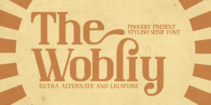 Wobliy is a classy serif font that has its own unique style & modern look. This typeface is perfect for an elegant & luxury logo, book or movie title design, fashion brand, magazine, clothes, lettering, quotes, and so much more.
 - Party Mush by PizzaDude.dk,
$20.00You can't take anything for granted when it comes to the Party Mush font - every single letter has got its own personality...and madness! This is a font that will definately kick those party invitations the right way! - Giamatti by Febri Creative,
$10.00 Giamatti is a handwritten font made with its own uniqueness. Unique, beautiful, simple font but looks elegant and professional. This font is perfect for use as logos, signatures, product names, company names, brands, promotional adverts, and much more.
 - Heralen Antelik by Letterena Studios,
$17.00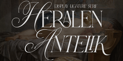 A serif modern and classic typeface that has its own unique style & modern look. This typeface is perfect for an elegant & luxury logo, book or movie title design, fashion brand, magazine, clothes, lettering, quotes, and so much more.
 - Shutter Stone by Sarid Ezra,
$13.00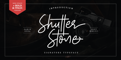 Introducing, Shutter Stone. Another Signature Script Font for you! Shutter Stone is handwritten font that contain stylistic alternate, swash, etc to create your own customised signature. This font is also support multi language. Also Support PUA. Thank You!
 - Mechanoid by Studio K,
$45.00 Mechanoid is a machine age font: crisp, clean, bold and unadorned, yet with a distinctive character of its own. As the name suggests it is well suited to engineering or technological themes, yet versatile enough for universal applications.
 - Trelink by Letterena Studios,
$17.00 A serif modern and classic typeface that has its own unique style & modern look. This typeface is perfect for an elegant & luxury logo, book or movie title design, fashion brand, magazine, clothes, lettering, quotes, and so much more.
 - Outspace Fighter by Ditatype,
$29.00 Outspace Fighter is an electrifying game-themed display font designed in uppercase, capturing the essence of futuristic space battles. This font is made in boxy shapes with sharp corners, evoking a sense of strength and precision. Each uppercase letter is meticulously crafted to exude a futuristic aesthetic, mirroring the angular and geometric forms found in the vast expanse of outer space. This design choice gives the font a sleek and modern appeal, perfect for conveying the intensity of space battles. With low-contrast letters, this font places emphasis on the overall form and structure of the font. The subtle differences in stroke width create a balanced and unified visual experience. This design choice ensures legibility while maintaining a cohesive and visually appealing composition, allowing your audience to effortlessly engage with your game-themed designs. You can also enjoy the available features here. Features: Stylistic Sets Multilingual Supports PUA Encoded Numerals and Punctuations Outspace Fighter fits in headlines, logos, posters, titles, branding materials, print media, editorial layouts, website headers, and any other projects. Find out more ways to use this font by taking a look at the font preview. Thanks for purchasing our fonts. Hopefully, you have a great time using our font. Feel free to contact us anytime for further information or when you have trouble with the font. Thanks a lot and happy designing.
 - Maiola by TypeTogether,
$49.00 Being inspired by early Czech type design, Maiola is clearly a contemporary typeface, that is mindful of its historical heritage, implementing old-style features and calligraphic reminiscence, more frankly so in the Italic. Nevertheless, through its personality, it attempts to create a welcoming tension on the page, without shouting too loudly at the reader. It handles its expressive tendencies with care and in doing so increases its usability, with legibility being of great importance. Subtle irregularities of the letterforms enhance furthermore the dynamic spirit and liveliness of the typeface. With the advent of Opentype, allowing for bigger character-sets and better language support, as a natural consequence, Maiola Multiscript covers Latin A, Cyrillic and Greek. Although basically independent from each other, they are, however, designed in the same spirit as the Latin, and harmonize well in multilingual text settings. The update to this beautiful font family includes the addition of over 240 glyphs featuring new ornaments, stylistic alternates, ligatures, superior letters, fractions and more. Furthermore, several glyphs were significantly improved and the kerning was fine tuned for better performance. Originally released in 2005, Maiola was an immediate success. It won the renowned TDC competition in 2004 where it was also recognized as a “judge’s choice”, was part of the touring exhibition e-a-t, and was selected in the Creative Review design competition in 2005.
 - Baritta Script by madjack.font,
$18.00 Baritta is a modern script font made with brushes and ink, thick and irregular lines. It contains the complete set of lowercase, uppercase, alternative, binder, punctuation, numbers, and multilingual support. Get inspiration from the preview above. Baritta is perfect for use in watercolor designs or bold handwriting styles, such as blog headings, branding, t-shirts, weddings, social media, product design, stationery, advertisements, clothing, cover books, business cards, greeting cards, branding, merchandise, invitations and handmade quotes and more. Baritta features alternative OpenType styles, binders and international support for most Western Languages included. To enable the OpenType Stylistic alternative, you need a program that supports OpenType features such as Adobe Illustrator CS, Adobe Indesign & CorelDraw X6-X7, Microsoft Word 2010 or newer versions. How to access all alternative characters using Adobe Illustrator: https://www.youtube.com/watch?v=XzwjMkbB-wQ Baritta is coded with Unicode PUA, which allows full access to all additional characters without having special design software. Mac users can use the Font Book, and Windows users can use the Character Map to view and copy one of the additional characters to paste into your favorite text editor / application. How to access all alternative characters, using Windows Character Map with Photoshop: https://www.youtube.com/watch?v=Go9vacoYmBw If you need help or have questions, please let me know. I am happy to help :) Thank you & Happy Designing!
 - Mashq by Arabetics,
$29.00 The Mashq script is the oldest documented Arabic Jazm calligraphy style. It was invented by the early Muslims in the Arabian cities of Mecca and Medina, exclusively for writing the Quran and other Islamic religious texts. The Mashq style employed complex ligature and multi-level baseline rules, and therefore it went through a continuous simplification process. Around the time period Mashq was developed, the early Arab Muslims experimented with another short-lived Mashq-like style with heavily slanted vertical stems, which closely resembled the common Ḥijazi style. This style is commonly referred to as the Ma’il (slanted) style. Eventually, the early complex Mashq style was replaced as the main Islamic Arabic script, by a more simplified Mashq-derived calligraphy style that was developed in the city of Kufa, modern day Iraq, which was commonly referred to as Kufi. The Kufic style became the official Arabic script style for centuries before it was replaced by the more developed Naskh, the modern Arabic script style used today. The Mashq font family by Arabetics includes three styles of Mashq. The first is Mashq regular, which closely follows the script style of Musḥaf ‘Uthman (currently displayed in the Topkapi Museum in Turkey) with only the initial and final Haa’ baselines shifting. The second is Mashq Maail, which emphasizes the features of the Ma’il style shared with Mashq. The third is Mashq Kufi, which closely follows the script style in an adequate sample from the Quran manuscripts of the Bergstraesser Archive. All three fonts include two styles, with and without Tashkeel (dots). The Mashq and Mashq Kufi fonts include two more styles, with and without Harakat (soft vowels), and Hamza. Only three soft vowels are implemented along with their Tanween (double) forms. The Sukoon vowel is the default shape before inserting a soft vowel. Hamza was treated as a vowel in the Mashq and early Kufi manuscripts. Kashida is a zero width character. In the Mashq fonts, inserting one Kashida before the final ‘Ayn glyph group will trigger alternative shapes. In the Mashq Kufi fonts, inserting one Kashida (or two) before the final Yaa’, ‘Ayn, and Ḥaa’ glyph groups will trigger alternative shapes. The Mashq font family by Arabetics was designed to be as compatible as possible with the Arabic keyboard and Unicode alphabet used in computers today. Calligraphic variations were implemented only when they marked significant and permanent script features.
 - Deception by Typodermic,
$11.95 Introducing Deception—the sub-pixel typeface that’s about to blow your mind! With ten captivating effects, this font is a must-have for anyone looking to create unique and eye-catching designs. Deception Array is the perfect choice for modern architectural themes, with wide blocks reminiscent of a digital VU meter. Deception Bars gives your text a mesmerizing look, like it’s being viewed through lenticular glass. Deception Blocks approximates the heavy JPEG degradation and pixel sharpening glitch effects that are all the rage right now. Looking for something flashy and prestigious? Try Deception Diamonds with a glow effect. Deception Lines can produce a grayscale effect or banding depending on resolution and rendering type, so keep experimenting to see what works best for you. Deception Particles echoes the look of impact printers or laser-etched sell-by dates, giving your text a vintage feel. Deception Plusses radiates positivity with its energetic design. Deception Process simulates grayscale LCD text or a thermal printer on the fritz, perfect for creating a unique and edgy look. Deception Scanline duplicates the appearance of television picture tube text rendering, ideal for recreating a videogame or retro computing vibe. And if you’re feeling daring, Deception System smacks of 1-bit dithering gone completely haywire! Each style of Deception is available in Regular and Bold, with OpenType fractions, numeric ordinals, and plenty of currency symbols included. So what are you waiting for? Try out Deception today and take your designs to the next level! Most Latin-based European writing systems are supported, including the following languages. Afaan Oromo, Afar, Afrikaans, Albanian, Alsatian, Aromanian, Aymara, Bashkir (Latin), Basque, Belarusian (Latin), Bemba, Bikol, Bosnian, Breton, Cape Verdean, Creole, Catalan, Cebuano, Chamorro, Chavacano, Chichewa, Crimean Tatar (Latin), Croatian, Czech, Danish, Dawan, Dholuo, Dutch, English, Estonian, Faroese, Fijian, Filipino, Finnish, French, Frisian, Friulian, Gagauz (Latin), Galician, Ganda, Genoese, German, Greenlandic, Guadeloupean Creole, Haitian Creole, Hawaiian, Hiligaynon, Hungarian, Icelandic, Ilocano, Indonesian, Irish, Italian, Jamaican, Kaqchikel, Karakalpak (Latin), Kashubian, Kikongo, Kinyarwanda, Kirundi, Kurdish (Latin), Latvian, Lithuanian, Lombard, Low Saxon, Luxembourgish, Maasai, Makhuwa, Malay, Maltese, Māori, Moldovan, Montenegrin, Ndebele, Neapolitan, Norwegian, Novial, Occitan, Ossetian (Latin), Papiamento, Piedmontese, Polish, Portuguese, Quechua, Rarotongan, Romanian, Romansh, Sami, Sango, Saramaccan, Sardinian, Scottish Gaelic, Serbian (Latin), Shona, Sicilian, Silesian, Slovak, Slovenian, Somali, Sorbian, Sotho, Spanish, Swahili, Swazi, Swedish, Tagalog, Tahitian, Tetum, Tongan, Tshiluba, Tsonga, Tswana, Tumbuka, Turkish, Turkmen (Latin), Tuvaluan, Uzbek (Latin), Venetian, Vepsian, Võro, Walloon, Waray-Waray, Wayuu, Welsh, Wolof, Xhosa, Yapese, Zapotec Zulu and Zuni.
 - Madriz by SilverStag,
$14.00 Introducing Madriz, a slab serif font with a retro feel that's perfect for any project that needs a touch of old-school charm. With over 32 fonts in one font family, Madriz offers a wide range of styles to suit any need. You can choose from Thin to Black weights and Regular to Extra Expanded widths to create your perfect look. Madriz is inspired by the old-school signage of Madrid, Spain. The name "Madriz" is actually the affectionate nickname that Madrileños, the people of Madrid, gave to their city. The font's bold, blocky letters capture the essence of Madrid's vibrant and historic streets. Madriz's versatile nature makes it a great choice for a wide range of projects. Its bold, retro style is perfect for showcasing heritage brands or giving a modern touch to classic designs. Madriz can also be used to create a sense of nostalgia, making it ideal for retro-themed projects or campaigns. Here are some of the ways you can use Madriz: Titles and headings: Madriz's bold, eye-catching style is perfect for titles and headings. Text blocks: Madriz's wide range of weights and widths makes it suitable for text blocks, from body copy to large paragraphs. Logos and branding: Madriz's retro charm makes it a great choice for logos and branding. With its 32 font styles and support for over 90 languages, Madriz is an incredibly powerful tool for any designer. It can be used to create a variety of looks, from classic and elegant to modern and edgy. Whether you're working on a print project, a web design, or an app, Madriz has the potential to make a lasting impression. Madriz is the perfect font for anyone who wants to add a touch of old-school charm to their designs. With its wide range of styles and features, Madriz is sure to make a statement in any project. Would you like to get 5 completely free fonts worth over $75? No tricks, no hidden words, terms or anything. Just subscribe to my newsletter, make sure to check your email to approve the subscription, add me to your contacts so that the emails don't end up in spam folder and you will get 5 fonts for free. The fonts are packed with alternates, ligatures and some even come with extra goodies. Happy creating everyone!
 - Tandelle by Typodermic,
$11.95 Welcome to the world of Tandelle—a sans-serif typeface with a unique flavor that will make your designs stand out. Tandelle was designed with a specific purpose in mind: to operate efficiently when there is a limited amount of horizontal space available. Its narrow letterforms are perfect for headlines, captions, and other types of text where space is at a premium. What sets Tandelle apart from other sans-serif typefaces is its flat points on verticals such as “A” and sharp points on horizontals such as “Z”. These distinctive features add a touch of sophistication and elegance to your designs, making them visually appealing and easy to read. Tandelle’s spacious shapes and minimal detail make it simple to read despite its narrowness. The typeface’s clean lines and modern design lend themselves to a wide range of applications, from branding and advertising to packaging and web design. Tandelle comes in four styles: Regular, Italic, Bold, and Bold-Italic. Whether you’re looking for a subtle accent or a bold statement, Tandelle has you covered. With its narrow letterforms and unique flavor, Tandelle is the perfect choice for any project that requires a touch of sophistication and style. So why settle for ordinary when you can have extraordinary? Try Tandelle today and see the difference for yourself. Most Latin-based European writing systems are supported, including the following languages. Afaan Oromo, Afar, Afrikaans, Albanian, Alsatian, Aromanian, Aymara, Bashkir (Latin), Basque, Belarusian (Latin), Bemba, Bikol, Bosnian, Breton, Cape Verdean, Creole, Catalan, Cebuano, Chamorro, Chavacano, Chichewa, Crimean Tatar (Latin), Croatian, Czech, Danish, Dawan, Dholuo, Dutch, English, Estonian, Faroese, Fijian, Filipino, Finnish, French, Frisian, Friulian, Gagauz (Latin), Galician, Ganda, Genoese, German, Greenlandic, Guadeloupean Creole, Haitian Creole, Hawaiian, Hiligaynon, Hungarian, Icelandic, Ilocano, Indonesian, Irish, Italian, Jamaican, Kaqchikel, Karakalpak (Latin), Kashubian, Kikongo, Kinyarwanda, Kirundi, Kurdish (Latin), Latvian, Lithuanian, Lombard, Low Saxon, Luxembourgish, Maasai, Makhuwa, Malay, Maltese, Māori, Moldovan, Montenegrin, Ndebele, Neapolitan, Norwegian, Novial, Occitan, Ossetian (Latin), Papiamento, Piedmontese, Polish, Portuguese, Quechua, Rarotongan, Romanian, Romansh, Sami, Sango, Saramaccan, Sardinian, Scottish Gaelic, Serbian (Latin), Shona, Sicilian, Silesian, Slovak, Slovenian, Somali, Sorbian, Sotho, Spanish, Swahili, Swazi, Swedish, Tagalog, Tahitian, Tetum, Tongan, Tshiluba, Tsonga, Tswana, Tumbuka, Turkish, Turkmen (Latin), Tuvaluan, Uzbek (Latin), Venetian, Vepsian, Võro, Walloon, Waray-Waray, Wayuu, Welsh, Wolof, Xhosa, Yapese, Zapotec Zulu and Zuni.
 - Postea by TypeTogether,
$47.00 The Postea font family is Veronika Burian and José Scaglione’s take on German geometric typefaces, reshaped with the right attributes for setting paragraphs and headings, and perfect for branding and text use. Some typefaces are a rough tool, like a pumice rock: abrasive to the senses, unforgiving, and unhelpful for most reading situations. Postea is an obsidian: smooth and classy, with attractive nuances in any light. The classic curves and purposeful details keep its individuality intact while allowing it to fit an incredible range of geometric font needs. Because of these qualities, Postea makes normal reading in paragraphs a cinch and your branding memorable. Compared to midcentury attributes of restraint and a sparse appearance, Postea’s deliberate play between character widths injects life and distinctiveness into its personality. The default ‘t, f’ have lyrical doses akin to a robust evening drink and are rounded out with a serpentine ‘s’ and rotund ‘o, g, b’. Another nice surprise awaits: spacing for the Hairline weight is tighter for optimal use in large headings and titles, while the regular weights have the expected, slightly looser spacing for text. Setting the test word ‘bogarts’ brings all this together nicely, invoking a balance between a constructed and human feel while brushing away the dust from a century of derivatives. Postea is opinionated and its modern stylistic sets allow it to be accommodating with softer, specially-designed alternative characters. SS01 replaces ‘b, f, M, m, t’, while SS02 changes only the lowercase ‘a’ to the round style, and SS03 swaps out the angled ‘y’ for a straight version. The fourth and sixth stylistic sets are packed with wallpaper-worthy geometric patterns, ornaments, arrows, and symbols aplenty. Postea’s 14 styles (seven upright and italic) and two variable fonts are accompanied by an all-new family of icons in three weights, which we developed a new, easy way to activate. Simply bookend the desired icon name with colons (:arrowUp: :chargingStation: :aid: :firstAid:), making sure to capitalise each word after the first word, then highlight and activate SS05. Icons include wayfinding, social interface, sanitary precautions like face masks, thermometers, and hand washing, and much more. Postea is resilient in the number of ways the family can be used, and its recognisable characters make it a prime selection for branding, signage, corporate typefaces, and magazines. Beginning with midcentury virtues, Postea is the rational response for text — a lyrical take on geometric sans serifs.
 - Hildegard by Linotype,
$29.99Hildegard is a sans serif text face that works well in both larger and smaller point sizes. On close inspection, one will discover a world of subtle angle variation within the letters' structure that is loosely inspired the stroke movements one uses in calligraphy. These built-up strokes create visible ink traps at many joints, which in smaller sizes play a functional as well as an aesthetic role. The Hildegard typefaces received one of several awards in the 2003 International Type Design Contest, sponsored by Linotype GmbH. - Tabac Big Glam by Suitcase Type Foundry,
$39.00 Tabac Big Glam probably stretches the Tabac super-family’s boundaries the furthest. While it’s based on the serif version, it achieves an especially surgical cleanliness and extremely sharp typesetting by completely letting the serifs go. Despite this, the text isn’t boring for a moment — the angled cut of the stems on b, d, h, k, l, the open loop on g or the rounded variant of the italic y, which can be called by turning on the stylistic set, reliably banishes any suspicions of the letters’ monotony.
 - Tabloid Dot M by Nadyr Rakhimov,
$10.00 TabloidDot M is a simple monospace font created for a small project. It had one task, to imitate the inscriptions on the electronic scoreboard in the form of dots arranged on a grid. As time went on I decided to make an extended version of the font with alternate letters and more styles, plus a variable font to control the size of the dots. The font has 6 stylistic sets, Proportional and Old-style figures, Ornaments, a set of Arrows, Currency Symbols, and supports Extended Cyrillic.
 - Shmulkas by Fontsoon,
$9.00 Nu?! Vhat else vould you font?! Introduction to the first kosher vant...er...font! Yes, our Board certified rabbis made all the proper blessings so you can use this font guilt free. Just kidding, what's Jewish without a schmear of guilt. This font borrows its style from the 2nd. Avenue Deli all the way down to Guss Pickles on Essex street. If pastrami on white bread with ketchup is for you, this font is NOT. Its strictly pastrami on rye with mustard and slaw on the side.
 - Mr Palker Dadson by Letterhead Studio-YG,
$35.00 Mr Palker Dadson — has appeared in a natural evolution of the Palker-Palkerson family. Its closest relative - burly slab serif Mr Palker Dad. This generation is more stout than the previous one. One may even be brave enough to use them for composing small texts. Notably Mr Parker Dad has become one of the frequently sold typefaces on the «Peterburg. The city speaks» map as it is highly readable while remaining extremely tight. Mr Parker Dadson has all the features of P&P’s family.
 - Chop Chop PB by Pink Broccoli,
$19.00 Inspired by an old matchbook which read: "Chop Suey: Finest Chinese and American Cooking". Chop Chop recreates that matchbook printed feel with soft rounded edges on what one would normally expect to be a sharp and pointy typeface. The typeface has two versions of each capital form, one in the capitals and one in the lowercase positions. The Contextual Alternates feature auto-magically swaps every other character with the alternative version allowing you to easily type you message, while creating a little diversity as well.
