10,000 search results
(0.038 seconds)
- Sidesakey by Aminmario Studio,
$20.00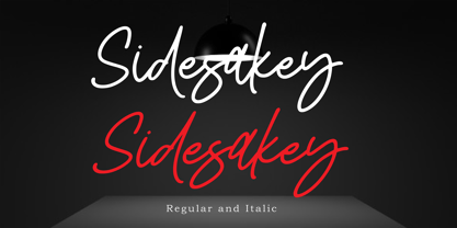 Sidesakey simplifies elegance into one truly stunning handwritten font. With its relaxed feel, Sidesakey is incredibly versatile, suitable to each of the design projects you may have in mind! Use it to create beautiful greeting cards, wedding invitations, logos, website titles and much more! Comes in Regular and Italic styles. Thank you for your purchase! Hope you enjoy with our font
 - Alexer Pro by NicolassFonts,
$35.00 Alexer Pro is a modern font family based on Alexer font family. Language support: Latin (including Vietnamese), Cyrillic, and Greek. It comes in 12 weights, 6 uprights, and matching italics. Each weight includes 1300 glyphs, alternates (G,I,t), and OpenType features. This family is ideally suited for packaging, headlines, advertising, and corporate identities. Perfectly for web, signage, and editorial design.
 - Miller Display by Carter & Cone Type Inc.,
$35.00 Miller, designed by Matthew Carter, is a “Scotch Roman,” a class of sturdy, general purpose types of Scottish origin, widely used in the US in the last century, but neglected since & overdue for revival. Miller is faithful to the Scotch style though not to any one historical example — and authentic in having both roman & italic small caps, a feature of the originals.
 - Rogue Sans Nova by Device,
$39.00 Originally commissioned by magazine publisher IPC, Rogue has proved to be one of the most popular Device releases. Now extended and updated as Rogue Nova, it sports additional weights, East European language support and reengineered spacing and kerning. It is now a versatile 30-font family, with five weights and three widths, all with italics. Powerful and authoritative, sharp-edged and contemporary.
 - Queensberry by Talbot Type,
$17.00 Queensberry is a contemporary take on the classic, Egyptian slab-serif style. It is a highly legible text font and an elegant display font at larger sizes. Its versatility is further enhanced by the free-flowing, bespoke italic, which is loaded with personality. Queensberry is available in a full family of five weights and includes a full range of accented characters.
 - Artegra Soft by Artegra,
$29.00 Artegra Soft is the round cornered addition to the Artegra superfamily. It's based on the perfectionist geometric forms of Artegra Sans, all the glyphs are softened with round corners with manual corrections to the soft edges. The family has 54 fonts in condensed, normal and extended widths, 9 weights per width with matching true italics to achieve the upmost versatility.
 - Wanwan by Jipatype,
$30.00 ฟอนต์วันวาน อักษรแบบตัวเขียนอ้างอิงจากสไตล์การเขียนแบบพู่กันให้ความรู้สึกพริ้วไหว มีสไตล์ให้เลือกใช้ 9 สไตล์ตเป็นตัวเอียงทั้งหมด และเพิ่มความน่าสนใจด้วยการไฮไลท์ตัวอักษรที่ต้องการจากนั้นเปิดใช้งาน Stylistic Set 01-09 (ss01-09) หรือ Access All Alternates (aalt) จะมีป็อปอัพเด่งขึ้นมาให้เลือกอักษรทางเลือกอื่นๆ ฟอนต์วันวาน เหมาะสำหรับการผาดหัว ข้อความสั่นๆ หรือจัดวางเป็นกลุ่มคำสั่นๆ - Wanwan, a calligraphy font based on a brush writing style. There are 9 styles with italic. Comes with Stylistic Set 01-09 (ss01-09) or Access All Alternates (aalt). Wanwan suitable for headline wedding cards and other graphic work.
 - Saj JY by JY&A,
$39.00 Designed by Jure Stojan, JY Saj is a typeface family that successfully balances the artistic and the conventional. With 10 weights (UltraThin to ExtraBold, with italic complements), it works at a variety of sizes, in print and on screen. There are both oldstyle and lining figures, the rupee symbol is supported, and roughly 3,500 kerning pairs were added per font.
 - Sincerity by Océane Moutot,
$32.90 Sincerity is an elegant and strong typeface identified by its high contrast, its sharp shapes and triangular serifs. Inspired by the Didone style, Sincerity adds modernity and some unique features to it. It offers a large choice of uses, from titles of magazines to newspapers, logotypes and so on. Sincerity is available in 16 styles, from thin to black in roman and italic.
 - Ciabatta by Sudtipos,
$39.00 Ciabatta is a luscious font made especially for packaging. Thanks to 5 weights, it can be used for all eventualities; powerful in headlines or as lettering, yet very legible in small texts. Its shapes are slightly narrow and based on classical italics but Ciabatta includes alternates with a double-storey ‘a’ and ‘g’ which offer a more formal appearance upright.
 - Battleslab by Kostic,
$40.00 Battleslab is a slab serif made for setting few words in large sizes. Two heavily contrasted weights work well when combined, with its mono-line wide light and heavy black it is perfect for making that "one-two punch" in headlines or logotypes. Display oriented Battleslab derived from Battlefin Family (which is much more comprehensive with its ligatures, italics and SC).
 - Lovelove by Aminmario Studio,
$20.00 Introducing Lovelove Font Lovelove is a lovely script font. Its charm makes it appear wonderfully, readable, and, ultimately, incredibly versatile. Comes in Regular and Italic styles. Equipped with beginning and ending love tail. This font will look outstanding in any context, whether it’s being used on busy backgrounds or as a standalone headline! Thank you for the purchase. Happy creating design :)
 - Cerita Cinta by Aminmario Studio,
$20.00 Introducing Cerita Cinta Font Cerita Cinta is a casual handwriting font. Its charm makes it appear wonderfully, readable, and, ultimately, incredibly versatile. Comes in Regular and Italic styles. Equipped with beginning and ending tail. This font will look outstanding in any context, whether it’s being used on busy backgrounds or as a standalone headline! Thank you for the purchase. Happy creating design :)
 - Viory by Sign Studio,
$15.00 Viory is a versatile font family. There are 7 thicknesses that match the italic version. They will complement each other to support your design. Equipped with Stylistic Set, Discretionary Ligature and Alternative Character features. Viory has a smooth shape because the pressure on each curve has been adjusted to the ideal. The impression of an elegant and classic is in this family.
 - Haarlemmer by Monotype,
$29.00 Haarlemmer is a recreation of a never-produced Jan Van Krimpen typeface that goes one step beyond authentic: it shows how he wanted it to be designed in the first place. The original, drawn in the late 1930s, was created for the Dutch Society for the Art of Printing and Books and was to be used to set a new edition of the Bible, using Monotype typesetting. Hence the problem: fonts for metal typesetting machines like the Linotype and Monotype had to be created within a crude system of predetermined character width values. Every letter had to fit within and have its spacing determined by a grid of only 18 units. Often, the italic characters had to share the same widths as those in the roman design. Van Krimpen believed this severely impaired the design process. The invasion of Holland in World War II halted all work on the Bible project, and the original Haarlemmer never went into production. Flash forward about sixty years. Frank E. Blokland, of The Dutch Type Library, wanted to revive the original Haarlemmer, but this time as Van Krimpen would have intended. Blokland reinterpreted the original drawings and created a typeface that matched, as much as possible, Van Krimpen's initial concept. While Van Krimpen's hand could no longer be on the tiller, a thorough study of his work made up for his absence. The result is an exceptional text family of three weights, with complementary italic designs and a full suite of small caps and old style figures. Van Krimpen would be proud.
 - Petrov Sans by Fontfabric,
$35.00 Petrov Sans Font Family is a font with a geometric approach that is out of this world. Featuring 9 uprights and 9 italics, Petrov Sans Font Family is a versatile typeface that will elevate any design project. Developed by the talented type designer Asen Petrov, finished by our own Stefan Yatanski and with the support of the CEO of Fontfabric – Svet Simov, Petrov Sans is the perfect blend of tradition and innovation.
 - Troia by Ahmet Altun,
$10.00 Troia Font Family comes in three weights; normal and italic. In addition, with rounded corners, each weight has its own smoother version. Thanks to its large letters and added spaces between the letters, this font can be used to get perfect results and create great works such as web typography, banners, logos, texts, t-shirts and printings, and also presentations. Troia's eye-pleasing and nice-looking style makes writing much more pleasant.
 - ZT Klotin by Khaiuns,
$14.00 ZT Klotin is a serif display font characterized by a strong, Classic vibe, with straps, special alternate glyphs, and soft Curves. Perfect for branding, weddings, social media, product design, stationery, and advertising. ZT Klotin is flexible enough to add these classic elements to almost any project requiring a special class touch. ZT Klotin features over 178 unique ligature and alternatives, ZT Klotin is crafted to be Soft and interwoven to create a stunning display of its subtle hypnotic curves, making it the perfect choice for impactful editorial layouts and bold Bold creations. FEATURE — 644 Glyphs — Uppercase & lowercase letters, numbers — Old-style figure — 40 Discretionary Ligatures & Standard Ligatures, — 178 Alternatives (Uppercase & Lowercase) — Symbols, punctuation marks I hope you have fun using ZT Klotin Thanks for using this font ~ Khaiuns X zelowtype
 - SEISDEDOS DEAD - Personal use only

- Celan by Craft Supply Co,
$20.00 Introduction to Celan Bold Serif Font The Celan – Bold Serif font stands out with its robust and masculine appearance. It features thick, strong lines and minimal white space. This design choice gives it a dominant presence, making it ideal for impactful titles. Characteristics of the Font Celan is characterized by its bold, assertive strokes. The limited white space between letters enhances its solidity. This quality makes the font appear more masculine and forceful. Its serif design adds a touch of classic elegance. Ideal Uses of Celan – Bold Serif This font is perfect for powerful titles that need to command attention. Its boldness makes it suitable for headers in various mediums like posters, websites, and magazines. The strong character of the font conveys confidence and authority.
 - Civane by insigne,
$- High atop the mountain of fonts, a new structure has been raised--one solid and strong against the challenges of time. Civane is a victorious conqueror among fonts, standing above the clutter and the mundane. Its firm structure joins effortlessly with graceful calligraphy in a new flowing, inscriptional typeface. Civane is inspired by monuments of great civilizations, whose lofty inscriptions remain chiseled into the very stones and columns of their structures. The font’s medium contrast with its flared stroke ends lead the reader to feel the solemn presence found in these great obelisks and shrines. Even Civane’s thinnest weight holds a quiet power over its audience. Still, its classic lines provide a beautiful flow between the strong letters, allowing the reader’s eye to move easily across the page. Civane supports OpenType features and comes with upright italics, alternates, ligatures, old-fashioned figures, titling and small caps. Preview all these features in the interactive PDF manual. The font family has 48 fonts, with three widths and eight weights. The font family also includes glyphs for 72 languages; over 550 glyphs per font stand ready for you to command throughout your design. Civane is built for advertising and display typesetting as well as title and small text, making it an excellent choice for websites as well as flyers and packaging. Use it for defining your brand or for creating designs that evoke academia, militaria, monuments, automobiles, signs, and so on. Its 48 well-designed fonts are well-equipped to help you leave your mark on history. Production assistance from Lucas Azevedo and ikern.
 - Xyngia by ROHH,
$40.00 Xyngia is a professional modern sans serif typeface. Thanks to its excellent legibility it is a great choice both for on-screen use as well as print purposes. Xyngia is designed for use in long and short paragraphs of text, headlines and user interfaces. Its design nuances gives it distinctive character making it an interesting option for brand identification and logo design. Xyngia consists of 22 fonts - 11 weights and their corresponding italics. It has extended language support (over 1000 glyphs) and true italics, as well as broad number of OpenType features, such as small caps, case sensitive forms, standard and discretionary ligatures, stylistic sets, contextual alternates, lining, oldstyle, tabular and small cap figures, slashed zero, fractions, superscript and subscript, ordinals, currencies and symbols.
 - Gaultier by Borutta Group,
$39.00 Gaultier is the result of over 5 years of work on a typeface inspired by my favourite creators in European typography – Claude Garamond, Robert Granjon and Eric Gill. The main idea of the project was to create a sans-serif antiqua with all features reserved for serif typefaces. In addition to the rich set of characters, Neuropa includes: Small Caps, Superscript, Subscript, Ligatures, Discretionary Ligatures, Contextual Alternates, Swash Variants and 5 different styles of digits. Upright styles with delicate contrast corresponds with the expressive form of italics inspired by Granjon italic construction. Gaultier will work wherever we want to emphasize modernity without forgetting tradition. The sharp character of the whole family is perfect for longer texts, visual communications and branding purposes.
 - Gyst Variable by phospho,
$90.00 Gyst is a neo-humanist sans-serif typeface that artfully blends the principles of Grotesque and Antiqua. With its classic uprights and the serifs in its true italics, Gyst spans the arc from a modern humanistic sans serif to a captivating calligraphic serif. Contrasting strokes and luscious, on the other hand razor-edged terminals reflect a sense of grace, thriving at the intersection of geometric precision and flourishing sophistication. Made for body text as well a s display use. In any situation, you will find the autonomous cursive posture to be a perfect playmate for the upright. Gyst Variable is a TTF Variable Font with a weight axis and a whole lot Alternates and Ligatures. Gyst is also available in four static upright and italic weights.
 - Le Monde Livre Std by Typofonderie,
$59.00 A text face in 4 styles Before the arrival of Phototypesetting, each font size had a specific design. Le Monde Livre, designed by Jean François Porchez, along with Le Monde Journal re-establishes this practice. When Le Monde Journal was developed specifically for use at small point sizes (below 10 points.) Le Monde Livre works beautifully for book typography, magazine settings. In comparison to the italics in Le Monde Journal, Le Monde Livre’s italics are of a totally different design, closer to the models of the Renaissance. The families match well together on the same page, Le Monde Journal for small sizes settings, Le Monde Livre for large settings. The verticals metrics and proportions of Le Monde Livre are calibrated to match perfectly others Typofonderie families.
 - Isla by Sudtipos,
$39.00 Eugene Grasset, the popular 19th-century Swiss graphic designer, dabbled in a multitude of disciplines such as ceramics, furniture, tapestry, jewelry and stamp design. Known mostly for his commercial posters and illustrations, he left a legacy of design that still fascinates scholars and professionals alike. One of the rarely mentioned Grasset treasures is the italic he designed in 1898 for use in two of his posters. Grasset's italic has an irregular quality that makes it seem much older than it is. It can be a very meaningful face in many contexts, such as map-related design or historical publications. Isla was digitized by Alfredo Graziani and completed by Alejandro Paul, maintaining the utmost respect for its historical flavor. The typeface includes a wealth of ligatures and alternates.
 - Sinkin Sans Narrow by K-Type,
$20.00 Sinkin Sans Narrow is a simple, pleasantly proportioned and easy to read sans-serif, available in all 9 standard web weights, 100 to 900, plus italics, so the face is a comprehensive illustration of the CSS web font numerical scale. Sinkin Sans fonts are designed with tiny, inconspicuous notches that sink into verticals at the intersections of strokes, adding highlights to congested corners. The incisions make right angles appear sharper and improve definition in more intricate characters. Sinkin Sans Narrow inherits the enviable clarity and readability of the luxuriously wide original family. The Narrow typeface, however, is designed to economise on space within busy web pages and has been sensitively condensed for maximum legibility. Each weight of Sinkin Sans Narrow is supplied with a free Italic.
 - Tribunus SG by Spiece Graphics,
$39.00 Warren Chappell was the original designer of this handsome pen-formed roman typeface introduced by the Stempel Foundry in 1939. It was cast in Germany as Trajanus and named after the Roman emperor whose accomplishments are preserved on the Trajan Column in Rome. This version, Tribunus, retains the same rugged but handsome quality of the oldstyle original. A set of italic oldstyle figures are included with the italic roman. Tribunus is also available in the OpenType Std format. Some new characters have been added to this OpenType version. Advanced features currently work in Adobe Creative Suite InDesign, Creative Suite Illustrator, and Quark XPress 7. Check for OpenType advanced feature support in other applications as it gradually becomes available with upgrades.
 - Vanitas Stencil by Reserves,
$49.00 Vanitas Stencil is an elegant high contrast contemporary sans. It is rooted in the style of a classic didone, excluding the typical serifs and ball terminals as well as being designed with a cleaner, more reductionist appearance. Strict attention was given to the cohesiveness and balance between letterforms as well as the careful refinement of all curves. The careful, atypically placed stencil marks complement Vanitas’ refined character, presenting a distinct slant on the average stencil treatment. Stylistically, Vanitas Stencil’s alluring, sophisticated sensibility is directly inspired by high fashion. The upright styles are complemented by a pairing of optically adjusted true italics, which were purposefully adapted to retain the sharpness of their counterparts. Abandoning traditionally executed cursive italic letterforms retains Vanitas Stencil’s distinct characteristic through each style.
 - Vanitha by Arterfak Project,
$18.00 Vanitha is a bold script font, inspired by vintage logos and old-school sign painting. This font is made with hand drawings and still pays attention to the calligraphic form so that it looks modern and unique. Vanitha is a display font, which you can use as logos, logotypes, merchandise, sports themes, flags, banners, stickers, labels, posters, and others. This font is also equipped with stylistic alternates to beautify your typographic design. Thank you for your support!
 - Woodline by Jeff Levine,
$29.00 Most folks might picture wood type lettering as the fancy styles of the 1880s which so perfectly evoked images of the Old West. Occasionally there is an exception to that rule, as an online image of some vintage wood letters with an Art Deco influence inspired a revival as a digital type face. Wood Lined JNL features a bold alphabet with an engraved line throughout the characters, and is available in both regular and oblique versions.
 - Insigma by Pixesia Studio,
$23.00 Introducing Insigma - Modern Decorative Serif Insigma is a bold serif typeface characterized by high contrast and exceptional versatility, exuding elegance and sophistication in any design project. Its subtle vintage nuances add a touch of refined sophistication, making it the perfect choice for headlines, invitations, advertising, and more. With Insigma, designers can create captivating and visually stunning designs that stand out in today's competitive landscape. Its sleek and bold appearance is sure to elevate any project and make a lasting impression on the viewer. FEATURES - Stylistic Alternates - Ligatures - PUA Encoded - Uppercase and Lowercase letters - Numbering and Punctuations - Multilingual Support - Works on PC or Mac - Simple Installation - Support Adobe Illustrator, Adobe Photoshop, Adobe InDesign, also works on Microsoft Word Hope you Like it. Thanks.
 - Cleveden by Greater Albion Typefounders,
$9.50 Cleveden was inspired by some lettering sighted on a neglected and somewhat tarnished brass plaque, affixed to an elderly office building. The elegance and character (somehow playful and formal at the same time) of the letterforms shone through the tarnished state of the plaque. As an aside the brass plaque in question was on the former business premises of a long established firm of accountants. We suspect the ethics of that profession would preclude us identifying which one. Our efforts to identify their engraver have proven unavailing. Cleveden is a family of four typefaces, Regular, Bold, Capitals and Capitals Bold. They are ideal for designs that call for distinctive formality and especially lend themselves to signage, certificates, and -dare it be said- engraved plaques!
 - Prima Sans by Bitstream,
$29.99Prima is a series of fonts designed at Bitstream by Jim Lyles (Sans and Serif) and Sue Zafarana (Sans Mono), released in 1998. The fonts have been tuned to give exceptionally good quality at low screen resolutions. The fonts are therefore suitable for sustained use in browsers and other applications where users read for long periods from the screen. Of course, Prima looks great printed out too. - Prima Serif by Bitstream,
$29.99Prima is a series of fonts designed at Bitstream by Jim Lyles (Sans and Serif) and Sue Zafarana (Sans Mono), released in 1998. The fonts have been tuned to give exceptionally good quality at low screen resolutions. The fonts are therefore suitable for sustained use in browsers and other applications where users read for long periods from the screen. Of course, Prima looks great printed out too. - Karika Hypnotica by Deniart Systems,
$20.00 Karika Hypnotica is the 4th volume in the Karika series of swirly circular symbols. The 52 original designs feature hypnotic motifs in circular symmatrical forms. A splendid addition to any illustration or design project such as backgrounds, greeting cards, posters, etc. Karika Hypnotica's characters are symmetrically sized in height and width so they'll work charmingly together with our Karika Hearts , Karika Swirls and Karika Encore symbol fonts.
 - Karika Encore by Deniart Systems,
$20.00 Karika Encore is the 3rd volume in the Karika series of swirly circular symbols. The 52 original designs feature floral and musical motifs in circular symmatrical forms. A splendid addition to any illustration or design project such as backgrounds, greeting cards, posters, etc. Karika Encore's characters are symmetrically sized in height and width so they'll work charmingly together with our Karika Hearts and Karika Swirls symbol fonts.
 - John Alden NF by Nick's Fonts,
$10.00The ATF syndicate released the inspiration for this quaint charmer in its 1884-1885 series of specimen books under its current name. Its warmth and unassuming naivete make it perfect for headlines seeking to evoke simpler times. Both versions of this font include the complete Latin 1252, Central European 1250 and Turkish 1254 character sets, along with localization for Lithuanian, Moldovan, Romanian and Turkish. - Sheldrake JNL by Jeff Levine,
$29.00 Sheldrake JNL is the second in a series of display fonts modeled from actual water-applied decals that were manufactured by the Duro Decal Company of Chicago (now Duro Art Industries). The font's name derives from the actual phone exchange for Duro, back in the days when a telephone listing had a name-number assignment for recognition. In this case, their number began as "SH(eldrake)-3".
 - Gravity by Philatype,
$24.00 The Gravity family is a unique series of heavy square slab serifs intended mainly for display usage. Gravity Normal exhibits impact with legibility. Gravity Nova is fine-tuned to showcase brawn and beauty. Gravity Supernova, the most audacious of the family, commands attention with its extremely dense, mechanical design. Each weight includes diacritics for Western and Central European languages and is tightly spaced for maximum impact.
