10,000 search results
(0.044 seconds)
- Catalpa by TypeTogether,
$35.00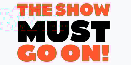 The Catalpa font family is José Scaglione and Veronika Burian’s wood type inspired design for an overwhelming headline presence. It has no regular weights, only four slender and four hulking weights. Catalpa wasn’t made to be normal; it was made to overwhelm, to stand out, to bellow. Catalpa is the first font family within a trilogy that will be released through 2020. Each of the three have a distinct purpose and their own look, but they serve a common goal: to act as a complete family covering an editorial’s wide array of needs. As the first of the three, Catalpa is the bookend font family with a headlining purpose. What requirements are there for a great headline typeface? Distinction, weight, and cohesiveness are a good start. Its distinctiveness must catch attention, it must have a range of weights applicable to its purpose, and its internal consistency and external look must create a cohesive family. Catalpa is a distinct and unified family whose weights are attuned to its single-minded purpose — headlines and large text. Catalpa has only eight styles that are divided into two ranges of weights — four very light weights (Hairline, Thin, Extralight, and Light ) and four very bold ones (Extrabold, Heavy, Black, and Extrablack). The thin and heavy ends of the spectrum also have their own variable fonts, each with one axis of weight so designers can fine-tune their work. The geometric influence of the design is more obvious in the light range, with their line thickness increasing in the classical manner. The bold weights increase more in width and substance to serve well in websites, mobile apps, posters, advertisements, and magazines that aim for impact more than spreading information. As a family, Catalpa gels in big headlines, short sentences, and isolated words. The family has many recognizable features, in the bolder weights especially, like the reversed contrast ‘S, s’ or the angular design of ‘Q, M, W, w, a, f, 2, 3’. Catalpa’s headlining mixture of geometry and quirkiness leaves an impression that is so characteristic of wood type, but designed for substrates and screens.
 - Shredded - Unknown license

- Scream - Unknown license

- DelitschAntiqua - Unknown license

- Greex - Unknown license

- Roman Acid - Unknown license

- Snail n Ink - Unknown license

- Malaga Pro by SoftMaker,
$9.99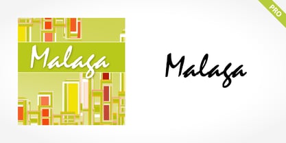 Malaga Pro is one of the fonts of the SoftMaker font library.
 - Soledad Pro by SoftMaker,
$9.99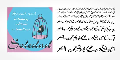 Soledad Pro is one of the fonts of the SoftMaker font library.
 - Balloon Pro by SoftMaker,
$14.99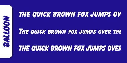 Balloon Pro is one of the fonts of the SoftMaker font library.
 - Casual Pro by SoftMaker,
$9.99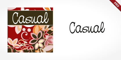 Casual Pro is one of the fonts of the SoftMaker font library.
 - Powers Of Marduk by Deniart Systems,
$15.00Based on the seals of the Fifty Names to summon the Elders. - Erasmus by Red Rooster Collection,
$45.00Based on the S. H. de Roos design, Amsterdam Foundry circa 1923. - Masterman by Wooden Type Fonts,
$15.00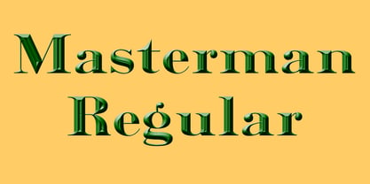 Modern text font based on a Hansen Type Foundry font (circa 1872).
 - Aquarius by Red Rooster Collection,
$45.00Based on the popular VGC typeface designed by Ronald Arnholm in 1972. - Pavane by Scriptorium,
$18.00Pavane is based on the calligraphy of Art Nouveau designer Rudolph Koch. - Parakalein by FSD,
$50.00Outlined techno font designed on the 1990s. Perfect for true expressive artworks - Rudolfo by Scriptorium,
$12.00Rudolfo is based on the calligraphy of Art Nouveau designer Rudolph Koch. - Giulio Pro by SoftMaker,
$9.99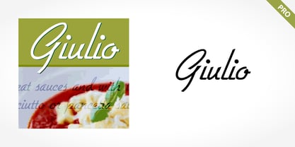 Giulio Pro is one of the fonts of the SoftMaker font library.
 - Elmore Pro by SoftMaker,
$9.99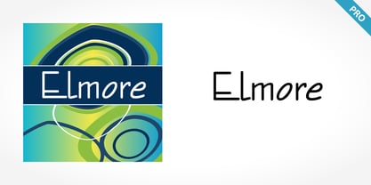 Elmore Pro is one of the fonts of the SoftMaker font library.
 - Pedro Pro by SoftMaker,
$9.99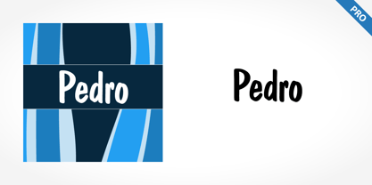 Pedro Pro is one of the fonts of the SoftMaker font library.
 - Somerset Pro by SoftMaker,
$9.99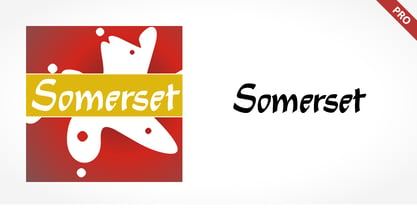 Somerset Pro is one of the fonts of the SoftMaker font library.
 - Altemus Flowers by Altemus Creative,
$11.00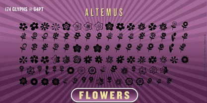 A collection of 174 flower designs based on '50s and '60s textiles.
 - Fratturato Digitale by Funk King,
$10.00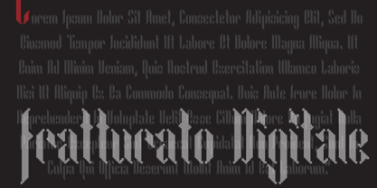 Fratturato Digitale is a contemporary modular take on a fraktur-style font.
 - Bellini by Red Rooster Collection,
$45.00An original design based on Progreso from the Gans foundry circa 1923. - Falcon Pro by SoftMaker,
$9.99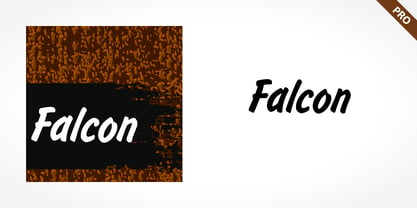 Falcon Pro is one of the fonts of the SoftMaker font library.
 - Bronto Burger by Comicraft,
$19.00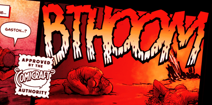 Eight tons of Meat-eating TYRANNOSAURUS REX vs. one Vegetarian BRONTOSAUR? CRUNCHTIME!
 - Platypus by Elemeno,
$15.00The sort of thing you used to see on hand painted signs. - Saint Louis by Red Rooster Collection,
$45.00Based on ‘Players,’ a typeface from English designer Adrian Williams, circa 1976. - Hadoar MF by Masterfont,
$59.00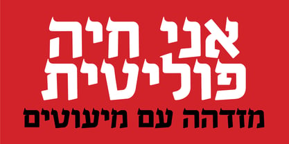 Inspired by hand written letters on a street sign in Tel Aviv
 - Antiqua Pro by SoftMaker,
$14.99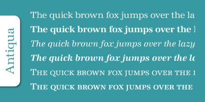 Antiqua Pro is one of the fonts of the SoftMaker font library.
 - Melville Pro by SoftMaker,
$9.99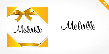 Melville Pro is one of the fonts of the SoftMaker font library.
 - Sterling Pro by SoftMaker,
$9.99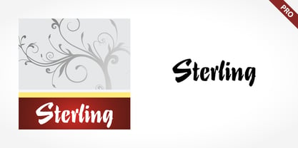 Sterling Pro is one of the fonts of the SoftMaker font library.
 - Smashed Display by Raquel Fernandes,
$17.49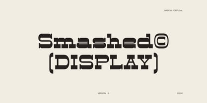 Smashed Typeface is a reversed-contrast, slab serif, display font. Was inspired by the old west days that we can often see in printing, circus posters and wanted notices in western movies, even tho the style was really used in many parts of the world during that period. This style is sometimes called as "circus letter" too. Was designed to have a modern look, using straighter lines and an extended style, can be used on various situations like posters, logos for restaurants, alternative business like an old washing station (as you can see on the next images), music bands etc. I believe that is a promising typography that can be used by various designers in a lot of diverse project. It counts with 226 multi language characters, one weight on version 1.0, on a next version I hope to take this project to another level, creating a variable typeface from condensed to really extended weights. It would complete this typography and eliminate the limits of use.
 - Deco Spring by Ingrimayne Type,
$10.00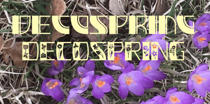 DecoSpring is a decorative art-deco family that was inspired by one word in an advertisement in a 1978 edition of my local newspaper. I could not find a typeface that matched it so decided to create one, which became DecoSpring-Regular. It is caps only, with an alternative set of capitals on the lower-case keys. Characters with very thick stems invite interior decoration and I opted for floral decorations. DecoSpring-Flowers can be used alone or it can be layered on top of the regular style to create colored flowers. Changing the width of the bolder stem resulted in two more style, the light and thing styles. Another set of four styles, the Simple set, was formed by eliminating the split in the stems by merging the two parts. All the DecoSpring faces are display faces to be used in small doses, and especially the bolder ones, at large point sizes.
 - Bennet Display by Lipton Letter Design,
$29.00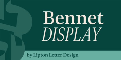 Bennet, Richard Lipton’s spirited serif superfamily, was inspired by Moth Design’s logotype and stationery system for the North Bennet Street School in Boston. Initially modest in concept, Bennet grew to an expansive suite of 96 fonts tuned for editorial use. The three widths of Bennet’s Display and Banner sizes—Regular, Condensed, and Extra Condensed—are ideal for precise fitting of newspaper and magazine headlines. Lipton developed graded text styles for the series, offering users precise variations to help compensate for varying degrees of ink spread on different types of paper stock during the printing process. For example, because of ink absorption, the lightest grade—Bennet Text One—printed on low-quality newsprint stock will have the same gray value as the darkest grade—Bennet Text Four—on superior coated paper. (Bennet Text Two is the default grade and offered here.) Bennet also provides for a stellar reading experience in digital media, its carefully considered details vibrant yet legible on-screen.
 - LTC Garamont by Lanston Type Co.,
$24.95Frederic Goudy joined Lanston as art advisor in 1920. One of his first initiatives was to design a new version of Garamond based on original Garamond designs of 1540. Goudy intended his free-hand drawings to be cut exactly as he had drawn them and fought with the workmen at Lanston to keep them from “correcting” his work. This new type was called Garamont (an acceptable alternate spelling) to distinguish it from other Garamonds on the market. (The other Garamonds on the market at that time were later confirmed to be the work of Jean Jannon.) In 2001, Jim Rimmer digitized Garamont in two weights. The display weight is based on the actual metal outlines to compensate slightly for the ink gain that occurs with letterpress printing. The text weight is a touch heavier and more appropriate for general offset and digital text work. Digital Garamont is available to the public for the first time in 2005. - Banda Nova by Typedepot,
$29.00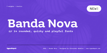 Hold on to your hats, there’s a new orchestra in town - the Banda Nova! Banda Nova is a crowd pleaser, feeling equally at home on the retail shelf as well as on the cover of your favorite magazine. The 7 weights included in the package offer a wide variety of styles, with delicate and elegantly thin weights morphing into cute, bulbous giants sure to bring a smile to anyone’s face. This versatility makes Banda suitable for virtually any design project, including logos, headlines, covers, packaging and more. We took the time to reimagine Banda, removing traces of our youthful naivety and expanding on everything that made it so good in the first place. Our team is proud to welcome back one of our earliest typefaces in a refreshed and much-improved rendition/adaptation, now featuring full Cyrillic support and almost twice the number of original characters. Are you ready to take center stage again? Download: PDF Specimen | Trial Fonts
 - Bennet Text by Lipton Letter Design,
$29.00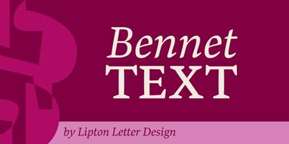 Bennet, Richard Lipton’s spirited serif superfamily, was inspired by Moth Design’s logotype and stationery system for the North Bennet Street School in Boston. Initially modest in concept, Bennet grew to an expansive suite of 96 fonts tuned for editorial use. The three widths of Bennet’s Display and Banner sizes—Regular, Condensed, and Extra Condensed—are ideal for precise fitting of newspaper and magazine headlines. Lipton developed graded text styles for the series, offering users precise variations to help compensate for varying degrees of ink spread on different types of paper stock during the printing process. For example, because of ink absorption, the lightest grade—Bennet Text One—printed on low-quality newsprint stock will have the same gray value as the darkest grade—Bennet Text Four—on superior coated paper. (Bennet Text Two is the default grade and offered here. Additional grades are available upon request.) Bennet also provides for a stellar reading experience in digital media, its carefully considered details vibrant yet legible on-screen.
 - Uniform Rounded by Miller Type Foundry,
$25.99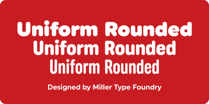 Uniform Rounded is a type family based on the 2014 Miller Type Foundry release, Uniform. This superfamily is comprised of three widths (regular, condensed, and extra condensed) each with six weights. The result is a fun and playful typeface that is extremely versatile and is a great asset for any project on any medium. Uniform Rounded is a multi-width geometric type family designed around the circle. The O of the Regular width is based on a circle, the O of the Condensed width is based on 1.5 circles stacked (with straight sides) and the O of the Extra Condensed width is based on two circles stacked with straight sides as well, and all other characters are derived from this initial concept. This unique idea creates a remarkably fresh type family that bridges the gap between circular geometric typefaces and condensed straight-sided typefaces. Uniform Rounded also includes many opentype features like Old Style Figures, Tabular Lining Figures, Alternate characters, Ligatures and more.


