10,000 search results
(0.109 seconds)
- Once upon a time in the not-so-distant realm of typography, a font with a personality as quirky as its creator's imagination came into the world. Its name? Evereverse, conjured from the creative caul...
- Bratislava by Hanoded,
$15.00 Bratislava is a rounded and elongated art deco typeface, based on several posters from the 1920's. Bratislava is slender and elegant and would look good on packaging and posters.
 - Steamboat by Atlantic Fonts,
$26.00 Steamboat is ready to embark on the next great adventure. Steamboat’s ribbony script has a vintage vibe, but is eager to put a playful twist on whatever comes its way.
 - Record Jacket JNL by Jeff Levine,
$29.00Record Jacket JNL gives an outline treatment to the popular typeface used on record album covers in the 1960s and 1970s, and is based on Jeff Levine's Album Cover JNL. - Wonderful JNL by Jeff Levine,
$29.00 A little bit of thick-and-thin Art Deco hand lettering is offered up in Wonderful JNL, based on some promotional text found on an old piece of sheet music.
 - Letterpress Leftovers JNL by Jeff Levine,
$29.00 Letterpress Leftovers JNL gathers twenty-six vintage letterpress cuts on a variety of themes as well as an attractive wood type border in various positions on the 0-9 keys.
 - Janda Someone Like You by Kimberly Geswein,
$5.00 These playful letters are perfect for any whimsical designs. There are two versions- one with tickmarked tips and one without. Looks great in all caps as well as mixed-case.
 - Shell Shock by Characters Font Foundry,
$17.50 Shell Shock was inspired by stencil typefaces used on military tanks and ammunition boxes. It can be enhanced with a separate set of bombs and warning signs for the typographer in power. Shell Shock Cloak is the ultimate add-on for Shell Shock. This 3-layered 'Cloaking Device' enhances the existing Shell Shock. Put the 3 Cloak layers on top of Shell Shock and suddenly it's camouflaged and you will hardly be able to find it. Use only one extra Cloak layer to give Shell Shock that cool distorted look, like those damaged warsigns on military vehicles. If you only use the Cloak layers you can create background patterns and structures. Try using different color combinations and you'll be surprised by the possibilities of Shell Shock Cloak. It's preferably seen on clothing, skateboards, party flyers, posters or other daring design.
 - Kis Antiqua Now TB Pro by Elsner+Flake,
$99.00 In the course of the re-vitalization of its Typoart typeface inventory, Elsner+Flake decided in 2006 to offer the “Kis Antiqua” by Hildegard Korger, in a re-worked form and with an extended sortiment, as an OpenType Pro-version. After consultation with Hildegard Korger, Elsner+Flake tasked the Leipzig type designer Erhard Kaiser with the execution of the re-design and expansion of the sortiment. Detlef Schäfer writes in “Fotosatzschriften Type-Design+Schrifthersteller”, VEB Fachbuchverlag Leipzig, 1989: No other printing type has ever generated as far-reaching a controversy as this typeface which Jan Tschichold called the most beautiful of all the old Antiqua types. For a long time, it was thought to have been designed by Anton Janson. In 1720 a large number of the original types were displayed in the catalog of the „Ehrhardische Gycery“ (Ehrhardt Typefoundry) in Leipzig. Recently, thanks to the research performed by Beatrice Warde and especially György Haimann, it has been proven unambiguously that the originator of this typeface was Miklós (Nicholas) Tótfalusi Kis (pronounced „Kisch“) who was born in 1650 in the Hungarian town of Tótfal. His calvinistic church had sent him to the Netherlands to oversee the printing of a Hungarian language bible. He studied printing and punch cutting and earned special recognition for his Armenian and Hebrew types. Upon his return to Hungary, an emergency situation forced him to sell several of his matrice sets to the Ehrhardt Typefoundry in Leipzig. In Hungary he printed from his own typefaces, but religious tensions arose between him and one of his church elders. He died at an early age in 1702. The significant characteristics of the “Dutch Antiqua” by Kis are the larger body size, relatively small lower case letters and strong upper case letters, which show clearly defined contrasts in the stroke widths. The “Kis Antiqua” is less elegant than the Garamond, rather somewhat austere in a calvinistic way, but its expression is unique and full of tension. The upper and lower case serifs are only slightly concave, and the upper case O as well as the lower case o have, for the first time, a vertical axis. In the replica, sensitively and respectfully (responsibly) drawn by Hildegard Korger, these characteristics of this pleasantly readable and beautiful face have been well met. For Typoart it was clear that this typeface has to appear under its only true name “Kis Antiqua.” It will be used primarily in book design. Elsner+Flake added two headline weights, which are available as a separate font family Kis Antiqua Now TH Pro Designer: Miklós (Nicholas) Tótfalusi Kis, 1686 Hildegard Korger, 1986-1988 Erhard Kaiser, 2008
 - Preissig Antikva Pro by Storm Type Foundry,
$39.00 This vintage, iconic typeface of original Czech letter-founding has been faithfully revised, extended and newly rendered in 2012. The majority of Vojtěch Preissig’s type faces have been, from their very creation, subject to controversial evaluations which might perhaps fill more pages than have been set in these type faces so far. The considerable technological backwardness of Czech typography between the world wars intensified the author’s creative effort even more. He had been devoting thought to his Antikva type face from 1912 onwards and dozens of hardly perceptible nuances of the same design have been preserved in his drawings. It was his only book type face, but it shows no signs of any hard struggle in creating it. Its extraordinary vividness and elegance are really surprising. It may be still indebted to the forms of Art Nouveau, which was withering away at that time, but its proportions, colour and expression inspire other Czech type designers. Preissig’s Antikva, Menhart’s Figural (and also Růžička’s Fairfield) and Týfa’s Antikva represent a clear line of development, very far away from the soft aesthetics of Tusar, Dyrynk or Brunner. The co-author of the modification for computer composition is Otakar Karlas. Without his experience the work would remain only a shadow of Preissig’s design. Our aim was to produce a large family of type faces for the setting of both books and jobbing works. The digital transcription of Preissig’s Antikva came into existence from summer till winter 1998. The direct model for this type face is the most successful, two-cicero (24 pt.) design dating from 1925. The designs of other sizes (12 pt., 14 pt., 16 pt. and then 36 pt. and 49 pt.) lack vividness and are the source of the widespread mistaken belief that Preissig’s Antikva consists of straight lines. That is, unfortunately, how even Muzika and Menhart describe it. Neither is it a Cubist type face as many of the semi-educated think today. Special attention had to be paid to italics. It is apparent that their design is not as perfect as that of Preissig’s Antikva. In contradistinction to the original we have deleted almost all lower serifs in the lower-case letters, enlarged the angle of inclination and completely redesigned the letters a, e, g, s, k, x, ... All crotches have been lightened by marked incisions. In other words, none of the italic letters corresponds to Preissig’s model. The signs which were missing have been supplemented with regard to the overall character of the alphabet. Preissig did not deal with bold designs, but the crystal-clear logic of his “chopping-off” of the round strokes enabled us to complete the type face family without any greater doubts. An excessively fragile type face, however, cannot be used for setting in smaller sizes; that is why we have prepared a separate family of text designs which has shortened ascenders, normal accents, slightly thickened strokes, and is, in general, optically more quiet and robust. We recommend it for sizes under 12 points. By contrast, the elegance of the basic design will be appreciated most in the sizes used for headlines and posters. Preissig’s Antikva is suitable not only for art books and festive prints, but also for poetry and shorter texts.
 - Domotika Pro by Zetafonts,
$39.00 Domotika was first designed for Zetafonts by Cosimo Lorenzo Pancini in 2018, trying to translate the modernist and humanist ideals into typographic form, looking for a conversation between the classical and the contemporary, the hand-made and the technological. Following the motto of Mies Van Der Roe and Gustave Flaubert ("God is in the details"), Domotika takes inspiration from architectural practice, with a pragmatic attention to functionality that doesn't forget aesthetics. Its design juxtaposes the open humanist letterforms to slight calligraphic curve endings that marries perfect readability to expressive design. The name itself of the typeface is an homage to the science of living comfortably, with its reference to "domotics", robotic technology for use in the home. In 2021 Andrea Tartarelli, who originally designed Domotika italics, completely reworked the original type family adding over five hundred glyphs to the original set and extending the language coverage to include over two hundred languages using latin, Cyrillic and greek alphabets. Open type features have been also expanded, including positional numbers, small caps, ligatures, contextual alternates and stylistic sets, as well as tabular, lining and old-style numerals. • Suggested uses: conceived as a great tool for editorial use, great for display usage too, where readability and personality must match design space needs; • 18 styles: 8 weights + 8 italics + 2 variable fonts; • 1075 glyphs in each weight; • Useful OpenType features: Access All Alternates, Small Capitals From Capitals, Contextual Alternates, Case-Sensitive Forms, Glyph Composition / Decomposition, Denominators, Fractions, Kerning, Lining Figures, Localized Forms, Mark Positioning, Mark to Mark Positioning, Alternate Annotation Forms, Numerators, Oldstyle Figures, Ordinals, Proportional Figures, Stylistic Alternates, Scientific Inferiors, Small Capitals, Stylistic Set 1, Subscript, Superscript, Tabular Figures, Slashed Zero; • 219 languages supported (extended Latin, Cyrillic, Greek alphabets): English, Spanish, Portuguese, French, Russian, German, Javanese (Latin), Vietnamese, Turkish, Italian, Polish, Afaan Oromo, Azeri, Tagalog, Sundanese (Latin), Filipino, Moldovan, Romanian, Indonesian, Dutch, Cebuano, Igbo, Malay, Uzbek (Latin), Kurdish (Latin), Swahili, Greek, Hungarian, Czech, Haitian Creole, Hiligaynon, Afrikaans, Somali, Zulu, Serbian, Swedish, Bulgarian, Shona, Quechua, Albanian, Catalan, Chichewa, Ilocano, Kikongo, Kinyarwanda, Neapolitan, Xhosa, Tshiluba, Slovak, Danish, Gikuyu, Finnish, Norwegian, Sicilian, Sotho (Southern), Kirundi, Tswana, Sotho (Northern), Belarusian (Latin), Turkmen (Latin), Bemba, Lombard, Lithuanian, Tsonga, Wolof, Jamaican, Dholuo, Galician, Ganda, Low Saxon, Waray-Waray, Makhuwa, Bikol, Kapampangan (Latin), Aymara, Zarma, Ndebele, Slovenian, Tumbuka, Venetian, Genoese, Piedmontese, Swazi, Zazaki, Latvian, Nahuatl, Silesian, Bashkir (Latin), Sardinian, Estonian, Afar, Cape Verdean Creole, Maasai, Occitan, Tetum, Oshiwambo, Basque, Welsh, Chavacano, Dawan, Montenegrin, Walloon, Asturian, Kaqchikel, Ossetian (Latin), Zapotec, Frisian, Guadeloupean Creole, Q’eqchi’, Karakalpak (Latin), Crimean Tatar (Latin), Sango, Luxembourgish, Samoan, Maltese, Tzotzil, Fijian, Friulian, Icelandic, Sranan, Wayuu, Papiamento, Aromanian, Corsican, Breton, Amis, Gagauz (Latin), Māori, Tok Pisin, Tongan, Alsatian, Atayal, Kiribati, Seychellois Creole, Võro, Tahitian, Scottish Gaelic, Chamorro, Greenlandic (Kalaallisut), Kashubian, Faroese, Rarotongan, Sorbian (Upper Sorbian), Karelian (Latin), Romansh, Chickasaw, Arvanitic (Latin), Nagamese Creole, Saramaccan, Ladin, Kaingang, Palauan, Sami (Northern Sami), Sorbian (Lower Sorbian), Drehu, Wallisian, Aragonese, Mirandese, Tuvaluan, Xavante, Zuni, Montagnais, Hawaiian, Marquesan, Niuean, Yapese, Vepsian, Bislama, Hopi, Megleno-Romanian, Creek, Aranese, Rotokas, Tokelauan, Mohawk, Onĕipŏt, Warlpiri, Cimbrian, Sami (Lule Sami), Jèrriais, Arrernte, Murrinh-Patha, Kala Lagaw Ya, Cofán, Gwich’in, Seri, Sami (Southern Sami), Istro-Romanian, Wik-Mungkan, Anuta, Cornish, Sami (Inari Sami), Yindjibarndi, Noongar, Hotcąk (Latin), Meriam Mir, Manx, Shawnee, Gooniyandi, Ido, Wiradjuri, Hän, Ngiyambaa, Delaware, Potawatomi, Abenaki, Esperanto, Folkspraak, Interglossa, Interlingua, Latin, Latino sine Flexione, Lojban, Novial, Occidental, Old Icelandic, Old Norse, Slovio (Latin), Volapük
 - Crown Title - Unknown license

- PIXymbols Signet Shadow by Page Studio Graphics,
$29.00Monogram font provides a striking effect, giving your monogram or business logo a custom-designed look. A bordered font includes a choice of components to project your own individuality. The parts align automatically as you press the keys. - Mogula by Letterena Studios,
$17.00 A serif modern and classic typeface that has its own unique style & modern look. This typeface is perfect for an elegant & luxury logo, book or movie title design, fashion brand, magazine, clothes, lettering, quotes, and so much more.
 - Gajkley by Letterena Studios,
$17.00 A serif modern and classic typeface that has its own unique style & modern look. This typeface is perfect for an elegant & luxury logo, book or movie title design, fashion brand, magazine, clothes, lettering, quotes, and so much more.
 - Malkana by JprintStudio,
$10.00 Introducing Malkana, Malkana is inspired by classic typography and brings its own unique style to any design project. It will take your designs to the next level! Ready to use for projects, texts, letters, or whatever you want!
 - Funky Shed by PizzaDude.dk,
$20.00OMG it's the funky shed! The height and width of each character vary to make it look jumpy. At the same time, Funky Shed, has got a crunchy line which makes it even more funky to look at! - The Wobliy by Letterena Studios,
$9.00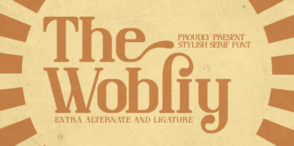 Wobliy is a classy serif font that has its own unique style & modern look. This typeface is perfect for an elegant & luxury logo, book or movie title design, fashion brand, magazine, clothes, lettering, quotes, and so much more.
 - Party Mush by PizzaDude.dk,
$20.00You can't take anything for granted when it comes to the Party Mush font - every single letter has got its own personality...and madness! This is a font that will definately kick those party invitations the right way! - Giamatti by Febri Creative,
$10.00 Giamatti is a handwritten font made with its own uniqueness. Unique, beautiful, simple font but looks elegant and professional. This font is perfect for use as logos, signatures, product names, company names, brands, promotional adverts, and much more.
 - Heralen Antelik by Letterena Studios,
$17.00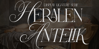 A serif modern and classic typeface that has its own unique style & modern look. This typeface is perfect for an elegant & luxury logo, book or movie title design, fashion brand, magazine, clothes, lettering, quotes, and so much more.
 - Shutter Stone by Sarid Ezra,
$13.00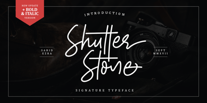 Introducing, Shutter Stone. Another Signature Script Font for you! Shutter Stone is handwritten font that contain stylistic alternate, swash, etc to create your own customised signature. This font is also support multi language. Also Support PUA. Thank You!
 - Mechanoid by Studio K,
$45.00 Mechanoid is a machine age font: crisp, clean, bold and unadorned, yet with a distinctive character of its own. As the name suggests it is well suited to engineering or technological themes, yet versatile enough for universal applications.
 - Trelink by Letterena Studios,
$17.00 A serif modern and classic typeface that has its own unique style & modern look. This typeface is perfect for an elegant & luxury logo, book or movie title design, fashion brand, magazine, clothes, lettering, quotes, and so much more.
 - PB Beneventan XIc by Paweł Burgiel,
$32.00 PB Beneventan XIc is a font face designed for imitate Beneventan minuscule (also called Lombardic, Casinense, Langobarda, littera Longobarda, Longobardisca) from southern Italy found in 11th century manuscripts. All characters are handwritten by use ink and pen, scanned, digitized and optimized for best quality without lost its handwritten visual appearance. Character set support codepages: 1250 Central (Eastern) European, 1252 Western (ANSI), 1254 Turkish, 1257 Baltic. Include also additional characters for Cornish, Danish, Dutch and Welsh language, spaces (M/1, M/2, M/3, M/4, M/6, thin, hair, zero width space etc.) and historical characters (mediaeval abbreviations, ligatures, ancient punctuation). OpenType TrueType TTF (.ttf) font file include installed OpenType features: Access All Alternates, Localized Forms, Fractions, Alternative Fractions, Ordinals, Superscript, Tabular Figures, Proportional Figures, Case-Sensitive Forms, Stylistic Alternates, Contextual Alternates, Stylistic Set 1-14, Contextual Ligatures, Historical Ligatures, Standard Ligatures. Include also kerning as single 'kern' table for maximum possible backwards compatibility with older software. Additional glyphs are mapped to Private Use Area codepoints. OpenType features automatically exchange some default glyphs by stylistic alternates and create ligatures for better historical appearance.
 - Hildegard by Linotype,
$29.99Hildegard is a sans serif text face that works well in both larger and smaller point sizes. On close inspection, one will discover a world of subtle angle variation within the letters' structure that is loosely inspired the stroke movements one uses in calligraphy. These built-up strokes create visible ink traps at many joints, which in smaller sizes play a functional as well as an aesthetic role. The Hildegard typefaces received one of several awards in the 2003 International Type Design Contest, sponsored by Linotype GmbH. - Electric Newspaper JNL by Jeff Levine,
$29.00 Around 1931, the Los Angeles Times (in partnership with the Richfield Oil Company) installed on its building a moving message board similar to the one at the New York Times in New York City which they dubbed an “electric newspaper”. The style of characters used on this electronic sign were the basis for the namesake font Electric Newspaper JNL, which is available in both regular and oblique versions. A blank space to place between words is available on both the solid bar and broken bar keystrokes.
 - Tabloid Dot M by Nadyr Rakhimov,
$10.00 TabloidDot M is a simple monospace font created for a small project. It had one task, to imitate the inscriptions on the electronic scoreboard in the form of dots arranged on a grid. As time went on I decided to make an extended version of the font with alternate letters and more styles, plus a variable font to control the size of the dots. The font has 6 stylistic sets, Proportional and Old-style figures, Ornaments, a set of Arrows, Currency Symbols, and supports Extended Cyrillic.
 - Shmulkas by Fontsoon,
$9.00 Nu?! Vhat else vould you font?! Introduction to the first kosher vant...er...font! Yes, our Board certified rabbis made all the proper blessings so you can use this font guilt free. Just kidding, what's Jewish without a schmear of guilt. This font borrows its style from the 2nd. Avenue Deli all the way down to Guss Pickles on Essex street. If pastrami on white bread with ketchup is for you, this font is NOT. Its strictly pastrami on rye with mustard and slaw on the side.
 - Mr Palker Dadson by Letterhead Studio-YG,
$35.00 Mr Palker Dadson — has appeared in a natural evolution of the Palker-Palkerson family. Its closest relative - burly slab serif Mr Palker Dad. This generation is more stout than the previous one. One may even be brave enough to use them for composing small texts. Notably Mr Parker Dad has become one of the frequently sold typefaces on the «Peterburg. The city speaks» map as it is highly readable while remaining extremely tight. Mr Parker Dadson has all the features of P&P’s family.
 - Chop Chop PB by Pink Broccoli,
$19.00 Inspired by an old matchbook which read: "Chop Suey: Finest Chinese and American Cooking". Chop Chop recreates that matchbook printed feel with soft rounded edges on what one would normally expect to be a sharp and pointy typeface. The typeface has two versions of each capital form, one in the capitals and one in the lowercase positions. The Contextual Alternates feature auto-magically swaps every other character with the alternative version allowing you to easily type you message, while creating a little diversity as well.
 - LTC Italian Old Style by Lanston Type Co.,
$39.95LTC Italian Old Style is not to be confused with the English Monotype font also called Italian Old Style, which is an earlier design from 1911 based on William Morris’s Golden Type that is based on Nicholas Jenson’s Roman face. Goudy went back to Jenson’s original Roman and other Renaissance Roman faces for his inspiration and the result is what many consider to be the best Renaissance face adapted for modern use. Bruce Rogers was one of the biggest admirers of Italian Old Style and designed the original specimen book for Italian Old Style in 1924 using his trademark ornament arrangement. These ornaments are now contained in the pro versions of the Roman styles—Regular Pro and Light Pro. With most digitizations of old metal typefaces, one source size is often used as reference (as was Goudy’s method for his own cuttings of his Village foundry types) so that all sizes refer to one set of original artwork. The original hot metal fonts made by Lanston Monotype (from Goudy’s drawings) and other manufacturers used two or three masters for different size ranges to have optimal relative weights—smaller type sizes would need proportionally thicker lines to not appear thin and larger sizes would require thinner lines to not appear to bulky. The variations in size ranges can also be affected by the size of the cutter head in making the master patterns. The light weights of LTC Italian Old Style were digitized from larger display sizes (14, 18, 24, 30, 36 pt) and the regular weights were digitized from smaller composition sizes (8,10,12 pt). The fitting for the regular weights is noticeably looser to allow for better setting at small sizes. Very few font revivals take this approach. Italian Old Style, originally designed by Frederic Goudy in 1924, was digitized by Paul Hunt in 2007. In 2013, it has been updated by James Grieshaber and is now offered as a Pro font. The newly expanded Pro font includes all of the original ligatures, plus small caps and expanded language coverage in all 4 Pro styles. - "La Pejina ffp" by deFharo is a distinct and intricately designed font that radiates charm and sophistication. Created by the Spanish type designer and illustrator Fernando Haro, known professionally...
- The Ekorre PERSONAL USE ONLY Black by Måns Grebäck is a distinctive font that stands out for its unique blend of whimsical charm and robust assertiveness. Designed by the renowned typeface artist Mån...
- PF Tempesta Five Extended is an intriguing font choice that draws attention for its distinct characteristics, meticulously designed by Yuusuke Kamiyamane. This font is an extension of the PF Tempesta...
- Frogster by Typotheticals,
$8.00Based on Italican Oblique. - England squad 2006 - Unknown license

- Squiggle by HeadFirst,
$16.99 Designed by Morice Kastoun Inspired by one of my childhood heroes, Squiggle is a characterful display typeface based on a linear form. Each character has been carefully crafted for maximum legibility.
 - P22 Aragon by IHOF,
$24.95 A whimsical font with robust curlicues. Designed for display lines on show programs, posters, print ads etc. Many—but not all—of the letters are based on rounded Lombardic medieval forms.
 - Gothic Extended by Wooden Type Fonts,
$15.00Based on a revival of one of the popular wooden type fonts of the 19th century, suitable for display, lower case missing but not always designed for this type of face.

