5,433 search results
(0.01 seconds)
- Tweed SG by Spiece Graphics,
$39.00 Tweed is a journey into the 1930s world of hand-lettering. The design looks very much like the personal scribblings of an old-fashioned cartoon animator. It’s the sort of sketch-style you might find describing a goofy caterpillar or laughing willyworm. Tweed is fun and light-hearted with open and rounded letters of a somewhat musical quality. Derived from old letterforms popularized by Carl Holmes in his wonderful book on the subject, Tweed is basically friendly in nature. This typeface is great for personal greeting cards and stationery - any kind of casual correspondence. It works well in display situations, too. And yes, there is an alternate to the funny-looking “w” character. Just press option l (el) on Mac. Or Alt 0172 on Windows. Tweed is now available in the OpenType Std format. Some new stylistic alternates have been added to this OpenType version. Advanced features work in current versions of Adobe Creative Suite InDesign, Creative Suite Illustrator, and Quark XPress. Check for OpenType advanced feature support in other applications as it gradually becomes available with upgrades.
 - Guilloche A by Wiescher Design,
$80.00 Guilloches were – in the old days – used to make the falsification of banknotes more difficult. The engraving of these intricate lines was done by a highly specialized mechanical machine, which was operated by an equally highly specialized engraving artist. Once the settings for a specific curve were changed back to zero it was very difficult, if not impossible to set them back to the old design. I have designed a useful set of Guilloches that join to form ribbons that create a kind of op-art 3d effect. Under the keys A-U and a-u you find joining pieces. Under the keys V-Z and v-z I placed start- and endpieces. 0-4 are different lenght straight extensions and 5-9 are not quite so straight extensions. All other keys are corner pieces that can be used as stand-alones or put in rows to make for superb decoration. With a little bit of experimentation and maybe colored overlays you can achieve super-phantastic designs. Your elegant type designer Gert Wiescher.
 - Marzano by FontMesa,
$35.00 Marzano is a geometric sans serif font that's ideal for headlines, logos, text and advertising, the name comes from the ever so sweet and wonderful San Marzano plum tomato grown in Italy. Marzano includes stylistic alternates, small caps, swash caps, case sensitive forms, old style figures, tabular figures, small caps figures, small caps old style figures, small caps question mark and exclamation point. Since a lot of people today like to type in code using the copyright and trademark symbols in place of a C or R we've decided, the first time to offer two registered trademark symbols, one that's the same size as the copyright symbol and an alternate version that's reduced in size and sits at the caps height. Marzano Slant is set at 6 degrees and is perfect for when you want the look of an italic but don't have the horizontal space in your page design for a full 12 degree italic. At FontMesa all of our italic fonts are cleaned up placing all nodes at extremas.
 - Cenzo Flare by W Type Foundry,
$20.00 Cenzo Flare is a mixture of modern sans serif base with a touch of flare to it. The inspiration is drawn from all kinds of old Americana advertising, Italian posters, old century logos and signs. All that plus the strong trend on retro fonts now displayed on tv series and current music imagery results on Cenzo Flare. A typeface designed for headlines, posters, advertising and corporate identity. With its appealing curvy smooth edges it is sure to catch the eye. Also enjoy multiple styles that work on their own or as overlapping layers with the InLine & Line variants to create colorful designs. This 40 font family consists of four 5-weight subfamilies: Regular, InLine, Line & Condensed. All of them with matching italics. Designed with powerful opentype features, each weight includes alternate characters to play with, extended language support and many more. We’re proud to introduce: Cenzo Flare. Learn about upcoming releases, work in progress and get to know us better! On Instagram W Foundry On facebook W Foundry wtypefoundry.com
 - DT Augustina Slab by Deveze Type,
$29.00 DT Augustina Slab is an original Clarendon's style slab serif font family of 98 styles including 7 weights, 7 widths plus Italics. There is no such a big choice of Clarendons with a wide range of styles on a market. Super wide range family will satisfy almost any request. Ultra Lights and Light styles will add elegance and lightness to your headlines, especially with using Italic swashes. Regulars, Mediums and Semi Bold will make your text blocks readable and stylish. Combine with Italics and Small Caps for sub-headers and highlights to get an incredible result. And finally Bold and Extra Bold for massive and heavy text headers. Strong, stable and reliable. The whole family has been working well in almost any type of a project: Websites, Apps, E-Books, Books, Magazines, TV broadcasting, Packaging. The family has an Open Type Features like a Ligatures, Italic Swashes, Small Capitals, Case Sensitive Forms, Tabular Figures, Old Style Figures, Tabular Old Style Figures, Circled Figures, Black Circled Figures, Fractions, Superscripts, Subscripts, Stylistic Sets, Localisation forms for Moldavian / Romanian, Catalonian and Turkish.
 - Bernhardt Standard by Linotype,
$40.99Bernhardt Standard, which was designed in 2003 by Julius de Goede, is a flowing Bastarde script. Bastarde is one of the sub-categories of Blackletter typefaces. The term Blackletter refers to typefaces that have evolved out of Northern Europe’s medieval manuscript tradition. Often called gothic, or Old English, these letters are identifiable by the traces of the wide-nibbed pen stroke within their forms. Of all of the various sorts of Blackletter styles, Bastarde scripts are the most flowing, or Italic. The first Bastarde typefaces, cut in the late 1400s, were based on French handwriting styles, especially those styles popular in Burgundy. The flowing nature of Bernhardt Standard makes it similar to some other sorts of Blackletter typefaces as well. Bernhardt Standard, because of its handwritten roots, is also similar to Kurrent, a style of handwriting that was popular in Germany prior the 20th Century. Bernhardt Standard is a very calligraphic face, suitable for formal applications. This typeface would be an excellent choice for certificates or awards. The old style figures in the font allow for nice short settings of text as well. - Rodeo Rebels by Putracetol,
$24.00 Rodeo Rebels is a display typeface with a retro, cowboy, and western theme. It's perfect for designs that require a bold and masculine touch, such as branding, packaging, posters, and headlines. The font was inspired by vintage rodeo posters and the American Old West, where bold, slab-serif typography was a common sight. To make the most out of Rodeo Rebels, consider using it in designs that require a rugged and tough aesthetic, such as clothing and apparel, whiskey and beer packaging, and Western-themed events. Pairing it with other vintage-inspired elements, such as distressed textures and illustrations, can also help create a cohesive look and feel. With its bold and rugged aesthetic, Rodeo Rebels is a font that demands attention. It's perfect for projects that require a vintage and masculine vibe, and its features make it a versatile choice for a wide range of designs. Give your projects a touch of the American Old West with Rodeo Rebels, and let its bold and rugged style do the talking.
 - Wallington Pro by Zeune Type Foundry,
$24.00 Wallington Pro is a decorative-serif font embodying vintage and elegant curves with functional structure. Style is adopted from Old English cultures with their descendants around mid-12th century and Art nouveau in 19th century, it was inspired by natural forms and structures and the curved lines. Crafted with love and easy-to-read letter design. Wallington Pro consists of 721 glyphs including 268 unique ligatures, 30+ catchwords and 10 stylistic sets. All glyphs are divided into several OpenType features such as Ligatures, Contextual alternates, Old Style Numeric and some astonishing special characters that allows you to mix and match pairs of letters to fit your design. This variety encourages unusual and extroverted creation in lettering design. The typeface offers numerous combination possibilities between the basic glyph set and stylistic sets.The stylistic sets are alternate alphabets that you can access by using OpenType savvy programs such as Adobe Illustrator, Adobe Photoshop CC, Affinity Designer, CorelDraw or Adobe InDesign. Wallington is an experimental and versatile font. Suitable for digital lettering, prints, logo, poster, t-shirt, packaging and applicable for some type of graphic design.
 - Scratch SCF by Scholtz Fonts,
$15.00Scratch SCF is a grunge font with a difference. It has an irregular, almost random outline that suggests an old-fashioned quill pen that is leaking and scratching its way across the page. There are also connotations of simplicity, of a writer that is unsophisticated, possibly learning to write for the first time. This is a font that avoids all the associations of slick, worldly-wise urbanity, of cynicism and of "the medium being more important than the message". Instead the simplicity of Scratch SCF conveys a sincerity and integrity of design that bespeaks simplicity and old-fashioned honesty. All these associations are conveyed with a contemporary look, without resorting to rehashing the past with yet another retro font. Scratch SCF has a full character set: all upper and lower case characters, all special and accented characters and all punctuation, numerical and mathematical characters. All have been carefully spaced and kerned. Scratch SCF Staggered is a little more "grungy" than the regular style because the individual letters do not rest on the same baseline and thus have more vitality. - Argo Nova by Eliezer Grawe,
$- In Greek mythology, Argo was the ship on which Jason and the Argonauts sailed from Iolcos to Colchis to retrieve the Golden Fleece. The Argo Nova font is an adventure though geometric sans universe with a touch of humanistic feel, bringing a different look with curved vertical strokes and high contrast on thicker weights. Designed with OpenType features, it includes extended Latin support, fractions, tabular and old-style figures, ligatures and more. With no excess in mind, it came in 10 styles (5 uprights and is matching italics) and it is a font family ideal for text, branding, signage, editorial, print and web design creations. 5 weights: Thin, Light, Regular, Bold and Black Matching italics Lining and old-style figures with proportional and tabular spacing Ligatures on “f” Alternate characters for a, æ, g and ß Fractions Ordinals Extended language support, designed following the Underware Latin Plus character set, with 534 glyphs, supporting 219 Latin based languages (see https://underware.nl/latin_plus/languages/). * Some features require an application with OpenType support.
 - Dederon Serif by Suitcase Type Foundry,
$75.00Dederon Serif has been specifically designed for book setting. Preliminary sketches were drawn in 2004. Its inspiration – particularly its weight and width proportions – can be traced to the Liberta typeface from the TypoArt type foundry in former Eastern Germany. After a careful study of the model, the design of Dederon branched off into its own direction, finding its distinctive voice and becoming a wholly original type family. Dederon Serif kept most of the elements typical for the Old Style Roman lettering, such as the angle of the stress, the medium x-height, and lower contrast. In large sizes, the typical shapes of the letters stand out – the calligraphic feel characteristic for the Czech typefaces by Oldrich Menhart, the unusual serifs hinting at the angle of the pen, the shapes of the stems, or the terminals of dots and ears. Upon finishing the serif version, a Serif-serif variant called Dederon Serif was added. The construction principles are also derived from the Old Style Roman model, which lends the lettering its open, humanist feel. Yet the design also conforms to the rules of the modern Serif serif. Most characteristics of Dederon Serif match the serif version – the weight of individual cuts, the width proportions, x-height, ascenders' and descenders' length, and the slope of the italics. Each version of Dederon Open Type Std contains the standard Western Latin character set and the Central European characters; a number of basic and accented ligatures, small caps; old style, small caps and caps, table, fraction and superscript numerals; expert glyphs and alternative characters. This brings the total to a comfortable 820 glyphs per weight, permitting truly professional use in the most demanding projects. - Dederon Sans by Suitcase Type Foundry,
$75.00Dederon Serif has been specifically designed for book setting. Preliminary sketches were drawn in 2004. Its inspiration — particularly its weight and width proportions — can be traced to the Liberta typeface from the TypoArt type foundry in former Eastern Germany. After a careful study of the model, the design of Dederon branched off into its own direction, finding its distinctive voice and becoming a wholly original type family. Dederon Serif kept most of the elements typical for the Old Style Roman lettering, such as the angle of the stress, the medium x-height, and lower contrast. In large sizes, the typical shapes of the letters stand out — the calligraphic feel characteristic for the Czech typefaces by Oldrich Menhart, the unusual serifs hinting at the angle of the pen, the shapes of the stems, or the terminals of dots and ears. Upon finishing the serif version, a sans-serif variant called Dederon Sans was added. The construction principles are also derived from the Old Style Roman model, which lends the lettering its open, humanist feel. Yet the design also conforms to the rules of the modern sans serif. Most characteristics of Dederon Sans match the serif version — the weight of individual cuts, the width proportions, x-height, ascenders' and descenders' length, and the slope of the italics. Each version of Dederon Open Type Std contains the standard Western Latin character set and the Central European characters; a number of basic and accented ligatures, small caps; old style, small caps and caps, table, fraction and superscript numerals; expert glyphs and alternative characters. This brings the total to a comfortable 820 glyphs per weight - GEOspeed - Personal use only

- Banco by Linotype,
$40.99 Designed for Linotype Library GMBH and the International Typeface Corporation in 1997 by Phil Grimshaw. Based on bold script Banco designed by French graphic and poster designer Roger Excoffon and released in 1952 by the Fonderie Olive. Originally Banco was an all-caps bold typeface, and the lower case and the corresponding light weight were created for ITC. The tapering slightly slanted strokes of Banco made by sharp-edged flat brush. The face has the effect of being quickly sketched by a powerful hand. For use in advertising and display typography. Cyrillic version developed for ParaType in 2000 by Tagir Safayev.
 - Gangfield by Slex Studio,
$18.00 Based on lettering with a sharp pen, Gangfield features a rather solid character and a measured rhythm. This is named after my nephew who has an optimistic and disciplined style. Gangfield is available in upright variants, with regular, italic and bold weights. Gangfield's bright and cheerful energy shines through either in the form of short blocks of text, or enhanced on display sizes with over 1,100 wildcards and swashes that vary in size and complexity. Gangfield includes 134 alternates with various variations plus several variants of ligatures which make it ideal for special dates such as weddings and parties.
 - Frequent by PizzaDude.dk,
$19.00 This font was originally meant to be my last creation of 2022, but as it turned out, it was the first font of 2023 instead! Why? Well, because it took me a lot of time to complete the 150 different swahes letter combinations, the 182 different letters (not counting numbers, accented characters etc) the small caps, the subscript and the multilingual support! Anyway, it was worth the work - the Frequent font works great as a display font, or whatever you have in mind. Play around with the different versions (Regular, Solid and Inside) for great results.
 - Letro by Thinkdust,
$10.00 Letro’s sturdy, slab serif form and sleek alternates make it perfect for any sort of display, whether it’s professional or personal, casual or serious, big, small, on a computer screen or on paper. Letro does everything: elegant while slightly blocky, stylised while legible, solid but full of finesse, this font isn’t the jack of all trades, it comes close to being the master. Letro comes in two weights, light and regular, with support for a multitude of languages. When you need a font with serifs to get the job done, Letro is your go to type.
 - Jozef by Underscore,
$35.00 Jozef is a serif typeface family with modern character and a firm voice. It is equally suited to setting text on screen and in print. With eight weights, matching italics, and decorative capitals it offers a plentiful typographic range, and provides language support for extended latin. The sharp serifs equip this typeface with a strong tone and clear legibility, while the italics offer a softer but equally solid appearance. Opentype features, number sets and a wide range of typographic characters make this a resourceful text typeface. Jozef was designed by Johannes Neumeier and published through Underscore in 2018.
 - Salim by Omotu,
$18.00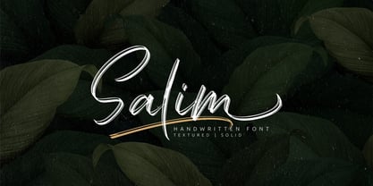 Salim is a handwritten brush font with 2 styles, regular (brush texture) and solid. Salim is perfect for branding, logotype, apparel, T-shirt, Hoodie, product packaging, quotes, flyer, poster. Comes with Uppercase and lowercase characters, Supports international languages, Numerals, punctuations, ligatures, stylistic alternates, and stylistic sets. Accessible in the Adobe Illustrator Glyphs panel, or under Stylistic Alternates in the Adobe Photoshop OpenType menu, Adobe InDesign, Corel Draw, even work on Microsoft Word. Thanks for looking, and I hope you enjoy it! Please don't hesitate to drop me a message if you have any issues or queries.
 - Eckhardt Informal JNL by Jeff Levine,
$29.00 Eckhardt Informal JNL was found in a Dan Solo alphabets book under the name "Circus Wagon". This hand-lettered design with a playful inline is reminiscent of the show cards of the 1940s and 1950s. The Eckhardt series of typefaces is named in honor of the late Al Eckhardt, Jr. - a good friend of type designer Jeff Levine whose talents in hand-crafting attractive lettering was appreciated by many. His work, like the others before him is fast become a lost art in today's technology-driven world. Eckhardt Informal JNL is available in it's regular (inline) version and also as a solid version.
 - Mynaruse by insigne,
$22.00 Mynaruse is an elegant and regal roman inscriptional titling family. It has sharp and elongated serifs that give the face extra punch. The face shines in settings that call for elegance and splendor. Mynaruse’s six weights range from a fine, delicate thin to a powerful and solid heavy weight. Mynaruse includes many useful OpenType features, including a set of swash alternates, alternate titling forms, ligatures and miscellaneous alternates. OpenType-capable applications such as Quark or the Adobe suite can take full advantage of the automatically replacing ligatures and alternates. This family also includes the glyphs to support a wide range of languages.
 - Arinkoln by Letterhend,
$19.00 Arin Koln is a typeface with fun and playful looks. This type of font perfectly made to be applied especially in storybook children or child theme which is need a standout font, and the other various formal forms such as invitations, labels, logos, magazines, books, greeting / wedding cards, packaging, fashion, make up, stationery, novels, labels or any type of advertising purpose. Features : Solid version illustration numbers and punctuation multilingual ligatures PUA encoded We highly recommend using a program that supports OpenType features and Glyphs panels like many of Adobe apps and Corel Draw, so you can see and access all Glyph variations.
 - Tectónica by Untype,
$29.00 Tectónica is an elegant and stable heavy-duty didonish typeface in three different flavors: the strong and sober Poster Style, the fancy and classic Engraved Style and the playful and sexy Swash Style, each of one includes a distinctive set of alternates, ligatures, numbers and plenty of other resources and OpenType features for your text delight. With heavy contrast and solid presence yet full of delicate details and variations, Tectónica was especially designed for being used in headings, logotypes, large text settings and display use in general where a well-founded and firm yet graceful and refined statement is needed.
 - Kaipara by Gleb Guralnyk,
$14.00 Presenting originally designed decorative font named Kaipara. The main goal of this font is a pattern that flows between the characters. Each letter has six variations that switches automatically to create a solid pattern feeling. Check out that "context alternates" OpenType feature is activated to achieve neccessery result. Also a simple supporting font is available here. Note: Please note that full pattern effect is working only with english alphabet and numbers. All other characters has only one variation. Note: Check out that all of your letters has the same case (lowercase or uppercase) to make the effect work properly.
 - Xotor by Typogama,
$19.00 Xotor is a double styled typeface family destined for use in titling and headlines. The main style, the Triline weight, is a modular typeface composed of three strokes and is best used in large sizes. For smaller bodies of text, the second Regular style is based on the same letter construction but in a simple, solid stroke. Both weights can either be used individually or combined to add extra effect to any layout. With an extended Latin language support, Xotor covers most Latin based scripts and equally features a range of Opentype features, from ligatures, alternative letters or different styles of numerals.
 - Zim by Scholtz Fonts,
$19.00 Zim is a bold, earthy font, named for the Great Zimbambwe ruins (a World Heritage site). Its solid silhouette represents the timelessness of this ancient structure. The font is very readable, and its bold, rugged shape make it ideal for display purposes, for posters and headlines. Fully professional, it contains a complete set of 255 characters — Upper and Lower case, all numerals, punctuation, symbols and accented characters. It is suitable for layout work in all major European languages — Spanish, Portuguese, German, French, Swedish and Italian (to name a few). The characters are spaced for readability and have been carefully kerned.
 - Grimmig by Schriftlabor,
$40.00 Grimmig draws inspiration from solid and angular blackletter shapes and the idea of cutting letters out of paper. The interaction between curves, sharp edges, and partially unconventional serif placement makes it an excellent typeface for impactful headlines. The vivid details fade into the background in smaller sizes and provide an enjoyable reading experience for continuous text. Open counters and a large x-height contribute to Grimmig’s legibility in text sizes. It was developed as part of the MA Typeface Design in the University of Reading but had started before as a graduation project for Tamara Pilz.
 - Fauna by Pasternak,
$12.00 Fauna is a stylish font inspired by hi-fi elements combined with square forms and straight lines. It also has the features of Constructivism, including solidity, emphasis on geometric shapes, and austerity. Bold futuristic characters make this font an ideal option for the development of a minimalistic and recognizable design, necessary for any modern project. It’s perfect for the creation of logos, titles, social media posts, posters, and ads. Due to the clear and eye-catching design of the characters, the font will surely attract your audience. It includes all basic symbols and characters. Plus, Fauna features proper kerning and supports several languages.
 - Rougant by Mans Greback,
$59.00 Rougant is a unique sans-serif typeface. Drawn and created in 2021, this lettering has a distinct vintage style and a strong personality. Use it for a motorcycle logotype or any graphic with a rock'n'roll vibe. Provided in three styles: Rougant Regular/Solid, Rougant Rough and Rougant Bold. Rougant is built with advanced OpenType functionality and has a guaranteed top-notch quality. It has extensive lingual support, covering all Latin-based languages, from North Europa to South Africa, from America to South-East Asia. It contains all characters and symbols you'll ever need, including all punctuation and numbers.
 - Staple by Ajeet Mestry,
$50.00 Staple is a Display Font. Each letter and number is made up of a clever arrangement of staples. Together, they retain the simplicity and beauty of a perfectly folded stapler pin. This creates a font that provides very good readability, solid shape and simple elegance that makes it perfect for use as a display font. To add elegance to the font, the letters and numerals are designed to retain the pin identity across all characters. Care has been taken so that the pins do not overlap. Nor are the pins bent or twisted into unnatural shapes to create the characters.
 - Norden Round by Asgeir Pedersen,
$23.99 The name Norden means “the Nordic”, as in the geographical area or its countries. Inspired by the simplicity of Nordic and Scandinavian design, the Norden fonts give you clarity of expression, beyond the usual geometric look and feel of traditional sans-serifs. Open and spacious, the shapes of the glyphs play both with and against each other. Round and soft versus square and solid, a basic curve versus a straight line, creating a detached yet distinct style of expression, from light-as-air Hairline to dark and Bold. Norden comes in three variants: Standard, Round and Display.
 - CamingoSlab by Jan Fromm,
$45.00 A sturdy and solid presence, CamingoSlab is defined by its heavy serifs, low stroke contrast and elliptic curves. Yet it retains a light touch, and feels vivid and friendly, thanks to the humanistic tone that derives more from handwriting than from strict construction. Special attention has been paid to compatibility with the other members of the Camingo series — With their consistent line heights, an equal grey value and the same formal language it can be seamlessly combined with CamingoDos and CamingoMono. CamingoSlab comes with a Pro version that contains small caps, ligatures, 10 different figure sets, stylistic alternates and two sets of arrows.
 - Black Engine by Linecreative,
$14.00 The Black Engine condensed slab serif font is vintage-inspired with a touch of classic style but gives it a tough feel. This font is built on a solid foundation, strong visuals, vintage motion, and a modern minimalist style. Black Engine is perfect for Jersey, athletics, posters, branding projects, Logo design, Clothing Branding, product packaging, for magazine titles. for something sports themed, album title, etc What you get dear, you will get : Black Engine- A clean Slab serif font including Upper & Lowercase characters(ALL CAPS), Numbers and Punctuation Supports Multi linguage (Latin Western Europe), Numbers and Punctuation
 - Lean by Ogle Studio,
$11.00 Lean is a solid must-have for anyone's font collection. With its plump weight and dynamic poise, Lean offers an eye-catching solution for any project. Handcrafted and informal, the style adds a real statement, whether it's for a logo, video artwork, business card, or presentation. The impact of the uppercase characters, married with the gentle roundness of the lowercase strokes, present a unique result for titling, sure to get you noticed. Lean's dynamic 'lean' makes strings come alive, giving a feeling of movement and excitement. The character set contains 190 glyphs, with latin and western language support.
 - Bigante by Vibrant Types,
$29.00 Bigante is a big, giant superfamily with two variants: Solid and Inline, offering six weights and seven widths. Its constructed design interprets rounded corners as three 30° angles, resulting in edged terminals and twelve-sided dots. While it sounds functional, this rounded-like semi-serif enhances the appearance, creating a friendly aesthetic. The lowercase alphabet features a high x-height. For versatile use in display and advertising, the multitude of fonts enables flexibility. Captivating with a linear structure, it associates with modern architecture, tactical sports, space travel, and futuristic technology. The character set of 780 glyphs supports 410 Latin languages.
 - Xperiment Sans by Tour De Force,
$30.00 Xperiment Sans is modern sans serif font family with eccentric design. Available in 7 weights, Xperiment Sans is unique and distinctive font family with solid visual character. Specific by it's geometry and atypical combination of stem positions and letter shapes, Xperiment Sans is basically very simple by design. It's ideal for modern and unconventional projects where you're not looking for conservative approach. Modern IT companies, electro types of music, sci fi movies, contemporary package design or if you are simply looking to be different, Xperiment Sans will work perfect in the most of situations. Contains standard ligatures in extended Latin character map.
 - Worn Gothic by Baseline Fonts,
$39.00 Worn Gothic, a typeface from the Grit History™ B family, creates rock solid text-- characters that are weathered, defined and strong, like the body of a gargoyle. Worn Gothic is rugged but legible, whose words stay firmly liquid, like dates stamped in concrete. Disjointed K legs create an unnerving look that makes you stare into the structure of the type. Oddities like this complement the integrity of its fluctuating strokes and consistent X-Height. It offers a few stylistic alternates to maintain readability at any size, in many languages. Worn Gothic offers full Greek character support as well as all punctuation.
 - Sundash by Jehoo Creative,
$16.00 Sundash versatile typeface with wide allternate allcaps. This bold modern font explores the style of Allcaps, we add a wide character to make it look more flexible. based on forms inspired by free urban culture, Sundash has a modern and vibrant spirit. Sundash explores how the shapes and curves of letters change their Focus. This font has a variable weight of 5 Light, regular, medium, bold, extrabold to make the sundash more solid. Sundash has 247 glypghs with a unique and bold character perfectly suited for a wide variety of applications from editorial design to branding, advertising, publications and digital.
 - Grimmig Variable by Schriftlabor,
$200.00 Grimmig draws inspiration from solid and angular blackletter shapes and the idea of cutting letters out of paper. The interaction between curves, sharp edges, and partially unconventional serif placement makes it an excellent typeface for impactful headlines. The vivid details fade into the background in smaller sizes and provide an enjoyable reading experience for continuous text. Open counters and a large x-height contribute to Grimmig’s legibility in text sizes. It was developed as part of the MA Typeface Design in the University of Reading but had started before as a graduation project for Tamara Pilz.
 - GEOspeed SC - Personal use only


