10,000 search results
(0.203 seconds)
- Poster Slabserif JNL by Jeff Levine,
$29.00 Based on one of the many hand lettered typefaces found with in the 1960 edition of Sam Welo’s “Studio Handbook for Artists and Advertisers”, Poster Slabserif JNL is available in both regular and oblique versions.
 - Wilmington BF by Bomparte's Fonts,
$39.00 This expressive, upright script was inspired by 1940s penmanship. Its OpenType programming will enhance your typography via features such as automatic ligatures and contextual alternates. Also included is a Stylistic Alternate for lowercase letter “g”.
 - Genever NF by Nick's Fonts,
$10.00 London's Reed and Fox 1874 specimen book featured two faces, Viennese and Corinthian, combined here in one elegant decorative face. Both versions support the Latin 1252, Central European 1250, Turkish 1254 and Baltic 1257 codepages.
 - Club Lunch JNL by Jeff Levine,
$29.00 A 1930s-era hand-lettered sign advertising a club lunch (consisting of soup, salad, dessert and coffee for 35 cents) provided not only the Art Deco lettering style but the name for Club Lunch JNL.
 - AZ Plug Italic by Artist of Design,
$20.00AZ Plug Italic font is inspired from a combination of original early 1900’s Edward Penfield and Franz Hazenplug poster art. This font is designed for use as a worn and antiqued headlines or subheadlines. - Eckhardt Centerline JNL by Jeff Levine,
$29.00 This typeface is one of a number of sign painter-oriented fonts named in honor of Jeff Levine's good friend Albert Eckhardt, Jr. (who ran Allied Signs in Miami Florida from 1959 until his passing).
 - Restaurant And Lounge JNL by Jeff Levine,
$29.00 Restaurant and Lounge is a casual, brush-style type face based on hand lettering found on a 1940s matchbook for the Park Avenue Restaurant (a popular dining spot during the golden years of Miami Beach).
 - Buddha by Solotype,
$19.95There are many Oriental-themed fonts, most without lowercase. This one originated in the German foundry of Schelter & Giesecke shortly before 1900. Use this font and an hour later you'll want to use it again. - Faerie Queen NF by Nick's Fonts,
$10.00Based on a typeface named "Titania" from a 1930s specimen book from the Fundición Richard Gans in Madrid, this exquisite design will add a touch of elegance and nostalgic charm to any project it graces. - Opportoonity JNL by Jeff Levine,
$29.00Opportoonity JNL is loosely based on lettering from 1940s cartoons. It's the perfect typeface for anything representing fun and carefree situations. There is a slightly limited character set and no kerning on this particular font. - Progreso by CastleType,
$59.00 Progreso is a condensed, unicase, serif gothic type design inspired by the hand-lettering on Russian posters from the 1920s. Supports most European languages, including modern Greek and most languages that use the Cyrillic alphabet.
 - Theatrics JNL by Jeff Levine,
$29.00Theatrics JNL gives a rounded corner treatment to Prismatiq JNL; which in turn was modeled from lettering found in an early 1900s French lettering book displayed at an online image sharing site. Limited character set. - Hatchet Job by Wing's Art Studio,
$10.00 Hatchet Job - A Halloween Brush Font Unleashed onto an unsuspecting public this Halloween, Hatchet Job is a brush font inspired by the slasher and cabin-in-the-woods horror movies and comics typical of the 1970s and 80s. This textured all-caps design takes its visual style from old cabins, ghost ships and axe-splintered wood that can only spell danger! With a bold brush strokes and frayed edges, it offers the tools to leave your readers nerves in tatters! The Hatchet Job font family includes all-caps uppercase and lowercase characters, along with numerals, punctuation, symbols and language support. Also included are a complete set of alternative characters and additional paint marks, drips and splashes. Wingsart Studio Design Tip! The uppercase and lowercase characters work great when mixed in an alternating fashion, with shapes that combine to create a dynamic, un-hinged look that's perfect for the Halloween season. Add the alternatives and paint marks into the mix and you'll have yourself a title or header design that looks truly custom-made.
 - Pacific Clipper SG by Spiece Graphics,
$39.00 Pacific Clipper has its roots in an old 1930s showcard lettering style. An extra bold version of this sign painter’s relic is shown in Carl Holmes' wonderful book on lettering. It may be described as what happens when Rudolf Koch's Kabel Heavy meets ATF's Novel Gothic. Also known as Sam’s Tune, Pacific Clipper’s noteworthy features include wedged crossbars in the capital A, E, F, and H. Overcurving is present in the capital B, D, P, and R while vertical strokes in the lowercase b, d, h, k, l, and t are chopped off obliquely. Figures in Pacific Clipper are also refreshingly different, particularly the number 4. This lettering favorite turned retro typeface has been extended to include a variety of weights. Pacific Clipper is now available in the OpenType format. Some new characters have been added to this OpenType version as Stylistic Alternates and Historical Forms. These advanced features work in current versions of Adobe Creative Suite InDesign, Creative Suite Illustrator, and Quark XPress. Check for OpenType advanced feature support in other applications as it gradually becomes available with upgrades.
 - Bohemio by Wiescher Design,
$39.50 Bohemio was designed in memory of Gunter Böhmer, an artist famous for his many book covers of the 1950s in Germany. The cover I took as an inspiration for this font is that of a book called Stiller (by Max Frisch). Bohemio sounds similar to "Böhmer" (which means the one from Bohemia) and it is also an alliteration to artisty. I thought "Bohemio" to be a nice name for this very strong, almost expressionist design. Yours very artsy craftsy Gert Wiescher
 - Klangfarbe Script by Mysterylab,
$18.00 Klangfarbe is a quirky ultramodern script with unique stroke tapers and droplet-like finials. This font is a true chameleon and is very much at home with a variety of looks: from a reimagining of kitschy 1950s scripts, to analog retro-tech, to steampunk, to high-fashion futuristic logos and beyond. Klangfarbe — a German language term meaning “timbre” or “sound color” — references the visual appearance of audio frequency waveforms echoed in many of the lowercase letters. A truly eye-catching choice.
 - Matthia by Linotype,
$29.99Linotype Matthia is part of the Take Type Library, which features the winners of Linotype’s International Digital Type Design Contest from 1994 to 1997. Dieter Kurz designed Matthia as a slender, flowing brush font. Its characters are in a handwritten style yet stand almost straight, making Matthia a mixture of reserved and lively, of static and dynamic. The font is reminiscent of advertisement typefaces popular in the 1950s and extremely versatile, suitable for short texts in small point size or headlines on posters. - Purple Purse Pro by Stiggy & Sands,
$29.00 Our Purple Purse Pro draws its inspiration from a vintage Ivory Soap ad from the 1950’s. Somewhat of a cross between Bodoni and Pixie, this font finds that it never truly takes itself seriously. The fun little bounce within the typeface gives it a perky personality. Opentype features include: - SmallCaps. - Full set of Inferiors and Superiors for limitless fractions. - Tabular, Proportional, and Oldstyle figure sets (along with SmallCaps versions of the figures). - Stylistic Alternates for Caps to SmallCaps conversion.
 - Edits And Credits JNL by Jeff Levine,
$29.00Edits and Credits JNL is a cheerful sans serif typeface modeled from ceramic letters in a movie titling set from the late 40s or early 1950s. In the original kit, letters would be lined up accordingly against a contrasting background and photographed for home or professional movie and slide titles. Note: The cap height is slightly smaller than normal for the respective point size. This will give the effect of wider line spacing - similar to that of home movie titles. - South Bay by Olivetype,
$18.00 If you're looking for something cute yet unique and natural, then South Bay is perfect for you. It would be great for a child's journal, a school project, or even a book cover. The letters will help you unleash your creative side and make anything from a basic to an advanced project look amazing!
 - Quaderno by Resistenza,
$39.00 Quaderno is a light and monolinear upright script, accompanied by the heavier weights. This connected script combining elements of the traditional Italian script Bella Scrittura and French script. Quaderno is suited for middle length texts and headlines and evokes both vernacular and commercial lettering of the 20th century and a typeface for school book purposes.
 - One Crayon by Balpirick,
$15.00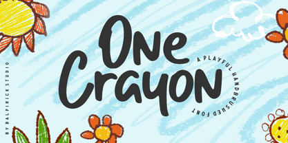 One Crayon is a Playful Handbrushed Font. One Crayon is a cute and informal display font. It embodies playfulness and authenticity and is the perfect choice for any children activity or school project. One Crayon also multilingual support. Enjoy the font, feel free to comment or feedback, send me PM or email. Thank you!
 - Andy Bear by Gatype,
$8.00 Andy Bear embodies oddity and authenticity. This dazzling display font will turn any creative idea into a standout. Get inspired by its fun styles, and use them to brighten up kids or school projects! This font has no shadow effect by default. You can create this effect by duplicating the text and placing the duplicates
 - Mermaid Babies by Subectype,
$14.00 Mermaid Babies is a fun, jolly and incredibly charming display font. It embodies playfulness and authenticity and is the perfect choice for any children activity or school project. What's Included : - Multilingual Support I hope you enjoy this font. If you have any questions please don't hesitate to drop me a message :) Thank You, Subectype
 - She is Mine by Olivetype,
$18.00 She's Mine is a fun and girly handwritten font. Its skinny and smooth style makes this font incredibly versatile, fitting a wide variety of creative ideas such as: kids, school projects, crafting and DIY projects. So what’s included: She's Mine (OTF) Basic Latin A-Z, a-z, numbers, symbols, and punctuations International Characters. Thank you
 - Dupliciter by JAF 34,
$9.90 DUPLICITER is an experimental display sans serif font which has two typefaces for comfortable and experimental use. DUPLICITER is a (latest) part of new school in type design that could be called like mind-free and geometric direction in the world. Sans serif, condensed, sharp edges, geometric, experimental, these are the main attributes of DUPLICITER.
 - Bodrum Stencil by Bülent Yüksel,
$19.00 Bodrum Collection: 1- Bodrum Sans 2- Bodrum Sweet 3- Bodrum Stencil 4- Bodrum Slab 5- Bodrum Styte 6- Bodrum Soft Bodrum Stencil is a stencil serif type family. Designed by Bülent Yüksel in 2018/19. The font, influenced by style serifs, popular in the 1920s and 30s, is based on optically corrected geometric forms for better readability. Bodrum Stencil is not purely geometric; it has vertical strokes that are thicker than the horizontals, an “o” that is not a perfect circle, and shortened ascenders. These nuances aid in legibility and give "Bodrum Stencil" a harmonious and sensible appearance for both texts and headlines. Bodrum Stencil provides advanced typographical support for Latin-based languages. An extended character set, supporting Central, Western and Eastern European languages, rounds up the family. The designation “Bodrum Stencil 14 Regular” forms the central point. "Bodrum Stencil" is available in 10 weights (Hair, Thin, Extra-Light, Light, Regular, Meduim, Bold, Extra-Bold, Heavy and Black) and 10 matching italics. The family contains a set of 650+ characters. Case-Sensitive Forms, Classes and Features, Small Caps from Letter Cases, Fractions, Superior, Inferior, Denominator, Numerator, Old Style Figures just one touch easy In all graphic programs. Bodrum Stencil is the perfect font for web use.
 - Bodrum Soft by Bülent Yüksel,
$19.00 You can download Bodrum Soft PDF Type Specimen here . "Bodrum Soft" is a rounded sans serif type family, designed by Bülent Yüksel in 20018/19. The font, influenced by serif styles that were popular in the 1920s and 30s, is based on optically corrected geometric forms for a better readability. "Bodrum Soft" is not purely geometric; it has vertical strokes that are thicker than the horizontals, an “o” that is not a perfect circle, and shortened ascenders. These nuances helps the legibility and gives "Bodrum Soft" an harmonious and sensible appearance for both texts and headlines. Bodrum Soft provides advanced typographical support for Latin-based languages. An extended character set, supporting Central, Western and Eastern European languages, rounds up the family. “Bodrum Soft 14 Regular” forms the central point. "Bodrum Soft" is available in 10 weights (Hair, Thin, Extra-Light, Light, Regular, Medium, Bold, Extra-Bold, Heavy and Black) and 10 matching italics. The family contains a set of 650+ characters. Case-Sensitive Forms, Classes and Features, Small Caps from Letter Cases, Fractions, Superior, Inferior, Denominator, Numerator, Old Style Figures can be accessed with one simple touch in all graphic programs. Bodrum Soft is the perfect font for web use. I hope you enjoy using it!
 - Standard CT by CastleType,
$59.00 CastleType was commissioned in 1991 by San Francisco Focus magazine to digitize three members of the Standard family. This is a Continental lineale that was popular in Switzerland in the 1950s and later in the United States. A cousin to the classic sans serifs, Standard is an alternative that is considerably warmer and a bit more idiosyncratic. In 2008, CastleType released additional members of the Standard CT family to make it a complete typographic solution with three widths (normal, condensed, extended) of four weights each (Regular, Medium, Bold, and Extra Bold). Some of the original Standard fonts, particularly Standard Regular, appear to have been hastily designed (or perhaps too closely imitated Helvetica); these have been greatly improved in the CastleType versions with more harmonious proportions and other refinements. The three lighter weights of the Extended subfamily were designed from scratch based on the new Standard CT Regular and Standard CT Extended Extra Bold. More recently, four light weights (Light, Extra Light, Ultra Light, and Hairline) have been added to each of the three widths. The entire Standard CT family includes support for most European languages, OpenType features, arbitrary fractions, and a collection of geometrics, dingbats & fleurons.
 - Redshine by Sign Studio,
$15.00 Redshine is a neat and bold script font. It has swash glyphs and alternate characters which will give you convenience when choosing a character for each design project. This font is PUA encoded which means you can access all of the glyphs and swashes with ease.
 - The Phamelo by madeDeduk,
$18.00 The Phamelo is a Modern bold script and this perfect for all your designs project, event and more. Feature - UPPERCASE - lowercase - Number & Symbol - International Glyphs - Alternative UPPERCASE - Alternative lowercase - Swashes If you need anything else just shoot me on email at: dedukvic@gmail.com Hope you enjoy it.
 - Vianova Serif Pro by Elsner+Flake,
$59.00 The font superfamily Vianova contains each 12 weights of Sans and Slab and 8 weights of the Serif style. The design from Jürgen Adolph dates back into the 1990s, when he studied Communication Design with Werner Schneider as a professor at the Fachhochschule Stuttgart. Adolph started his carrier 1995 at Michael Conrad & Leo Burnett. He was responsible for trade marks as Adidas, BMW, Germanwings and Merz. He has been honored as a member of the Art Directors Club (ADC) with more than 100 awards. On February 26, 2014, Jürgen Adolph wrote the following: “I was already interested in typography, even when I could not yet read. Letterforms, for instance, above storefronts downtown, had an irresistible appeal for me. Therefore, it is probably not a coincidence that, after finishing high school, I began an apprenticeship with a provider of signage and neon-advertising in Saarbrücken, and – in the late 1980s – I placed highest in my field in my state. When I continued my studies in communications design in Wiesbaden, I was introduced to the highest standards in calligraphy and type design. “Typography begins with writing” my revered teacher, Professor Werner Schneider, taught me. Indefatigably, he supported me during the development of my typeface “Vianova” – which began as part of a studies program – and accompanied me on my journey even when its more austere letterforms did not necessarily conform to his own aesthetic ideals. The completely analogue development of the types – designed entirely with ink and opaque white on cardboard – covered several academic semesters. In order to find its appropriate form, writing with a flat nib was used. Once, when I showed some intermediate designs to Günter Gerhard Lange, who occasionally honored our school with a visit, he commented in his own inimitable manner: “Not bad what you are doing there. But if you want to make a living with this, you might as well order your coffin now.” At that time, I was concentrating mainly on the serif version. But things reached a different level of complexity when, during a meeting with Günther Flake which had been arranged by Professor Schneider, he suggested that I enlarge the offering with a sans and slab version of the typeface. So – a few more months went by, but at the same time, Elsner+Flake already began with the digitilization process. In order to avoid the fate predicted by Günter Gerhard Lange, I went into “servitude” in the advertising industry (Michael Conrad & Leo Burnett) and design field (Rempen& Partner, SchömanCorporate, Claus Koch) and worked for several years as the Creative Director at KW43 in Düsseldorf concerned with corporate design development and expansion (among others for A. Lange & Söhne, Deichmann, Germanwings, Langenscheidt, Montblanc.”
 - Vianova Slab Pro by Elsner+Flake,
$59.00 The font superfamily Vianova contains each 12 weights of Sans and Slab and 8 weights of the Serif style. The design from Jürgen Adolph dates back into the 1990s, when he studied Communication Design with Werner Schneider as a professor at the Fachhochschule Stuttgart. Adolph started his carrier 1995 at Michael Conrad & Leo Burnett. He was responsible for trade marks as Adidas, BMW, Germanwings and Merz. He has been honored as a member of the Art Directors Club (ADC) with more than 100 awards. On February 26, 2014, Jürgen Adolph wrote the following: “I was already interested in typography, even when I could not yet read. Letterforms, for instance, above storefronts downtown, had an irresistible appeal for me. Therefore, it is probably not a coincidence that, after finishing high school, I began an apprenticeship with a provider of signage and neon-advertising in Saarbrücken, and – in the late 1980s – I placed highest in my field in my state. When I continued my studies in communications design in Wiesbaden, I was introduced to the highest standards in calligraphy and type design. “Typography begins with writing” my revered teacher, Professor Werner Schneider, taught me. Indefatigably, he supported me during the development of my typeface “Vianova” – which began as part of a studies program – and accompanied me on my journey even when its more austere letterforms did not necessarily conform to his own aesthetic ideals. The completely analogue development of the types – designed entirely with ink and opaque white on cardboard – covered several academic semesters. In order to find its appropriate form, writing with a flat nib was used. Once, when I showed some intermediate designs to Günter Gerhard Lange, who occasionally honored our school with a visit, he commented in his own inimitable manner: “Not bad what you are doing there. But if you want to make a living with this, you might as well order your coffin now.” At that time, I was concentrating mainly on the serif version. But things reached a different level of complexity when, during a meeting with Günther Flake which had been arranged by Professor Schneider, he suggested that I enlarge the offering with a sans and slab version of the typeface. So – a few more months went by, but at the same time, Elsner+Flake already began with the digitilization process. In order to avoid the fate predicted by Günter Gerhard Lange, I went into “servitude” in the advertising industry (Michael Conrad & Leo Burnett) and design field (Rempen& Partner, SchömanCorporate, Claus Koch) and worked for several years as the Creative Director at KW43 in Düsseldorf concerned with corporate design development and expansion (among others for A. Lange & Söhne, Deichmann, Germanwings, Langenscheidt, Montblanc.”
 - Rhythm by Positype,
$42.00 I hate the idea of revivals. I have publicly said I choose not to do revivals because they make me uncomfortable. This is as close as I have been to crossing my own line. To be direct, Rhythm is based on the ATF typeface, Ratio (I just recently learned the foundry of origin). I came across this typeface from a printed specimen years ago when I was in school and held onto it. It was unique and I loved how well integrated the inline worked within both the flourish and serif of the glyphs—it was old, but not, reminiscent, but fresh. My specimen was limited in the glyph offering (it was c. 1930ish) and I realized a lot would need to be done to ‘finish’ it and bring it to contemporary expectations. I didn't want to do ‘retro’ and tried to avoid the visual trappings associated with it. What I did want to do is interpret what I had in the specimen and reinterpret it digitally, refining its construction and extending its typographic equity along the way. The ‘One’ and ‘Two’ (and their matching ‘Solids’) styles diverge providing various elaborations that coordinate well between rigid bracketed serifs and compact tails. I further expanded the glyph offering to include a full diacritic set, old style numerals, fractions, stylistic alternates, swashes, titling alternates and controlled flourishes that adhere to the efficient framework of the script. And yes, I refer to it as a ‘script’ because calling it a ‘cutesy serif’ seems wrong :) I hope this is seen less as a slavish revival and more as a championing of a really unique typeface. The Original Typeface was Adastra, designed by Herbert Thannhaeuser for the Foundry D. Stempel AG in Frankfurt, Germany.
 - Degdegan by Haksen,
$18.00 Degdegan is a futuristic classic bold script style with unique alternates feel nice balanced. Provide many variant ligatures style make the design letter looks incredible. Honestly it works perfectly for headlines, logos, posters, packaging, T-shirts and much more. Recommended to use in Adobe Illustrator or Adobe Photoshop with opentype feature. Ligatures feature is default setting in Adobe Illustrator or Adobe Photoshop in Uppercase character. So when you want not to use the ligatures. Open glyphs panel : In Adobe Photoshop choose tool Window Character and then please klick fi symbol In Adobe Illustrator choose tool Window Type Open Type and then please klick fi symbol How to access Alternates Character? Open glyphs panel : In Adobe Photoshop choose tool Window glyphs In Adobe Illustrator choose tool Type glyphs If you have questions, just send me a message and I’m glad to help. Have a great day, Haksen
 - Labours by Akufadhl,
$15.00 Labours is a bold strong handcrafted typeface, inspired by an old and rustic signs on the street. Designed for any vintage purpose. suitable for Posters, Logotype, T-Shirt design, and many other vintageous design!
 - Schmalfette CP by CounterPoint Type Studio,
$29.95 SchmalfetteCP is the result of another collaboration between designers Jason Walcott and Rob King. King suggested that Walcott revive this wonderful and somewhat forgotten sans serif typeface from the mid 1950s. Originally designed by Walter Haettenschweiler in 1954, Schmalfette Grotesk was used for many years in the German magazine "Twen". The typeface was notoriously hard to acquire at the time and graphic designers in the USA often resorted to cutting letters from the Twen magazines and reusing them in their own designs. Later, when digital type came along several typefaces very similar were created that claimed to be digital revivals of Schmalfette Grotesk. However, they are actually only loosely based on the original. The proportions are different and in some cases a lower case was added. The original font was all caps. At Rob King's suggestion, Jason Walcott has strived to recreate the most faithful digital revival possible of the original Schmalfette Grotesk with the new version of SchmalfetteCP. In some cases small changes were made to accommodate today's digital needs (e.g. web fonts), but anyone who has ever searched for this typeface now has a version available that most closely resembles Haettenschweiler's original work. Schmalfette CP comes in OpenType format in both .ttf and .otf files and offers support for all Latin based and Eastern European languages.
 - Never Settle by Atom,
$14.00 Never Settle is a bold and powerful handwritten font with a cool vibe. It will turn any design idea into a true standout! NEVER SETTLE to give the best to you!
 - Sangeki by Anomieka,
$12.00 Sangki is a cool and bold serif font. Masterfully designed to become a true favorite, this font has the potential to bring each of your creative ideas to the highest level!
 - Bolgica by Soerat Company,
$25.00 Bolgica is a Neo-grotesque slab serif inspired by the slab serifs of the 1800’s century. By combining modern elements in several letter characters, the Bolgica family is very suitable for various design needs such as advertising, packaging, logos, editorial and publishing, branding and other creative industries. The family has 9 weights, as well as the matching true italics forms, provides typographical support with features such as ligatures, alternate characters, case-sensitive forms, fractions, and super and subscript characters. It comes with a complete range of figure set options – old style and lining figures, each in tabular and proportional widths. With over 752 glyphs per style, Elioth supports around 150+ languages in Latin and Cyrillic script. Family overview: 9 weights (from Thin to Heavy) + italics Extended Latin Cyrillic 726 glyphs Variable Font 150+ languages OpenType Features: Localized Forms Subscript and scientific inferiors Superscript (Superiors) Numerators and Denominators Fractions Lining Figures Tabular Figures Oldstyle Figures Circled Number Case-Sensitive Forms Standard and Discretionary Ligatures Stylistic Alternates Contextual Alternates