10,000 search results
(0.027 seconds)
- Xenia by ParaType,
$25.00 Designed for ParaType in 1990 by Lyubov Kuznetsova. A bold square-serif style. For use in advertising and display typography. The decorative style was added in 1993 by Lyubov Kuznetsova and Alexander Tarbeev.
 - Big D NF by Nick's Fonts,
$10.00 Another Speedball pen alphabet from master draftsman Ross George, this face is bold and lively. Both versions of this font support the Latin 1252, Central European 1250, Turkish 1254 and Baltic 1257 codepages.
 - Chapeaux Noirs NF by Nick's Fonts,
$10.00 A simple stylistic device gives this clean, bold sans serif face a slightly spooky feeling. Both versions of this font support the Latin 1252, Central European 1250, Turkish 1254 and Baltic 1257 codepages.
 - RosarGrad by Ingrimayne Type,
$9.95 RosarGrad is a simple but elegant calligraphic face with six style: plain, italic, medium, medium italic, bold, and bolditalic. It was inspired by hand lettering on a graduation picture from the late 1960s.
 - Maye Calistial by Maulana Creative,
$13.00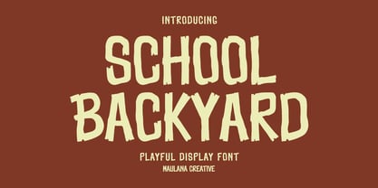 School Backyard playful display font. Regular stroke, fun character with a bit of ligatures and alternates. To give you an extra creative work. School Backyard font support multilingual more than 100+ language. This font is good for logo design, Social media, Movie Titles, Books Titles, a short text even a long text letter and good for your secondary text font with script or serif. Make a stunning work with School Backyard font. Cheers, Maulana Creative
 - Gloriance by Mevstory Studio,
$25.00 Gloriance is a classic serif font adapted from the art deco style, a visual style that emerged in the 1920s and 1930s. This font is characterized by bold geometric shapes, a symmetrical design, and a sense of modernity and glamour. Gloriance is designed to have a distinctive classic impression with the presence of decorative elements such as extended lines, neat and tidy decorative shapes and types. These decorative elements can add a sense of sophistication and luxury to text. With a wide selection of alternates and ligatures, you can create a variety of styles and play with this unique fonts. This typeface is perfect for an elegant logo, jewelry stuff, packaging, magazine design, fashion brand, classic stuff, poster, flyer, wedding invitation, quotes, or simply as a stylish text overlay to any background image.
 - Rocket Pop by astroluxtype,
$20.00 Rocket Pop and Rocket Pop Outline are influenced by product packaging and cereal box art from the 1960's and 1970's. The fonts will work as companions or separate. Best used over 36pt as a headline display face, these fonts will bring a bold playfulness to any project where a vintage or retro style is in the concept. The style reflects the era when things were indeed, mad, where men (and some women) did crazy art for vinyl records, food packaging and kiddie products. Sugar frosted blue donut cereal is yummy for your tummy like... Rocket Pop and Rocket Pop Outline. Buy both and get the discount! Watch for the Cerealboxx Set coming soon that will include the astroluxtype fonts, Sugarbang! Koo Koo Puff and Rocket Pop together in one box.
 - Rocket Pop Outline by astroluxtype,
$20.00 Rocket Pop Outline and Rocket Pop are influenced by product packaging and cereal box art from the 1960’s and 1970’s. The fonts will work as companions or separate. Best used over 36pt as a headline display face, these fonts will bring a bold playfulness to any project where a vintage or retro style is in the concept. The style reflects the era when things were indeed, mad, where men (and some women) did crazy art for vinyl records, food packaging and kiddie products. This outline font will bring a snap and crackle and a pop to any of your vintage design projects. Watch for the Cerealboxx Set coming soon that will include the astroluxtype fonts, Sugarbang! Koo Koo Puff and Rocket Pop together in one delicious box.
 - Six Week Holiday by Kitchen Table Type Foundry,
$16.00 In Holland, all kids have a six week long school holiday during the summer months. To prevent chaos, traffic jams and other madness, the government has divided the country in three regions (North, Middle and South) and school holidays start a few days to a week and a half apart. For kids this is the best time of the year, as they can have fun for a month and a half, but for us parents this sometimes is a bit of a logistic nightmare, as we still have to work! Six Week Holiday is an ode to the chaos of summer. It is a cute handmade ‘school’ font that will put some sunshine in your designs! Comes with extensive language support.
 - Thoroughfare JNL by Jeff Levine,
$29.00 The Art Deco style of the 1930s offers many variants of the popular "streamline" look in hand lettering found on old sheet music titles. Thoroughfare JNL is one such example of a monoline design with the interesting curves and angles that was considered so modern and up to the minute for its time.
 - Screenplay JNL by Jeff Levine,
$29.00Screenplay JNL was modeled from the signage seen in an old photo of the RKO movie studios building circa the 1930s. This multi-line lettering is so classic of the Art Deco period. For best effect and readability, use wider spacing between letters. For single words or initials, regular spacing should do fine. - Eurasian Stencinitials JNL by Jeff Levine,
$29.00Eurasian Stencinitials JNL are modeled from a set of crudely die-cut Old English capital letter stencils that were made in Japan in the Early 1960s. The interesting treatment of the letters (with a slight hint of Japanese calligraphy) has some added bamboo plants for balance and decoration in this digital version. - Slapsie Maxi NF by Nick's Fonts,
$10.00Our old friend Carl Holmes, in another offering from his ABC of Lettering, takes the blacks to the max with this commanding face. A perfect choice for can't-miss headlines. Both versions of this font contain the Unicode 1252 (Latin) and Unicode 1250 (Central European) character sets, with localization for Romanian and Moldovan. - Guillotine by Canada Type,
$24.95 Guillotine is inspired by an uncredited early 1970s film face called Rhythm Bold. While the original film type had plenty of round forms that were uneven and somewhat badly drawn to fit within the overwhelming pop wave of the time, this digital incarnation disposes of all curves, relies on a much sharper grid, and adheres to specific parameters of stroke widths and angles. Guillotine is a thick poster classic, mechanically constructed yet clearly exhibiting the idiosyncratic traits of hand drawing. Its forms embody the amalgamation of a multitude of influences, such as woodcut letters, punch card forms, and the unique art nouveau concepts that were popular in the 1960s and 1970s. The totality of the font is a strong display aesthetic that plays very well anywhere the eye is meant to see a strong but casual, sharp but hand crafted message. This font comes in all popular formats for all common platforms, and includes expanded language support to cover Western, Eastern and Central European Latin languages, as well as Baltic, Celtic/Welsh, Esperanto, Maltese, and Turkish. A few alternate characters are sprinkled throughout the character map.
 - Mathias by Bisou,
$15.00 Except doodling on your notebook, what a better occupation would you have while the teacher tries to explain physics on the blackboard ? Create an awesome font ? Mathias is a font created in class by a lazy designer named Mathias. The result is one of the most complete font made by Bisou. Mathias font is retro. It will catch the attention of the reader in a blink of an eye. Exclusively recommended for titles, this bold font will suite perfectly your company name on a big truck, your old school car spare parts sign, the logo for a brand of cigarettes, alcoholics or shoe polish.
 - Broken Console by Arterfak Project,
$14.00 Proudly present "Broken Console", the geometric pixel font inspired by the old school game console which displaying pixel art in the game view. Broken Console created in 3 styles: Regular (one pixel), Bold (double pixels), and Shadow. This font is an all-caps font that is suitable for the contemporary era of graphic design nowadays. This font has a distinctive look in letterforms that makes it so unique, and suitable for specific themes like Techno, Digital, Retro, New Wave, Cyberpunk, Night, Gaming, Sporty, and much more! Font featured : All-caps alphabet Numbers Symbols & punctuation Multilingual support Thank you for visiting. Hope you like it!
 - Ristaga Script by Gatype,
$10.00 Ristaga Script is an old-school inspired script typeface that pairs perfectly with bold and tough type. Very awesome for labels & logos. I'm starting to create typefaces to use in a branding project and I think Gibson is the missing font from my Type Collection. Perfect for use in everything from Branding, Web, Packaging, Etc. The Ristaga script features OpenType style alternatives, International binders, and support for most Western Languages included. To enable the OpenType Stylistic alternative, you need a program that supports OpenType features such as Adobe Illustrator CS, Adobe Indesign & CorelDraw X6-X7, Microsoft Word 2010 or later. Thank you very much for viewing and Enjoying it.
 - Cartoon Family by Ake,
$12.00 Cartoon Family Font is a cool and friendly display font that brings a playful and authentic vibe to your designs. This fun font is perfect for children activities, school projects, storybooks, posters, and more. With its chunky letter style, Cartoon Family Font adds a touch of liveliness and personality to any design. Let your creativity soar and watch your designs come alive with this captivating font.
 - Renault MN - Unknown license

- Sodbuster NF by Nick's Fonts,
$10.00 Another William H. Page classic, Gothic Dotted, provided the pattern for this bold and brassy typeface. Both versions of this font support the Latin 1262, Central European 1250, Turkish 1254 and Baltic 1257 codepages.
 - Dujour by Ascender,
$29.99 Dujour is an art deco revival of the 1930s typeface Independent from the Collette and Dufour typefoundry. Steve Matteson created Dujour to enhance posters, signs or other documents with a touch of historical boldness.
 - Road Repair JNL by Jeff Levine,
$29.00 Road Repair JNL is a bold (hand lettered) sans serif stencil font based on the opening credits from the 1954 film “Drive a Crooked Road” – and is available in both regular and oblique versions.
 - Cervo Neue Condensed by Typoforge Studio,
$29.00 Cervo Neue Condensed is the new perfected and Condensed version of Cervo Neue, containing 18 variants. It differs from the previous version of Cervo with the higher accents over glyphs, enlarged punctuation, old-style numerals and the newly added varieties Semi Bold, Bold, Extra Bold and Black. Additionally, there is the variety of grotesque. Font Cervo is inspired by a “You And Me Monthly” published by National Magazines Publisher RSW „Prasa” that appeared from Mai 1960 till December 1973 in Poland. Recently, Cervo Neue Condensed has started being used as a display text in „Przekrój Magazine” which was published in years 1945–2013 in Krakow (2002–2009 in Warsaw) as a weekly and again from 2016 as a quarterly journal in Warsaw.
 - Bodebeck by Linotype,
$29.99 The Swedish designer/typographer Anders Bodebeck designed the Bodebeck type family in 2002. The family, which includes five different styles, is primarily intended for use as a titling, or display face, and belongs to the neo-transitional style of typefaces. Transitional style type first appeared in England during the late 1750s, when John Baskerville released his first sets of type. Bodeck bears similarities to another, later transitional style typeface as well - Eric Gill's Perpetua (originally released by the British Monotype Corporation in 1928). Like these two previous English stonecutters turned masters of typography, Anders Bodebeck has given us a modern re-interpretation of classic letterforms. Bodebeck, which is fitted with old style figures, is available in the following styles: Regular, Italic, Bold, Bold Italic, and Extra Bold."
 - Boldiva by Graphicfresh,
$9.00 Looking for a way to add a touch of bold, retro charm to your designs that evoke the fun and creativity of the 70s, 80s, and 90s? Look no further than our collection of classic and modern fonts that are perfect for logos, posters, and all kinds of design projects, whether you're going for an old-school vibe or a fresh new twist on retro design. With our carefully curated selection of fonts, you'll have everything you need to create eye-catching and memorable designs that capture the essence of classic design from the past. Whether you're looking to add some vintage flair to a modern design, or you want to create a throwback look that's right at home in the 90s, our fonts are the perfect tool for the job. From bold, geometric designs that harken back to the 80s, to playful, colorful fonts that embody the fun-loving spirit of the 70s, our collection has something for everyone. And with our easy-to-use design tools and resources, you'll have everything you need to bring your creative vision to life in no time. So why wait? Start exploring our collection of classic and modern fonts today, and discover how easy it can be to create stunning logos, posters, and designs that are truly one-of-a-kind. Whether you're a seasoned designer or just starting out, our fonts are the perfect way to add a touch of old-school charm to any project.
 - Generisch Sans by Akufadhl,
$29.00 Generisch - a german equivalent of generic - sans serif typeface has gain its own place among designers and earn such popularity due to its "simple" design. Generisch is influenced by early grotesk typefaces from early 1900's when sans was starting to get popular and used as a body type. Some old ligatures such as ch ck and ng are present in generisch (not the ct and st tho), old style numeral for better typesetting experience and more.
 - Schneidler Latein by Spirit & Bones,
$33.00 The Schneidler Latein is a sharp and elegant Antiqua based on the ductus of the broad edged pen with a strong character. Running perfectly in paragraph text giving it something quite special and being effortlessly legible at the same time, Schneidler Latein works great in headings as well. Each glyph is a piece of art ready to be used in branding and blowup combining beauty and personality in a kick-ass blend. It is absolutely new to the digital world as it never has been digitized before. This new version digitized, further developed and extended by artist and graphic designer Lena Schmidt comes in nine styles from which there are four application-related ones like Subtext and Display and five weight-related ones like Bold and Heavy. Each style contains 948 glyphs, variations of numbers, three stylistic sets one preserving the historic forms of changed characters, small caps, open type features and superior and inferior characters. Designed by F. H. Ernst Schneidler the Schneidler Latein was released in 1916, the bold version in 1920 and the italics in 1921. Schneidler was born in 1882 in Berlin. He studied at the school for applied arts in Düsseldorf with professor F. H. Ehmcke and P. Behrens. He was as a painter, graphic designer and illustrator. In 1920 he was appointed as teacher in the school for applied arts Stuttgart. His students were Albert Kapr, Imre Reiner and Lilo Rasch-Naegele among others. Further well-known fonts from his hands are for example Legende, Amalthea, Schneidler Mediävel and Schneidler Antiqua. Lena Schmidt was born 1981 in Bremen. She is a german painter, graphic designer and illustrator mostly known for her huge wood carving paintings. From 2003 to 2011 she studied Fine Arts in Hamburg with professor Matt Mullican. From 2015 to 2019 she studied graphic design with a focus on type design at HAW Hamburg Department Design with professor Jovica Veljović. She lives and works in Hamburg, Germany.
 - Ornata F by Wiescher Design,
$39.50 Ornata F is the sixth of a series of old ornaments that I am trying to save from oblivion. I am completely redesigning the ornaments from scratch. These ornaments have been designed around 1910, I could not find out by whom. This set is perfect to design flowery frames. Your digitizing typedesigning savior, Gert Wiescher
 - Thalia by profonts,
$41.99 Thalia is a wonderful Artdeco typeface design reminiscent of 1900. Very likely, it was originally designed at that time. Unger redesigned the typeface based on old prints, completed the character set and expanded the typeface to cover the full Latin glyph set. Thalia is perfect for anything about theater, such as posters, programs, etc.
 - WL Dot Matrix by Writ Large,
$5.00 WL Dot Matrix is another typographic flashback to computing of the mid 1980s, when 9-pin dot-matrix printers were the state of the art. Compatible with the cleaner WL Rasteroids family, WL Dot Matrix explores some of the common failure modes of old printers: smudging ribbons, slipped tractor feeds, and gummed up print heads.
 - Closet Skeleton by Hanoded,
$20.00 Some time ago I stumbled upon a little book called 'De Sprookjeshoorn' ('Horn of Fairy Tales') by Anton Eijkens (1920 - 2012). It was published in 1946 and contains several authentic and unique fairy tales - unfortunately unreadable to modern children, as the language used is out of date. What caught my eye was the handwritten font on the cover of the booklet. Closet Skeleton is a fairytale font inspired by the one I found on the cover of De Sprookjeshoorn. It comes with several curly alternates and some end-ligatures as well. I added an 'old fashioned' ampersand and a modern one, so you can choose which one to use. Apart from that, Closet Skeleton comes with a closet choc-a-block full of diacritics.
 - ITC Officina Display by ITC,
$29.99When ITC Officina was first released in 1990, as a paired family of serif and sans serif faces in two weights with italics, it was intended as a workhorse typeface for business correspondence. But the typeface proved popular in many more areas than correspondence. Erik Spiekermann, ITC Officina's designer: Once ITC Officina got picked up by the trendsetters to denote 'coolness,' it had lost its innocence. No pretending anymore that it only needed two weights for office correspondence. As a face used in magazines and advertising, it needed proper headline weights and one more weight in between the original Book and Bold."" To add the new weights and small caps, Spiekermann collaborated with Ole Schaefer, director of typography and type design at MetaDesign. The extended ITC Officina family now includes Medium, Extra Bold, and Black weights with matching italics-all in both Sans and Serif -- as well as new small caps fonts for the original Book and Bold weights. - ITC Officina Sans by ITC,
$40.99When ITC Officina was first released in 1990, as a paired family of serif and sans serif faces in two weights with italics, it was intended as a workhorse typeface for business correspondence. But the typeface proved popular in many more areas than correspondence. Erik Spiekermann, ITC Officina's designer: Once ITC Officina got picked up by the trendsetters to denote 'coolness,' it had lost its innocence. No pretending anymore that it only needed two weights for office correspondence. As a face used in magazines and advertising, it needed proper headline weights and one more weight in between the original Book and Bold."" To add the new weights and small caps, Spiekermann collaborated with Ole Schaefer, director of typography and type design at MetaDesign. The extended ITC Officina family now includes Medium, Extra Bold, and Black weights with matching italics-all in both Sans and Serif -- as well as new small caps fonts for the original Book and Bold weights. - ITC Officina Serif by ITC,
$40.99 When ITC Officina was first released in 1990, as a paired family of serif and sans serif faces in two weights with italics, it was intended as a workhorse typeface for business correspondence. But the typeface proved popular in many more areas than correspondence. Erik Spiekermann, ITC Officina's designer: Once ITC Officina got picked up by the trendsetters to denote 'coolness,' it had lost its innocence. No pretending anymore that it only needed two weights for office correspondence. As a face used in magazines and advertising, it needed proper headline weights and one more weight in between the original Book and Bold." To add the new weights and small caps, Spiekermann collaborated with Ole Schaefer, director of typography and type design at MetaDesign. The extended ITC Officina family now includes Medium, Extra Bold, and Black weights with matching italics-all in both Sans and Serif -- as well as new small caps fonts for the original Book and Bold weights."
 - Northash by Arterfak Project,
$17.00 Introducing Northas the vintage stencil font inspired by the old-school signage and military design. This font has a bit condensed letterform that gives a strong look and dignified. Perfect for many themes such as sports, military, urban, wildlife, vintage, and more! Fonts featured : Uppercase Small caps Numbers Symbols & punctuation Accented characters Alternates Catchwords: in, out, the, with, de, of, at, and, etc. Thank you for your support and happy designing!
 - Kiez by Blackmoon Foundry,
$24.00 The “Kiez“ is an old school style font designed by Elena Albertoni in 2016. Inspired by shop and bar signage of the sixties and seventies, which can still be found today in the so called “Kiez“ in Hamburg St. Pauli or in one or another “Kiez“ in Berlin, which means neighborhood here. It also has a cinematic touch, again: think of the sixties and seventies or your favorite b-movie.
 - Vintage Browner by Arterfak Project,
$19.00 Vintage Browner is an exquisitely designed vintage-inspired typeface. Meticulously crafted with an original hand-drawn design, it exudes an old-school charm that is ideal for designs requiring a classic touch. This font is truly a perfect fit for vintage themes, including vintage logos, logotypes, packaging, storefronts, prints, t-shirts, decals, labels, and countless other possibilities. With its special characters, you can create your very own vintage aesthetic designs!
 - Annexxus by Kustomtype,
$25.00 Kustomtype's 'Annexxus' font is a serrif font family with a regular & oblique version. It contains all upper & lower cases. The 'Annexxus' family is coordinated into letterforms, metrics, and weights to work better together. Why still looking for old school types for your posters, text, design, artwork, headtext, editoral design, magazines, etc.? Dress up your graphic work with 'Annexxus! A good font does not have to be perfect to be wonderful!
 - Integra Chic by Kustomtype,
$25.00 Kustomtype’s “Integra Chic” font is a sans serif font family with a regular & oblique version. It contains all upper & lower cases. The “Integra Chic” family is coordinated into letterforms, metrics, and weights to work better together. Why still looking for old school types for your posters, advertising, text, design, artwork, headtext, editoral design, magazines, etc... “To banish imperfection is to destroy expression, to check exertion, to paralyze vitality.” John Ruskin
 - Skulebuk by WCM,
$20.00Skulebuk is a decorative typeface ideally created for use on edgy/street/urban or sports related design projects. Reminiscent of the early 90s scribblings in the back of my old school books (we all remember right!) instead of doing real work! The two weights available Regular and Heavy will help balance designs that want to over use the typeface i.e Heading and body text. 80s-90s is very now!
