10,000 search results
(0.079 seconds)
- Hillray by Sarid Ezra,
$15.00 A NEW STYLISH BOLD FONTS WITH LIGATURE & ALTERNATES, Hillray! Hillray is a stylish bold sans that contains ligatures and alternates each characters! You can make a unique branding with this fonts. This stylish bold fonts also included extrude and outline style that will compliments the regular style! This fonts suitable to use for poster, branding, merchandise, and any street art style! Also support multilingual and already PUA Encoded! Thank You!
 - Palo Slab by TypeUnion,
$30.00 Palo Slab is an epic font family made up of 9 weights in four widths, along with italic & oblique options to total a massive 108 styles. Using our 2020 release Palo as the base, the slab version began to take on its own life and personality to become a unique entity in its own right. From super punchy heavy weights to the delicate lighter weights, the Palo Slab super family is a versatile beast that offers you ultimate flexibility. The heavy weights ranging from Compressed Black to Wide Black are built with super tight spacing and love to be big and bold, so perfect for showing off your brand. The Italic styles add curves to the slab feel, providing a beautiful flow, but we've also included an oblique option if you want to use the blockier version. Palo Slab features extensive latin language support as well as OpenType features such as case sensitive punctuation, old style figures, scientific numbers and ligatures, + arrows. You can check out our 2020 release Palo here.
 - Walkingblue by LetterStock,
$25.00 Walkingblue This pair was inspired by old motorcycle poster design that i saw on some gellery, It was crafted by hand specially to add natural handmade feeling in its brand identity than i make it clean with pentool. We add some rough to make it retro feel, this font is bold so it can look strong if you use it for branding or even title for your retro poster design. Opentype features Walkingblue font has 204 character set included Walkingblue Font is very good looking in retro rough logotype, labels, t-shirt prints, product packaging, invitations, advertising and others. This fonts works with folowing languages: Afrikaans, Albanian, Asu, Basque, Bemba, Bena, Chiga, Cornish, Danish, English, Estonian, Filipino, Finnish, French, Friulian, Galician, German, Gusii, Indonesian, Irish, Italian, Kabuverdianu, Kalenjin, Kinyarwanda, Low German, Luo, Luxembourgish, Luyia, Machame, Makhuwa-Meetto, Makonde, Malagasy, Malay, Manx, Morisyen, North Ndebele, Norwegian Bokmål, Norwegian Nynorsk, Nyankole, Oromo, Portuguese, Romansh, Rombo, Rundi, Rwa, Samburu, Sango, Sangu, Scottish Gaelic, Sena, Shambala, Shona, Soga, Somali, Spanish, Swahili, Swedish, Swiss German, Taita, Teso, Vunjo, Zulu Thank you for using this font. LS
 - Adriane Text by Typefolio,
$49.00 Adriane Text was designed between 2006 and 2007 with additional production completed by Silas Dilworth for this 2008 release [v1.002]. Focusing on text composition and unique typographic characteristics, details within the characters provide both personality and excellent legibility at small sizes. With a medium contrast, a predominantly vertical axis, and a generous x-height, it can be classified as a transitional typeface. This package of advanced OpenType fonts consists of the style-linked quartet of Regular and Bold weights accompanied by corresponding Italics, each of which include small caps and full support for Extended Latin character sets - now including Central European diacritics. Old style and lining figures are provided in both proportional and tabular spacing, and an extensive set of ligatures, ornaments, dingbats, and alternate ampersands are available across the family. The Italics possess a fluidity that contrasts with the staid posture of the Roman styles. The degree of inclination for the uppercase and lowercase characters are slightly different, offering an enhanced visual rhythm in the text settings.
 - Poem Script Pro by Sudtipos,
$79.00 Poem Script is a mixed collection of interpretations conjuring a late nineteenth century American pen script style. Though not an actual Italian letterform, this style was called “Italian Alphabet” stemming from an old penman’s term for an alphabet where the stress or shades are opposite their normal placement. The American variant followed from the late eighteenth century British hand also confusingly called “Italian Hand,” which itself evolved from some seventeenth century French batarde scripts. It showcases the phenomenal control and mastery of hand skills required to create such ornamental and lively letters centuries ago. Producing the shaded strokes in reversed positions such as this required holding the pen in a position horizontal to the baseline, or the letterforms would have to be written backwards or by rotating the paper at peculiar and extreme angles to achieve the effect. Exotic, elaborate and very attractive, Poem Script contains plenty of variations on each letter and comes with hundreds of calligraphic ornaments. Poem Script received a Certificate of Excellence at the Type Directors Club NY and was selected at the Bienal Tipos Latinos 2012.
 - Croftler by LetterStock,
$23.00 Croftler This pair was inspired by old motorcycle poster design that i saw on some gellery, It was crafted by hand specially to add natural handmade feeling in its brand identity than i make it clean with pentool. We add some rough to make it retro feel, this font is bold so it can look strong if you use it for branding or even title for your retro poster design. Opentype features Croftler font has 201 character set included Walkingblue Font is very good looking in retro rough logotype, labels, t-shirt prints, product packaging, invitations, advertising and others. This fonts works with folowing languages: Afrikaans, Albanian, Asu, Basque, Bemba, Bena, Chiga, Cornish, Danish, English, Estonian, Filipino, Finnish, French, Friulian, Galician, German, Gusii, Indonesian, Irish, Italian, Kabuverdianu, Kalenjin, Kinyarwanda, Low German, Luo, Luxembourgish, Luyia, Machame, Makhuwa-Meetto, Makonde, Malagasy, Malay, Manx, Morisyen, North Ndebele, Norwegian Bokmål, Norwegian Nynorsk, Nyankole, Oromo, Portuguese, Romansh, Rombo, Rundi, Rwa, Samburu, Sango, Sangu, Scottish Gaelic, Sena, Shambala, Shona, Soga, Somali, Spanish, Swahili, Swedish, Swiss German, Taita, Teso, Vunjo, Zulu Thank you for using this font. LS
 - Scribonius GTSLB by Intellecta Design,
$30.00 Blackletter typefaces, also known as Gothic, Fraktur, or Old English, have been used in the headings and initial chapters of books. This style of typeface is recognizable by its dramatic thin and thick strokes, and in some fonts, the elaborate swirls on the serifs. Blackletter typefaces are based on early manuscript lettering and evolved in Western Europe from the mid twelfth century. They are best used for headings, logos, posters, and signs, as they are not easy to read in body texts. Blackletter was type that emulated the most common handwritten scripts of the era and was used for books of hours and initial chapters of books Brazilian type designer Paulo W created this font ideally suited for advertising and packaging, festive occasions, editorial and publishing, logo, branding and creative industries as well as poster and billboards. An elegant and clean typeface, with two harmonic blackletters styles, the bold lowercases with beaufitul ornamented initials. A classic decorative design around an antique theme: The headings of gothic texts, this font works great in display purposes. ENJOY
 - Tooth & Nail by Set Sail Studios,
$12.00 Introducing Tooth & Nail; a rustic & hearty hand-painted dry brush font, designed to work in both all-caps as well as lowercase. It also includes a bonus vector pack, featuring 24 elements designed to boost your text and reaffirm it's hand-made style. With rough bold strokes and high quality textures throughout, Tooth & Nail is the perfect workhorse font for product packaging, promotional messages, handwritten quotes, home decor and branding projects. Tooth & Nail is reliable and familiar, like meeting someone for the first time and feeling like you've been reunited with an old friend. Tooth & Nail consists of 2 styles: 1. Tooth & Nail • A handwritten brush font containing upper & lowercase characters, numerals and a large range of punctuation. 2. Tooth & Nail Alt • This is a second version of Tooth & Nail, with a completely new set of lowercase characters. If you wanted to avoid letters looking the same each time to recreate a custom-made style, or try a different word shape, simply switch to this font for an additional layout option.
 - Relato Sans by Emtype Foundry,
$69.00 Relato Sans is the other face of Relato Serif (a typeface with much idiosyncrasy) nevertheless, the sans version of this typeface is more austere and aseptic. A humanistic type, with a contemporary cut, created for general use in texts and holders and with a great variety of weights, which allow enough flexibility for projects of great magnitude. Although leading with an independent family it maintains many of the characteristics of its homologous such as proportions, the “x” height, the construction based on air lines of the italic, ornaments and so on. These details show coherence with the serif version, and at the same time reinforce its personality. Being a multifunctional type, the “kerning” has been worked to function in small sizes as well as in larger ones such as holders. The contrast between weights, was optimized to be used in pairs (Light with Semibold, Regular with Bold and Medium with Black). Relato Sans is presented in 6 different weights, in Roman, Italic, Small Caps and Small Caps Italic with three different styles of numerals, Old style figures, Lining figures and Small Caps figures.
 - Ermis Pro by Wannatype,
$62.00 Ermis Pro – handwritten, multilingual, natural Ermis Pro is a cross between a perfectly finished, comprehensive, classically cut old face type and handwriting. It combines the slightly irregular contours you see in very small letter sizes caused by the flow of ink on paper with the elegant look and feel of a serif font. This makes Ermis Pro the perfect choice for stylish printed materials with a personal touch, doubtlessly winning fans in the worlds of fiction and fantasy alike. Ermis Pro is robust and easy to read in both display and body copy. With its comprehensive character set, it is suitable for a wide range of typographical uses. Besides the standard Latin, the character set includes the Greek and Cyrillic alphabets as well as extended Latin with pan-African letters and the complete International Phonetic Alphabet (IPA). Ermis Pro also comes with numerous OpenType features such as discretionary ligatures, small capitals and nine number variants. The typeface features upright and italic fonts in three weights: Light, Regular and Bold.
 - Historic Warehouse by Just My Type,
$25.00 Gotta tell ya: think out of the box and this font is addictingly fun to use! Introducing Historic Warehouse, a substantial, yet elegant family, invoking advertising fonts of the early 20th century. Why the name? When asked to design a banner for Tucson’s Historic Warehouse District, I couldn’t find the look I wanted from any known fonts. After drawing what I wanted in Illustrator, there were three (and in the process, four) fonts just waiting to be realized. Happy to oblige. Here’s Historic Warehouse Regular, setting the stage. It’s sturdy, bold, and plays curves against rounded angular shapes. To its left is Historic Warehouse Condensed, trim, elegant and at its best at very large sizes; to the right is Historic Warehouse Wide, with charming style and presence. Finally, there’s Historic Warehouse Extended, extravagant in its proportions, with a beautifully-crafted form like a fine carriage. As the song says, “Everything Old Is New Again,” and this family looks as fresh and clean at the beginning of this century as it might have at the beginning of the last.
 - PF DIN Stencil B by Parachute,
$43.00 This is a new version of our popular DIN Stencil family designed with a wider cut than the original. This overcomes the diminishing effect of the stencil at smaller sizes where the cuts tend to disappear, whereas it makes a bold statement at display sizes. Traditionally, stencils have been used extensively for military equipment, goods packaging, transportation, shop signs, seed sacks and prison uniforms. In the old days, stencilled markings of ownership were printed on personal possessions, while stencilled signatures on shirts were typical of 19th century stencilling. DIN Stencil B manages to preserve several traditional stencil features, but introduces additional modernities which enhance its pleasing characteristics and make it an ideal choice for a large number of contemporary projects. It consists of 7 diverse weights from Extra Thin to Black. This version supports Latin, Cyrillic, Eastern European, Turkish and Baltic. DIN Stencil B includes several additions such the recently unicode encoded character of the German uppercase Eszett (ẞ), the Russian currency symbol for Rouble (₽), Ukrainian Hryvnia (₴), Azeri and Kazakh letterforms.
 - Mellow Serif by ParaType,
$30.00 Mellow Serif is a soft and friendly typeface. It looks compelling in large point sizes due to the rounded terminals and calligraphic details. Mellow Serif also works well in body text with a small leading size as it has even proportions and a large x-height. Mellow Serif includes ten styles—five upright and five italic, ranging from Light to Extra Bold. The typeface supports extended Latin, extended Cyrillic, and Greek. The character set also includes old style figures, small caps in the Light, Regular, and Medium upright styles as well as stylistic alternate sets that slightly change the way Mellow Serif looks in large point sizes. The Regular style also has alternative letterforms with swashes. Mellow Serif is great for book printing (from fiction and children’s books to science literature), headings, and large texts on the web as well as for toys and confectionary packaging. It also works perfectly with a rounded sans serif Mellow Sans. Mellow Serif was created by Natalya Vasilyeva, an expert in designing text and calligraphic typefaces, and released by Paratype in 2023.
 - Raslani American letters - Unknown license

- Kremlin Bolshevik - Unknown license

- Rocker stage by Jehansyah,
$9.00 This font is very beautiful if we combine it into a design that wants to appear bold, bold and unique, there are several alternatives that you can use to make this font as support for your design project.
 - Jesus Saves by Breauhare,
$13.94 Jesus Saves is a font based on the familiar old logo that has “JESUS” hidden within a maze-like set of multi-branched vertical bars. The characters appear to be an alien, cryptic language at first sight, perhaps even a Japanese, Chinese, or Korean language, thanks to the unusual figures created by the combinations of various letters. It is a teaser for the eyes, as well as a visual feast of De Stijl-type art. It is an attention-getting font that is cool to look at, an eye puzzle that is enticing to decipher. It’s a great font to use for striking logos (see Gallery Images) by the judicious use of ligatures, where in word settings ligatures may be used at the beginnings of words, the middle or the endings of words. Jesus Heals is the missing spaces from the Jesus Saves font, sort of like a doughnut hole font! If you use this font to fill in the spaces in the Jesus Saves font, it becomes whole, or healed, thus the name. Jesus Lives is a raised block/3D or three dimensional version of Jesus Heals. For color combinations in apps that support layering, Jesus Lives synchs and has perfect kerning register with Jesus Heals, as Jesus Heals has with Jesus Saves. The digitization was done by fontmeister John Bomparte.
 - Taco by FontMesa,
$25.00 Taco is a new Mexican style font family based on our Tavern and Algerian Mesa type designs. When I finished the extra heavier weights for Tavern I decided to play around with a decorated version, the extra bold letters allowed for much more room to work with an inlay pattern. After experimenting with several designs I decided on a Mexican pattern because the original base font is very popular in Mexican restaurant logos and menus plus it's frequently used on Tequila bottle labels. I originally planned three weights for the Taco font family, however, after completing the bold weight I've decided to release it now so you may put it to use while the regular and extra bold are being produced, sorry I can't estimate a release date for the two other weights. To use the fill font layers you'll need an application that allows you to work in layers such as Adobe Creative Suite products. The Taco Fill Uno font may be used as a stand alone font, however, we recommend searching for our Tavern font family where you'll find three different bold weights of this same design. Opentype features aware applications are also needed for accessing the many alternate glyphs in Taco, all the alternates that you love in our Tavern fonts are also available in Taco. While the fill font layers are in registration with one another some applications may throw them out of alignment by changing the spacing. Custom inter letter spacing in Adobe Creative Suite may also throw the fill fonts out of alignment. We recommend doing your custom spacing first then duplicate the type layer and change to the next fill font and color. The inspiration for the Taco name of this font family was from a homemade Taco dinner I made for a guest at my house, after dinner I searched to see if there was a commercial font named Taco. There was no such font named Taco and the rest is history. The old Stephenson Blake Algerian font has come a long way since 1908, and we're not done with it yet. We hope you enjoy our Taco font family, we're looking forward to see it in use.
 - ITC Pino by ITC,
$29.99The ITC Pino™ typeface family is Slobodan Jelesijevic’s second suite of commercial fonts. Although a small family of three weights, it is remarkably versatile. Like many typefaces, Pino grew out of a desire for a particular kind of design. Jelesijevic was creating a series of illustrations for a children’s magazine and needed a typeface that was lighthearted, legible and would complement his illustrative style. Unable to find exactly what he needed, he decided to make his own font. “I spent the better part of a day looking for just the right typeface,” he recalls. “Of course, the hard part was finding something that would harmonize perfectly with my drawings. A custom font was not part of the project brief or budget, but I thought that perhaps I could use it again.” The regular weight of Pino became the solution to Jelesijevic’s problem. Jelesijevic did use the font again, but quickly realized that the single weight needed companion designs. Pino Bold and Black followed in quick succession. Before licensing the designs to ITC, the three-weight family provided headlines, book cover titles and even short blocks of text copy in several of Jelesijevic’s design projects. Born in Gornji Milanovac, Serbia, in 1951, Jelesijevic graduated with a degree in graphic communication and lettering from the Faculty of Applied Arts in the University of Arts in Belgrade. Currently, in addition to typeface design, he is sought out as a graphic designer and illustrator. When not working on design projects, he teaches graphic communications at the Faculty of Art in the University of Niš, Serbia. Pino is a stressed sans of slightly condensed proportions. Pino’s generous x-height, clearly defined counters and distinctive character shapes enable it to fulfill a wide variety of typographic applications. Friendly without being sanguine, the Pino type family will communicate with charm and vitality. - Permanence by Typodermic,
$11.95 Welcome to the world of Permanence, where the past meets the future. Inspired by the iconic cover of Alvin Toffler’s groundbreaking hardcover, “Future Shock” from 1970, Permanence is the perfect typeface to transport you to a world of limitless possibilities. With its bold, clean lines and sleek design, Permanence captures the essence of the retro-futuristic style. Its crisp, angular shapes and unique curves evoke a sense of progress and innovation, harking back to a time when anything was possible. Permanence is more than just a typeface—it’s a vision of a better tomorrow. Its timeless design captures the optimism and hope of a bygone era, while still feeling fresh and modern. Why settle for the ordinary when you can experience the extraordinary with Permanence? Most Latin-based European writing systems are supported, including the following languages. Afaan Oromo, Afar, Afrikaans, Albanian, Alsatian, Aromanian, Aymara, Bashkir (Latin), Basque, Belarusian (Latin), Bemba, Bikol, Bosnian, Breton, Cape Verdean, Creole, Catalan, Cebuano, Chamorro, Chavacano, Chichewa, Crimean Tatar (Latin), Croatian, Czech, Danish, Dawan, Dholuo, Dutch, English, Estonian, Faroese, Fijian, Filipino, Finnish, French, Frisian, Friulian, Gagauz (Latin), Galician, Ganda, Genoese, German, Greenlandic, Guadeloupean Creole, Haitian Creole, Hawaiian, Hiligaynon, Hungarian, Icelandic, Ilocano, Indonesian, Irish, Italian, Jamaican, Kaqchikel, Karakalpak (Latin), Kashubian, Kikongo, Kinyarwanda, Kirundi, Kurdish (Latin), Latvian, Lithuanian, Lombard, Low Saxon, Luxembourgish, Maasai, Makhuwa, Malay, Maltese, Māori, Moldovan, Montenegrin, Ndebele, Neapolitan, Norwegian, Novial, Occitan, Ossetian (Latin), Papiamento, Piedmontese, Polish, Portuguese, Quechua, Rarotongan, Romanian, Romansh, Sami, Sango, Saramaccan, Sardinian, Scottish Gaelic, Serbian (Latin), Shona, Sicilian, Silesian, Slovak, Slovenian, Somali, Sorbian, Sotho, Spanish, Swahili, Swazi, Swedish, Tagalog, Tahitian, Tetum, Tongan, Tshiluba, Tsonga, Tswana, Tumbuka, Turkish, Turkmen (Latin), Tuvaluan, Uzbek (Latin), Venetian, Vepsian, Võro, Walloon, Waray-Waray, Wayuu, Welsh, Wolof, Xhosa, Yapese, Zapotec Zulu and Zuni.
 - Leroy by Andinistas,
$39.95 Leroy is a font family of 5 members designed from geometrizing Roman and Gothic skeletons. Its purpose is to provide optimal reading of titles and paragraphs with strong mechanical flavor. Because of this, its variables are designed to sort information in media such as labels, signs and industrial atmosphere packaging related with the Soviet Union’s fonts in 1920. This idea matured white horizontal lines superimposed on alphabets drawn with an ancient architectural team known as “Leroy K & E Controlled Lettering System”. Then that evolved into a family concept unifying its proportion to the same X height for its members, resulting in a versatile type system. Therefore, Regular and Bold variables have low contrast between thick and thin strokes. Its upstream and downstream are extremely short, generating a suitable interline that clogs the vertical area. Its overall width equal to its X height, supports its tight spacing that compacts the horizontal area. Therefore, the variant with black caliber has plenty of contrast between thick and thin strokes. The light variable has a “blind” effect radiating light halos, ideal to propose hierarchies and combinations with orthogonal projection. In that sense, Leroy’s modular character reminds constructivist ideology merged with typographical variants suitable for graphic design with geometric look. To achieve this, I studied the softening of forms and counter blocks into a typographical system specially designed for composing useful information to attract attention. In that sense, the dingbats were obtained through a careful process of research and testings done with drawings that provided full and empty visual strategies that with the passage of time helped to forge the major decisions of a metamorphosis from industrial tools, birds and humans from pictogram mixing various genres.
 - HWT Konop by Hamilton Wood Type Collection,
$24.95 HWT Konop is a monospaced (fixed-width) typeface that is also square! Designed by Mark Simonson (Proxima Nova) as square characters that can be arranged vertically or horizontally and in any orientation. To a traditional letterpress job printer, a font like this wouldn’t make much sense. But to a modern letterpress printer it is an unusual and creative design toolkit. The bold gothic style is reminiscent of gothic wood types but more geometric. Since the characters are meant to be used in any orientation, the usual optical adjustments, such as making verticals thicker than horizontals and making tops smaller than bottoms are set aside. This results in a quirky but charming design. To provide more design options, Simonson came up with a modular system consisting of three sizes: 12-line, 8-line, and 6-line. These three sizes can be used together like Lego® bricks, with endless arrangements possible. And the sidebearing match so that characters always align when different sizes are used together. The digital version of Konop replicates the wood type version as much as possible, including the three different size designs. It includes OpenType stylistic sets that allow most characters to be rotated in place, 90° left, 90° right, or 180°, just like the wood type version. Extra characters not available in the wood type version are included with the digital fonts. The set of 3 is priced just $5 more than one single font, so order via "Package Options" HWT Konop is named for Don Konop, a retired Hamilton Manufacturing employee, who worked from 1959 to 2003. In addition to serving on the Two Rivers Historical Society Board from 2004 to present-day, he was also instrumental as a volunteer in helping with the museum’s move to its current home in 2013.
 - Naked Power by Typodermic,
$11.95 Introducing Naked Power, a stunning sans-serif typeface inspired by the iconic geometric fonts of the early 1900s. In a world where minimalism reigns supreme, Naked Power brings a much-needed touch of retro charm to the modern design landscape. With its clean lines and distinctive shapes, Naked Power adds a unique personality and character to any project. Whether you’re creating a logo, designing a website, or crafting a poster, this font is sure to make a lasting impression. Available in eight weights, Naked Power offers incredible versatility and flexibility. From delicate lightweights to bold and powerful heavyweights, this font has everything you need to make a statement. And with its appealing italics, you can add even more emphasis and style to your work. Don’t settle for ordinary design. Bring your projects to life with Naked Power, the retro-inspired typeface that’s sure to turn heads and capture hearts. Most Latin-based European writing systems are supported, including the following languages. Afaan Oromo, Afar, Afrikaans, Albanian, Alsatian, Aromanian, Aymara, Bashkir (Latin), Basque, Belarusian (Latin), Bemba, Bikol, Bosnian, Breton, Cape Verdean, Creole, Catalan, Cebuano, Chamorro, Chavacano, Chichewa, Crimean Tatar (Latin), Croatian, Czech, Danish, Dawan, Dholuo, Dutch, English, Estonian, Faroese, Fijian, Filipino, Finnish, French, Frisian, Friulian, Gagauz (Latin), Galician, Ganda, Genoese, German, Greenlandic, Guadeloupean Creole, Haitian Creole, Hawaiian, Hiligaynon, Hungarian, Icelandic, Ilocano, Indonesian, Irish, Italian, Jamaican, Kaqchikel, Karakalpak (Latin), Kashubian, Kikongo, Kinyarwanda, Kirundi, Kurdish (Latin), Latvian, Lithuanian, Lombard, Low Saxon, Luxembourgish, Maasai, Makhuwa, Malay, Maltese, Māori, Moldovan, Montenegrin, Ndebele, Neapolitan, Norwegian, Novial, Occitan, Ossetian (Latin), Papiamento, Piedmontese, Polish, Portuguese, Quechua, Rarotongan, Romanian, Romansh, Sami, Sango, Saramaccan, Sardinian, Scottish Gaelic, Serbian (Latin), Shona, Sicilian, Silesian, Slovak, Slovenian, Somali, Sorbian, Sotho, Spanish, Swahili, Swazi, Swedish, Tagalog, Tahitian, Tetum, Tongan, Tshiluba, Tsonga, Tswana, Tumbuka, Turkish, Turkmen (Latin), Tuvaluan, Uzbek (Latin), Venetian, Vepsian, Võro, Walloon, Waray-Waray, Wayuu, Welsh, Wolof, Xhosa, Yapese, Zapotec Zulu and Zuni.
 - Heroid by Typodermic,
$11.95 Introducing Heroid, the typeface that’s as powerful as a superhero! With its bold and daring letterforms, this font is guaranteed to make your design stand out from the crowd. Heroid comes in both regular and bold, so you can choose just how much of an impact you want to make. And with a selection of alternate caps, you can customize your design even further, making it truly one-of-a-kind. This typeface is so strong, it could punch its way through a steel door! So why settle for a plain, boring font when you can have Heroid, the typeface that’s as heroic as you are. Most Latin-based European writing systems are supported, including the following languages. Afaan Oromo, Afar, Afrikaans, Albanian, Alsatian, Aromanian, Aymara, Bashkir (Latin), Basque, Belarusian (Latin), Bemba, Bikol, Bosnian, Breton, Cape Verdean, Creole, Catalan, Cebuano, Chamorro, Chavacano, Chichewa, Crimean Tatar (Latin), Croatian, Czech, Danish, Dawan, Dholuo, Dutch, English, Estonian, Faroese, Fijian, Filipino, Finnish, French, Frisian, Friulian, Gagauz (Latin), Galician, Ganda, Genoese, German, Greenlandic, Guadeloupean Creole, Haitian Creole, Hawaiian, Hiligaynon, Hungarian, Icelandic, Ilocano, Indonesian, Irish, Italian, Jamaican, Kaqchikel, Karakalpak (Latin), Kashubian, Kikongo, Kinyarwanda, Kirundi, Kurdish (Latin), Latvian, Lithuanian, Lombard, Low Saxon, Luxembourgish, Maasai, Makhuwa, Malay, Maltese, Māori, Moldovan, Montenegrin, Ndebele, Neapolitan, Norwegian, Novial, Occitan, Ossetian (Latin), Papiamento, Piedmontese, Polish, Portuguese, Quechua, Rarotongan, Romanian, Romansh, Sami, Sango, Saramaccan, Sardinian, Scottish Gaelic, Serbian (Latin), Shona, Sicilian, Silesian, Slovak, Slovenian, Somali, Sorbian, Sotho, Spanish, Swahili, Swazi, Swedish, Tagalog, Tahitian, Tetum, Tongan, Tshiluba, Tsonga, Tswana, Tumbuka, Turkish, Turkmen (Latin), Tuvaluan, Uzbek (Latin), Venetian, Vepsian, Võro, Walloon, Waray-Waray, Wayuu, Welsh, Wolof, Xhosa, Yapese, Zapotec Zulu and Zuni.
 - 612KosheyLinePL - Unknown license

- andregestauchtbold - Unknown license

- Gorlock - Unknown license

- Littler Serifada by Intellecta Design,
$21.90a bold sans serif family with many variants - Langó - Unknown license

- Antaviana - Unknown license

- Esta Pro by DSType,
$26.00The multi award winning ESTA is back, renewed and improved in OpenType format. Now named Esta Pro, is available in Regular, Italic, Bold, Bold Italic, Display and Swashes. Includes plenty of features, like SmallCaps, Alternates, Ligatures and CE characters. - Sometype Mono by Dharma Type,
$- Sometype Mono is a free monospaced font family for coding and tabular layout which can be used for commercial purpose for free. So far, Sometype Mono consists of 6 style. Regular, Italic, Medium, Medium Italic, Bold and Bold Italic.
 - CAL Bodoni Casale by California Type Foundry,
$47.00 This typeface has been beloved throughout history. Bodoni used it to print his first masterwork, but it has never before been publicly available. Now available for the first time, CAL Bodoni Casale has been painstakingly crafted from hi-res scans of 4 original Bodoni printings. Unlike many Bodonis drawn from computerized straight lines, this Bodoni follows the original contours of the master himself. With small caps, old style numbers, special options for $, %, £, €, Bodoni Casale allows you to make elegant pricing, sales signs, or logos. Besides it's authentic origins, Casale's 21st century debut includes Features & Alternates never seen before, including Frankenfont (giving the font 6 fun alternative uses with 1 click!). Other alternates, such as the $ and €, give the user options when styling their work. Various word and letter spacing options are also automatically included so the user can choose to preserve Bodoni's original spacings or go with a more modern look. The Bodoni for White on Black Most Bodoni fonts will start to disappear on black. Bodoni Casale’s robust strokes don’t disappear, even when set to smaller sizes. The robust strokes of this Bodoni font also lend visibility and legibility at large sizes with dark background, such as on signage. What You Get ✓Bodoni's original font, Roman + Italic and small caps ✓Style Sets for quick and beautiful formatting ✓5 Unicase Options ✓An army of percentage signs, dollar signs, and money symbols. ✓Punctuation Options for any reading situation ✓A Realistic and Inky look ✓Designed by Bodoni Himself For a Full Tour of Bodoni Casale, here's a video!
 - Elliana Samantha by Bluestype Studio,
$15.00 This is our newest product called Elliana Samantha. Elliana Samantha is a stunning signature font with a cool twist. Get inspired by its modern simplicity! This font is suitable for use on business cards, wedding invitations, t-shirt designs, logos, magazines, quotes, fashion, watermarks, invitations, signatures. Thank you, and don't forget to check out our other products.
 - Halloween Rules by AEN Creative Studio,
$15.00 Halloween Rules is a cool-lettered and spooky decorative font. It is perfectly suitable for any Halloween-related project or crafty idea! Add it confidently to your favorite creations and let yourself be amazed by the outcome generated. Halloween Rules is PUA encoded, which means you can access all of the glyphs and swashes with ease!
 - Blossom Riviera by Olivetype,
$18.00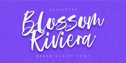 Blossom Riviera is the perfect brush script font for giving your projects a natural, handmade feel. With its cool, awesome texture, it's perfect for creating beautiful, unique logos and headlines. So what’s included : Standard Latin Numbers, symbols, punctuations and ligatures Multilingual Support. PUA Encoded and fully accessible without additional design software Simple Installations Works on PC & Mac Thank You!
 - Chancellor by PintassilgoPrints,
$24.00 Chancellor is a robust hand-drawn sans serif display typeface. Its sturdy letterforms takes inspiration from Plakatstil era posters, while bringing up also cool adornments to flourish your lettering designs. This all caps typeface has two versions for each letter, amplifying your composition choices. It's positively a great tool for a wide range of creative display uses.
 - Linotype Centennial by Linotype,
$29.99 Centennial appeared in 1986 in honor of Linotype’s 100th birthday. The roman and light cuts of the font are reminiscent of the Century typeface, particularly on that of Linn B. Benton and Morris F. Benton, designed around the turn of the 19th century for the American Type Founders. Like Century, Centennial too embodies a cool, reserved neutrality.
 - Rose Thorns by Putracetol,
$35.00 Introducing Rose Thorns - A Deathmetal Font. This font is inspired by underground and metal music band logostyle. There are ligature character in this font, which makes this font even super cool. Rose Thorns is suitable for death metal music, underground, hardcore music, blackletter, death metal logo design, clothing, logos, music covers, posters or other designs with the theme deathmetal.
 - Brookvale Retro Condensed by Get Studio,
$25.00 Brookvale - Retro Condensed Font is a nostalgic typeface that channels the essence of the past with a contemporary twist. It's condensed letterforms and retro flair evoke a sense of vintage charm, making it an ideal choice for projects seeking a dash of retro coolness. Perfect for posters, branding, and designs that celebrate the enduring appeal of yesteryears.


