10,000 search results
(0.084 seconds)
- Sure thing! "84 Rock!" by Jonathan Paquette is a font that captures the rebellious spirit and raw energy of the 1980s rock scene. This display font is characterized by its bold, edgy design that seem...
- Celebration by RMU,
$35.00 A blackletter font of decorative style and of obscure origin which was rescued for all devotees of these old hot-metal letters. This font contains a bunch of useful ligatures, and by typing 'N', 'o' and period and activating the OT feature Ordinals you get an old-style number sign.
 - Lonestar Western by FontMesa,
$25.00Lonestar Western is a revival of the old classic slab serif font named Hellenic which was very popular in the middle to late 1800s. While watching an old western movie the opening credits caught my attention, it was the Hellenic font with spurs added which gave it a more western look. - AZ Text by Artist of Design,
$20.00 AZ Text font was inspired from a need for a generic worn san serif text of letters that looks old. This font utilizes an "old look" to the line work which is designed to have a "worn feel" to it. Ideal for use as the body or text in your design.
 - FS Blake by Fontsmith,
$80.00 Art deco The inspiration for FS Blake’s elegant, lightly geometric forms can be traced back to design of the 1930s; designer Emanuela Conidi was influenced by the typography of cool, European, art deco posters. FS Blake bears traits of the art deco style, from its thin weights to its heavy weights, giving a set of faces each with their own distinct character, but still with a strong family resemblance. Mechanical type Mechanical and organic shapes combine in FS Blake to create a harmonious whole of generous curves and cursive spikes. A strong, punchy contender in display sizes, it’s also got a gentle touch with small text in lighter weights. Lively, versatile and with plenty of character contrast between weights, the FS Blake family offers impact in whatever task it’s given.faces each with their own distinct character, but still with a strong family resemblance. Sketch book Great fonts still emerge from a combination of hand, paper and pencil. After filling her sketch book with ideas, Emanuela and Jason extracted the elements that both felt could work in a font. The process yielded a whole crop of starting points for future designs as well as a focus for FS Blake as a striking, characterful, almost industrial font.
 - Mayayo by Type-Ø-Tones,
$40.00 We usually describe Mayayo as no good for condolence letters, nor for carving inscriptions, etc. Indeed, as we have seen, the designers who choose Mayayo used it in funny different ways.
 - Smash Int'l by Comicraft,
$19.00Comicraft just want Puny Humans to leave Comicraft alone... Why soldiers shoot at Comicraft? PAH! Bullets do not hurt Comicraft... Bullets only make Comicraft Angry... and when Comicraft angry... COMICRAFT SMASH! - Smash by Comicraft,
$19.00 Comicraft just want Puny Humans to leave Comicraft alone... Why soldiers shoot at Comicraft? PAH! Bullets do not hurt Comicraft... Bullets only make Comicraft Angry... and when Comicraft angry... COMICRAFT SMASH!
 - Belly Swing by Bogstav,
$16.00 Belly Swing is natural, organic and kind of cute. It's my handmade sans font with contextual alternates - meaning that you have 3 different versions of each lowercase letter to choose from!
 - Gravesend Sans by Device,
$39.00 Smart, legible and elegant, Gravesend Sans is a based on the unique typeface used for the iconic grass-green signage for the Southern Railway. In existence from 1923 to 1948, when the network was nationalised, the Southern Railway linked London with the Channel ports, South West England, the South coast resorts and Kent. The same design was also used for the ‘hawkeye’ signs on the London, Midland and Scottish Railway, differentiated by black letters on a yellow background. Reference for each letter was taken from vintage ‘target’ station nameplates and other platform signage. The rarest letters were the Q, seen in Queens Road Battersea, the X, seen in East Brixton, and the Z, used in Maze Hill, site of an infamous train crash in 1958. Being hand-made, the letters often differ in width and thickness. There was no lower case. The Bluebell Railway, a heritage steam line, runs over part of the old Southern Railway network and uses a very similar type. The design of the numbers differed considerably, but here have been taken from the Device 112 Hours font Smokebox. As well identifying platforms, they were used on the front of the steam engine’s smokebox, hence the name, and stylistically are more in keeping with the letters than some of the squarer versions that can be seen in old photographs. William Caslon IV is credited with the first Latin sans-serif type, shown in a 1816 Caslon specimen book. ‘Two Lines English Egyptian’, as it was called, was caps-only, and there are several other correlations between that type design and this one. Includes a selection of authentic arrows and manicules, plus abbreviated ligatures such as ‘St.’ (Saint or Street) ‘Rd.’ (Road) and ‘Jn.’ (Junction). The Cameo version includes many graphic banner elements that can be freely combined.
 - Lenolove by Balevgraph Studio,
$10.00 Lenolove is a cool and classy display font. Add this minimalistic and techno-style font to any web design, logo, Title, or anything else that needs a smart, cool touch. What's Included? Uppercase & Lowercase Numbers & Punctuation Multilingual Support Regular & Italic PUA Encoded
 - PR Mapping by PR Fonts,
$10.00 This font provides a variety of symbols for decorating maps simulating those of the sixteenth to nineteenth centuries. For fans of piracy, there is a range of skull and crossbones imagery. The font also includes cartouches, scrolls and symbols for mountains, hills and castles of various sizes.
 - LHF Ambrosia by Letterhead Fonts,
$39.00 An old turn-of-the-century style commonly used on billheads, letterheads, certificates, etc.
 - FG Lova by YOFF,
$14.95FG Lova is a small connected script font that looks like old letter writing. - Hoyts German Cologne by Coffee Bin Fonts,
$20.00This font was inspired by lettering found on old tradecards from the 19th century. - Castiana by Sebastian Cabaj,
$29.00 Castiana is an elegant font inspired by old books, medieval typography, and rustic art.
 - Nostalgia by Resistenza,
$39.00 Say Hello to Nostalgia! A Modern Font with a retro feeling 3 Fonts Regular, Effect and Flowers Go back in time and travel through the magazines and graphics from the fabulous 1970´s. Different serif typefaces, rounded and bold were the big focus to add a spark of life and modernity to the products. Nostalgia is our contemporary interpretation of this beautiful collection of fonts. Our aim is to draw the positive mood of these nostalgic letterforms with softened edges and rounded terminations, to evoke a fresh and contemporary view on this graphic approach. An extended set of alternates & swashes specially designed to create stylish lettering compositions have been included. You can Access your OpenType features and discover all the possibilities. Combining the glyphs with "Nostalgia Icons" as well as changes of color you'll feel the magic. This endless collection of flowers and decorative forms will boost the vintage mood to any project. The result is a very versatile font that works in a wide range request, from logos, headlines, branding, magazine design to wedding cards, poster and so much more.
 - End Crawl by Wing's Art Studio,
$10.00 End Crawl - A Halloween Brush Font Introducing a new creeping terror this Halloween, End Crawl is a hand-drawn brush font inspired by the gore-soaked horror movies and comic books of the 1970s and 80s. This textured all-caps design evokes a nervous energy that will leave your readers frozen in suspense! With a bold painted look surrounded by an anxious outline, it offers the tools to leave your readers stomach in knots! The End Crawl font family includes all-caps uppercase and lowercase characters, along with numerals, punctuation, symbols and language support. Also included are a complete set of alternative characters and additional paint marks, drips and splashes. Wingsart Studio Design Tip! The uppercase and lowercase characters work great when mixed in an alternating fashion, with shapes that combine to create a dynamic, trembling look that's perfect for the Halloween season. Add the alternatives and paint marks into the mix and you'll have yourself a title or header design that looks truly custom-made. I've even included the base font and outlines separately, allowing to overlay your own colour combinations!
 - Sitcom by GroupType,
$19.00 If there was an American Typeface Hall of Fame, Bank Gothic, designed by the great Morris Fuller Benton would hold a place of special distinction considering this design has survived so many trends in typographic fashion since being introduced in 1930. It's just as desirable today as it was over eighty years ago; arguably more. Today, Bank Gothic is a very popular choice as a titling face for science fiction books, posters and countless television and movie titles. It is also a popular typeface for use in computer games and digital graphics. GroupType’s 2010 revival of this American classic is true to the design, the period, and Benton’s aesthetic. GroupType worked with some of the most talented and experienced type designers that were historically grounded and sensitive to this design project. Fortunately, Mr. Benton has left us a large selection of other great typefaces for insight and guidance. GroupType’s new revival includes the original three weights in regular and condensed style but also a new small cap and lowercase in each font necessary for 21st century typography.
 - Bank Gothic by GroupType,
$29.00 If there was an American Typeface Hall of Fame, Bank Gothic, designed by the great Morris Fuller Benton would hold a place of special distinction considering this design has survived so many trends in typographic fashion since being introduced in 1930. Its just as desirable today as it was over eighty years ago; arguably more. Today, Bank Gothic is a very popular choice as a titling face for science fiction books, posters and countless television and movie titles. It is also a popular typeface for use in computer games and digital graphics. GroupType’s 2010 revival of this American classic is true to the design, the period, and Benton’s aesthetic. GroupType worked with some of the most talented and experienced type designers that were historically grounded and sensitive to this design project. Fortunately, Mr. Benton has left us a large selection of other great typefaces for insight and guidance. GroupType’s new revival includes the original three weights in regular and condensed style plus two new distressed fonts. All have a new small cap and lowercase in each font necessary for 21st century typography.
 - State Machine by Barnbrook Fonts,
$30.00 State Machine is a display typeface inspired by lettering applied to American and Russian Cold War-era military vehicles. It also features an alternate character set inspired by 1970s hand-made political banners. The name State Machine is a term found in both political theory and computer programming. The theoretical definition describes the political and bureaucratic organisation of a state as well as the repressive state apparatuses such as the military and police. Max Weber describes the state as "a human community that (successfully) claims the monopoly of the legitimate use of physical force within a given territory". In computer programming, a state machine is a mathematical model of computation used to design computer programs. It is conceived as an abstract machine that is in one of a finite number of states. It can change from one state to another when initiated by a triggering event or condition. Taken at a wider conceptual level, when these two definition are combined the meaning becomes analogous to a tool (such as a philosophical idea) with which to transform a society.
 - Story Tales by Resistenza,
$39.00 A fairy tale, is a folklore genre that takes the form of a short story. Story tale, is a new type family for wonderous, romantic, magical and playful narratives brought to you by Resitenza. The 1970s were wild and whimsical times. Book covers from this time were iconic, innovative and enduring; bold colour and stylised pattern dominated. Story Tales forms were inspired by 70s books covers, and aims to encapsulate the zeitgeist of the time, but the typeface is by no means constrained to revivals of this era. There are nods to 60's flower power & psychedelia, chromatic type and decorative queues from the 1800s and the spirit of post-war era children's almanacks. It is also perfectly suited to inspiring curiosity, imagination and fantasy in today's audiences. Each of Story Tales 8 styles (4 upright and 4 italics) stack on top of one another giving the designer broad aesthetic range. This layering of styles and the ornamental illumination allows striking multi-coloured typography for your book covers, editorial and poster designs.
 - News Gothic No. 2 by Linotype,
$40.99News Gothic No. 2 is an enhanced version of News Gothic produced by the D. Stempel AG type foundry in 1984. It added more weights to the News Gothic family than were available in other versions, increasing its use in contemporary design and communication. The lighter weights of the original News Gothic were designed by Morris Fuller Benton in 1908 for American Typefounders (ATF). News Gothic typeface is quite similar to Benton's other sans serifs from the early twentieth century, including Franklin Gothic and Lightline Gothic. The bold weights were added to the News Gothic scheme in 1958. The capital letters in News Gothic No. 2, just like those found in News Gothic, have a similar visual width to each other. The lowercase is compact and powerful. These design attributes contributed to Benton's strong handle on the sans serif genre, and for years his types have been popular for newspaper headlines and many other uses. Still a popular presence on the font charts, News Gothic has proven its ability to get the job done right. - Mommie by Hubert Jocham Type,
$59.90 In the early 1980s, at the start of my career, I had the opportunity to work in a print shop with classic lead setting. In those days I would study issues of U&lc magazine from ITC. What really caught my attention were scripts in the Spencerian style. I’ve been fascinated by this American penmanship tradition ever since. A few years ago I developed a font. Boris Bencic used it when he was redesigning L’Officiel magazine in Paris. I took these initial forms and developed them into the font Mommie when I started my own foundry. Although I usually design text typefaces, working on Mommie taught me how complex it can be to create a script headline font. The biggest challenge in this process has been to keep it alive and fresh. The Regular weight is only made for very big headlines. The thin lines with the bold drops are very elegant. For smaller sizes use the Medium and Small weight. It won the TDC 2008 award and was Judges Choice of Christian Schwartz.
 - Alvardo by Tigade Std,
$15.00 Alvardo is a retro and vintage bold script font. This font is PUA encoded which means you can access all of the glyphs and stylistic alternates with ease! It is looking great on product, headlines, magazines, logos, poster, branding and many more!. Use this font to bring your design back to the oldies!
 - Fleischman BT by Bitstream,
$50.99Charles Gibbons' Fleischman BT Pro revives J.M. Fleischman's quirky and elegant text faces of the 1730s. Born in Germany, Fleischman worked in Holland, primarily at Enschedé en Zonen where he cut dozens of faces. His types represent some of the earliest examples of the Transitional style, predating and influencing the work of Fournier, Baskerville, and Bodoni. They were wildly popular in their day, used for everything from newspapers to currency, and Fleischman himself has enjoyed a renaissance of late. Fleischman BT Pro preserves the feel of the printed metal types while expanding the original to include four OpenType fonts: roman, italic, bold, and bold italic. They all include small caps, old style and lining figures, discretionary and historical ligatures, ornaments, and superiors. Fleischman Pro also supports Western, Central European, and Eastern European languages. - Ador by Fontador,
$24.99 Ador is a humanist sans serif especially designed for contemporary typography and comes up with 8 weights from ultralight to black plus true italics and 343 ligatures. A large x-height not only creates space in the letters for extra-bold styles, but also lends Ador an open and generous character in the more narrow and semi-bold versions. The nice balance between sharp ink trapped and soft, dynamic shapes helps to work in small sizes. Diagonal stress, angled finials and the 4 degree true italic styles give Ador a dynamic look. The font contains 981 glyphs including small caps, tabular, old style, fractions … and a wide range of flexibility for Latin language support for every typographical needs. Ador is a contemporary sans serif typeface, special for logotypes, brands, magazines and editorial.
 - ZT Klotin by Khaiuns,
$14.00 ZT Klotin is a serif display font characterized by a strong, Classic vibe, with straps, special alternate glyphs, and soft Curves. Perfect for branding, weddings, social media, product design, stationery, and advertising. ZT Klotin is flexible enough to add these classic elements to almost any project requiring a special class touch. ZT Klotin features over 178 unique ligature and alternatives, ZT Klotin is crafted to be Soft and interwoven to create a stunning display of its subtle hypnotic curves, making it the perfect choice for impactful editorial layouts and bold Bold creations. FEATURE — 644 Glyphs — Uppercase & lowercase letters, numbers — Old-style figure — 40 Discretionary Ligatures & Standard Ligatures, — 178 Alternatives (Uppercase & Lowercase) — Symbols, punctuation marks I hope you have fun using ZT Klotin Thanks for using this font ~ Khaiuns X zelowtype
 - Cacao by Wiescher Design,
$39.50 Cacao is another one of my "found fonts". I found this one in an old advertising for a French cocoa drink. Since I am a vervent lover of cocoa, I will give you my recipe for a normal coffee mug full of delicious hot cocoa. Mix three heaped teaspoons of sugar with one and a half to two teaspoons of finest cocoa powder. Then add a little cold milk, stir, add a little cold milk, stir, and so on until you have a mushy creamy consistency. Now slowly add - always stirring - boiling hot water til the cup is almost full. Top with a little liquid cream and enjoy! If you have a package design job, use my Cacao font and stir in some creativity. Your sweet-tooth designer, Gert Wiescher.
 - Narrative BF by Bomparte's Fonts,
$39.00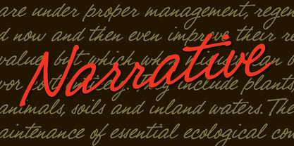 A cool handwritten script with a warm and friendly voice.
 - Vicious Story by Mvmet,
$16.00 Vicious Story is a very cool and playful hand-drawn display font, it can be used for your kids friendly horror themed designs and many more. It works great for creating cool designs that scream for attention. It’s ideal for anything ranging from t-shirts, book designs, restaurant menu, blog writing, greeting cards to stickers, or anything that needs a casual touch. Fall in love with its incredibly cool style, and use it to create lovely designs!
 - Aukim by AukimVisuel,
$20.00 Aukim is an exceptional, unique and ligature-rich font that gives a new look to your texts. It is a more text-oriented font and thanks to its OpenType features, it becomes versatile. It is available in 3 sub-families (condensed, normal and extended) for a total of 54 fonts. There are 9 weights with their real italics. It has 886 glyphs, 107 uppercase and 65 lowercase ligatures per font. It also offers a wide range of languages, from Latin to Cyrillic, as well as powerful OpenType features such as meticulously and professionally maintained kerning, stylistic variations, swashes, highly distinctive ligatures, old-fashioned tabular figures, fractions, denominators, superscripts, unlimited subscripts, arrows and much more to satisfy the most demanding professionals. On the one hand, it has rounded curves with very open endings that make this font family noble, friendly and contemporary and on the other hand very useful for writing titles on any medium. Perfectly suitable for graphic design and any display use. It could easily work for web, signage, corporate design as well as editorial design. Aukim is a cool, wonderful, elegant, bold and fun display font. It can easily be paired with an incredibly wide range of projects, so add it to your creative ideas and notice how it makes them stand out!
 - AZ Hello Brushed by Artist of Design,
$25.00 AZ Hello Brushed font was inspired from old auto repair signs. This font utilizes an "old look" to the line work which is designed to have a "worn feel" to it. It is designed to compliment it's sister font; AZ Hello. Ideal for use as headline or sub-head text in you design.
 - Les Palmiers by Sarid Ezra,
$19.00 Introducing, Les Palmiers, an old handwritten script! Les Palmiers is a vintage and rough handwritten script. This font include alternates and swash that will make your project more attractive. With rough and imperfect side, this font will also make your design looks more vintage and old. Les Palmiers also support multi language!
 - Heathen by Canada Type,
$24.95A few emails sent to Canada Type have asked for more “bad scripts”. A few others asked for "more Mascara-like treatments". And some asked for more fonts of “distressed elegance”. Whatever you like to call this style of doubled-script font, sightings of designs using it have become common within the last few years. Such fonts have become the standard in expressing elegant confusion, old chaos in modern settings, recycled histories, and rebellious ideas. This style is quite often seen on chic clothing, music packaging, some sports paraphernalia, surfer and skateboarder gear, even book covers. That said, the Heathen font was made to include an advantageous feature that other distressed scripts do not normally have: More intertwined over-swashing in the majuscules. This over-swashing is quite useful in settings where the stroke and fill colors differ, or complement each other. It is also quite the point of emphasis where the idea is to show elegance gone ancient, old thoughts in a modern wrapper, rust never sleeping, or the very basic limits of the world’s nature. The original Heathen was made by redrawing Phil Martin’s Polonaise majuscules and superposing them over the majuscules of Scroll, another Canada Type font. The lowercase is a superposition of Scroll’s lowercase atop a pre-release version of Sterling Script, yet another Canada Type font. Heathen Two was made in a similar way, by combining two pre-release Canada Type scripts. - Alisal by Monotype,
$29.99 Matthew Carter has been refining his design for Alisal for so long, he says, that when he was asked to complete the design for the Monotype Library, it was almost as if he were doing a historical revival of his own typeface. The illusion even extended to changes in his work process: although he now does all his preliminary and final drawing on screen, the first trial renderings of Alisal were done as pencil renderings. Alisal is best classified as an Italian old style design. Originally created between the late 15th and mid-16th centuries in northern Italy, the true Italian old styles were some of the first roman types. They tend to be the most calligraphic of serifed faces, with the axis of their curved strokes inclined to the left, as if drawn with a flat-tipped pen or brush. These designs offer sturdy, free-flowing and heavily bracketed serifs, short descenders, and a modest contrast in stroke weight. Alisal has nearly all the classic Italian old style character traits, plus a few quirks of its own. It is calligraphic in nature, with more of a pen-drawn quality than faces like Palatino or Goudy Old Style. It is more rough-hewn than either Goudy's Kennerley or Benton's Cloister, and is generally heavier in weight than most of the other Italian old style designs. One place where Alisal makes a clean break with traditional old style designs is in the serifs. While sturdy and clearly reflecting pen-drawn strokes, Alisal's serifs have no bracketing and appear to be straight strokes crossing the main vertical. Like Caslon or Trajanus, Alisal is a handsome design when viewed as a block of copy. Ascenders are tall and elegant, and serve as a counterpoint to the robust strength of the rest of the design. Alisal is available as a small family of roman and bold with a complementary italic for the basic roman weight, providing all that is needed for the majority of text typography. Alisal is not as well-known as some of Carter's other typefaces, but this lovely and long-incubated design was certainly worth the wait.
 - Abort Mission by PizzaDude.dk,
$12.00 This is the kind of letters I drew in school back in the 1980ies. I would never have guessed that I would do the same thing like 40 years later! I remember making a simple space game for my VIC-20 computer, and I needed some "data letters" (as I called it) - as far as I can remember, this is close to what I made 40-like years ago. Also, I was inspired by the well known series "Stranger Things" - you know, all that 80ies theme stuff took me down memory lane! :) Anyway, all the letters are handdrawn, using a squared paper as guide - at it may look simple, but it took me quite some time to finish this font (hence the name!)
 - Catholic Girls by Scholtz Fonts,
$21.00Catholic Girls is a timeless, handwriting-based, semi-calligraphic font that is highly readable yet has an informality combined with a quiet elegance. Above all else, Catholic Girls is well-behaved, ladylike, and can be expected to behave correctly and make the right impression in a wide range of situations. This "hand" is based on the style of handwriting taught at many Catholic Girls' Schools. It is feminine, elegant and readable. Use "Catholic Girls" for a great variety of applications, including: ? party invitations, wedding stationery, social event media, ? marketing material for seminars, property developments, leisure & lifestyle promotions, fashion, interior design, restaurants, florists, cosmetics ? publishing: magazines, books, children's books, greeting cards, ? packaging: girls' clothing, girls' toys, household consumables, cosmetics, fashion items, interior decor products - Heavy Duty by Gerald Gallo,
$20.00 Heavy Duty is a bold condensed sans serif font set. Heavy Duty Solid is crisp and clean while Heavy Duty Sketch suggests characters that could have been sketched with a pen or pencil. Both fonts have the same uppercase and small caps lowercase alphabet, numbers, punctuation, symbols, and miscellaneous characters. The Heavy Duty fonts are ideal for making a bold statement in headlines, titles, or text. Heavy Duty Solid and Heavy Duty Sketch are to be sold only as a set priced at $20.
 - Tall Tales by Comicraft,
$39.00 In a World where no stories are small stories... In a Land where words need to be Bold, Meaningful and maybe even Italic... Comes a font worthy of telling Marvelous Tales some thought Too Tall, Too Astonishing to be told... And when those Untold Stories, those Astounding Tall Tales, are finally told... THAT WORLD WILL NEVER BE THE SAME AGAIN! From Visionary Font Director John Roshell and the Studio that brought you BlahBlahBlah, you must not miss TALL TALES! In theaters and Streaming now.