10,000 search results
(0.045 seconds)
- Spirit of 69 by Mysterylab,
$21.00 Here's a lively new take on the swirly psychedelic type we all know and love, Spirit of '69 brings in some subtle dimensions of waviness to the vertical strokes, upslanted horizontal strokes, and alluring paisley shapes formed out of the negative spaces. This is a unicase font, in the grand tradition of the Art Nouveau lettering of the early 20th century, and the melty groovy fonts of the 1960s. Lots of fun and beautiful too!
 - Funky Tut NF by Nick's Fonts,
$10.00Two handlettered typefaces from J. M. Bergling’s 1914 classic, Art Alphabets and Lettering collided to produce this lively and unusual combination. The caps were originally called "Morocco", and the lowercase are taken from his Keramic Text. The result suggested more of an Egyptian flair, in an offbeat kind of way, and so it got its name. Both versions of the font include 1252 Latin, 1250 CE (with localization for Romanian and Moldovan). - Baby Cakes NF by Nick's Fonts,
$10.00This robust, roly-poly typeface is patterned after a 1974 release from the Ludwig & Mayer foundry of Frankfurt am Main named Big Band, and designed by Karlgeorg Hoefer. The type color is even darker than the original, and the result is a delightful face that will definitely attract attention. The PC Postscript, Truetype and Opentype versions contain the complete Latin language character set (Unicode 1252) plus Central European (Unicode 1250) languages as well. - Now Appearing JNL by Jeff Levine,
$29.00Now Appearing JNL is a digital version of some hand-lettering spotted on an early 1960s ad for a Miami Beach night club. Its fun, casual appearance makes it perfectly suitable for any project that conveys a relaxed atmosphere. The font was intentionally not kerned, so the free-flowing form of the lettering is at its best, but it can be set tight by hand if a more compact look is desired. - Herkimer Bunrab NF by Nick's Fonts,
$10.00Eh, what's up, Doc? This cuddly little oddball of a typeface was originally released under the rather unlikely name of Hercules by the Amsterdam Typefoundry in 1926. This face includes OpenType Stylistic Alternates for b, h, h, k and l, which feature very tall ascenders with a "bunny ear" vibe. Both versions include the complete Latin 1252, Central European 1250 and Turkish 1254 character sets, as well as localization for Moldovan and Romanian. - Suffiya NF by Nick's Fonts,
$10.00The Boston Type Foundry called the pattern for this elegant typeface "Moslem," suggesting the exotic appeal of faraway lands. The face succeeds in fulfilling its promise, with remarkably little extraneous fussiness. The font's name suggests that it's a wise choice for headlines which tout the lure of distant charms. Both versions of the font include complete Latin 1252, Central European 1250 and Turkish 1524 character sets, with localization for Moldovan, Romanian and Turkish. - Park West JNL by Jeff Levine,
$29.00 The thin, stylish Art Deco slab serif lettering featured on the cover of the 1934 sheet music for “Then I’ll be Tired of You” inspired the digital type face Park West JNL, which is available in both regular and oblique versions. Central Park West has always been the upscale area for affluent New Yorkers, but in the Great Depression years of the 1930s the mystique of the well-to-do held an even stronger significance.
 - Monthly Adventures JNL by Jeff Levine,
$29.00 The cover lettering of a 1940s issue of a romance comic spotted in an auction online was the inspiration for Monthly Adventures JNL. Classic in its Art Deco look, this condensed outline font is evocative of the hand-lettered titles used during the Golden Age of the comic book. Available in both the original outline version and a thick, solid version with the outline removed, as well as oblique variations of both.
 - North End Stencil JNL by Jeff Levine,
$29.00 An image of a vintage British lettering stencil set [probably circa 1960s] spotted in an online auction inspired North End Stencil JNL. The original lettering was a hybrid of both stencil and solid letter forms, but for the digital version all of the characters were given the stencil treatment. North End Stencil JNL is named after a district in London, and the type face is available in both regular and oblique versions.
 - Yum Yum NF by Nick's Fonts,
$10.00The Cleveland Type Foundry strikes again, with this delightful little number from their 1893 specimen book, originally named "Mikado". This version takes its name from one of the characters in the Gilbert and Sullivan operetta of the same name, and the name aptly describes the tasty nature of this frolicking face. Both versions of this font include the complete Latin 1252 and CE 1250 character sets, with localization for Romanian and Moldovan. - Rum Doodle by Hanoded,
$15.00 The Ascent of Rum Doodle is short story written in 1956 by W. E. Bowman. The story is a parody of the many non-fictional mountaineering chronicles and tells the adventures of a group of incompetent climbers, trying to conquer the highest mountain in the world. Rum Doodle is an angular, uneven font, ideal for posters and book covers. The lower case letters all have alternates and it comes with a mountain of language support.
 - Lateral Incised NF by Nick's Fonts,
$10.00Gravure was designed by Morris F. Benton in 1927 for American Type Founders and was also released in 1929 by the London foundry of C. W. Shortt. This luminous face has a slightly naïve charm seldom found in incised typefaces. Ornamental and engaging, it’s a perfect choice for headlines with warmth and grace. Both versions of the font include 1252 Latin and 1250 CE (with localization for Romanian and Moldovan) character sets. - Pentaprism NF by Nick's Fonts,
$10.00In the Dynamic Seventies, "prismatic" typefaces were all the rage, and few were more popular than variants of Paul Renner's Futura and the Herbert Bayer-inspired Bauhaus. This family of fonts features Futura-like forms in the uppercase and Bauhaus-like forms in the lowercase, so you can mix or match to create just the perfect headline. As always, all versions contain the complete Latin 1252, Central European 1250 and Turkish 1254 character sets. - Nouveau Auto JNL by Jeff Levine,
$29.00 “The Auto Show” is the title of an early 1900s pieces of sheet music proving that America has had a fascination with cars since the earliest days of the automotive industry. The song sheet’s title was hand lettered in a casual Art Nouveau style which has been re-drawn digitally as Nouveau Auto JNL, and is available in both regular and oblique versions… and what’s better than a nouveau auto (a new car)?
 - Gandy Dancer NF by Nick's Fonts,
$10.00The 1912 American Specimen Book of Type Styles from ATF featured a quaint little offering called "Tabard", whose antique charm was enhanced by several rather quirky alternate characters. This version tosses out the standard characters and keeps the quirks in the works: the result is warm, engaging, slightly mischievous and a whole lot of fun. The Opentype version of this font supports Unicode 1250 (Central European) languages, as well as Unicode 1252 (Latin) languages. - Eckhardt Signwriter JNL by Jeff Levine,
$29.00Eckhardt Signwriter JNL is based on a casual display lettering face popular with many sign painters and show card writers of yesteryear, best suited for large print projects. Jeff Levine has named this font (along with others in a series) after the late Albert Eckhardt, Jr. (1929-2005) who had owned Allied Signs in Miami, Florida from 1959 until his passing. Al was a talented lettering artist and a good friend to Jeff. - P22 Festiva by IHOF,
$29.95 Festiva is based on lettering found on a 1960s kitchen appliance catalog. It evokes ’60s TV and pop culture while still having a contemporary feel. The fun exuberant flavor of this face is perfect for parties and celebrations. The letters dance across the baseline and the lower case wants to be an upper case but just can’t quite make it. P22 Festiva Regular includes a full unicode European Character set (Western, CE, Turkish, Romanian, etc).
 - Ah, the Digital Readout Upright by ShyFoundry - it's the font that looks like it escaped from the dashboard of a 1980s sci-fi spaceship, only to find a loving home in the hearts of modern designers. ...
- Dominant Type by Hanoded,
$15.00 We’re in a lockdown of sorts (again) and things are pretty … uhm … boring at the moment. No going out for a coffee, no school (so the kids are at home), no meeting with friends… The new reality kinda sucks if I say so myself. Besides that, it turns out that we have a new dominant type of Covid in Holland.. wait, Dominant Type! Ahh, great name for my latest font! Dominant Type is a handmade all caps font. It comes with extensive language support (including Vietnamese) and 2 sets of alternate glyphs for that bit of ‘random awesomeness’!
 - Breadcrumbs by Hanoded,
$15.00 Every morning, after the kids have gone to school, I vacuum the floor and remove about half a kilo of breadcrumbs… No, not really have a kilo, but any given bird could probably survive on the leftovers. When it was time to name this font, Breadcrumbs was all I could think of! Breadcrumbs and children seem to go together well, as they are featured in Hansel & Gretel and Hop-o'-My-Thumb. Breadcrumbs font is a happy, sloppy fairytale font, which you can use for your book covers, your party posters and maybe crumbly bread packaging. But that is entirely up to you.
 - Cosmic Sans by Zachary Mazur,
$15.00 Cosmic Sans was my first font ever created for a school project. The class I made this font for was my Advanced Typography and was a semester project. I really couldn't think of a title for this font, until one of my good friends said, "Why don't you name it Cosmic Sans?" I searched the internet for any other fonts with that name, and sure enough there wasn't. Thus the name stuck. This font is more or less a display font, thus every secondary character was not created. I hope you enjoy this font and much as I have while creating it!
 - Module by Sébastien Truchet,
$40.00 Sébastien Truchet designed a modular typographic system during his last year in the School of Fine Arts of Besançon. The system is made of a unique grid and 6 modules which are the components to build several typefaces. The most radical is the "2-2". The last one is the "10-12".This is the "2-3". The goal is to use a grid made of 2 modules in width and three in height. This version is the most pertinent minimalist typeface which keeps plasticity and legibility. There is a character set of capitals tied to the origin of the project
 - Mrs White by Hipopotam Studio,
$40.00 We designed Mrs White for our next book for children. We needed a clean script that would give a feeling of a primary school handwriting. Mrs White is filled with ligatures and contextual alternates which gives her very smooth line of text. Scripts shouldn't be used without lowercase letters so we added a small caps for headlines and acronyms. Check out the manual for more information on how to use Mrs White. Polish language use latin characters but we would like our Eastern neighbors to be able to enjoy Mrs White so we added cyrillic alphabet (script and caps).
 - Medina Gothic by Design is Culture,
$39.00 Medina Gothic is a three-weight sans serif inspired by Latin American moderne. It was designed in response to the 2002, Altos de Chavon design conference in The Dominican Republic, which celebrated utilitarian driven gestures in graphic design. "There’s a rigor to Medina Gothic that takes care of all sorts of tenets of a hard-working, highly legible, objective font. But at the same time, it’s human. All the curved terminals and open counter forms make for a sort of kindness. For all the discipline, it doesn’t sacrifice its friendliness." – William Morrisey, Professor of Typography, Parsons The New School for Design.
 - FF Berlage Burcht by FontFont,
$58.99 FF Berlage started as a research project about the typography of the prominent Dutch architect Hendrik Pieter Berlage (1856 1935). Donald Beekman based the design on a great number of sources, but mainly lettering found in two of Berlage s most quintessential buildings, the Amsterdam Commodities Exchange building (called Beurs van Berlage), and the ANDB building for the Amsterdam diamond cutters union (called De Burcht). Berlage is considered the father of modern architecture in The Netherlands due to his revolutionary theories on architecture and design, that would greatly influence many Dutch architect groups, like the Amsterdam School and De Stijl.
 - Sweetest by Supersemarletter,
$11.00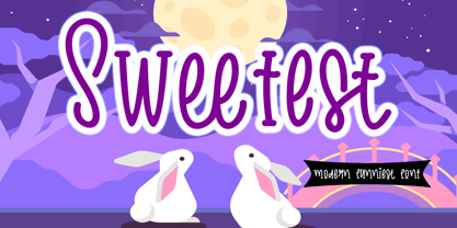 Sweetest is a cute and friendly handwritten font. It embodies playfulness and authenticity and is the perfect choice for any children activity or school project. Provide Ligatures with special character make the design letters looks incredible. Honestly it works perfectly for headlines, logos, posters, packaging, T-shirt and much more. Font Features : . Regular Version . Character set A-Z in Uppercase and Lowercase . Ligatures in lowercase and special . Numerals and Punctuation . Accented Characters . Multiple Languange Supported Recomended to use in Adobe Illustrator or Adobe Photoshop with opentype feature. If you have any questions, just send me a message and I'm glad to help.
 - EmBauhaus by Emboss,
$25.00 EmBauhaus is a display typeface, geometric in style, inspired by the face named after the world changing Bauhaus School. To aid readability I rethought the original typeface and closed all of the voids cut out of the strokes. We also modified the upper case to make it a more traditional design. An example of this is the upper case L, where a 90 degree angle was added. This typeface was designed to be used judiciously in a layout, to draw focus to words and headlines, using stark angles, radii and geometry to create visual rhythm and gestalt.
 - Propisi by ParaType,
$25.00The typeface was designed at ParaType (ParaGraph) in 1997 by Manvel Shmavonyan for Russian primary school sample writing schoolbooks. The typeface is based on script fonts presented in the book 'Rodnoy Mir' by. L.I.Tikunova. The first version of the font included just letters of Russian alphabet and basic set of figures and signs. The second version with extended set of alphabetic letterforms was developed in 2004 by Gennady Fridman. Current third version that covers full Cyrillic and Western code pages was prepared by Gennady Fridman and released in 2009. Medium style also was added by him in 2009. - Talent Stencil by Jeff Levine,
$29.00 Stencils have played a number of roles over the years, from decorative patterns to military markings; from labeling shipping containers to a student’s school project. One unusual application of a stencil alphabet was some metal letters spotted for sale at an online auction site. These antique letters were used for promoting the current show on a theater marquee just as plastic ones are used nowadays. Following the auction images as a guide, the Roman stencil font from those marquee letters is now preserved digitally as Talent Stencil JNL; which is available in both regular and oblique versions.
 - FF Berlage Beurs by FontFont,
$58.99 FF Berlage started as a research project about the typography of the prominent Dutch architect Hendrik Pieter Berlage (1856 1935). Donald Beekman based the design on a great number of sources, but mainly lettering found in two of Berlage s most quintessential buildings, the Amsterdam Commodities Exchange building (called Beurs van Berlage), and the ANDB building for the Amsterdam diamond cutters union (called De Burcht). Berlage is considered the father of modern architecture in The Netherlands due to his revolutionary theories on architecture and design, that would greatly influence many Dutch architect groups, like the Amsterdam School and De Stijl.
 - Dear Penpal Script by Giaimefontz,
$6.00 This is a fully connected script font, not calligraphic, but entirely designed to follow handwritten cursive ligatures rules as teached in schools. In order to correctly visualize it, you have to enable OpenType features (Contextual Alternates, Discretionary Ligatures, Standard Ligatues and Kerning). Trying to write All Capitals will generate Block Letters writings, since cursive style doesn't allow more than the first uppercase per word, however this font is not meant to be a Block Letters font. Using specific type combinations will generate special glyphs. All of these features are intended to reproduce a classic schoolboy or schoolgirl notebook.
 - League of Ages - Personal use only

- DuerersMinuskeln - 100% free

- Flaemische Kanzleischrift - Personal use only

- ZentenarZier - Unknown license

- TrixieExtra - Unknown license

- Copperplate New by Caron twice,
$39.00 Imagine America in the 1930s. A gangster flick with Al Capone, a crime novel featuring Philip Marlowe. Our hero in a fedora sits in a classy bar, orders a double bourbon, lights a cigar and eyes the evening paper. He turns the pages, reading about a bank heist over on Third Avenue, a scandal involving a baseball player, a small ad for a general practitioner and a large spread about a famous law firm. What do the bottle of booze and the majestic facade of the bank have in common? The elegant baseball uniform and trustworthy attorneys? - Copperplate Gothic - When Frederick William Goudy created his legendary typeface in 1901, it went on to literally become the symbol of early 20th century America. Tiny serifs, characteristically broad letterforms, and particularly bold titles decorated calling cards at 6-point size, enormous bronze-cast logos, newspaper headlines, restaurant menus and more. This was the golden age of Copperplate, lasting up until the arrival of die neue Typografie and monospaced grotesques in the 1960s. Then the typeface almost completely disappeared. It made a partial comeback with the advent of the personal computer; digitizations of varying quality appeared, and one version even became a standard font in Adobe programs. This may have played a role in Copperplate later being used in DIY projects and amateur designs, which harmed its reputation. Copperplate New has been created to revive the faded glory of the original design. Formally, the new typeface expands the existing weight and proportional extremes. The slight serifs are reduced even further, making the typeface sans-like at smaller point sizes and improving readability. In contrast, at large point sizes it retains all of its original character. Decorative inline & shadow styles have been added and both have been created in all five proportions, making it easy to adapt the typesetting to the format you need. Despite these changes and innovations, Copperplate New remains true to Goudy’s original design and represents a snazzy way to evoke a golden era in American culture. Specimen: http://carontwice.com/files/specimen_Copperplate_New.pdf
 - Apricot by Canada Type,
$24.95 A. R. Bosco made Romany for ATF in 1934, when there was much demand for script types in advertising and publishing. It was the high times of Speedball lettering, and a casual script in that fashion was naturally very welcome. It became an instant hit and was used widely for a good part of the 1930s and 1940s. Apricot is not only a revival of Bosco's work, but also a major expansion of it. It contains very effective solutions to the many problems presented by the original metal type, which had to always be tracked too wide because of the forms of some of its letters. Solving these problems was not an easy task. A comprehensive set of alternates was designed to give the user the ability to replace some forms in certain uses, and a large set of two-, three-, and even four-letter ligatures was added to solve the awkwardness of some of the more common letter pairings. The resulting work is quite delightful, especially for those who like to take advantage of OpenType technology. Apricot is the rarest kind of script in digital type these days, the kind that is upright, round, bold, feminine, and distinctly young in appearance. A birthday cake for a teenage girl can certainly benefit from these letters. So can greeting cards, family show posters, diary covers, party invitations, women's shirts, toy packaging, celebration literature, and almost anything that needs that special touch of shiny happy youth. Apricot is available in all common font formats. The Postscript and True Type versions come in 4 fonts, which include one for alternates and two for ligatures alongside the main font. The OpenType version is one font that contains more than 380 glyphs and all the necessary programming for the palettes of OpenType-supporting applications. If you liked Canada Type's hugely popular font Dominique, you will love Apricot.
 - Friandise by JBFoundry,
$19.90 Do not believe that Friandise is reserved for the chocolate enthusiasts. It’s a pair of fonts which will allow you to ally simplicity and frivolity, sweetness and hardness, discretion and show.
 - Good Show by HIRO.std,
$17.00 Good Show is a Bold Script Font This font describes about stylist, humanist, dynamic, funny, easy going, cool, and easy to use and will bring a good harmony when the letters are connected and paired each other. Good Show inspired from pop culture era. FEATURES - Uppercase and Lowercase letters - Support Opentype Features - Contextual Alternates - Stylistic Alternates - Numbering and Punctuations - PUA Encoded Characters - Multilingual Support - Works on PC or Mac - Simple Installation USE Good Show works great in any Branding, Logotype, Apparel, Poster, Product Packaging, Advertisement, Label, Product Design, Magazine and any projects that need Bold Handwritten Font. Enjoy using! Thanks. HIRO.std


