10,000 search results
(0.019 seconds)
- Revival 565 by ParaType,
$30.00 Revival 565 is the Bitstream version of type Berling. The face was created by Karl-Erik Forsberg for the Swedish Berling foundry in 1951, with other weights added in 1958. The design is an old style roman, particularly useful for books, journals, and other text applications. Despite the fact that it has higher contrast than most old style typefaces, Berling has the classic features of old style romans with its small x-height, and ascenders that exceed the height of the capital letters. Berling is good for text settings as well as display work. Cyrillic version was developed for ParaType by Manvel Shmavonyan in 2008.
 - DT Enigmystic by Dragon Tongue Foundry,
$9.00 When reading text, the most informative parts of the written word for a human brain to identify, are the top and bottom edges of each word, and to a lesser degree, the leading and trailing edges. The overall shape has more useful info than the inner workings of each word. DT Enigmystic, is a display font family that gives you just that. The outer edge. At first glance, these letters don't look like standard letters, and yet, they are perfectly readable. And it is a 'somewhat' smart text, in that it will automatically complete the trailing edge of every word, whenever it sees a comma, period or space. Similarly, it will automatically complete the leading edge of every word following a space. When used as display test or as a heading, the first letter will need to be preceeded by a space, to achieve a full enclosed word outline. As with most of my fonts, do use Contextual Ligatures. This allows the letters to come alive. When generated here on this webpage, contextual ligatures are not turned on, and so the words do not appear completely closed at their beginnings and ends. But as can be seen in the poster images, these outlined words do automatically complete themselves when contextual ligatures are active.
 - Novel Pro by Atlas Font Foundry,
$50.00 Novel Pro is the humanist Antiqua typeface family within the largely extended award winning Novel Collection, also containing Novel Sans Pro, Novel Sans Hair, Novel Sans Condensed Pro, Novel Display, Novel Display Condensed, Novel Display Extra Condensed, Novel Display Compressed, Novel Display Extra Compressed, Novel Mono Pro, Novel Sans Rounded Pro and Novel Sans Office Pro. Classic proportions of a Renaissance Antiqua combined with modern details let Novel appear as a friendly and elegant but functional typeface. The almost upright letters of the narrow Italics create a vital contrast to the generous construction of the roman. All typeface families of the Novel Collection have a carefully attuned character design and a well balanced weight contrast. The fine gradation of 12 weights enable designers to create fine legible typography and combine the design with other members of the Novel Collection to reach highest quality in typography. Novel Pro [914 glyphs] comes in 12 styles and contains small caps, an extra set of alternate glyphs, many ligatures, lining figures [proportionally spaced and monospaced], hanging figures [proportionally spaced and monospaced], small caps figures [proportionally spaced and monospaced], positive and negative circled figures for upper and lower case, superior and inferior figures, fractions, extensive language support, arrows for uppercase and lowercase and many more OpenType™ features.
 - Visible by Andinistas,
$24.00 Visible is a dynamic typeface family designed by CFCG @andinistas. Visible Script has narrow horizontal spacing between lowercase, while Visible Script 2 has generous and wide horizontal spacing. Mixing both styles you will achieve italic designs loaded with speed and strength to communicate aggressiveness, nervous and sanguine temperament. Visible Caps contains capital letters derived from the font's writing, but drawn aggressively and slanted 15 degrees to the right. This type of visual characteristic is typical of very fast and nervous writing that is performed with emotion without sacrificing harmony. a monolineal and condensed version is the Visible caps 2, allowing for significant horizontal space saving economies. Used Visible Caps 1 and 2, become much more than just an expressive and functional artistic tool. In short, by combining their expressive writing or Visible Caps & Script lettering styles, they make words and phrases appear to be written with a brush and ink-filled calligraphic strokes and with eye-catching qualities, their design is the perfect choice for distinctive headlines and brand identities. for music, movies, video games and more. A special thanks to the Venezuelan artist for his impressive illustrations @franciscomarin_artistaplastico ENJOY more than 1100 glyphs: + Visible Script: 398 glyphs + Visible Script2: 221 glyphs + Visible Caps: 222 glyphs + Visible Caps2: 298 glyphs
 - Hangulatin EN by URW Type Foundry,
$99.99 To obtain maximum pleasure in working with Hangulatin, please use the typeface as follows: 1 Open an OpenType-savvy program 2 Select the "Hangulatin“ typeface. 3 Copy the following test text into your document: HEL LO WORLD ! THE QUICK BROWN FOX JUMPS O VER THE LA ZY DOG . If this fails to bring about the desired result, please make sure that you are using an OpenType-savvy program and that usage of the OpenType features is activated in that program. Standard graphic programs are suited to that purpose. The same applies to Microsoft Word starting from the 2010 version upwards.To have fun and success with your new typeface, please write all words in the format shown in the sample text, i.e. all syllables need to be written in capital letters and separated from one another using spacecharacters (for single letters leave 2 spaces). If, however, a desired syllable is not to be substituted, proceed as follows: Please check + to see whether it is a word from the English language; + whether the word has been spelled correctly; + whether the word has been subdivided into syllables correctly; + whether the syllable has been terminated with a space character (allow 2 spaces for single letters).
 - Paverify by Esintype,
$14.00 Paverify is an all-caps geometric slab serif display face inspired by a particular pavement tile component which is evoking a blocky “I” letter. All other characters were interpreted based on its look and drawn accordingly. There are three uppercase Roman fonts in different weights and widths substantially. With the additional versions, type family consisting of 7 fonts in total. Over 220 Latin, Cyrillic and Greek script languages supported. Each font contains an extensive multilingual support with more than 1600 glyphs and OpenType features, including number forms, fractions, and stylistic alternate sets those provide different looks by the typographic preferences. For the lowercase letters there are small caps variants, i.e., shorter caps. These also have identical glyphs and matching marks to enable “Small Capitals From Capitals” feature. Narrower Medium and Bold styles was produced to accompany the Black first design. Paverify comes with an ornaments font named as “Extras”, which contains geometric graphical elements, i.e., paver stone patterns, banner/sticker background sets, star comps and a collection of catchwords to simplify creating feature rich layouts. As is known as interlocking paver in certain regions — a rectangular shape with the distinctive diagonal tabs — transcribing the simplest letter to draw into the whole alphabet was a challenging task. Not only it was the single thing that can be used as a source, considering its thick form in roughly 1.2:1 proportions compared to the sophistication of letterforms was the challenge. Starting point was keeping design consistent while both avoiding and preserving a particular appearance to achieve a similar texture, basically a repeating pattern on the streets. In contrary of a traditional approach, Paverify tend to have more contrast than the other slab serifs which helps to reduce massive stem weight of the source form. This look contributes to its hand painted sign effect achieved in a certain degree, which may otherwise impractical to transform because the source material is an inorganic, static form by definition. Tight and even spacing of the pavement tiles was inspirational for the kerning balance of the letters. Although the lighter weights have more space between the letter pairs, black weight adjusted as to be close to each other as the original grid. Tight spacing can be ignored by using Capital Spacing OpenType feature for the Outline versions as layer fonts. In one stroke, this gives an extra space between the letters to avoid diagonal armed letter terminals overlap. Black typographic colour and texture gives a sturdy appearance to the lines, it is useful for the projects where a robust display faces preferred for the titling, strong headlines, letter stacks, dropcaps, initials, short names on materials such as advertisements, book covers, posters, logotypes, wordmarks, package designs, and more in print or digital. Paverify can be paired as a complimentary face in a combination with broader type systems, where vintage look compositions and woodcut style fusions requiring an extra stunning texture.
 - Shake Your Head by PizzaDude.dk,
$20.00Shake Your Head is a grafitti font which involves both smooth curves and ragged edges. Somewhat a mixture between the grungy lines of TagBoyHardcore and the more elegant swings of TagStarHardcore. Furthermore Shake Your Head is spaced very tight and kerned even tighter in order to keep my way of writing tagfonts! - Pyragy by Belli Creative,
$9.00 Pyragy is a display font with a classical vibe. It has beautifully crafted nine swashes. It’s genuine, interesting, and perfectly fits different design works, such as posters, book or album covers, digital spaces, or any other media. It supports various Latin-based languages and comes with powerful open-type and true-type features.
 - LHF Welo Thin by Letterhead Fonts,
$42.00 A classic Art Deco period style inspired by Samuel Welo, circa 1930. Letters are widely spaced to allow the subtle beauty of the letters to shine. Includes over 30 bonus alternates and two sets of small caps which are designed to be used at the cap height rather than sit on the baseline.
 - Monolite by Thinkdust,
$10.00 Monolite occupies a space of its own, ignoring the common rules dictated to it. At once simple to look at and complex to perceive, this font is solid and resilient, perfect for making a stand. This font speaks in the language of the Resistance fighting for their freedom, stubbornly opposing blind conformity.
 - Rambla by TipoType,
$31.90 Rambla is a humanist sans for medium-long texts. It’s slightly condensed, with a generous x-height and short ascender/descenders. Its proportions have as objective to gain space in height and width. It’s elegant at large sizes and legible at the same time, with a lot of rhythm in small sizes.
 - Mentor by Ultramarin,
$40.00 Mentor is a font made for professor Bruno K. Wiese 85th birthday. I made it especially for the birthday card I sent him as friendly comment to his always present ideas on clarity, purity, exactness and "less is more". He taught us the importance of carefully managing the spaces between elements in typography.
 - Hybi10 Metal by Hybi-Types,
$12.50 With its straight and clean face Hybi10 Metal can be a quite normal antique font family. But the alternates with different versions of spikes at the uppercase letters gives it an additional use. Decide for your own, how to use it. The styles with real capitals widens the range of use too.
 - 210 Jamak by Design210, Korean Fonts,
$300.00 It is a font designed in a balanced manner by optimizing the width and spacing of letters to make use of readability. Serif was treated as a curve to emphasize a soft and comfortable feeling. The serifs of the letters gave a distinct impression and gave it a natural look by adding inclination.
 - The Craprio by Muksal Creatives,
$12.00 The Craprio is a unique, simple, clean and well appointed display serif. It is perfect for gorgeous logos, titles, web layouts, fashion magazine and branding. It looks very nice and classy in an all-caps with a wide-set spacing, and also very beautiful on its own in capital and lowercase letters.
 - HU Mobydick by Heummdesign,
$15.00 HU mobydick is a body font with square modules and a wide space composition. Sharp right-angled joints and strong endings. And thin strokes are combined to complete a harmonious typeface for body text. The gray level of the body text is set low, so it can be used for light work.
 - Horier Time by Letterhend,
$17.00 Unveil the depths of terror and embrace the macabre with our latest font creation,Horier Time - – a bloody mesmerizing horror display font. Prepare to embark on a spine-tingling journey into the darkest realms of design, where fear and fascination intertwine. Features : Uppercase & lowercase Numbers and punctuation Alternates/Ligatures Multilingual PUA encoded
 - Turista Flaca NF by Nick's Fonts,
$10.00This Art Deco-inspired face is based on the Baltimore Type Foundry’s Tourist Extra Condensed. Graceful and elegant, this typeface’s compact design also packs a lot of information into very little space. This font contains the complete Latin language character set (Unicode 1252) plus support for Central European (Unicode 1250) languages as well. - Gabilo Script by Sulthan Studio,
$14.00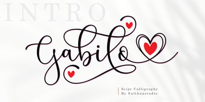 Gabilo Script font with a smooth, handwritten style. Gabilo script is perfect for branding projects, homeware design, product packaging, use in business cards, invitation cards, etc. Simply as a stylish text overlay onto a background image or anything that requires a touch of elegance. also comes with heart swashes that can be spliced.
 - Rigo by Katatrad,
$33.00 Rigo™ is a flexible family of modern sans serif. Rigo is characterized by some humanistic characteristics, its open part of negative space and its overall width make it highly legible and readable at small to large size. The openness helps Rigo to be a good performer on the screen as well.
 - Marusya - Unknown license

- Sales Book JNL by Jeff Levine,
$29.00 Sales Book JNL was recreated from sample letters found in the wood type section of an old printer's supply catalog.
 - KG Shake It Off by Kimberly Geswein,
$5.00 Hand-drawn by my 10-year-old daughter, this font comes in 4 whimsical styles- chunky, 3D, regular, and outline.
 - Timbro by Font&Co.,
$19.00 Timbro – Italian for ’rubber stamp’ – is an all-caps, decorative display typeface based on lettering from old Land Registry records.
 - American West by FontMesa,
$20.00 Inspired by an old document from the New York and Western Railroad, American West brings the olden days to mind.
 - KD Pempo by Kassymkulov Design,
$19.00 A retro multiline display font for your old-school, nostalgic projects. Supports a large set of characters incl. Cyrillic script.
 - Horsfords by Coffee Bin Fonts,
$20.00This font was inspired by lettering found on the cover of an old Almanac style cookbook from the 19th century. - Matchbook JNL by Jeff Levine,
$29.00 The hand lettering which inspired Matchbook JNL was used on an old matchbook from the Carrousel Restaurant in Miami Beach.
 - Luft by Sebastian Cabaj,
$20.00 Luft is blackletter typeface with a modern feel. Inspired by old writing letters and preparation for using in modern design.
 - Vetrena MF by Masterfont,
$59.00 A square san serif font family for short texts and headlines. Inspired by old hand-painted signs in Tel Aviv.
 - Abiding by Suomi,
$35.00 A Slab Serif font family of five weights for headline and text use, with old style numerals and small caps.
 - DorovarFLF-Carolus - Unknown license

- Battlemaze by Typodermic,
$11.95 Attention all Space Marines! The battle for legibility in the galaxy is over! Introducing Battlemaze—the font that will help you obliterate any enemy with its heavy techno headline design. Inspired by the legendary Japanese industrial logo designs and fused with the futuristic 1980s computer printer fonts, Battlemaze is the ultimate weapon in your typography arsenal. With its tightly folded line treatment, this font is built to withstand the most intense space battles. Whether you’re fighting on a distant planet or defending your ship from alien invaders, Battlemaze will never let you down. And if you’re looking for an added advantage, check out its ligatures—the “B” flips when it comes before a “J” period, or comma. So gear up, Space Marines! It’s time to unleash the power of Battlemaze and conquer the galaxy with its angled “A” and “V” glyphs. Trust us, your enemies won’t know what hit them! Most Latin-based European, and some Cyrillic-based writing systems are supported, including the following languages. A Afaan Oromo, Afar, Afrikaans, Albanian, Alsatian, Aromanian, Aymara, Bashkir (Latin), Basque, Belarusian (Latin), Bemba, Bikol, Bosnian, Breton, Bulgarian, Cape Verdean, Creole, Catalan, Cebuano, Chamorro, Chavacano, Chichewa, Crimean Tatar (Latin), Croatian, Czech, Danish, Dawan, Dholuo, Dutch, English, Estonian, Faroese, Fijian, Filipino, Finnish, French, Frisian, Friulian, Gagauz (Latin), Galician, Ganda, Genoese, German, Greenlandic, Guadeloupean Creole, Haitian Creole, Hawaiian, Hiligaynon, Hungarian, Icelandic, Ilocano, Indonesian, Irish, Italian, Jamaican, Kaqchikel, Karakalpak (Latin), Kashubian, Kikongo, Kinyarwanda, Kirundi, Komi-Permyak, Kurdish (Latin), Latvian, Lithuanian, Lombard, Low Saxon, Luxembourgish, Maasai, Macedonian, Makhuwa, Malay, Maltese, Māori, Moldovan, Montenegrin, Ndebele, Neapolitan, Norwegian, Novial, Occitan, Ossetian, Ossetian (Latin), Papiamento, Piedmontese, Polish, Portuguese, Quechua, Rarotongan, Romanian, Romansh, Russian, Sami, Sango, Saramaccan, Sardinian, Scottish Gaelic, Serbian, Serbian (Latin), Shona, Sicilian, Silesian, Slovak, Slovenian, Somali, Sorbian, Sotho, Spanish, Swahili, Swazi, Swedish, Tagalog, Tahitian, Tetum, Tongan, Tshiluba, Tsonga, Tswana, Tumbuka, Turkish, Turkmen (Latin), Tuvaluan, Uzbek (Latin), Venetian, Vepsian, Võro, Walloon, Waray-Waray, Wayuu, Welsh, Wolof, Xhosa, Yapese, Zapotec Zulu and Zuni.
 - Roc Grotesk by Kostic,
$40.00 Roc is a sans serif grotesk inspired by American wood types from the end of the 19th century. With nine weights in five widths, this family contains 45 fonts in total. The character set supports Western and Central European languages, as well as Turkish. Roc Grotesk comes in a range of five widths: Compressed, Condensed, Normal, Wide and ExtraWide, in order to cover a wide scope of applications. Although the styles at both ends of each range are made in their most pronounced form in terms of width and weight, they are not taken to such extremes as to become absurd, and are quite usable in display settings. The Normal width keeps all its nine styles in proportionally similar widths. The Compressed width, however, is deliberately made to be disproportionate, so that every style takes the least possible horizontal space. That is why the contrast between Compressed Thin and Compressed Heavy style is substantial. As the weights progress from Thin to Heavy, the stroke contrast becomes more prominent. It is intentionally exaggerated in heavier weights, which is particularly apparent in the uppercase E and R of the Black and Heavy style. Roc has a large x-height and relatively short descenders and ascenders. No uppercase letter descends below the baseline, so the lines of an all-caps text can be packed tightly on a poster or a headline. The Regular style is somewhat generously spaced, as it is most likely to be used for setting longer passages of text. Its Bold counterpart is spaced in such a way that the width of the text column will be similar to the text set in Regular. Tabular figures in these two styles have exact matching widths, so for example, you could emphasize one row of numbers in a data column without visually disrupting the vertical order of the table. The lowercase g and r have alternatives to accommodate what most designers expect from a typical Grotesk typeface. The single-story g and the cut-off r are accessible via the OpenType feature.
 - Open Book ING by Ingrimayne Type,
$9.00 OpenBookING is a gimmick or novelty font that has letters on pages of a book. It is caps only and monospaced. The letters on the upper-case keys are on the left-handed pages of an open book and the letters on the lower-case keys are the same letters but on the right-handed pages of an open book. One could alternate upper and lower case keys to get letters on complete books, but the Opentype feature of contextual alternatives (calt) does this automatically. Several previous typefaces from IngrimayneType used the calt feature to alternate shapes that fit together in an interlocking pattern, such as alternating concave and convex shapes. OpenBookING uses the calt feature in a different way, to alternate two halves of a symmetrical shape. To provide two copies of numbers and common symbols, some non-alphabetical characters are unavailable because their slots were taken by the second form of the number or common symbol. If stylistic set one (ss01) is turned on, spaces are replaced with empty pages. This may leave you with unwanted spaces at the end of lines, and to eliminate them, turn off the feature (or change the font) for these spaces. The empty pages can be used in a layer to add color to the text. There is also a second set of empty pages with a filled page that can also be used in layers. (See poster for examples.) These pages are on the (logicalnot multiply) and (register divide) characters for the first set and on the (ordmasculine ellipsis) and (macron trademark) keys for the second set. Finally, OpenBookING has a large set of accented characters if anyone should need them. The letters used on the books were derived from the font Myhota-Bold. For a related typeface of letters on book covers, see NewLibrary. OpenBookING has limited uses and is priced accordingly.
 - Posh by Lián Types,
$49.00 I've always been in love with fat didones. That’s the reason of Posh. In search of something unique, I started this family back in 2013 with the aim of creating the fattest yet readable bodonian typeface in the market: It was a challenge, because roman fonts need generous counters (or what some call white spaces) and taking them to the extreme of inexistence attempted against the construction of many glyphs. Ears, dots, terminals and serifs always need some extra space so I had to find the exact point of boldness to make characters which have those attributes work well in the middle of those which haven't. (1) After a while, I felt I was again ‘in my element’: Big contrasted letters, sexy and elegant curves, and that Lubalinesque feeling that characterise my fonts. (2) Words written with Posh are a explosion of elegance and sensuality due to the fact that its didone attributes were exaggerated. Since it’s full of alternate glyphs, one can change and choose them until a nice block of ‘‘black’’ is achieved. (3) To accompany the regular style, I designed Posh Inline, a font with the same quantity of glyphs than the regular one; an all caps style called Posh Capitals, and also a really playful Italic version. I hope you find this one delicious like I do! This font is dedicated to all who understand letters are not just meant to be read, but also to be appreciated in group and individually. Enjoy it. NOTES (1) In example, it can be easy to design a fat letter ‘n’ with almost no counter, but really tough to make a satisfactory letter ‘s’ with serifs to match that ‘n’. (2) Also, it wasn't my first attempt in fat didones. Take a look at my font Reina, made in 2012. (3) Posters above show many words with ball terminals that seem to dance above and below the words in order to fill those “undesired” blank spaces.
 - Cursed Stone by Ditatype,
$29.00 Cursed Stone is a spine-chilling display font that will transport your designs to a realm of dark enchantment. Designed in large letters and with a bold weight, this typeface demands attention and exudes an aura of haunting mystery. Each letter is meticulously crafted with eerie stone texture details, adding an ominous and cursed touch to the font. The large size of the letters enhances the font's imposing presence, making it impossible to ignore. The stone texture details in each letter of this font bring an authentic and sinister feel, as if the font was chiseled from the depths of an ancient cursed monument. These haunting details add an element of mystique and darkness, immersing the viewer into a world of malevolent enchantment. The combination of bold weight and stone texture gives Cursed Stone a rugged and formidable look, evoking images of cursed relics and forbidden ruins. The letters appear to hold secrets from the past, carrying a haunting energy that captures the imagination. For the best legibility you can use this font in the bigger text sizes. Enjoy the available features here. Features: Alternates Multilingual Supports PUA Encoded Numerals and Punctuations Cursed Stone fits in headlines, logos, movie posters, flyers, invitations, branding materials, print media, editorial layouts, headers, and any horror-themed project. Find out more ways to use this font by taking a look at the font preview. Thanks for purchasing our fonts. Hopefully, you have a great time using our font. Feel free to contact us anytime for further information or when you have trouble with the font. Thanks a lot and happy designing.
 - ArchiLogo by Archiness,
$- ArchiLogo is not a regular outline-font. It has a stencil element to it and it’s a kind of indirect, because the font is basically the space between the lines. You have to read between the lines, so to speak. It’s like one of the key elements in architecture: the space between the walls. Here’s where type design meets architecture! The new version, ArchiLogo 3.0, has been improved slightly and 13 glyphs have been added to a total of 85 characters. It is still a free font. Because of the popularity of this font I decided to introduce ArchiLogo Pro. Indeed, the pro version of ArchiLogo. Besides the basic Macintosh Character Set the supported languages are Latin 1, Latin 2: Eastern Europe, Turkish, Windows Baltic. It grew to over 300 glyphs.
 - Bigail by Mevstory Studio,
$25.00 Bigail condensed design makes it an ideal choice for display purposes, such as headlines, titles, and logos. Its clean and legible appearance makes it suitable for short text applications, such as captions or taglines, where space is at a premium. Bigail is versatile and well-suited for a variety of design fields, including branding, advertising, editorial design, and web design. Its condensed design is particularly useful for designs where space is limited, such as packaging, signage, and mobile app interfaces. Overall, Bigail is a high quality font that offers excellent readability and legibility while conveying a sense of modernity and sophistication. Its sleek and streamlined design makes it a great choice for a wide range of design applications, making it a valuable addition to any designer’s font library.
 - KAPITAL by Superfried,
$32.00 KAPITAL is an elegant, geometric uppercase sans. It is available in standard and stencil style across four weights – light | regular | medium | demi – covering 346 glyphs. It is based on the capital character set from a previous release – Basik. Continuing the clean, geometric aesthetics, KAPITAL was refined further to create a more minimal style. This enabled the characters to discreetly perform their role – to simply convey the message of the writer without distraction. To achieve this, special attention was applied to the form consistency of the glyphs across the weights and negative space throughout. In many typefaces as the weight is increased the form and style can deviate significantly from the original design. With regards to negative space – although inevitable – wherever possible key letterforms were adjusted to alleviate this.

