10,000 search results
(0.266 seconds)
- Schwabacher - Personal use only

- Stonecross - Unknown license

- Fatz by Good Java Studio,
$20.00 Fatz is the perfect font for all your fun designs. The main font file is equipped with ordinary characters. Everything is made with the bold and smooth brush, and everything is the same size as Hello Balls, so you can be sure they will work well together! It is suitable for you to use in making t-shirt design, quote, label, packaging, logo type, or long writing. Because we have compiled kerning and matrices that are tailored to your needs.
 - Moenstram by Flawlessandco,
$9.00 Moenstram is an authentic and unique blackletter font that made with bold and striking style. An Original typeface that suitable for any graphic designs such as branding materials, t-shirt, print, business cards, logo, poster, t-shirt, photography, quotes .etc This font support for some multilingual. Modern Sweet Retro that contains uppercase A-Z and lowercase a-z, alternate character, numbers 0-9, and some punctuation. If you need help, just write me! Thanks so much for checking out my shop!
 - Orphic by Flawlessandco,
$9.00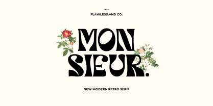 Orphic is a display retro font with a fun and bold style that perfect for your boho-themed projects such as poster design, branding materials, t-shirt, business cards, logo, photography, quotes, and more. Try out some alternate characters for another visual result! This font support for some multilingual. Also contains uppercase A-Z and lowercase a-z, alternate character, numbers 0-9, and some punctuation. If you need help, just write me! Thanks so much for checking out my shop!
 - Shervington by Greater Albion Typefounders,
$16.00 Shervington is a geometric, All capitals and Small capitals typeface with a range of opentype features ideal for banners, headlines, logo design and good clear signage. The letterforms are all geometrically inspired, and are just unusual enough to stand out without obviously striving to do so. It’s a design of bold horizontal and vertical strokes complimented with ‘tiny’ serifs and owes a certain amount of inspiration to traditional sign writing techniques. The family consists of three typefaces; Regular, Shadow and Weathered.
 - Wahwoh by 38-lineart,
$14.00 WAHWOH is a heavy allcaps font which is perfect for heavy titles and headlines. The uppercase looks rough while the lowercase looks sharp. This typeface gives the impression of street style, bold, retro, urban and modern style. Clear and bold, easy to combine with other artwork and typefaces, this is the reason why you should have this font.
 - Wrought by Jon Cartagena,
$10.00 Wrought is a bold geometric display font by Jon Cartagena. It's purpose is to give a rugged, heavy feeling to your designs. Wrought is available in four weights: Thin, Light, Regular, and Bold. Each character is carefully designed to be vertically aligned at the center. This gives Wrought a unique flair, while promoting a harmonious look through each word.
 - Epoca Pro by Hoftype,
$39.00 Epoca, designed in 2010, is a classic linear sans for text and display. It has economical proportions, a neutral appearance and a discreet elegance. While sturdy and robust, it is nonetheless a strong workhorse. The slightly angular shape of the round elements results in a quiet flow of the line which enables fatigue-proof reading even with large amounts of text. Epoca comes in eight styles and in OpenType format. All weights contain small caps, standard ligatures, proportional lining figures, tabular lining figures, proportional old style figures, lining old style figures, matching currency symbols, fraction- and scientific numerals.
 - Argos by Hoftype,
$49.00 Argos, a type face with a strong personality. A rounded serif type family which uses exclusively modern design elements. While it possesses decorative qualities, thanks to its hearty serif weights it can be successfully used as a text type. Argos comes in 6 weights and with its extended character set it permits a wide range of applications. Each font is equipped with ligatures, small caps, proportional lining figures, tabular lining figures, proportional old style figures, lining old style figures, matching currency symbols, fraction- and scientific numerals. Argos supports Western European as well as Central and Eastern European languages.
 - Empira by Hoftype,
$49.00 Empira is a new high-contrasted face. While its principal structure shows some reference to transitional faces, the pronounced graphic shape of its elements are definitely of contemporary origin. It appears crisp, sharp and even somewhat fancy. Empira supports up to 80 languages and its OpenType format allows a wide range of typographic applications. 20 styles offer a fine gradation of the weights. All weights contain small caps, ligatures, superior characters, proportional lining figures, tabular lining figures, proportional old style figures, lining old style figures, matching currency symbols, fraction- and scientific numerals, matching arrows and alternate characters.
 - Varese Gradient by Tarallo Design,
$18.99 Varese Gradient is a color font for display, headlines, or large body text. Use it for bold graphic statements or a vintage mood. Its geometric style is inspired by Art Deco and early 1900s European travel posters. This typeface will set a friendly and light tone while giving messages a unique and memorable feeling. The gradients transition vertically and come in these sets; color with white, color with black, two colors, chromatic grays, grayscales, and concepts like summer or cappuccino. The font name will indicate its color. The full family includes one regular font. Here is a list of all the fonts in color. The lowercase letterforms are similar to the uppercase, but the lowercase have counterforms. It comes with OpenType features such as alternate glyphs, half-height letters, standard ligatures, and stylistic sets. The fonts are OpenType SVG format and fully scalable. Contact Tarallo Design if you need custom colors. Varese Gradient has siblings, Varese Soft (rounded) and Varese Outlined (color/shadow/outline).
 - Quick Titling JNL by Jeff Levine,
$29.00 An ad spotted in a 1960 issue of Billboard magazine promoting a 45 rpm release by Randy Lee doing the old song "Did You Ever See A Dream Walking?" featured the song title in a casual, brush lettered style. While the ad made a perfect model for a digital font design, the record itself tanked. Quick Titling JNL is available in both regular and oblique versions.
 - Fairfield by Linotype,
$41.99 Rudolph Ruzicka designed his font Fairfield as a legible text font. His philosophy: The reader expects optical assistance with reading. He does not want to be distracted while interpreting and understanding the ideas of a text." Fairfield font is based on the forms of Venecian Old Face fonts as well as on the designs and details of Art Deco, giving the font a distinctive appearance"
 - Hackbot by Typefactory,
$14.00 Hackbot is a font which is both retro-inspired and amusing to the eye. The gaps between the letterings allows you to feel vintage and travel back to the old times. It’s a font which uses a sans serif style of writing, but uses a retro design to make an overall unique font. It’s flawlessly suitable for promoting games, creating quotes, retro designs and much more.
 - Simeon's Handwritten Blackletter by Simeon out West,
$20.00 Simeon's Handwritten Blackletter is the result of my desire to have my handwritten old English style writing available for my computer. It is a basic Gothic style font with my own touch to the lettering. Simeon's Handwritten Blackletter comes with full punctuation, a character set for most Western European based Latin alphabet languages. Being a decorative font, it works best at larger point sizes.
 - Moon Type by Thomas Käding,
$1.00 This font of Moon Type is modelled after Dr. Moon's original poster. He developed this embossed writing system to help those who have lost their sight later in life, and so are familiar with the shapes of English letters. Moon writing is still used, and you can find books written with it. This font only contains the letters and punctuation that are in the Moon Type system.
 - Sigmund Freud Typeface by Harald Geisler,
$29.00 “For those who regret what keyboards and touch screens have done to their penmanship, typographer Harald Geisler has an answer: Sigmund Freud.” — The Wall Street Journal Sigmund Freud was a neurologist who lived from 1856 to 1939. His research and studies led to the foundation of ‘Psychoanalysis’. When I first saw Freud’s century old letters, I was fascinated by the beauty of these historic manuscripts. It made me smile to imagine a person writing his or her shrink a letter set in Freud’s handwriting. I started to plan creating a font based on his manuscripts. I contacted the Sigmund Freud Museum Vienna and Freud Museum London. To start the creation I selected eight handwritten documents from the archive in Vienna – This selection of specimen was my orientation during the design process. The Samples were created between 1883 to 1938 and are of various character such as handwritten scientific papers, personal letters, notes and a telegram. A successful Kickstarter Campaign "The Sigmund Freud Typeface - A Letter to your Shrink" with over 1400 Backers enabled me to visit the archive in Vienna and study the original manuscripts of Sigmund Freud. After a year of preparation and design work, I finished four alphabets based on Freud’s handwriting. What are the different Versions PRO, Kurrent, #1, #2, #3 and #4 about? “This project gives people the convenience afforded by the computer while maintaining the romantic nostalgia, beauty, and character of letter writing with real handwriting.” — Daniel Vahab, The Huffington Post When you write with your hand, every letter looks a little different. When you write a text on your computer every letter looks exactly the same. In order to make type look like handwriting, I chose four different variations of each letter from Freud’s manuscripts, drew and stored them in the font. The font is then programmed to exchange letters while you are typing. This makes the rendered result on your screen or print look like unique handwriting. PRO While you are typing… the PRO Version actively combines all four alphabets and exchanges them automatically. Through this mechanism never the same two o’s will stand next to each other. With every touch a unique look is generated. This works in certain applications i.e. Word 2010(or newer), Pages, TextEdit, Editor(Pre-installed on Windows 7 or newer), InDesign, Illustrator… →Here you can see an animation of what this effect looks like in action. (Please Note: some applications like LibreOffice, OpenOffice do currently not support this feature. Date: December 2013) #1 #2 #3 and #4 The Sigmund Freud Typeface #1, #2, #3 and #4 each hold one individual lowercase alphabet based on Freud’s handwriting. Kurrent Most of Freud’s correspondence was written in German. Until the 1950′s a different handwriting was taught throughout German speaking countries (Switzerland, Austria, Germany). This style is called Kurrent. The name Kurrent and Cursive derive from the Latin word currere - to run, hurry - both styles were designed to write fast. As you can see in the samples above, Freud practiced both Kurrent and when writing english Cursive (Latin script or Joined-up). Kurrent has three significantly different letters (s,h,e). Use Kurrent to render the authentic look of an historic Sigmund Freud letter in German. Bundle On the Top of this page you can get all six fonts of the Sigmund Freud Typeface Family in a bundle. International Typeface All styles of the Sigmund Freud Typeface feature a wide range of accented letters so you can write to all your friends in Sweden (Bjørn) France (Chloé & Zoë), Ireland (Dáirine), Poland (Łucja), Germany (Jörg) and almost everywhere around the globe (Find a complete list in the tech specs). Usage recommendations I hope that this design will be valuable to you and most of all that you have fun with this typeface! 1. Point Size — To reproduce the size of Sigmund Freud’s handwriting adjust the type size between 18-24 point in your word processor. If you are using an imaging software like Photoshop set the resolution to 300dpi and adjust the point size between 18-24. 2. Line Spacing — Narrow the line hight until swashes of capital letters touch the baseline above. This also happens when you write a letter and gives the document a unique handwritten look. 3. Right Aligned — Freud had the habit to write towards the right edge of the page and start loosely on the left. Set your text alignment to ‘right’ to incorporate this dramatic expression also to your documents. What do other People say about the Sigmund Freud Typeface? “Wouldn’t you love to write a letter to your shrink using the Sigmund Freud typeface?” — Dorothy Tan, Design TAXI ''“JUST DON’T WRITE A LETTER TO YOUR MOTHER WITH IT… …until the reader looks a bit closer, and they see 70+ years of modern science weighing in on turn-of-the-century pop psychology."'' — Mark Willson, Fast Company “Doctor, what does it mean if you dream of creating a font of Freud’s handwriting?” — Ayun Halliday, Open Culture “…geekily romantic, at once artistic and scientific” — Edie Jarolim, Freud’s Butcher “…sympathisch” — Jürgen Siebert, Fontblog !WOW! Thank you for reading the complete font description! You are awesome! If you still have a question please contact me through MyFonts or my website haraldgeisler.com. Credits This project was made possible by the help of 1481 Backers on Kickstarter and the kind support of the Sigmund Freud Museum Vienna and the Freud Museum London. Thank you. All of Freud’s Manuscripts shown are © Sigmund Freud Museum Vienna. Poster Image: IN17 - Sigmund Freud, Germany 1932. © Freud Museum London. Flag Image: IN19 - Sigmund Freud 1930’s. © Freud Museum London.
 - PlainPensle by Ingrimayne Type,
$14.95 As its name suggests, PlainPensle is a handwriting font that emulates printing and writing with a pencil or ballpoint pen. The plain and bold styles have hand printing that is ordinary and nondescript. The italics and bolditalics contain simple handwritten cursive.
 - Trade Gothic Display by Monotype,
$42.99 It’s a colorful world. Don’t limit yourself to black and white. The Trade Gothic® Display designs take advantage of color to create lively and compelling statements, making the designs ideal for advertising, branding, poster and publication projects. Based on the powerful Trade Gothic Condensed Heavy typeface, Monotype Studio designer Lynne Yun, created the fonts necessary to set both “beveled” and “embossed” characters in any color. Trade Gothic Display 1 (embossed) generates striking highlighted type, while Trade Gothic Display 2 (bevel) produces powerful shadow and outline effects. The designs are natural additions to the Trade Gothic Next family, and stand on their own as formidable display typefaces.
 - Magreb by 38-lineart,
$19.00 Magreb is a classic serif font inspired by Garamond and Venetian Serif Styles, accentuating softness and conveying luxury. This family of four weights and their corresponding italics is an old style construction and bridges the glory of the past with the elegance of the present. The process of making this fonts starting with an ellipse brush with a certain slope so that it resembles calligraphy pen strokes. followed by creating the basic serif elements, refining the vectors and softening each joint so that it looks natural. Next, develop it from regular weight to weight bold. Magreb has expanded the latin character set to support 200+ latin based languages. We added opentype features suchs superscript and subscript; Numeretor and Denominator; Old Style figures and lining figures.
 - Salad by Zetafonts,
$39.00 The island of Fuerteventura is more known for its white sand beaches and windsurf-friendly constant winds than for its typographic marvels. Still, it's on the walls of a ballroom next to its white-sand beaches that Debora Manetti found the hand-painted letterforms that she took as inspiration for her typeface Sala de Fiestas. The resulting font was a condensed sans serif full of curious details and a jumpy latino vibe that many years after still keeps its freshness and vernacular charme. Francesco Canovaro took the original typeface as a starting point for a grand tour into sign-painter aesthetics, developing a reboot of the original into a new type family: Salad. While being faithful to the original proportions and feeling, Salad provides extreme versatility through its five-weights range, its extended charset and its set of Open Type features including stylistic sets, alternates, positional numerals, small capitals and case sensitive forms. While the roman family with its italic counterpart provide a good workhorse tool for informal branding, packaging and editorial projects, the interlocking and the inline weights add additional possibilities for display purposes. This is enriched by the inclusion in the typeface of a set hand-drawn decorative dingbats that further complement the sign painting vibe of the family. All Zetafonts expertise in handmade lettering, typographic design and water sports has been put to test to assure Salad is the best typographical alternative to a a trip to Canary Islands!
 - Giroji by Twinletter,
$12.00 Introducing our newest font called Giroji, this font is designed with a bold, strong, and unique handwriting theme, so that when used it can create a relaxed, elegant and charming impression when applied to your design project so that it can give the viewer a distinctive impression. Start using this font to create an ideal and balanced design for each of your projects. In addition, this font is designed with a natural handwritten touch that is refined to create portions and compositions to suit your needs. So this font is perfect for crafts, children’s writing, adventure posters, food banner titles, wedding invitations, product packaging logos, quotes, social media page covers, furniture banner headlines, book covers, and much more.
 - Foot Print by Bureau Bunk,
$14.95 While Walking along the shore of our Main Port to Europe in Rotterdam, The Netherlands, my 14 year old son Jules first hardly dared to step in the mud for he was wearing his brand new sneakers. Concentrating in where he put his feet, he noticed he made a character! The FootPrint-Regular was born! The FootPrint-Regular is a powerful header-typeface, but funny enough it's usable as small copy too! Blaze your Trail! Anything you can imagine on Police investigations, Bloodhound Thrillers, Trails, Tracks and Traces, anything about Outdoor Stores, Tracking or even maybe Pedestrian Clubs, or things like Survival Sports, Walking Events or Hiking Gear; Blaze'm your FootPrint-Regular Trail on all Banners, Blimps, Ads and Doormats!
 - Stenciled Message JNL by Jeff Levine,
$29.00 Inspired by an old retail stencil lettering guide, Stenciled Message JNL is a bold Roman serif typeface available in both regular and oblique versions.
 - Sheet Music JNL by Jeff Levine,
$29.00 Sheet Music JNL was based on lettering found on an old piece of 1930s-era sheet music being sold at a local rummage sale.
 - Subytro by Subtitude,
$39.00 Subytro! Use this font for sweet bold titles. It adds personality and an handmade feeling. Old Style font based on posters of the fifties.
 - BitchSlap - Unknown license

- Chilada by Image Club,
$29.99Chilada is an outrageous display family by designer Patricia Lillie for Image Club. Across four versions, the decorate treatment inside Chilada's letters becomes more intense. Chilada characters exude an energy of their own. Their design could be described as a cross between Bank Gothic and Neuland, with a spoonful of funk mixed in. Big and chunky, Chilada's forms are made up of straight lines only. There are no curved elements. The resulting design is angular and cuts a good figure on the page. Of the Chilada family's four members, the basic font is named Chilada Uno. Uno is Spanish for one!" The forms of Chilada Uno's letter are solid black-or whatever color you choose to set them in! Chilada Dos, Tres, and Quatro each offer their own decorative treatments: Chilada Dos's letters sport a zigzag inline, Chilada Tres is decorated or an ornamented leaving leaves more black from the letters than white, while Chilada Quatro's level of decoration is just crazy. Its letters are made up more more from white space than from black marks. Chilada Quatro is almost an outline font!" - ZT Mota by Khaiuns,
$14.00 ZT Mota is a bold and elegant typeface. It has a temperamental character but is more flexible towards various stylistic designs, reflecting more in its graphics the transitional stage between classical serifs of varying proportions, leaning towards the stylized types of Roman culture. All the ZT Mota styles are based on the same core but with a completely different expression which is to have an extra large x-height and bold so that the font looks bold as if the writing on the font was actually carved out of stone, perfect for an efficient choice for use of distinguishable displays such as headlines, packaging, magazines, posters, and advertisements, among others. I hope you have fun using ZT Mota Thanks for using this font ~ Khaiuns X zelowtype
 - Fragtude by Letterhend,
$20.00 "Old is Gold".. Perhaps that's the best words to represent this typeface called Fragtude - a pair of vintage display typeface consist of bold script and serif. One of our finest typeface, crafted carefully to make sure its quality. Inspired by 40s 50s lettering and signage, the nostalgic feels will bring you back to the good ol' days. This typeface is perfectly made to be applied especially in logo, and the other various formal forms such as invitations, labels, logos, magazines, books, greeting / wedding cards, packaging, fashion, make up, stationery, novels, labels or any type of advertising purpose. Features : uppercase & lowercase numbers and punctuation multilingual swash and ligatures alternates PUA encoded We highly recommend using a program that supports OpenType features and Glyphs panels like many of Adobe apps and Corel Draw, so you can see and access all Glyph variations. How to access opentype feature : letterhend.com/tutorials/using-opentype-feature-in-any-software/ Email us to letterhend@gmail.com if you need something! Happy Designing!
 - Rogers2 - Unknown license

- Anglaise by Ladyfingers,
$39.00 Anglaise was designed for display and it likes to be big and present, filling the width of a whole spread. The repetition of vertical black and white space holds the typeface together and the contrasting straight and round shapes add the personality... for even more... use the OpenType features, and Anglaise will start merging and building new characters for you to play around with... Enjoy!
 - Vistaria Notes by Letterhend,
$19.00 Introducing, Vistaria Notes - A beautiful script based on manual hand writing. Inspired by old-fashioned calligraphy script, so classy and classic! This type of font perfectly made to be applied especially in logo, and the other various formal forms such as invitations, labels, logos, magazines, books, greeting / wedding cards, packaging, fashion, make up, stationery, novels, labels or any type of advertising purpose. Features : uppercase & lowercase numbers and punctuation multilingual swash and ligature alternates PUA encoded We highly recommend using a program that supports OpenType features and Glyphs panels like many of Adobe apps and Corel Draw, so you can see and access all Glyph variations. How to access opentype feature : letterhend.com/tutorials/using-opentype-feature-in-any-software/ Email us to letterhend@gmail.com if you need something! Happy Designing!
 - Doriss Girls by Open Window,
$- Dorriss girls were the dancing troop at the Moulin Rouge. I had the idea for this font while trying to come up with an alternative to beveling. I thought it would be interesting to create this sort of stepped effect as I've never really seen this treatment on a font before. Then my need to create chaos shows up again with Doriss Girls informal. A hand drawn take on the forms. This seemed like it would appear on an old art nouveau poster by the great Toulouse Lautrec, so there you have the genesis of this font. I've been somewhat compelled by the letterforms so I may expand and create a more normal version of this font someday with a range of weights. That would be the bees knees.
 - Breathless by Wiescher Design,
$39.50 Breathless was inspired by movie posters of the Nouvelle Vague era when Jean Seberg and Jean-Paul Belmondo were young and films where in black and white. So I named this very spiky affair after that phantastic movie of my youth A bout des souffle or like it was called in English, Breathless. -Your breathless type designer, Gert Wiescher
 - HWT Showcard Script by Hamilton Wood Type Collection,
$29.95 Described as “An extended script type that lends itself well to fine fashion, ready-to-wear and all quality merchandise” in a marketing blurb pitching Beaufont by the Morgan Sign Machine Company of Chicago for their Line-O-Scribe sign printing system. This advertising script font was originally manufactured exclusively for Morgan Sign under license by the Hamilton Wood Type Manufacturing Company. The source patterns and original artwork for this typeface exist in the archives of the Hamilton Wood Type & Printing Museum, and were used for this fresh digitization of this font. This digital take includes alternate letters as originally designed in the mid-century wood type version, and now includes a full extended latin character set with over 350 characters.
 - Dynatron by Studio K,
$45.00 Dynatron is a bold condensed retro-style font inspired by the old sci-fi comic covers, an example of which I have mocked up here.
 - Engravers Gothic by ParaType,
$30.00 An old extended Grotesque for use in advertising and display typography. Cyrillic version with adding Bold style created for ParaType in 2003 by Isabella Chaeva.
 - Dashing by Twinletter,
$14.00 Dashing, a beautiful geometric font for writing titles and sentences that are comfortable to see when reading, a simple but elegant impression makes this font suitable for you to use for various needs of your design projects. smooth, casual and formal. This font is an alternate character in each letter, especially uppercase letters, which you can apply in writing to create a new and captivating look in writing names or trademarks, and so on. This font is perfect as text with displays for a wide variety of branding, advertising, posters, banners, packaging, news headlines, magazines, websites, logo design, and more.


