10,000 search results
(0.021 seconds)
- Sympathetic by Bülent Yüksel,
$19.00 “Sympathetic Font” multi-purpose use is an open designed font. It is possible to produce unlimited designs using this font. “Sympathetic Font” is made up of 24 different forms. Hearts, square, triangle, circles, moon and stars, horizontal and vertical lines, sloping inner lines and wavy lines. Shading and decorations are also available. Ideally suited for advertising and packaging, logo, branding, slogans and creative industries, poster and billboards as well as web and screen design. You can create unique designs using fonts in layers. TECHNICAL: Sympathetic provides advanced typographical support for Latin-based languages. An extended character set, supporting Central, Western and Eastern European languages, rounds up the family. “Sympathetic” has 24 different forms and italics total 48 types. The family contains a set of 321 characters. Stylistic Alternates, Localized Forms and Old Style Figures just one touch easy In all graphic programs. Sympathetic is the perfect font for web use. You can enjoy using it.
 - Amarone by Monotype,
$29.99 Amarone is a spiky calligraphic display typeface with some old fashioned flavour. It was designed by Carl Crossgrove, and includes an extensive set of swash caps which allow for extra drama where needed. Crossgrove wrote each of Amarone's letters by hand using pen and rough paper, and has retained some of this visual texture in the final digital design. The typeface works well at small sizes, but when used at larger sizes this texture comes to the fore. Amarone's elegant, formal character can be modified with its swash caps, which allow the typeface to move from prim and ordered to wildly expressive. Amarone lends itself well to packaging, posters and editorial usage – or in any environment where designers need to evoke times gone by. The Amarone font features an extensive character set with support for over 130 languages, and a range of OpenType typographic features including ligatures, initial and terminal forms, figures, fractions and swashes.
 - Linotype Textra by Linotype,
$40.99Linotype Textra is a clever twist on the sans serif genre, designed by Jochen Schuss and Jörg Herz in 2002. Schuss says this about Linotype Textra: "Two in one! The same Linotype Textra, which is so neutral and practical for long text passages turns into an eye-catching headline type when used in larger point sizes. The trick? It's all in the details. The type's clear, robust forms give it a high degree of legibility when used in smaller point sizes for texts. When used in larger sizes, the angular, slightly irregular forms that give the type its strong character become apparent. Hence the name Linotype Textra: pure text with a little something extra!" With 15 weights, the Linotype Textra family provides graphic designers with a good basis for almost any type of work. The five regular weights have matching true italics and old style figures, and the five small cap weights include tabular figures. - Halogen Slab by Positype,
$29.00 When I released Halogen, I asked ‘Who doesn't want or need an expansive contemporary extended sans that has a sense of style and swagger… what if it had a lowercase, small caps and various numeral options… how could you say no?’ Go, click on the Halogen link and read on, if you're interested. Halogen was well-received, so I decided to take it further with Halogen Slab (the name kinda tips you off as to what kind of typeface it is, don't ya think?). As always, I prefer not to take short cuts and provide an anemic offering of glyphs — a modern typeface offered today must provide more than just the basics and this one does — lowercase, smallcaps, old style numerals, tabular forms, stylistic and titling alternates, fractions, case-sensitive features, and even an alternate uppercase ordinal set is included. Now go make cool print and digital things with it, and share them with me.
 - Nazare Exuberant by Ndiscover,
$39.00 Nazare Exuberant is the Poster version of Nazare. This version makes the vintage design more elegant and luxurious. It has super high contrast and the semi-serifs were turned into opulent serifs. Some shapes were redesigned by adding a slight calligraphic feel, making it even more vibrant. This way this design got more organic, more human, more serious, more trustworthy and more luxurious. This is the design for your posters, headlines and actually anything where the letters have a big point size. If you need a more text suitable version you can always use the original Nazare. Another feature is the insertion of some Opentype features: Ligatures were added as well as old style numbers. With its six weights you will have plenty of room for many variations. From the Regular that focus more on elegance to the Heavy that focus more on the lavishness. Regardless of which style you choose Nazare Exuberant is so unique that your designs will not remain unnoticed.
 - P22 Mystic Font by IHOF,
$24.95 The P22 Mystic font knows all. Aside from allowing for type design in a faux eastern script, this font peers into the world of the spirits for guidance and enlightenment. Sure it has small caps and ligatures as OpenType features, but it also has a special “oracle” feature which will answer your most mystifying questions. The design itself was based on an actual Ouija board. Somehow the spirits became embedded into the font itself and now when a question is typed, an answer is revealed—provided the Contextual Alternates feature is enabled. It is not known how the otherworldly harbinger was able to integrate into OpenType scripting, but who are we mere mortals to question this power? Ask and ye shall be amazed! Only the Opentype Pro version will offer the “Magic Eight-Ball” feature. It also contains the small caps and old style figures as found in both TT and PS versions of the fonts.
 - Quars by Letterjuice,
$66.00 Quars is a text and display typeface family designed to work on magazines. However, it is also suitable for books and other editorial material. It has a strong personality with elegant, sharp and contemporary features. This typeface comes from several subtle influences, from the contrast of the Scotch Romans to the sharpness of contemporary Dutch designers. Quars is a crystal clear and neat typeface full of small details, its structure is bursting with curves and accurate features which gives it its firm personality. Its italic experiments with the boundaries of italics themselves; with just 1 degree of slant Quars Italic accomplishes its purpose of highlighting pieces of text within its Roman. This carefully thought out inclination protects the uppercase from the usual distortion which Italic caps suffer. It offers a generous glyph set with many ligatures specially crafted for titling and ornaments based on anonymous metal types found in the drawers of an old printing workshop in a coast town near Barcelona.
 - Donnerstag by insigne,
$22.00 Donnerstag is an extended slab serif and a new companion to insigne's Montag, Dienstag and Mittwoch typefaces. Donnerstag conveys power and personality with its strong slab letterforms and ball terminals. Donnerstag's seven different weights give it a great deal of versatility, from its beefy and masculine black weight to the delicate and feminine hairline. Because of Donnerstag's width, this typeface is best used for logotypes, headlines or short blocks of text. Donnerstag includes many useful OpenType features, including a set of upright italic swash alternates, ligatures, small caps, fractions and old style figures, alternates for the ball terminals and simplified characters for titling. OpenType-capable applications such as the Adobe suite or Quark can take full advantage of automatically replacing ligatures and alternates. This family also includes the glyphs to support a wide range of latin based languages. For complementary companions, be sure to check out the rest of the typeface super family, also available from insigne.
 - Pieta by Type Dynamic,
$37.00 Pieta is a wide sans type family inspired by old typeface lettering from Netherlands, with a more contemporary design. The Pieta family includes 7 weights, from Hairline to Black, with their corresponding italics. Each font includes OpenType Features such as Proportional Figure, Tabular Figures, Numerator, Superscript, Denominators, Scientific Inferiors, Subscript, Ordinals, Ligatures and Fractions. Pieta family supports Latin and Cyrillic, all these languages are covered: Latin language support: Afar, Afrikaans, Albanian, Asturian, Azeri, Basque, Bosnian, Breton, Bulgarian, Catalan, Cornish, Corsican, Croatian, Czech, Danish, Dutch, English, Esperanto, Estonian, Faroese, Filipino, Finnish, Flemish, French, Frisian, Friulian, Gaelic, Galician, German, Greenlandic, Hungarian, Icelandic, Indonesian, Irish, Italian, Kurdish, Latin, Latvian, Lithuanian, Luxembourgish, Malagasy, Malay, Maltese, Maori, Moldavian, Norwegian, Occitan, Polish, Portuguese, Provençal, Romanian, Romansch, Saami, Samoan, Scots, Scottish, Serbian, Slovak, Slovenian, Spanish, Swahili, Swedish, Tagalog, Turkish, Walloon, Welsh, Wolof Cyrillic language support: Adyghe, Avar, Belarusian, Bulgarian, Buryat, Chechen, Erzya, Ingush, Kabardian, Kalmyk, Karachay-Balkar, Karakalpak, Kazakh, Komi, Kyrgyz, Lak, Macedonian, Moldovan, Mongol, Permyak, Russian, Rusyn, Serbian, Tatar, Tofa, Tuvan, Ukrainian, Uzbek
 - Asgard by Zetafonts,
$39.00 Francesco Canovaro designed Asgard as a way to mix his passion for the raw energy of extra bold sans serif typography with the expressivity of high contrast and calligraphy-inspired letterforms. He built the typeface around a strong geometric sans skeleton, to make the letters feel solid and powerful while using wood-type vernacular solutions to solve density through high contrast details. The typeface name was chosen as an homage to the mythical homeland of the Norse Gods, evoking a land of fierce warriors, power and strength - but also of divine, delicate beauty. Thanks to the help of Andrea Tartarelli and Mario de Libero the original design was extended along with the design space, expanding the number of weights and widths with a "workhorse typeface" approach, and adding also a slanted axis to experiment with italics. The result is a super-family of 9 styles of 8 weights for a total of 72 fonts, each coming with an extended set of 968 glyphs covering over 200 languages using Latin, Greek and Cyrillic scripts. The three variation axes (width, weight, slant) are also all accessible in a variable font version that is included with the whole family. This gives the designer a full range of options for typesetting, with the Roman and Fit widths providing basic display and text-sized alternatives, and the Wide width adding more display and titling options. The inclusion of backslant italic styles gives Asgard an extra chance to add its voice to the typographic palette. To complement this, all Asgard fonts have been given a full set of Open Type Features including standard and discretionary ligatures, stylistic sets, positional numerals and case sensitive forms. Dynamic and expressive, Asgard is a super-family that manages to look brutal and refined at the same time, quoting the vernacular typographic practices of letterpress print while expressing the contemporary zeitgeist. • Suggested uses: perfect for contemporary branding and logo design, bold editorial design, dynamic packaging and countless other projects. • 73 styles: 8 weights + 8 italics + 8 backslant italics, 3 different widths + 1 variable font. • 968 glyphs in each weight. • Useful OpenType features: Access All Alternates, Contextual Alternates, Case-Sensitive Forms, Glyph Composition / Decomposition, Discretionary Ligatures, Denominators, Fractions, Kerning, Standard Ligatures, Lining Figures, Localized Forms, Mark Positioning, Mark to Mark Positioning, Alternate Annotation Forms, Numerators, Oldstyle Figures, Ordinals, Scientific Inferiors, Stylistic Set 1, Stylistic Set 2, Stylistic Set 3, Subscript, Superscript, Slashed Zero • 219 languages supported (extended Latin, Greek and Cyrillic alphabets): English, Spanish, Portuguese, French, Russian, German, Javanese (Latin), Vietnamese, Turkish, Italian, Polish, Afaan Oromo, Azeri, Tagalog, Sundanese (Latin), Filipino, Moldovan, Romanian, Indonesian, Dutch, Cebuano, Igbo, Malay, Uzbek (Latin), Kurdish (Latin), Swahili, Greek, Hungarian, Czech, Haitian Creole, Hiligaynon, Afrikaans, Somali, Zulu, Serbian, Swedish, Bulgarian, Shona, Quechua, Albanian, Catalan, Chichewa, Ilocano, Kikongo, Kinyarwanda, Neapolitan, Xhosa, Tshiluba, Slovak, Danish, Gikuyu, Finnish, Norwegian, Sicilian, Sotho (Southern), Kirundi, Tswana, Sotho (Northern), Belarusian (Latin), Turkmen (Latin), Bemba, Lombard, Lithuanian, Tsonga, Wolof, Jamaican, Dholuo, Galician, Ganda, Low Saxon, Waray-Waray, Makhuwa, Bikol, Kapampangan (Latin), Aymara, Zarma, Ndebele, Slovenian, Tumbuka, Venetian, Genoese, Piedmontese, Swazi, Zazaki, Latvian, Nahuatl, Silesian, Bashkir (Latin), Sardinian, Estonian, Afar, Cape Verdean Creole, Maasai, Occitan, Tetum, Oshiwambo, Basque, Welsh, Chavacano, Dawan, Montenegrin, Walloon, Asturian, Kaqchikel, Ossetian (Latin), Zapotec, Frisian, Guadeloupean Creole, Q’eqchi’, Karakalpak (Latin), Crimean Tatar (Latin), Sango, Luxembourgish, Samoan, Maltese, Tzotzil, Fijian, Friulian, Icelandic, Sranan, Wayuu, Papiamento, Aromanian, Corsican, Breton, Amis, Gagauz (Latin), Māori, Tok Pisin, Tongan, Alsatian, Atayal, Kiribati, Seychellois Creole, Võro, Tahitian, Scottish Gaelic, Chamorro, Greenlandic (Kalaallisut), Kashubian, Faroese, Rarotongan, Sorbian (Upper Sorbian), Karelian (Latin), Romansh, Chickasaw, Arvanitic (Latin), Nagamese Creole, Saramaccan, Ladin, Kaingang, Palauan, Sami (Northern Sami), Sorbian (Lower Sorbian), Drehu, Wallisian, Aragonese, Mirandese, Tuvaluan, Xavante, Zuni, Montagnais, Hawaiian, Marquesan, Niuean, Yapese, Vepsian, Bislama, Hopi, Megleno-Romanian, Creek, Aranese, Rotokas, Tokelauan, Mohawk, Onĕipŏt, Warlpiri, Cimbrian, Sami (Lule Sami), Jèrriais, Arrernte, Murrinh-Patha, Kala Lagaw Ya, Cofán, Gwich’in, Seri, Sami (Southern Sami), Istro-Romanian, Wik-Mungkan, Anuta, Cornish, Sami (Inari Sami), Yindjibarndi, Noongar, Hotcąk (Latin), Meriam Mir, Manx, Shawnee, Gooniyandi, Ido, Wiradjuri, Hän, Ngiyambaa, Delaware, Potawatomi, Abenaki, Esperanto, Folkspraak, Interglossa, Interlingua, Latin, Latino sine Flexione, Lojban, Novial, Occidental, Old Icelandic, Old Norse, Slovio (Latin), Volapük.
 - skeemat - Unknown license

- LudwigHohlwein - 100% free

- Protura by MIX.Jpg,
$15.00 Protura Sans Serif Masculine - 9 Font Weights With Italics Introducing Protura Sans Serif Masculine, a versatile and powerful font family designed to make a bold statement in your creative projects. With nine distinct font weights and accompanying italics, Protura offers unmatched flexibility for all your design needs. Key Features: Nine Font Weights: Protura Sans Serif Masculine boasts an extensive range of weights, from Light to Ultra Bold. Whether you're crafting a subtle headline or a powerful logo, you'll find the perfect weight to convey your message. Italics Included: In addition to the standard weights, Protura also provides elegant italic versions for each weight. These italics add a touch of sophistication to your typography, making it ideal for editorial work and branding projects. Masculine Aesthetic: Protura's design exudes strength and masculinity, making it an excellent choice for projects aimed at a bold and assertive audience. Its clean lines and sharp edges give your text a contemporary and impactful look. Versatile Usage: This font family is highly adaptable, suitable for a wide range of design applications, including branding, packaging, editorial design, posters, websites, and more. It's a true workhorse font that performs well in various contexts. Legibility: Protura prioritizes legibility without compromising on style. Its well-crafted letterforms ensure that your text remains clear and readable, even at small sizes. OpenType Features: Take advantage of OpenType features such as ligatures and alternate characters to add subtle design nuances and improve overall visual appeal. Multilingual Support: Protura Sans Serif Masculine supports a multitude of languages, making it a globally accessible font choice for your projects. Applications: Branding: Create impactful logos and brand identities that leave a lasting impression. Editorial Design: Enhance the readability and visual appeal of magazines, newspapers, and books. Web Design: Craft modern and engaging websites that resonate with your target audience. Packaging: Design packaging that stands out on the shelf and communicates product quality. Posters and Flyers: Grab attention with bold and stylish promotional materials. Unleash the power of Protura Sans Serif Masculine to elevate your design projects with a masculine, contemporary, and highly versatile typographic solution. With its extensive weight range and italics, this font family empowers you to create impactful and visually stunning designs.
 - Vendetta by Emigre,
$69.00 The famous roman type cut in Venice by Nicolas Jenson, and used in 1470 for his printing of the tract, De Evangelica Praeparatione, Eusebius, has usually been declared the seminal and definitive representative of a class of types known as Venetian Old Style. The Jenson type is thought to have been the primary model for types that immediately followed. Subsequent 15th-century Venetian Old Style types, cut by other punchcutters in Venice and elsewhere in Italy, are also worthy of study, but have been largely neglected by 20th-century type designers. There were many versions of Venetian Old Style types produced in the final quarter of the quattrocento. The exact number is unknown, but numerous printed examples survive, though the actual types, matrices, and punches are long gone. All these types are not, however, conspicuously Jensonian in character. Each shows a liberal amount of individuality, inconsistency, and eccentricity. My fascination with these historical types began in the 1970s and eventually led to the production of my first text typeface, Iowan Old Style (Bitstream, 1991). Sometime in the early 1990s, I started doodling letters for another Venetian typeface. The letters were pieced together from sections of circles and squares. The n, a standard lowercase control character in a text typeface, came first. Its most unusual feature was its head serif, a bisected quadrant of a circle. My aim was to see if its sharp beak would work with blunt, rectangular, foot serifs. Next, I wanted to see if I could construct a set of capital letters by following a similar design system. Rectangular serifs, or what we today call "slab serifs," were common in early roman printing types, particularly text types cut in Italy before 1500. Slab serifs are evident on both lowercase and uppercase characters in roman types of the Incunabula period, but they are seen mainly at the feet of the lowercase letters. The head serifs on lowercase letters of early roman types were usually angled. They were not arched, like mine. Oddly, there seems to be no actual historical precedent for my approach. Another characteristic of my arched serif is that the side opposite the arch is flat, not concave. Arched, concave serifs were used extensively in early italic types, a genre which first appeared more than a quarter century after roman types. Their forms followed humanistic cursive writing, common in Italy since before movable type was used there. Initially, italic characters were all lowercase, set with upright capitals (a practice I much admire and would like to see revived). Sloped italic capitals were not introduced until the middle of the sixteenth century, and they have very little to do with the evolution of humanist scripts. In contrast to the cursive writing on which italic types were based, formal book hands used by humanist scholars to transcribe classical texts served as a source of inspiration for the lowercase letters of the first roman types cut in Italy. While book hands were not as informal as cursive scripts, they still had features which could be said to be more calligraphic than geometric in detail. Over time, though, the copied vestiges of calligraphy virtually disappeared from roman fonts, and type became more rational. This profound change in the way type developed was also due in part to popular interest in the classical inscriptions of Roman antiquity. Imperial Roman letters, or majuscules, became models for the capital letters in nearly all early roman printing types. So it was, that the first letters in my typeface arose from pondering how shapes of lowercase letters and capital letters relate to one another in terms of classical ideals and geometric proportions, two pinnacles in a range of artistic notions which emerged during the Italian Renaissance. Indeed, such ideas are interesting to explore, but in the field of type design they often lead to dead ends. It is generally acknowledged, for instance, that pure geometry, as a strict approach to type design, has limitations. No roman alphabet, based solely on the circle and square, has ever been ideal for continuous reading. This much, I knew from the start. In the course of developing my typeface for text, innumerable compromises were made. Even though the finished letterforms retain a measure of geometric structure, they were modified again and again to improve their performance en masse. Each modification caused further deviation from my original scheme, and gave every font a slightly different direction. In the lower case letters especially, I made countless variations, and diverged significantly from my original plan. For example, not all the arcs remained radial, and they were designed to vary from font to font. Such variety added to the individuality of each style. The counters of many letters are described by intersecting arcs or angled facets, and the bowls are not round. In the capitals, angular bracketing was used practically everywhere stems and serifs meet, accentuating the terseness of the characters. As a result of all my tinkering, the entire family took on a kind of rich, familiar, coarseness - akin to roman types of the late 1400s. In his book, Printing Types D. B. Updike wrote: "Almost all Italian roman fonts in the last half of the fifteenth century had an air of "security" and generous ease extremely agreeable to the eye. Indeed, there is nothing better than fine Italian roman type in the whole history of typography." It does seem a shame that only in the 20th century have revivals of these beautiful types found acceptance in the English language. For four centuries (circa 1500 - circa 1900) Venetian Old Style faces were definitely not in favor in any living language. Recently, though, reinterpretations of early Italian printing types have been returning with a vengeance. The name Vendetta, which as an Italian sound I like, struck me as being a word that could be taken to signifiy a comeback of types designed in the Venetian style. In closing, I should add that a large measure of Vendetta's overall character comes from a synthesis of ideas, old and new. Hallmarks of roman type design from the Incunabula period are blended with contemporary concerns for the optimal display of letterforms on computer screens. Vendetta is thus not a historical revival. It is instead an indirect but personal digital homage to the roman types of punchcutters whose work was influenced by the example Jenson set in 1470. John Downer.
 - akaDora - 100% free

- Camelin by Gian Studio,
$15.00 Introducing Camelin sant display is a complete typeface that is modern, simple and clean. As a typographic display it is useful for posters, logotypes, titles and short text in general. This font is easy to read and bold, easy to play. the embellished serif of the hat is slightly different from the usual hat to create an alternative glyph. We also designed an attractive uppercase set inside, to enhance your design. Enjoy!
 - Beleck by ArimaType,
$19.00 Beleck is a bold and horror display font. To make your creations look amazing, this font has the potential to take your creative ideas further. It is perfect for your horror designs and also a unique alternative to display designs. Beleck was designed for the needs of Halloween themed design concepts and events in October and November. Beleck is also perfect for quotes, greeting cards, invitations, posters, business cards, presentations and more.
 - Cheesy Bread by Putracetol,
$24.00 Introducing Cheesy Bread, a super playful bold font. This font is perfect for your projects related to kids, which is playful and fun. This font also has 2 versions, clean and rough. Cheesy Bread also perfect for branding design, posters, apparel, logotype, header, quote, invitation, greeting card, cover, poster, fashion design and any more. Come with lot of ligatures character, its help you to make great lettering. This font is also support multi language.
 - Stifin by Maulana Creative,
$22.00 Stifin handwritten display font. Bold stroke, fun character with a bit of ligatures and alternates. To give you an extra creative work. Stifin font support multilingual more than 100+ language. This font is good for logo design, Social media, Movie Titles, Books Titles, a short text even a long text letter and good for your secondary text font with script or serif. Make a stunning work with Stifin handwritten display font. Cheers, Maulana Creative
 - Laureen pro Arabic by Zaza type,
$29.00 Laureen pro typeface Laureen pro is an Arabic typeface that has a very particular appearance. It combines the characteristics of different genres; most notably the contrast of serif faces. While its design is influenced by Kufic and the Naskh style. Laureen pro consists of two typefaces, text and display, and 4-weights. It’s a perfect choice for bold headlines, oversize typography, fashion logos, branding, identity, website design, album art, covers, posters, advertising, etc.
 - Undine Soul by Maulana Creative,
$15.00 Undine Soul blackletter display font. Bold stroke, fun character with a bit of ligatures and alternates. To give you an extra creative work. Undine Soul font support multilingual more than 100+ language. This font is good for logo design, Social media, Movie Titles, Books Titles, a short text even a long text letter and good for your secondary text font with script or serif. Make a stunning work with Undine Soul font. Cheers, Maulana Creative
 - Roter Hoody by HansCo,
$15.00 Roter Hoody font is a retro serif and bold display font. You will get three types of fonts in this pack, Regular, Outline and Shadow version. Use this display font to add that special retro touch to any design idea you can think of! Very suitable for logotype, Stickers, Packaging design, Cricut Project, headlines, brand identity, t shirt or apparel industry, posters, magazines, books, YouTube, Instagram, websites, or any of your creative design projects. Enjoy!
 - Geskal by Maulana Creative,
$11.00 Geskal is a wide strong sans display font. With bold stroke, fun character with a bit of ligatures. To give you an extra creative work. Geskal font support multilingual more than 100+ language. This font is good for logo design, Social media, Movie Titles, Books Titles, a short text even a long text letter and good for your secondary text font with script. Make a stunning work with Geskal font. Cheers, Maulana Creative
 - Geometra by T4 Foundry,
$21.00 Geometra is a new font family from Swedish type designer Bo Berndal and the T4 font foundry. Somewhere between a slab serif and a sans it has a crisp, geometric feel and is both 20’s retro and modern. Its soft curves and openness makes it very readable in smaller print. The powerful serifs give the font lots of character in larger sizes. Geometra comes in three weights, regular, semibold and bold.
 - Blakecats by Maulana Creative,
$11.00 Blakecats is a quirky handwritten font. With chunky bold stroke, upright and fun character with a bit of ligatures. To give you an extra creative work. Blakecats font support multilingual more than 100+ language. This font is good for logo design, Social media, Movie Titles, Books Titles, a short text even a long text letter and good for your secondary text font with sans or serif. Make a stunning work with Blakecats font. Cheers, MaulanaCreative
 - Blackmon by ahweproject,
$14.00 Blackmon is a retro, bold script font that will bring you back to the 60s – 80s. This typeface has an extruded version, so you can create a retro effect with ease. This typeface is perfect for logos, invitations, labels, magazines, books, greeting/wedding cards, packaging, fashion, make-up, stationery, novels, labels, or other advertising purposes. This font is PUA encoded, which means you can access all of the glyphs and swashes with ease!
 - Joyeux Script by Elyas Beria,
$9.00 Is it modern, is it retro? Is it flowing, is it angular? It's all of these and more. Elegant and sophisticated, Joyeux© Script is a multilingual typeface in two weights that is perfect for any project that requires a touch of refinement, from invitations, labels, greeting and wedding cards, packaging, fashion, and logos to book covers and magazines. Includes: uppercase & lowercase regular and bold numbers and punctuation multilingual characters alternates ©2023
 - Zimeta by Twinletter,
$12.00 Zimeta is a sanserif font with a unique style that we created specifically for you to satisfy your diverse demands, where a friendly font and strong character make your project bold and powerful. of course, your various design projects will be perfect and extraordinary if you use this font because this font is equipped with a font family, both for titles and subtitles and sentence text, start using our fonts for your extraordinary projects.
 - Arrear by Kirill Malykhin,
$15.00 Arrear is a modern sans-serif font family. It includes three weights: regular, medium and bold. Has cut corners for lowercase letters. This is a versatile font that suits any project and is modern and easy to read. With it, you can create websites, logos, use in advertising, packaging, magazines and much more. This font will inspire you to create impressive designs that will amaze everyone! Multilingual support: extended latin and cyrillic.
 - Billy Magie by Sarid Ezra,
$17.00 Introducing, new font, Billy Magie - a stylish stencil serif with ligatures and alternates! Billy Magie is a stylish and bold stencil serif with a bunch of ligatures and alternates that will make your presentation looks amazing and sophisticated! This font will make your project looks more clean and modern. You can use this font for logo, poster, event, or your social media post. Billy Magie also support Multi Language. and already PUA Encoded!
 - MC Masitro by Maulana Creative,
$13.00 Masitro is a rounded flare serif Display font. Bold stroke, fun character with a bit of ligatures and alternates. To give you an extra creative work. Masitro font support multilingual more than 100+ language. This font is good for logo design, Social media, Movie Titles, Books Titles, a short text even a long text letter and good for your secondary text font with script or serif. Make a stunning work with Masitro font. Cheers, MaulanaCreative
 - Blonden by Craft Supply Co,
$15.00 Introducing Blonden: A condensed sans-serif font that fuses modernity with streamlined efficiency. Blending style and compactness, Blonden brings a dynamic edge to any design. Experience the sleek versatility of Blonden's condensed form, perfect for making bold statements in tight spaces. This typeface is ideal for greeting card, packaging, brand identity, poster, or any purpose to make your design project look eye catching and trendy. Feel free to play with this typeface!
 - Big Band JNL by Jeff Levine,
$29.00 Big Band JNL is a classic Art Deco typeface in every sense of the word. Large, bold and innovative in its sectional construction, the font is based on a lettering example found in a 1941 Speedball® Lettering Pen instruction book. The basic alphabet was used for the model, with a new set of numbers and additional characters created by Jeff Levine in order to make this font fully functional in today’s digital designs.
 - Austten by Wacaksara co,
$20.00 Austten is a bold connected script font with a clear style and dramatic movement this font is great for your next creative project such as logos, printed quotes, invitations, cards, product packaging, headers, Logotype, Letterhead, Poster, Apparel Design, Label, and etc. Austten comes with uppercase, lowercase, numerals, accents (Multilingual characters), punctuations and so many variations on each characters include opentype alternates, common ligatures and also additional swash to let you customise your designs.
 - North Queen by Typeskets,
$22.00 North Queen is a Variable font and Font Family with 8 weights, starting from thin to extra bold, this font belongs to the classic serif nuanced font, very suitable for making label designs, posters, headlines, and many more, you might be able to add this font in your font collection VARIABLE We hope you enjoy this font! please feel free to comment if you have any thoughts or feedback. Thanks for purchasing and happy creating!
 - Ricksons by Maulana Creative,
$15.00 Ricksons is a casual Handwritten font. With Bold contrast stroke, fun character with some of ligatures. To give you an extra creative work. Ricksons font support multilingual more than 100+ language. This font is good for logo design, Social media, Movie Titles, Books Titles, a short text even a long text letter and good for your secondary text font with sans or serif. Make a stunning work with Ricksons font. Cheers, MaulanaCreative
 - Softmachine by Shinntype,
$39.00 Everything about Softmachine—the rounded terminals, the bold weight, the letter forms and proportions—is designed with one objective: to create a uniform distance between letter strokes, in and between characters. This is achieved by the shape, spacing and kerning of letters, and by using contextual alternates to control adjacent glyph combinations. The effect translates, in the Outline font, into an overlapping outline of remarkably even thickness. Also included: an alternate stylistic set.
 - Askale by Mantra Naga Studio,
$20.00 Askale - Victorian Vintage Display Font. This typeface has many alternatives with swashes that can make your lettering/logotype more attractive. Bold serifs and more swash on each character make this font even more unique. This font is very suitable to be applied, especially to logos, and various other formal forms such as invitations, labels, logos, magazines, books, greeting / wedding cards, packaging, fashion, make up, stationery, novels, labels or any type. advertising purposes.
 - New West by Fontysia,
$15.00 New West is a modern clean soft round sans serif font. With bold stroke, fun character. To give you an extra creative work. New West font support multilingual and ligatures. This font is good for logo design, branding design, Social media, Movie Titles, Books Titles, a short text even a long text letter and good for your secondary text font with sans or serif. Make a stunning work with New West font.
 - Norges by Maulana Creative,
$14.00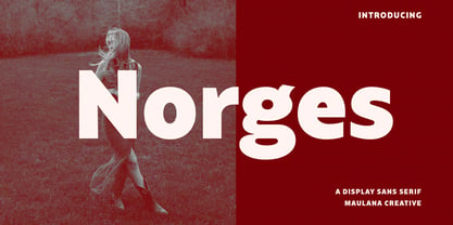 Norges is a contemporary sans display font. With bold stroke, fun character with a bit of ligatures and alternates. To give you an extra creative work. Norges font support multilingual more than 100+ language. This font is good for logo design, Social media, Movie Titles, Books Titles, a short text even a long text letter and good for your secondary text font with Script. Make a stunning work with Norges font. Cheers, Maulana Creative


