10,000 search results
(0.026 seconds)
- Headbrush by Putracetol,
$16.00 Headbrush is a bold script font with brush effects on each character. Those effects make this font unique and different. You can use this font for making an awesome logo, apparel projects, signature, album covers, posters, labels, branding, magazines, social media, & advertisements, but Headbrush also works great for other projects. Headbrush has many OpenType features like ligature, alternate and also multilingual support.
 - Mandalika by Sarid Ezra,
$17.00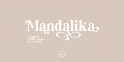 Mandalika is a bold and elegant serif with a bunch of ligatures and alternates that will make your presentation or logo even more stunning and stand out! Mandalika also contains multi-lingual support and PUA encoding. Features: Uppercase & Lowercase Numbers & Symbols Multi-Lingual Support Ligatures Alternates for each characters PUA Encoded Don't hesitate to send me an email at saridezra@gmail.com
 - October Wish by Subectype,
$16.00 October Wish is a casual handwritten font with bold handwriting style. Each stroke and curve of this font is unique charm that effortlessly enhances any project, from invitations to digital designs. Adding an authentic touch that resonates across diverse themes and mediums. Elevate your creations and evoke a sense of artful individuality as you harness the power of these versatile handwritten fonts.
 - Binary Groove by Hipfonts,
$17.00 Binary Groove is a bold and dynamic font that captures the essence of the 1980s retro-futuristic style. The geometric shapes and sharp edges of each letterform evoke a sense of technology and progress, while the rounded edges add a touch of playfulness. The font features a sleek and modern design that is perfect for headlines, posters, packaging, and branding projects.
 - Street Smart by Fontysia,
$9.00 Introducing: Street Smart is a fun and bold graffiti font, which includes six versions of each letter which can be used separately or on top of one another for a different look. This font is PUA coded which means you can access all the glyphs and replace them easily! (please type preview to see if I have what you need!)
 - Meila Arabic by NamelaType,
$29.00 Meila Arabic is sibling of Meila with the addition of Arabic glyphs, for Arabic, Urdu, and Farsi. Still carrying a childish character with a cheerful font, visually featuring bold and cute characters. Meila has smooth lines on each side, especially on the outside, almost no sharp corners. On the inside there is only one line that functions as a counter space.
 - Letter Sketch by Motokiwo,
$15.00 This fun typeface is great for quote, tagline, or headline. Letter Sketch is all caps hand drawn font with two style, rough sketch and filled version. It's have natural drawing feels in each characters and give personal touch to your projects. Letter Sketch Regular : a funky rough pencil sketch font Letter Sketch Bold : the filled version of Letter Sketch Regular
 - Hybi14 Boldie by Hybi-Types,
$9.00 The Hybi14-Boldie is a bold Script in two styles. It’s lack of excessive details makes it appropriate for all oportunities of headlines, slogans and advertising. It’s friendly and charming character makes it pleasant to look at. The fonts are offering a huge character set for usage in many languages. Also thousands of kerning pairs within each style are obligatory.
 - Fort Yukon by Larin Type Co,
$15.00 Inspired by wildlife, Fort Yukon is a bold and authentic vintage family font. This will inspire any design project that needs a vintage style. This font family is composed of 14 styles which perfectly complement each other. You can use them to create a logo or use for your business, branding, t-shirts, book covers, stationery, marketing, blogs, magazines and more.
 - Funky Flamingo by Hanoded,
$15.00 I really can’t tell you why I called this font Funky Flamingo. Normally I name fonts after something I see or do, but I don’t have a special thing for flamingoes, nor do I keep them in my backyard. Funky Flamingo is a happy handmade serif with a retro look. It comes in regular and bold styles, each style with its own Italic.
 - Midfield by Kreuk Type Foundry,
$12.00 Introducing MIDFIELD DISPLAY. Midfield Family is All Caps display typeface with solid, masculine, urban, sporty, & bold character. Each glyph is very well suited to make an interesting quote, headline & striking poster design. This font is perfect for logos, badges, clothing, signage, posters, and much more! This font includes standard and extended Latin characters as well as numbers and symbols. Multi-language support.
 - Stone Age by Indian Summer Studio,
$15.00 Stone Age Cave Art primeval prehistoric Neolithic primitive cavish petroglyphic genuine rough original early font.
 - COMANDO X by RASDesign,
$50.00Comando X is special font, built to create different characters using case-sensitive different characters. - ATF Alternate Gothic by ATF Collection,
$59.00 ATF Alternate Gothic is a new, significant digital expansion of Morris Fuller Benton’s classic 1903 type design. Originally available in one bold weight, the metal typeface came in three slightly different widths for flexibility in copy-fitting layouts. ATF Alternate Gothic has impact at any size. Its letterforms are instantly familiar: Benton’s original metal type family was used throughout the 20th century in newspapers, magazines, and advertising, providing “strong and effective display” in a compact space. Monotype issued its own metal version for machine typesetting, and Alternate Gothic likely served as inspiration for Linotype’s ubiquitous Trade Gothic® Bold and Bold Condensed. ATF Alternate Gothic expands on the characteristics that perhaps made Trade Gothic so popular, providing a wider range of weights and widths to address the needs of today’s designers and technologies. The space-saving clarity of ATF Alternate Gothic brings readability to the world of advertising typefaces. With its finely graded range of ten weights, with four widths of each weight (40 fonts total), this extensive type family can be used to pack a lot into a narrow space, and the range makes it easy to create variations of an advertisement or announcement for different formats and media. The tall x-height and narrow proportions, combined with a relatively low waist and springy, tension-filled forms, make ATF Alternate Gothic strong and effective in display. All ten weights have been carefully spaced for readability, caps and lowercase work well together, while attention-grabbing all-caps settings are clear and never crowded, no matter how narrow.
 - Flintlock by CozyFonts,
$25.00 The Flintlock Font Family has a Bold personality. The 'Rough' version of the Flintlock Font has a hand-carved or hand-etched edge, carefully crafted for each of over 300 glyphs. Caps, lower case, all numbers, fractions, accents and European characters that work in over 70 languages. 'Classically Built with a Vintage Flair'. Vintage in the American West Tradition that might have been forged and implemented from the 1860s through the 1930s and consequently fresh again. Flintlock Rough can be envisioned on many things dated from 1860 to present day. The font is available in 3 basic weights as of this release date. There are other versions on the drawing board... Flintlock Rough works extremely well with Posters, Branding, Movie Titles, Invites, Stationary, Signage, Embroidery, Letterpress, Ads, Logos and anything that feels Industrial or Hand-Crafted, eg. Coffee, Breweries, Antiques, Woodcuts, Western Styles, Sports Styles, Holidays, Menus, and more. Flintlock Flat & Flintlock Flat Italic are the siblings to Flintlock Rough without the hand-carved edge but rather clean with slightly rounded corners and edges. Extremely Legible, Bold and best used in all the same application descriptions mentioned above and more, specifically contemporary uses and settings, eg. Sports, Titles, Branding, Headlines, Logos and more. Curiously the Flat & Italic versions of Flintlock work extremely well in 1960s and 1970s settings.
 - League of Ages - Personal use only

- DuerersMinuskeln - 100% free

- Flaemische Kanzleischrift - Personal use only

- ZentenarZier - Unknown license

- TrixieExtra - Unknown license

- Yes Dear by HiH,
$8.00 Yes Dear is a hopefully humorous acknowledgement that men and women communicate differently — one of those Mars-Venus things. Women tend to talk about their feelings. Men hide in the cave. It sounds funny, but it can have serious consequences in people’s lives and their relationships. T. D. Jakes deals with the subject effectively in his DVD, He-Motions. We guys need to find our way out of the cave. Our women need to recognize what is going on and gently help us emerge from the cave. Men and women were certainly never meant to be identical, but it would be useful if we could learn to communicate our feelings in more healthy and effective ways. Yes Dear has a full character set, including accented caps. Two empty frames are provided at positions 135 & 137. The Gallery includes a PDF file showing some text and the full character set and a JPG looking out from the cave. A lot going on outside the cave. Be sure and take a look.
 - Aougtron by Twinletter,
$17.00 Aougtron is a modern font that combines a dynamic slope with sporting event-inspired lettering and cutouts. Designed to apply to all professional sporting events, it can also be used to create modern logos and screen prints in text fields. Aougtron’s bold and powerful appearance is created by the strong horizontal strokes on each letter which contrasts sharply with the elegant strokes on the corners of each letter. Combine these fonts to create a maximum display effect on each of your projects. What’s Included : - File font - All glyphs Iso Latin 1 - Alternate, Ligature - Simple installations - We highly recommend using a program that supports OpenType features and Glyphs panels like many Adobe apps and Corel Draw so that you can see and access all Glyph variations. - PUA Encoded Characters – Fully accessible without additional design software. - Fonts include Multilingual support
 - Beverly Shores Script SG by Spiece Graphics,
$39.00 If you take the South Shore Line from Chicago to South Bend, your train will pass though the small community of Beverly Shores, Indiana. The beautifully restored and highly colorful “Beverly Shores” train station sign not far from the Lake Michigan beach is the source of inspiration for this connecting script typeface. The sign’s existing ten letters have now been extended to include the entire alphabet. This old-fashioned depot letterstyle is much in the spirit of such faces as Fulton Sign and Inserat Cursive. Ascenders and descenders have been lengthened and capitals are now much larger. Alternate lowercase swashes, capitals, and small figures have been included for your convenience. And custom uphill words such as “The,” “for,” and “to” have been added for more novelty and spark in headline settings. Beverly Shores Script with Alternates is also available in the OpenType Std format. Some new characters including old style figures have been added to this OpenType version. Advanced features currently work in Adobe Creative Suite InDesign, Creative Suite Illustrator, and Quark XPress 7. Check for OpenType advanced feature support in other applications as it gradually becomes available with upgrades. All aboard for Beverly Shores!
 - Hangman's Delight by Hanoded,
$15.00 Hangman's Delight is a scratchy, all caps font. The upper case letters come with swirls and curls, but the lower case letters are unadorned. A bit of an unusual font, I admit, but it would look nice on book covers and posters. Comes with some ligatures and stylistic alternates and a whole bunch of diacritics.
 - Patty Day by Ingrimayne Type,
$14.95 March may be a good time to use this typeface. PattyDay is a caps-only typeface in which the letters are decorated with shamrocks or clovers. Some but not all of the lower-case letters are different from the upper-case letters. If you want a version of this face without the shamrocks, try Ingone.
 - Interoffice Memo JNL by Jeff Levine,
$29.00 Interoffice Memo JNL was inspired by an image of a plastic lettering template used for making mimeographed fliers in the days prior to the widespread use of photocopy machines. A classic Deco-style alphabet is on the upper case, with alternate A,E,F,L,M,N and W in the lower case set.
 - ShirlyUJest by Ingrimayne Type,
$9.95 The letters of ShirlyUJest have serifs that have gone wild, crossing over themselves, giving them the look of overgrown vegetation. It is weird and bizarre and out of control; the name says it all. It is caps-only with the lower-case keys containing the glyphs identical to those on the upper-case keys.
 - Wurstchen by Ingrimayne Type,
$9.00 WurstchenDotted is made up up of sausage segments. It does not have true lower-case letters, but rather variants of the upper-case letters instead. As all extreme display fonts, it is useful in small doses. The three WurstchenOverlay fonts decompose WurstchenOutlined and can be used in layers to create letters with three colors.
 - Dumper by LetterStock,
$25.00 Introducing "Dumper" - Your Original Hand-Drawn 60's Retro Bold Font Step into the bold and vibrant world of "Dumper," a font that seamlessly blends original hand-drawn craftsmanship with the iconic style of the 60's retro era. Ideal for posters, headlines, and vintage-themed branding projects, this font exudes a dynamic energy that adds a bold statement to your designs. Key Features: Original Hand-Drawn Craftsmanship: Each character in "Dumper" is crafted by hand, bringing a unique and authentic touch to your creations. 60's Retro Bold Vibes: Immerse your designs in the bold and lively spirit of the 60's, making "Dumper" a perfect choice for projects seeking a retro aesthetic. Why Choose "Dumper": Craft posters and headlines that command attention with bold and dynamic lettering. Design branding materials that transport your audience back to the vibrant 60's era. Establish a brand presence with a font that effortlessly captures the essence of retro boldness. Download "Dumper" Now and Let Your Designs Boldly Embrace the 60's Retro Vibe!
 - Circensis by RMU,
$35.00 Picking up a concept of Fritz Richter, Circensis is the realization of an adorned diplay font which had not been hitherto available, neither as a hot-metal font nor digitally. It is a great and legible font for circus and variety ads and posters, as well as for films, cafés, ice-cream parlors etc.
 - Nori by Positype,
$49.00 First, the important information…Nori is a hand-lettered typeface that contains over 1100 glyphs, 250 ligatures, 487 alternate characters, 125+ swash and titling alternates, lining and old style numerals. To make sure it is perfectly clear—Nori is the result of brush and ink on paper. The textures produced in each glyph are real and the imperfections are intentional and add to the sincerity of the letters. I say this to be as blunt as possible in order to avoid confusion and to frame what this typeface represents—calligraphic, handwritten letters captured digitally for their warmth and poetic variation for print and screen. Like my handwritten, calligraphic or brush-driven faces before it (the Baka series and the TDC2 2010 winning typeface, Fugu), Nori is a product of my analog and digital hand. To view the words and sentences formed by this typeface is to look at how my hands, yes hands, make letters. The fluidity, as well as the irregularity, is human, honest and intentional—to do so lets the brush I am holding breathe life into each letter. Once digital, any number of points and repetitive processes can’t mask its influences—and I like that. The brush, a simple instrument, my tool, my friend designed to emulate traditional Japanese sumi-e brushes... the Pilot Japan Kanji Fude brush pen. Each letter, each variation was written over and over again until I found the right combination. From there, each was scanned, digitized and optimized. Points were removed in order to ‘clean’ the glyphs up some but I did not want to compromise the integrity of the actual brush stroke. Once this base set of characters (about 350) were completed, the thoughtful manipulation of the glyphs, their gestures and forms were further expanded to solidify the embellishments used within the ligatures, alternates, swashes and additional features. This process was admittedly self-indulgent to an extent. I wanted the words created with this typeface to have the flexibility of variation and cohesiveness of movement that someone fluidly producing these letters by hand might have. I hope you enjoy this typeface as much as I did during the six months working on it. A specimen and style guide is included with the purchased of Nori.
 - Ozana Pro by Mostardesign,
$99.00 Ozana Pro is a bracketed serif font family adapted to the professional requirements of graphic designers, web designers and mobile app developers. Comprised of 24 styles including 12 styles designed especially for headlines and 12 styles for text and long paragraph design, Ozana Pro is a very versatile family of fonts that can be used in many projects such as editorial design, branding or corporate identity creation, design of posters or logos, the creation of websites or the development of mobile applications. This serif font family, with a resolutely modern aspect, also hides a unique typographic design since it has 2 distinct styles (Roman and Display) which have 2 different optical sizes in order to graphically differentiate the appearance of titles, subtitles and long paragraphs. With this design of glyphs differentiated by the optical size according to the styles, the titles have a very graphic aspect while the long texts have a more classic design in order to keep an optimal readability in all cases. Ozana Pro is also equipped with powerful OpenType features such as case sensitivity, true small caps, ligatures, tabular figures, old styles figures, numbers circled. Ozana Pro is also available as a variable font family.
 - Restora by Nasir Udin,
$22.00 Restora is a mix of old-style roman serif styles. The combination of beautiful letterforms and old style serif makes Restora a versatile type family that can be used in many different themes of design projects. It comes in eight weights from thin to black with matching italics. Its mixture of weights provide a wide range of styles that will help you find the best vibe for your projects, from body text to big headlines, from classic style to modern, bold, and a bit funky style. It is well suited for book covers, editorial, branding, advertising and more. Its OpenType features provide a number of swash, beautiful ligatures and stylistic alternates that give your typography a unique look. RESTORA NEUE is available now! Check it out!
 - Byblos by Wiescher Design,
$39.50 “Byblos” is the name of a town in Lebanon and the name of a famous hotel in St. Tropez. Some time ago I discovered their original logo in an old french magazine, just 5 by 3 centimeters small without any text, address, telephone number not even a picture. They did not need that, that’s how famous the hotel and its old logo was. Well they abandoned their identity when the place was sold to a big chain – I think. But the logotype, just those five letters inspired me to this new font. It evokes times past and has a little Bauhaus in it – as well as a really modern touch, all depends on the way you use it. Your strange typedesigner Gert Wiescher
 - Lentzers by Ingrimayne Type,
$9.95 The upper-case letters of Lentzers fit into the shape of a convex lens and the lower-case letters fit into the shape of a concave lens. The typeface was designed to have concave shapes alternate with convex shapes so the letters snuggle together. The OpenType contextual alternatives (calt) feature will automatically make this happen if your word processor supports it. (To get only concave or convex shapes, one must turn off the contextual alternatives feature. With only concave shapes the spaces between letters form thin convex lenses and with only convex shapes the spaces between letters form thin concave lenses. The name of the family was inspired by these lens shapes and also by the name of distant ancestors.) Lentzers is caps only. It comes in three weights: light, regular, and bold. It is eye-catching for posters and titles and poorly suited for text.
 - Faith And Glory by Set Sail Studios,
$12.00 Thanks for checking out Faith and Glory! These 2 hand-painted brush fonts are designed to perfectly combine with one another and allow you to create beautiful rustic typography with a personal touch. Ideal for; Logos, printed quotes, invitations, image overlays, greeting cards, product packaging, text headers, & whatever else your imagination holds! Faith and Glory One Is a script font which includes upper & lowercase characters, punctuation, numerals, and multilingual support. Alternates are available for several lower case characters, these are accessible by turning on 'Stylistic Alternates', or via any software with a Glyphs panel. Faith and Glory Two is a condensed brushed font containing uppercase only characters, punctuation, numerals, and multilingual support are also included. Alternates are available for key characters, you can access these simply by switching between upper & lower case glyphs within the 2 fonts (e.g. typing 'A' and 'a' will give you 2 alternate characters).
 - Woven by Ingrimayne Type,
$9.00 Woven is a geometrical typeface based on a simple tessellation or tiling pattern. The template for the letters has both vertical and horizontal symmetry and the tiling pattern has four-fold rotational symmetry. Variations of this pattern are popular with quilters and most have a woven look to them. To fit the letters into the template results in some distorted letters but it is the pattern that matters, not the individual elements of that pattern. With proper spacing, a block of text will fit together both horizontally and vertically. Woven is intended to be used with alternating letter sets and the OpenType feature of contextual alternatives does this automatically in applications that support it. The upper-case could be used alone but it unlikely that the lower-case characters could be used by themselves. The typeface is hard to read and would make a challenging font for word-search puzzles.
 - Kulturista by Suitcase Type Foundry,
$39.00 Kulturista is an unmistakeable linear slab serif typeface with pronounced rectangular serifs. The drawings are based on the sans-serif Nudista typeface, and Kulturista also inherits Nudista’s distinctive narrowed character proportions, range of weights and glyph sets. The italics are inclined sufficiently, and have the same width and colouring as the plain styles. They aren’t just a mechanically-slanted version of the basic styles, as is often the case for typefaces derived from geometrical images — a whole range of characters have their own drawn variants, which greatly strengthens their highlight function. The italics are therefore an equal partner for the roman styles. Kulturista is definitely a good choice for a headline typeface for magazines and book covers. The range of boldness can come in handy when editing sections, headlines and supplements. The typeface understandably proves itself as a healthy foundation for a unified visual style, and holds up at display sizes as well as on shorter texts.
 - ITC Adderville by ITC,
$29.99On a cold winter's night, George Ryan, of Galápagos Design Group, began musing on the possibilities for a “truly original” sans serif typeface. What came out of his musing, and his always-present sketchpad, was ITC Adderville, a typeface whose visual impact is immediate and strong. Ryan explains how he did it: “The rounded ends of its strokes and their skewed baseline contact create an illusion of dancing feet. The tops of lowercase stems emit serif buds, suggesting transition into or out of the serifed form. The spear-like lowercase stroke terminators, along with other distinctive elements such as the stylized reticulation of the lowercase 'g' segments, the salute of that same character's spur, and the bold, non-self-conscious 'i' and 'j' dots, all contribute to the playful and unique nature of this design.” The result is a friendly, lively type family whose graduated weights -- book, medium, and heavy -- lend themselves especially well to use at small display sizes and in short blocks of text. - FF Brokenscript by FontFont,
$41.99 Dutch type designer Just van Rossum created this blackletter FontFont in 1991. The family contains 2 weights: Bold and Condensed and is ideally suited for advertising and packaging, festive occasions, editorial and publishing, logo, branding and creative industries as well as poster and billboards. FF Brokenscript provides advanced typographical support with features such as ligatures, alternate characters, case-sensitive forms, and stylistic alternates. It comes with proportional oldstyle figures. This FontFont is a member of the FF Brokenscript super family, which also includes FF Brokenscript Rough.


