10,000 search results
(0.027 seconds)
- Sliced Delight by Rajesh Rajput,
$9.00 Sliced Delight - a modern serif typeface combining classical elegance and contemporary flair. The Sliced Delight typeface is available in 9 weights ranging from Thin to Black, each featuring three optical variations - Display, Title, and Heading - for 27 styles. The Sliced Delight typeface's unique design features give it a bold and dynamic look while maintaining legibility and readability. In addition, the optical variations allow for versatility in usage. Whether you're designing a print publication, a website, or a brand identity, the Sliced Delight typeface is a versatile and eye-catching choice that will make your content stand out.
 - Rastely by Craft Supply Co,
$20.00 Unleash Your Joy with Rastely Dive into the fun with Rastely – Funky Typeface. It’s a joyful escape, perfect for creative minds. Inspired by psychedelic vibes, this font keeps it chill. Its playful curves promise a good time. Every letter brings a smile, designed for fun at first sight. Playful to the Core Rastely isn’t just a font; it’s a party invitation. Crafted with a relaxed approach, it’s easy-going yet bold. Let each character tell a story of cheer. Imagine your projects with a touch of whimsy. Moreover, its easy legibility makes it perfect for all ages.
 - Spitting Image by preussTYPE,
$25.00 SpittingImage is a font which speaks of mechanical exactness, cool and reserved. The SpittingImage font family is formed by two different weights (regular and bold), each one with uppercase and lowercase letters, numbers, punctuation marks and diacritic characters in regular and italic. The outline version included as a part of OpenType-Feature. There are in all styles numerous ligatures, alternate characters, small caps, and different sets of numbers that you can put both headlines and short texts without any problems. OpenType features: contains over 1.000 Glyhps Central European Glyhps Standard Ligatures Small Capitals Stylistic Alternates Discretionary Ligatures OldStyle Figures Ordinals Slashed Zero Feature
 - Konstans by Flawlessandco,
$9.00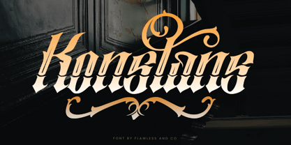 Konstan is a Blackletter font with an authentic and unique style on each character that gives a bold touch to any design you create. There's some connected letters and some alternates that suitable for any graphic designs such as branding materials, t-shirt, print, business cards, logo, poster, t-shirt, photography, quotes .etc This font support for some multilingual. Also contains uppercase A-Z and lowercase a-z, alternate character, numbers 0-9, and some punctuation. for more license, you can check in flawlessand.co If you need help, just write me! Thanks so much for checking out my shop!
 - Syabil by Eko Bimantara,
$16.00 Syabil is a sans serif font family designed by Eko Bimantara. This font crafted with the intention to present a clean, legible, multipurpose that easy to read wether it on screen or print. Fit for all purposes; Text, display, headline, print, corporate identity, logo, branding, product, infographic, photography and other application and medium. This font consist of 9 weight; Thin, Light, Book, Regular, Medium, SemiBold, Bold, ExtraBold and Heavy with each weight paired by italic. Also including Latin Plus language support with more than 11.700 glyphs in all weight which make this font contain broad language support.
 - Andove by Locomotype,
$20.00 Andove is a narrow sans font with very tight compression. With a slim character and a fairly large x-height, Andove looks great for very large and eye-catching typesettings. The one-sided serif in ascenders makes this font very unique and stands out to show it is sporty and strong enough. What's even more interesting is Andove has a true italic on each weight so it can be an option for really big headlines and poster title. Andove consists of 10 styles in six weights — Thin to Bold — Upright and True Italics and comes with extended language support including Cyrillic.
 - Montu by Supfonts,
$12.00 Montu is an elegant, modern sans serif font family. It includes upright and Italic style, each of them has five weights from thin to bold. This is a multi-functional font that is perfect for any project Montu Font Features: - Full Set of standard alphabet and punctuation - PUA Encoded - no special software needed to access extra characters - Language support: All European languages - Multilingual Characters AÁĂÂÄÀĀĄÅÃÆBCĆČÇĊDÐĎĐEÉĚÊËĖÈĒĘẼFGĞĢĠḠHĦIIJÍÎÏİÌĪĮĨJKĶLĹĽĻŁMNŃŇŅÑ OÓÔÖÒŐŌØÕŒPÞQRŔŘŖSŚŠŞȘẞTŤŢȚUÚÛÜÙŰŪŲŮŨVWẂŴẄẀXYÝŶŸỲỸZŹŽŻ aáăâäàāąåãæbcćčçċdðďđeéěêëėèēęẽfgğģġḡhħiıíîïìijīįĩjȷkķlĺľļłmnńňņñoóôöòőōøõœpþ qrŕřŗsśšşșßtťţțuúûüùűūųůũvwẃŵẅẁxyýŷÿỳỹzźžż Thanks so much for checking out my shop, and please get in touch if you have any questions! Don't forget to subscribe so you don't miss out on the new awesome fonts Dima
 - Norden Round by Asgeir Pedersen,
$23.99 The name Norden means “the Nordic”, as in the geographical area or its countries. Inspired by the simplicity of Nordic and Scandinavian design, the Norden fonts give you clarity of expression, beyond the usual geometric look and feel of traditional sans-serifs. Open and spacious, the shapes of the glyphs play both with and against each other. Round and soft versus square and solid, a basic curve versus a straight line, creating a detached yet distinct style of expression, from light-as-air Hairline to dark and Bold. Norden comes in three variants: Standard, Round and Display.
 - Theadzan by Almarkha Type,
$29.00 Hello everyone, we introduce our new product, Thadzan - Super Bold Condensed inspired by the title of the sports poster, We make it very energetically, so it has very strong characteristics, taking into account the thickness and density of each gliph, along with a ligature that makes this font look unique. Thadzan font with strong and challenging nuances. It is also equipped with 10 glyph ligatures, which make the characteristics of this font even more extraordinary. very suitable for the title, typography, clothes, Poster, magazines, brochures, packaging,Websites and much more for your design needs, making your designs more modern and professional.
 - Hiper Hoper by Sipanji21,
$10.00 "Hyper Hoper" is a 3D layered graffiti font that includes regular, shadow, and inner styles within each character. Fonts with multiple layers like this are designed to provide a three-dimensional effect to the text, enhancing its depth and visual appeal. By utilizing the regular, shadow, and inner layers in "Hyper Hoper," you can create text that appears to have depth and dimension, with shadowed and inner details adding a dynamic quality to the font. This font is suitable for various design projects such as graffiti art, posters, or any creative work where a bold and three-dimensional typographic style is desired.
 - Fluster by Flawlessandco,
$9.00 Fluster is a Blackletter font with an authentic and unique style on each character that gives a bold touch to any design you create. There's some connected letters and some alternates that suitable for any graphic designs such as branding materials, t-shirt, print, business cards, logo, poster, t-shirt, photography, quotes .etc This font support for some multilingual. Also contains uppercase A-Z and lowercase a-z, alternate character, numbers 0-9, and some punctuation. for more license, you can check in flawlessand.co If you need help, just write me! Thanks so much for checking out my shop!
 - Astrid Grotesk by Eclectotype,
$40.00 Astrid Grotesk is a normalized version of Schizotype Grotesk. Normalized; not neutralized. Where many neo-grotesks appear cold with their harsh neutrality, Astrid has a warmth, eminating from its (for want of a better word) clunkiness. With the latest update, it becomes a true workhorse, with a range of widths and italics for the normal widths. Astrid Grotesk, while being clearly a neo-grotesk in appearance, has a personality all of its own. Standout characters include the f and t, and the default binocular g, unusual in neo-grotesks. And the right angled terminals on c, e and s. Stylistic sets offer up alternate forms of a, g, y, I, @, dutch IJ, german eszett and l. A full complement of numerals is included: proportional and tabular, lining and oldstyle, plus fractions, subscript and superscript. Note also that the tabular figures are duplexed across weights - very useful when highlighting specific entries in tables. The tabular figures feature also substitutes in fixed width (across all weights) comma and period, so your decimals line up perfectly always. Lastly, case sensitive forms of certain glyphs are included for all-cap settings. This typeface will be useful for corporate identities and branding work. It’s spaced more for text settings in the normal width, and gets more display-optimized as the width decreases, but with careful tracking, all styles can sing at display sizes. Bored of those other Swiss style typefaces? Astrid Grotesk could be the face you need to breathe new life into your designs. Coupled with Schizotype Grotesk, its more eccentric cousin, you've got an unorthodox branding system ready to use straight out of the box.
 - Seizieme by URW Type Foundry,
$49.99 In 1905 the Parisian typefounders Peignot & Cie. issued their Série 16. This clear roman with a large x-height and an italics soon enjoyed a great popularity. Coen Hofmann’s drawings made for the Seizième follow the original Peignot Série 16 as close as possible. The regular font has the original small caps, while all members of the family are enhanced, next to the ranging ones, with old style figures. Also superior and inferior figures are available. The original series did not have a bold version. This was, however, carefully drawn for this digital rendition. The Série 16 and its versions for the composing machines were much used for the type setting of scientific publications. That is why a comprehensive set of mathematical and sundry characters are added to the Seizième fonts. Next to the accented characters for the several West and East European languages the Seizième was also enhanced with a Cyrillic, also available in regular, italic and bold versions.
 - Capital by Fenotype,
$19.00 Capital is a multifunctional super family with modernist roots. It is comprised of two distinct subfamilies: Gothic and Serif. Both share the same structure and proportions and come in seven weights – thin, light, regular, bold, extra bold and black, along with corresponding italics. Both Capital families are equipped with a full set of Cyrillic characters, making them a versatile choice for multinational use. All Capital fonts come with the following Open Type features: Small Caps, Old Style Figures, Fractions, Numero-sign & Ligatures. Features specific for Gothic roman versions only are Circle Numerals, Titling alternate for the R character and Arrows. The Gothic italics have a Titling alternates feature where the true italic forms are omitted and replaced with simpler stroke endings. Both Capital gothic and Serif families are true workhorse fonts that can carry out almost any typographic task. Combine them both for the best results – multi-pack available for a no-brainer price.
 - Twine by Wilton Foundry,
$29.00 By twisting and weaving separate strands of rope together, a stronger TWINE is created. The distinctive “valleys” that give the twine its twisted and wavy appearance is the result of the twining process. Similarly, TWINE the font, is an exaggerated representation of the calligrapher’s individual pen strokes that create a cohesive character which is enhanced with the stencil. Unlike other stencils, TWINE emphasizes calligraphic strokes, so you will find it very legible even in small point sizes. Check it out! Furthermore, twine is inspired by Plantin, an old-style serif typeface named after the printer Christophe Plantin, which is based on the 16th century Gros Cicero face cut by Robert Granjon. Twine is a great choice when you need a font that is timeless, contemporary and distinctive. Perfect for Advertising, Corporate identities and Packaging design, Museum display, Technology, Hospitality, Travel, and Retail applications. Twine is available in TWINE Regular, TWINE Italic, TWINE Bold, TWINE Bold Italic. It is a Stencil that is Distinctive, Contemporary, and Timeless.
 - Leophard by Arterfak Project,
$16.00 Create a great combination design with this font family! Leophard font family is a modern slab serif that is inspired by sporty design and vintage style. There are 6 different styles that you can apply in your design projects. This font is made with tenacious basic shapes, the visuality of strength, old school movement, and modern minimalist style. - Regular style - good for your titles, sub-headlines or body text for readability. - Bold style - recommended for your titles, naming, labels or logos. - Bold inline style - is cool for your big typographic designs that are showing the precision of the shapes. - Outline style - good for your additional text, or minimalism design purposes. - Shadow style - suitable for vintage logos, minimalist effects, and titles. - Stencil style - inspired by street art and letterpress design. Recommended for design project which visualizes strength and movement. Make a great combination on your label designs, brand, poster headlines, movie titles, storefront, monograms, sport designs and merchandise design.
 - Musika by Lurinzu Studios,
$12.75 Musika" is a serene and elegant display typeface that is inspired by the vibe of soft jazz. Serene, elegant, soothing, somewhat sensual and at the same time feels like a warm hug. This typeface is made with the intention to be used in both titles and body text. The bold weight (even the light weight could also be used as a title card) holds really well as a title while the lighter weights (regular and light) can be used in body text. *This font includes letters, numbers, multi-language, and all essential marks needed. * Three (3) weights are currently available. (Light, Regular and Bold)
 - FG Rakel by YOFF,
$13.95FG Rakel is a small old looking handwriting connected script font. I have found it useful on greeting cards and scrapbook journaling among other things. - Century New Style by Red Rooster Collection,
$45.00Designed by Les Usherwood. Digitally engineered by Steve Jackaman. This beautiful version of Century Old Style by Les may be superior to any existing versions. - Fishermans Knot by Gleb Guralnyk,
$14.00 Presenting a vintage typeface named "Fisherman's Knot". Its style was inspired by boating knots and old graphics heritage. Thank you and have a great day!
 - Bayern Handschrift NF by Nick's Fonts,
$10.00A hundred-year-old offering from Bauer & Company, named simply "Manuscript," provided the inspiration for this elegant script face. The name translates as Bavaria Handwriting. - Stampede by FontMesa,
$25.00Stampede was created from a small sample of letters found on an old document dating back to 1902 from the Chicago, Indiana & Eastern Railway Co. - Cardboard Cutouts JNL by Jeff Levine,
$29.00Cardboard Cutouts JNL is a blocky sans serif font re-drawn from some old "kiddie" stencils from the 1950s or 1960s acquired by Jeff Levine. - Garash Script by Dharma Type,
$14.99 Very decorative script inspired by old lettering in Eastern Europe. Eye-catching for picture books, toys for children. There is another font which called Garash.
 - Typist Code Prop by VanderKeur,
$25.00 The Typist Code SansSerif is part of a big family, the Typist Family. The family consists of a monospaced, a Slab Serif and a SansSerif version. The idea behind this family originated from the research into the design of typewriter typestyles, which is also the reason why the monospaced version was released first. Since it was decided from the start to make a SlabSerif and a SansSerif version of these monospaced fonts, it was also a logical consequence that the proportional variants also became available in these versions. The monospaced SansSerif fonts have been given the name 'Code' since they are designed to be used while writing code for a software program, for example. The proportional variants with each 6 weights of the Typist Slab Serif and Code (SansSerif) are now available. Although the name may seem a bit strange, it is a logical consequence from the monospaced variant. The SansSerif variant therefore has Typist Code Prop, written in full the Typist Code Proportional. After all, who wants to be bothered with long font names in their font menu. The entire Typist family is designed as a font for use in editorial and publishing publications. A lot of attention has been paid to the spacing and kerning of the fonts. Due to the many variants and weights, this font is versatile. Typist Font Family was designed by Nicolien van der Keur and published by vanderKeur design. Typist Slab Prop and Typist Code Prop contains each 6 styles (Thin, Light, Regular, Medium, Semi-Bold and Bold, each weight also designed as a true italic) and has family package options. The links to the monospaced version of The Typist are here: https://www.myfonts.com/collections/typistslabfont-vanderkeur https://www.myfonts.com/collections/typist-code-font-vanderkeur
 - Goldbugs by Nathatype,
$29.00 Hi, Everyone! Want font to make your branding bold? Looking for a fabulous, stylish, modern, and adventure font? We've got what you want. Goldbugs-A Serif Font Goldbugs a timeless serif font. Designed with elegance and modern style. Every letter has a unique and beautiful touch, which will make your design come alive. This font is perfect for quotes, shirt designs, websites, branding, children's designs, svg designs, blogs, logos, invitations and more! Our font always includes Multilingual Support to make your branding reach a global audience. Features: Ligatures Stylistic Set Swashes PUA Encoded Numerals and Punctuation Thank you for downloading premium fonts from Natha Studio
 - Bomberboy by Din Studio,
$25.00 Hi, Everyone! Want a font to make your branding bold? Looking for a statement font that exudes prominence, style, and adventure? Then we’ve got the font for you! Introducing Bomberboy - A Grafiti Font Bomberboy is offered in two versions: solid and shadow. Use this cool, colourful graffiti font to breathe a street life vibe into your projects. This font is perfect for logos, printed quotes, cards, packaging, website or social media branding, and many more! Our font always includes Multilingual Support to make your branding reach a global audience. Features: Alternates Standart Ligatures Multilingual Support PUA Encoded Numerals and Punctuation Thank you for downloading premium fonts from Din Studio
 - Streetbomber by Din Studio,
$29.00 Hi, Everyone! Want to make your branding bold with graffiti font? Then we’ve got the font for you! Introducing Streetbomber- A Grafiti Font Streetbomber is an urban font that echoes the classic tag lettering style. Use this cool and artistic graffiti font to breathe a street life vibe into your projects. This font is perfect for logos, printed quotes, cards, packaging, website or social media branding, and many more! Streetbomber includes multilingual options to make your branding reach a global audience. Includes: Streetbomber (OTF) Features: Alternates Standart Ligatures Stylistic Set Multilingual Support PUA Encoded Numerals and Punctuation Thank you for downloading premium fonts from Din Studio
 - Micfloral by Nathatype,
$29.00 Do you have dream to delve into the rich depths of history? Are you ready to make your branding bold? Then, we've got what you want to. Micfloral-A Display Font Micfloral is designed with perfectly balanced between playfulness and refinement, this display font delivers your message with style. Use it for social media branding projects, book cover, fashion designs, printed quotes, packaging, or even as a stylish text overlay to any background image. Our font always includes Multilingual Support to make your branding reach a global audience. Features: - Ligatures - Stylistic Sets - Swashes - PUA Encoded - Numerals and Punctuation Thank you for downloading premium fonts from Nathatype
 - Zierfraktur by RMU,
$35.00 This highly stylish, engraved blackletter font was cut by Rudolf Koch between 1919 and 1921 for Klingspor in Offenbach on Main. It was then sold under the name Deutsche Zierschrift. I completely redraw and extended this font and called it Zierfraktur. To take full advantage of this fine headline blackletter font, please use it from, at least, 18 points upward. This font contains a bunch of useful ligatures, and it is recommended to activate both Standard and Discretionary Ligatures. The round s can be reached by typing the # key, and you get the numero sign by typing the combination N-o-period and activating the OT feature Ordinals.
 - Fresh Roomettes by Nathatype,
$25.00 Wanna make your branding spark? Looking for a gorgeous and stylish font? If you need to create a big, bold logo for your business, work on a poster for an event, or whatever your project may be-then we've got what you want. Fresh Roomattes - A Signature Font Fresh Roomattes is an elegant signature font. Every swash, stroke, and curve was created to entice happiness and elegance. Great choice for your logo, book cover, poster, t-shirt, branding, and advertisement needs. Our font always includes Multilingual Support to make your branding reach a global audience. Features: Ligatures Alternates PUA Encoded Numerals and Punctuation Thank you for downloading premium fonts from Nathatype
 - Diocletian by Type Fleet,
$12.00 Diocletian fortiter in re, suaviter in modo Diocletian typeface captures the essence and glory of the Diocletian’s palace, one of the most imposing heritages of the late Roman empire. It is designed to bring the confidence and fortune to contemporary communication in a heroic and gentle manner. Diocletian typeface is based on the Uncial script, made up of wide, rounded letters. It is desirable for cafes, restaurants, shops, hotels and apartments. The typeface’s x-height is around 76% of its capitals. The font is enriched with ligatures and special characters.
 - Qweny Check by Ergibi Studio,
$18.00 Qweny Check is a font liquid shaped, with a classic modern feel mouthwatering delights. This liquid font, which was meticulously crafted, is the ideal option for your vintage products. The many ligature in this font add a unique style making this typeface stand out from the usual display fonts, perfect for headlines, logos, posters, packaging, T-shirts, coffee shops, restaurants, magazine headers, signs or gift/post cards, cafe and wedding or any kind of advertising purposes. If there is a problem, question, or anything about my fonts, don't hesitate to ask! Big Thanks ~ Ergibi Studio
 - Basil Lime Margarita by PeachCreme,
$19.00 Dive into the refreshing elegance of "Basil Lime Margarita" – a font that dances between carefree spontaneity and sophisticated allure. Crafted with the attention to detail reminiscent of bespoke calligraphy, every stroke tells a story. Featuring 123 meticulously designed ligatures, it brings words to life with a seamless flow. And with distinct beginning and ending swashes, this font becomes a playground for design creativity. Whether you're branding a chic cafe or penning heartfelt notes, "Basil Lime Margarita" ensures your message stands out with a dash of zest and a splash of charm.
 - Culinary by Latinotype,
$39.00 Culinary is a typographic system inspired by the art of cooking. This family comes with 2 subfamilies: one Regular Family of 4 weights plus a Sans Line font and a set of Borders, and one 4-weight Script Family that also includes Sans Line and Borders. Culinary is well-suited for packaging, restaurant and cafe branding, bakeries, logos, magazines, menus, recipe books, invitations and much more. The OpenType features allow access to a wide set of characters, including ligatures, swashes, endings, initial and terminal forms, and lots of alternates.
 - Fishmonger by Suitcase Type Foundry,
$39.00Fishmonger originated from a commission of two fonts for the corporate identity of a fishmonger shop. When sketching the elementary principles for the lettering, the idea for a modern, extensive font family with a large number of styles was born. The first step consisted of defining the range of widths and weights. Then the master design Medium Regular was completed. The next step was adjusting the Extra Condensed Thin, the Extra Condensed Bold, The Extra Extended Thin and the Extra Extended Bold weights, as they are the vertices of an imaginary square map of the face. This meant that, in order to achieve a harmonious result, the x and y axis needed to be defined. From top to bottom, from the widest to the most condensed cut, the proportions are linear. However, from light to black, the line curves gently, allowing lesser difference between the light cuts, and a dramatic one between the heavier cuts. To ensure the original parameters were respected each position on the vertex was checked against the Medium Regular. After sorting out the ideal set-up, the remaining characters of each of the weights were drawn, and the remaining cuts were interpolated according to the principles above. Fishmonger is a functional, clean design, free of any buoyant, ornamental shapes, almost minimalist. Maybe this is what lends the type family its unique appearance. - Sketchnote by Delve Fonts,
$29.00 The Sketchnote typeface was born of necessity: designer Mike Rhode needed a series of hand-drawn fonts to illustrate and produce his book, “The Sketchnote Handbook.” Because of its origin, this typeface was designed to be practical and convey the human character and quirks of his normal handwriting and hand-drawn lettering. The family is comprised of five fonts: Sketchnote Text in Regular, Bold, and Italic, the somewhat compressed and bold Sketchnote Square for headlines, and the playful Sketchnote Dingbats. Sketchnote Text is a casual script with a slightly bouncy baseline. In order to mimic the differences present in natural handwriting, OpenType features are built-in that automatically switch between multiple versions of each letter or number. In total, over 240 alternates in each of the text fonts are employed, making for a more authentic appearance. The warm texture of Sketchnote is the result of actual ink-spread on paper captured in the scans of written letterforms and was intentionally left intact during the digitization process to preserve that feeling. Rhode created Sketchnote Square as a display type to complement Sketchnote Text. Drawn instead of written, the letters often have neat little happenstance voids within the strokes. Sketchnote Dingbats features a selection of icons, rules, and arrows to provide some functional and fun tidbits, handy for bringing additional life to any design.
 - Veto Sans by Monotype,
$50.99 Veto® Sans is both highly legible and handsomely distinctive – a rare blend in a typeface. It’s a design that stands out and fits in. Veto Sans is equally competent on screen and in print. It’s four carefully determined weights in both normal and condensed proportions, each with an italic complement, give the family an exceptionally deep range of applications. All the designs in the family are valuable design tools. None are superfluous. Advertising, brand, corporate, editorial and interactive design are all in Veto Sans’ wheelhouse. It also shines in wayfinding and other signage projects. And to all these, it brings a warmth and personality. An ample x-height, open counters, vertical stroke endings and subtly condensed capital letters enable Veto Sans fonts to perform with grace in print and digital environments while being space efficient. An added benefit is that all-capital typography set in Veto Sans is not only space saving, it’s also easy to read. Drawn as a complete reimaging of his earlier Veto design, Swiss designer Marco Ganz worked to create character shapes distilled to their purest forms while maintaining a relaxed and natural demeanor. Ganz, who is also a three-dimensional artist, is acutely aware that the negative space between letters and the internal space within letters is as important as the positive shape of the letters themselves. This dynamic balance between the negative and positive aspects of character forms gives Veto Sans a sense of immediacy without looking hurried. Ganz also took great care to draw a suite of italic designs that not only complement the roman weights perfectly, but also give the family a dynamic verve. A large international character set also ensures ease of localization. “Veto Sans,” says Ganz, “is a typeface for designers that search for a new and different solution to age-old typographic challenges.”
 - Aramus by Hackberry Font Foundry,
$24.95 Aramus is a new serif font in my continuing objective of designing book fonts that I can really use. In many ways, Aramus is a very different direction for me. It comes from a scan of an old display face that has been radically modified to a much smaller x-height than I have been using lately, plus taller ascenders. Many of the characters needed a lot of correction to bring them into my taste. In general, I have decided that many of my fonts create a type color that is too dense. Aramus is an attempt to get away from that look. Although Amitale has been a very successful book family and excellent to work with, I find I still need something more open with a lighter color. Aramus is the first look at the new direction. The original hand-cut serifs vary a lot, different for almost every character. This gives a little looseness and helps the lightness I am looking for. It will be interesting to see where this all goes. This is a normal serif for me in that it has caps, lowercase, small caps with the appropriate figures for each case. This font has all the OpenType features in the set for 2009. I didn't bother with the CE accents (though I can add them upon request. They will be in the final new book family). There are several ligatures for your fun and enjoyment: bb gg ff fi fl ffi ffl ffy fj ft tt ty Wh Th and more. Like all of my fonts, there are: caps, lowercase, small caps, proportional lining figures, proportional oldstyle figures, & small cap figures, plus numerators, denominators, superiors, inferiors, and a complete set of ordinals 1st through infinity. Enjoy!
 - Aeonian by Adorae Types,
$40.00 Aeonian, designed by Emilia Adorno, was mostly inspired by the iconic morphology adopted by the arts of the 1920s. One hundred years later we can still see the resemblance between the wants and the needs of now and then to reach for the sky, to look ahead and enter the future in style. Now as then, we seek the right tools to do so, then once again, we embrace the rational, yet elegant and stylish forms of simplicity, geometry and symmetry. At the same time, there is a strong and growing need for a warmer approach to creating lovemarks. For that, Aeonian’s alternates hold attractive, soft and inviting shapes to an emotional appeal. Aeonian is a combination of all of them. A rational side entwined with an emotional one. Born a geometric sans, Aeonian ended up being a 2 in 1 font with a sans serif set and alternates reaching over 1200 glyphs. The entire family contains 6 weights, from thin to black, with its matching italics. It features a variety of ligatures to be used as connectors, specially for display. It also offers multilingual support, even for certain display ligatures. Later, Aeonian kept growing, with stylistic alternate sets of initial, mid and final glyphs. These are its arms to reach for infinity with a warm heart. The wide range of possibilities that Aeonian offers, makes it the best font for creating vast design systems with a rich visual language.