10,000 search results
(0.066 seconds)
- Staylight by Ardian Nuvianto,
$18.00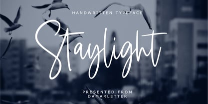 Staylight is a chic, refined script font. Its stylish ligatures make this font the perfect match for any project. Staylight is consisting of a fashionable style script make looks classy and touch of stylish. This font was created to look as close to a natural handwritten script as possible. Staylight is perfect for branding projects, logos, wedding designs, social media posts, advertisements, product packaging, product designs, label, photography, watermark, invitation, stationery and anything that you want. This font is PUA encoded which means you can access all of the amazing glyphs and ligatures with ease!
 - Something Real by Gassstype,
$25.00 Hello Everyone, introduce our new product Something Real – Pure Handmade Typeface font with a Signature Style and classy style, this font is great for your creative projects such as watermark on photography, and perfect for logos & branding, photography, invitation, watermark,advertisements,product designs, stationery, wedding designs,label ,product packaging, special events or anything that need handwritting taste. That is why Something Real has charming, authentic and relaxed characteristic more natural look to your text with a more natural look to your text. You can activate Ligature OpenType panel.
 - Evenstar by Kereatype,
$10.00 Introducing the new ‘Evenstar’ Serif Family font with 9 Weight is a fashionable and modern elegant serif font with some sexy stylish extras:). Based on our experience as a graphic designer who works for a lot of companies, we often are requested to design a logo in a unique style but with an elegant shape. So, we try to brainstorm and create this font to make the idea is going out. This is perfect for BRANDING and LOGO DESIGN. You will get classy, elegant, and certainly unique logos with this font.
 - Racon by Ahmet Altun,
$17.00 Racon Font Family comes in two weights as regular and bold with seven styles. You can create unique and great designs with its classy, legible, elegant look and most preferred texture and clean styles. You can enrich your designs by using Racon Fonts with its clean and old styled extra figures. You can reach the keyboard codes of the extras as a pdf file from the "Gallery". It would be a perfect choice for designing posters, affiches, logos, invitation cards, t-shirt and magazine prints, eye-pleasing typographic designs and more. Enjoy!
 - Saxo Grammaticus by Jonas Stensgaard,
$8.00 Saxo Grammaticus is a beautiful and friendly family that works great with family themes, elegant & classy material and professional settings. It's so versatile you'll find yourself coming back to it over and over for your projects, and that's whether you're looking to create logos, quotes, poster designs, brochures, packaging, anything with big letters like headlines, wedding invitations, holiday cards, advertisements, signs and on and on and on... There is a total of 107 ligatures and 76 alternates! That's plenty of options for any designer wanting to give those big letters a little extra wham bam!
 - Kozmetica Script by Sudtipos,
$69.00 Kozmetica is new original elegance from the dynamic team of Koziupa and Paul. Soft, warm forms made of pensively fluid strokes make for comfortable and classy delivery with just enough ornamentation to evoke the rich days of art deco. Kozemtica comes with plenty of alternates, focusing in particular on the degree of lowercase ornamentation. The setting can be simple and straightforward, or swashed with hairlines seamlessly emanating and swirling from beginning or ending forms. Designed by Koziupa and digitized by Ale Paul, Kozmetica’s ideal use is in packaging design.
 - Selino by Reyrey Blue Std,
$16.00 Introducing, Selino Family Typeface. An elegant, classy with artistic touch family typeface. Selino Family Typeface is perfectly suitable for layout design for quotes or body copy, best used as a display for headings, logos, branding, magazines, product packaging, invitations. logotypes, and much more. Don't wait to add this luxury font family to your collection and start designing straight away. Features : · Font Family totals 4 fonts (Bold, Bold Italic, Regular, Regular Italic) · All Uppercase and Lowercase · Number & Symbol · Supported Languages · Alternates and Ligatures · PUA Encoded Hope you enjoy with our font!
 - Insomnyacs by Gassstype,
$23.00 Here comes a New font, Introducing INSOMNYACS It's Weird Display Font is a Natural Style and Authentic classy style, this font is great for your creative projects such as watermark on photography, and perfect for logos & branding, invitation,advertisements,product designs, stationery, wedding designs,label ,product packaging, special events or anything that need handwritting taste. INSOMNYACS is a natural Hand Drawn feel. It is perfect for any design project as Invitation,logo, book cover, craft or any design purposes,photos, photography overlays, signs, window art, scrapbooking, tags and so much more!
 - Wild Mango by KA Designs,
$12.00 Wild Mango is a chic + modern serif font. This font is perfect for branding, logos, social media, prints, stickers, shirts, svg files and more! Wild Mango is unique as it can be used for a variety of design styles. It fits in wonderfully for free-spirited, boho designs and also for more classy editorial looks! There are a lot of fun stylistic alternates available to use with this font. These letters are embedded into the font file and easily accessible in programs such as photoshop and illustrator. Thank you!
 - Asgaria by Cooldesignlab,
$15.00 Asgaria is a serif font family with an elegant and classy look. Each letter is designed with natural and beautiful curves. These fonts are tailor-made for luxury themed projects, from bold magazine images, to wedding invitations, branding, poster designs, logos, business cards and more. If you're involved in a project that requires beautiful, professional writing, this font is perfect to help you get it done. The Asgaria font features open, ligature and alternative types that are packaged in 2 fonts: Regular, and Italic. Asgaria fonts include uppercase, lowercase, numbers, punctuation marks and multilingual support.
 - Fallena Moodesty by Duanolle Studio,
$18.00 Fallena Moodesty is a unique handwritten script font that looks elegant, modern, and stylish. Fallena Moodesty is perfect for branding projects, logos, product packaging, product design, labels, photography, watermarks, invitations, wedding designs, stationery, advertisements, social media posts and any project that requires a taste for classy handwriting. What's Included: Standard & Multilingual glyphs Ligature PUA encoded We highly recommend using a program that supports OpenType features and Glyphs panels like many of Adobe apps and Corel Draw, so you can see and access all Glyph variations. Hope you happy and enjoy with our font!
 - Zieder Danger by Sipanji21,
$16.00 Hello, this is Zieder Danger modern Graffiti Font! This Fonts designed so that users can use it more easily and make graffiti designs easier. Zieder Danger is very suitable for use in various media such as; packaging, logos, labels, posters, shirt designs, bulletins, typography, and many other media, especially with graffiti look. Features: All Caps PUA Encoded open Support for MAC or PC Simple installation for Adobe Illustrator, Corel Draw, Photoshop, or Procreate (New Updated) Support Multilanguage That's it! If you have any questions don't hesitate to ask! Stay Classy!
 - Philliper by Gatype,
$14.00 Philliper is a signature bold script font, masterfully designed to become a true favorite. It maintains its modern classy influences while feeling contemporary and fresh. Fall in love with it and bring your projects to the highest levels! Philliper is perfect for product packaging, branding project, megazine, social media, wedding, or just used to express words above the background. Fonts featured : Uppercase, Lowercase, Numbers, Symbols, Accents, Stylistic, Swash, and Ligatures also Multilingual Support Enjoy the font, feel free to comment or feedback, send me PM or email. Thank you!
 - Summer South by Ergibi Studio,
$17.00 Summer South is a blend of 2 handwritten fonts with sans having a distinctive style and classy style, this font is suitable for your creative projects such as watermarks on photography, and perfect for logos & branding, photography, invitations, watermarks, advertisements, product designs, tools write, wedding designs, labels, product packaging, special events or anything that requires a handwritten flavor with a blend of sans. Summer South comes with 2 Signature and Sans Styles and has beautiful swash bonuses: uppercase, lowercase, lowercase, numbers, punctuation, binders, alternative letters and multilingual support
 - Fourt Carsey by Reyrey Blue Std,
$16.00 Introducing, Fourt Carsey Typeface. Fourt Carsey is an elegant and modern font that take classy and fashionable touch family typeface. Fourt Carsey Typeface is perfectly suitable for layout design for quotes or body copy, best used as a display for headings, logos, branding, magazines, product packaging, invitations. logotypes, and much more. Don't wait to add this luxury font family to your collection and explore the uniqueness of this typeface! Features : · All Uppercase and Lowercase · Number & Symbol · Supported Languages · Alternates and Ligatures · PUA Encoded Hope you enjoy with our font!
 - Romes by PeachCreme,
$16.00 Hi, peaches! Glad to introduce to you our latest “Romes” font duo that combines classy serif and cute script fonts. The exquisite curves of the serif font and natural beautiful flow of the script font can give your projects a voguish and elegant touch! Romes Script is a lovely and at the same time clear and easy-to-read handwriting font. Romes is a moderately bold font that blends traditional influences into a contemporary aesthetic. This font duo works well for branding, weddings, social media, product design, stationery, advertising, and many more.
 - Greatboyz by Figuree Studio,
$18.00 Hello, this is Graetboyz - Realistic Graffiti Tag Font! This font was designed so that users can use it more easily and make graffiti designs easier. Greatboyz is very suitable for use in various media such as; packaging, logos, labels, posters, shirt designs, bulletins, typography, and many other media, especially with graffiti look. Features: Uppercase & Lowercase PUA Encoded open Support for MAC or PC Simple installation for Adobe Illustrator, Corel Draw, Photoshop, or Procreate (New Updated) Bonus Swash That's it! If you have any questions don't hesitate to ask! Stay Classy!
 - Proza Display by Bureau Roffa,
$39.00 Proza Display is the eye-catching counterpart of Proza, consisting of 12 styles (6 weights + italics). Together, Proza and Proza Display form a large family of 24 styles, which are all equipped with plenty of language support and opentype features. Proza Display was made to function especially well at large sizes, drawing the reader's attention with its beautiful and slightly eccentric shapes. Its large character set (support for 200+ languages) and opentype features make sure that Proza Display doesn't let you down, while its classy design helps you to make a visual impact.
 - Costa Std by Typofonderie,
$59.00 A mediterranean style sanserif in 4 styles The original idea of Costa was to create a contemporary mediterranean typeface style. Costa is a synthesis of the purity, as found on Greek capitals, and softness, found in Renaissance scripts. First thing was the design concept that take its roots on the Chancery script. Such writing style appeared during Italian Renaissance. Later few typefaces have been developed from such cursive models. Today most serifed typeface italic take their roots on such triangular structure we can find on gylphs like the n, p, or d. The Costa capitals remains close to pure sanserif models when the lowercases features an ending serif on many letters like the a, n, d, etc. This ending serif being more like a minimal brush effect, creating a visual contrast and referencing the exoticness of the typeface. Knowing that the Costa typeface family began life in the 90s as a bespoke typeface for Costa Crociere, an Italian cruise company — it suddenly makes sense and explains well why Jean François Porchez focused so much on Italian Chancery mixed to a certain exotism. The curvy-pointed terminals of the Costa n can obviously get find on other glyphs, such as the ending of the e, c and some capitals. So, the sanserif looks more soft and appealing, without to be to pudgy or spineless. The general effect, when set for text, remains a sanserif, even not like Rotis Semiserif. Costa is definitly not a classical typeface, or serif typeface which convey past, tradition, historicism as Garamond does beautifully. Because of the Costa crocieres original needs, Costa typeface was designed to be appropriate for any uses. Anytime you’re looking for good mood, qualitative effects, informal tone, cool atmosphere without to be unconvential or blowzy, Costa will convey to your design the required chic and nice atmosphere, from large headlines sizes, brands, to small text sizes. It’s a legible typeface, never boring. A style without neutrality which doesn’t fit comfortably into any typeface classification! Does it proves the novelty of its design and guarantees as well as its originality? Its up to you to be convinced. Barcelona trip Originally not planned, this need appeared because of a trip to Barcelona at the time of the project, where Jean François was giving a lecture. He wanted to pay an homage to that invitation to create something special. So, he designed during his flight some variations of the Spanish Ch, following ideas developed by the Argentinian type designer Rubén Fontana for his typeface called Fontana ND (published by the Barcelona foundry Bauer). Then, he presented during his lecture variations and asked to the audience which design fit the best to their language. They selected the design you can find in the fonts today. Read more about pairing Costa Type Directors Club 2000 Typographica: Our Favourite Typefaces 2004
 - Invitation Script by Intellecta Design,
$69.00 Iza W and Intellecta Design are proud to announce Invitation Script, a modern and clean revival of the classic work of the Portuguese master penman Manuel de Andrade de Figueiredo, whose work can be seen in “Nova Escola para aprender a ler, escrever, e contar (...)'' (1722). Invitation Script is the third script superfamily published by Intellecta Design, after Penabico and Van den Velde Script. Invitation Script has original letters designed by Iza W. Creative direction and core programming were provided by Paulo W. Chyrllene K assisted with some work on unusual and archaic styles, resulting in a special font - Invitation Script Archaic (soon available). Invitation started out from Andrade’s script style and evolved into a voluptuous script font family. The result is a typeface ideal for beautiful headings, signatures, art work typography, titles and short pieces of hand-lettered text. Invitation family includes two multi-table Opentype fonts, three supplementary fonts for ornaments and fleurons, and the Archaic font with some of the Andrade’s original characters. Embedded in the regular fonts are additional sets of letters. Over 40 variations are available for certain letters via the Special Sets Opentype table. The two regular versions of Invitation Script contains the following: (i) An extensive set of ligatures providing letterform variations that make eye-popping designs or simulate real handwriting. These are accessible via contextual alternates and other open-type features. (ii) Many stylistic alternates for each letter (upper and lowercase, accessed via the glyph palette, encoded in the ranges of the Special Set Opentype feature). Since there are over 1100 glyphs in each font, we suggest using the glyph palette. (iii) A set of ornaments and fleurons accessed with the glyph palette or using the Ornaments feature. Additional ornaments can be found in the two Invitation Script Ornaments fonts. (iv) Initial and final letters with artistic variations accessible using the initial and final form open-type features. (v) Major kerning work: over 6000 kerning pairs, hand-set to avoid collisions and to create intricate combinations of letters, using swashes and other resources. These powerful features are all accessible in InDesign, Illustrator, QuarkXpress and similar software. We recommend exploring the magic of this font using the glyph palette. Our sample illustrations and PDF brochures showcase the power and pizzazz of this calligraphic script. Let your imagination go wild and use Invitation Script in ways that Andrade could not have foreseen. In non-OpenType-savvy applications, Invitation Script is still an exceptionally beautiful calligraphic typeface that stands up to the competition. The regular fonts contains the complete Latin alphabet, including Central European, Vietnamese, Baltic and Turkish, with a full set of diacritics and punctuation marks. --- 1 FIGUEIREDO, Manuel de Andrade de, 1670-1735 Nova Escola para aprender a ler, escrever, e contar. Offerecida á Augusta Magestade do Senhor Dom Joaõ V. Rey de Portugal. Primeira parte / por Manoel de Andrade de Figueiredo, Mestre desta Arte nas cidades de Lisboa Occidental, e Oriental. - Lisboa Occidental: na Officina de Bernardo da Costa de Carvalho, Impressor do Serenissimo Senhor Infante, 1722. - [18], 156 p., 44 f. grav. a buril : il., ; 2º (31 cm)Engraved royal coat of arms supported by angels over the city of Lisbon, engraved portrait of the author (both of the foregoing by Bernard Picart), (12)ff., 156pp., engraved calligraphic section title, 44 engraved plates. Wood-engraved culs-de-lampe and lettrines. Sm. folio. “Andrade de Figueiredo was born in Espirito Santo, where his father was Governor of the ‘Capitania.’ The fine portrait is dated 1721 and is showing Figueiredo at the age of 48. He was an eminent calligrapher and a creator of the Portuguese handwriting until the reign of Don José I (ca. 1755). His work follows the style of the great Italian masters in its use of clubbed ascenders and descenders, and of Diaz Morante, the famous Spanish writing master, in its very elaborate show of command of hand. By his contemporaries, he was known as the ‘Morante portugues’” (Ekström). “Ce livre est un manuel, composé de quatre parties, destiné à apprendre à lire, à écrire, à conter ainsi que l’orthographe. Les planches comportent des examples d’écritures, d’alphabets et de textes ornés de remarquables traits de plume exécutés d’une main sûre et enjouée” (Jammes).
 - Fadetho by Twinletter,
$17.00 Introducing Fadetho, a display font that captivates and brings elegance to each of your projects. With a relaxed and elegant theme, Fadetho is the perfect solution for creating charming and creative looks. Fadetho’s excellent features make it an attractive choice. With the available ligatures and alternates, you can combine beautiful characters and create unique and classy typography designs. Not only that, Fadetho is also multilingual, allowing you to reach an international audience and adapt this font to multiple languages. This gives you flexibility and expands the potential of your project. The elegant style and touch of elegance in every Fadetho lettering make it the perfect choice for projects that require a special feel. Let this font add an exclusive touch to your designs. Choose Fadetho as your loyal partner in creating stunning and classy looks. Get this font now and let its beauty and elegance inspire your creations. What’s Included : File font All glyphs Iso Latin 1 Alternate, Ligature Simple installations We highly recommend using a program that supports OpenType features and Glyphs panels like many Adobe apps and Corel Draw so that you can see and access all Glyph variations. PUA Encoded Characters – Fully accessible without additional design software. Fonts include Multilingual support
 - Roc Grotesk by Kostic,
$40.00 Roc is a sans serif grotesk inspired by American wood types from the end of the 19th century. With nine weights in five widths, this family contains 45 fonts in total. The character set supports Western and Central European languages, as well as Turkish. Roc Grotesk comes in a range of five widths: Compressed, Condensed, Normal, Wide and ExtraWide, in order to cover a wide scope of applications. Although the styles at both ends of each range are made in their most pronounced form in terms of width and weight, they are not taken to such extremes as to become absurd, and are quite usable in display settings. The Normal width keeps all its nine styles in proportionally similar widths. The Compressed width, however, is deliberately made to be disproportionate, so that every style takes the least possible horizontal space. That is why the contrast between Compressed Thin and Compressed Heavy style is substantial. As the weights progress from Thin to Heavy, the stroke contrast becomes more prominent. It is intentionally exaggerated in heavier weights, which is particularly apparent in the uppercase E and R of the Black and Heavy style. Roc has a large x-height and relatively short descenders and ascenders. No uppercase letter descends below the baseline, so the lines of an all-caps text can be packed tightly on a poster or a headline. The Regular style is somewhat generously spaced, as it is most likely to be used for setting longer passages of text. Its Bold counterpart is spaced in such a way that the width of the text column will be similar to the text set in Regular. Tabular figures in these two styles have exact matching widths, so for example, you could emphasize one row of numbers in a data column without visually disrupting the vertical order of the table. The lowercase g and r have alternatives to accommodate what most designers expect from a typical Grotesk typeface. The single-story g and the cut-off r are accessible via the OpenType feature.
 - JAF Lapture by Just Another Foundry,
$59.00 Lapture is based on the Leipziger Antiqua by Albert Kapr, released in 1971 by the East German foundry Typoart. It has been extended and carefully redesigned by Tim Ahrens in 2002-05. The strong calligraphic characteristics are a result of the design process: "The size of the counters and the width of individual characters at small optical sizes were analysed with a steel pen while the letter shapes were designed in larger size with a specially trimmed reed pen. Sometimes the hand is more innovative than the head alone," says Kapr. A unique feature of this font is the introduction of gothic shapes into a latin typeface. "The basic concept is to string together narrow white hexagons as counters and inter-letter spaces, defined by vertical stems and triangular serifs. The interior spaces are at least as important as the strokes that make up the characters." Lapture is an ideal choice if a reference to gothic style is desired, as true black letter types are often too eye-catching and not as legible as latin fonts for unfamiliar readers. "The last few years have seen a number of very elegant typefaces based on the mellow and feminine renaissance model. However, sometimes we require a font that is strong and robust, harmonic yet rigid," says designer Tim Ahrens. JAF Lapture is provided in OpenType format. Each font contains more than 600 glyphs, including true small caps, nine sorts of figures, contextual and stylistic alternates and accented characters. This means that you only need to purchase one font whereas in other families you would have to buy two or three fonts in order to get the same. Technically, they follow the Adobe Pro fonts and provide the same glyph set and OpenType functionality. JAF Lapture Basic is provided in OpenType format. Each font contains the standard sets of both MacOS and Windows. In contrast to JAF Lapture they do not provide any advanced OpenType features and no extended glyph set.
 - Dynascript by Alphabet Soup,
$60.00 Typography enters the Space Age! Dynascript brings the ease of “Pushbutton Automatic” to your typesetting experience. Dynascript is actually Two fonts in One–without switching fonts you can instantly change from Dynascript’s connecting font to the non-connecting italic with the simple push of a button. For more details download “The Dynascript Manual” from the Gallery Section. What is Dynascript? Dynascript is the slanted script cousin of Dynatype. It shares many of the characteristics of it’s sibling, but is drawn entirely from scratch and has it’s own unique character. To some it may be reminiscent of various mid-century neon signage, and of sign writing, Speedball alphabets and even baseball scripts. The design of Dynascript also takes some cues from a historical typographic curiosity that began in Germany in the ‘20s and which lasted into the ‘60s—when Photo-Lettering gave it the name "Zip-Top". Basically it was believed to be the wave of the future—that by weighting an alphabet heavier in its top half, one could increase legibility and reading speed. The jury’s still out on whether or not there’s any validity to this claim, but I think you’ll agree that in the context of this design, the heavier weighting at the top of the letters helps to create some uniquely pleasing forms, and a script unlike any other. Typesetters across the planet will also be able to set copy in their language of choice. Dynascript’s 694 glyphs can be used to set copy in: Albanian, Basque, Catalan, Cornish, Croatian, Czech, Danish, Dutch, Esperanto, Estonian, Faroese, Finnish, French, Galician, German, Hungarian, Icelandic, Indonesian, Irish, Italian, Kalaallisut, Latvian, Lithuanian, Malay, Maltese, Manx, Norwegian Bokmål, Norwegian Nynorsk, Oromo, Polish, Portuguese, Slovak, Slovenian, Somali, Spanish, Swahili, Swedish, Turkish, and Welsh—and of course English. Sorry! Off-world languages not yet supported. PLEASE NOTE: When setting Dynascript one should ALWAYS select the “Standard Ligatures" and “Contextual Alternates” buttons in your OpenType palette. See the “Read Me First!” file in the Gallery section.
 - TT Corals by TypeType,
$29.00 TT Corals useful links: Graphic presentation | Customization options TT Corals is a modern humanist sans-serif which has many typical traits of the beginning of the 20th century. For increased functionality, we created 6 styles of various weights: thin, light, regular, bold, extrabold and black. Its distinctive smooth lines and separate elements allow TT Corals to be used for a variety of design applications. It fits classical literature or music perfectly, and is appropriate for any creative or innovative content. TT Corals inspires new ideas for your creativity and art with its freshness and novelty. FOLLOW US: Instagram | Facebook | Website TT Corals language support: Acehnese, Afar, Albanian, Alsatian, Aragonese, Arumanian, Asu, Aymara, Banjar, Basque, Belarusian (cyr), Bemba, Bena, Betawi, Bislama, Boholano, Bosnian (cyr), Bosnian (lat), Breton, Bulgarian (cyr), Cebuano, Chamorro, Chiga, Colognian, Cornish, Corsican, Cree, Croatian, Czech, Danish, Embu, English, Erzya, Estonian, Faroese, Fijian, Filipino, Finnish, French, Friulian, Gaelic, Gagauz (lat), Galician, German, Gusii, Haitian Creole, Hawaiian, Hiri Motu, Hungarian, Icelandic, Ilocano, Indonesian, Innu-aimun, Interlingua, Irish, Italian, Javanese, Judaeo-Spanish, Judaeo-Spanish, Kalenjin, Karachay-Balkar (lat), Karaim (lat), Karakalpak (lat), Kashubian, Khasi, Khvarshi, Kinyarwanda, Kirundi, Kongo, Kumyk, Kurdish (lat), Ladin, Latvian, Laz, Leonese, Lithuanian, Luganda, Luo, Luxembourgish, Luyia, Macedonian, Machame, Makhuwa-Meetto, Makonde, Malay, Manx, Maori, Mauritian Creole, Minangkabau, Moldavian (lat), Montenegrin (lat), Mordvin-moksha, Morisyen, Nahuatl, Nauruan, Ndebele, Nias, Nogai, Norwegian, Nyankole, Occitan, Oromo, Palauan, Polish, Portuguese, Quechua, Rheto-Romance, Rohingya, Romanian, Romansh, Rombo, Rundi, Russian, Rusyn, Rwa, Salar, Samburu, Samoan, Sango, Sangu, Scots, Sena, Serbian (cyr), Serbian (lat), Seychellois Creole, Shambala, Shona, Slovak, Slovenian, Soga, Somali, Sorbian, Sotho, Spanish, Sundanese, Swahili, Swazi, Swedish, Swiss German, Swiss German, Tagalog, Tahitian, Taita, Tatar, Tetum, Tok Pisin, Tongan, Tsonga, Tswana, Turkish, Turkmen (lat), Ukrainian, Uyghur, Vepsian, Volapük, Võro, Vunjo, Xhosa, Zaza, Zulu.
 - Cholla by Emigre,
$49.00 The Cholla typeface family was designed by Sibylle Hagmann in 1998-99 and named after a species of cactus she encountered in the Mojave Desert. Cholla was originally developed for the Art Center College of Design in Pasadena, California. There, art director Denise Gonzales Crisp and associate designer, Carla Figueroa, collaborated with Hagmann to create a series of fonts that would offer a great deal of variation. The variety was needed to echo the school's nine different departments, yet together the fonts had to exude a unified feel. It was first used in the radically designed 1999/2000 Art Center catalog which won a honorable mention in I.D. magazine and was featured in Eye No. 31. Originally Hagmann set out to design a typeface that, as she recalls, "I could feel comfortable making, first of all, and one that would serve a purpose and had a clear idea behind it, and something that I would want to use myself." Stylistically Hagmann set out to create "12 cuts with slightly different personalities, with different ideas applied. For example the bold weight isn't simply the Regular with weight gain, but has bold letterforms with their own peculiar details. What all weights share and what is the necessary unifying detail is the tapered curve - marked out, for example, in the lowercase b's left top and bottom of the bowl." Gonzales adds: "The forms seemed classical as well. This combination could have a long life, and be timely. I also saw - at least in the beginnings of Cholla - forms that connoted hybrid, of inter-connection, of human and machine growing together. These notions seem appropriate for a school that teaches design and art." Greek version by Panos Haratzopoulos.
 - Chilopod by Typodermic,
$11.95 Are you looking for a font that will transport you back to the golden age of video games? Look no further than Chilopod—the worm script typeface inspired by the classic arcade game, Centipede. With its bold, connected letters, Chilopod will bring a touch of retro gaming nostalgia to any project. But it’s not just a pretty face—this font also features OpenType ligatures, which allow common letter combinations to flow seamlessly into continuous lines. It’s the perfect blend of form and function. So whether you’re designing a poster for your next gaming tournament or just want to add some playful flair to your branding, Chilopod is the font for you. Try it out today and get ready to level up your design game! Most Latin-based European writing systems are supported, including the following languages. Afaan Oromo, Afar, Afrikaans, Albanian, Alsatian, Aromanian, Aymara, Bashkir (Latin), Basque, Belarusian (Latin), Bemba, Bikol, Bosnian, Breton, Cape Verdean, Creole, Catalan, Cebuano, Chamorro, Chavacano, Chichewa, Crimean Tatar (Latin), Croatian, Czech, Danish, Dawan, Dholuo, Dutch, English, Estonian, Faroese, Fijian, Filipino, Finnish, French, Frisian, Friulian, Gagauz (Latin), Galician, Ganda, Genoese, German, Greenlandic, Guadeloupean Creole, Haitian Creole, Hawaiian, Hiligaynon, Hungarian, Icelandic, Ilocano, Indonesian, Irish, Italian, Jamaican, Kaqchikel, Karakalpak (Latin), Kashubian, Kikongo, Kinyarwanda, Kirundi, Kurdish (Latin), Latvian, Lithuanian, Lombard, Low Saxon, Luxembourgish, Maasai, Makhuwa, Malay, Maltese, Māori, Moldovan, Montenegrin, Ndebele, Neapolitan, Norwegian, Novial, Occitan, Ossetian (Latin), Papiamento, Piedmontese, Polish, Portuguese, Quechua, Rarotongan, Romanian, Romansh, Sami, Sango, Saramaccan, Sardinian, Scottish Gaelic, Serbian (Latin), Shona, Sicilian, Silesian, Slovak, Slovenian, Somali, Sorbian, Sotho, Spanish, Swahili, Swazi, Swedish, Tagalog, Tahitian, Tetum, Tongan, Tshiluba, Tsonga, Tswana, Tumbuka, Turkish, Turkmen (Latin), Tuvaluan, Uzbek (Latin), Venetian, Vepsian, Võro, Walloon, Waray-Waray, Wayuu, Welsh, Wolof, Xhosa, Yapese, Zapotec Zulu and Zuni.
 - Versatile EP by Borges Lettering,
$9.00 Versatile EP is a powerhouse of 9 fonts that make design and logo creation effortless. While other sans-serif fonts tend to be rigid and cold, Versatile stands out with it's warm and natural feel. It's generous x-height aids in its legibility and function, and the forms are classic yet modern allowing this font to live up to its name as a truly versatile workhorse for your next design or layout. Use it by itself, or in combination with Versatile 7 layer font package (Sold Separately.) https://www.myfonts.com/fonts/charlesborges/versatile-bold/ Versatile EP contains 3 body styles, and 6 shadow fonts including striped and solid in different weights. Versatile EP is not just for the Graphic Designer. It's well suited for the Sign Maker, Cricut and Silhouette users, and anyone else who uses a vinyl plotter. It weeds beautifully in cut vinyl. Its different layers allow the user to stack multi-colored vinyl to create one a kind signs and displays. Versatile EP is ideally suited for advertising and packaging, logo, branding and creative industries, poster and billboards, signage as well as web and screen design. What's included: 9 Fonts included in for one low price: 3 body fonts and 6 different shadows. 1,462 Glyphs (Characters) in each font for a total of 13,158 Glyphs per style pack. Over 200 Languages supported including Cyrillic, Bulgarian Cyrillic and Greek. A massive library of Alternate Characters: Latin, Extended Latin and Cyrillic Alternates including their Diacritic and Small Cap counterparts. Superscripts, Subscripts, Numerators, Denominators, and Scientific Inferiors. Small Caps in Latin, Extended Latin and Cyrillic include Numbers, Punctuation, Diacritics and Alternates. Extended currency symbols including Bitcoin. Fun assortment of speech bubbles. Unlimited fractions. PUA Encoded Versatile EP makes designing fun!
 - Avenir Next Cyrillic by Linotype,
$49.00 The original Avenir typeface was designed by Adrian Frutiger in 1988, after years of having an interest in sans serif typefaces. The word Avenir means “future” in French and hints that the typeface owes some of its interpretation to Futura. But unlike Futura, Avenir is not purely geometric; it has vertical strokes that are thicker than the horizontals, an “o” that is not a perfect circle, and shortened ascenders. These nuances aid in legibility and give Avenir a harmonious and sensible appearance for both texts and headlines. In 2012, Akira Kobayashi worked alongside Avenir’s esteemed creator Adrian Frutiger to bring Avenir Next to life, as a new take on the classic Avenir. The goal of the project was to take a beautifully designed sans and update it so that its technical standards surpass the status quo, leaving us with a truly superior sans family. Since then, Monotype expanded the typeface to accommodate more languages. Akira’s deep familiarity with existing iterations of the Frutiger designs, along with his understanding of the design philosophy of the man himself, made him uniquely suited to lead the creation of different language fonts. Avenir Next World family, the most recent release from Monotype, is an expansive family of fonts that offers support for more than 150 languages and scripts that include Latin, Cyrillic, Greek, Hebrew, Arabic, Georgian, Armenian and Thai. Avenir Next World contains 10 weights, from UltraLight to Heavy. The respective 10 Italic styles do not support Arabic, Georgian and Thai, since Italic styles are unfamiliar in these scripts/languages. Separate Non-Latin products to support just the Arabic, Cyrillic, Georgian, Hebrew and Thai script are also available for those who do not need the full language support.
 - Avenir Next World by Linotype,
$149.00 The original Avenir typeface was designed by Adrian Frutiger in 1988, after years of having an interest in sans serif typefaces. The word Avenir means “future” in French and hints that the typeface owes some of its interpretation to Futura. But unlike Futura, Avenir is not purely geometric; it has vertical strokes that are thicker than the horizontals, an “o” that is not a perfect circle, and shortened ascenders. These nuances aid in legibility and give Avenir a harmonious and sensible appearance for both texts and headlines. In 2012, Akira Kobayashi worked alongside Avenir’s esteemed creator Adrian Frutiger to bring Avenir Next to life, as a new take on the classic Avenir. The goal of the project was to take a beautifully designed sans and update it so that its technical standards surpass the status quo, leaving us with a truly superior sans family. Since then, Monotype expanded the typeface to accommodate more languages. Akira’s deep familiarity with existing iterations of the Frutiger designs, along with his understanding of the design philosophy of the man himself, made him uniquely suited to lead the creation of different language fonts. Avenir Next World family, the most recent release from Monotype, is an expansive family of fonts that offers support for more than 150 languages and scripts that include Latin, Cyrillic, Greek, Hebrew, Arabic, Georgian, Armenian and Thai. Avenir Next World contains 10 weights, from UltraLight to Heavy. The respective 10 Italic styles do not support Arabic, Georgian and Thai, since Italic styles are unfamiliar in these scripts/languages. Separate Non-Latin products to support just the Arabic, Cyrillic, Georgian, Hebrew and Thai script are also available for those who do not need the full language support.
 - Avenir Next Hebrew by Linotype,
$79.00 The original Avenir typeface was designed by Adrian Frutiger in 1988, after years of having an interest in sans serif typefaces. The word Avenir means “future” in French and hints that the typeface owes some of its interpretation to Futura. But unlike Futura, Avenir is not purely geometric; it has vertical strokes that are thicker than the horizontals, an “o” that is not a perfect circle, and shortened ascenders. These nuances aid in legibility and give Avenir a harmonious and sensible appearance for both texts and headlines. In 2012, Akira Kobayashi worked alongside Avenir’s esteemed creator Adrian Frutiger to bring Avenir Next to life, as a new take on the classic Avenir. The goal of the project was to take a beautifully designed sans and update it so that its technical standards surpass the status quo, leaving us with a truly superior sans family. Since then, Monotype expanded the typeface to accommodate more languages. Akira’s deep familiarity with existing iterations of the Frutiger designs, along with his understanding of the design philosophy of the man himself, made him uniquely suited to lead the creation of different language fonts. Avenir Next World family, the most recent release from Monotype, is an expansive family of fonts that offers support for more than 150 languages and scripts that include Latin, Cyrillic, Greek, Hebrew, Arabic, Georgian, Armenian and Thai. Avenir Next World contains 10 weights, from UltraLight to Heavy. The respective 10 Italic styles do not support Arabic, Georgian and Thai, since Italic styles are unfamiliar in these scripts/languages. Separate Non-Latin products to support just the Arabic, Cyrillic, Georgian, Hebrew and Thai script are also available for those who do not need the full language support.
 - Materia Pro by Elsner+Flake,
$79.00 Minimal, modular, modern—at first glance, Materia shows a contemporary flair, combining pure, strong geometrical form with a subtle, distinct appearance. Actually, the design was inspired by lettering from the turn of the 19th to the 20th century that still can be found in the East of France. While its formal origins date back as far as this, revived e. g. by the constructivists into the nineteen twenties and later on by Dutch information designer Wim Crouwel in the nineteen-sixties, the visual language of Materia still speaks of the »future«. Following a minimalistic concept the font is formally built on a grid. Wherever optical curves are needed for a smoother, more comfortable shape of letters than a simple rectangular block, diagonals cut off the egdes – like a diamond is cut to achieve more beauty. Thus headlines and texts set in Materia are given a certain »egdy« feeling, whereas their tonality is still kept well-balanced, keeping concentation all on information in a nonconfomist way. Materia comes in eight styles, from elegant Thin to attention-forcing Ultra. Even a regular Italic is available, following the classic type-set-principle. Two of the styles are explicitly designed for display use, Shadow and Code. Both are ready for combinations with Bold or each other respectively, the layering of Shadow and Code e. g. allows astonishing effects or highlighting within the letters. For OpenType-users Materia is a real Pro, containing accented Latin letters for over 70 languages, small caps, old style, tabular and lining figures and special condensed titling all caps for cases in which space is all that counts. How useful all of the above mentioned is may be seen in the book David Lynch – Lithos, designed by Koma Amok, published in 2010 by item éditions, Paris, and Hatje Cantz, Germany, which was typeset completely in Materia.
 - Fluire by Lián Types,
$37.00 MAS AMOR POR FAVOR (1) (more love, please) Fluire means -to flow- in Italian and that’s what this font is all about. The story began when a friend of mine asked for a tattoo with the word -Fluir- (to flow in Spanish). She didn't want a tattoo full of swashes and swirls, like I'm used to doing, but something more fluent, soft and minimal. My very first attempts were more related to copperplate calligraphy but I wasn't even close: I discovered that I needed to forget a little bit about the classic contrast and speed of the engrosser's nib and started playing with a tiny flat metal nib. Letters started to flow, and I immediately thought of turning them into a font. Inspired by the tattoo I created and by other tattoos I saw, I started the journey of what would be a very fun process. The result is a very cute, almost monoline font with a wide range of uses. USES If not used for a tattoo (my first ‘target’), the font delivers amazing results in combination with Fluire Caps: These two need each other, they go together, they talk. I designed Fluire Caps Down and Fluire Caps Up so it’s easier to manage their colors. Also there’s Fluire Caps Down Lines, which has a decorative thin line to add yet another dimension. Use the fonts in magazines, book covers, posters, greeting cards, weddings, lettered walls, storefronts! TIPS Since the font is Open-Type programmed, I strongly recommend using it in applications that support that feature. Also, the font looks way better when -contextual alternates- are activated, but it’s your choice :) Try Fluire, and keep flowing. NOTES (1) The phrase alludes to maybe the most tattooed phrase in Latin America.
 - Malow by Putracetol,
$28.00 Malow - Display Font Malow is a stunning display font that will bring elegance and sophistication to any project. This font was designed with a contemporary style that still maintains a classic look, making it perfect for a wide range of applications. The idea behind the creation of Malow was to develop a font that combines a modern aesthetic with a touch of timeless elegance. The result is a typeface that looks fantastic on branding projects, logos, packaging designs, posters, and more. Malow is a versatile font that can be used in a variety of design contexts, whether it's for print or digital projects. Its clean lines and bold appearance make it an excellent choice for headlines and titles, while its legibility also makes it ideal for body text. This font comes with a range of features that make it even more appealing. It includes uppercase and lowercase letters, opentype alternates and ligatures, and full multilingual support, ensuring that it can be used for projects in any language. In the font package, you will find three different file formats, including OTF, TTF, and WOFF. This makes it easy to use the font across a range of design software, including Adobe Illustrator, Photoshop, InDesign, and more. If you're looking to add a touch of sophistication to your design project, then Malow is an excellent choice. Its clean lines and elegant style make it a versatile font that will elevate any design. In summary, Malow is an elegant display font that combines modern and timeless styles, making it a great choice for a wide range of design projects. Its features include multilingual support, opentype alternates and ligatures, and three file formats in the package. This font is perfect for anyone looking to add a touch of sophistication to their project.
 - Choret Fudyng by Alit Design,
$19.00 Introducing Choret Fudyng, a font with a captivating Bubble style that will elevate your designs to new heights. This font family offers a range of options to suit your creative needs, including the enchanting 3D, classic Regular, and elegant Light variants. Whether you're designing logos, posters, or social media graphics, Choret Fudyng has the perfect style to make your text pop. Each letter is meticulously crafted with attention to detail, ensuring a visually pleasing and harmonious look. With Choret Fudyng, you can effortlessly add depth and dimension to your typography, creating stunning visuals that leave a lasting impression. Choret Fudyng is not just a font; it's a complete typographic solution. With full support for PUA Unicode, this font allows you to access a wide range of additional characters and symbols, expanding your creative possibilities. It's also designed to be multilingual, enabling you to effortlessly communicate in different languages and alphabets. But that's not all - Choret Fudyng takes ligatures to the next level. With an extensive collection of ligature options, this font lets you create fluid and seamless connections between characters, enhancing the overall aesthetic appeal of your designs. Whether you're designing logos, branding materials, or invitations, Choret Fudyng's ligatures will add a touch of elegance and sophistication. Experience the power of Choret Fudyng and unlock a world of typographic versatility. With its PUA Unicode support, multilingual capabilities, and abundant ligature options, this font is a must-have for any designer or creative enthusiast. Language Support : Latin, Basic, Western European, Central European, South European,Vietnamese. In order to use the beautiful swashes, you need a program that supports OpenType features such as Adobe Illustrator CS, Adobe Photoshop CC, Adobe Indesign and Corel Draw. but if your software doesn’t have Glyphs panel, you can install additional swashes font files.
 - Narony by Alit Design,
$22.00 Introducing "Narony" – where sophistication meets nature in a harmonious dance of elegant typography and organic inspiration. This unique font seamlessly blends the timeless allure of serif with the dynamic fluidity of script, creating a typographic masterpiece that is both refined and enchanting. Serif Elegance: Embrace the classic charm of serif letterforms that exude sophistication and readability. Narony's serif elements add a touch of timelessness to your text, making it perfect for both formal and creative contexts. Dynamic Script: The script elements in Narony bring a sense of movement and fluidity to your words. The dynamic script flows effortlessly, adding a touch of personality and modernity to your designs. Whether used for headings or accents, Narony's script component elevates your text with grace. Natural Harmony: Immerse your designs in the serenity of nature with Narony's natural concept. Adorned with elegant leaf illustrations, each character is delicately intertwined with botanical elements, creating a seamless blend of man-made artistry and the beauty of the natural world. Versatility in Design: Narony is designed for versatility, making it suitable for a wide range of applications. From branding and logo design to wedding invitations and editorial layouts, this font effortlessly adapts to various design needs. Distinctive and Memorable: Set your projects apart with a font that is both distinctive and memorable. Narony leaves a lasting impression on your audience, ensuring that your message is not just read but experienced. Ideal Usage: Branding and Logo Design Editorial Layouts Wedding Invitations Packaging Design Social Media Graphics Nature-themed Projects Elevate your designs with the perfect blend of sophistication and nature – Narony. Let your words flourish in the graceful strokes of this font, where each character is a work of art and each design tells a story of elegance and harmony. Experience the beauty of Narony and redefine your typographic expression.
 - Terfens Gothic by insigne,
$29.00 Terfens Gothic is the perfect choice for your next project! With its medium contrast and approachable design, this calligraphic sans serif has a classic feel that will never go out of style. Terfens Gothic is the perfect typeface for anyone looking to add a touch of uniqueness to their designs. With its generous x-height and rounded terminals, it's perfect for creating one-of-a-kind designs that are sure to impress. Its large x-height gives it a welcoming, but not too casual vibe. With forty-eight different typefaces, it has the versatility and aesthetic options you need to make your project stand out. Choose from regular, condensed, and extended styles, each with nine different weights and italics. Terfens Gothic has the look you need to make a powerful impression. Terfens is the ideal typeface for any project that has to stand out, thanks to its towering verticality. Terfens may be utilized for a variety of purposes because of its adaptable design. Terfens is a sans unlike any other- it starts with a beautiful calligraphic chancery script and then adds movement and personality. This sans is guaranteed to make your next project more exciting! The Terfens Type System's third typeface, Terfens Gothic, is an amazing addition to any type collection. The Terfens Type System's adaptability is unrivaled, with its vast choice of styles, widths, and weights. This font family has everything you need to create unique, customized designs that will suit your individual needs. Whether you need a narrow or wide font, or a hairline or bold weight, the Terfens Type System has you covered! And, with its Opentype features, the Terfens Type System is perfect for anyone who wants to add a personal touch to their projects.
 - Inlove by Sudtipos,
$29.00 Ideal for magazines, posters or flyers, Inlove is a modern take of Ariel Di Lisio’s passion for geometric and very contrasted typefaces. Because the strong influence over his work, Ariel was invited during 2009 to be part of the Herb Lubalin Exhibition at New York. Designed by Ariel Di Lisio and digitized by Ale Paul.
 - Borda by The Northern Block,
$39.00 A carefully drawn geometric typeface. Exacting angles are combined with smooth corner details to form a clean, legible font with a modern appearance. The compact nature of the letterforms allows for great use of space across text layouts. Details include 6 weights with italics, extended European & Cyrillic character set, manually edited kerning and Euro symbol.
 - Linotype Marcu San by Linotype,
$29.99Marcu San is part of the Take Type Library, which features the winners of Linotype’s International Digital Type Design Contest. Designer Markus McCallion designed his sans serif font with unusual forms based on circles and circle fragments. Legibility is thus decreased for the sake of a unique look and a variety of design possibilities.