10,000 search results
(0.049 seconds)
- Bastia by Jen Wagner Co.,
$17.00 Bastia is a classy, bold upper and lowercase typeface that looks incredible in both large and small settings. Best used as a display for headings and logos, Bastia's clean lines and smooth curves give any project an extra touch of class. See how it looks when used for body text in the 11th sample image above. I also love combining Bastia and clean sans serifs for minimal logos (see the "Lucky Finch" sample logo). This download also includes a special outline version of the serif, so you can layer text or add some flair to your logos and display type. There are also alternates available for "k" and "s" that give each letter some extra curves (available via the special characters panel One thing to note about Bastia is the letter spacing. It was intentionally spaced for clean reading if you wanted to use it for body type, so I recommend setting the spacing a little tighter for display use (around -10 to -20 should do!). Includes: Bastia Bold (uppercase & lowercase) Bastia Bold Outline (uppercase & lowercase) Numbers & punctuation Foreign language support Alternates for "k" and "s" – available via the special characters panel
 - Nazanin by Linotype,
$187.99Nazanin, originally named Haghighi, is a modern Arabic text face first produced by Linotype in 1978. Its popular design was converted into OpenType format in 2005, taking full advantage of digital technology to allow accurate positioning of diacriticals and kerning refinements. The counters and inter-character proportions of Nazanin are characteristic of Persian display lettering and typography. This is particularly true of Nazanin bold, which gives a strong image when used for display purposes. Nazanin possesses fuller, deeper characters than is normally exhibited in Arabic typography: its angled counters contributing to fluid, well-balanced, yet vibrant, letterforms. Originally designed for Farsi typesetting, Nazanin has now become popular for Arabic typesetting as well. Nazanin is available in two OpenType weights: Nazanin Light and Nazanin Bold. Both of the fonts include Latin glyphs (from Palatino Roman and Palatino Bold, respectively) inside the font files, allowing a single font to set text in both most Western European and Arabic languages. Nazanin incorporate the Basic Latin character set and the Arabic character set, which supports Arabic, Persian, and Urdu. They include tabular and proportional Arabic, Persian, and Urdu numerals, as well as a set of tabular European (Latin) numerals. - Anderlacht by Typehand Studio,
$12.00 Anderlacht is a vintage serif font with a stamp texture that is perfect for quotes, logos, designs, digital art and more. Also accompanied by several illustrations that make it possible to make designs very easily, and there is also a multilingual language. Anderlacht Regular & Italic Anderlacht Stamp Regular & Italic 12 illustrations in lines, solids and textures PUA Encoded Multilingual Language Support
 - Anori by Océane Moutot,
$29.90 Anori is a playful sans serif. Inspired by handwriting and the playfulness of the italic sharp, Anori is a dynamic, high contrast and smooth typeface. It will bring originality to your designs and the large variety of glyphs will give you freedom for all of your projects. Anori is available in 10 styles, from light to black, in roman and italic.
 - Ruden by Panatype Studio,
$9.00 RUDEN is a condensed rounded rough typeface, with an organic hand-written style, come with 4 family style ( Regular, Italic, Outline, Outline Italic ) which is perfect for your designs that want a rough style, modern vintage, elegant, soft, and carefully crafted for all graphic design needs. File Includes : Following Language Support : LATIN EXTENDED ( Western European, Central European, South Eastern European ) Thank You
 - Hockeynight Sans by XTOPH,
$20.00 Hockeynight Sans with its round corners is the smoothest sports-font you will find. Its the helvetica under the college fonts. Spice it up and mix some of the alternative glyphs in! Hockeynight comes in 7 Weights and each one available as an Italic. Use it big and bold on your sports-poster, space it up to get that dirty look or use some alternate glyphs for your logodesign. Look out for the Brush Versions and the Slab Version of Hockeynight
 - FF Cube by FontFont,
$62.99 Danish type designer Jan Maack created this display and sans FontFont in 2008. The family has 18 weights, ranging from Light to Bold in Condensed, Normal, Expanded, and Extra Expanded (including italics) and is ideally suited for advertising and packaging, logo, branding and creative industries, poster and billboards as well as sports. FF Cube provides advanced typographical support with features such as ligatures, alternate characters, case-sensitive forms, and stylistic alternates. It comes with tabular oldstyle and tabular lining figures.
 - Energize by Burntilldead,
$10.00 Energize is a sports font family with 3 weight (thin, regular, bold) & various styles of outline - extrude. The Italic styles bring another vibe of speed. This font family is built to bring active looks, racing, workouts, and other athletic activities. Its shape is rooted in the the competitive sports spirit. The Idea is to bring the dynamic shape mixed with weight , elevating athletic performance through progressive innovation of font, so whenever people see the font they think of hard work and sports.
 - Register by Device,
$29.00 The capitals of Register share a similar construction to Morris Fuller Benton’s 1930 Bank Gothic for American Type Founders, but iron out the broader curves and add ‘ink traps’ to emphasise the machine aesthetic. Register also provides the lower case missing from Bank Gothic. Available in two main widths, each in five weights plus reweighted italics with cursively-derived letterforms, plus a bold condensed, Register has been used for the Sochi Winter Olympics, Source magazine and releases from Transient Records.
 - Biago by Letteralle,
$29.00 Typeface in 70s and 80s became the inspiration for Biago. soft and bold are the characteristics of Biago. The large and rounded legs make Biago unique and different from other serif fonts. Biago brings a warm, friendly, unique, and simple impression. Biago is intended for display purposes, such as large headlines, titles, logos, or anything that requires special characteristics and attention. Biago's five width, will give you the flexibility to express your interface and design. Italic and alternate versions are also included.
 - Incognia by Nasir Udin,
$29.00 Incognia is a sharp and high-contrast long-serif type family of 10 fonts inspired by classic roman typography. Ranging from light to bold with matching italics, Incognia offers many possibilities to be applied in many graphic or editorial projects. The lighter weights are suitable for short paragraph, and the heavier weights are perfect for display purpose such as titling or headlines, branding, editorial, book covers, and packaging. Incognia has extended latin character set that supports 200+ latin-based languages.
 - Retro Feeling by Prestige Artsy Studio,
$12.00 Retro Feeling is a bold and beautiful retro font that will take you back in time. It features a unique italic font that adds a touch of elegance to any design project. Perfect for vintage-themed designs. Retro Feeling will give your project a distinct and timeless look. Its versatility and elegance make it perfect for various design uses, from logos, posters, and display headlines to packaging and branding materials. Bring the retro vibe to your design project with Retro Feeling!
 - FF Info Pict by FontFont,
$62.99 Erik Spiekermann, working in collaboration with Ole Schäfer, originally designed FF Info® Display for use in the context of wayfinding systems. The variants FF Info™ Text and FF Info™ Correspondence were developed later for text setting and office communication. FF Info Display The sober and clear forms of the sans serif FF Info Display have been deliberately molded to make them perfect for use on wayfinding systems. The font by Ole Schäfer and Erik Spiekermann not only takes the problem of lack of space into account - it is some 15% narrower than comparable typefaces - the characters have also been designed to ensure they remain legible even in adverse conditions for reading. As text on signs often contains words with which readers are unfamiliar and which are thus deciphered letter for letter rather than perceived as whole words, it is essential to provide for a clear differentiation between glyphs. Additional serifs on the lowercase "i" and uppercase "I" and a small arch on the terminal of the lowercase "l" ensure that it is possible to readily discriminate between these particularly problematic letters. Moreover, sharp corners on glyphs can also make it difficult to read signs with backlighting or when driving past. The rounded corners of FF Info Display counteract this effect and make sure that the character forms remain well defined.FF Info Display is available in five carefully coordinated weights, from Regular to Bold. In the corresponding italic variants, the letters appear overall more rounded while the lowercase "a" has a closed form and the "f" has a descender. Also included among the glyphs of FF Info Display are several ligatures and arrow symbols. Pictograms with different themes that complement the typeface are also available in four weights. FF Info Text Thanks to his know-how gained through designing other typefaces, Erik Spiekermann became aware that fonts created for use in problematic environments can be used in many different situations. In smaller point sizes, FF Info Display cuts a fine figure when used to set longer texts. So Spiekermann carefully reworked FF Info Display to produce FF Info Text, a font perfected for use in this context. Not only can the characters be more generously proportioned, certain features, such as additional serifs to aid with the differentiation of problematic letters, are also no longer necessary in textual surroundings. The upright styles have a double-story "g" while Spiekermann has added oldstyle figures and small caps. FF Info Correspondence FF Info Correspondence has also been designed for setting block text although it recalls the style of old typewriter characters and is specifically intended for use in office communication. The characters of this third member of the family are thus more formal, without rounded terminals but with rectangular punctuation marks. The narrower letters are provided with large serifs to give them more space although, at the same time, this reduces the differences in terms of letter width among the alphabet. In contrast with its two siblings, FF Info Correspondence has only three weights, each with corresponding italic.The three styles of the FF Info super family cover an extensive range of potential applications. If the different kerning is adjusted manually, the three styles harmonize happily with each other and can be readily used in combination to set, for example, headlines and texts and also creative display options.
 - dearJoe - Unknown license

- Aureola by OneSevenPointFive,
$20.00 Condensed Sans-Serif font family 7 widths with corresponding italics 2 free fonts (Aureola regular & italic) OpenType features
 - Emedan by Cercurius,
$19.95 An all-capitals reversed sans-serif font, designed for easy creation of signs, labels and banners. Various endpieces are included. Upright and italic can be combined.
 - After 5 by Our House Graphics,
$17.00 From the basement labs and after hours lounge of R?U?S?S?T Institute, we present After 5. With a somewhat formal (ha ha) yet warm, friendly feel, its normally calm, even tempered and sensible rhythm takes on the syncopated, jazzy beat that goes along with too many martinis when discretionary ligatures are turned on. A friend once asked, was I trying to design a font that looked sort of �Korean?� I said no, I was trying to mess up the Latin alphabet. So, here it is: After 5, a bold, upright condensed slab-serif display typeface with a mixed-up attitude. Complete with bold roman and matching italics. This attention getting font is ideal for Posters, headlines, Packaging and logos.
 - Koloss CT by CastleType,
$39.00 A well-designed bold art deco font. Very chunky. Uppercase, lowercase, numerals and punctuation. CastleType additions to the Koloss family include Koloss Bold Condensed and Koloss Bold Wave. The latter was used beautifully in the wonderful children's book The Leaf Men (and the Brave Good Bugs) written and illustrated by William Joyce.
 - Expanse by Alfareaniy,
$500.00 Expanse is a retro futuristic typeface. The font has a bold and big vibe and mixes sharp and round corners, kind of like the very old sci-fi movie titles. Expanse includes uppercase multilingual letters, numbers and punctuation.
 - Chalga VP by VP Creative Shop,
$20.00 Introducing Chalga Serif Typeface - 3 weighs - Latin and Cyrillic support Chalga is elegant, vintage typeface that contains 3 weights to enchant your next project. They have basic latin, advanced latin, basic Cyrillic and advanced Cyrillic character sets. Very versatile fonts that works great in large and small sizes. Its a Caps only fonts. Chalga is perfect for branding projects, home-ware designs, product packaging, magazine headers - or simply as a stylish text overlay to any background image. Uppercase, numeral, punctuation & Symbol Light Regular Bold Basic and advanced latin character sets Basic and advanced Cyrillic character sets Alternate Glyphs Ligature Glyphs Feel free to contact me if you have any questions! Mock ups and backgrounds used are not included. Thank you! Enjoy!
 - Village by Font Bureau,
$40.00 David Berlow undertook the revival of Frederic W. Goudy’s Village family in the early ’90s as the first real step in the successful redesign of Esquire magazine. Goudy originally cut Village No. 2 in 1932 to bring early ideas up to date, adding the italic a year or two later for his own satisfaction. Font Bureau expanded Village, the model for Goudy’s mature style, into a ten-part series designed for Esquire’s use in text and display; FB 1994
 - Casey by 50Fox,
$15.00 Say hello to Casey Typeface! A fancy and beautiful editorial serif with luxury ligatures, alternates glyphs and multilingual support - with a complementary italic version. It's a versatile font that looks great in big and small sizes. This has a wide variety of uses, including editorial projects, logo design, clothing branding, product packaging, magazine headers, and so much more. It's ideal for any type of graphic design project or as a stylish text overlay to any image.
 - Manier by Piotr Łapa,
$30.00 Manier is a fresh, display, wedge-serif font family inspired by transitional and contemporary typefaces. Manier has a big x-height value, modern proportions, sharp serifs and an extreme stroke contrast with a vertical stress. The Roman style is paired with dynamic Italics which combines the elements of classic Cursive and the characteristics of Manier. The typeface is a great choice for headlines, titles, posters and branding but also can be successfully used in occasional texts.
 - FF Atma Serif by FontFont,
$72.99 American type designer Alan Dague-Greene created this serif FontFont in 2001. The family has 8 weights, ranging from Book to Black (including italics) and is ideally suited for book text and editorial and publishing. FF Atma Serif provides advanced typographical support with features such as ligatures, small capitals, petite capitals, alternate characters, case-sensitive forms, and fractions. It comes with a complete range of figure set options – oldstyle and lining figures, each in tabular and proportional widths.
 - Opun Loop by Jipatype,
$27.00 อบอุ่นลูป เป็นอักษรแบบแซนส์เซอริฟกลมมน มาพร้อมกับอักษรแบบมีหัวสำหรับภาษาไทย ดูกึงทางการ อ่อนโยน น่ารัก ใช้สำหรับเป็นพาดหัวก็ดี หรือเป็นเนื้อความก็เหมาะสม มีทั้งหมด 9 น้ำหนักและตัวเอียงของแต่ละน้ำหนักรวมทั้งหมดมี 18 สไตล์ และมีฟีเจอร์อื่น ๆ อาทิเช่น Small Caps และฟีเจอร์อื่น ๆ พร้อมให้คุณได้เลือกใช้งาน รองรับหลากหลายภาษา Opun Loop is a sans serif rounded typeface with loop head style for Thai character. Semi-formal, Softly, Lovely feel. Suitable for headline and text body. Comes with 9 weights and italics of each weight total 18 styles, and there are features such as Small Caps and many features available for you. Support multi-languages.
 - Sanshiro by Kereatype,
$19.00 Sanshiro is a geometric sans serif font family. Contain 9 weights from Thin to Black with matching Italics. Sanshiro Normal character shapes have optimized proportions and an improved balance perfect to use for text and the heavyweight has a strong character have a unique style with a smooth shape to use for any display. Sanshiro font can improve and be used for any display media to support your visual design. Latest Update: Version 2.001 • PUA Code update • PostScript hinting
 - Classy Brune by Typetemp Studio,
$18.00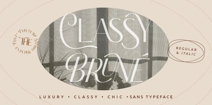 Classy Brune a display sans serif with luxury, clean, chic, and visual elegance with two styles Regular and Italic and alternatives, ligatures, multilingual suport. Perfect for editorial projects, Logo design, Clothing Branding, product packaging, magazine headers, or simply as a stylish text overlay to any background image. Features : Uppercase and Lowercase Stylistic Alternates & Ligatures Numerals & Punctuation Multilanguange PUA Encoded Web Font Included Contact me with an inbox message If you have any question. Thank you! Happy Creating
 - Magallanes Essential by Los Andes,
$18.00 Magallanes Essential a contemporary neo-humanist sans serif font designed by Daniel Hernández. Its strokes and terminals are related to the calligraphic strokes from humanist typefaces. Every weight comes with alternative glyphs for a more dynamic use. Magallanes is the perfect titling font to complement text faces in magazines, logotypes, etc. It is a essential family of 8 fonts, 4 weights and italics. This typeface no contains alternate glyphs and add only Windows 1252 Character set (219 Glyphs).
 - D Blues by W Type Foundry,
$29.00 D Blues its a sans serif typefamily of 9 weights plus matching italics. It is inspired by the neo humanist typefaces with a mix of 20st grotesque sans typeface. D Blues serve very well in web & print design areas, body text, excellent web-font legibility etc… D Blues is equipped with a complete set of opentype features including alternative glyphs, fractions, ligatures and many more. It is perfectly suited for highlighting lettering, magazines, web, interaction design, advertising & logotypes.
 - Aloha Brush by Nirmana Visual,
$22.00 Aloha Brush This font is a supercharged, street-wise brush font bursting with energy. With extra feel as a real brush would! Letters are made with brushes on paper. Then scanned and carefully drawn into vector format. Thas 2 styles of regular and italic variations with a more natural look to your text. Aloha Brush is very suitable for use in various media such as; packaging, logos, labels, posters, shirt designs, bulletins, typography, and many other media.
 - Menco by Kvant,
$59.00 Menco was inspired by the lettering of engineering, found on blueprints, mechanical drawings, stencils and templates. The family has 5 weights, ranging from Thin to Black (including italics) and is ideally suited for advertising and packaging, editorial and publishing, logo, branding and creative industries as well as small text. Menco provides advanced typographical support with features such as case-sensitive forms, fractions, super- and subscript characters, and stylistic alternates. It also comes with tabular lining and proportional lining figures.
 - Mensura Slab by Graviton,
$20.00 Mensura Slab font family has been designed for Graviton Font Foundry by Pablo Balcells in 2013. It is a modular, geometric typeface with subtle rounded angles that provides a soft, pleasant appearance. It has been conceived to be primarily a display typeface, but given its clarity it can also be used for composing short and intermediate length texts. Mensura Slab consists of 8 styles and 4 weights plus italics. Each containing small caps and several alternate characters.
 - Chistodella by Keristyper Studio,
$14.00 Chistodella is a calligraphy handwriting with classic style and elegant touch, inspired by lettering on the vintage. Which was created to meet the needs of your next design project. Carefully designed to work together in harmony for creating awesome typographic designs in a flash. This font is good for logo design, Social media, Movie Titles, Books Titles, short text even long text letters, and good for your secondary text font with sans or serif. Make a stunning work with Roselites font. Featured: -Standard Uppercase & Lowercase -Numeral & Punctuation -Multilingual : ä ö ü Ä Ö Ü ß ¿ ¡ -Alternate & Ligature -PUA encoded We recommend programs that support the OpenType feature and the Glyphs panel such as Adobe applications or Corel Draw. so you can use all the variations of the glyphs. Hope you enjoy our fonts!
 - ITC Adderville by ITC,
$29.99On a cold winter's night, George Ryan, of Galápagos Design Group, began musing on the possibilities for a “truly original” sans serif typeface. What came out of his musing, and his always-present sketchpad, was ITC Adderville, a typeface whose visual impact is immediate and strong. Ryan explains how he did it: “The rounded ends of its strokes and their skewed baseline contact create an illusion of dancing feet. The tops of lowercase stems emit serif buds, suggesting transition into or out of the serifed form. The spear-like lowercase stroke terminators, along with other distinctive elements such as the stylized reticulation of the lowercase 'g' segments, the salute of that same character's spur, and the bold, non-self-conscious 'i' and 'j' dots, all contribute to the playful and unique nature of this design.” The result is a friendly, lively type family whose graduated weights -- book, medium, and heavy -- lend themselves especially well to use at small display sizes and in short blocks of text. - VTF Justina by Variable Type Foundry,
$22.99 VTF Justina is a different typeface with a sans serif style that is inspired by geometric typographies to seek functionality and simple quality in any type of project. This very personal character of its forms together with the variety of eighteen weights with their respective italics (Thin, Extra Light, Ultra Light, Light, Regular, Semi Bold, Bold, Ultra Bold, and Black) it has makes it perfect to combine with the VTF Rozanova in digital projects (for example, web or applications) or printed (for example, corporate identity or packaging). Becoming a very interesting option for both large and small bodies without losing legibility in any weight. Justina has Opentype functions (Case sensitive forms, ordinals, scientific inferiors, denominators, superscripts, subscripts, numerators, fractions) designed exclusively for its design. Supports the following languages: Afrikaans, Albanian, Catalan, Croatian, Czech, Danish, Dutch, English, Estonian, Finnish, French, German, Hungarian, Icelandic, Italian, Latvian, Lithuanian, Maltese, Norwegian, Polish, Portuguese, Romanian, Slovak, Slovenian, Spanish, Swedish, Turkish and Zulu.
 - Aeris by Linotype,
$29.99 Aeris™ typeface is a contemporary book face created by the American designer Tom Grace. It combines the proportions and rhythm of a sans serif font with the high contrasts and flexed strokes of script faces, while the open counters also ensure optimal legibility. Tom Grace focuses on providing subtle differentiations in his cuts and, as a consequence, this font family has its own individual structure: there are A and B variants of the basic forms regular, italic, bold and bold italic, and a display version for use in titles that also comes in A and B variants. It is advisable to use the A variant for larger font sizes, while the slightly more emphasized B variant can be recommended for smaller font sizes. Where the basic forms are to be mixed together in a work, it is important to use the corresponding A/B variants throughout as their designs have been carefully coordinated. Aeris is available in the OpenType Pro format and thus includes a wide range of different glyphs. The font family can be used in various environments, such as books, magazines, advertisements and promotional materials, but it is also the perfect choice for printed corporate documentation.
 - AZ Hello Brushed by Artist of Design,
$25.00 AZ Hello Brushed font was inspired from old auto repair signs. This font utilizes an "old look" to the line work which is designed to have a "worn feel" to it. It is designed to compliment it's sister font; AZ Hello. Ideal for use as headline or sub-head text in you design.
 - HOCUS FOCUS - Personal use only

- Gelion by Halbfett,
$30.00 Gelion is a large family of geometric sans serif fonts. It ships both as two Variable Fonts or as 16 traditional fonts. Those static fonts span eight different weights, ranging from Extralight to Black. Each has an upright and an italic font on offer. The italics are carefully crafted, with an 8° slope. Gelion is inspired by 20th-century geometric sans serifs and classic neo-grotesque designs from the late 19th century and the middle of the 20th century. Its forms remain true to the gracefully geometric look of its classic predecessors, which will surely tick off any client’s long list of branding requirements. Letters in all of Gelion’s weights are drawn with virtually monolinear strokes. Its lowercase letters have a tall x-height. Yet, that still leaves enough room for the fonts’ diacritical marks. Gelion’s default “a” and “g” each have single-storey forms by default. The dots on the ‘i’, ‘j’, and diacritics are round, as are the punctuation marks. Gelion is an excellent choice for both corporate design and editorial design projects, thanks to its range of weights and its legibility in text. The fonts include a lot of ligatures, some monochromatic emoji, a set of arrows, lovely Roman Numerals, and more. Thanks to Gelion’s stylistic alternates, if a project comes up where you do not need a geometric vibe, you can activate Stylistic Set 1. That will replace many of the fonts’ letters with more humanistic-sans alternates, giving your text the feeling of a whole other type design with just one click. Last but not least, the descending “f” available in Gelion’s italics is a nice typographic trait.
 - Classic Heritage by Gleb Guralnyk,
$15.00 This vintage typeface named "Classic Heritage" has a steampunk look and was inspired by old-school lettering styles. The 13 stylistic alternate letters can help you to create a unique and interesting text composition.

