10,000 search results
(0.042 seconds)
- Aldine 401 by ParaType,
$30.00Aldine 401 is a Bitstream version of Bembo type family. It was designed on the base of artwork of Francesco Griffo for Aldus Manutius. Originally the font appeared in “De Aetna” in 1495 — the book by Pietro Bembo about his journey to Mount Etna. Griffo’s design was one of the first old style typefaces followed by Garamond. It was the forerunner for the standard text types in Europe for the next two centuries. A modern version of Bembo was designed at Monotype under the supervision of Stanley Morison in 1929. Aldine 401 is still very popular in book design due to its well-proportioned classic letterforms and lack of peculiarities. Italic was based on the handwriting of Giovanni Tagliente. Books and other texts set in Aldine 401 can encompass a large variety of subjects and formats because of its classical beauty and high readability. Cyrillic version was developed by Isabella Chaeva and released by ParaType in 2008. - Apolline Std by Typofonderie,
$59.00 A Venetian serif in 6 styles The Apolline typeface family was created by Jean François Porchez as a means to study the transition from Renaissance writing into the first printing types. Rather than sticking to the method commonly used these days for the creation of revivals of Jenson or Bembo types, it seemed more interesting to try and get in the same mindset as those exceptional designers during this pivotal period in the history of typography. Thus Apolline is an exploration of the design methods used by people like Nicolas Jenson and his contemporaries for adapting handwriting with its multiple occurrences (a, a, a, b, b, b…) into single, unique signs (a, b…). Initially Jean François made drawings modelled after his own calligraphy. They were done at a very small size on tracing paper (2 cm high for the capitals) to preserve the irregularity of human handwriting. Besides emphasising the horizontal parts of the letter forms, the serifs were designed asymmetrically to reinforce the rhythm of the writing. The final drawings were produced at a large size (10 cm high for the capitals) to allow for subtle optimisation of specific details. The very narrow and fluid Apolline italic Influenced by various concepts for an ideal italic by Van Krimpen, Gill, etc. Apolline italic was designed at 8° degrees. Although the structure of the letterforms were informed by chancery scripts, the italic has full serifs like the roman. Very narrow and fluid, its unique design creates a good contrast when used in combination with its upright counterparts. Thanks to the presence of the serifs similar to roman typefaces it sets very neatly in large sizes. The next step was digitising the drawings with Ikarus (the pre-Bézier-curves era) to create the final roman and italic fonts. Two years later, when the family was expanded to six series the same method was used, this time with Fontographer. This was necessary for correcting a few problems caused by the conversion to Bézier outlines, and to add intermediate weights. Before the advent of feature-rich OpenType, quality type families consisted of several separate fonts for each weight to provide users with various sets of numerals, an extended ligature set and alternates, ornaments, and so on. Introducing Apolline Morisawa Awards 1993
 - Juxta Sans Mono by NaumType,
$19.00 Juxta Sans Mono is an experimental monospace sans, an extension of the Juxta superfamily. During the creation of the Juxta script, I felt that the aesthetics and the main idea of the font had promising potential and I started thinking about a pair for it. So the idea of Juxta Sans Mono was formulated. Juxta has several style-forming elements: 45° beveled or cross out bowls, squared m and w arcs and other unobvious letter structures. Despite its unusual and sometimes odd (f, g, m) letterforms, Juxta Sans is fairly easy to read due to its monospace font nature and wide spacing. Juxta Sans Mono offers great customization potential. It has two sets of stylistic alternates — [salt] makes a letter underscored, but keep it in line, [ss01] replaces some of the glyphs with different letterforms. The [case] function automatically adjusts the height of the punctuation marks to the neighbor letter and [onum] is a set of old style numbers. Juxta Sans Mono also has subscript and superscript features, but they are utilized a bit unconventionally — if you want to customize your logo or headline, you can make a glyph superscript and the one next to it subscript and they automatically kern into one letter width. You can see examples of using these features in the presentation. Juxta Sans Mono is available in 8 weights, including Thin, Light, Regular, Medium, SemiBold, Bold, ExtraBold and Black. It extends multilingual support to Basic Latin, Western European, Euro, Catalan, Baltic, Turkish, Central European, Pan African Latin, Afrikaans, and Basic Cyrillic.
 - TT Prosto Sans Condensed by TypeType,
$29.00 'Prosto' in the name of the font is translated into Russian as “Simply”. Prosto Sans Condensed is the condensed version of the Prosto Sans font family. We created the simplest font possible, and it will fit perfectly into any design. Each line of this typeface is emotionally neutral and aims to not emphasize the text in its graphic representation, but only to use the text to convey the meaning. Having Prosto Sans and Prosto Sans Condensed in your collection is like having a universal tool that helps you every day when you need to 'mend' or 'repair' something. Due to condensed proportions, any text array fits a smaller text field than usual.
 - Oxford Street by K-Type,
$20.00 Oxford Street is a signage font that began as a redrawing of the capital letters used for street nameplates in the borough of Westminster in Central London. The nameplates were designed in 1967 by the Design Research Unit using custom lettering based on Adrian Frutiger’s Univers typeface, a curious combination of Univers 69 Bold Ultra Condensed, a weight that doesn’t seem to exist but which would flatten the long curves of glyphs such as O, C and D, and Universe 67 Bold Condensed with its more rounded lobes on glyphs like B, P and R. Letters were then remodelled to improve their use on street signs. Thin strokes like the inner diagonals of M and N were thickened to create a more monolinear alphabet; the high interior apexes were lowered and the wide joins thinned. The crossbar of the A was lowered, the K was made double junction, and the tail of the Q was given a baseline curve. K-Type Oxford Street continues the process of impertinent improvement and includes myriad minor adjustments and several more conspicuous amendments. The stroke junctions of M and N are further narrowed and their interior apexes modified. The middle apex of the W is narrowed and the glyph is a little more condensed. The C and S are drawn more open, terminals slightly shortened. The K-Type font adds a new lowercase which is also made more monolinear so better suited to signage, loosely based on Univers but also taking inspiration from the Transport typeface both in a taller x-height and character formation. The lowercase L has a curled foot, the k is double junctioned to match the uppercase, and terminals of a, c, e, g and s are drawn shorter for openness and clarity. A full repertoire of Latin Extended-A characters features low-rise diacritics that keep congestion to a minimum in multiple lines of text. The font tips the hat to signage history by including stylistic alternates for M, W and w that have the pointed middles of the earlier MOT street sign typeface. Incidentally, Alistair Hall (‘London Street Signs’, Batsford, 2020) notes that when the manufacturer of signs was changed in 2007, Helvetica Bold Condensed was substituted in place of the custom design, “an unfortunate case of an off-the-peg suit replacing a tailored one” and a blunder that has happily since been rectified, though offending nameplates can still be spotted by discerning font fans.
 - TT Supermolot Neue by TypeType,
$35.00 Useful links: TT Supermolot Neue PDF Type Specimen TT Supermolot Neue graphic presentation at Behance Looking for a custom version of TT Supermolot Neue? TT Supermolot Neue is a redesigned, extended and greatly enhanced reincarnation of the popular TT Supermolot and TT Supermolot Condensed font families. During its existence, the hammers (‘molot’ in Russian) managed to get into the spotlight in a huge number of projects, for example, in popular video games, films, and branding. Despite its popularity, the limited composition of old families put boundaries their development, which prompted us to release a completely redesigned and greatly extended version. And while the old families could offer designers only a limited number of tools, in the new version you can already find 54 fonts, and each individual font now consists of more than 620 glyphs. First, we have added a completely new subfamily, TT Supermolot Neue Extended. But this is only the tip of the iceberg—in order to achieve visual harmony between the three subfamilies, we completely revised the distribution of widths among them. As a result of this work, the width of the TT Supermolot Neue Basic subfamily became a bit narrower, and the width of the TT Supermolot Neue Condensed subfamily became even narrower than it was in the old version. Secondly, we’ve increased the number of weights. While in the old versions there were only 5 weights, in the new ones there are 9 in each of the subfamilies. In addition, we gave a facelift to the lowercase and uppercase letters. In TT Supermolot Neue, the design of all controversial grapheme forms was soothed and now the family can also be used in the text set. We have completely redrawn italics. It took us half a year to compensate for all the circles, to transform italic strokes, to work out the position of the diacritics, to make right the spacing, and to finish kerning. Following a good tradition, in the TT Supermolot Neue extensive support for useful OpenType features was added, and hinting was also improved. If we talk about visual features, we recommend paying closer attention to two stylistic sets: the first set (ss01) is designed to make the typeface more humanist, and when you turn on the second set (ss02), the typeface becomes even more technological. In addition, the typeface has more than 26 items of standard and discretionary ligatures. We also have not forgotten about the figures and we added a set of old-style figures to the standard version. In addition, the typeface has case, ordn, frac, sups, sinf, numr, dnom, onum, tnum, lnum, pnum, calt, liga, dlig, salt, ss01, ss02.
 - Tepeyacac by Ixipcalli,
$35.00 Typography inspired from original text of Nican Mopohua form Antonio Valeriano.
 - Brewery No 2 Paneuropean by Linotype,
$103.99An entry in the Second Linotype Design Contest, Linotype Brewery, designed by Gustavs Andrejs Grinbergs, became part of the TakeType Collection in 1997. Brewery No 2 represents a significantly improved version of its precursor, and the typeface has been both extended and enhanced. When asked about prototypes, Grinbergs cites German typefaces of the early 20th century. It is thus not surprising that the characters of Brewery™ No 2 are based on geometrical forms. However, this is no mere synthetic Grotesque-derived typeface. It has significant contrasts in line thickness and triangular line terminals that are not unlike serifs, placing it in the middle ground somewhere between a Grotesque and serif font. The contrast between the features of a synthetic Grotesque and an Antiqua gives the characters of Brewery No 2 their distinctive charm and is the distinguishing attribute of this contemporary typeface. Additional vibrancy is provided by bevelled line endings (as in the case of the 'E' and the 'F'), the circular punctuation marks and the slight curve of the descending bar of the 'k'. Thanks to a generous x-height and its open counters, Brewery No 2 is also highly legible in small point sizes. Only in its bolder versions is another aspect of Brewery No 2 apparent; Grinbergs has here made the linking elements more rectangular and has emphasized the counters, so that the Bold variants of Brewery No 2 exhibit elements typical of a broken typeface. Brewery No 2 is available in seven finely graduated weights, ranging from Light to Black. Every variant has a corresponding, slightly narrower Italic version. In addition, the lowercase 'a' is given a closed form, the 'e' is more rounded and the 'f' has a descender. The character sets of Brewery No 2 leave nothing to be desired. In addition to small caps and ligatures, there are various numeral sets with old style and lining figures for setting proportional text and table columns. In its most extensive form (the Pan-European variant), Brewery No 2 can be used to set texts in many languages that employ the Latin alphabet and also texts in international languages that use Cyrillic or monotonic Greek orthography. Although some of the features of Brewery No 2, such as the tiny serifs, are only evident in the larger point sizes, this typeface is not just at home when used to set headlines. Brewery No 2 also cuts a good figure in short or medium length texts. This contemporary typeface with its formally elegant quality looks good, for example, on posters, in newspapers and promotional material. It can also be used for websites as it is also available as a web font. - Brewery No 2 by Linotype,
$40.99 An entry in the Second Linotype Design Contest, Linotype Brewery, designed by Gustavs Andrejs Grinbergs, became part of the TakeType Collection in 1997. Brewery No 2 represents a significantly improved version of its precursor, and the typeface has been both extended and enhanced. When asked about prototypes, Grinbergs cites German typefaces of the early 20th century. It is thus not surprising that the characters of Brewery™ No 2 are based on geometrical forms. However, this is no mere synthetic Grotesque-derived typeface. It has significant contrasts in line thickness and triangular line terminals that are not unlike serifs, placing it in the middle ground somewhere between a Grotesque and serif font. The contrast between the features of a synthetic Grotesque and an Antiqua gives the characters of Brewery No 2 their distinctive charm and is the distinguishing attribute of this contemporary typeface. Additional vibrancy is provided by bevelled line endings (as in the case of the 'E' and the 'F'), the circular punctuation marks and the slight curve of the descending bar of the 'k'. Thanks to a generous x-height and its open counters, Brewery No 2 is also highly legible in small point sizes. Only in its bolder versions is another aspect of Brewery No 2 apparent; Grinbergs has here made the linking elements more rectangular and has emphasized the counters, so that the Bold variants of Brewery No 2 exhibit elements typical of a broken typeface. Brewery No 2 is available in seven finely graduated weights, ranging from Light to Black. Every variant has a corresponding, slightly narrower Italic version. In addition, the lowercase 'a' is given a closed form, the 'e' is more rounded and the 'f' has a descender. The character sets of Brewery No 2 leave nothing to be desired. In addition to small caps and ligatures, there are various numeral sets with old style and lining figures for setting proportional text and table columns. In its most extensive form (the Pan-European variant), Brewery No 2 can be used to set texts in many languages that employ the Latin alphabet and also texts in international languages that use Cyrillic or monotonic Greek orthography. Although some of the features of Brewery No 2, such as the tiny serifs, are only evident in the larger point sizes, this typeface is not just at home when used to set headlines. Brewery No 2 also cuts a good figure in short or medium length texts. This contemporary typeface with its formally elegant quality looks good, for example, on posters, in newspapers and promotional material. It can also be used for websites as it is also available as a web font.
 - Eldwin by The Northern Block,
$49.50 Eldwin is a connected script type family with a friendly demeanour. With two styles of Script and Capitals, they combine playfulness with functionality, which allows it to perform best in display and headline situations. The inspiration for Eldwin was drawn from traditional Italian and American sign paintings. Details include six weights in two styles, 526 characters per Script font and 431 characters per Capitals font. Opentype features consist of stylistic alternates, ligatures, fractions, arrows and language support covering Western, South and Central Europe, and Cyrillic.
 - Basquiat Irregular by Cuda Wianki,
$29.00 Basquiat Irregular is a font inspired by graffitti and children's writing. Contains 3 alternative characters for each letter, multilanguage support including cyryllic. It's perfect for creating artistic publications, writing quotes and many other designs. The family also has two fonts with frames, lines and ornaments. Its apperance is rough, hand painted and casual. Perfect for music and street art designs. Frames and lines are created by typing uppercase letters for starting or ending frame or creating an arrow and lowercase letters for typing lines.
 - Euro Icon Kit by TypoGraphicDesign,
$9.00 The typeface EURO Icon Kit is designed at 2020 for the font foundry Typo Graphic Design by Manuel Viergutz. The display font is inspired by the here and now. 763 glyphs incl. icons, dingbats & symbols. Decorative extras like arrows, emojis, ornaments, geometric shapes, catchwords, decorative ligatures (type the word #LOVE for ❤ or #SMILE for ☺ as OpenType-Feature dlig) and stylistic alternates (20 stylistic sets) + sign of the zodiac. Have fun with this font & use the DEMO-Font (with reduced glyph-set) for FREE!
 - Paul Grotesk Stencil by artill,
$29.00 Paul Grotesk Stencil is a new Version of the modern, clean, minimalist grotesque typeface Paul Grotesk, with delicious detail. Created and published in collaboration by Fargus Meiser and Lukas Bischoff. It comes in 8 stylish weights and 3 are free to try. Designed with powerful opentype features in mind. Each weight includes extended language support, fractions, arrows, special numbers and more. It fits perfect for graphic design, editorial, corporate and any display use. Also check the webfont to create a nice responsive interface design!
 - Brandon Printed by HVD Fonts,
$25.00 Brandon Printed is based on the famous Brandon Grotesque typeface. It has an eroded, printed look with variations of every letter by using different styles. With several different styles like a shadowed version, an inline version and a double printed version you can create a lot of lovely combinations. The Brandon Printed package also contains a set with 95 Extras like arrows, catchwords, stars, emblems numbers & lines. Brandon Printed has a high level of detail, so it may process more slowly in some applications.
 - Tabloid Dot M by Nadyr Rakhimov,
$10.00 TabloidDot M is a simple monospace font created for a small project. It had one task, to imitate the inscriptions on the electronic scoreboard in the form of dots arranged on a grid. As time went on I decided to make an extended version of the font with alternate letters and more styles, plus a variable font to control the size of the dots. The font has 6 stylistic sets, Proportional and Old-style figures, Ornaments, a set of Arrows, Currency Symbols, and supports Extended Cyrillic.
 - Framework Mono by High Peak,
$21.00 Framework Mono is a modern monospaced typeface. A close relative of the original Mittelhorn font family, with whom it shares some letter and number design features, the two fonts are ideal companions. It comes in 3 weights, 3 uprights and matching italics. Designed with opentype features, each weight includes extended language support, fractions, arrows, ligatures and more. Perfectly suited for graphic design and for any display use. It could nicely work with code editors, web, editorial design, as well as corporate tabular data sheets and more. Enjoy!
 - Tangent by Hoftype,
$49.00 Tangent provides a fresh new look on serif dominant typefaces. Its strict graphic outline makes it appear crisp, lively and unsentimental; and at the same time humanistic virtues have also been well taken into account. Tangentd consists of 18 styles. It comes in OpenType format and provides an extended language support. All weights contain standard and discretionary ligatures, proportional lining figures, tabular lining figures, proportional old style figures, lining old style figures, matching currency symbols, fraction- and scientific numerals, matching arrows and alternative characters.
 - Riveta by JCFonts,
$30.00 Riveta is a sharp type family available in 18 styles, designed in 2021 by Joël Carrouché. Medium and medium italic styles are 100% free to use. The typeface features a simple and solid geometric construction, with straight terminals and a very discrete triangular serif that gives the font some extra spice in big size. Riveta is equipped for advanced typography, with features such as ligatures, tabular and proportional figures, arrows and icons, stylistic alternates, case-sensitive forms, fractions, scientific inferiors and superiors, and circled figures.
 - Aktifo by Degarism Studio,
$45.00 Aktifo is designed with two Flavour which carries a modern and contemporary style, based on elementary geometric shapes and constructed of monolinear lines, it was invented to be functional, leaving behind anything that can be regarded as superfluous. Aktifo comes in 28 styles: there are two types of families Actifo A and Aktifo B from Light to Black, which both have differences in characters and spaces. Developed with powerful opentype features, equipped with extended language support: Cyrillic, Greek (BETA) and fractions, tabular figures, arrows, ligatures and more.
 - Lumios Brush by My Creative Land,
$29.99 Lumios Brush is a new addition to the Lumios Extended Font Family. It was written with Pilot Brush Pen on a glossy paper (which allows a really smooth brush movements) and then carefully digitized. Just like Lumios Marker, its Brush sibling has multilingual (including basic cyrillic) support. The font also benefits from 2- and 3-letter ligatures (again, multilingual), stylistic alternates and swashes, underlines, arrows and a few symbols. If you already own Lumios Design Elements, you can used them with the Lumuis Brush font.
 - Mathelo by Maulana Creative,
$15.00 Mathelo is a modern semi geo-humanist sans font. With three different weight stroke, fun character with a bit of ligatures and stylistic alternates. To give you an extra creative work. Mathelo font support multilingual more than 100+ language. This font is good for logo design, Social media, Movie Titles, Books Titles, a short text even a long text letter and good for your secondary text font with sans or serif. Make a stunning work with Mathelo font. Cheers, Maulana Creative
 - MC Rocket Stars by Maulana Creative,
$12.00 Rocket Stars is a classic display serif font. With medium low contrast stroke, fun character with a bit of ligatures and alternates. To give you an extra creative work. Rocket Stars font support multilingual more than 100+ language. This font is good for logo design, Social media, Movie Titles, Books Titles, a short text even a long text letter and good for your secondary text font with script or serif. Make a stunning work with Rocket Stars font. Cheers, Maulana Creative
 - Hartsinger by Maulana Creative,
$12.00 Hartsinger is a fancy handwritten font. With cartoon vibes or notes on the book scratch, had a fun character with a bit of ligatures and fun swashes. To give you an extra creative work. Hartsinger font support multilingual more than 100+ language. This font is good for logo design, Social media, Movie Titles, Books Titles, a short text even a long text letter and good for your secondary text font with sans or serif. Make a stunning work with Hartsinger font. Cheers, MaulanaCreative
 - Nicestrips by Maulana Creative,
$12.00 Nicestrips is a fancy casual script font With clean stroke, super slanted and fun character. It has Opentype features of ligatures and some alternate lowercase character, To give you an extra creative work. Nicestrips script font support multilingual more than 100+ language. This font is good for logo design, Social media, Movie Titles, Books Titles, a short text even a long text letter and good for your secondary text font with sans or serif. Make a stunning work with Nicestrips font. Cheers, MaulanaCreative
 - Gissel Chatsey by Maulana Creative,
$13.00 Gissel Chatsey is a casual handwritten script font. With medium contrast stroke, fun character with a bit of ligatures and alternates. To give you an extra creative work. Gissel Chatsey font support multilingual more than 100+ language. This font is good for logo design, Social media, Movie Titles, Books Titles, a short text even a long text letter and good for your secondary text font with sans or serif. Make a stunning work with Gissel Chatsey font. Cheers, Maulana Creative
 - Quiny Alissa by Maulana Creative,
$13.00 Quiny Alissa is an expressive signature script font. With high contrast slanted stroke, fun character with a bit of ligatures and alternates. To give you an extra creative work. Quiny Alissa font support multilingual more than 100+ language. This font is good for logo design, Social media, Movie Titles, Books Titles, a short text even a long text letter and good for your secondary text font with sans or serif. Make a stunning work with Quiny Alissa font. Cheers, Maulana Creative
 - MC Monndy by Maulana Creative,
$16.00 Monndy is a rough stamp style fun sans serif font. With semi bold stroke and slant, fun character with a bit of ligatures and alternates. To give you an extra creative work. Monndy font support multilingual more than 100+ language. This font is good for logo design, Social media, Movie Titles, Books Titles, a short text even a long text letter and good for your secondary text font with script or serif. Make a stunning work with Monndy font. Cheers, Maulana Creative
 - MC Nun Waw by Maulana Creative,
$14.00 Nun Waw is a modern humanist condensed sans display font. Bold stroke, fun character with a bit of ligatures and alternates. To give you an extra creative work. Nun Waw font support multilingual more than 100+ language. This font is good for logo design, Social media, Movie Titles, Books Titles, a short text even a long text letter and good for your secondary text font with script or serif. Make a stunning work with Nun Waw font. Cheers, Maulana Creative
 - Half Blvd by Maulana Creative,
$15.00 Half Blvd is an industrial genre display sans serif font. With bold soft round edge stroke, fun character with a bit of ligatures. To give you an extra creative work. Half Blvd font support multilingual more than 100+ language. This font is good for logo design, Social media, Movie Titles, Books Titles, a short text even a long text letter and good for your secondary text font with sans or serif. Make a stunning work with Half Blvd font. Cheers, Maulana Creative
 - Frollyness by Maulana Creative,
$16.00 Frollyness is a casual signature script font. With a gel pen line stroke, slant and fun character with a bit of ligature and bit lower alternate. To give you an extra creative work. Frollyness font support multilingual more than 100+ language. This font is good for logo design, Social media, Movie Titles, Books Titles, a short text even a long text letter and good for your secondary text font with sans or serif. Make a stunning work with Frollyness font. Cheers, Maulana Creative
 - Gentlysoftly by Maulana Creative,
$11.00 Gentlysoftly is a characteristic signature font of Maulana creative, with clean monoline storke, slanted, condensed and fun character. It has Opentype features of ligatures character, To give you an extra creative work. Gentlysoftly signature font support multilingual more than 100+ language. This font is good for logo design, Social media, Movie Titles, Books Titles, a short text even a long text letter and good for your secondary text font with sans or serif. Make a stunning work with Gentlysoftly signature font. Cheers, MaulanaCreative
 - Contoursy by Maulana Creative,
$14.00 Contoursy is a Fancy Signature script font. With light stroke, slanted and fun character with a bit of ligatures and a bit lowercase alternatives. To give you an extra creative work. Contoursy font support multilingual more than 100+ language. This font is good for logo design, Social media, Movie Titles, Books Titles, a short text even a long text letter and good for your secondary text font with sans or serif. Make a stunning work with Contoursy font. Cheers, MaulanaCreative
 - Angel Rise by Maulana Creative,
$12.00 Angel Rise is an expressive signature font. With clean mono-line stroke, super slant and fun character with a different Upper and lower alternate style. To give you an extra creative work. Angel Rise font support multilingual more than 100+ language. This font is good for logo design, Social media, Movie Titles, Books Titles, a short text even a long text letter and good for your secondary text font with sans or serif. Make a stunning work with Angel Rise font. Cheers, MaulanaCreative
 - MC Bigzo Hams by Maulana Creative,
$23.00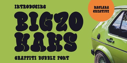 Bigzo Hams graffiti bubble display font. Bold stroke, fun character with a bit of ligatures and alternates. To give you an extra creative work. Bigzo Hams graffiti display font support multilingual more than 100+ language. This font is good for logo design, Social media, Movie Titles, Books Titles, a short text even a long text letter and good for your secondary text font with script or serif. Make a stunning work with Bigzo Hams graffiti bubble display font. Cheers, Maulana Creative
 - Chorest by Maulana Creative,
$15.00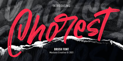 Chorest is an SVG handwritten font. With brush stroke, slant and fun character with a bit of ligatures and bit lowercase alternatives. To give you an extra creative work. Chorest SVG font support multilingual more than 100+ language. This font is good for logo design, Social media, Movie Titles, Books Titles, a short text even a long text letter and good for your secondary text font with sans or serif. Make a stunning work with Chorest SVG font. Cheers, MaulanaCreative
 - Le Greg by Maulana Creative,
$15.00 Le Greg is a modern soft sans display font. With bold stroke, fun character with a bit of ligatures and ton of stylistic alternates. To give you an extra creative work. Le Greg font support multilingual more than 100+ language. This font is good for logo design, Social media, Movie Titles, Books Titles, a short text even a long text letter and good for your secondary text font with sans or serif. Make a stunning work with Le Greg font. Cheers, Maulana Creative
 - Podles Atubin by Maulana Creative,
$17.00 Podles Atubin fat bubble display font. Heavy stroke, fun character with a bit of ligatures. To give you an extra creative work. Podles Atubin fat bubble display font support multilingual more than 100+ language. This font is good for logo design, Social media, Movie Titles, Books Titles, a short text even a long text letter and good for your secondary text font with script or serif. Make a stunning work with Podles Atubin fat bubble display font. Cheers, Maulana Creative
 - MC High Nobiety by Maulana Creative,
$24.00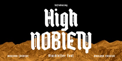 High Nobiety is a modern style of blackletter font. With medium low contrast stroke, fun character with a bit of ligatures and alternates. To give you an extra creative work. High Nobiety font support multilingual more than 100+ language. This font is good for logo design, Social media, Movie Titles, Books Titles, a short text even a long text letter and good for your secondary text font with sans or serif. Make a stunning work with High Nobiety font. Cheers, Maulana Creative
 - Qobryts by Maulana Creative,
$11.00 Qobryts is a fancy signature script font. With thin contrast stroke, super slanted and Unique Upper and lower characters with a bit of ligatures. To give you an extra creative work. Qobryts font support multilingual more than 100+ language. This font is good for logo design, Social media, Movie Titles, Books Titles, a short text even a long text letter and good for your secondary text font with sans or serif. Make a stunning work with Qobryts font. Cheers, MaulanaCreative
 - Winter Airs by Maulana Creative,
$13.00 Winter Airs is a natural feel script font. With rough stroke, fun character with a bit of ligatures and has a two files lowercase alternates. To give you an extra creative work. Winter Airs font support multilingual more than 100+ language. This font is good for logo design, Social media, Movie Titles, Books Titles, a short text even a long text letter and good for your secondary text font with sans or serif. Make a stunning work with Winter Airs font. Cheers, MaulanaCreative