10,000 search results
(0.16 seconds)
- Lane - Narrow - Personal use only

- Futurex Narrow - Unknown license

- Wewak Narrow - Unknown license

- Narrow Path by Ingrimayne Type,
$9.00 NarrowPath is a family of 18 condensed and ultra-condensed sans-serif typefaces. The family was derived from the font family NarrowWay by adding true lower-case letters. Some alternative letters forms can be reached with the OpenType feature of stylistic sets. The character spacing in most of the styles is quite loose and it can be tightened with an application's character spacing if needed. These typefaces are display faces that can be useful for squeezing tall lettering into tight spaces. Uses may include packaging, signage, and titles.
 - Tecna Narrow by Descarflex,
$20.00 The Tecn@ Narrow family was designed so that its characters are legible and easy to interpret in any writing and where space saving is necessary; among them, the descriptive memory of plans or instructions, for example. Tecn@ Narrow complements the Tecn@ Background Light, Dark Square & Triangle font family.
 - Gothic Narrow by Wooden Type Fonts,
$15.00 A revival of one of the popular sans serif wooden type fonts of the 19th century, narrow, short ascenders and descenders.
 - Aspire Narrow by Grype,
$18.00 While the Aspire family finds its roots of inspiration in the ACURA automotive company logo, with its wider base, the Aspire Narrow family condenses those styles into something more suitable for larger bodies of text in a more standardized width. Aspire pays homage the techno display styling of the inspiration logotype, further evolving beyond its brand inspired origin to give birth to a font family that pulls on modern and historical styles. It adopts a sturdy yet approachable style with its uniform stroke forms and curves, and goes on to include a lowercase, numerals, and a comprehensive range of weights, creating a straightforward, uncompromising collection of typefaces that lend a solid foundation and a broad range of expression for designers. Here’s what’s included with the Aspire Narrow Family bundle: 477 glyphs per style - including Capitals, Lowercase, Numerals, Punctuation and an extensive character set that covers multilingual support of latin based languages. (see the 6th graphic for a preview of the characters included) Stylistic Alternates - alternate characters that remove the angled stencil cuts for a more standardized text look. 3 weights in the family: Light, Regular, & Black. 3 obliques in the family, one for each weight: Light, Regular, & Black. Fonts are available in TTF & OTF formats. The TTF format is the standard go to for most users, although the OTF and TTF function exactly the same. Here’s why the Aspire Narrow Family is for you: - You’re in need of a narrow automotive sans font family with a range of weights and obliques. - You’re love that ACURA letter styling, and want to design with a narrow font within that genre. - You’re looking for an alternative to Eurostile with more stylized letterforms. - You’re looking for a clean techno typeface for your starship console labelling. - You just like to collect quality fonts to add to your design arsenal.
 - Warren Narrow by AKTF,
$36.00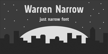
- Sancoale Narrow by insigne,
$22.00 Sancoale Narrow is a carefully honed and meticulously crafted new family member for the Sancoale series. Sancoale Narrow has been specially designed to allow for even more versatility for the Sancoale Family. Sancoale Narrow continues with Sancoale's successful simple, geometric and legible structure. It is a contemporary design that is distinctive and unique. This new narrow addition can be used in conjunction with the original Sancoale, but it can also stand on its own. Narrow type comes in a handy in a myriad of situations, from poster design to book covers, web pages to editorial layouts. Sancoale Narrow's six weights make for a typeface family that is very useful for many applications, and also includes a set of true italics. The design is simplified without stems or spurs in the default character set. OpenType alternates do include alternates with stems, Small Caps, Fractions, Tabular Figures, and plenty of alts, including "normal" capitals and lowercase letters. Please see the informative .pdf brochure to see these features in action. Sancoale Narrow also includes a full array of Latin diacritics for multilingual support. OpenType capable applications such as Quark or the Adobe suite can take full advantage of the automatically replacing ligatures and alternates. This family also includes the glyphs to support a wide range of languages. The Sancoale superfamily is suitable for a wide range of uses and is a very economical and versatile addition to any designer's font collection.
 - Crox Narrow by NumidiaType,
$25.00 Crox™ Narrow is the second family of Crox™, designed for long texts and gaining paragraph spaces. It's available in 19 styles, including upright and italic, and the majority of glyphs are compressed to make a different spacing between characters. The basic English characters are provided as both numerator and denominator sets in the narrow version too; this feature may assist with the creation of fractions with letters and numbers, such as in advanced scientific fraction form scripting. Within each style, all weights support over 25 professional OpenType features, with significant coverage of western languages. and include multi-alternative characters in Styles 1, 2, 4, 10, and 11, which were initially intended for advanced usage. Specimen Crox™ is a trademark of Yassine Abdi.
 - Metroflex Narrow by GarageFonts,
$39.00 - Ginza Narrow by Positype,
$22.00 Here's what I said about the original Ginza: Sometimes you get an idea stuck in your head and the only way to get rid of that demon is to put something down on paper. A year later the doodles became a skeleton, and then the skeleton had a body, then the body had a name, then the name got a personality. What was left was a clean set of fonts that encompass a very simple skeleton with a lot of visual appeal. And now with Ginza Narrow: Once Ginza was released, I immediately wanted to commit the time to create a narrower version—if for nothing else but to add additional versatility to the skeleton, but my schedule just would not allow it until a client recently asked me to. There was no need to ask twice as I had already started and then shelved the initial builds. I also had the opportunity to expand the localization of the fonts by adding Cyrillic.
 - Narrow Way by Ingrimayne Type,
$9.00 NarrowWay is a family of 18 condensed and ultra-condensed sans-serif typefaces. The family started with the ultra-condensed widths, then the condensed and regular widths (the regular is still quite condensed) were added. All widths have three weights and each weight has an italics style. These 18 styles lack a true lowercase but rather have a set of alternative characters, some based on lower-case forms, on the lower-case keys. Some alternative letters can be reached with the OpenType feature of stylistic sets. The character spacing in most of the styles is quite loose and it can be tightened with an application's character spacing if needed. These typefaces are display faces that can be useful for squeezing tall lettering into tight spaces. They are not readable at small point sizes.
 - Obvia Narrow by Typefolio,
$29.00 'Obvia' appeared as a result of direct observation on typefaces classified as geometric and the plan to explore for the first time width axes Condensed, Narrow, Normal, Wide and Expanded. The idea behind 'Obvia's design was to create a distancing from geometrically pure shapes, in this case, square shapes. Then some details were added, such as subtle inktraps, concave endings of the stems and carefully drawn alternate characters, giving a 'geohumanist' tone to the font. This first family of 'Obvia' has 9 weights ranging from Thin to Black, delivering a strong typographic identity, from the paper to the pixel.
 - Brim Narrow by Jamie Clarke Type,
$15.00 Brim is inspired by antique woodtype and chromatic type from the 1800s. Its various styles stack together creating a variety of decorative combinations. Each style can be assigned its own colour, resulting in a rich assortment of eye-catching combinations. The font began as a handful of letters created for a logotype. It became clear that it would make an excellent display typeface, so it was expanded to include all uppercase letters, numbers, European accents and more. Warm and tactile, Brim produces punchy headlines and decorative titles. Perfect for posters, packaging and logotypes. The name Brim accurately describes the expanded outer edge designed to produce its distinctive outlines. This overlapping structure couldn’t function correctly in wood or metal type; however for digital typography this system produces a more efficient solution for colour type, both in design and smaller file size, important for web typography. Many thanks to Dave Foster, Toshi Omagari, & Terrance Weinzierl, who generously gave their time to guide the design of this typeface. For a flattened version, see Brim Combined
 - MB Narrow by Ben Burford Fonts,
$20.00 MB Narrow is a very compressed display font that comes in three weights. with is full use of the 20 stylistic sets it gives the user a lot of scope to how it look. without using them it has a very rounded and geometric look but with alternates for the Capital A, M, N, V, W, X, Y and the lowercase a, f, g, v, w, x & y you can create a more traditional 'movie poster' look. with standard & discretional ligatures and oldstyle figures there are plenty of opentype features.
 - Oksana Sans Wide by AndrijType,
$33.00 Oksana Sans Wide is designed for short and big texts. It has six weights from Thin to Heavy. Supports Western, Central, Baltic Latin and European Cyrillic code pages. Old-style digits, some ligatures, alternative characters and Ukrainian hryvnia sign are also included.
 - Oksana Sans Compressed by AndrijType,
$33.00 Oksana Sans Compressed is the most skinny part of Oksana Sans font family, but still it retains most features of this humanist sans serif. The Compressed version is designed to get most of your page and fill a minimum space with maximum information. It can be useful in multiple columns typesetting — like magazines, newspapers or business documentation. Oksana Sans Compressed could be a good minor companion for other Oksana fonts as well. It has six weights from Thin to Heavy plus free and funny Fat Compressed Italic face, supports Western, Central European, Baltic Latin and Slavic Cyrillic codepages. Old-style digits, some ligatures, alternative characters and modern currency signs are also included.
 - Oksana Sans Condensed by AndrijType,
$33.00 Oksana Sans Condensed is designed for tight-fitting text. It has six weights from Thin to Heavy. Supports Western, Central, Baltic Latin and European Cyrillic codepages. Old-style digits, some ligatures, alternative characters and Ukrainian hryvnia sign are also included.
 - OKABA by Zamjump,
$17.00 OKABA a sans serif typeface full of personality and taste. A display typeface at its core, complete with several ligatures and alternatives for capital letters. With a clean, minimal, and modern sans typeface. Look elegant by using ligatures for your magazine, brochure and editorial layouts.
 - AKsans by AKTF,
$27.00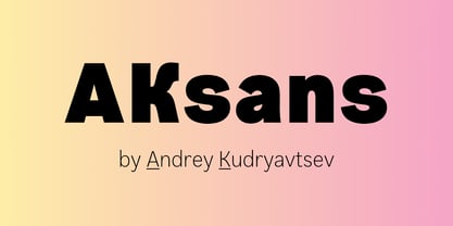
- Kosans by Prioritype,
$15.00 Introducing Kosans - Modern Look Typeface It is a modern and classic look font that has beautiful characters in it that makes this font look simple but still classy. You can apply it to your design projects such as logos, business cards, brands, social media posts, quotes and much more which you can make with this great item for any design! Features: -Uppercase & Lowercase ( All Caps ) -Numeral -Punctuation -Multilingual -Opentype Features & PUA Encoded Multilingual contained: Afrikaans, Albanian, Asu, Basque, Bemba, Bena, Breton, Catalan, Chiga, Cornish, Danish, Dutch, English, Estonian, Filipino, Finnish, French, Friulian, Galician, German, Gusii, Indonesian, Irish, Italian, Kabuverdianu, Kalenjin, Kinyarwanda, Luo, Luxembourgish, Luyia, Machame, Makhuwa-Meetto, Makonde, Malagasy, Manx, Morisyen, North Ndebele, Norwegian Bokmål, Norwegian Nynorsk, Nyankole, Oromo, Portuguese, Quechua, Romansh, Rombo, Rundi, Rwa, Samburu, Sango, Sangu, Scottish Gaelic, Sena, Shambala, Shona, Soga, Somali, Spanish, Swahili, Swedish, Swiss German, Taita, Teso, Uzbek (Latin), Volapük, Vunjo, Zulu. Note: Use a program that supports the Opentype features and the glyph panel is available, so you can see the various alternative characters available. Examples of programs such as Adobe Illustrator, Corel Draw or Affinity Designer.
 - Osaca by Rosario Nocera,
$15.00 Osaca is a sans serif font family inspired by nature and it is composed of 6 weights, from extra light to heavy, including the matching italics. Osaca is a typeface that doesn't go unnoticed due to its particular design: its curves and lines mirror the typical motif of leaves. Osaca is ideal for large and medium headers and titles, but also perfectly suitable for short or large paragraphs as it creates an effect that is quite different from the classic sans-serif and definitely unique.
 - Osande by XdCreative,
$20.00 Osande is a modern sans serif font with neo-Grotesque touch, more homogenous forms with minimal stroke contrast. Osande the font family contains 3 basic forms: italics, obliques, and upright. Each of which has 7 different weights ( Thin, Extra Light, Light, Regular, Medium, Semibold, and Bold ). Osande can easily be matched to an incredibly large set of projects, so add it to your creative ideas and notice how it makes them stand out! Thank you.
 - OKASA by Twinletter,
$15.00 Okasa, our newest typeface, is now available. We present to you a quirky and contemporary typeface, which you can use to produce an optimal visual display in each of your projects and to impress all of your audience with the unique look of your project. Because everyone does not necessarily understand Japanese letters, we supply fonts with letters that can be utilized for your project. We produced this display font with a Japanese theme or an Asian font, which we designed to fulfill the needs of your Japanese-themed project. Of sure, your initiative will be understood by people all around the world. Logotypes, food banners, branding, brochure, posters, movie titles, book titles, quotes, and more may all benefit from this font. Of course, using this font in your various design projects will make them excellent and outstanding; many viewers are drawn to the striking and unusual graphic display. Start utilizing this typeface in your projects to make them stand out. Caps only fonts
 - Ohana by T-26,
$19.00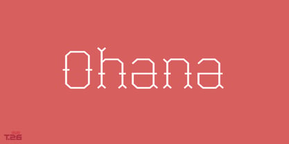
- Komika Text - Unknown license

- Komika Text - Unknown license

- PanAm Text - Unknown license

- Komika Text - Unknown license

- Komika Text - Unknown license

- Medici Text - Personal use only

- Wedding Text by Tilde,
$39.75 - Faust Text by Solotype,
$19.95Barnhart Bros. and Spindler called this Faust Text when they introduced it in 1898. A quarter of a century later, they brought back a number of obsolete faces and renamed them. This one became Missal Text in their 1923 catalog. - Noam Text by TypeTogether,
$69.00 Adi Stern’s Noam Text shows that typographic progress is often in the small things — in the perfecting of familiar traditions and in staying loyal to the spirit of what came before. It can’t really be called progress unless it honours its history. In this way, TypeTogether is happy to introduce Noam Text: A Hebrew and Latin serif font that builds on its heritage with the twin tools of honour and progress. Since 1908, the Frank-Rühl fonts have dominated the Hebrew book and newspaper market. Noam Text’s design goal was to create a coherent family with both Latin and Hebrew serif text typefaces, each authentic to its own script, and which would serve as an alternative to last century’s predecessor. In short order, users will recognise Noam Text as a source of progress in its bilingual abilities. Hebrew and Latin have opposite reading directions, creating many issues: opposing directionality of the open counters; vertical stress in Latin, but horizontal in Hebrew; fewer extenders in Hebrew; and no Hebrew capital letters. All these have been taken into account in Noam Text’s modern design. Of unique importance — all punctuation marks have a Hebrew version, which makes each script complete and uncompromising. Among other technologically advanced details, Noam Text was programmed for all expected scenarios of mixing Hebrew, Latin, figures, and punctuation. Noam Text is intended mostly for setting long texts, so it strives to achieve maximum legibility in minimum space with its large x-height, short and fairly condensed Latin capitals, large and open counters, and low contrast. Originally derived from the Hebrew, the shallow horizontal curves and strong baseline serifs provide dynamism and enhance the reading flow. Noam Text Latin’s italic is rounded and reading friendly, is condensed to generate a lighter texture than the roman, and has a flowing stance. These virtues help it endure harsh printing conditions and subpar inks and paper. Noam Text’s three total weights provide a proper solution for integrating texts in both scripts, as well as a contemporary alternative for use in books, newspapers, and magazine design. Aligned with TypeTogether’s commitment to produce high-quality type for the global market, the complete Noam Text family displays an impressive amount of discretion, applying to wide use-cases by not edging too close to religious motifs or imbibing in secular indulgence. This means Noam Text can be the go-to family across the board and capitalise on the desire for clear typographic progress in this modern age.
 - Europa Text by Solotype,
$19.95This circa 1910 European face was introduced into the United States by a German type foundry traveling salesman during the great depression of the 1930s. We have used it quite successfuly in sizes as small as 10 and 12 point. - Jules Text by DSType,
$40.00 Jules Text is the perfect companion to the previously released Jules family.
 - Melville Text by Luhop Creative,
$27.00 Melville Family is a meticulously crafted font collection that falls under the transitional serif classification. It offers a variety of font styles, including italic and serif old style, with a total of 16 unique styles to choose from Melville is a versatile and flexible solution that can be used in various industries such as stationary office, newspaper, cover book, web design, and text. Discover how Neville can enhance your projects and meet your specific needs.
 - American Text by SoftMaker,
$9.99 American Text is a condensed American blackletter published by SoftMaker.
 - Qualion Text by ROHH,
$39.00 Qualion Text™ is a modern geometric sans serif typeface with humanist and calligraphic inspirations. It is a text family designed for excellent legibility. Qualion Text™ is a sibling of Qualion™ & Qualion Round™, geometric family with lots of swashes and ornaments. Letter shapes and proportions has been adjusted to fit paragraph text and small sizes: - typeface is narrower now in order to fit more text in the design space - larger stroke contrast - pronounced ink traps and tapering - elegant true italics made even more calligraphic - adjusted spacing and kerning - adjusted font weights The main purpose of the family is clean and legible paragraph text, however it is very attractive choice for branding, headlines and display use, too. The italic styles as well as thin, bold and black upright styles have very strong character and look great in display sizes. Italics are very fluent, calligraphic, subtle and elegant, from the other side bold and black uprigths are very modern, powerful and unique thanks to the pronounced ink traps. Qualion Text™ family consists of 20 styles - 10 weights with corresponding true italics. Both have extended language support, as well as broad number of OpenType features, such as small caps, case sensitive forms, standard and discretionary ligatures, swashes, stylistic sets, contextual alternates, lining, oldstyle, tabular and small cap figures, slashed zero, fractions, superscript and subscript, ordinals, currencies and symbols.


