4,260 search results
(0.03 seconds)
- Frank Reaction by Will Stewart,
$40.00 A high quality hand rendered pencil script that includes a variety of contextual alternates to ensure the best handwritten look. Frank Reaction works brilliantly when used for both display and body copy and it is available for both print and web application. Use Frank Reaction to give your work personality and life.
 - Brillany by Solidtype,
$14.00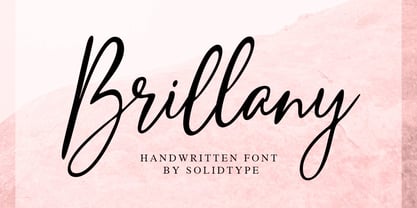 Brillany is a simple handwritten script font, modern and fashionable. This elegant font is legible and looks great as a headline or in body text. This font will perfect for many different project for blogging, social media, branding, wedding invites, cards etc. Including ligatures, uppercase and lowercase, punctuation and multiple languages support.
 - Caliny by Marc Lohner,
$21.00 This cheerful font family combines cuteness and fun, making it a great choice for any kid’s app, book, toy, packaging, movie, theme park and so much more. Caliny’s curves are drawn with care and love. It covers more than 200 languages and has some advanced typographic features, like case sensitive forms to offer.
 - Rushbold by Sign Studio,
$15.00 Rushbold inspired by the old brush style that has a fat body, it will really help to bring out a warm, retro, vintage, classic, playful feel. Has 2 Stylistic Sets (Upper & Lowercase) and other Alternate Characters. Each section has a smooth line so that for large prints it will still look good.
 - Monoela by Interfont,
$40.00 Inspired by the mechanical typewriter, Monoela interprets its characteristics in a contemporary way — whether in body text or emphasis. Despite being a non-proportional typeface, Monoela guarantees good legibility, both for man and machine. Matter-of-factly and rational at first sight, Monoela's character becomes visible in striking shapes and unexpected proportions.
 - Meltdown by Comicraft,
$19.00 Misshapen Muck Monster Mutations are on the loose... Their creepy hyper-irradiated bodies have emerged from the blasted desolate wastes of The Forbidden Zone! Could this be Doomsday... or did we just leave one of our typefaces on the radiator? Either way, Meltdown is the perfect font for monstrous inhuman atrocities everywhere.
 - Toffee Display by Vástago Studio,
$20.00 Toffee Display is a sans serif project inspired on Gill sans, Helvetica and Eurotstile italics. This project is designed for food packaging, candies, commercial, and fast food. I recommend combining it with a light and calligraphy font to get absolute contrast. That is it, Thanks for buy it and work with it!
 - Lastik by That That Creative,
$120.00 Lastik is a real work horse of a font. It includes 5 styles that cover all you need from Display Fonts to body copy. This font comes from the idea of an approachable, friendly fun serif font. The font takes inspiration from old scholastic materials from the late 90s and early 2000's.
 - Mental Duck by PizzaDude.dk,
$17.00 Drawn with a thick marker, I present to you: Mental Duck! A loose and laid back comic book font, suitable for both comics, posters, products for children, toys ... in fact anything that needs a legible and handdrawn look. Comes in three different versions: Regular, Fill and Shadow. Mix them for great results!
 - ITC Cinderella by ITC,
$29.99Some typefaces are staid, somber design tools. Then again, there's ITC Cinderella from Patricia Lillie: a typeface that's light-footed as a ballerina and joyful as a child at play. “There is a group of display faces that I simply love. Type that just seems to dance, type that makes me smile, designs that, when I see them, I say, "Boy, do I wish that was one of mine" says Lillie. “Although I never wanted to imitate these designs, when Cinderella started to emerge, I felt like it was the closest I've come to that quality.” ITC Cinderella projects gaiety and freedom. Capitals harmonize with a lowercase that bounces along with a lively, carefree attitude. Stroke weight stress is, well, all over the place. Curlicues abound. This delightful design is just that: brimming with delight. - Type Ultimate by VP Creative Shop,
$39.00 Type Ultimate is an exquisite serif font that combines elegance and sophistication. It comes in regular and italic versions, each containing a stunning collection of 383 ligature glyphs and alternate glyphs, as well as 26 swashes for both regular and italic versions. With its extensive character set, Type Ultimate supports a wide range of languages, making it a versatile choice for various projects. This font is perfect for creating a memorable logo, establishing a strong brand identity, and making headlines that stand out. Its timeless and refined design also makes it an excellent choice for elegant wedding invitations and other formal occasions. Overall, Type Ultimate is a font that exudes beauty and refinement, adding a touch of sophistication to any project it's used in. Language Support : Afrikaans, Albanian, Asu, Basque, Bemba, Bena, Breton, Chiga, Colognian, Cornish, Czech, Danish, Dutch, Embu, English, Estonian, Faroese, Filipino, Finnish, French, Friulian, Galician, Ganda, German, Gusi,i Hungarian, Indonesian, Irish, Italian, Jola-Fonyi, Kabuverdianu, Kalenjin, Kamba, Kikuyu, Kinyarwanda, Latvian, Lithuanian, Lower Sorbian, Luo, Luxembourgish, Luyia, Machame, Makhuwa-Meetto, Makonde, Malagasy, Maltese, Manx, Meru, Morisyen, North Ndebele, Norwegian, Bokmål, Norwegian, Nynorsk, Nyankole, Oromo, Polish, Portuguese, Quechua, Romanian, Romansh, Rombo, Rundi, Rwa, Samburu, Sango, Sangu, Scottish, Gaelic, Sena, Shambala, Shona, Slovak, Soga, Somali, Spanish, Swahili, Swedish, Swiss, German, Taita, Teso, Turkish, Upper, Sorbian, Uzbek (Latin), Volapük, Vunjo, Walser, Welsh, Western Frisian, Zulu Ligatures Uppercase - AB,AC,AD,AG,AK,AL,AM,AN,AP,AR,AS,AT,AV,AY,BE,BL,BO,BU,CE,CH,CK,CO,CT,DE,DI,DO,EA,ED, EE,EF,EI,EL,EM,EN,EP,ER,ES,ET,EV,EX,EY,FA,FE,FF,FI,FO,FR,FT,FU,GA,GE,GH,GO,GR,HA,HE,HI, HO,HT,KE,KI,KN,LA,LD,LE,LF,LI,LL,LO,MA,ME,MI,MM,MO,MP,MU,NA,NC,ND,NE,NG,NK,NO,NS,NT, NY,OA,OD,OK,OL,OM,ON,OO,OP,OR,OS,OT,OU,OW,PA,PE,PL,PO,PP,PR,RA,RD,RE,RI,RO,RR,RS,RT, RY,SA,SE,SH,SO,ST,SU,TA,TE,TH,TI,TL,TO,TR,TS,TT,TU,UG,UL,UN,UR,US,UT,VE,VI,WE,WH,WI,WO,YO, YS,MEN,WER,FRO,RON,ROM,THE,AND,ING,HER,HAT,HIS,THA,ERE,FOR,ENT,ION,TER,WAS,YOU,ITH, VER,ALL,THI,TIO,OUL,ULD,IGH,GHT,AVE,HAV,ICH,HIC,HIN,HEY,ATI,EVE,HING,WERE,FROM,THAT,THER, TION,OULD,IGHT,HAVE,THIS,THIN,THEY, ATIO,EVER,MENT Lowercase - ab,ad,ag,ai,ak,al,am,an,ap,as,at,av,ay,ba,be,bl,bo,bu,ca,ce,ch,ck,co,ct,de,di,do,ea,ec,ed,ee,ef,eg,ei,ej,el,en,ep,es,et,ev,ew,ey,fa,fe,fi,fo,fr,fu,ga,ge,gh,gi,gr,ha,he,hi,ho,ht,ic,id,ie,ik,il,im,in,io,ir,is,it,iv,ke,ki,kn,la,ld,le,lf,li,lo,ly,ma,me,mi,na,nc,nd,ne,ng,ni,nk,nl,no,nt,ny,oa,oc,od,of,oi,ok,ol,om,on,oo,op,ot,ou,ov, ow,pa,pe,pi,pl,po,pp,qu,ra,rd,re,ri,rm,rn,ro,rr,rs,rt,ru,ry,sa,se,sh,si,so,sp,ss,st,su,ta,te,th,ti,tl,to,ts,tt, tu,uc,ug,um,un,up,ur,us,ut,va,ve,wa,we,wo,xp,ye,yo,ys,men,wer,fro,rom,ron,the,and,ing,her,hat,tha, ere,for,ent,ion,ter,you,ver,thi,ght,ave,hey How to access alternate glyphs? To access alternate glyphs in Adobe InDesign or Illustrator, choose Window Type & Tables Glyphs In Photoshop, choose Window Glyphs. In the panel that opens, click the Show menu and choose Alternates for Selection. Double-click an alternate's thumbnail to swap them out. Mock ups and backgrounds used are not included. Thank you! Enjoy!
 - Altra Two by Hackberry Font Foundry,
$24.95AltraTwo is a complete redraw of a family based on a tracing of a clip art font from an old printed book. The AltraTwo family adds italic, black, and black italic. I liked the gentle calligraphic look. Consider it a sans serif with style. This is a typical NuevoDeco OpenType pro font with caps, lowercase, small caps, lining, oldstyle, and small cap figures, numerators, denominators, fractions, swashes, and so on. There aren't many unusal ligatures for this one, though. It does have the Latin 2 character set or what Adobe calls CE, Central European characters. Altra has been my preferred header face for sevral years. it also works very well for body copy. I usually use it for my contrasting tip and quote paragraphs with Bergsland Pro as my normal body copy. - Lonarue by Twinletter,
$13.00 Introducing “Lonarue Font” – Where Playfulness Takes Center Stage! Lonarue Font is your passport to a world of creativity and fun in typography. This whimsical typeface is carefully crafted to bring joy and a touch of playfulness to your designs. With its lively and distinctive characters, Lonarue Font is the ideal choice for projects that demand a dash of imagination. Whether you’re designing children’s books, cheerful greeting cards, or vibrant logos, this font adds a delightful charm that captivates your audience. Embrace the playful spirit of Lonarue Font and let your creativity shine. Elevate your designs, capture attention, and create lasting impressions effortlessly with this versatile typeface. Experience the magic of Lonarue Font and infuse your projects with the joy of playful typography today! – PUA Encoded Characters – Fully accessible without additional design software.
 - Perfectly Nineties by Jen Wagner Co.,
$17.00 Introducing Perfectly Nineties – a brand new serif with all the nostalgic vibes! I've started seeing classic, tightly spaced serifs of the 80s & 90s making a comeback, and wanted to create the perfect one for you too! Perfectly Nineties is a beautifully nostalgic upper and lowercase typeface that looks incredible in both large and small settings as a display and body text. It's gorgeous used on its own, or paired as you see above with Aguafina Script (free from Google Fonts: https://fonts.google.com/specimen/Aguafina+Script ) One thing to note about Perfectly Nineties is the letter spacing. It was intentionally spaced for clean reading if you wanted to use it for body type, so I recommend setting the spacing a little tighter for display use (around -20 should do!).
 - Rocket Pop Outline by astroluxtype,
$20.00 Rocket Pop Outline and Rocket Pop are influenced by product packaging and cereal box art from the 1960’s and 1970’s. The fonts will work as companions or separate. Best used over 36pt as a headline display face, these fonts will bring a bold playfulness to any project where a vintage or retro style is in the concept. The style reflects the era when things were indeed, mad, where men (and some women) did crazy art for vinyl records, food packaging and kiddie products. This outline font will bring a snap and crackle and a pop to any of your vintage design projects. Watch for the Cerealboxx Set coming soon that will include the astroluxtype fonts, Sugarbang! Koo Koo Puff and Rocket Pop together in one delicious box.
 - Shopping Guide by Jeff Levine,
$29.00 While watching the 1947 holiday classic “Miracle on 34th Street”, one scene in particular presented a chance to develop a retro type design. ‘Kris Kringle’ suggests to a mother visiting with her child in the Macy’s toy department to try Gimbel’s for a toy she couldn’t find at the store. The news of this behavior reaches Mr. Macy himself, who embraces the practice as a brilliant marketing strategy. A number of departments are then presented with reference books containing competitor ads, and the visual of the cover stating “R.H. Macy & Co. Shopping Guide for the Convenience of Our Customers” shows on screen. The thin, Art Deco sans serif monoline with a few serif-like hooks added onto some characters became the basis for Shopping Guide JNL, which is available in both regular and oblique versions.
 - HU Basic Round by Heummdesign,
$15.00 English HU Basic Sans is a body text font with simple Sans structure. It is well used in medias that are appropriate to use sensible font types. yet, its shows it's stylish aspects with it's wide main body. Greek Το HU Basic Round είναι μια γραμματοσειρά κειμένου σώματος με απλή δομή Sans. Χρησιμοποιείται καλά σε μέσα που είναι κατάλληλα για χρήση λογικών τύπων γραμματοσειρών. Ωστόσο, δείχνει ότι είναι κομψές πτυχές με το μεγάλο κύριο σώμα του. Υπάρχουν 1 βάρη του HU Basic Round : light Cyrillic HU Basic Round - это шрифт основного текста с простой структурой Sans. Он хорошо используется в средствах массовой информации, которые подходят для использования разумных типов шрифтов. тем не менее, это показывает его стильные аспекты с его широким основным корпусом. HU Basic Round имеет 1 толщины: light
 - 1543 Humane Jenson by GLC,
$38.00 In 1543 the well-known “De humani corporis fabrica” treatise on anatomy by André Vesale, was printed by Johann Oporinus in Basel (Switzerland). Various typefaces were used for this work, mostly in Latin but including Greek characters. Its Jenson-type font was the one which inspired this font. It is a very elegant one, including the “long s”, a few abbreviation forms and ligatures. As it was a Latin text, there were no accented characters and a few capitals were absent. I had to reconstruct them. A render sheet, in the font file, makes all characters easy to identify on the keyboard. This font may be used as a “modern” one for web-site titles, posters and flier designs, publishing ancient texts... and anything else you want! One of the most elegant types ever cut, it stands up very well to enlargement, remaining as readable as in its original small size.
 - Quatie by insigne,
$24.00 Originally a conceptual approach from the Chatype project of Jeremy Dooley and Robbie de Villiers, Quatie has been restructured to add a new industrial element to Insigne’s offerings. Like the Official Font of Chattanooga, Tennessee, Quatie definitely carries a contemporary, hipster feel. Quatie similarly draws much of its inspiration from the industrial brawn of the railroad and the unique characteristics of Cherokee letterforms, giving it an atypical form not usually found in an industrial slab. While the Quatie concept was originally set aside for the more technological look of Chatype’s final image, Jeremy revived this face from its dormant state and refined it for its commercial release in 2013. This bracketed slab with its slightly rounded, soft edges adds a warm, retro, industrial element to Insigne’s offerings. The resulting quirky, ‘hipster’ vibe of Quatie lends its voice to give an unparalleled edge to your designs.
 - Sabon Georgian by Linotype,
$67.99The Sabon® Georgian design translates the original Sabon typeface into Georgian language. Its old style Latin-based design traits and proportions have been carefully and beautifully interpreted as Georgian script characters. In the early 1960s, a group of German master printers wanted a typeface family which would provide them with consistent and predictable results, whether it was used as machine or hand-set composition. They approached one of Germany’s most distinguished type designers, Jan Tschichold, to undertake the design task. The end result of the design commission is a typographic tour de force, and the face that establishes Tschichold’s reputation as a type designer. The completed design, released in 1966, not only solved the imposed design problem of the early 1960s, it is also an exceptionally beautiful and useful digital design. The Sabon® Georgian design further extends the range of this remarkable typeface - HWT Archimedes by Hamilton Wood Type Collection,
$24.95 Archimedes is a wood type design sometimes known as Mansard. This particular version was brought back to life as a wood type font by Virgin Wood Type. The variation with screw heads in the design was first seen in 1879 by the William H. Page Co. This new digital version is a simultaneous release with Virgin Wood Type and features a variety of styles including the standard screw head option—plus a Phillips head, Hex/Allen Wrench head, and even the vexing Apple® pentalobe tamper reistant star screw. The result is a sturdy and industrial font that has a certain “joie de vivre” and “bling” attitude. Not for every designer, but you know this is for YOU! As a bonus, the screwheads themselves are accessible via a glyph palette, so you can put the screws to Comic Sans, or any other font, if you so desire.
 - Cornelius by Artcity,
$19.00 Cornelius is a playful hand-drawn font family designed by Daniel Bak (Artcity). It is available in three handy weights: regular, bold and screaming. It contains international language accent marks and diacriticals, including Greek and Cyrillic in both OTF and TTF formats. Font family name is inspired by the main male ape character from the 1968 science fiction film Planet of the Apes and Pierre Boulle novel of the same name. Boulle published his La Planète des singes in 1963, which was originally translated in 1964 as Monkey Planet by Xan Fielding, and later re-issued as Planet of the Apes . Dr. Cornelius is a chimpanzee archaeologist and historian who appears in the original novel, and also the first three installments of the classic movie series, from the 1960s and 1970s. He was portrayed mainly by actor Roddy McDowall, but also by David Watson.
 - Metro New Two by JAB'M,
$15.00The main inspiration is from Art Nouveau which flourished in Europe at the end of the 19th and beginning of the 20th centuries. This design included furniture (Majorelle, Lalique) and architecture (Victor Horta, Henry Van de Velde, Gaudi, Alfons Mucha). But Hector Guimard remains the favorite for all aspects of its art and, of course, its typefaces used on the Parisian Metropolitan posters. In particular, the various kerning of the various letters he used to make the poster a whole design from singular designs, leading to numerous variations. As a designer, I initially worked a first version, called Metro New One, which is more geometric and traditional. This design "Two" has more flexible shapes and long vertical hooks. It can be used to enhance specific parts in letters and books in the context of Art, specially Art Nouveau and Art Deco of course, posters of any kind. - Annlie by ITC,
$29.99Annlie™ Extra Bold and Annlie Extra Bold Italic are two display faces designed by Fred Lambert in 1966 for the Annlie type family. These two samples from the Annlie family are both fat faces. Fat faces were offshoots of the modern, or Didone, typefaces that were de rigueur during the early 1800s. These fat faces were among the first typefaces to be used solely for advertising purposes. Naturally, they were always used in larger point sizes, in display functions. Annlie could be called an optimization of these old advertising typefaces. With high x-heights, ultra contrast between thick and thin strokes, and perfectly engineered drawing techniques, Annlie is a highly crafted typeface. Give it a spin in your next advertising campaign! Annlie’s fine thin strokes are very graceful in their appearance, and lend a strong, yet soft, feminine feeling to anything they touch. - Fondue by Latinotype,
$29.00 Fondue: an eclectic-flavoured contemporary typeface. Designed by Jorge Alberto Martínez and Latinotype Team. Fondue is a type family of eclectic shapes, inspired by Art Deco designs, in particular, the lettering used by the Mexican cartoonist Ernesto “El Chango” Cabral on almost the entire publication Revista de Revistas ("Magazine of Magazines"). Far from being a copy, Fondue expects to be an adaptation of the thinking of that time to be used in contemporary context. Fondue has a cursive ductus, wide horizontal proportion and large x-height. Its friendly consistent rhythm makes it ideal for medium-sized text, headlines, branding, and so on. The family comes in 6 weights, from Thin, which reminds of the cartoonist’s loose strokes, to Ultra Bold, the version with powerful and unique voice. Fondue has a set of 496 characters that support 207 different languages.. OpenType features include standard and discretionary ligatures as well as stylistic alternates.
 - Fleur by Lián Types,
$39.00 La vie est une fleur dont l'amour est le miel Fleur is the French for flower and I've chosen this language for a good reason. Over the past 5 years, I've had the opportunity to travel a lot to Paris and I've always tried to catch every moment and detail of this delightful city through the eyes of the designer inside me. Paris is full of surprises, mainly for us, artists. In fact, I believe the city is a museum itself. Every corner of any street has something inspiring. But, there’s something I particularly love and I want to address here: The Palais Garnier. Built between 1861 and 1875, this opera house is a dream made true for many of us, who love somptuosité. Garnier, the architect of this magnificent building, said that the style he proposed was not Grecian nor Roman/baroque, he created something new and called it Napoleonic: Luxurious at its best. Fleur is inspired in this palace which, in fact, has some similar letters inside. Garnier put his name at the ceiling of the Rotonde des Abonnés: Letters are interlacing each other with nicely done art nouveau curves. I thought I could take this idea and achieve something very delicate and imposing at the same time if the font consisted entirely of caps with the logic of a didone and a bit of art-nouveau. This mix of elegance and flamboyance gave birth to Fleur which has a wide range of uses but was mainly intended for perfumes, fashion magazines, storefronts, book covers or logos. Not only you'll find many decorative glyphs, but also a vast amount of unique ligatures will make you really adore this font. Get Fleur and profite de la vie TECHNICAL As suggested above, the font has many open-type coded alternates and a vast amount of unique ligatures. Install the font in applications that support them, like Adobe Illustrator or Photoshop.
 - LUCKY TYPEWRITER - Personal use only

- Child's Play Trial Version - Unknown license

- Stencil Label JNL by Jeff Levine,
$29.00 In the 1943 Three Stooges comedy short “Higher than a Kite”, Curly reaches into a box with the label “hand grenades” painted on its side and pulls out one of the devices. The bold, squared stencil hand lettering on that prop inspired Stencil Label JNL, which is available in both regular and oblique versions.
 - Madani by NamelaType,
$49.00 Madani is a geometric sans serif consisting of 9 weights ranging from Thin to Black and matching Oblique. With a touch of character choice, adding tails to some glyphs on the stylistic set 1 and pointing joined at some of the tapered characters in the stylistic set 2, suitable for display and body text font.
 - Odaiba Soul by Megami Studios,
$12.50 The second in our Cool Japan series, Odaiba Soul echoes back to some of the futuristic amusement centers and entertainments found on Odaiba Island in Tokyo Bay. Tailored for sci-fi lettering, anime awesomeness or even just making flyers for a day trip across the Rainbow Bridge, this is one to keep in mind!
 - Sanzibar Script by ArtyType,
$29.00 Sanzibar Script is a classically styled, single weight typeface, complete with alternate style settings. A multi-functional all-rounder, ideal for both body copy and headline use. The third offering in the Sanzibar range following the earlier standard & Schreef sets, the Script variant adds warmth and further versatility to the ever expanding ArtyType collection.
 - Glamure Serif by Fauzistudio,
$15.00 Glamure Serif is inspired by the Myriad font which has often been used by technology companies and governments since the 1990s. Glamure Serif is a clean, sleek and versatile font, using geomatrices to make this font more modern and elegant. Glamure Serif can function as a title, logo, body copy, subtitle, headline and others.
 - Kwadrat by Malgorzata Bartosik,
$19.00 Kwadrat is a modern unusual typeface. Some of the letters have surprising shapes, so it can be used mainly for display purposes, but also as body text. It's available in 4 weights: Light, Regular, Medium, Bold and as a variable font. It's multilingual - contains Latin alphabet with Western, Central and South Eastern European diacritics. Enjoy!
 - DyeLine by The Northern Block,
$12.80 A modern geometric typeface influenced by architectural reproduction drawings such as blueprints and dyelines. The concept was to create a font that displays a simple elegance at large scale and would also be able to produce great legibility for body text. Details include 5 weights, a complete character set, manually edited kerning and Euro symbol.
 - ITC Blackadder by ITC,
$29.00ITC Blackadder is the work of British designer Bob Anderton, an eerie transformation of insurrectionist Guy Fawkes' signature after his torture. Anderton based his design on 16th century handwriting, captured the scrolls and curlicues and then added the sinister tremble. This elegant, yet potentially menacing display face is perfect for theatrical or scary" applications." - Samy by Soda,
$20.00 Samy is pure warm in a rational world. Yet its features cover uses of any kind. From very thin to chubby weights, this typeface offers a wide range of styles. This work is composed of two subfamilies: Samy, which gives a more conventional font looking, and the Alt version, conveying more fun and joy.
 - Komix Eighties by Figuree Studio,
$18.00 Say hello to Komix Eighties font. Made with love and joy. Comic look, so it will make your design more beautiful, cute, fun, and colorful. It comes With three awesome styles. Features: - Character Set A-Z (All-caps) - Numerals and Punctuation (OpenType Standard) - Accents (Multilingual characters) - PUA Encode I hope you can enjoy the font :)
 - Love Bubble by Mazkicibe,
$10.00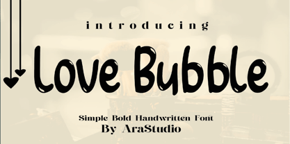 Love Bubble Font is a handwritten and modern font that combines a sweet touch and beautiful curves in every letter. using a touch of soft body curves so that it is pleasing to the eye Love Bubble Font is great for: Wedding invitations, Birthday invitations, fashion magazines, logos, signatures and is great for watermark photography.
 - Budrick BB by Blambot,
$8.00 Budrick BB is a slick, clean body copy font family that's just a bit rounded. It is available in four weights: Regular, Italic, Bold, and Bold Italic. (And those Italics have some slightly different letter forms than the plain versions!) To top it all off, Budrick BB has a hefty collection of European characters.

