8,228 search results
(0.022 seconds)
- Boscribe by Monotype,
$29.99Bo Berndal's handwriting was terrible in his younger days, and he could not even read his own notes. When he started out as an apprentice in a printing shop, he started to copy Garamond italic and formed his own style of writing. Later he was inspired by both Alfred Fairbanks and his reform-writing and by Paul Standard in the U.S.A and created the Boscribe font. - TT Severs by TypeType,
$29.00 TT Severs useful links: Specimen | Graphic presentation | Customization options TT Severs is a geometric grotesque with emphasized elements of internal brackets. A distinctive feature of TT Severs is the unusual form of internal ovals, which refers us to the style of traditional Arabic writing. TT Severs has a strong character and is great for use in high tech (IT), the web, in robotics, computer games, and sports. TT Severs is a 2-in-1 font family. In a large body size, it works great as a display font, creating a distinctive character for logos and headings. At the same time, when TT Severs is used in a small body size or in large text arrays, the font’s peculiarities of bracket construction fade, and it perfectly functions as a text font, thanks to both the low contrast between vertical and horizontal strokes and the detailed logic of interaction of black and white letter elements. The font family TT Severs includes 18 fonts, each of which consists of 558 glyphs. The family has standard and discrete ligatures, which include experimental ligatures for the Cyrillic alphabet. In addition, TT Severs can be made a little more humanist—it is enough to turn on stylistic alternates, and due to them the font takes the form of a humanist grotesque, which refers us to traditional broad nib writing. As part of the font family, you will also find old-style figures and a large number of OT features such as case, ordn, sups, sinf, dnom, numr, onum, tnum, pnum, liga, dlig, salt (ss01), frac.
 - ALS Scripticus by Art. Lebedev Studio,
$63.00 There are many script typefaces but there is only one Scripticus. Scripticus is like a chameleon: In whatever surroundings you put it, it adapts itself and looks like it couldn't be anywhere else. Be it a sales advertisement, a music Website, a comic strip or a journal with complex chemical formula – Scripticus always solves the problem in a natural and leisurely way. And it never makes compromises concerning clarity. But where does Scripticus come from? … From the good old high school blackboard! Blackboards have become almost obsolete in teaching, but be it a black or white background – clear, strong characters placed on the board while the facts are explained are still one of the best ways to make and keep things understandable. Scripticus is dedicated to my high school chemistry teacher who was an expert in just this. While the letterforms come from different inspirations, its aim is the same as the pedagogical aim of my teacher: Combining clarity with a strong personality. Scripticus has a special trick to give it its natural look: Four alternates for each letter and each number plus rotation coding make the glyphs appear in lively melodic flow. In this way even mathematic equations look nice! Scripticus has a lot of OT-features that help it do its job. They are: capital spacing, localized forms, subscript, scientific inferiors, superscript, numerators, denominators, fractions, ordinals, tabular figures, historical forms, ligatures, stylistic alternates, stylistic set and ornaments. Finally, as is my general goal in type design – Scripticus supports close to one hundred languages from Latin extended to Cyrillic extended.
 - Destroy by Meutuwah,
$12.00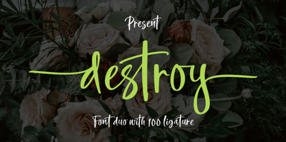 INTRODUCING Destroy Brush is handwritten font with a modern Brush feel. Destroy Brush is perfect for modern projects, headings, blogs, logos, brandings, web design, card, coffee shop, t-shirt, invitations and more! Programs that support in this font is a Microsoft Office Adobe Photo Shop, Adobe Illustrator, Adobe Indesign, and Corel Draw, badges etc. Thank You Font Lovers....!
 - Northell by Meutuwah,
$20.00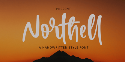 INTRODUCING Northell is handwritten font with a modern Brush feel. Northell is perfect for modern projects, headings, blogs, logos, brandings, web design, card, coffee shop, t-shirt, invitations and more! Programs that support in this font is a Microsoft Office Adobe Photo Shop, Adobe Illustrator, Adobe Indesign, and Corel Draw, badges etc. Thank You Font Lovers....!
 - Newton by ParaType,
$30.00 Based on Times New Roman of Monotype, 1932, by Stanley Morison and Victor Lardent, and other versions of Times. It has many characteristics of an Old Style serif faces; it was designed for better legibility in combination with good economy. Widely used in books and magazines, reports and office documents, and also for display and advertising.
 - Personnel JNL by Jeff Levine,
$29.00 The hand lettered title found on the 1938 sheet music for "I Haven't Changed a Thing" is a condensed Art Deco thick-and-thin sans serif with rounded corners. Reminiscent of office door and similar signage, this classic bit of lettering from the past is now available as Personnel JNL in both regular and oblique versions.
 - DF Staple Mono by Dutchfonts,
$33.00 DF Staple Mono is a personal answer on the archaic and ‘middle-of-the-road’-forms of typewriter typefaces like ‘Courier’ and ‘American Typewriter’. The form of a staple (office supply no. 1) and its transformations inspired me during the design process. The first four weights are all monospaced and are completed with a real italic.
 - Riga Screen by Ludwig Type,
$45.00 Riga Screen is designed to work particularly well on screen. Especially responsive websites or office applications will appreciate its economic proportions. Riga has been specially engineered and optimized for exceptional readability in small sizes on all current computer monitors, including tablets and smartphones. This small family of four weights is the perfect companion for the Riga type family.
 - Mountty by Meutuwah,
$20.00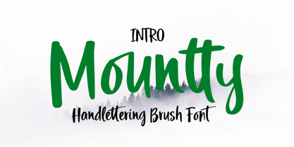 INTRODUCING Mountty is handwritten font with a modern Brush feel. Mountty is perfect for modern projects, headings, blogs, logos, brandings, web design, card, coffee shop, t-shirt, invitations and more! Programs that support in this font is a Microsoft Office Adobe Photo Shop, Adobe Illustrator, Adobe Indesign, and Corel Draw, badges etc. Thank You Font Lovers....!
 - Love Squall by Meutuwah,
$16.00 INTRODUCING Love Squall is handwritten font with a modern Brush feel. Love Squall is perfect for modern projects, headings, blogs, logos, brandings, web design, card, coffee shop, t-shirt, invitations and more! Programs that support in this font is a Microsoft Office Adobe Photo Shop, Adobe Illustrator, Adobe Indesign, and Corel Draw, badges etc. Thank You Font Lovers....!
 - FF Kaytek Sans by FontFont,
$50.99 Kaytek™ Sans is a fresh take on the correspondence typefaces of the 90s - which were originally designed for the demands of office environments. Just like its predecessors, this text typeface is robust and hard-working - meaning it works well in challenging design or printing environments - but it’s not without personality. Look closer at the lowercase g and a, especially in the italic, and you can see some unexpected elements of subversiveness within the design. This blend of sturdiness and quirkiness means it’s just as relevant for information-heavy projects, such as annual reports, as it is in more expressive environments. Although first and foremost designed for text, Kaytek Sans’ details shine through in its heavier weights and larger sizes, meaning it also has display potential. Every style of the typeface takes up exactly the same amount of space, thanks to the way Radek Łukasiewicz created the design. He based the entire typeface on a single, master set of proportions. This means designers can switch between styles without the text being reflowed, making it particularly useful in magazines, where space might be limited, and also on the internet, where hover links appear in a different style. As well as its roots in the office, Kaytek Sans draws on a little bit more 90s nostalgia. It’s named for the first and only Polish walkman, and embodies the same solid, no-nonsense shapes that made the analogue technology of the era so charming. Just like these early personal music devices, Kaytek Sans is practical, but not clinical, able to work hard while still exuding warmth and personality. It pairs effortlessly with Kaytek Slab, which is a sturdier and more expressive take on the design. Kaytek Sans comes in 12 weights, from Thin to Black Italic, and offers multi-language support. Kaytek Slab, Kaytek Headline and Kaytek Rounded are also available.
 - KG Lego House by Kimberly Geswein,
$5.00 Neat handwriting perfect for teachers. This font includes extra math symbols for teachers. Just enough personality while still being perfectly neat.
 - Muraba by NamelaType,
$19.00 Muraba Font is a one-of-a-kind, bold vintage serif display typeface, defined by its distinctively thick, squared-off serifs that offer decorative flair. This versatile typeface is ideal for various applications, including logos, headers, and display text
 - Microgramma by URW Type Foundry,
$35.00 Designed to Swiss principles by Alessandro Butti and Aldo Novarese for Nebiolo in 1952 as an improvement on the squared-off Bank Gothic capitals. The design was revisited by the same designers ten years later; Eurostile was the result.
 - Amazónica - Personal use only

- Blustella by Alfaraby Studio,
$18.00Blustella a fonts of stylish calligraphy that have a varied base line, fine lines, classic and elegant touches. Can be used for various purposes. Such as title, signature, logo, wedding invitation, t-shirt, letterhead, nameplate, label, news, poster, badge etc. Blustella displays stylish calligraphy alternate characters. Includes initial letters and terminals, alternatives, ligatures and multiple language support. The Features of this fonts is: * Standart ligatures * Stylistic Alternates * PUA Unicode (Private Use Areas) * Swash Programs that support in this font is a Adobe Photo Shop, Adobe Illustrator, Adobe Indesign, Corel Draw and Microsoft Office. OpenType features can be accessed by using OpenType smart programs such as Adobe Photo Shop, Adobe Illustrator, Adobe Indesign, Corel Draw and Microsoft Office. can also be accessed through the character map. Special greetings for all, all of us all smoothly in running the routin. Thank you for your purchase!. - Rufolo by Eurotypo,
$22.00 Rufolo is a family of fonts that can be considered both aesthetic and utilitarian. It has an apparent serif, barely hinted at, whose clear past reference is a beautiful epigraphic script on the marble plate placed at the southern entrance of the Roman amphitheatre, in Pompeii. Perhaps its origin dates back to Ugarit's cuneiform writing (as Morrison suggests as the origin of the serif in "Politics and Scripts") whose characteristic triangular-shaped incision footprint produces a powerful trait that not only gives character to the writing but also facilitates its support and visual compensation of sizes with neighboring signs. Other clear inspirational references have been Robert Hunter Middleton's Stellar (1929); Albertus (1932) by William A. Dwiggins; Optima (1952) by Hermann Zapf; And more recently RRollie (2016) by our foundry. Rufolo collects the attractive characteristic of the stroke endings but the proportions of its structure becomes much more regular, the capitals are in line with a constant square module, while the above references retain the proportions of the Roman Trajan. Some endings strokes have slightly baroque reminiscence with the intention of giving it greater plasticity and aesthetic enrichment, but absolutely controlled, taking special care of the aspects of readability and expressive neutrality. Rufolo Family comes in four weight: Light, Regular, Bold and Black, accompanied by its corresponding Italic versions.
 - Saskya by Dear Alison,
$29.00 While I was in Boston in 2014, I visited the Museum of Fine Arts and to my good fortune there was an exhibit of etchings by Rembrandt, one of my favorite artists. As to be expected, many were simply gorgeous, but one especially caught my eye. It was an etching of a priest (Jan Cornelis Sylvius, Preacher) with an extensive amount of writing in Latin. While I'm not certain that it was Rembrandt's own hand, the script was beautiful and I was fascinated by it because it had to be written on the etching plate in reverse. I snapped a few photos using my phone and later found other editions on line. I was so taken by the script that it begged me to create a modern typeface from it. The result is Saskya, named after Rembrandt's wife Saskia. There were many ligatures and glyph variants in the print, of which I captured many of them and made them accessible via OpenType features. The complete alphabet was not present in the sample, however, I discovered some other source material to sensitively fill in those gaps, with a remaining last few that I created myself. A truly romantic hand, Saskya will work well for invitations of many sorts, and when you're looking for that 'old thyme' scripty feeling in your graphics.
 - Be My Valentine by One Line Design,
$6.00 Spread a little love with the Be My Valentine display font. These capital letters are filled with love. 82 Glyphs. Letters A-Z, Numbers 0-9, Punctuation!?.’ In both Black & transparent (white) and black with colored heart. A-Z glyphs with colored heart are in lower case, check compatibility for colored fonts.
 - TXT Tough Love by Illustration Ink,
$3.00Add character to your paper crafts and publications. Download this cool Tough Love font to create lettering with a scratched or brush-stroke look. Design titles, captions, journaling and more, or simply give your publication an off-beat, handwritten appeal. - Woebegone by Hanoded,
$10.00 Woebegone is a cute little handmade font. I started off by drawing the glyphs with a Pilot pen, then added some strokes with a Japanese brush pen. Woebegone comes in Regular and Italic and has all the accents you need.
 - Aeron by District,
$15.00 Aeron started with a no-nonsense geometric sans-serif structure that grew into a functional semi-serif family of fonts. Half-rounded slabs mix with curvy and squared-off terminals for a personable yet structured family that works in all sizes.
 - TXT Scribbletti by Illustration Ink,
$3.00Add character to your paper crafts. Download this unique "Scribbletti" font to create lettering with a scratchy, handwritten look. Design titles, captions, and journaling for scrapbook pages and greeting cards, or simply give your publication an off-beat, handwritten appeal. - Bruce 1065 Soft Serifs by Intellecta Design,
$19.90Bruce 1065 is a beautiful victorian font by Chyrllene K, with two styles, a free interpretation off the "1065 font style" of the 1882 George Bruce's New York typefoundry extra-rare catalogue, from Intellecta’s collection of rare books and catalogues. - Cut Block by Adam Ladd,
$20.00 A hand-drawn typeface that depicts the idea of cutting away pieces of wood. It has a rough, yet modern appearance as it is largely based off the popular Gill Sans (with some modifications). Leaving a graphic and textured look.
 - Sock Hop JNL by Jeff Levine,
$29.00Back in the 1950s and 1960s a popular event was the sock hop - when kids would meet in the school gymnasium, kick off their shoes and dance to the popular records of the day. Sock Hop JNL recalls those simpler times. - Monster Mash by Comicraft,
$19.00 While working on our Macs late at night, Our Eyes beheld an Eerie Type: It's called The Mash! It's called MONSTER MASH!
 - MarkerMoe by JOEBOB graphics,
$- What happens when you write small characters with a huge marker? The answer is MarkerMoe; very irregular handwriting that's only just readable.
 - Alt Robotechnica by ALT,
$20.00 Robotechnica is my first ever pixel font, I was experimenting with pixel fonts for a while and I’m happy with the result.
 - DB Journal Doodles by Illustration Ink,
$3.00DoodleBat Journal Doodles includes several boxes perfect for writing down a secret journals entry or scribbling down a favorite quote or idea. - Aquiline by GroupType,
$24.95 Handsome, adventurous, legible and elegant, this script has the feel of practical handwriting from past centuries. Aquiline is based on a cursive italic style influenced by the 16th century European writing masters. The Aquiline design team turned to Ludovico degli Arrighi, the great 16th century writing master, for period ideas on how to improve, strengthen and add grace to the font. Aquiline has strokes and gestures that seem very like the writing of Arrighi and Mercator, such as the flamboyant balloon of a flourish on the cap A; the graceful flourishes on the cap B, D, and L; and the compact lowercase with tall ascenders. Aquiline has a strong personality and is historically correct.
 - Austera Text by Corradine Fonts,
$30.00 Austera Text is a clean and structural humanist font face whose purpose is to be clear while don't interferes with the message concept. Austera Text is a contemporary serif with moderate contrast, sharp shapes, fairly large x-height and moderate aperture with the aim to make it very legible in continuous text. The italic version has a unique appearance with its pronounced angle mixed whit its elongate beginning and ending strokes. Although Austera Text was created to be used in continuous text, it also could be applied to many other uses obtaining nice results, from editorial and corporate design to advertising, packaging and digital design. Austera Text has OpenType features such Old Style figures, standard and discretionary ligatures, ordinals and fractions. Composed of more than 500 glyphs, Austera Text supports Western European, Central/Eastern European, Baltic, Turkish and Romanian Languages.
 - Linotype Scrap by Linotype,
$29.00Linotype Scrap is part of the Take Type Library, chosen from the entries of the Linotype-sponsored International Digital Type Design Contests of 1994 and 1997. The font is available in two weights and was designed by German artist Ingo Preuss. It is as though the forms of the basic weight were cut with scissors out of pieces of paper. There are no inner contours, only the outer silhouettes. The capital letters which make up Scrap Bonus are set on black rectangular backgrounds and are white and framed with a white contour. This weight includes a number of different pictograms which were also not spared the scissors. The decorative Linotype Scrap embodies the comic style of the 1990s and is meant exclusively for headlines of points sizes 18 and larger. - 1512 Initials by GLC,
$20.00 This set of initial decorated letters is an entirely original creation, drawn inspired by Italian renaissance patterns. It contains two roman alphabets : one drawn in white on black background and the other in black on white. We have included a few fleurons and decorative elements. It can be used as variously as web-site titles, posters and flyers design, publishing texts looking like ancient ones, or greeting cards, all various sorts of presentations, as a very decorative, elegant and luxurious additional font... This font supports strong enlargements remaining very smart and fine. It's prefered height is about one inch equivalent to about four lines of characters. This font may be used with all blackletter fonts, but works especially well with 1543 Humane Jenson, 1557 Italique and 1742 Civilite, without any anachronism.
 - Heavenly Bodies by Aah Yes,
$0.25 All 6 fonts use the characters A - K and a - k to show two planets/stars/moons moving across each other. Nice and simple. There's a different number of points on the stars, or they're different sizes, and some appear to pass left-to-right, and some appear to pass the other way. Just type in ABCDEFGHIJK or abcdefghijk and you'll see. Two fonts have all the characters on the same level, (All-Black and Black+White). The Offset font has the 'sun/moon' with one slightly above the other and in black and white, and Half has them all-black. Partial has them even further separated in 2-tone. NearMiss is a very close shave. Comma, hyphen, and full stop/period give just a single symbol; there's a Space, and that's it.
 - Yink by Eclectotype,
$40.00 Yink takes big, bulbous, ball terminals up a notch, by repeating the shapes not only in the black but in the white space too. This interplay between black and white shapes is reminiscent of the yinyang symbol in places, which is where the name Yink originates. It's a shamelessly over-the-top font, and should be set large. There's a handful of OpenType features, including ligatures and alternates: Ligatures for ff, fft, ft, tt, gj Alternates are grouped into stylistic sets: 1. An alternate u, possibly more legible, but definitely not as much fun! 2. Again, a more boring version of m, just in case the default is ambiguous. 3. A more exuberant L 4. A blackletter informed T 5. Alternate P and R 6. An alternate 1 (one)
 - Magical Tours by IKIIKOWRK,
$17.00 Proudly Present Magical Tours - Psychedelic Type, created by ikiiko. Magical Tours is a stunning typeface with the retro appeal and allure of a psychedelic design. This distinctive bottom thickness typeface takes you on a fantastic journey through time while still maintaining a timeless aesthetic. Magical Tours, inspired by the writing styles of the 60s, where the psychedelic trend perfectly encapsulated the restless essence of youth at the time. This font has a distinct personality due to its inventive mix of vintage components and psychedelic influences, making it ideal for evoking the romance of the past. This typeface is perfect for an vintage stuff, retro poster layout, fashion ads, book cover, packaging, food & beverages and also good for quotes, or simply as a stylish text overlay to any background image. What's included? Uppercase & Lowercase Number & Punctuation Multilingual Support Works on PC & Mac Enjoy our font and if you have any questions.
 - Costanera by W Type Foundry,
$29.00 Costanera is a neohumanist typeface with both soft strokes and endings, which is inspired by 90s typefaces. It has an organic aspect and curved finials associated to the early calligraphy, while its straight angles give Costanera a technological and futuristic impression. Costanera weights go from thin to black, thus it can be used in short-impact phrases ideally using Black or Thin weight and extensive texts selecting the Book version. On the other hand, due to its calligraphic-futuristic features Costanera is perfectly suitable for different fields, such as vanguard technology, architecture, and signage topics. This typeface is composed of a Normal and Alternative version, adding 32 weights in total. Stylistic sets, small caps, ligatures, lining and old style numbers, fractions, circle numbers and arrows are part of the Opentype features. Moreover, this project comes with 790 glyphs that allows to write in 219 languages.
 - Olymp80 by Konst.ru,
$10.00 Dedicated to the XXII summer Olympic Games. I was inspired by the icons of these games when creating font Olymp80. This is an excerpt from the official report of the Moscow Olympics: "Sports pictographs, as we know, are pictographic drawings symbolising sports. They serve as points of reference and help overcome language barrier. Over the past few years, they have been integrated into the decoration of Olympic cities, and have been depicted in Olympic posters, commemorative medals, postage stamps, tickets, souvenirs, etc. On the OCOG-80’s request, graduates from several art colleges took up the design of the pictographs of the insignia as the theme of their dissertations. With the help of the research institute of industrial aesthetics, the Organising Committee chose the work submitted by Nikolai Belkov, Mukhina Art School graduate from Leningrad. The State Committee for Inventions and Discoveries under the USSR Council of Ministers recognised the new design as a production pattern. Though highly stylised, the new signs are easily comprehensible. They are smoother in outline because they are constructed at an angle of 30-60 (previously the angle was 45-90). Another merit of the new system is that the designs can be adapted for use in four representations: direct (solid, black against a white background), reverse (solid, white against a black background), contour (black contour against a white background), and reverse-contour (white contour against a black background), and permit several colour and shade and size variations." All text and pictures you may see on 1980 Moscow, Volume 2, Part 2, Page 420. Monospaced font for names, logotypes, titles, headers, topics etc. Font includes only uppercase letters with two alternative designs for each letter.
