10,000 search results
(0.038 seconds)
- Linotype Astrolo by Linotype,
$29.99Born in Fulda, Germany, Martina Theisen studied communications design in Mainz. She spent many years working for the television company, SWR Mainz. Now she works as a designer and illustrator. She creates fonts, as well as illustrates children's books and school textbooks. For Linotype Typentypo (2002, part of TakeType 4), she designed the display faces Linotype Creatures, Linotype Improfil Outline and Black (profiles of funny faces), Linotype Smileface, Linotype Maenneken and Linotype Astrolo (hand-drawn astrological symbols). - Big Clyde by Galapagos,
$39.00In designing an advertising poster to show off the unconventional Safefont typeface, Steve drew what appeared as relatively traditional letterforms for the expository text. When these characters were as well received as the typeface which was the subject of the poster, Steve decided to expand them into a full-fledged graffiti style typeface of their own. While exploring where this new design might lead, Steve worked to elaborate the poster segment which had inspired it. He soon found himself staring at a drawing of a weapons-wielding Bonnie and Clyde. The desperate duo resonated with the graphic elements of the drawn letters; thus leading to the effortless fleshing out of the design, and to its name, Big Clyde. - Bullets by Wiescher Design,
$6.00 BulletNumbers come in very handy for all kinds of lists that don't exceed 100 categories. I have long since been using my own Bullets in positive and negative and four styles, serif, sans, engravers and script, a fitting one for every occasion. Now I added six more designs and perfected the Bullets for all of you. The following is a »must read«! Here is how to use them: (Important! Set letterspacing to '0', otherwise the two digit numbers will have gaps!!!) The numbers 1-0 reside on the standard keys. Two digit numbers 01-99 can be composed out of left and right half circles by using (lowercase) 'abcdefghij' for the first digit (left half circle) and 'lmnopqrstu' for the second digit (right half circle). The critical pairs (all combinations with 1) can be found in various places. Type '!' for 10, '#' for 11, '$' 12, '%' for 13, '&' for 14, '(' for 15, ')' for 16, '*' for 17, '+' for 18, ',' for 19, '-' for 21, '.' for 31, '/' for 41, ':' for 51, ';' for 61, '?' for 81, '_' for 91. The two arrows are on the < and > keys. '100' can be found with shift+option+1. Last but not least, the capital letter bullets A-Z can be found on the shift+letter A-Z. Your very practical Gert Wiescher
 - Channel Tuning JL - Unknown license

- URW Akropolis by URW Type Foundry,
$39.99 The design of this display face is based on the hot metal typeface Acropolis, issued by the German type foundry Ludwig Wagner in Leipzig in 1940. To further increase its usefulness a Cyrillic was added to it: URW Akropolis, redrawn and digitally remastered by Coen Hofmann for the URW Font Forum, is a true display design that should not be set below 48 point if you want to preserve it's fine details like the open triangular sections, e.g. in L, G, S, T etc. and gain the full typographic splendidness of this beautiful typeface.
 - NAKED - Personal use only

- Trumania EEN - 100% free

- LGF Besitos Square by LGF Fonts,
$18.00 BESITOS is a deconstruction INSPIRED on a sans serif type, in which the weights of the source did not mark the width of the letter but the lines that compose it is made in two variants according to their lines end up at right angles or curves.
 - LGF Besitos Round by LGF Fonts,
$18.00BESITOS is a deconstruction INSPIRED on a sans serif type, in which the weights of the source did not mark the width of the letter but the lines that compose it is made in two variants according to their lines end up at right angles or curves. - Raw by Device,
$29.00 Raw was designed in 2006 for Shelter, the UK homeless charity. It was originally called “Cathy”, after the film “Cathy Come Home”, which was instrumental in inspiring the founding of the charity. Now reworked with more “inkiness”, it is released as part of the Device range.
 - Chocolate Bar JNL by Jeff Levine,
$29.00 Chocolate Bar JNL emulates hand-lettering on the sheet music for a song selection called "Shoe Shine Boy" from Connie's Hot Chocolates of 1936 (an all-black musical revue). The lettering was not found in the song's title, but rather in the name of the show itself.
 - Killer Garbage by PizzaDude.dk,
$19.00 Killer Garbage is a grunge version of my Spitzenklasse font. It's worn and torn real bad - but not more than the font is still legible even at very small sizes. I don't fancy grunge fonts that only has one or two versions of each letter available. The text usually gets very static and predictable, because the same letters are repeated again and again. That's why I have included 6 different versions of each letter in this font! And the great thing about this is that the letters automatically cycles as you type! Forget everything about repeating the same letters all the time!!!
 - Spekulatus by Bogstav,
$18.00 Spekulatus is a made up name, and that was what I needed for a font like this. I am not sure which category it fits in: grunge, square, handmade, rough or maybe even graffiti? Well, let's just say that it fits in all 5 - or perhaps even more? All letters are handdrawn, and messed up a bit with a thin fine white liner, leaving a gentle grungy and worn effect. I've added 5 different versions of each letter, which is quite nice - not having the same letters repeating all the time!
 - Alt Vxt11 by ALT,
$- Vxtr11 is a experimental typeface for use on logos and titles this typeface is not for text! see the presentation here http://www.behance.net/gallery/Vxtr11-Experimental-Typeface/818127
 - Steno Pro by DBSV,
$10.00 About family “StenoPro” Short for stenography… The name of the font was taken from the method of high-speed writing (shorthand) with a special alphabet. In shorthand, the rule "write as you hear" applies, that is, spelling is not observed. Capitalization, accents, ghosts, and punctuation except the semicolon are removed. In narrow letters you have the advantage of more words in a limited space… This series is composed and includes dozen fonts with 633 glyphs each, with true italics, and supports of course: Latin, Greek & Cyrillic.
 - Kantor by T4 Foundry,
$21.00Kantor's modular stroke and humanist axis defines it as an old-style 15th century Venetian serif typeface. At the same time, the lowercase Kantor alphabet is relatively compressed and has the vertical stems of a textura blackletter. However, Kantor has distinct, penformed shapes and has also kept all the organic irregularities of traditional handwriting (or punch-cutting, as it were). Kantor is not happy, not sad - but calm and dignified. Perfect for buddhist poems, fantasy video games and antique scrolls to give that "long time ago"-feeling. - Alisal by Monotype,
$29.99 Matthew Carter has been refining his design for Alisal for so long, he says, that when he was asked to complete the design for the Monotype Library, it was almost as if he were doing a historical revival of his own typeface. The illusion even extended to changes in his work process: although he now does all his preliminary and final drawing on screen, the first trial renderings of Alisal were done as pencil renderings. Alisal is best classified as an Italian old style design. Originally created between the late 15th and mid-16th centuries in northern Italy, the true Italian old styles were some of the first roman types. They tend to be the most calligraphic of serifed faces, with the axis of their curved strokes inclined to the left, as if drawn with a flat-tipped pen or brush. These designs offer sturdy, free-flowing and heavily bracketed serifs, short descenders, and a modest contrast in stroke weight. Alisal has nearly all the classic Italian old style character traits, plus a few quirks of its own. It is calligraphic in nature, with more of a pen-drawn quality than faces like Palatino or Goudy Old Style. It is more rough-hewn than either Goudy's Kennerley or Benton's Cloister, and is generally heavier in weight than most of the other Italian old style designs. One place where Alisal makes a clean break with traditional old style designs is in the serifs. While sturdy and clearly reflecting pen-drawn strokes, Alisal's serifs have no bracketing and appear to be straight strokes crossing the main vertical. Like Caslon or Trajanus, Alisal is a handsome design when viewed as a block of copy. Ascenders are tall and elegant, and serve as a counterpoint to the robust strength of the rest of the design. Alisal is available as a small family of roman and bold with a complementary italic for the basic roman weight, providing all that is needed for the majority of text typography. Alisal is not as well-known as some of Carter's other typefaces, but this lovely and long-incubated design was certainly worth the wait.
 - ITC Puamana by ITC,
$29.99From the fluid brushstrokes of Teri Kahan's lettering comes a tropical treasure: ITC Puamana, graceful as a palm tree in the ocean breeze. “Puamana” is a Hawaiian word with several meanings; among them are “the blossoming of miraculous power” and “sea breeze.” ITC Puamana captures the essence of the tropics, suggesting the sway of palm trees in the ocean air. With its ragged edges and italic slant, this brush-written alphabet has a unique visual texture that graces the page with spirited movement. Sketched on the beach in Maui by west coast designer Teri Kahan, ITC Puamana first saw life as apparel art for a Hawaiian clothing company. Now this versatile typeface is a complete alphabet that's useful for both text and titles. ITC Puamana can be put to use in everything from book jackets to in-store signage. - Magnetic Script by Mysterylab,
$14.00 Introducing Magnetic Script, a bold stylized font family that is not only eye-catching and assertive, but highly legible at both display and text sizes. The heart of this font's usefulness is the three-layer setup that allows you to quickly copy a text block twice, then reassign the main layer, the extruded shadow underlayer, and the top highlight layer to three different colors. Magnetic Script is massively versatile, and appropriate for many uses including university / collegiate logos, sports team logos, graphics for motorcycle clubs, automotive rallies, microbrewery labels, and vintage & retro styles of all kinds. It's the ultimate branding and logo design font suite.
 - Berndal by Linotype,
$29.99Bo Berndal, the master Swedish typographer, is the eponymous designer of Berndal, a contemporary text family with five different styles. This family represents a new achievement for Bo Berndal, who has spent many years working to optimize text legibility in the printed media. Several small tricks make the Berndal family an interesting milestone in legibility. Berndal's letterforms contain large x-heights. Large x-heights open up the counterforms of letters, making text appear lighter on a page, but their correspondingly shorter ascenders and descenders can hinder legibility. This does not occur in Berndal at all! Coupled with this experiment, Berndal's various font weights display a certain softness and roundness. The letterforms themselves are relatively wide, with an overall consistency in width. The calligraphic nature of the strokes has been minimized, yet a contrast stroke-thickness is still to be noticed within the alphabet. Berndal's five styles offer almost everything that one could want from a good text family. The Regular weight may be paired with Small Caps, Italic, Bold, and Bold Italic. All styles ship in the OpenType format, and include tabular and old style figures. The two italic weights are made up of true italics, not obliques. The Berndal family is a part of the Take Type 5 collection from Linotype GmbH." - Speedometer by Dharma Type,
$19.99 Speedometer is derived from Dimensions font family that is most narrow and black font for titling and logo. This Speedometer is more elegant by its contrast between the thickness of stem and thinness of the arms than Dimensions. This contrast makes more vigorous and speedy impressions too. All 6 weights and italics have upper and lower cases, accented characters and small capital glyphs that can be used with OpenType smcp feature.
 - Amateur Stencil JNL by Jeff Levine,
$29.00With all of the stencil fonts created by Jeff Levine from various vintage sources, you would think everything had already been covered. Not so. Along comes Amateur Stencil JNL. Modeled from a child's stencil set from the late 1950's or early 1960's, it vaguely resembles Futura, but its irregular widths and semi-stencil appearance sets it off greatly from that classic typeface. - Goolage by Beary,
$15.00 Introducing Goolage: A Modern Serif Font for Elegance! Goolage is our latest font creation, blending the aesthetics of modern serif with an unmatched touch of elegance. Goolage is the top choice to elevate the look of your designs with a touch of elegant modern serif. Start using Goolage in your projects and let this font bring a unique and beautiful aesthetic to your work. Get Goolage now and witness how your designs become extraordinary!
 - Epoque Seria by Rafaeiro Typeiro,
$24.00 Époque Seria is that kind of person who looks really cute when angry. This font was derived from the Époque family. She is the little sister to Époque - a little shorter with her smaller x-height and — how do you say it in the typographic circle — your eyes are also smaller (and you know you squint when things get serious, isn't it?). The genealogy of these font face is undeniable, but Époque Seria has a ‘personality’ very different from her older sister. The reduction of the x-height also shakes somewhat with the cap that had crossbar. To accompany the package of standardization, the letters that don't have their straight axes were changed, which brought to the set more Cs and Gs contemporaries. In addition, other measures were taken as a greater softness in the variation of the weights and the abandonment of the black weight, being considered too heavy for this version.
 - ArTarumianBehrensInitialen by Tarumian,
$100.00 Behrens Initialen is based on the type graphics of the German architect and type designer Peter Behrens (1868-1940). The drawing of the original typeface is in tune with the Art Nouveau (Jugendstil) style in which Behrens worked. This is a light, delicate, somewhat theatrical typeface, the forms of which bear at the same time a certain shade of Gothic and modernity, and can be used, in particular, when there is a need to make a reference to medieval graphics while maintaining the modern style of composition. In the proposed version, the original initial graphics are used not only for uppercase letters, but also for Arabic figures, while for lowercase letters and for the base of other characters are used the letters themselves - without decorative framing. This feature can be useful for obtaining various effects when using both lower and upper cases in parallel, including when they are overlaid. The font includes the Latin, Cyrillic and Armenian ranges. Created by Ruben Tarumian in 2020.
 - Ongunkan Wakanda Runic by Runic World Tamgacı,
$50.00 Wakandan is an alphabet designed by Hannah Beachler, and used in the 2018 film Black Panther. It is based on Nsibidi symbols. In the film it is used to transliterate English text in the credits and other on-screen text. Another script used in the film was developed by Oluwaseun Osewa and inspired by Nsibidi, a system of symbols used in southeastern Nigeria between about 400 and 1400 AD. In addition, the symbols of several different ancient languages were also used for the alphabet. Like Old North Arabia, Old Tifinagh. I did not draw for this font, except for a few letters. I transferred the sound values from the ancient writing languages fonts that I had made before to the Wakanda font, so I did not take much time, I finished it in 4-5 hours.
 - Everything Preserved by Graphicxell,
$19.00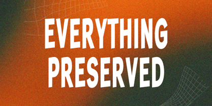 Everything Preserved Sans Font Typeface inspired by the famous minimalist logo perfect for the purposes of designing templates, brochures, videos, advertising branding, logos, invitation, layout design, elegant crafting, beauty design and other What's Included : + otf/ttf file + Standard glyphs + International Accent + Works on PC & Mac + Simple installations Accessible in the Adobe Illustrator, Adobe Photoshop, Corel Draw. PUA Encoded Characters - Fully accessible without additional design software. Fonts include multilingual support Image used : All photographs/pictures/vector used in the preview are not included, they are intended for illustration purpose only. Thank You
 - Westack by Almarkha Type,
$35.00 Introducing Westack – Modern Display Serif inspired by the famous minimalist logo, perfect for the purposes of designing templates, brochures, videos, advertising branding, logos and more. What’s Included : Westack (OTF/TTF) Standard glyphs Ligatures Web Font International Accent Works on PC & Mac Simple installations Accessible in the Adobe Illustrator, Adobe Photoshop, Adobe InDesign, even work on Microsoft Word. PUA Encoded Characters – Fully accessible without additional design software. Fonts include multilingual support +Image used : All photographs/pictures/vector used in the preview are not included, they are intended for illustration purpose only. Cheers! Thank You
 - GFWet - Unknown license

- GFWaterproof - Unknown license

- Handmade Nouveau JNL by Jeff Levine,
$29.00 An example of Art Nouveau lettering (complete with its unusual characters and varying shape widths) was found in a sample from the vintage publication "Modeles de Lettres Artistiques" ("Models of Artistic Letters"). This classic design is now available digitally as Handmade Nouveau JNL, in both regular and oblique versions.
 - Clamshell by Jafar07,
$20.00 Clamshell Modern Caligraphy Script font is a harmonious blend of elegance and contemporary flair, seamlessly adaptable to modern and classic design landscapes. It effortlessly radiates timeless elegance and is tailored to meet the needs of professionals seeking designs that are both sophisticated and versatile. Easy to use yet rich in detail, this font is the ideal choice for designers who value both beauty and functionality in their work. Explore this font collection now and infuse your designs with the captivating essence of calligraphy.
 - Costumed Hero JNL by Jeff Levine,
$29.00 Comic books are filled with pages full of the daring adventures of crime fighters with colorful costumes, amazing abilities and wondrous powers. They have enthralled kids of all ages since the 1930s. Costumed Hero JNL emulates both the hand lettered cover titles of those vintage comics as well as the title credits from a 1960s television show based on one of these characters. With its non-conforming letter shapes and varying widths, the lighthearted look of classic comic title art can be yours. The font is available in both regular and oblique versions.
 - Somehand by PintassilgoPrints,
$24.00 Handsome in its own way, More versatile than one could say. Four alternates to each letter, Because in this family Spontaneity do matter. (And just in case someone wonders, Yes, there are alternates for numbers!) Seven cuts the family holds. Six of them Are for saying with words. And the very last, (Before someone asks) Holds some very cool dingbats. Books, apps, mags, To just name a few, Now go with Somehand And try something new :)
 - ITC Kristen by ITC,
$29.99ITC Kristen is the work of American designer George Ryan. He describes it as not your average text or display font." The inspiration for the design came from the handwritten menu at a neighborhood restaurant. With time, the forms moved away from the originals and towards something more like a child's scrawl. The result is singularly unique. ITC Kristen remains legible without losing any charm. - FS Truman by Fontsmith,
$80.00 Beyond broadcast Like Truman Burbank, the star of The Truman Show, FS Truman was born for TV. You’ll know it from Sky One’s on-screen trails and announcements, but it’s just as at home in other media. Its starting point was the skeleton of a highly legible, space-saving, corporate font with some of FS Dillon’s geometric discipline built in. Its distinctive tone of voice and “ownability” are in its boxy but friendly shapes, and characters with hybrid features. FS Truman’s weights and widths were honed to work at TV screen resolutions. A face for TV it may have been, but this is a font that works on every level, on screen, in print, in headlines, in listings, in longer text, in tight corners and open spaces. The space-saver Compact, condensed but crystal clear, FS Truman comes into its own where a lot needs to be said in not a lot of space. Its letter spacing allows the type room to breathe, even at small sizes, while its fulsome x-height and diminutive descenders pave the way for tighter leading. A natural for headlines and titles over three or four lines. “Hybrid” features With every font, Fontsmith look for crafty new ways to imbue letterforms with a consistent character. The idea with FS Truman was to introduce “hybrid” features. In open letters such as “c” and “s”, for example, the top terminals have straight, vertical cuts while their lower terminals have a more angular, cursive finish. Boxy, spacious forms with unusual curves and angles create not just highly legible and efficient letters but strongly distinctive ones, too.
 - 1546 Poliphile by GLC,
$38.00 This family was inspired from the French edition of Hypnerotomachie de Poliphile ("The Strife of Love in a Dream") attributed to Francesco Colonna, 1467 printed in 1546 in Paris by Jacques Kerver. He was using a Garamond set (look at our 1592 GLC Garamond), including two styles: Normal and Italic (Normal carved by Claude Garamond, Italic we don't know; it was an Italic pattern very often in use in Paris at that time). We have modified the slant angle of the Capitals used with Italics because the Normal capitals were used in both styles in the original. The present font includes all of the specific latin abbreviations and ligatures used in this edition (with a few differences between the two styles). Added are the accented characters and a few others not in use in this early period of printing. Decorated letters such as 1512 Initials, 1550 Arabesques, 1565 Venetian, or 1584 Rinceau can be used with this family without anachronism.
 - Fer by ParaType,
$30.00 Fer is a sans-serif font for body text, not lacking in its own distinctive voice. The aftertaste of reading the text set in Fer is like reading the letters on old rusty plates somewhere in Southern Europe, hence the name (Fer means iron in French). Being a modern system that includes a variable font with weight and optical size axes, Fer combines the features of geometriс sans serifs and old sans serifs with closed apertures. The typeface contains three sets of styles: for captions, text and headings, — with the weight ranging from regular to black. Fer was created with the idea to unite nations. The Latin character set supports all European languages, most African languages and Vietnamese. Cyrillic has support for all living Cyrillic languages and some obsolete characters too. The font also supports the Greek language. Additionally, the character set includes currency signs of all supported languages’ countries, old style, lining, tabular and proportional figures as well as numbers in squares and circles. Lastly, the font has lots of localized letterforms and stylistic sets. Fer was designed by Dmitry Goloub for Paratype in 2020–2023.
 - Libertat by Elyas Beria,
$9.00 In a not-too-distant future, humanity was ruled by a powerful, technologically advanced empire known as the Synod. The Synod controlled all forms of communication, and through this, they controlled the minds of the people. But a small group of rebels, known as the Resistance, had managed to evade the Synod's surveillance and formed a secret underground movement. They were determined to overthrow the Synod and restore freedom to the people. One of the Resistance's key members was a young artist named Trystån. He had a unique talent for creating powerful, visually striking posters that captured the spirit of the Resistance's message and spread it to the masses. Trystån had just completed a new poster, one that would be critical to the Resistance's plans. It depicted a single, outstretched hand holding a traditional Kimarii laser staff, with the words "Libertat!" emblazoned across the top. The poster featured a striking and powerful font that perfectly captured the spirit of the Resistance's message. The font was a combination of bold lines, elegant confident curves, and strong angles, giving it a sense of strength and determination. The lettering was large and prominent, filling up much of the poster, making it hard to miss. The letters seemed to be almost carved into the surface, giving the impression of something that was permanent and unshakable. The font was colored in dark shades, and was a sans serif typeface, that gives the message a very modern and current feel yet also feels vintage and retro, connecting the present with the struggles of the past. And with multilingual support, the typeface ensured that the message of the Resistance could be disseminated in every language on the planet. The background was minimalistic and in contrast, with a neutral palette, with just a hint of a sand-like color, representing the harsh conditions of the land that the people were fighting for their rights. The focus was all on the lettering, and how it conveyed the message. The poster was indeed a moving piece of graphic design, with its strong, striking font, and powerful imagery. It was clear that Trystån had put a lot of thought and care into its design. The poster, he hoped, would connect with people on an emotional level and inspire them to rise up against the oppression of the Synod Empire. The poster was set to be distributed at a major rally in the capital, where the Resistance was hoping to gain the support of thousands of citizens. But the Synod was not about to let this happen. They had long suspected the existence of the Resistance and had been working to infiltrate their ranks and discover their plans. The night before the rally, the Synod launched a surprise raid on the Resistance's hideout, capturing Trystån and several other members of the Resistance. Trystån was thrown into sand pits and interrogated by the Synod's top agents. They wanted to know everything about the Resistance's plans, including the details of the poster and the rally. Trystån, knowing the importance of the poster, refused to give in, even under the harshest of conditions. Meanwhile, the rally was drawing near, and the Resistance was desperate to get the poster out to the public. They knew that it was their only hope of gaining the support they needed to overthrow the Synod. They came up with a plan to smuggle the poster out of the hideout, but it would be a risky endeavor. As the rally began, the Resistance made their move, slipping the poster into the hands of the crowd. Trystån's poster had made a big impact in the rallies, and soon it became the symbol of hope for the resistance, and the visual representation of their struggle for freedom. The poster had become the catalyst for the revolution, and it would be remembered for many years to come as the symbol of the fight for freedom and democracy. The image of the outstretched hand holding the Kimarii laser staff struck a chord with the people, and they began to rise up against the Synod's oppression. Trystån, still locked away in the sand pits behind a stasis feild, could only imagine the scene unfolding outside. But he knew that his work had helped to spark a revolution, and he felt a sense of pride and accomplishment. The Resistance, with the help of the rally, was able to overthrow the empire, and Trystån was released, celebrated as a hero and hailed as the artist who helped to bring about the new era of freedom and democracy. The poster Trystån had designed had become the symbol of a new era, and it would hang in museums and public places as a reminder of the power of resistance and art, in the face of oppression. Features: regular and light weights numbers and punctuation multilingual characters
 - Sennetarium JNL by Jeff Levine,
$29.00Jeff Levine first designed Sennetarium JNL back in 2004; based on the large drop caps found on intertitle cards from an old Charlie Chaplin film. The font’s name is a nod to Mack Sennett, king of the screwball comedies of the silent film era.


