10,000 search results
(0.03 seconds)
- Neospace Exp - Personal use only

- Calligraphic Afera Beauty by Caron twice,
$39.00 Calligraphic Afera is beautiful. This is a strong, high-contrast typeface with a dynamic disposition based on drawing with a cut nib, i.e. traditional typography. It exhibits its specific disposition in the details of each character. The font is a suitable tool for headlines on a website, blog, magazine, or poster. It also works well for package design. This calligraphic style is an elegant tool for headings communication. Specimen: http://carontwice.com/files/specimen_Calligraphic_Afera_Beauty.pdf
 - Happy Reader by JBFoundry,
$1.00 Happy Reader is a font family conceived to make reading easier for dyslexic children. Recent studies show that a wide spacing of the letters favors speed and understanding of the children with difficulties. Happy Reader proposes a handwritten writing with connected characters in three different spacings. NB: if letters are not connected, it is necessary to activate Contextual Alternates.
 - Daub by Greater Albion Typefounders,
$8.95 Daub captures the look of old-style graffiti—it's graffiti from the days when vandals used a brush and a pot of white paint. Not an airbrush or aerosol in sight. Use Daub to give headings and posters that rough, hand brushed look. Add real grit and vigor to your work, with that old-style urban hard edge.
 - Times Europa Office by Linotype,
$50.99The Times Europa Office family is designed after the model of the original serif family produced by Walter Tracy and the Linotype Design Studio in 1974. A redesign of the classic Times New Roman typeface, Times Europa was created as its replacement for The Times of London newspaper. In contrast to Times New Roman, Times Europa has sturdier characters and more open counter spaces, which help maintain readability in rougher printing conditions. Times Europa drastically improved on the legibility of the bold and italic styles of Times New Roman. Overall, text set in Times Europa is easier to read, and quicker to digest. Akira Kobayashi, Linotype’s Type Director, brought Times Europa up to speed for the new millennium in 2006. Now optimized for office communication instead of newspaper design, Times Europa Office offers a familiar yet refreshingly new appearance for serif text. Because of The Times of London’s specific printing conditions in the early 1970s, Times Europa originally had some intentional errors built into its letterform design. These inconsistencies created an even image in newspaper text in the long run. However, these design elements bear no role on modern office communication and its needs. Kobayashi redrew these problem forms, eliminating them completely. Now Times Europa’s font weights appear clearer and easier to read than ever before. - Thystle by Scholtz Fonts,
$25.00 Thystle is a "font for all seasons". It has six styles ranging from fine to in-your-face, from delicate mono-weight pen strokes to fully calligraphic lines, from delicate, narrow characters to bold, powerful statements. Characteristically, all the styles abound with Anton Scholtz's energetic "creative common" style - extravagant capitals, clear characters, and bursting-with-life swashes. Three Thystle styles are calligraphic. You can use: - Regular for invitations, poems, greeting cards and body text - Black for swing tags, music media, menus and sub-headings - Fat for posters, book covers and headings Three Thystle styles are monolinear. You can use: - Mono1, which is both delicate and condensed in width, for invitations, poems, greeting cards and body text - Mono2, which is of medium weight and condensed in width, for swing tags, music media, menus and sub-headings - Mono3, which is heavier and of standard width, for posters, book covers and headings. Opentype features include alternative upper case characters, as well as a number of ligatures. (These can be used in applications that access OpenType features.) Thystle contains over 283 characters - (upper and lower case characters, punctuation, numerals, symbols and accented characters for both Text and Display caps). It has all the accented characters used in the major European languages.
 - Arbus by Popskraft,
$18.00 When we think of a child's font, random scribbles often come to mind, but I thought, why not make a child's font fun, spontaneous, and at the same time simple and readable. This is how the Arbus font was born. This font is perfect for anyone looking for a light, free-style font that will last a long time. In addition, the font has a number of undeniable advantages: The Arbus font is perfectly balanced, which allows you to use it both in headings and for large amounts of text. Thus, you can completely design your products with one font family. The Arbus font family has nine font weights. The font supports all European languages and of course the Latin alphabet. Works on PC & Mac This beautiful Arbus font can be installed on any operating system, it can also be used in professional programs like Figma or Addobe Crative Cloud, as well as in other simpler software like Canva.
 - Selly Calligraphy by AEN Creative Studio,
$12.00 Selly is a beautiful modern calligraphy font featuring cute hearts in its swashes. It will elevate a wide range of design projects to the highest level, be it branding, headings, wedding designs, invitations, signatures, logos, labels, and much more!
 - Lathi by AEN Creative Studio,
$12.00 Lathi is a beautiful modern handwritten font featuring cute hearts in its swashes. It will elevate a wide range of design projects to the highest level, be it branding, headings, wedding designs, invitations, signatures, logos, labels, and much more!
 - HV Simplicité by Harmonais Visual,
$9.00 Simplicité typeface was designed by Harmonais Visual. A display typeface, with beautiful contrasts. You will be pleased to use the many options of alternates and ligatures, perfectly suitable for creating nice design such as logos, mash head or titles.
 - Hello Father by Sealoung,
$10.00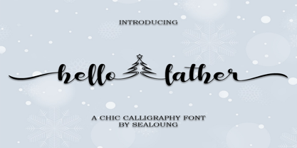 Hello Father feels equally charming and elegant. This stunning handwritten font is a stylish homage to classic calligraphy. It features a varying baseline, smooth lines, gorgeous glyphs and stunning alternates. It will elevate a wide range of design projects to the highest level, be it branding, headings, wedding designs, invitations, signatures, logos, labels, and much more!
 - Eco Coding by S-Core,
$20.00 Eco Coding is a sans-serif monospaced font, especially designed for programmers. This font is optimized for programming (coding) environment. Eco Coding's neutral and open shapes will make your eyes comfortable to read any source codes and text on screen. The appearance of Eco Coding is neutral, but it has distinctive shapes enhance legibility and readability on screen.
 - Nono by Wiescher Design,
$39.50 Nono is the nickname of my oldest son, Konstantin. His little brother could not really speak yet, but he was always looking for him and said something to the tune of, "wea is a nono". From that time on I call Konstantin Nono. I designed a handwritten script with his real name, that i named Konstantin. Now I made this slick version of that script – hence – Nono! I made three basic sets of characters plus a smallcaps version. To top things off, I designed a set of endletters that I throw in for free. Everything can be mixed! I sell single cuts but the best deal would be the entire packet, it goes for a very fair price. Your generous typedesigner, Gert Wiescher
 - Teorema Sans by FSdesign-Salmina,
$39.00 Teorema. Well balanced Reading. Looking for a geometric yet flexible character? Teorema typeface combines different geometric shapes, according to a pragmatic approach that favors flexibility and ease of use. The font is distinguished by the contrast between perfectly circular shapes, and other, more angular ones in search of a formal balance aimed at optimizing the recognizability of the characters and finally the legibility of the text. Worthy of a geometric “theorem”? Try Teorema for free. Download a free version of Teorema Regular and Bold with a reduced character set. Check it out!
 - Halender by Kartiny Type,
$14.00 Halender Script is an Elegant script font that comes with very beautiful character changes, a type of classic copper decorative script with a modern touch, designed with high detail to present an elegant style. Halender script is interesting because the typeface is pleasing to the eye, clean, feminine, sensual, glamorous, simple and very easy to read, because of the many luxurious letter connections. I also offer a number of decent stylistic alternatives for some of the letters. Thank You
 - Nipok by Gravitype,
$14.90 Nipok is a single weight display typeface, inspired by the aesthetics of different decades. Rounded terminals and playful intersections from the 60’s and 70’s, joined with straight and compact lines from the 80’s and 90’s. The particular style is given by the alternation of upper and lower case letters, chosen to fill the empty spaces greatly and create harmony. In addition, alternates are included to give you more stylistic options. While by default this font is a semi unicase, the alternative glyphs extend the Ascent and Descent metrics. Multilingual support is available.
 - Nusaibah by Eyad Al-Samman,
$20.00 “Nusaibah” is the first name of an early convert woman to Islam, and the first female to fight in defense of the Islamic religion. Her full name is Nusaibah bint Kaíab Al-Maziniyyah and she took part in the Battles of Uhud, Hunain, Yamama and the Treaty of Hudaibiyah with Islam’s prophet Muhammad (pbuh). Nusaibah is best known for her brave and heroic feat during the Battle of Uhud - fought on March 19, 625 - when she entered the battle carrying a sword and a shield to protect the prophet Muhammad (pbuh) from the arrows of the enemy, and she accordingly received several wounds while fighting and these wounds were not healed until the following year. The prophet Muhammad (pbuh) mentioned her distinct courage by saying that in whichever direction he turned in the battlefield, he could see her defending and protecting him. "Nusaibah" is a modern, geometric, and headline Arabic display typeface. The main trait of this typeface is the novel symmetrical design of its letters which renders it as one of the modern stylish typefaces used for headlines and titles. This is can be noticed in its letters such as “Theh”, “Jeem”, “Ain”, “Sheen”, and others. Moreover, “Nusaibah” font has a character set which supports Arabic, Persian, Urdu, and Latin letters and numerals with a limited range of specific Arabic and Latin ligatures. This font comes in two weights (i.e., regular and bold) with nearly 643 distinctive glyphs. Due to its geometric and linear design, “Nusaibah” typeface is appropriate for heading and titling in Arabic, Persian, and Urdu magazines, posters, and surfaces of different equipment. It is also elegantly suitable for signs, books’ covers, advertisement light boards, products’ and services’ names, and titles of flyers, pamphlets, novels, and books of children. “Nusaibah” typeface is one of the Arabic typefaces that has a novel and modern-day design which can be used in versatile graphic, typographic, and artistic works in different languages for diverse cultures.
 - Rotation by Linotype,
$29.99After the Second World War, the Ionic style replaced Modern Face as the favored typeface for newsprint. A couple decades later, it was in turn replaced by the next generation of newspaper fonts, a mix of Old Face, Transitional and Modern Face forms. Rotation was designed by Arthur Ritzel and presented by Stempel/Linotype in 1971 and named for the rotation newsprint machine for which is was particularly suited. The font displays the influence of Old Face design and gives newsprint a feeling of lightness and elegance. - SF Hussein by Sultan Fonts,
$19.99 SF Hussein font is designed to be used in broad writing and short sentences. It is an ornate heading font with minimal details. Its domain is stationery, logos, branding, ad design, and posters, and it can be paired with a range of other font styles to create different moods. This font is an improvement of the Hussein font that was presented by designer Sultan Al-Maqtari in 2013 The Hussain font supports Arabic, Latin, Persian, and Urdu.
 - Ribuah Sans by LetterMuzara,
$20.00 Ribuah Sans is a sans serif font with high contrast, inspired by the font "Bodoni" and the architecture of brutalism. Ribuah Sans consists of three styles (light, regular, bold) and includes several writing systems such as Latin (supporting all European languages and Turkish), Cyrillic (supporting all Cyrillic-based alphabets), Greek and Hebrew. By it's modern, geometric and strict nature this font will immediately draw attention to your design, thereby becoming a perfect option for heading and advertising.
 - Atley by Artisan Studio,
$20.00 Atley is a script font to have a form of modern calligraphy, there are also some wonderful alternative glyph. The Features of this fonts is; Contextual swashes Contextual Alternates Standart ligatures Stylistic Alternates Stylistic sets Can be used for various purposes.such as headings, logos, wedding invitation, t-shirt, letterhead, signage, lable, news, posters, badges etc. To enable the OpenType Stylistic alternates, you need a program that supports OpenType features such as Adobe Illustrator CS, Adobe Indesign & CorelDraw X6-X7.
 - Bougainville Neo by Type Associates,
$24.50 Bougainville Neo is a complete remake of our popular Bougainville series which first appeared at MyFonts in 2005. Neo is now in 4 additional weights plus italics. The original typeface family was named in honor of the renowned eighteen-century French mathematician and explorer Louis-Antoine de Bougainville to whom we owe the naming of South Sea Islands and colorful tropical flora he discovered along his journey. Bougainville Neo makes for effective headings at any size and is equally readable at semi-display sizes.
 - Mrs Eaves XL Serif by Emigre,
$59.00 Originally designed in 1996, Mrs Eaves was Zuzana Licko’s first attempt at the design of a traditional typeface. It was styled after Baskerville, the famous transitional serif typeface designed in 1757 by John Baskerville in Birmingham, England. Mrs Eaves was named after Baskerville’s live in housekeeper, Sarah Eaves, whom he later married. One of Baskerville’s intents was to develop typefaces that pushed the contrast between thick and thin strokes, partially to show off the new printing and paper making techniques of his time. As a result his types were often criticized for being too perfect, stark, and difficult to read. Licko noticed that subsequent interpretations and revivals of Baskerville had continued along the same path of perfection, using as a model the qualities of the lead type itself, not the printed specimens. Upon studying books printed by Baskerville at the Bancroft Library in Berkeley, Licko decided to base her design on the printed samples which were heavier and had more character due to the imprint of lead type into paper and the resulting ink spread. She reduced the contrast while retaining the overall openness and lightness of Baskerville by giving the lower case characters a wider proportion. She then reduced the x-height relative to the cap height to avoid increasing the set width. There is something unique about Mrs Eaves and it’s difficult to define. Its individual characters are at times awkward looking—the W being narrow, the L uncommonly wide, the flare of the strokes leading into the serifs unusually pronounced. Taken individually, at first sight some of the characters don’t seem to fit together. The spacing is generally too loose for large bodies of text, it sort of rambles along. Yet when used in the right circumstance it imparts a very particular feel that sets it clearly apart from many likeminded types. It has an undefined quality that resonates with people. This paradox (imperfect yet pleasing) is perhaps best illustrated by design critic and historian Robin Kinross who has pointed out the limitation of the “loose” spacing that Licko employed, among other things, yet simultaneously designated the Mrs Eaves type specimen with an honorable mention in the 1999 American Center for Design competition. Proof, perhaps, that type is best judged in the context of its usage. Even with all its shortcomings, Mrs Eaves has outsold all Emigre fonts by twofold. On MyFonts, one of the largest on-line type sellers, Mrs Eaves has been among the 20 best selling types for years, listed among such classics as Helvetica, Univers, Bodoni and Franklin Gothic. Due to its commercial and popular success it has come to define the Emigre type foundry. While Licko initially set out to design a traditional text face, we never specified how Mrs Eaves could be best used. Typefaces will find their own way. But if there’s one particular common usage that stands out, it must be literary—Mrs Eaves loves to adorn book covers and relishes short blurbs on the flaps and backs of dust covers. Trips to bookstores are always a treat for us as we find our Mrs Eaves staring out at us from dozens of book covers in the most elegant compositions, each time surprising us with her many talents. And Mrs Eaves feels just as comfortable in a wide variety of other locales such as CD covers (Radiohead’s Hail to the Thief being our favorite), restaurant menus, logos, and poetry books, where it gives elegant presence to short texts. One area where Mrs Eaves seems less comfortable is in the setting of long texts, particularly in environments such as the interiors of books, magazines, and newspapers. It seems to handle long texts well only if there is ample space. A good example is the book /CD/DVD release The Band: A Musical History published by Capitol Records. Here, Mrs Eaves was given appropriate set width and generous line spacing. In such cases its wide proportions provide a luxurious feel which invites reading. Economy of space was not one of the goals behind the original Mrs Eaves design. With the introduction of Mrs Eaves XL, Licko addresses this issue. Since Mrs Eaves is one of our most popular typefaces, it’s not surprising that over the years we've received many suggestions for additions to the family. The predominant top three wishes are: greater space economy; the addition of a bold italic style; and the desire to pair it with a sans design. The XL series answers these requests with a comprehensive set of new fonts including a narrow, and a companion series of Mrs Eaves Sans styles to be released soon. The main distinguishing features of Mrs Eaves XL are its larger x-height with shorter ascenders and descenders and overall tighter spacing. These additional fonts expand the Mrs Eaves family for a larger variety of uses, specifically those requiring space economy. The larger x-height also allows a smaller point size to be used while maintaining readability. Mrs Eaves XL also has a narrow counterpart to the regular, with a set width of about 92 percent which fulfills even more compact uses. At first, this may not seem particularly narrow, but the goal was to provide an alternative to the regular that would work well as a compact text face while maintaining the full characteristics of the regular, rather than an extreme narrow which would be more suitable for headline use. Four years in the making, we're excited to finally let Mrs Eaves XL find its way into the world and see where and how it will pop up next.
 - Primate by John Moore Type Foundry,
$20.00 Primate is a typeface family that works both as a display font for reading, casual and informal as it approaches the forms of nature, hence the name Primate. Primate's family comes in a full range of weights, from the thin Ultra Light to Heavy Black, all weights are also presented in italics and all have ornaments. Primate is a natural and fun to compose texts, giving the design work of a contemporary look.
 - Polish Dirty News by 066.FONT,
$9.99 Polish Dirty News is a display font that draws inspiration from the distinctive aesthetic of 90s zines, and exudes a varied and extravagant style that lends a certain nonchalance to projects. Its expressive and daring letters are perfect for creative projects such as posters, invitations or branding materials. Polish Dirty News perfectly captures the striking look and distinctive character of the text, which is associated with the unique spirit of that decade. Remastered in 2022.
 - Strokes by Favorite Fonts,
$17.00 The "Strokes" font family presented here has several styles: regular, italic, bold and bold italic. The font supports the alphabet consisting of Latin letters and symbols, Cyrillic, Tatar. The composition of the font "Strokes" includes graphemes from uppercase and lowercase letters, numbers, standard characters. The originality of the font lies in its name. The "Strokes" font is made up of many intersecting lines, forming rounded sans-serif letters, but at the same time smooth and easy to read, which will fit perfectly into your composition. The unusualness and attractiveness of the font makes it noticeable among the texts that surround us everywhere. This property is convenient to use on signs, logos, corporate identity, product packaging. The decorativeness of the font is eye-catching and will add important accents to your work.
 - Geek Speak by Comicraft,
$29.00 Scissors cuts paper, paper covers rock, rock crushes lizard, lizard poisons Spock, Spock smashes scissors, scissors decapitates lizard, lizard eats paper, paper disproves Spock, Spock vaporizes rock, and as it always has, rock crushes scissors. If you're familiar with this theory, you already Speak Geek, and now you can download a font that has 250 friends in the Comicraft Font Library but has never met one of them. Take it to Comic-con this weekend and take photos of Wonder Woman cosplayers together then post them to your tumblr account... Or head down to the basement for D&D and debate the merits of George Lucas fiddling with his trilogies. Yep, GEEKSPEAK shoots first -- put that on a t-shirt! And gimme some Spock. GeekSpeak features Western & Central European, Vietnamese & Cyrillic support, worldwide currency symbols and Crossbar I Technology™ * Comicraft fonts are created by actual comic book letterers for actual comic book lettering
 - Andulka Sans by Storm Type Foundry,
$55.00 Andulka was drawn in 2004 for the purposes of publication and visual identity. Her peaceful expression also excels in poetry and fiction. It reads so smoothly that you won’t even know that its width proportion is actually narrowed, so it’s very suitable for magazines, newspapers and thickest volumes of scientific literature. Her serif counterpart is Andulka. The entire Andulka system can easily build a typography of the entire publishing house.
 - Genial by Scholtz Fonts,
$16.95 Genial is an elegant, contemporary script font in nine styles, specifically designed for maximum versatility. All of the styles, ranging from condensed thin to expanded fat, are clear and legible. The font conveys a feeling of relaxed elegance. The Family: Medium weights - Regular: of medium weight and regular width - Expanded: of medium weight and wide - Condensed: of medium weight and condensed width (narrow characters) - perfect for limited space Black weights (for best readability) - Regular: for bolder statements - Expanded: expanded width for bolder statements Light weights - Regular: regular width, delicate line - Expanded: wide characters and a delicate line - Condensed: condensed width (narrow characters) and a delicate line Fat weight - Expanded: for maximum impact (wide and extra-bold) Use a combination of styles for product branding, book covers, invitations, greeting cards. The Genial combination will enable you to use different styles of the same font for headings, sub-headings and body text. Genial contains over 250 characters - (upper and lower case characters, punctuation, numerals, symbols and accented characters are present). It has all the accented characters used in the major European languages.
 - P22 Phantasmagoria by IHOF,
$39.95 P22 Phantasmagoria is a stylized Celtic-meets-Futurist font has multiple variations as a geometric majuscule. The heads of beasts that cap each large Uppercase letter complement the thinner, lowercase letters that can function on their own as an effective and flexible titling font. The Pro version features all basic variations plus more.
 - Groovy Boss by Eu Iturria Morante,
$36.00 Groovy Boss is a decorative type, inspired by the playful aesthetics from the 60s and 70s. Groovy and Boss were words used in those decades to refer to something as cool or trendy. Great for titles or short phrases, the curves and psychedelic forms of each letter will contribute to creating amazing compositions.
 - Aberration by Mad Irishman Productions,
$22.00Aberration is a distressed display typeface with a flair for exploration. Suitable for headings where you want to convey just a hint of danger, this font includes Cyrillic and Greek characters. - Hargloves Sans by Heypentype,
$20.00 Hargloves sans remixes between grotesque proportions and 80’ industrial inspired-typefaces. Yes, it is a major improvement from original Hargloves fonts with completely different projections. Hargloves Sans intended primarily for text, editorial or long-form text. This new design emphasized on reader joy experience when reading text without losing typeface characters. Hargloves Sans support almost all Latin script language, roughly around 356 latin language according to hyperglot analytics. This language coverage is heypentype priority to serve all possible Latin script language all over the world. The premise is simple, because it is text typeface it should cover all Latin script languages whether its popular language or not. Hargloves Sans have a higher x-height compared to Hargloves. Higher x-height will give a seamless, undistracted reading. The open counter on nearly squared proportions is Hargloves Sans main character. There’s a lot of feature coming for this typeface in the future.
 - Rosenbaum by SIAS,
$34.90 The design of Rosenbaum started with the idea of an eclectic merger of didone stroke pattern and contrast, uncial letterforms and blackletter appearance. It was a destillation experiment. It happened around christmas in 2011. The result is a unique typeface which strongly evokes a peculiar pastiche mood without being any historical in the strict sense of the word. It’s all about the fun to mix ingredients and to freely create reminiscences in a new way. Rosenbaum is a typeface like a fairytale – one of a kind, strangely poetic and incredibly true at once… Use Rosenbaum for emotional typographics, for fairytale books and stories, for headings and invitations, for distinctive labels or menu cards, for Wave Gothic publishing … you will know best! Both Rosenbaum Eins and Rosenbaum Rose contain all characters needed for any European language. They both contain the same range of additional symbols and ornaments, some of them are zero-width calligraphic embellishments designed for direct combination with the letters, even inside of words.
 - Clean Fragile by Nathatype,
$29.00 Have you been looking for a sans serif font? Do you dream of creating headings that stand out and inspire modern and artistic? Wait no more, we will give you the best choice. Clean Fragile-A Sans Serif Font Clean Fragile is a gorgeous sans serif font, designed with the modern vibe. This font is perfect for anything adventurous, and direct. Every stroke, and curve was created to entice happiness and elegance. A real head-turner for your presentation, designs, website illustrations, and much more. Clean Fragile includes Multilingual Support to make your branding reach a global audience. Inspire your audience, clients, or guests with this beautiful, statement font. Features: Ligatures Stylistic Sets Swashes PUA Encoded Numerals and Punctuation Thank you for downloading premium fonts from Nathatype
 - Background Echo by Hanoded,
$15.00 I don’t live in the mountains, so when we go on holiday and visit the mountains, we always like to hear the echo! A bit childish, I know, but that’s how it is. Background Echo is a very nice, handmade, all caps font. It’s not exactly a laser-cut design; glyphs are a bit uneven, wobbly in places and have their own idea of what they should look like. That, my dear potential customers, is the charm of a hand made font! Background Echo comes with a vast array of diacritics, regular and bold styles and a selection of interesting swashes for the upper case glyphs
 - Steradian by Emtype Foundry,
$69.00 Steradian is an exploration of the geometric genre and although it has a geometric base, the widths between letters are not much different across the weights. That is due to the process, in which the proportions of the heavier weights paved the way for the lighter ones. It also has a series of details that make Steradian stand out and gives it a special touch. Some of its main features are the double-story ‘a’, its closed apertures and some of the capitals have a distinct personality (such as the G and Q). Read more about the design process at the Emtype’s Blog.
 - Bream by Hackberry Font Foundry,
$24.95 This is the display version of Librum. Librum means “book” in Latin, which I thought was appropriate. Bream is Latin for proclaim—appropriate for display work. The fonts are very close to Librum-Book and Librum-Italic, with the same OpenType features. The glyphs are modified a bit to make them a little more elegant, but that’s not very noticeable. Mainly, the letterspacing and kerning is tighter and more carefully fit to large point sizes. As for classification, I like oldstyle, Venetian, geralde, English oldstyle. There’s discrete modulation, slanted crossbars, full brackets serifs of medium thickness and sharp cut ends. For a great deal, see Librum Book Design Group, for a package containing all fifteen fonts!
 - Schwandner Versalia by Intellecta Design,
$35.00 A highly intrincated decorative capital from the work of Johann Georg Schwandner (1716-1791). An accurate historical revival and interpretation of Iza W, at Intellecta Design. State-of-art to use in headings, chapter initials from books, magazines and other publications. Also use in baroque and renaissance inspired layouts, or modern mixed proposals.
 - RaseDowne by Graffiti Fonts,
$39.99RaseDowne is unique amoung all of our other Graffiti Fonts. This font is intended to be rotated 90 degrees clockwise so the text reads downward. This single font includes 2 alphabets with capitals that extend downwards. The RaseDowne font was created from hundreds of handwritten samples. This style was created by RaseOne & is often used to create tattoo designs, fashion designs and mountable artwork. There are actually nearly 3 full alphabets plus numbers, symbols and a variety of embellishments all included in this one font. The rough, natural style and imperfect lines help maintain a handmade look. Using the optional glyphs you can try multiple letter combinations until you get just the right configuration for whatever word or phrase you are trying to make.
